Tài liệu HTML & CSS: The Complete Reference- P12 pptx
Bạn đang xem bản rút gọn của tài liệu. Xem và tải ngay bản đầy đủ của tài liệu tại đây (531.99 KB, 50 trang )
526
P a r t I I : C o r e S t y l e
526
P a r t I I : C o r e S t y l e
Linked styles are the preferred method of specifying CSS rules because they cleanly
separate the style from the markup. However, do note that using linked styles does come
with the small penalty of an extra HTTP request.
Embedded Styles
Document-wide styles can be embedded in a document’s head element using the <style>
tag. Note that styles should be commented out to avoid interpretation by non-style-aware
browsers.
<style type="text/css">
<!
p {font-size: 1.5em; font-family: Georgia, "Times New Roman", Times, serif;
color: blue; background-color: yellow;}
em {font-size: 2em; color: green;}
>
</style>
However, be aware that comment masking is frowned upon in XHTML, and instead
you should use linked styles or use a CDATA section like so:
<style type="text/css">
<![CDATA[
p {font-size: 1.5em; font-family: Georgia, "Times New Roman", Times, serif;
color: blue; background-color: yellow;}
em {font-size: 2em; color: green;}
]]>
</style>
Given the support of this structure, particularly with the confusion of XHTML serving and
handling, it is best to avoid this commenting scheme or, better yet, simply stick to linked styles.
It is possible to set a media attribute on a <style> tag to define different types of rules
per output medium:
<style type="text/css" media="print">
/* Print rules here */
</style>
<style type="text/css" media ="screen">
/* Screen rules here */
</style>
Imported Styles—@import
Within embedded <style> blocks, properties can be imported from an external file and
expanded in place, similar to a macro. Importing can be used to include multiple style
sheets. An imported style is defined within a <style> tag using @import followed
optionally by a type value and a URL for the style sheet:
<style type="text/css">
@import url(newstyle.css);
@import print url(printstyle.css);
</style>
Please purchase PDF Split-Merge on www.verypdf.com to remove this watermark.
C h a p t e r 5 : C S S S y n t a x a n d P r o p e r t y R e f e r e n c e
527
PART II
C h a p t e r 5 : C S S S y n t a x a n d P r o p e r t y R e f e r e n c e
527
The @import directive allows style sheets to be grouped and joined together, though
some might wonder what the value of this function is given what linked styles provide.
NOTE Some CSS developers use the @import directive to perform a weak form of browser
selection, because many older CSS implementations do not support the directive. The basic idea
of the trick is to put sophisticated style rules in an
@import style sheet and leave basic styles in
the style block. This trick should be avoided, particularly given that some browsers, notably
versions of Internet Explorer, will cause a disturbing flash effect when loading imported styles.
Inline Styles
You can apply styles directly to elements in a document using the core attribute style, as
shown next. As the closest style-inclusion method to a tag, inline styles take precedence
over document-wide or linked styles.
<h1 style="font-size: 48px; font-family:Arial, Helvetica, sans-serif;
color: green;">CSS Test</h1>
Given the tight intermixture of style into markup, this scheme should be used sparingly.
Note that some features of CSS, particularly pseudo-class–related values such as link states,
may not be settable using this method. Further note that there is no way to set media-
specific style rules inline on individual elements.
CSS Measurements
CSS supports a number of measurements. In most cases, they involve a number, and CSS
supports both positive and negative integer values, like 3 and –14, as well as real numbers
like 3.75. Very often the numbers are found with units; for example,
p {margin: 5px;} /* all margins set to 5 pixels */
But in a few cases they may not have units, as the measurement may be contextual from
the meaning of the property:
p {line-height: 2;} /* double spaced */
When a measurement is zero, there is no need for a unit,
* {margin: 0;}
but it won’t hurt to include one:
* {margin: 0px;}
Commonly, absolute length units like inches (in), centimeters (cm), millimeters (mm),
points (
pt), and picas (pc) are used. These absolute measures should be used when the
physical characteristics of the display medium are well understood, such as in printing. We
also might use relative measures that can scale, such as
em units, ex values, percentage, or
pixels. Table 5-3 summarizes these units of measure.
Please purchase PDF Split-Merge on www.verypdf.com to remove this watermark.
528
P a r t I I : C o r e S t y l e
528
P a r t I I : C o r e S t y l e
NOTE There are many other values found in CSS3, such as viewport sizes (vh, vw, vm), root
relative sizing (rem), angles [degrees (deg), grads (grad), and radians (rad)], times
[milliseconds (
ms) and seconds (s)], frequencies [Hertz (Hz) and kilo Hertz (kHz)], and so on.
See Chapter 6 for information on these and other values.
TABLE 5-3 CSS1 and CSS2 Length Measurement Units
Measurement Description Example
%
Defines a measurement as a
percentage. Percentages are denoted
by a number followed by the % symbol
and are always relative to another value
such as length. Quite often they are
used to specify some value relative
to an inherited value from a parent
element.
p {font-size: 14px;
line-height: 150%;}
cm
Defines a measurement in centimeters.
div {margin-bottom: 1cm;}
em
Defines a measurement relative to the
height of a font in em spaces. Because
an em unit is equivalent to the size of a
given font, if you assign a font to 12pt,
each em unit would be 12pt, thus 2em
would be 24pt.
p {letter-spacing: 5em;}
ex
Defines a measurement relative
to a font’s x-height. The x-height is
determined by the height of the font’s
lowercase letter x.
p {font-size: 14pt;
line-height: 2ex;}
in
Defines a measurement in inches.
p {word-spacing: .25in;}
mm
Defines a measurement in millimeters.
p {word-spacing: 12mm;}
pc
Defines a measurement in picas. A pica
is equivalent to 12 points; thus, there
are 6 picas per inch.
p {font-size: 10pc;}
pt
Defines a measurement in points. A
point is defined as 1/72nd of an inch. A
point does not equate to a pixel unless
there are 72 pixels per inch onscreen.
body {font-size: 14pt;}
px
Defines a measurement in screen
pixels. Surprising to some Web
developers, pixel measurements are
relative, as there may be different pixel
densities on different screens.
p {padding: 15px;}
Please purchase PDF Split-Merge on www.verypdf.com to remove this watermark.
C h a p t e r 5 : C S S S y n t a x a n d P r o p e r t y R e f e r e n c e
529
PART II
C h a p t e r 5 : C S S S y n t a x a n d P r o p e r t y R e f e r e n c e
529
CSS Strings and Keywords
In CSS, strings are defined with either single quotes ('example') or double quotes
("example"). Quotes may be found within the opposite quote ("I say this is an
'example'!"
). Commonly, strings are found when specifying a font name, like so:
p {font-family: "Fancy Font";}
We also find that strings may be used with selectors:
a[title="Match me match me"] {color: red;}
There is an occasional need for special characters in strings; in particular, newlines may
be specified with a "\00000a" value. In situations where a newline is typed, a \ character
can be used as line continuation:
a[title="Next\
Line here"] {color: red;}
More common than quoted strings are the numerous keyword values found in CSS. The
number of keywords is vast and is used for specifying sizes,
.big {font-size: xx-large;}
.small {font-size: small;}
.downsize {font-size: smaller;}
border styles,
.double {border: 5px solid black;}
.dashed {border-style: dashed;}
text formatting and style,
.style1 {text-decoration: underline;}
.style2 {font-variant: small-caps;}
.style3 {font-weight: bold;}
element meaning,
#nav {display: block;}
#gone {display: none;}
#test {display: inline;}
layout,
#region1 {position: absolute; top: 10px; left: 10px;}
#region2 {position: relative; top: -60px; left: 100px;}
#region3 {position: fixed; top: 0px; left: 0px;}
and more.
Please purchase PDF Split-Merge on www.verypdf.com to remove this watermark.
530
P a r t I I : C o r e S t y l e
530
P a r t I I : C o r e S t y l e
In some situations, the keyword may be part of a functional style notation. For example,
in CSS the specification of a URL as a value is marked by
url(address), where address is
the actual value of the resource to be linked to:
body {background: url(stars.png);}
#div1 {background: url( />Newer color formats like rgb(), rgba(), hsl(), and hsla() are set with similar
notation, and other functional notation style values may emerge over time such as calc()
(see Chapter 6 for a brief discussion). For example, there is discussion of CSS potentially
including variables which allows values to be set in one place and used in various rules. For
example,
@variables {
primaryBackground: #F8D;
primaryColor: #000;
defaultMargin: 2em;
}
p {color: var(primaryColor); background-color: var(primaryBackground);
margin: var(defaultMargin);}
So far such ideas are still uncommon, so if a value is not found within quotes or followed by
a measurement, it is likely a keyword or counter. If it isn’t or is simply not an understood
value, it will be ignored by CSS-conforming user agents anyway.
Counters
Counters demonstrate the possibility of variable-like values in CSS. They are defined as
alphanumeric names that correspond to some current counter value in a document. In some
cases, the counter( ) functional notation is used and in some cases it is not, as shown by
these rules:
ol.cT {
counter-reset: counter1;
list-style-type: none;}
ol.cT li:before {
counter-increment: counter1;
content:
counter(counter1) " - " ;}
Interestingly, the ambiguity of allowing the counter1 value to appear in a keyword-like
fashion is somewhat troubling. It is likely that the counter( ) style syntax will eventually
be applied everywhere.
CSS Color Values
Style sheets support a variety of color measurement values, as shown in Table 5-4. Appendix C
provides a greater discussion of possible color values and names.
Please purchase PDF Split-Merge on www.verypdf.com to remove this watermark.
C h a p t e r 5 : C S S S y n t a x a n d P r o p e r t y R e f e r e n c e
531
PART II
C h a p t e r 5 : C S S S y n t a x a n d P r o p e r t y R e f e r e n c e
531
TABLE 5-4 CSS Color Values (continued)
Color Format Description Example
Specification-
defined named
colors
There are 17 defined colors under CSS 2.1.
Each is listed here with its six-digit hex form
equivalence:
maroon (#800000) red (#ff0000)
orange (#ffA500) yellow (#ffff00)
olive (#808000) purple (#800080)
fuchsia (#ff00ff ) white (#ffffff)
lime (#00ff00) green (#008000)
navy (#000080) blue (#0000ff)
aqua (#00ffff) teal (#008080)
black (#000000) silver (#c0c0c0)
gray (#808080)
Other color keywords may be commonly
used but are ad hoc in their definition.
See Appendix C for more information.
body {font-family:
Arial; font-size: 12pt;
color: red;}
Commonly defined
named colors
Most browsers support a number of
common colors based upon the X11
windowing system palette, such as
mintcream. Appendix C provides a
complete list of these extended colors
and a discussion of the potential pitfalls
of using them.
#gap {color: khaki;}
System Color
Names
CSS2 introduced named color keywords
which allows Web page colors to be
matched to an operating system’s color
use. A complete list of the allowed values
and their meaning is found in Appendix C.
While these names are commonly
supported, there is some concern that
they will not be supported in CSS3.
.formLabels {color:
CaptionText;}
input[type="button"]
{background-color:
ButtonFace;}
6-Hex Color CSS’s six-digit hexadecimal format is
the same as color defined in (X)HTML.
The format specifies color as #rrggbb,
where rr is the amount of red, gg the
amount of green, and bb the amount of
blue, all specified in a hexadecimal value
ranging from 00 to FF.
div {font-family:
Courier; font-size:
10pt; color: #00CCFF;}
3-Hex Color This is an RGB hexadecimal format of
#rgb, where r corresponds to a hex
value (0–F) for red, g for green, and b for
blue. For example, #f00 would specify
pure red, while #fff would specify white.
Given its data limits, the format is less
expressive than 6-Hex Color.
span {font-family:
Helvetica; font-size:
14pt; color: #0CF;}
Please purchase PDF Split-Merge on www.verypdf.com to remove this watermark.
532
P a r t I I : C o r e S t y l e
532
P a r t I I : C o r e S t y l e
Color Format Description Example
HSL Color CSS3 introduces Hue Saturation
Lightness (HSL), where color values are
specified as hsl(hue,saturation,
lightness). Hue is set as the degree
on the color wheel, where 0 or 360 if
you wrap around is red, 120 is green,
and 240 is blue, with the various other
colors found between. Saturation is
a percentage value, with 100% being
the fully saturated color. Lightness is a
percentage value, with 0% being dark and
100% light with the average 50% being
the norm.
#red {
color: hsl(0,100%,
50%);}
#green {
color:
hsl(120,100%,50%);}
#blue {
color:
hsl(240,100%,50%);}
HSLa Color This is the CSS3 HSL value with a fourth
value to set the alpha channel value
for the color to define the opacity of
the element. An HSLa is specified via a
function style hsla(hue,saturation,
lightness, alpha), where hue,
saturation, and lightness are the same
as standard hsl() values, and the alpha
channel value for defining opacity is a
number between 0 (fully transparent) and
1 (fully opaque).
#bluetrans {color: hsla(
240,100%,50%,0.5);}
RGB Color CSS colors can also be defined using
the keyword rgb, followed by three
numbers between 0 and 255, contained in
parentheses and separated by commas,
with no spaces between them. RGB
color values can also be defined using
percentages. The format is the same,
except that the numbers are replaced by
percentage values between 0% and 100%.
#p1 {color:
rgb(204,0,51);}
p {color:
rgb(0%,10%,50%);}
RGBa Color This is like RBG color but adds an alpha
channel value to specify the opacity of
the color. An RGBa is specified via a
function-style rgba(r,g,b,a) value,
where colors r, g, and b are specified
as a decimal value from 0 to 255 or a
percentage from 0% to 100%, and the
alpha channel value for defining opacity
is a number between 0 (fully transparent)
and 1 (fully opaque). Values outside this
range will be rounded up or down to fit the
closest value.
#redtrans {
color:
rgba(255,0,0,0.4);}
TABLE 5-4 CSS Color Values (continued)
Please purchase PDF Split-Merge on www.verypdf.com to remove this watermark.
C h a p t e r 5 : C S S S y n t a x a n d P r o p e r t y R e f e r e n c e
533
PART II
C h a p t e r 5 : C S S S y n t a x a n d P r o p e r t y R e f e r e n c e
533
CSS Selectors
CSS supports a rich set of selectors for specifying to which particular element(s) a CSS rule
applies. CSS1 initially supported basic selectors to indicate a particular tag, group of tags, or
position in the document tree. CSS2 expanded this to address selecting on attributes and
more positions in the tree. We show here pieces of CSS3, which has gone somewhat
overboard by making selector syntax at times potentially quite confusing, particularly when
chained excessively. Given that many browsers support this emerging selector syntax, it is
important to show it together with the other selectors as a complete reference. Table 5-5
summarizes the selector syntax from CSS1, CSS2, and the commonly supported parts of the
CSS3 specifications. A summary and expansion of CSS3 selectors to include those that are
less supported is provided in Chapter 6.
TABLE 5-5 CSS Selectors (continued)
Selector Description Example Defined In
E
Selects all elements of
the name E specified in
the rule
h1 {color: red;}
/* makes all h1 tags red */
CSS1
*
Selects all elements
* {color: blue;}
/* makes all elements blue */
CSS2
E, F, G
Applies the same
rules to a group of
tags E, F, and G
h1,h2,h3 {background-color:
orange;}
/* sets the background color of
all h1, h2, and h3 elements to
orange */
CSS1
#id
Selects any tag with an
id attribute set
#test {color: green;}
/* makes a tag with id='test'
green */
CSS1
E#id
Selects the specified
element E with the
given id attribute set
h3#contact {color: red;}
/* sets the color to red on the h3
tag with the id equal to contact */
CSS1
.class
Selects all tags with
the specified class
value
.note {color: yellow;}
/* makes all tags with
class='note' yellow */
CSS1
E.class
Selects the specified
elements of type E with
a particular class value
h1.note {text-decoration:
underline;}
/* underlines all h1 tags with
class='note' */
CSS1
E F
Selects descendent
tags where F is a
descendent some time
from element E
p strong {color: purple;}
/* sets all strong tags that are
descendents of p tags purple */
CSS1
Please purchase PDF Split-Merge on www.verypdf.com to remove this watermark.
534
P a r t I I : C o r e S t y l e
534
P a r t I I : C o r e S t y l e
Selector Description Example Defined In
E > F
Selects direct
descendents
body > p {background-color:
yellow;}
/* makes all p tags that have the
body tag as their immediate parent
have the background color yellow */
CSS2
E + F
Selects adjacent
siblings
h1 + p {color: red;}
/* makes all p tags that are
immediately preceded by an h1 tag
red */
CSS2
E ~ F
Selects preceding
siblings
p ~ strong {font-style: italic;}
/* sets the font style to italic
on all strong tags that have a p
tag as a preceding sibling */
CSS3
E[attr]
Selects all elements of
E that have the given
attribute attr
a[href] {background-color: yellow;}
/* sets the background color to
yellow for all a tags that have an
href attribute*/
CSS2
E[attr=value]
Selects all elements
of E that have set the
given attribute attr
equal to the given
value
a[href=""]
{font-weight: bold;}
/* sets the font-weight to bold
on all a tags that have their href
attribute set to http://www
.htmlref.com */
CSS2
E[attr|=value]
Selects all elements of
E that have an attribute
attr that contains a
value that starts with
the value given in a list
of hyphen-separated
values
p[lang|="en"] { color: red; }
/* English text in red */
CSS2
E[attr~=value]
Selects all elements
of E that have a space-
separated list of values
for attr where one of
those values is equal
to the given value
p[title~="Test"] { font-style:
italic; }
/* sets the font style to italic
on all p tags that have one word
in their title equal to Test */
CSS2
E[attr^=value]
Selects all elements
of E that have the
attribute attr that
begins with the given
value
p[title^="HTML"] {color: green;}
/* sets the color to green if the
title starts with HTML */
CSS3
TABLE 5-5 CSS Selectors
Please purchase PDF Split-Merge on www.verypdf.com to remove this watermark.
C h a p t e r 5 : C S S S y n t a x a n d P r o p e r t y R e f e r e n c e
535
PART II
C h a p t e r 5 : C S S S y n t a x a n d P r o p e r t y R e f e r e n c e
535
Selector Description Example Defined In
E[attr$=value]
Selects all elements
of E that have the
attribute attr that ends
with the given value
p[title$="!"] {color: red;}
/* sets the color to red if the
title ends with an exclamation
mark */
CSS3
E[attr*=value]
Selects all elements
of E that have the
attribute attr that
contains the given
value
p[title*="CSS"] {font-style:
italic;}
/* sets the font style to italic
in any p tag that has CSS in its
title */
CSS3
a:link
Specifies the unvisited
link
a:link {font-weight: bold;}
/* makes unvisited links bold */
CSS1
a:active
Specifies the link as it
is being pressed
a:active {color: red;}
/* makes links red as they are
pressed */
CSS1
a:visited
Specifies the link after
being pressed
a:visited {text-decoration: line-
through;}
/* puts a line through visited
links */
CSS1
:after
Sets a style to be used
immediately following
the element
div:after {content:
url(sectionend.gif);}
/* inserts the sectionend.gif
image immediately following all
div tags */
CSS2
::after
Same as :after;
changed under CSS3
to make pseudo-
elements obvious
div::after {content:
url(sectionend.gif);}
/* inserts the sectionend.gif
image immediately following all
div tags */
CSS3
:before
Sets a style to be used
immediately before the
element
div:before {content:
url(sectionstart.gif);}
/* inserts the sectionstart.gif
image before all div tags */
CSS2
::before
Same as :before;
changed under CSS3
to make pseudo-
elements obvious
div::before {content:
url(sectionstart.gif);}
/* inserts the sectionstart.gif
image before all div tags */
CSS3
:checked
Selects the elements
that are checked
:checked {color: blue;}
/* sets the color to blue if an
element is checked */
CSS3
TABLE 5-5 CSS Selectors (continued)
Please purchase PDF Split-Merge on www.verypdf.com to remove this watermark.
536
P a r t I I : C o r e S t y l e
536
P a r t I I : C o r e S t y l e
Selector Description Example Defined In
:default
Selects the elements
that are the default
among a set of similar
elements
:default {background-color: red;}
/* sets the background color of a
default button like a submit to
red */
CSS3
:disabled
Selects the elements
that are currently
disabled
input:disabled {background-color:
gray;}
/* sets the background color to
gray on disabled input elements */
CSS3
:empty
Selects an element
that has no children
div:empty {display: none;}
/* hides the div if it has no
children */
CSS3
:enabled
Selects the elements
that are currently
enabled
input:enabled {background-color:
white;}
/* sets the background color to
white on enabled input elements */
CSS3
:first-child
Selects the element
only if the element is
the first child of its
parent
p:first-child { color: red;}
/* sets the font color to red for
all of the p tags that are the
first child of their parent */
CSS2
:first-letter
Selects the first letter
of an element
p:first-letter {font-size: larger;}
/* makes the first letter of a
paragraph larger */
CSS1
::first-letter
Same as :first-
letter; changed
under CSS3 to make
pseudo-elements
obvious
p::first-letter {font-size:
larger;}
/* makes the first letter of a
paragraph larger */
CSS3
:first-line
Selects the first line of
an element
p:first-line {color: red;}
/* makes the first lines
of paragraph red */
CSS1
::first-line
Same as :first-
line; changed under
CSS3 to make pseudo-
elements obvious
p::first-line {color: red;}
/* makes the first lines
of paragraph red */
CSS3
:first-of-type
Selects the element
that is the first child
of its parent that is of
its type
strong:first-of-type {font-size:
bigger;}
/* sets the font size bigger on the
first strong tag of its parent */
CSS3
TABLE 5-5 CSS Selectors
Please purchase PDF Split-Merge on www.verypdf.com to remove this watermark.
C h a p t e r 5 : C S S S y n t a x a n d P r o p e r t y R e f e r e n c e
537
PART II
C h a p t e r 5 : C S S S y n t a x a n d P r o p e r t y R e f e r e n c e
537
Selector Description Example Defined In
:focus
Selects the element
only when the element
holds the focus
input:focus {background-color:
yellow;}
/* sets the background color to
yellow on the input element that
has focus */
CSS2
:hover
Selects the element
when the user is
hovering over it
p:hover {background-color: yellow;}
/* sets the background color to
yellow on the p element that the
user is currently hovering over */
CSS2
:lang(value)
Selects all elements
that have the lang
attribute set to the
given value
*:lang(fr) {color: blue;}
/* sets the font color to blue
for every element that has the
attribute lang set to 'fr' */
CSS2
:last-child
Selects the element
that is the last child of
its parent
p:last-child {font-size: small;}
/* sets the font size to small on
the p tags that are the last child
of their parent */
CSS3
:last-of-type
Selects the element
that is the last child
of its parent that is of
its type
strong:last-of-type {font-size:
smaller;}
/* sets the font size smaller
on the last strong tag of its
parent */
CSS3
:not(s)
Selects elements
that do not match the
selector s
*:not(h1) {color: black;}
/* sets the color to black on every
element that is not an h1 tag */
CSS3
:nth-child(n)
Selects the element
that is the nth child of
its parent
div:nth-child(2) {background-
color: red;}
/* sets the background color to
red if the div is its parent's
second child */
CSS3
:nth-last-
child(n)
Selects the element
that is the nth from
last child of its parent
p:nth-last-child(3) {color:
yellow;}
/* sets the color to yellow if the
p element is its parent's third to
last child */
CSS3
:nth-last-of-
type(n)
Selects the element
that is the nth-from-last
child of its parent that
is its type
p:nth-last-of-type(2) {color:
purple;}
/* sets the color to purple on the
second to last p element of its
parent */
CSS3
TABLE 5-5 CSS Selectors (continued)
Please purchase PDF Split-Merge on www.verypdf.com to remove this watermark.
538
P a r t I I : C o r e S t y l e
538
P a r t I I : C o r e S t y l e
NOTE Most of the CSS3 selectors are not supported in Internet Explorer browsers, including
version 8.0, though they are widely supported by other browser vendors.
Page Media Selectors
CSS2 and beyond provide special support for multiple media types. Print styles in
particular introduce interesting selectors that are specific for page media. Table 5-6
summarizes the selectors used for such media-dependent styles.
NOTE CSS properties like orphans, page-break-after, page-break-before,
page-break-inside
, and widows are often used in conjunction with these selectors.
See the corresponding section in this chapter for the particular property for more information.
Selector Description Example Defined In
:nth-of-type(n)
Selects the element
that is the nth child of
its parent that is its
type
strong:nth-of-type(5) {text-
decoration: underline;}
/* underlines the fifth strong tag
under a parent */
CSS3
:only-child
Selects an element if
it’s the only child of its
parent
h1:only-child {color: blue;}
/* sets the h1 color to blue if
the h1 is the only child of its
parent */
CSS3
:only-of-type
Selects an element if
it’s the only child of its
parent with its type
p:only-of-type {font-weight: bold;}
/*sets the p element to be bold if
it is the only p tag child of its
parent */
CSS3
:root
Selects the element
that is the root of the
document
:root {background-color: blue;}
/* sets the background color to
blue for the root element */
CSS3
::selection
Selects the part of
the element that is
currently selected;
supported in Firefox as
::-moz-selection
as well
#test::selection {color: red;}
/* makes the text red when
selected */
CSS3
:target
Selects the element
that is the target of a
referring URI
:target{color:red;}
/* if the element is the target of
the referring URI, the color is
set to red */
CSS3
TABLE 5-5 CSS Selectors (continued)
Please purchase PDF Split-Merge on www.verypdf.com to remove this watermark.
C h a p t e r 5 : C S S S y n t a x a n d P r o p e r t y R e f e r e n c e
539
PART II
C h a p t e r 5 : C S S S y n t a x a n d P r o p e r t y R e f e r e n c e
539
Miscellaneous CSS Constructs
This section discusses some miscellaneous constructs associated with style sheets.
/* comments */
Comments can be placed within style sheets. Style sheets use the comment syntax used in C
programming (/*comment*/):
<style type="text/css">
p {font-face: Courier; font-size: 14px; font-weight: bold;
background-color: yellow;}
/* This style sheet was created at Demo Company, Inc. for the express purpose
of being an example in HTML & CSS: The Complete Reference, 5th Edition */
/* Oh by the way people can see your comments so think twice about what you
put in them */
</style>
HTML comment syntax (<! comment >) does not apply in CSS. However, as
discussed previously in the “Style Inclusion Methods” section, HTML comments are often
used to mask style blocks:
<style type="text/css">
<!
p {font-size: 1.5em; font-family: Georgia, "Times New Roman", Times, serif;
TABLE 5-6 CSS2 Page and Media Selector Summary
Selector or
Construct Description Example Defined In
@media
Groups style rules for multiple
media types in a single style
sheet
@media screen {body
{font-family: sans-serif;
font-size: 18 pt;}
}
CSS2
@page
Used to define rules for page
sizing and orientation rules for
printing
@page {size: 8.5in 11in;}
CSS2
:first
Sets page layout rules for the
first page in a document when
printing
@page :first {margin-top:
1.5in;}
CSS2
:left
Sets page layout rules for a
left-hand page when printing
@page :left {margin-left:
4cm; margin-right: 2cm;}
CSS2
:right
Sets page layout rules for a
right-hand page when printing
@page :right {margin-left:
6cm; margin-right: 3cm;}
CSS2
Please purchase PDF Split-Merge on www.verypdf.com to remove this watermark.
540
P a r t I I : C o r e S t y l e
540
P a r t I I : C o r e S t y l e
color: blue; background-color: yellow;}
em {font-size: 2em; color: green;}
>
</style>
Internet Explorer’s conditional comments are also found in CSS for masking linked style
sheets for one browser or another. See entry on comments in the reference found in Chapter 3
for more details.
@charset
A single @charset rule can be used in an external sheet to define character set encoding of
the style rules and values.
Example
@charset "ISO-8859-1"
/* external style sheet rules follow below */
Note
• This rule should never be used in an embedded style sheet, as there are many other
ways to indicate character sets with a <meta> tag or an HTTP header.
@font-face
This “at” rule is used to associate a font name to be used in a style sheet with some
downloadable font. A font-family property is used within the rule to name the font
and a src property is associated with an external font name:
@font-face {font-family: fontname;
src: url(fontfile);}
Later, the font can be used as a name within properties like font-family and font,
though you should specify other font names as a fallback in case downloadable font
technology is not supported or the font fails to load for some reason.
Examples
@font-face {font-family: "Mufferaw";
src: url(MUFFERAW.ttf);}
body {font-family: "Mufferaw", serif; font-size: 5em;}
It is also possible to set selection of a particular downloadable font when a particular font
characteristic like bold or italic is set, by adding the corresponding rule to the @font-face rule:
@font-face {font-family: "Mufferaw";
src: url(MUFFERAW.ttf);}
@font-face {font-family: "Mufferaw";
src: url(MUFFERAWBOLD.ttf);
font-weight: bold;}
p {font-family: "Mufferaw", serif; font-size: 5em;}
em {font-weight: bold;} /* would specify the Mufferaw bold font */
Please purchase PDF Split-Merge on www.verypdf.com to remove this watermark.
C h a p t e r 5 : C S S S y n t a x a n d P r o p e r t y R e f e r e n c e
541
PART II
C h a p t e r 5 : C S S S y n t a x a n d P r o p e r t y R e f e r e n c e
541
Note
• The particular font technologies for downloadable fonts vary significantly between
browsers. Internet Explorer has supported EOT files since IE 4. Netscape supported
TrueDoc downloadable fonts but these were phased out. Firefox 3.5, Safari 3, and
Opera 10 have reintroduced downloadable fonts using TrueType files. See Appendix B
for examples of mixing the various technologies.
@media
An @media rule can be used to define style rules for multiple media types in a single
embedded style sheet.
Examples
<style type="text/css">
@media screen { /* screen rules */ }
@media print { /* print rules */ }
@media screen, print { /* screen and print rules */ }
</style>
The syntax may look a little odd because you have to wrap style blocks with more curly
braces, like so:
<style type="text/css">
@media screen {body
{font-family: sans-serif;
font-size: 14px;}
}
@media print {body
{font-family: serif;
font-size: 10px;}
}
</style>
A variation of this syntax with device constraints, dubbed a “Media Query,” is supported in
many browsers and is discussed in Chapter 6.
@page
An @page rule is used to define a page block for printed styles. Generally, within this
construct we see various CSS properties like size, page, and margin to control the
dimensions of the page.
Examples
/* sets tables to be on landscape pages */
@page {size: 8.5in 11in; margin: .5in;}
@page {marks: crop;}
/* we can name particular page's rules as well with an identifier */
@page report {size: landscape;}
Please purchase PDF Split-Merge on www.verypdf.com to remove this watermark.
542
P a r t I I : C o r e S t y l e
542
P a r t I I : C o r e S t y l e
/* pseudo-classes can be used to select alternating pages as well
as the first page */
@page :left {margin: .5in;}
@page :right {margin: 1.5in;}
@page :first {margin: 5in;}
Note
• This construct is not well supported, even in modern browsers.
!important
This construct specifies that a style takes precedence over any different, conflicting styles.
This construct should be used sparingly.
Examples
body {font-family: Times;}
div {font-size: 14pt; line-height: 150%; font-family: Arial ! important;}
#div1 {font-family: Sans-Serif;}
/* all divs, no matter how used, will be in Arial, see !important */
CSS1 and CSS 2.1 Properties
This section presents the CSS1 and 2.1 properties in alphabetical order. CSS2 properties that
were dropped from the CSS 2.1 specification are presented in Chapter 6, which covers
emerging and proprietary CSS properties.
Note that the properties tend to come in groups and that most groups have shorthand
notation. For example, the background property is shorthand for background-color,
background-image, background-position, and background-attachment. Individual
properties of a set may contain extra details, which are noted in the corresponding section
for that property and are not necessarily repeated in the section for the shorthand entry of
the set.
The property entries that follow generally include the following information:
• Brief summary Brief summary of the property’s purpose.
• Syntax Syntax for the element, including allowed values defined by the W3C
specification.
• Example(s) One or more examples demonstrating use of the property.
• Compatibility The property’s general compatibility with CSS specifications and
browser versions.
• Note(s) Additional information about the property or its usage. This may include
some CSS3 details for properties that are only slightly modified in the emerging
specification. The bulk of the CSS3 information is presented in Chapter 6.
All the values allowed with a property are defined in the earlier section “CSS
Measurements.” Similarly, the examples assume that you understand selectors, which
are summarized in the earlier section “CSS Selectors.”
Please purchase PDF Split-Merge on www.verypdf.com to remove this watermark.
C h a p t e r 5 : C S S S y n t a x a n d P r o p e r t y R e f e r e n c e
543
PART II
C h a p t e r 5 : C S S S y n t a x a n d P r o p e r t y R e f e r e n c e
543
TIP The support site has this reference online and may have updates or fixes to
this information.
background
This property sets in a shorthand form any or all background properties.
Syntax
background: background-color background-image background-repeat
background-attachment background-position;
Property order should not matter, and any properties not specified use their default values.
Examples
body {background: white url(picture.gif) repeat-y center;}
.red {background: #ff0000;}
#div1 {background: white url(logo.gif) no-repeat fixed 10px 10px;}
Compatability
CSS 1, 2, 3 IE 4+ Netscape 4 (buggy), 6+, Firefox 1+ Opera 4+, Safari 1+
Notes
• As with all shorthand forms, document authors should experiment with individual
background-related property values before adopting a short form.
• Under the emerging CSS3 specification, it is possible to specify multiple files for a
background and separate each with a comma. For example,
body {background: white url(donkey.gif) top left no-repeat,
url(elephant.gif) bottom right no-repeat;}
would put a background image in the top-left and bottom-right areas of the body,
respectively. Support is limited, though Safari 1.3+ browsers support most CSS3
background features.
background-attachment
This property sets the background image to scroll or not to scroll with its associated element’s
content. The default value is scroll, which sets the background to scroll with the associated
content, typically text. The alternate value,
fixed, is intended to make the background static
while associated content such as text scrolls over the background. A value of
inherit applies
the value of this property from a containing parent element.
Syntax
background-attachment: scroll | fixed | inherit
Examples
body {background-image: url(tile.gif); background-attachment: scroll;}
#logo {background-image: url(logo.gif); background-attachment: fixed;}
Please purchase PDF Split-Merge on www.verypdf.com to remove this watermark.
544
P a r t I I : C o r e S t y l e
544
P a r t I I : C o r e S t y l e
Compatibility
CSS 1, 2, 3 IE 4+ Netscape 6+, Firefox 1+ Opera 4+, Safari 1+
Note
• This property is often used to create a watermark effect similar to the proprietary
attribute of the <body> tag, bgproperties, introduced by Microsoft.
background-color
This property sets an element’s background color. A wide variety of color values, as detailed
earlier in Table 5-4, can be used, while the default value, transparent, allows any
underlying content to show through.
Syntax
background-color: color | transparent | inherit
Examples
.red {background-color: #FF0000;}
.red2 {background-color: #F00;}
.red3 {background-color: red;}
.red4 {background-color: rgb(255, 0, 0);}
.red5 {background-color: hsl(0, 100%, 50%);}
Compatibility
CSS 1, 2, 3 IE 4+ Netscape 4 (buggy; may not fit
entire region), 6+, Firefox 1+
Opera 4+, Safari 1+
Notes
• This property is often used in conjunction with the color property. If both
properties are not set, it is possible to have rendering problems in the unlikely event
that the browser default colors hide content because colors are too similar. The W3C
CSS validator will warn of the possibility of this rare but troubling issue.
• Used with block elements, this property colors content and padding but not
margins.
background-image
This property associates a background image with an element. Underlying content may
show through transparent regions in the source image. The background image requires a
URL (complete or relative) to link it to the source image specified with the url( ) syntax.
The default value is none and sets the background so that it doesn’t display an image.
Syntax
background-image: url(image-file) | none | inherit
Please purchase PDF Split-Merge on www.verypdf.com to remove this watermark.
C h a p t e r 5 : C S S S y n t a x a n d P r o p e r t y R e f e r e n c e
545
PART II
C h a p t e r 5 : C S S S y n t a x a n d P r o p e r t y R e f e r e n c e
545
Examples
body {background-image: url(plaidpattern.gif);}
p {background-image: none;}
#robot {background-image: url( />Compatibility
CSS 1, 2, 3 IE 4+ Netscape 4 (buggy; may not fit
entire region), 6+, Firefox 1+
Opera 4+, Safari 1+
Notes
• Under the emerging CSS3 specification, it is possible to specify background images
and separate each with a comma. For example,
body {background-image: url(donkey.gif), url(elephant.gif);}
However, without positioning of the backgrounds or transparency, you may
obscure images. Support is limited, though Safari 1.3+ browsers support most CSS3
background-image
features.
background-position
This property determines how a background image is positioned within the canvas space
used by its associated element. The position of the background image’s upper-left corner
can be specified as an absolute distance, typically in pixels, from the surrounding element’s
origin. It can also be specified as a relative unit, nearly always a percentage, along the
horizontal and vertical dimensions. Finally, the position can be specified as named values
that describe the horizontal and vertical dimensions. The named values for the horizontal
axis are center, left, and right; those for the vertical axis are top, center, and bottom.
The default value for an unspecified dimension when only a single value is given is
assumed to be center.
Syntax
background-position: horizontal vertical
where horizontal is
percentage | length | left | center | right
and vertical is
percentage | length | top | center | bottom
Examples
body {background-image: url(plaidpattern.gif);
background-position: 50px 100px;}
#div1 {background-image: url(bricks.png); background-position: 10% 45%;}
body {background-image: url(logo.gif); background-position: top center;}
Please purchase PDF Split-Merge on www.verypdf.com to remove this watermark.
546
P a r t I I : C o r e S t y l e
546
P a r t I I : C o r e S t y l e
Compatibility
CSS 1, 2, 3 IE 4+ Netscape 6+, Firefox 1+ Opera 4+, Safari 1+
Notes
• According to the CSS 2.1 specification, the tiling and positioning of background
images on inline elements is undefined. In practice, browsers tend to support it.
• When keywords are solely used, the ordering of values is not important.
• Under CSS3 you may specify multiple
background-position values and separate
them with commas. Each value will then be applied to the corresponding background
in the list of backgrounds. For example, background-position: 50px 100px,
200px 200px;
would position the first background at 50px, 100px and the second
background at 200px, 200px. Support is limited, though Safari 1.3+ browsers support
most CSS3 background-position features.
background-repeat
This property determines how background images specified by the property background
or background-image tile when they are smaller than the canvas space used by their
associated elements. Possible values are repeat (repeats in both direction), repeat-x
(repeats only horizontally), repeat-y (repeats vertically), and no-repeat. The default
value is repeat.
Syntax
background-repeat: repeat | repeat-x | repeat-y | no-repeat | inherit
Examples
body {background-image: url(yellowpattern.gif) background-repeat: repeat;}
#div1 {background-image: url(tile.gif); background-repeat: repeat-x;}
p {background-image: url(tile2.jpg); background-repeat: repeat-y;}
.mark {background-image: url(logo.png); background-repeat: no-repeat;}
Compatibility
CSS 1, 2, 3 IE 4+ Netscape 4 (buggy; may not fit
entire region), 6+, Firefox 1+
Opera 4+, Safari 1+
Notes
• According to the CSS 2.1 specification, the tiling and positioning of background
images on inline elements is undefined. In practice, browsers tend to support it.
• Under CSS3 you may specify multiple
background-repeat values and separate
them with commas. Each value will then be applied to the corresponding background
in the list of backgrounds. For example, background-repeat: no-repeat,
repeat-x;
would apply no-repeat to the first background and repeat-x to the
second. Support is limited, though Safari 1.3+ browsers support most CSS3
background-related features.
Please purchase PDF Split-Merge on www.verypdf.com to remove this watermark.
C h a p t e r 5 : C S S S y n t a x a n d P r o p e r t y R e f e r e n c e
547
PART II
C h a p t e r 5 : C S S S y n t a x a n d P r o p e r t y R e f e r e n c e
547
border
This property defines in a shorthand form the width, style, and color for all four sides of an
element’s border.
Syntax
border: border-width border-style border-color
where border-width sets all borders in numeric measurements or with a named value of
thin, medium, or thick. The second value, border-style, is used to set the style of the
border and is set to a value of dashed, dotted, double, groove, hidden, inset, none,
outset, ridge, or solid. Finally, border-color is used to set the color of the border
using a CSS color value.
Examples
div {border: 2px double red;}
.dashed {border: .5em dashed #f00;}
Compatibility
CSS 1, 2, 3 IE 4, 5 (buggy), 5.5+ Netscape 4 (buggy), 6+, Firefox 1+ Opera 4+, Safari 1+
Note
• To set the individual sides of an element’s border, use the various rules that pertain
to individual borders, like border-bottom, border-bottom-color, border-
bottom-style
, border-bottom-width.
border-bottom
This property defines in a shorthand form the width, style, and color for the bottom border
of an element.
Syntax
border-bottom: border-width border-style border-color;
Example
#redbottom {border-bottom: thin solid red;}
Compatibility
CSS 1, 2, 3 IE 4+ Netscape 6+, Firefox 1+ Opera 4+, Safari 1+
Note
• Given that CSS1 did not support border-bottom-color and border-bottom-
style
, this property is useful for setting the characteristics of the bottom of boxes
for older browsers.
Please purchase PDF Split-Merge on www.verypdf.com to remove this watermark.
548
P a r t I I : C o r e S t y l e
548
P a r t I I : C o r e S t y l e
border-bottom-color
This property defines the color of an element’s bottom border.
Syntax
border-bottom-color: color | transparent | inherit
where color is a valid CSS color value.
Example
p {border-style: solid; border-width: thin; border-bottom-color: orange;}
Compatibility
CSS 2, 3 IE 4+ Netscape 6+, Firefox 1+ Opera 4+, Safari 1+
border-bottom-style
This property defines the style for the bottom border of an element.
Syntax
border-bottom-style: dashed | dotted | double | groove | hidden |
inset | inherit | none | outset | ridge | solid
Example
#box {border-width: 10px; border-style: solid; border-bottom-style: double;}
Compatibility
CSS 2, 3 IE 4+ Netscape 6+, Firefox 1+ Opera 7+, Safari 1+
border-bottom-width
This property sets the width of an element’s bottom border.
Syntax
border-bottom-width: non-negative length | medium | thick | thin | inherit
Examples
.low {border-bottom-width: thick;}
p {border-bottom-width: 15px;}
Compatibility
CSS 1, 2, 3 IE 4, 5 (buggy), 5.5+ Netscape 4 (buggy), 6+, Firefox 1+ Opera 4+, Safari 1+
Please purchase PDF Split-Merge on www.verypdf.com to remove this watermark.
C h a p t e r 5 : C S S S y n t a x a n d P r o p e r t y R e f e r e n c e
549
PART II
C h a p t e r 5 : C S S S y n t a x a n d P r o p e r t y R e f e r e n c e
549
border-collapse
This property defines whether table cell borders are connected or separate.
Syntax
border-collapse: collapse | separate | inherit
The default value is separate, with each cell having a border with possible spacing. With
a value of collapse, the borders appear to collapse on each other so that there’s no more
spacing between the borders. The rendering here should illustrate the idea of the property
clearly:
Example
<table border="1" style="border-collapse: collapse;">
<tr>
<td>Cell 1</td><td>Cell 2</td><td>Cell 3</td>
</tr>
<tr>
<td>Cell 4</td><td></td><td>Cell 5</td>
</tr>
</table>
Compatibility
CSS 2, 3 IE 5–7 (partial), 8+ Netscape 6+, Firefox 1+ Opera 5+, Safari 1+
border-color
This property defines the color of an element’s border.
Syntax
border-color: color [ color color color]
where color is a valid CSS color, transparent, or inherit.
Please purchase PDF Split-Merge on www.verypdf.com to remove this watermark.
550
P a r t I I : C o r e S t y l e
550
P a r t I I : C o r e S t y l e
The border-color property can be used to specify the color of all four borders
individually in the standard top, right, bottom, left style:
A single value copies the color to all border sides. With two values, the first sets the
border color of the top and bottom, and the second sets the border color of the right and left.
With three values, the first sets the border color of the top, the second sets the color of the
right and left, and the third sets the color of the bottom. With four values, each color is set
individually in the order top, right, bottom, and left.
Examples
p {border-style: solid; border-width: thin; border-color: blue;}
#d1 {border-style: double; border-color: #0000EE;}
#rainbow {border-color: red green blue orange;}
Compatibility
CSS 1, 2, 3 IE 4, 5 (buggy) 5.5+ Netscape 4 (buggy), 6+, Firefox 1+ Opera 4+, Safari 1+
Note
• All borders are set at once, but individual color values can be set with the shorthand
border-top, border-right, border-bottom, and border-left as well as with
the specific properties border-top-color, border-right-color, and so on.
border-left
This property defines in a shorthand form the width, style, and color for the left border of
an element.
Syntax
border-left: border-width border-style border-color;
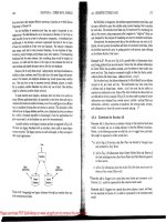
Content
border-right-color
border-left-color
border-bottom-color
border-top-color
margin
padding
1
3
2
4
Please purchase PDF Split-Merge on www.verypdf.com to remove this watermark.


