Tài liệu LWUIT 1.1 for Java ME Developers- P2 pdf
Bạn đang xem bản rút gọn của tài liệu. Xem và tải ngay bản đầy đủ của tài liệu tại đây (933.95 KB, 50 trang )
Chapter 2
[ 37 ]
While textLabel is instantiated from Label, animLabel is a customized version.
The code for this class appears below:
import com.sun.lwuit.Container;
import com.sun.lwuit.Graphics;
import com.sun.lwuit.Label;
public class HelloLabel extends Label
{
//decides which circle is to be drawn
private int state;
//time when previous repaint was done
private long prevTime;
private boolean done;
private boolean initialized;
//nominal interval between two successive repaints
private final int interval = 150;
//width of the label
private int width;
//height of the label
private int height;
//radius of first circle
private int rad1 = 10;
//radii of other three circles
private int rad2, rad3, rad4;
//top left corners of bounding rectangles - smallest to largest
private int x1, y1, x2, y2, x3, y3, x4, y4;
//create a new HelloLabel
public HelloLabel()
{
super();
}
//if this object is registered for animation
//then this method will be called once for every frame
public boolean animate()
{
//painting parameters not set up
//so don't repaint
if(!initialized)
{
return false;
This material is copyright and is licensed for the sole use by William Anderson on 26th August 2009
4310 E Conway Dr. NW, , Atlanta, , 30327Please purchase PDF Split-Merge on www.verypdf.com to remove this watermark.
Components
[ 38 ]
}
//get current time
long currentTime = System.currentTimeMillis();
//check if it's 'interval' milliseconds or more since last
//repaint also see if all circles have been drawn
if (!done && (currentTime - prevTime> interval))
{
//it's more than 'interval' milliseconds
//so save current time for next check
prevTime = currentTime;
//increment state to draw next larger circle
state++;
//check if all circles drawn
if (state == 5)
{
//all finished so set done flag
done = true;
//and ask for string display to be updated
((HelloForm)getComponentForm()).updateText();
}
//request repaint
return true;
}
//either too soon for next repaint
//or all circles drawn
//no repaint to be done
return false;
}
//reinitialize to start animation for next (non-space) character
public void resumeAnimation()
{
state = 0;
done = false;
}
//will be called whenever 'animate' method returns true
public void paint(Graphics g)
{
//save the present color
int color = g.getColor();
//set color for drawing circles
g.setColor(0xff8040);
This material is copyright and is licensed for the sole use by William Anderson on 26th August 2009
4310 E Conway Dr. NW, , Atlanta, , 30327Please purchase PDF Split-Merge on www.verypdf.com to remove this watermark.
Chapter 2
[ 39 ]
//act as per state value
switch(state)
{
//draw smallest circle
case 1:
//translate to draw relative to label origin
g.translate(getX(), getY());
//paint the circle
g.fillArc(x1, y1, 2*rad1, 2*rad1, 0, 360);
//restore original co-ordinate settings
g.translate(-getX(), -getY());
break;
//draw next larger circle
case 2:
g.translate(getX(), getY());
g.fillArc(x2, y2, 2*rad2, 2*rad2, 0, 360);
g.translate(-getX(), -getY());
break;
//draw next larger cirle
case 3:
g.translate(getX(), getY());
g.fillArc(x3, y3, 2*rad3, 2*rad3, 0, 360);
g.translate(-getX(), -getY());
break;
//draw largest circle
case 4:
g.translate(getX(), getY());
g.fillArc(x4, y4, 2*rad4, 2*rad4, 0, 360);
g.translate(-getX(), -getY());
}
//restore color
g.setColor(color);
}
public void initialize()
{
//get dimensions of label
width = getWidth();
height = getHeight();
//size of largest circle to be determined by
//the shorter of the two dimensions
int side = width < height? width : height;
This material is copyright and is licensed for the sole use by William Anderson on 26th August 2009
4310 E Conway Dr. NW, , Atlanta, , 30327Please purchase PDF Split-Merge on www.verypdf.com to remove this watermark.
Components
[ 40 ]
//find the center of the circle
int centerX = width / 2;
int centerY = height/2;
//radius of largest circle
//5 less than than half the shorter side
rad4 = side/2 - 5;
//difference between successive radii
int radStep = (rad4 - rad1)/3;
//radii of second and third circles
rad2 = rad1 + radStep;
rad3 = rad2 + radStep;
//top left corners of the four bounding rectangles
x1 = centerX - rad1;
y1 = centerY - rad1;
x2 = centerX - rad2;
y2 = centerY - rad2;
x3 = centerX - rad3;
y3 = centerY - rad3;
x4 = centerX - rad4;
y4 = centerY - rad4;
initialized = true;
}
}
HelloLabel takes care of the animation by drawing successively larger circles with a
minimum interval of 100 milliseconds between two consecutive renderings.
The code for the three classes listed above will be discussed in detail in Chapter 11.
Deploying an application
When we use the Build button on the SWTK to compile an application, the required
class les are generated. This allows the application to be executed on the SWTK.
However, to deploy an application into an actual device, the class les cannot be
used. What you need is a JAD le and a JAR le. To generate these les, use the
Package button. The two les will be created and placed in the bin folder of the
application. To load these les onto a phone, you will need the connecting cable
and the software recommended by the device manufacturer. Usually, both of
these come with the handset. In case you do not have the necessary hardware and
software, you can get them from third-party vendors too. Handsets that support
Bluetooth or infrared interfaces can load programs through these connections.
This material is copyright and is licensed for the sole use by William Anderson on 26th August 2009
4310 E Conway Dr. NW, , Atlanta, , 30327Please purchase PDF Split-Merge on www.verypdf.com to remove this watermark.
Chapter 2
[ 41 ]
A second way of loading applications onto a phone is through the Over-the-Air
Provisioning (OTA) function. This allows you to download an application from
a remote server over the internet. On the internet, you can nd many excellent
tutorials on MIDlet deployment using OTA. You can look up the following article
for more details:
"
Deploy MIDlets on J2ME-enabled devices" by Soma Ghosh at
/>Finally, don't forget to check the Bundle box on the External APIs screen. This will
make sure that the LWUIT library is bundled with your application.
The Component class
We have already established a nodding acquaintance with the widgets. It is now time
to get to know them more intimately starting with Component—the root. As long as a
developer is working with just the widgets that come with the library, the Component
class does not have to be accessed directly. It is only when we want to create our own
components that we have to extend the Component class, and override the methods
that would dene the look-and-feel and the behavior of the custom component.
However, even when we use only the built-in widgets, it is useful to have an
understanding of what the Component class does, as it is the foundation for all
widgets in the LWUIT library.
The only constructor of
Component class is protected Component(). Therefore we
cannot instantiate a component. However, we can subclass Component if we want.
The
Component class contains methods that dene the underlying functionalities
that are common to all widgets. There are a number of methods to provide support
for visual aspects of components. This is only natural, as appearance is a highly
important factor for a widget. There are methods for handling user inputs and for the
actual rendering of components. In the following sections, we shall list out the more
important methods, and throughout this book, we will try out code using examples
to illustrate the use of these methods.
This material is copyright and is licensed for the sole use by William Anderson on 26th August 2009
4310 E Conway Dr. NW, , Atlanta, , 30327Please purchase PDF Split-Merge on www.verypdf.com to remove this watermark.
Components
[ 42 ]
Methods to handle size and location
One of the major issues involved in drawing a Widget is its size. This is an important
factor for desktop versions too, but is much more critical for small devices like
mobile phones. This is because the dimensions of the available display area vary
widely, and the display screens are small. The following methods allow access to a
component's size:
public void setSize(Dimension d)
public void setPreferredSize(Dimension d)
public Dimension getPreferredSize()
The last two methods are meant for the use of developers. The setPreferredSize()
method does not guarantee that the specied dimension will be adhered to. The
nal decision, in this regard, rests with the layout manager. The rst method is used
by the applicable layout manager to set the actual size that will be used in a given
situation. This method should not be used by an application.
When the
getPreferredSize() method is invoked, it may, if required, invoke
another method to calculate the preferred size, based on the contents of the
component. This is the protected Dimension calcPreferredSize() method.
Applications can use this method to return preferred dimensions for a component,
especially when a custom component is being created.
There are also methods to access individual dimensions of a component's size.
These are:
public void setWidth(int width)
public void setHeight(int height)
public int getWidth()
public int getHeight()
public int getPreferredW()
public int getPreferredH()
Here again, the rst two methods should not be used by developers, and are meant
for layout managers only.
Another important consideration for laying out widgets is the location. So we
have methods for setting the coordinates of the top-left corner of a widget, but
these too are not to be used directly in an application. There is an interesting
method—
protected Rectangle getBounds(), that returns the bounds of a
widget as a rectangle. A rectangle has four elements: X and Y coordinates of the
top-left corner, width, and height. Calling this method gives us the location and
the size of a widget in a single step.
•
•
•
•
•
•
•
•
•
This material is copyright and is licensed for the sole use by William Anderson on 26th August 2009
4310 E Conway Dr. NW, , Atlanta, , 30327Please purchase PDF Split-Merge on www.verypdf.com to remove this watermark.
Chapter 2
[ 43 ]
Methods for event handling
A component also needs to have the ability to respond to user inputs. In a mobile
device, the user may communicate with a widget, either through a keyboard or a
pointer. LWUIT supports both modes, and the
Component class has the following
methods to handle key and pointer actions:
public void pointerDragged(int x, int y)
public void pointerPressed(int
x, int y)
public void pointerReleased(int
x, int y)
public void keyPressed(int
keycode)
public void keyReleased(int
keycode)
public void keyRepeated(int
keycode)
The methods are very aptly named, and it is easy to understand their functions.
The keyRepeated method needs clarication, as it works only for Up, Down, Left,
and Right keys. By default this method just calls the keyPressed and keyReleased
methods when any of the four keys listed above is held down. A subclass can
override this method to provide any other functionality. The parameters that are
passed when one of the rst three methods is invoked represent the coordinates of
the point at which the pointer action took place. Similarly, the parameter for the last
three methods is the code for the key that was pressed.
Methods for rendering
Size and location data provide the basis for actual rendering of the components.
There are a host of methods that perform various tasks related to drawing a
component. A look at the list of these methods gives us our rst idea about the
intricacies involved in giving shape to a widget:
public void paint(Graphics g)
protected void paintBorder(Graphics g)
protected void paintBackground(Graphics g)
public void paintBackgrounds(Graphics g)
public void paintComponent(Graphics g)
public void paintComponent(Graphics g, boolean background)
protected void paintScrollbars(Graphics g)
protected void paintScrollbarX(Graphics g)
protected void paintScrollbarY(Graphics g)
•
•
•
•
•
•
•
•
•
•
•
•
•
•
•
This material is copyright and is licensed for the sole use by William Anderson on 26th August 2009
4310 E Conway Dr. NW, , Atlanta, , 30327Please purchase PDF Split-Merge on www.verypdf.com to remove this watermark.
Components
[ 44 ]
An understanding of the rendering process of a component in the LWUIT
environment helps us to visualize how a widget gets built up on the screen. At this
point, we take a brief detour to explore the rendering pipeline of a widget, and later
in this chapter, we will familiarize ourselves with the all important Graphics class ,
which is the foundation for all painting activities.
The painting process
The painting of a component starts with clearing the background. This is done by
erasing whatever was earlier drawn on that space. This is the background painting
step which allows us to paint different backgrounds for widgets. If no specic
background (like an image) is specied, then this step ends up with a background
that is the same color as the container on which it is being drawn.
The next step is to draw the component itself. The paint method of the component is
invoked for this. The usual practice is to delegate the actual painting to an instance
of
LookAndFeel via the UIManager. Let us suppose we have created our own
widget—OurOwnWidget, and we want to paint it. We shall override the paint
method to pass on the job of painting to the current LookAndFeel object. This is
the code we shall write:
public void paint(Graphics g)
{
UIManager.getInstance().getLookAndFeel().drawOurOwnWidget(g, this);
}
Obviously, the LookAndFeel object must implement the drawOurOwnWidget method.
DefaultLookAndFeel, the concrete subclass of LookAndFeel that comes with
LWUIT, contains methods for drawing all standard widgets. For example, it has the
method drawButton for buttons, drawComboBox for combo boxes and so on. This is
the key to the Pluggable Look And Feel feature of LWUIT for customizing the look
of a widget.
This customization can actually be done in two ways, as we noted earlier while
introducing
LookAndFeel in Chapter 1. One way is to override the appropriate draw
method in DefaultLookAndeel. The other way is to plug a completely new subclass
of LookAndFeel into UIManager.
The second approach is not really a very practical one, as it will mean writing
our own draw methods for all the widgets. The preferable approach would be
to extend
DefaultLookAndFeel, and override an existing method, or add a new
one, as required. In this case, we would extend DefaultLookAndFeel, and add a
method to render OurOwnWidget—public void drawOurOwnWidget(Graphics g,
OurOwnWidget oow).
This material is copyright and is licensed for the sole use by William Anderson on 26th August 2009
4310 E Conway Dr. NW, , Atlanta, , 30327Please purchase PDF Split-Merge on www.verypdf.com to remove this watermark.
Chapter 2
[ 45 ]
Then the new version of DefaultLookAndFeel (MyLookAndFeel) can be installed in
the following way:
UIManager.getInstance().setLookAndFeel(new MyLookAndFeel());
There is only one instance of UIManager per application, as we saw in Chapter 1.
We cannot create an instance of UIManager. The only way to get a reference to this
object is to invoke the static method UIManager.getInstance(). We can then use
the setLookAndFeel(LookAndFeel plaf) method to install the desired instance of
LookAndFeel .
Instead of using one of the approaches outlined above, we can obviously let
the rendering be done by the component itself. If we are planning to distribute
our component, this would be the preferable technique as the component will
be self-sufcient, and the user of the component will not have to plug in a
new
LookAndFeel.
The nal step is to paint any border that the component might have. Painting of the
border is done by the paintBorder(Graphics g) method of Component class, which
in turn, calls the paint(Graphics g, Component c) method of the Border clss. We
shall see how borders are handled for widgets in Chapter 4.
Note that all these steps are executed automatically by LWUIT, and the relevant
methods are invoked in proper sequence. However, the order of the activities
described may get modied, as some borders take over the responsibility of
background painting.
Miscellaneous methods
In addition to the methods that are listed above, the Component class contains
many others that support a widget's functionalities. For example, consider the
initComponent() method. This method can be used to set up attributes and to
initialize variables or states to make a component ready to go.
The
Component class supports a unique identier for each component. This identier
is used to apply a style to a component. The identier can be accessed using the
protected String getUIID() method. All subclasses of the Component class
must override this method, and return the identier that is used for setting a style
to that component.
As we work our way through the examples in this book, we shall become familiar
with the methods described here and their applications.
This material is copyright and is licensed for the sole use by William Anderson on 26th August 2009
4310 E Conway Dr. NW, , Atlanta, , 30327Please purchase PDF Split-Merge on www.verypdf.com to remove this watermark.
Components
[ 46 ]
Animation support for components
The Component class implements the Animation interface, making all components
capable of being animated. The method that provides the basic support for animation
is
boolean animate(). This method is called once for every frame, and if it returns
true, then a repaint is performed. The paint method then ensures that a new frame is
drawn to visually implement the animation. The obvious advantage of this approach
is that a repaint is not asked for unless it is really required, thus minimizing painting
operations, which in turn, optimizes processor utilization. The HelloLabel class uses
this method to request a repaint at proper times.
Handling Style
The Style class holds the attributes required to determine the look of a widget.
When a widget is created, a style object is automatically generated, and this ensures
that every widget has a style object associated with it. The two methods that allow
a component to access its style object are:
public Style getStyle()—gets the style object for this component
public void setStyle(Style style)—sets a new style object for
this component
HelloMIDlet makes extensive use of these methods to specify the appearances of the
form and the labels.
The Graphics class
In order to draw a widget, painting methods use an instance of the platform graphics
context, which is abstracted by the Graphics class. This class cannot be instantiated,
and the only way to obtain an instance is through a paint callback, or by using the
getGraphics() method of a mutable image. Incidentally, a mutable image
(as opposed to an immutable image) is an image that can be modied.
The
Graphics class provides the tools for drawing patterns and images. For
instance, if you want to draw a line between two points, then you would use the
drawLine(int x1, int y1, int x2, int y2) method of this class. This method
draws a straight line between two points whose coordinates are (x1, y1) and (x2, y2)
respectively. There are similar methods for drawing a wide range of geometrical
shapes, either in the form of an outline, or lled with a color. There are also methods
for drawing images and textual strings. There are appropriate accessor methods for
the colors, fonts, and other attributes that support the rendering process.
•
•
This material is copyright and is licensed for the sole use by William Anderson on 26th August 2009
4310 E Conway Dr. NW, , Atlanta, , 30327Please purchase PDF Split-Merge on www.verypdf.com to remove this watermark.
Chapter 2
[ 47 ]
Two very important functions of the Graphics class are to set a clip region and to
translate coordinates.
A clip region denes a part of a pattern that is to be drawn. Let us say that we are
dealing with an image that is 500 x 500 pixels in size. If we want to draw just a 50
x 50 pixel portion of the image, then we can use the
setClip(int x, int y, int
width, int height) method of the Graphics class to select a rectangular part with
its top-left corner at coordinates (x, y) and with the specied width and height.
The translate capability shifts the position for drawing a pattern. This can be useful
when successive frames draw a gure at different positions. Assume that a gure is
to be moved to the right of the screen, with a displacement of dx pixels per frame.
In this case, we can use the translate method like this:
g.translate(dx, 0) where
g is the graphics context for drawing, and dx is the required displacement to the
right. The second parameter is zero, as we do not want any vertical movement.
Incidentally, you can see this method being used in the code listing for HelloLabel
class above.
Summary
The main topics of this chapter were an introduction to building an application with
the SWTK and also to the Component class. In addition, we studied some other topics
too. The following is a list of what we have studied in this chapter:
What to download, and their sources
How to set up, build, and run a project using the SWTK
The
Component class
Different types of methods in the
Component class
The painting process of a component
The
Graphics class
Animation support in the
Component class
How the
Component class handles Style
•
•
•
•
•
•
•
•
This material is copyright and is licensed for the sole use by William Anderson on 26th August 2009
4310 E Conway Dr. NW, , Atlanta, , 30327Please purchase PDF Split-Merge on www.verypdf.com to remove this watermark.
This material is copyright and is licensed for the sole use by William Anderson on 26th August 2009
4310 E Conway Dr. NW, , Atlanta, , 30327Please purchase PDF Split-Merge on www.verypdf.com to remove this watermark.
The Container Family
A Container is a component that is designed to hold other components. There are
several components that are members of the container family. These are the Form,
the Dialog, the Calendar and the TabbedPane. As a container is itself a component,
we can add one container into another. If we have two groups of components, then
we can add them to two separate containers, and add these two containers to a third
one. We can then add the third container to fourth, the fourth to fth and so on. This
nesting ability is very useful as it allows us to develop very intricate arrangements
for components on a form.
Although our primary focus in this chapter is on
Container and its descendants,
we shall also spend some time on the Command and the Font classes, as they are
very important aspects of widget look-and-feel. So our agenda will be:
Learn about the
Command and the Font classes.
Learn about the
Container class.
Learn how to create a form and use its various capabilities. As we study
the different aspects of a form, we shall progressively apply them on a
demo application.
Familiarize ourselves with handling
Style and Command through the
example above.
Learn about Dialogs and how to use them by building a demo.
Learn about the
Calendar class and build a simple calendar demo.
Learn about TabbedPanes and build a demo.
LWUIT is an evolving library, and we have to keep up with the changes that will be
announced from time to time. At the time of writing, one of the changes expected to
be incorporated in the next code drop involves
Style. In this chapter, we will get a
preview of these impending modications.
•
•
•
•
•
•
•
This material is copyright and is licensed for the sole use by William Anderson on 26th August 2009
4310 E Conway Dr. NW, , Atlanta, , 30327Please purchase PDF Split-Merge on www.verypdf.com to remove this watermark.
The Container Family
[ 50 ]
The Container
The primary function of a container is to hold components. Since a container itself
is a component, it allows nesting of containers. It also allows layout managers to
arrange components in specic ways.
The
Container class maintains a list of all components that it holds in a
java.util.Vector object. The index of a component in the vector denes its
position in the stacking order within the container. Unless specied, a component
to be added to a container occupies the last position in the vector. It is possible to
insert a component into a given position by using a method that allows us to specify
an index. This is discussed further in the section on Calendar. The following gure
shows how components are stacked within a container:
Index n
(last component to be added)
Index n-1
(penultimate component to be added)
Index 2
(third component to be added)
Index 1
(second component to be added)
Index 0
(first component to be added)
.
.
.
.
.
.
.
.
.
.
.
.
.
.
.
.
.
.
Creating a Container
There are two constructors for creating a container. They are:
public Container(Layout layout)—creates a container with the specied
layout manager.
public Container()—creates a container with FlowLayout as the layout
manager. A layout manager is responsible for positioning components
within a container. Layout managers will be discussed in Chapter 7.
•
•
This material is copyright and is licensed for the sole use by William Anderson on 26th August 2009
4310 E Conway Dr. NW, , Atlanta, , 30327Please purchase PDF Split-Merge on www.verypdf.com to remove this watermark.
Chapter 3
[ 51 ]
The methods of the Container class
The methods of Container class are naturally oriented towards adding or removing
components and towards managing the components within it. As we build and
analyze the demo applications in this book (starting from the next section), we shall
become familiar with the use of methods. So, without any further ado, let's roll up
our sleeves and get the action going.
The form
A form is a top level container with a title bar and a menu bar. The contents of the
form are placed between the two bars. Reproduced below for reference, we see the
screenshot of a form. It shows the place where the title of the form appears (TitleBar)
and the place for commands (MenuBar) where the Exit command has been placed.
Also shown is the space for the Content Pane, which actually holds the entire set of
components that are added to the form.
Creating a form
The Form class has two constructors:
public Form()—creates a form without any title. If you use this constructor,
then you can later set the title. However, if no title is specied at all, then the
form created will not have a TitleBar. The default layout manager of a form is
BorderLayout.
public Form(String title)— creates a form with the specied title.
•
•
This material is copyright and is licensed for the sole use by William Anderson on 26th August 2009
4310 E Conway Dr. NW, , Atlanta, , 30327Please purchase PDF Split-Merge on www.verypdf.com to remove this watermark.
The Container Family
[ 52 ]
We will create a form and try out the topics that we discuss as we go along. We will
use the second constructor for our form. The code for the MIDlet is:
import com.sun.lwuit.Display;
import com.sun.lwuit.Form;
import javax.microedition.midlet.MIDlet;
public class DemoForm extends MIDlet
{
public void startApp()
{
//initialize the LWUIT Display
//and register this MIDlet
Display.init(this);
//create a new form
Form demoForm = new Form("Form Demo");
//show the form
demoForm.show();
}
public void pauseApp()
{
}
public void destroyApp(boolean unconditional)
{
}
}
At this stage, the code is very simple. All the action takes place in the startApp()
method. The rst thing to be done is to initialize the display and register the MIDlet.
Remember that invoking the init method before doing anything else is essential for
all LWUIT applications. We then create the form, and in the last line of code, we call
the show() method to display the form.
We now have a form with just a title, as the following screenshot shows. It does not
even have an Exit command. So, to exit from the demo you will have to close the
window. Next, let us add a command to the form so that we have an appropriate
way of closing the application.
This material is copyright and is licensed for the sole use by William Anderson on 26th August 2009
4310 E Conway Dr. NW, , Atlanta, , 30327Please purchase PDF Split-Merge on www.verypdf.com to remove this watermark.
Chapter 3
[ 53 ]
Handling commands
Now it is time to add an Exit command to our form. To add commands to a form and
to enable it to handle them, we need to do the following:
Create the commands.
Add the commands to the form.
Add a listener for the command. In this case, the MIDlet will be our listener.
So the MIDlet will have to implement the
ActionListener interface.
Write the
actionPerformed(ActionEvent ae) method—the only method of
ActionListener.
Before we actually install a command on this form, let's familiarize ourselves with
the
Command class.
The Command class
A command represents an action that can be taken by a user and can be placed on a
soft button or in a menu. In the rst screenshot of this chapter, the Exit command has
been placed on the left soft button. Had there been a second command, it would have
been placed on the right soft button, which is situated at the bottom-right corner of
the screen. When there are more than two commands, the rst command to be added
to the screen goes on the left soft button and the rest are placed in a menu. The word
Menu would then appear on the right soft button. There is an optional three button
mode, which we will try out later in this chapter, when we add commands to a
demo form.
Creating a command
A command has three attributes:
A String that represents the name of the command.
An image used as an icon for the command. This is an optional item. If you
use this, then make sure that you get the size of the image right. For example,
if it is a very large image, then the menu bar will be disproportionately high.
An
ID. This too is optional. It provides a convenient way of writing the
actionPerformed(ActionEvent ae) method, as we shall see later in
this chapter.
•
•
•
•
•
•
•
This material is copyright and is licensed for the sole use by William Anderson on 26th August 2009
4310 E Conway Dr. NW, , Atlanta, , 30327Please purchase PDF Split-Merge on www.verypdf.com to remove this watermark.
The Container Family
[ 54 ]
We can create a command with only the rst attribute, or with one or both of the
optional ones. The constructors are:
public Command(String command)
public Command(.String command, Image icon)
public Command(String command, int id)
public Command(String command, Image icon, int id)
Methods of Command class
The methods of this class that will be used frequently are:
Method Parameters Returns
String getCommandName()
the command name
Image getIcon()
the image (icon) representing
the command
int getId()
the command id
Installing a command
The code listing below shows the revised DemoForm.
import com.sun.lwuit.Display;
import com.sun.lwuit.Command;
import com.sun.lwuit.Form;
import com.sun.lwuit.events.ActionEvent;
import com.sun.lwuit.events.ActionListener;
import javax.microedition.midlet.MIDlet;
public class FormDemoMIDlet extends MIDlet implements ActionListener
{
public void startApp()
{
//initialize the LWUIT Display
//and register this MIDlet
Display.init(this);
//create a new form
Form demoForm = new Form("Form Demo");
//create and add 'Exit' command to the form
//the command id is 0
demoForm.addCommand(new Command("Exit", 0));
//this MIDlet is the listener for the form's command
•
•
•
•
This material is copyright and is licensed for the sole use by William Anderson on 26th August 2009
4310 E Conway Dr. NW, , Atlanta, , 30327Please purchase PDF Split-Merge on www.verypdf.com to remove this watermark.
Chapter 3
[ 55 ]
demoForm.setCommandListener(this);
//show the form
demoForm.show();
}
public void pauseApp()
{
}
public void destroyApp(boolean unconditional)
{
}
//act on the command
public void actionPerformed(ActionEvent ae)
{
Command cmd = ae.getCommand();
switch (cmd.getId())
{
//'Exit' command
case 0:
notifyDestroyed();
}
}
}
We can see from the highlighted code that all the necessary steps for adding a
command have been implemented. The actionPerformed(ActionEvent ae)
method shows how the command id simplies the structure of the method. As the
id is an int, a switch statement can very conveniently identify a command and
take proper action. An alternative approach would be to get and check the name of
the command like this:
//get command name
String cmdName = cmd.getCommandName();
//if name is 'Exit' the close app
if(cmdName.equals("Exit"))
{
notifyDestroyed();
}
This material is copyright and is licensed for the sole use by William Anderson on 26th August 2009
4310 E Conway Dr. NW, , Atlanta, , 30327Please purchase PDF Split-Merge on www.verypdf.com to remove this watermark.
The Container Family
[ 56 ]
I like to work with command id, as case 0: is shorter to type than an if statement.
However, we must keep in mind that
id is optional, and the default value is
0. Using the approach based on id will introduce a bug if id is not specied
in the constructor, as all commands with the default
id will initiate the action
corresponding to
case 0. On the other hand, the command name is a mandatory
parameter. So the approach based on command name works properly, regardless
of the constructor used to create commands, as long as names are not duplicated.
The following screenshot shows the demo form with an Exit command that can be
used for closing the emulator:
If you are building your application for a device that supports three soft buttons,
then you can use the third soft button. This is done either by programmatically
setting the thirdSoftButton ag in the Display class to true, or by adding an
isThirdButtonSupported user-dened property to the project, and setting its
value to true.
For the rst approach, add
Display.getInstance().setThirdSoftButton(true)
just after the Display.init method call. Now, when you add commands, the rst
command will be added to the center soft button, the second one to the left and the
third one to the right. If there are more than three commands, then all the commands
from the third onwards will be added to a menu, and the command Menu will
appear on the right soft button.
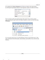
If you want to set the option for the third soft button through the project settings,
then click on the Settings button on the SWTK, and then select the User Dened
icon. Click on the Add button to get the following dialog:
This material is copyright and is licensed for the sole use by William Anderson on 26th August 2009
4310 E Conway Dr. NW, , Atlanta, , 30327Please purchase PDF Split-Merge on www.verypdf.com to remove this watermark.
Chapter 3
[ 57 ]
Enter isThirdSoftButtonSupported as the Property Name and true as the Property
Value. Now this property will be incorporated in the Java Application Descriptor
(JAD le) for the project.
Assuming that the third soft button mode has been set, let us add a couple of
dummy commands:
//create and add two dummy commands
demoForm.addCommand(new Command("OK"));
demoForm.addCommand(new Command("Go"));
//create and add 'Exit' command to the form
//the command id is 0
demoForm.addCommand(new Command("Exit", 0));
The following screenshot shows that the commands have been added as expected:
Managing the form's appearance
There are a number of attributes that determine the look of a component. These are:
Background and foreground colors—each component has four color
attributes: two each for background and foreground. A component is
considered selected when it is ready for activation. When a button receives
focus, for example, it is in the selected state, and it can be activated by being
clicked on. A component can have a background color for the selected state
and another for the unselected one. Similarly, the foreground color (usually
the color used for the text on the component) can be individually dened for
the two states.
Fonts for writing text on it—text can be rendered using the standard font
styles, as supported by the platform, as well as bitmap fonts. The font for
each component can be set individually.
•
•
This material is copyright and is licensed for the sole use by William Anderson on 26th August 2009
4310 E Conway Dr. NW, , Atlanta, , 30327Please purchase PDF Split-Merge on www.verypdf.com to remove this watermark.
The Container Family
[ 58 ]
Background transparency—the transparency of a component's
background can be set to vary from fully opaque (the default setting) to
fully transparent. The integer value
0 corresponds to full transparency
and
255 to complete opacity.
Background image—by default, the background of a component does not
have any image. However, this setting can be used to specify an image to be
used as the background.
Background painters—background painters can be used to customize the
background of one or of a group of components. We shall learn more about
background painters in Chapter 12.
Margin and padding—the visual layout of a component denes the margin
and padding. This is depicted in the following gure. LWUIT allows margin
and padding for each of the four directions (top, bottom, left, and right) to be
set individually.
Top
Left
Right
Bottom
MARGIN (transparent)
MARGIN (transparent)
PADDING
PADDING
CONTENT
AREA
When we created the demo form, a Style object was automatically created and set
for this form. The default values of all the attributes mentioned above for the form
are held within this Style object. They are responsible for the form's appearance.
Obviously, these default values are not very attractive, and we must modify them
to improve the way our form looks.
From a visual perspective, a form has three distinct parts:
TitleBar
ContentPane
MenuBar
•
•
•
•
•
•
•
This material is copyright and is licensed for the sole use by William Anderson on 26th August 2009
4310 E Conway Dr. NW, , Atlanta, , 30327Please purchase PDF Split-Merge on www.verypdf.com to remove this watermark.
Chapter 3
[ 59 ]
Each of these parts have a style, and the attributes of all the three styles will have to
be set with our selected values. Let's start with the title bar and see how to handle its
style. The rst attribute that we shall change is the background color of the title bar.
Setting the TitleBar's looks
A component's style object is not directly available, and we have to use the
getStyle() method of a component to get a reference to its style. However, the title
bar is a part of the form, and the Form class provides the getTitleStyle() (and a
setTitleStyle()) method, which has been used here. The Style class has methods
to access the attributes. Once we have the reference to a style object, we can use its
accessor methods to get or set attribute values. To change the background color of
the title bar, we must add the following line to demoForm:
//set background color for the title bar
demoForm.getTitleStyle().setBgColor(0x555555);
The parameter for setting the background color is in the standard RGB format,
and it is expressed in hexadecimal int form. The color can also be expressed as
an equivalent decimal int, which would be 5592405 for this color.
We could have used an alternate approach for setting the title bar style attributes.
The
getTitleComponent() method of Form returns the component (a label actually)
that forms the title. We can then set the style of the title bar directly. So the above
line of code can be replaced by demoForm.getTitleComponent().getStyle().
setBgColor(0x555555)
with the same result.
Now, let's see what the form looks like.
This material is copyright and is licensed for the sole use by William Anderson on 26th August 2009
4310 E Conway Dr. NW, , Atlanta, , 30327Please purchase PDF Split-Merge on www.verypdf.com to remove this watermark.
The Container Family
[ 60 ]
We have a nice dark title bar, but the title itself has almost disappeared. In order to
make it visible again, we need to change the font color. We will take this opportunity
to change the font style entirely by installing a new font. But rst, here is a short
introduction to the Font class.
The Font class
The Font class is an abstraction of fonts available on the platform, as well as of those
non-native fonts that are bundled with the application.
Creating a Font
A Font is an abstract class and cannot be directly instantiated. To get a font other
than the default native font, you have to use a static method of the class. If you are
going to use a font derived from the native font (system font as it is called), then
the method to use is createSystemFont(int face, int style, int size). The
parameters to the method can take the following values:
face—one of
Font.FACE_SYSTEM, Font.FACE_PROPORTIONAL,
Font.FACE_MONOSPACE
style—one of Font.STYLE_PLAIN, Font.STYLE_ITALIC, Font.STYLE_BOLD
size – one of Font.SIZE_SMALL, Font.SIZE_MEDIUM, Font.SIZE_LARGE
There are methods for creating new bitmap fonts too, but these are not very
convenient to use. It is far easier to use the LWUIT Designer that comes with the
LWUIT library. In Chapter 9, we shall learn how to create and edit bitmap fonts
using the LWUIT Designer.
The methods of the Font class
In addition to the methods for creating new fonts, this class provides a number of
methods that make it very convenient to work with fonts. The ones that we shall
need to use often are:
•
•
•
This material is copyright and is licensed for the sole use by William Anderson on 26th August 2009
4310 E Conway Dr. NW, , Atlanta, , 30327Please purchase PDF Split-Merge on www.verypdf.com to remove this watermark.
Chapter 3
[ 61 ]
Method Parameters Returns
int charsWidth(char[] ch,
int offset, int length)
ch
—array of characters
offset—the starting
index
length—number of
characters
The sum of the widths
of characters from the
given array for the
instance font starting
at offset and for the
number of characters
given by length.
abstract int charWidth(
char ch)
ch
—the specied
character
The width of the
specied character
when rendered alone.
int stringWidth(String str)
str
—the given String The width of the
given String for this
font instance.
int substringWidth(String
str, int offset, int length)
str
—the given String
offset—the starting
index
length—number of
characters
The width of a
substring of the given
string for the instance
font starting at offset
and for the number of
characters given
by length.
abstract int getHeight()
Returns the total
height of a character
for the instance font.
static Font getDefaultFont()
Returns the global
font instance that will
be used by default.
static void setDefaultFont
(Font f)
f
—the font to be set as
default.
Sets the global font
instance that will be
used by default.
int getFace()
Returns the type
of font face for the
instance font.
int getStyle()
Returns the style for
the instance font.
int getSize()
Returns the size for
the instance font.
The Font class also provides methods that can be used only in the context of bitmap
fonts. We shall discuss these methods in Chapter 9.
This material is copyright and is licensed for the sole use by William Anderson on 26th August 2009
4310 E Conway Dr. NW, , Atlanta, , 30327Please purchase PDF Split-Merge on www.verypdf.com to remove this watermark.


