3
Digging Below the Surface
This chapter completes our look at the “mechanics” of CSS: the background you
need to have in order to work with the technology. It covers six major topics:
❑ a quick review of the three methods we can use to assign CSS properties to
HTML documents
❑ the use of shorthand properties to group the values for a related set of prop
erties within a single statement
❑ the workings of the inheritance mechanism in style sheets
❑ the structure of a style, including variations on the use of selectors to determine
with great precision exactly what is affected by a style
❑ the units and values that can appear in styles to express sizes, locations, and
other properties, and how they’re used
❑ CSS comments, which can be used to place human-readable notes in your
CSS code
Licensed to
Chapter 3: Digging Below the Surface
Applying CSS to HTML Documents
In Chapter 1, we discussed three methods for applying style sheet properties to
HTML documents. Let’s briefly review them here.
inline styles
We can use the style attribute, which is available for the vast majority of
HTML elements, to assign CSS properties directly to HTML elements.
color: blue;">Welcome
This method is best reserved for times when you want quickly to try out one
or more CSS properties to see how they affect an element. You should never
use this method in a practical web site, as it avoids almost every advantage
that CSS has to offer.
embedded styles
We can use the style element in the head portion of any HTML document
to declare CSS rules that apply to the elements of that page.
<style type="text/css">
h1, h2 {
color: green;
}
h3 {
color: blue;
}
</style>
This form of CSS offers many advantages over inline styles, but is still not
as flexible or powerful as external styles (discussed below). I recommend that
you reserve embedded styles for use when you’re certain that the styles you’re
creating will be useful only in the current page. Even then, the benefit of
separate code offered by external styles can make them a preferable option,
but embedded styles can be convenient for quick-and-dirty, single-page work.
external styles
We can use a <link /> tag in the head portion of any HTML document to
apply the CSS rules stored in an external file to the elements of that page.
<link rel="stylesheet" type="text/css" href="mystyles.css" />
40
Licensed to
Using Shorthand Properties
External styles are the recommended approach to applying CSS to HTML,
as this technique offers the full range of performance and productivity advant
ages that CSS can provide.
Using Shorthand Properties
Most properties take a single item as a value. When you define a property with
a collection of related values (e.g. a list of fonts for the font-family property),
the values are separated from one another by commas, and if any of the values
include embedded white space or reserved characters, such as colons, they may
need to be enclosed in quotation marks.
In addition, there’s a special set of properties called shorthand properties, which
let you use a single property declaration to assign values to a number of related
properties. This sounds more complicated than it is.
The best-known shorthand property is font. CSS beginners are usually accus
tomed to defining font properties one by one:
h1 {
font-weight: bold;
font-size: 90%;
line-height: 1.8em;
font-family: Helvetica, Arial, sans-serif;
}
But CSS provides a shorthand property, font, that allows this same rule to be
defined much more succinctly:
h1 {
font: bold 90%/1.8em Helvetica, Arial, sans-serif;
}
You can do the same with properties such as padding:
h1 {
padding-top: 10px;
padding-right: 20px;
padding-bottom: 10px;
padding-left: 5px;
}
We could replace the above declaration with the following shorthand:
41
Licensed to
Chapter 3: Digging Below the Surface
h1 {
padding: 10px 20px 10px 5px;
}
The values are specified in a clockwise order, starting at the top of the element:
from top, to right, to the bottom, then left.
All shorthand properties are identified in Appendix C.
How Inheritance Works in CSS
Before you can grasp the syntax and behavior of CSS rules, you need a basic
understanding of inheritance, and how it’s used in CSS.
Think of a family tree. Your great-grandfather is at the top of the tree, followed
by his children, including his only son (your grandfather). Below your grandfather
is your mother and her siblings, and then, beneath her, there’s you, your siblings,
and your children. Some of your features, such at the color of your hair and eyes,
would be inherited from your ancestors—perhaps you have your mother’s hair
color, but your grandfather’s eyes. Other features may not be passed on in this
way. Your son may be far taller than anyone else in the family.
Just as everyone in your family fits into your family tree, every element on an
HTML page belongs to the document’s inheritance tree. The root of that tree is
always the html element.1 Normally, the html element has only two direct des
cendants in the inheritance tree: head and body.
Figure 3.1 shows a simple HTML inheritance tree for a small document.
As you can see, the document has in its head the standard title and link ele
ments, the latter of which probably links to an external style sheet. It also includes
a meta element (most likely to set the document’s character set).
The body element has five children: an h1, an h2, a p element (labeled p1 so we
can refer to it easily), a div, and an unordered list (ul) element. The div element,
in turn, contains two paragraph elements, one of which has an emphasis (em)
element, while the other contains an anchor (a) element. The ul element includes
three list item (li) elements; one of these includes an emphasis (em) element,
while another contains the paragraph element labeled p4.
1
This is even true of documents written to older versions of the HTML standard, in which the html
element was not required.
42
Licensed to
How Inheritance Works in CSS
Figure 3.1. A simple HTML inheritance tree
Each element in an HTML document (with the exception of the root html ele
ment) has a parent element. This is the element that directly precedes it in the
tree. In Figure 3.1, p1’s parent is the body element. Likewise, p1 is said to be a
child of the body element.
Most elements in an HTML document will be descendants of more than one
element. For example, in Figure 3.1, the paragraph element p1 is a descendant of
the body and html elements. Similarly, the paragraph element p2 is a descendant
of the div, body, and html elements. This notion of element hierarchy is important
for two reasons:
❑ The proper use of some of the CSS selectors you’ll work with will depend on
your understanding of the document hierarchy. There is, for example, an im
portant difference between a descendant selector and a parent-child selector.
These are explained in detail in the section called “Selectors and the Structure
of CSS Rules”, later in this chapter.
❑ If you don’t supply a specific value for an element’s property, in many cases,
that element will take the value assigned to its parent. Consider the example
document shown in Figure 3.1. If the body element had a declaration for the
font-family property and p1 did not, p1 would inherit the body element’s
font-family. In contrast, setting the width property of an element will not
directly affect the width of its child elements. font-family is an inherited
property; width is not.
43
Licensed to
Chapter 3: Digging Below the Surface
The properties that are inherited—and those that are not—are indicated in
Appendix C. However, you can set any property to the special value inherit,
which will cause it to inherit the value assigned to its parent element.
This inheritance issue can become tricky when you’re dealing with fairly
complex documents. It’s particularly important when you’re starting with a
site that’s been defined using the traditional table layout approach, in which
style information is embedded in HTML tags. When a style sheet seems not
to function properly, you’ll often find that the problem lies in one of those
embedded styles from which another element is inheriting a value.
Selectors and the Structure of CSS Rules
In Chapter 1 we learned that every CSS style rule consists of two parts: a selector,
which defines the type(s) of HTML element(s) to which the style rule applies;
and a series of declarations, consisting of properties and values, that define the
style.
So far, we’ve seen only simplistic selectors. Typically, they’ve contained only one
element:
h1 {
font-size: 120%;
text-transform: capitalize;
}
We’ve encountered one or two instances where a single rule is designed to apply
to more than one kind of HTML element:
h1, h2, h3 {
font-size: 120%;
text-transform: capitalize;
}
In this section, we’ll take a look at all the different kinds of selectors that are
available to you in CSS.
Universal Selector
The universal selector matches every element in the document. It has very little
practical value by itself, but the universal selector can come in handy in specific
44
Licensed to
Element Type Selector
situations involving, for example, attribute selectors, which I’ll explain later in
this section.
In this example, all elements in the page are given a text color of red:
* {
color: red;
}
Element Type Selector
The element type selector is the most common selector. It specifies one HTML
element type with no qualifiers. In the absence of other style rules that might
apply to the element type provided in the selector, this rule applies to all such
elements on the page.
In this example, we specify the text and background color of all hyperlinks in the
current document. They will appear as white text on a green background.
a {
color: white;
background-color: green;
}
Class Selector
To apply a style rule to a potentially arbitrary group of elements in a web page,
you’ll need to define a class in the style sheet, then identify the HTML elements
that belong to that class using the class attribute.
To define a class in a style sheet, you must precede the class name with a period.
No space is permitted between the period and the name of the class.
The following style sheet entry defines a class named special.
.special {
font-family: Verdana, Helvetica, Arial, sans-serif;
}
Then, we add class="special" to the elements that we want to adopt this style.
A Special Heading
This is a special paragraph.
45
Licensed to
Chapter 3: Digging Below the Surface
You can write your class so that it applies only to a particular type of element.
In the following example, we create the same special class, but this time it applies
only to paragraph elements.
p.special {
font-family: Verdana, Helvetica, Arial, sans-serif;
}
If you define an element-specific class such as the p.special example above,
then associate that class (in this case, special) with an element of any other
type, the style rule simply does not apply to that element.
An HTML element can belong to multiple classes: simply list those classes (sep
arated by spaces) in the class attribute:
Paragraph! Of! Stuff!
ID Selector
An ID selector lets you target a single HTML element within a page. Like a class
selector, an ID selector must be defined in the style sheet and included explicitly
in the HTML tag. Use the # symbol to identify an ID selector in the style sheet,2
and the id attribute to give an element an ID. IDs must be unique within a
document; no two HTML elements in a single document should have the same
ID.
This style sheet rule defines a rule for an element with the ID unique:
#unique {
font-size: 70%;
}
The code below uses the HTML id attribute to indicate the element that will be
affected by the rule above:
This will be a very tiny headline
For example, if you had five <div class="sidebar"> items on your page, but
you wanted to style differently the one responsible for displaying your site’s
search box, you could do so like this:
2
Optionally, you can confine the ID’s use to an element of a specific type by preceding the # with
the HTML element’s tag name (e.g. div#searchbox). But, since you can have only one element
with the specific ID within a document, it seems silly to confine it to a specific element type.
46
Licensed to
Pseudo-element Selector
div.sidebar {
border: 1px solid black;
background-color: yellow;
}
#searchbox {
background-color: orange;
}
The search box would then appear in your HTML as shown here:
<div id="searchbox" class="sidebar">
<!-- HTML for search form -->
</div>
Now, since the div has id="searchbox" and class="sidebar" attributes, all
the sidebar declarations will be applied to the search box, but it will take its
background-color from the #searchbox rule. The guidelines for cascading
overlapping rules (discussed in Chapter 9), in combination with the ID selector,
let you avoid having to redefine all the sidebar properties in a special searchbox
class.
However, you could just as easily define a class and apply it to the exceptional
element (the search box, in this example). This approach is more flexible, although
perhaps not as efficient in terms of code space. For example, imagine you’ve
identified a class or other rule that applies to all level-three headings except one,
and you’ve used an ID selector for the exception. What do you do when a redesign
or content change requires one more such exception? The ID selector solution
breaks down immediately in that situation.
Pseudo-element Selector
This and all the remaining selectors in this section require a browser that supports
the CSS 2 specification, such as Firefox, Safari, Opera, or Internet Explorer 7.
Some features, such as the :hover pseudo-class, are supported by some older
browsers, but their implementations are not complete.
Pseudo-element selectors and pseudo-class selectors are unique among the CSS
selectors in that they have no equivalent HTML tag or attribute. That’s why they
use the prefix “pseudo” (meaning “false”).
So far, the CSS specification has defined only three pseudo-elements: firstletter, first-line, and first-child. While the first two of these phrases
mean something to us humans, it’s ultimately up to each browser to interpret
47
Licensed to
Chapter 3: Digging Below the Surface
them when rendering HTML pages that use these pseudo-elements. For example,
does first-line mean “first sentence,” or does it mean the first physical line
that’s displayed—a value that changes as the user resizes the browser? The firstchild pseudo-element, on the other hand, is not browser-dependent. It refers to
the first descendant of the element to which it is applied, in accordance with the
HTML document hierarchy described in the section called “How Inheritance
Works in CSS”.
To define a pseudo-element selector for a style rule, precede the pseudo-element
name with a colon. Here’s an example:
p:first-letter {
font-family: serif;
font-size: 500%;
float: left;
color: gray;
}
This creates a drop-caps effect for the first letter in every paragraph on the page,
as shown in Figure 3.2. The first letter in each paragraph will be five times larger
than the usual type used in paragraphs. The float style property, which we discuss
in Chapter 8, ensures the remaining text in the paragraph wraps around the en
larged drop-cap correctly.
Figure 3.2. Creating a drop-caps effect using the first-letter
pseudo-element
Pseudo-class Selector
A pseudo-class selector is exactly like the pseudo-element selector, with one
exception. A pseudo-class selector applies to a whole element, but only under
certain conditions.
The current release of CSS 2 defines the following pseudo-classes:
48
Licensed to
Pseudo-class Selector
❑ hover
❑ active
❑ focus
❑ link
❑ visited
❑ lang
A style sheet, then, can define style rules for these pseudo-classes as shown in
the example below. You may remember that we’ve already seen a rule that uses
the hover pseudo-class.
a:hover {
color: green;
}
All anchor tags will change color when the user mouses over them. As you can
see, this means the pseudo-class selector comes into play only when the user in
teracts with the affected element.
The lang pseudo-class3 refers to the setting of the lang attribute in an HTML
element. For example, you could use the lang attribute shown below to define
a paragraph in a document as being written in German:
Deutsche Grammophon
If you wanted, for example, to change the font family associated with all elements
in the document that were written in German, you could write a style rule like
this:
:lang(de) {
font-family: spezialitat;
}
lang vs language
Be careful not to confuse this lang attribute with the deprecated language
attribute that used to be used to set the scripting language used in pages.
3
Be aware that browser support for the lang pseudo-class is still very scarce. It’s covered here mainly
for the sake of completeness.
49
Licensed to
Chapter 3: Digging Below the Surface
Descendant Selector
As we’ve discussed, all HTML elements (except the html element) are descendants
of at least one other HTML element. To apply a CSS style rule to an element
only when it’s a descendant of some other kind of element, we can use a descend
ant selector.
A descendant selector, such as the one shown in the following style rule, restricts
the applicability of the rule to elements that are descendants of other elements.
The scope of the descendant selector is determined by reading the rule from right
to left. Spaces separate the element types.
li em {
color: green;
}
The style rule identifies that a color of green will be applied to any text contained
in an em, or emphasis, element only when the emphasized text is a descendant of
a list item.
In the fragment below, the first em element will be displayed in green characters;
the second will not, as it doesn’t appear within a list item.
<ul>
<li>Item one</li>
<li>Item <em>two</em></li>
</ul>
An <em>italicized</em> word.
It’s important to note that the descendant relationship need not be an immediate
parent-child connection. Take this markup, for example:
<div class="sidebar">
If you have any questions, <a href="contact.html">please call
our office during business hours</a>.
</div>
The following style rule would apply to the anchor element even though it focuses
explicitly on a elements that are descendants of div elements. This is because,
in this case, the a element is the child of a paragraph that’s contained in a div
element.
50
Licensed to
Parent-child Selector
div a {
font-style: italic;
}
Parent-child Selector
A parent-child selector causes a style rule to apply to element patterns that
match a specific sequence of parent and child elements. It is a special case of the
descendant selector that we discussed above. The key difference between the two
is that the pair of elements in a parent-child selector must be related directly to
one another in a strict inheritance sequence.
A parent-child relationship is specified in a selector with the “greater than” sign
(>).
Below is an example of a parent-child relationship.
body > p {
font-weight: bold;
}
In the example below, this rule will only affect para2, as para1 and para3 are
not direct descendants of the body element.
<body>
<div class="sidebar">
This is the sidebar.
</div>
Welcome to the web site! Here's a list:
<ul>
<li>
This is the first paragraph in the list. It's
also the last.
</li>
</ul>
</body>
As of this writing, Internet Explorer for Windows (up to and including version
6) distinguishes itself by being the only major browser that does not support
parent-child selectors. Because of this, careful use of descendant selectors is far
more common, and the parent-child selector is often abused to specifically create
styles that do not apply to Internet Explorer for Windows.
51
Licensed to
Chapter 3: Digging Below the Surface
Adjacent Selector
Adjacency is not related to inheritance. Adjacency refers to the sequence in which
elements appear in an HTML document. As it happens, adjacent elements are
always siblings, but it’s their placement in the document, rather than their inher
itance relationship, that is the focus of this selector. This point is demonstrated
in the HTML fragment below:
This is important stuff!
First important item
Second important item
The first h2 heading is adjacent to the h1 heading, but the second h2 heading is
not adjacent to the h1 heading.
The adjacent selector uses the + sign as its connector, as shown here:
h1 + h2 {
margin-top: 11px;
}
This style rule would put 11 extra pixels of space between the bottom of an h1
heading and an h2 heading that followed it immediately. It’s important to recog
nize that an h2 heading that follows a paragraph under an h1 heading would not
be affected.
As of this writing, Internet Explorer for Windows (up to and including version
6) remains the only major browser that does not support adjacent selectors, al
though support is planned for Internet Explorer version 7. Because of this, the
adjacent selector has not yet found widespread use in practical web design.
Attribute Selectors
The group of selectors I’m lumping together as attribute selectors are among
the most interesting of all the CSS selectors, because they almost feel like pro
gramming techniques. Each attribute selector declares that the rule with which
it is associated is applied only to elements that have a specific attribute defined,
or have that attribute defined with a specific value.
There are four levels of attribute matching:
[attribute]
52
Licensed to
matches if the attribute attribute is defined at all for
the element(s)
Attribute Selectors
[attribute="value"]
matches only if the attribute has a value of value
[attribute~="value"]
matches only if the attribute is defined with a spaceseparated list of values, one of which exactly matches
value
[attribute|="value"]
matches only if the attribute is defined with a hy
phen-separated list of “words,” and the first of these
words begins with value
You might, for example, want to apply style properties to all single-line text input
boxes (<input type="text" />) in your document. Perhaps you want to set
their text and background colors to white and black, respectively. This style rule
would create that effect:
input[type="text"] {
color: white;
background-color: black;
}
The third variation of the attribute selector described above searches the values
assigned to an attribute, to see whether it contains the word you’ve specified (i.e.
a value in a space-separated list).
For example, during the development of a web site, various graphic designers
may have inserted some img elements with temporary placeholder alt attributes,
with the idea of returning to them later to finish them. You could call attention
to the existence of such tags with a style rule like this:
img[alt~="placeholder"] {
border: 8px solid red;
}
This selector will find all img elements whose alt attributes contain the word
“placeholder,” and will put an eight-pixel red border around them. That ought
to be hard to miss!
The fourth variation really is useful only when you’re dealing with the lang at
tribute. Typically, the lang attribute takes on a value such as en or de. However,
it can also be used to define the regional dialect of the language being used: enus for American English, en-uk for British English, etc. This is when the [attrib
ute|="value"] selector comes into its own. It enables you to isolate the first
portion of the lang attribute, where the language that’s being used is defined.
The other portions of the hyphen-separated value are ignored.
53
Licensed to
Chapter 3: Digging Below the Surface
As you’ve probably come to expect by now, attribute selectors are not supported
by Internet Explorer for Windows versions 6 and earlier. As with other advanced
selector types, this has prevented the widespread adoption of attribute selectors,
despite their obvious usefulness.
Selector Grouping
To apply a style rule to elements of several different types in an HTML document,
we use selector grouping, separating with a comma the element types to which
the rule is to be applied.
Here’s a simple example of this type of selector:
h1, h2, h3 {
font-family: Helvetica, Arial, sans-serif;
color: green;
}
The elements in the selector list need not be of the same type or even the same
level of specificity. For example, the following style rule is perfectly legal. It applies
a specific style to level-two headings (h2) and to paragraphs whose class is defined
as special:
h2, p.special {
font-size: 22px;
}
You may include a space between the comma-separated items, though this is not
necessary.
Expression Measurements
Most of the values we define in a CSS rule include measurements. These meas
urements tell the rule how tall or wide something is to be, so it follows that you’ll
most commonly use measurements when working with fonts, spacing, and posi
tioning.
There are two types of measurements: absolute and relative. An absolute meas
urement (e.g. setting a font-size to 18px, or 18 pixels) tells the browser to render
the affected content 18 pixels tall.4 Technically speaking, it tells the browser to
4
Again, if I wanted to be terribly precise, I would say that a pixel is actually a relative measurement,
because its meaning is relative to the display medium on which the page is produced. But, in this
54
Licensed to
Expression Measurements
use the specified font and scale its character height so that the font’s overall
height is 18 pixels. Chapter 8 includes an explanation of font height and width.
Relative measurements, on the other hand, instruct the browser to scale a value
by some percentage or multiple, relative to the size of the object before the scaling
takes place. The example below defines a style rule in which all fonts in paragraphs
on the page should be scaled to 150% of the size they would have been without
this style:
p {
font-size: 150%;
}
If you knew that, in the absence of such an instruction, the text of all paragraphs
on the page displays at a size of 12 pixels, you could also accomplish the same
thing this way:
p {
font-size: 18px;
}
Generally, you should use the relative sizing values whenever you can. This
technique works better than absolute sizing when the user has set preferences
for font sizes, and in situations in which multiple style sheets could be applied.
It’s also more accessible, as visually impaired users can more easily increase the
font size on the page by configuring their browsers’ preferences.
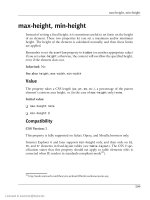
All length values (the term used by the CSS specification to describe any size
measurement, whether horizontal or vertical) consist of an optional sign (+ or
-), followed by a number (which may include a decimal point), followed by a
unit of measurement. No spaces are permitted between the number and the unit
of measurement.
context, “relative” means “relative to some other value in the style rule or in the HTML,” and in that
sense, pixels are absolute.
55
Licensed to
Chapter 3: Digging Below the Surface
Absolute Values
Table 3.1. Absolute values supported in style sheets
Style
Abbreviation
Style Meaning
Explanation
in
inch
Imperial unit of measure; 2.54 cen
timeters
cm
centimeter
mm
millimeter
pt
point
1/72 inch
pc
pica
12 points, or one-sixth of an inch
px
pixel
One dot on the screen
Table 3.1 shows the absolute values that are supported in CSS style sheets, and
where they’re not obvious, the values’ meanings.
When a length of zero is used, no unit of measurement is needed. 0px is the same
as 0. It doesn’t make sense to give a unit of measurement when the length is zero
units, because zero is the same distance in any unit of measurement.
Whenever you need to supply an absolute measurement for the size or position
of an element in a style sheet rule, you can use any of the above abbreviations
interchangeably. Each of the following rules should produce precisely the same
result:
font-size:
font-size:
font-size:
font-size:
font-size:
1in;
2.54cm;
25.4mm;
72pt;
6pc;
Pixels pose an entirely different set of issues. A pixel is one point on a screen that
can be on or off, displaying any color that is needed. If you set your monitor’s
display to a resolution of 800 pixels by 600 pixels, a pixel corresponds to 1/600
of the screen height. On a 15-inch display, the height is about 10.5 inches and
56
Licensed to
Relative Values
the width is a little more than 13 inches.5 A 12-pixel font display on that monitor
would turn out to be about 1/50 of the 10.5-inch height of the display, or just a
little more than one-fifth of an inch.
Many designers set their font sizes using pixels in the belief that this prevents
site users from increasing the font size using their browser settings, because Inter
net Explorer does not allow the resizing of text set in pixels. However, most other
browsers do allow the user to resize text set in pixels. A common issue arises with
sites whose designers haven’t realized that fonts set using pixels can be resized
in other browsers: often, the text will appear to expand out of fixed-size boxes.
From the point of view of accessibility, if users need a larger font size and have
increased the text size in their browsers accordingly, we should support this choice
regardless of which browser they’re using; thus, we should avoid setting text
heights using pixels. Creating designs that work well even if users have increased
the text size in their browsers is part of the process of designing for the Web.
The use of pixels to size text should be avoided.
Relative Values
Because of the problems posed by the use of any absolute value, the most flexible
way to approach measurements for style rules is to use relative units of measure
ment. Principally, these units are em and percentage, although some people prefer
to use the more obscure ex measurement. The em measurement is so named be
cause it refers to the width of an uppercase “M” in the given font, but in practice,
it’s equal to the font-size of the current font. The ex measurement is based on
the height of the lowercase “x” character in a font (more commonly known as
the x-height of the font) and is far less common than the em.
Both the em and the percentage generate font sizes based on the inherited or de
fault size of the font for the object to which they’re applied. In addition, ems and
percentages are 1:100 equivalent. A size of 1em is identical to a size of 100%.
This description begs the question, “What’s the default or inherited font size for
a particular HTML element?” The answer is: it depends.
Prior to the emergence of Opera 5 for Windows, browsers set the default values
for all fonts as part of their startup processes. Users had no control. The browsers
5
High school math would lead you to predict a nine- by 12-inch screen, but unfortunately, 15-inch
monitors don’t normally have a full 15 inches of diagonal screen space. Perhaps computer manufac
turers don’t study Pythagoras.
57
Licensed to
Chapter 3: Digging Below the Surface
defined a default, and web designers overrode the defaults willy-nilly, as they saw
fit. The user took what was presented.
Then, along came the idea of user choice—a development that, not surprisingly,
was facilitated by the emergence of CSS. Essentially, the developers of the Opera
browser created a local style sheet that users could modify and set their own de
faults to use. The Opera developers also defined a nice graphical user interface
through which users could set preferences for these styles.
This was great for users, but web designers found themselves in a quandary. If,
for example, you assumed that browsers were going to default body text to a 12
point font size6 (which was the de facto standard before the user-controlled
preferences era), you could set a style to apply a 1.25em scaling to the text and
get a 15-point font size for the text in question. It was nice and predictable.
But now, a 1.25em scaling applied to a font tells the browser to increase the size
of the font to 1.25 times (or 125% of) its default size. If the user has set up his
or her browser to show standard text at a height of 16 points, your 1.25em
transformation brings the size up to 20 points.
When you stop to think about it, though, that’s probably just fine. The user who
chooses a larger base font size probably needs to see bigger type. If you want type
that would otherwise be at 12 points to display at 14 for some good reason, then
it’s not unreasonable to expect that this new user will benefit in the same way
from seeing the font used in this particular situation increase from his or her
standard 16 points to 20.7
Most of the time, there’s not really a reason to muck around with the user’s set
tings for font sizes, so changing them arbitrarily isn’t a good idea. Before you
apply this kind of transformation to a segment of text in your web design, ask
yourself if it’s really necessary. My bet is that, nine times out of ten, you’ll find
it’s not.
I would be remiss if I didn’t point out that some pitfalls are inherent in the use
of relative font sizes. Under some circumstances, relative font values can combine
and multiply, producing bizarre results indeed.
6
Just in case you were wondering, pixel sizes and point sizes are not equivalent, and the ratio between
the two varies between browsers and operating systems. For example, the 12-point default font size
used by most Windows browsers was rendered at 16 pixels on that platform. 12pt is equivalent to
16px on Windows browsers.
7
If that’s not the case, you probably want to rethink your reason for boosting the font size in the
first place.
58
Licensed to
CSS Comments
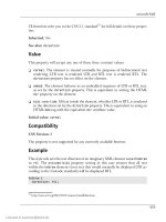
For example, let’s say that you define style rules so that all text that’s bold is
displayed at 1.5em and all italic text is displayed at 1.5em, as shown below.
.bold {
font-weight: bold;
font-size: 1.5em;
}
.italic {
font-style: italic;
font-size: 1.5em;
}
In your document, these styles are used together in a number of different ways,
as shown in this markup:
This is normal, <span class="bold">this is bold,</span>
<span class="italic">this is italic,</span>
<span class="bold italic">this is bold and italic,</span> and
finally, <span class="bold">this is bold,
<span class="italic">then italic</span></span>.
When you nest8 these styles, the resulting text will display at 2.25em (1.5em ×
1.5em). This problem arises with child elements, which inherit from their parent
container elements the computed values for measured properties, not the relative
values. This is relatively easy to avoid, but if you overlook it, the results can be
quite startling, as Figure 3.3 illustrates.
Figure 3.3. Relative measurements gone haywire
CSS Comments
You’re probably already familiar with the concept of comments in HTML:
<!-- this is an HTML comment -->
8
Nesting is the process of putting one element inside another. For example, we say that a span inside
another span is nested.
59
Licensed to
Chapter 3: Digging Below the Surface
Comments allow you to include explanations and reminders within your code.
These are ignored entirely by the browser, and typically are included solely for
the developer’s convenience. If you’ve ever had to make changes to code that
hasn’t been touched in a few months, I’m sure you can appreciate the value of a
few well-placed comments that remind you of how it all works.
CSS has its own syntax for comments. In HTML, a comment begins with and ends with -->. In CSS, a comment begins with /* and ends with */:
<style type="text/css">
/* This rule makes all text red by default. We include
paragraphs and table cells for older browsers that don't
inherit properly. */
body, p, td, th {
color: red;
}
</style>
If you know much JavaScript, you’ll recognize this syntax, which can be used to
create multiline comments in that language as well. However, unlike JavaScript,
CSS does not support the single-line double-slash (//) comment style.
Summary
This chapter ended our overview of CSS technology with a tour of some of the
syntactic and structural rules of CSS styles. Along the way, it explained the basic
ideas involved in HTML document inheritance.
In Chapter 4, we’ll see how you can check your pages to see if they meet the
W3C Recommendations. Passing such a check will help you ensure that your
pages will display as expected not only in current browsers, but in all future
browsers as well. We’ll also learn a few tricks to get your pages to display in a
usable way in older browsers.
60
Licensed to
4
Validation and Backward
Compatibility
This chapter discusses two related topics. It begins with a description of the use
of W3C and other CSS-validation tools and techniques to ensure that your CSS
designs create valid pages. As you migrate existing table-centered designs to CSS,
validation will be helpful in pointing out areas where you haven’t quite lived up
to CSS expectations.
The second part of the chapter focuses on some small changes you can make to
valid CSS pages so that they will display as correctly as possible in older or in
compatible browsers. It discusses the main types of browser problems that you
may encounter, how to use the @import rule to avoid some potential pitfalls, and
how to define a page’s DOCTYPE to gain more direct control over the rendering of
that page.
Validating your CSS
It’s vital that you validate all your external style sheets, as well as all your HTML
pages that use internal style sheets. It’s not just easy to do—it’s free. If you submit
a page (or multiple pages) to the W3C’s CSS validation service, and they pass,
you can put a nifty little icon like the one in Figure 4.1 on your page.
Licensed to
Chapter 4: Validation and Backward Compatibility
Figure 4.1. A Valid CSS badge
To submit a style sheet or HTML page for validation, just go to
The page you’ll see looks like Figure 4.2.
Figure 4.2. The main page of the W3C’s CSS validator
Scroll down this page if necessary, and you’ll see that three options are available:
you can submit a URL for validation, upload a file from your computer for valid
ation, or enter some CSS to be validated.
The simplest way to validate your CSS is by entering a URL. You can enter the
URL of your CSS file, or the URL of any HTML page. In the latter case, the
validator will load and check any externally linked style sheets, in addition to
looking over the CSS contained within the HTML document itself.
If your CSS is contained in a file on your hard drive, the easiest way to validate
it is by uploading the file. The validator won’t be able to see any of the linked
62
Licensed to
Validating your CSS
files on your hard drive, so you’ll have to upload all of the files that contain CSS
one by one.
The forms on the validator’s home page perform validation using the default
settings, but we can change these options by using one of the advanced interfaces,
which are linked from the bottom of each form. One of these advanced interfaces
is shown in Figure 4.3.
Figure 4.3. One of the W3C CSS validator’s advanced pages
The validation form contains three drop-down menus:
The first, labeled Warnings, determines how significant a mistake must be before
the validator includes it in the litany of warnings it produces as part of its report.
It has four options:
❑ All
❑ Normal report
❑ Most important
❑ No warnings
63
Licensed to


