Tài liệu Microsoft SharePoint 2010 Enterprise Applications on Windows Phone 7 ppt
Bạn đang xem bản rút gọn của tài liệu. Xem và tải ngay bản đầy đủ của tài liệu tại đây (951.83 KB, 36 trang )
professional expertise distilled
P U B L I S H I N G
Microsoft SharePoint 2010 Enterprise
Applications on Windows Phone 7
Todd Spatafore
Chapter No.2
"Getting Started with Internet Explorer
Mobile"
In this package, you will find:
A Biography of the author of the book
A preview chapter from the book, Chapter NO.2 "Getting Started with Internet Explorer
Mobile"
A synopsis of the book’s content
Information on where to buy this book
About the Author
Todd Spatafore is a professional web developer and software architect who enjoys living
life on the sharp edge of technology. Todd is an expert on HTML, CSS, JavaScript,
ASP.NET (WebForms and MVC), C#, and Silverlight. Todd is currently the Director of
Technology at Draftfcb.
Before starting at Draftfcb, Todd was a Senior Software Architect for MRM Worldwide.
Todd was the principal software architect for many of Microsoft's websites including
Windows Server 2008, Microsoft Office 2007 Real Life Tools, and SQL Server 2008. In
addition to these defining pages, Todd worked closely with internal teams at Microsoft to
introduce a new content management system for Microsoft.com, the fourth most visited
website on the Internet. These content management systems were designed and built on
top of SharePoint 2010.
Prior to MRM, Todd was a Software Architect building websites such as the California
Teachers Association, Novellus, and Technology Credit Union (TechCU). These sites
utilized the Microsoft Content Management System, which has since been integrated into
SharePoint.
For More Information:
www.PacktPub.com/microsoft-sharepoint-2010-enterprise-applications-onwindows-phone-7/book
Beyond traditional websites and campaign landing sites, Todd has worked on unique
applications such as a Windows Media Center application for ClickStar, a Santa Monica
startup designed to showcase independent films from very well-known filmmakers.
Todd maintains his own blog at on which he muses about
current programming topics such as Silverlight, JavaScript, HTML, CSS, and Hyper-V.
Currently, Todd is working on a few independent Windows Phone 7 apps, and speaks at
MSDN conferences on web application architecture, RIA development in Silverlight,
Windows Phone 7, and SharePoint. Follow Todd on Twitter @Spatacoli.
Todd graduated from Montana State University with a BS in Physics.
To my wife Leanne, you will always be walking on top of clouds. My
daughter Inara, keep on giggling. "How can I stand here with you and not
be moved by you?"
For More Information:
www.PacktPub.com/microsoft-sharepoint-2010-enterprise-applications-onwindows-phone-7/book
Microsoft SharePoint 2010 Enterprise
Applications on Windows Phone 7
Microsoft Windows Phone 7 is a reinvention of the Windows Mobile platform and
improves productivity by taking a fresh approach to the most common Smartphone
business usage scenarios such as e-mail, calendar, contacts, and collaboration. Microsoft
SharePoint is a web technology-based server that can be used to build portals,
collaboration sites, and also content management sites.
Windows Phone 7 allows you to integrate with Microsoft SharePoint 2010 and create
enterprise-ready websites and applications that access Microsoft SharePoint Server on
Windows Phone 7. This book will show you how to do so.
The book starts by providing an overview of the out-of-the-box features of Windows
Phone 7 for enterprises then moves on to an overview of the web browser that is included
on the phone, Internet Explorer Mobile, covering the improvements found compared to
the desktop version of Internet Explorer 7 and the limitations of the browser. The book
then dives deep into topics such as Windows Phone 7 Web Development, building
SharePoint Sites for Windows Phone 7, building SharePoint Pages for Windows Phone 7,
and SharePoint Communities amongst others.
What This Book Covers
Chapter 1, Introducing Windows Phone 7. Windows Phone 7 is a reinvention of the
Windows Mobile platform. This chapter begins with an overview of the phone controls
and capabilities. Then Microsoft Outlook capabilities are covered. This includes working
with e-mail, contacts, and calendars. Next the full range of Microsoft Offi ce capabilities
is reviewed covering OneNote, Word, Excel, PowerPoint, and SharePoint. The chapter
concludes with a brief overview of the Windows Marketplace.
Chapter 2, Getting Started with Internet Explorer Mobile. Windows Phone 7 includes a
mobile version of Internet Explorer that has most of the rendering features found in the
desktop Internet Explorer 7 and the JavaScript capabilities of desktop Internet Explorer 8.
This chapter begins with a brief discussion of web page architecture. It follows that up
with a more in-depth investigation of the browser found in Windows Phone 7. Next is a
discussion of the mobile friendly META tag settings. The chapter concludes with an
example of building a single web page that will render for both the desktop browsers and
Windows Phone 7 Internet Explorer.
For More Information:
www.PacktPub.com/microsoft-sharepoint-2010-enterprise-applications-onwindows-phone-7/book
Chapter 3, Enhancing SharePoint Sites for Windows Phone 7. SharePoint is a powerful
tool and this chapter begins to expose the power found in SharePoint by discussing the
customizations available to users and administrators. Next, an overview of the structure
of SharePoint from sites to web applications is discussed. Then, an overview of the
development environment used for the rest of the book is examined. This leads into a
summary of the various site templates available in SharePoint. The chapter concludes
with an example of building a custom site.
Chapter 4, Building SharePoint Pages for Windows Phone 7. Within a site, data is stored
as either lists or libraries. This chapter begins with an examination of these differences.
Then it describes adding columns to a list and customizing the list item output. The
chapter ends with an example of replacing the mobile home page.
Chapter 5, Customizing SharePoint Communities for Windows Phone 7. This chapter
focuses on customizing SharePoint communities for use on Windows Phone 7. The
SharePoint communities of interest are blogs and Wikis.
Chapter 6, Introduction to Programming Windows Phone 7 with the SharePoint Client
Services. This chapter moves away from programming SharePoint's web interface for
Windows Phone 7 to building Windows Phone 7 applications that utilize SharePoint data.
After a brief discussion of security in SharePoint, the chapter provides an example of
building a simple RSS reader. The simple RSS reader gets data from an anonymous RSS
feed from a SharePoint list, and discusses many of the basics of building a Windows
Phone 7 application.
Chapter 7, Building a Windows Phone 7 Dashboard Application with SharePoint Data.
The chapter begins with another discussion of security in SharePoint and the example in
this chapter utilizes forms based authentication in SharePoint. The example from Chapter
6 is revisited, but this time a username and password are used to access the data. After a
brief discussion of the tools available for building SharePoint applications on the desktop
the focus turns to building out the dashboard application for Windows Phone 7.
Appendix A, Additional Resources. There are a lot of resources on the Internet that
provide the bits and pieces required to build the exceptional applications that enterprise
consumers will require from their phones. This chapter provides a list of additional
resources that could come in handy while developing for both SharePoint and
Windows Phone 7.
Appendix B, What wasn't covered in this book and why? This book isn't an exhaustive
reference for how to develop Windows Phone 7 applications and sites for SharePoint.
This appendix will cover some topics that weren't described in any detail, but might be of
use for an enterprise SharePoint application on Windows Phone 7.
For More Information:
www.PacktPub.com/microsoft-sharepoint-2010-enterprise-applications-onwindows-phone-7/book
Getting Started with Internet
Explorer Mobile
This chapter will be a brief overview of the web development process. It will begin
with an overview of web page architecture. It will then discuss best practices for
building web pages. Following that we will discuss how this relates to mobile
web development. The chapter will finish up with an overview of mobile web
development specific to Windows Phone 7.
At the end of the chapter, we will build a very simple web page. We will see how this
simple page would be built for a desktop browser and then how we can optimize it
for Windows Phone 7's Internet Explorer Mobile browser by crafting the content and
adding a single extra CSS file.
This chapter will cover:
Web page architecture
Internet Explorer Mobile
Mobile-friendly META tag settings
Building a simple web page enhanced for Internet Explorer Mobile
To get started with Internet Explorer Mobile let's look at basic web page architecture.
For More Information:
www.PacktPub.com/microsoft-sharepoint-2010-enterprise-applications-onwindows-phone-7/book
Getting Started with Internet Explorer Mobile
Web page architecture
Web pages on the client side mainly consist of three vital components: HTML, CSS,
and JavaScript. The exact version of each of these varies, but in the end it all comes
down to these three pieces.
HyperText Markup Language (HTML)
HyperText Markup Language (HTML) is the container for the page content. The
page should contain just that content and nothing else. A properly coded site would
leave the presentation and functionality portions of the page to CSS and JavaScript.
In addition, the content should be constructed in a manner that makes logical sense
for the content that is being delivered. This is called semantic HTML.
By using semantic HTML, the page content can be readily searchable by a wider
range of devices, other than just a desktop browser. Although in this book, we will
use this to our advantage to write pages that can be viewed in Windows Phone 7's
Internet Explorer Mobile browser, it can also help search engines discover your site
content, and assist people with disabilities in getting to your content.
People with disabilities use devices, such as a screen reader, to get the content of
a site. These screen readers can only gather information from the actual markup
of the site. If we have a PNG image with text in it, the screen reader cannot "see"
that information. In that particular case, we can use the alt attribute of the image
to provide a hint to the content, but it would be better to put the content inside a
paragraph, unordered list, or some other textual tag and then replace it with an
image if absolutely required using JavaScript.
The other case that was mentioned earlier was that search engines can better
determine the contents of a web page with semantic markup. This will help our page
rankings and hopefully drive more visitors to our site.
Think about the HTML markup like the script of a movie. Although we'll add lights,
actors, and probably special effects later, right now the black and white text on paper
has to convey all of the meaning. The same is true of the HTML markup for your site.
As you build websites, constantly keep in mind what information you are trying to
impart with the page and make that the focus.
[ 36 ]
For More Information:
www.PacktPub.com/microsoft-sharepoint-2010-enterprise-applications-onwindows-phone-7/book
Chapter 2
Cascading Style Sheets (CSS)
Cascading Style Sheets (CSS) are documents that describe the way HTML should
be displayed. The CSS language allows the web developer to separate the design
aspects (layout, colors, fonts, and so on) from the page content. One could easily
change the entire look and feel of a page simply by replacing the CSS files. An
amazing group of examples of this is available at . The
CSS Zen Garden website demonstrates the amazing power that CSS has on the
presentation of HTML content. Utilizing a proper style sheet can result in content
that will quickly display the relevant information that a Windows Phone 7 user has
come to expect from the applications on the phone.
When developing websites that are going to be viewed on Internet Explorer Mobile,
it is important to keep in mind some very important potential problems. Although
float works great on desktop browsers and will work on many mobile browsers,
the content within these containers may not look good on a small screen.
The CSS float attribute was one of the first tools that allowed web developers to
break free from table based layouts, that is, laying out the contents of a page using
tables. Float allowed developers to group content in div elements and then float
those block elements into position. It is a very powerful tool, but on a mobile device,
the limited screen size would hamper the ability for the user to view the content.
Instead, they would be constantly scrolling left and right or up and down to find all
the content.
A better way of handling this would be to utilize float on the desktop version of the
site and then leave the div elements in block display allowing the IE Mobile browser
to handle the content layout.
Along these same lines, the CSS attributes, padding and margin, work great for
precise positioning of elements on a desktop browser. However, the limited screen
real-estate of a Mobile browser limits the usefulness of this positioning power. Try to
limit the use of these attributes on the mobile device and only use them to highlight
useful information.
Finally, because pixels are absolute values, a pixel is a precise defined scale of
measurement with no room for interpretation; the phone has to work more to
display those elements that are positioned using pixel measurements. Using points,
em, or percentage measurements instead, allow the phone to be more fluid with the
layout.
Be sure to test the site on Windows Phone 7 devices to ensure the content is legible
and the display is fine.
[ 37 ]
For More Information:
www.PacktPub.com/microsoft-sharepoint-2010-enterprise-applications-onwindows-phone-7/book
Getting Started with Internet Explorer Mobile
JavaScript
JavaScript, otherwise known as ECMAScript, is the scripting language that is used
to create dynamic user interfaces and allow a page to update "on the fly". Users have
come to expect a certain fluidity to their web experiences, and now with the power
of Internet Explorer Mobile for Windows Phone 7, they can have that same power in
the palm of their hand.
Remember that the user is probably looking at a 3.5 inch screen, has
fingers that are roughly 40-80 pixels square, and those fingers are
incapable of registering a hover command to the browser. If your
navigation, for example, requires the user to hover over something, this
will not work in Internet Explorer Mobile. Instead, make the navigation
an easy to use, unordered list of hyperlinks
Putting HTML, CSS, and JavaScript together
Windows Phone 7 is about getting the relevant information viewable with minimal
fuss. The following are some tips for creating a website for Windows Phone 7's
Internet Explorer Mobile:
Show only the content that is relevant for the page requested
Reduce the use of images and colors
Remove the extra-large hero images
Hero images are those large images usually at the top of the main
content section, but usually used as a graphic headline.
Usually, they don't contain any content and only serve to enhance the
design of the site.
Rearrange the navigation to take up a minimum amount of space
Move the navigation to the bottom of the page if possible
Remove flashy loading screens
Utilizing HTML, CSS, and JavaScript with proper discipline will result in more
satisfied customers.
[ 38 ]
For More Information:
www.PacktPub.com/microsoft-sharepoint-2010-enterprise-applications-onwindows-phone-7/book
Chapter 2
Developing websites is not a trivial task. Mastering each of these three components is
a great task. It is important, while developing websites, to try and minimize as much
duplication as possible, not only in the JavaScript code that so many developers
tended to focus on, but also in the CSS and the HTML content. Reducing duplication
will allow for maintainable, upgradable, and understandable code.
Also, by reducing duplication, the amount of data sent to the browser is also
reduced. This is helpful when dealing with a browser that is connecting from a
patchy cellular network.
Historically, building a mobile version of a website meant a completely different
team of designers and web developers built a totally separate web application
from the desktop version of the site. Then, using the server side code, the mobile
browsers were detected and redirected to the mobile version. SharePoint does this
by redirecting mobile browsers to {server}/_layout/mobile/mblwiki.aspx?Url
=%2FSitePages%2FHome%2Easpx as an example. This book will utilize the practice
of building websites where the exact same site is used for both the desktop and the
mobile browsers.
When starting a new web application, a general rule of thumb is to use content
adaptation techniques for the application. However, for a baseline you must have
at least:
ECMAScript 3
W3C DOM Level 1
W3C standard box model support
CSS2 rendering
Client-side cookies support
XMLHttpRequest object support
By targeting this lowest common denominator of browser, we will ensure that our
web applications will run well on most browsers on the web.
Remember that common practices on desktop browsers may end up being
annoyances on a mobile device. Try not to open modal dialog boxes, or even open
pop-ups. Opening a pop-up window will cause a whole new tab to appear. This may
even close a tab that the user had previously opened if they already had
six tabs open.
[ 39 ]
For More Information:
www.PacktPub.com/microsoft-sharepoint-2010-enterprise-applications-onwindows-phone-7/book
Getting Started with Internet Explorer Mobile
When designing the user interaction for a website, always keep the user
in mind. They are busy people coming to your website. Be kind to them.
Give them the information they are looking for without hassle.
Internet Explorer Mobile
Windows Phone 7 comes with a new browser that is based on the rendering engine
of Internet Explorer 7 and some JavaScript improvements from Internet Explorer
8. Additionally, it includes some enhancements that aren't found in either of those
desktop browsers.
Internet Explorer Mobile User Agent
The Internet Explorer Mobile User Agent string is as follows:
Mozilla/4.0 (compatible; MSIE 7.0; Windows Phone OS 7.0; Trident/3.1;
IEMobile/7.0; <DeviceManufacturer>; <DeviceModel>)
This UA String allows the device manufacturer to insert their name and the model
of the phone in the string. Knowing the User Agent string is helpful when reviewing
server logs to determine what browsers are coming to your website. This will help
you optimize your site for the people who actually are viewing your content.
Like previous versions of Internet Explorer Mobile, the user can select either a
Mobile version or a Desktop version display engine. When the Desktop version is
selected, the User Agent string changes to the following:
Mozilla/4.0 (compatible; MSIE 7.0; Windows NT 6.1; XBLWP7; ZuneWP7)
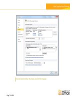
Changing the display engine mode can be accomplished on the Internet Explorer
SETTINGS screen, as shown in the following screenshot:
[ 40 ]
For More Information:
www.PacktPub.com/microsoft-sharepoint-2010-enterprise-applications-onwindows-phone-7/book
Chapter 2
Although this choice could complicate things, as we develop our sites, we should
make careful consideration of how we are going to treat the mobile version, but try
not to detect the desktop version. If the user makes a conscious choice to view the
desktop version, we should not force them to view something different from what
they would see on a real desktop browser.
Client side browser detection
Many people use the user agent string to detect at runtime what to display on the
browser. Although this works, there are better techniques to find out if the browser
is mobile. Those techniques should be used instead of User Agent detection.
Using property detection instead of browser detection will allow
your site to be forward compatible.
[ 41 ]
For More Information:
www.PacktPub.com/microsoft-sharepoint-2010-enterprise-applications-onwindows-phone-7/book
Getting Started with Internet Explorer Mobile
Forward compatibility isn't a very complex idea. It is just thinking about programming
so that as new browsers come along with new capabilities, we won't have to rewrite
our applications to take advantage of these capabilities. The application just takes
advantage of whatever functionality is available to it in whatever browser in which it is
currently running. An example of property detection is as follows:
function hasAdvancedDOM() {
// check for a feature that is known to be advanced
if(document.getElementsByClassName)
return true;
return false
}
Downloading the example code for this book
You can download the example code files for all Packt books you
have purchased from your account at .
If you purchased this book elsewhere, you can visit http://www.
PacktPub.com/support and register to have the files e-mailed
directly to you.
The preceding code simply detects if the DOM function document.
getElementsByClassName() exists or not. Internet Explorer Mobile has this
function, as does Firefox 2+, Safari, Chrome, and Internet Explorer 9. However,
previous versions of Internet Explorer Mobile did not have this function. If we had
this in a previous version of a website, we wouldn't have to do anything special
to get this to work in Windows Phone 7's Internet Explorer Mobile. Although, the
code we would actually write in a web page would be much more complicated, this
example demonstrates a starting point.
Server-side detection
Server-side detection usually uses the User Agent string along with a large list
of mobile device User Agent strings to determine the capabilities of the browsers
requesting a page. This list of mobile devices and their capabilities are kept in a
.browser file.
[ 42 ]
For More Information:
www.PacktPub.com/microsoft-sharepoint-2010-enterprise-applications-onwindows-phone-7/book
Chapter 2
There are some projects on the web to keep and maintain this .browser file.
The best known of these, "Mobile Device Browser File", available at http://mdbf.
codeplex.com, lost funding from Microsoft. There is another one that can be
found at We will look at
modifying this code manually later in this chapter.
The main topic of this book is SharePoint 2010 development for Windows Phone 7.
However, ASP.NET 3.5 SP1 is the framework that SharePoint 2010 development is
based on. This framework has a smaller list of browsers in the .browser file than the
more current ASP.NET 4. One of the omissions is IEMobile. What this means is that
in ASP.NET 4, you can use the following code to detect a mobile browser:
Request.Browser.IsMobileDevice
This code will work in ASP.NET 3.5 SP1, but it will not return true for Windows
Phone 7's Internet Explorer Mobile by default.
The simplest solution is to use code like this to detect the IE Mobile browser:
Request.UserAgent.ToString().Contains("IEMobile")
We could probably do better here. In the first place, we could update SharePoint's
compat.browser file to include Windows Phone 7. The compat.browser can be
found here: <drive>:\inetpub\wwwroot\wss\VirtualDirectories\<site>80\
App_Browsers\compat.browser
The structure of this file can be found at the following URL:
/>
If you look at SharePoint's compat.browser file, the fourth browser listed looks like
it might be for the Windows Phone 7 Internet Explorer Mobile. However, a closer
examination will show that this browser is actually for the Office Hub in Windows
Phone 7. To add the Internet Explorer Mobile browser, copy the browser elements
for Internet Explorer Mobile for Windows Mobile 6.5 and edit it like this:
<identification>
<userAgent match="XBLWP7" />
</identification>
<capabilities>
<capability name="supportsTouchScreen" value="true" />
</capabilities>
</browser>
<identification>
[ 43 ]
For More Information:
www.PacktPub.com/microsoft-sharepoint-2010-enterprise-applications-onwindows-phone-7/book
Getting Started with Internet Explorer Mobile
</identification>
<capabilities>
<capability name="browser" value="IE Mobile" />
<capability name="canInitiateVoiceCall" value="true" />
<capability name="isMobileDevice" value="true" />
<capability name="javascript" value="true" />
<capability name="optimumPageWeight" value="1500" />
<capability name="tables" value="true" />
<capability name="version" value="${version}" />
<capability name="supportsTouchScreen" value="true" />
</capabilities>
</browser>
This will make our code easier to manage later by allowing us to use the Request.
Browser.IsMobileDevice property.
The change here, besides changing the browser ID, is in the regular expression which
is used to detect the browser. In the desktop mode, we look for the text, XBLWP7, as
this is a very obvious change in the User Agent in this state. For the mobile mode,
we copied the IE Mobile 6 plus browser section. Microsoft changed the User Agent
slightly between IE Mobile 6 and IE Mobile 7. The change comes in the User Agent,
IE Mobile 7 doesn't have a space between the browser name IEMobile and the
start of the version number. Instead, it has a forward slash. IE Mobile 6 had a space
between the browser name and the version number.
XHTML Mobile Profile
XHTML Mobile Profile (XHTML MP) is a standard designed specifically for mobile
phones created by the Open Mobile Alliance. It is derived from XHTML, which itself
is a well formed XML version of HTML.
Internet Explorer Mobile will render pages with the extension of xhtml. The desktop
version of the browser opens the Save As dialog when a page with that extension
is hit. In addition, Internet Explorer Mobile will automatically switch to a mobile
friendly view state attempting to automatically adjust the width of the content to fit
into a 320 pixel wide viewport.
[ 44 ]
For More Information:
www.PacktPub.com/microsoft-sharepoint-2010-enterprise-applications-onwindows-phone-7/book
Chapter 2
Enhancing JavaScript in Internet Explorer
Mobile
Many people writing their first Windows Phone 7 web application want to figure
out how to do screen rotation. It sounds silly, but the browser does not handle
it automatically in the emulator. When a user rotates the phone from portrait to
landscape (or visa versa), the browser fires an onresize event. To handle the
rotation, connect a function to this event and deduce from the difference between the
screen.width and screen.height properties if it is in portrait or landscape.
However, on actual phones, the rotation in Internet Explorer Mobile happens
automatically. When we rotate the phone, the viewport is automatically stretched to
the new width and the address bar moved to the top of the screen. If we want our
page to resize on a rotation, we still need to listen to the onresize event.
[ 45 ]
For More Information:
www.PacktPub.com/microsoft-sharepoint-2010-enterprise-applications-onwindows-phone-7/book
Getting Started with Internet Explorer Mobile
JavaScript enhancements include the following three querying functions that should
speed up most applications:
getElementsByClassName(name)
querySelector(selector)
querySelectorAll(selector)
The first is getElementsByClassName(name). This function, in previous versions of
Internet Explorer, required one to navigate recursively though the entire DOM tree
to find all elements that had the class name specified and return them in an array of
elements. The code for this was incredibly slow, but with a native built-in version of
this function, it runs amazingly quickly.
The next two querying functions that have been added are almost identical to one
other. The first returns the first element in the DOM tree that it finds, and the second
returns all elements with the selector pattern specified.
Those functions are querySelector(selector) and
querySelectorAll(selector). These functions take a selector (a group of tags, IDs,
and classes in a string that looks like a CSS selector) and find matches in the DOM.
CSS enhancements
To view an element close up, a user can double tap on the element. This will cause
the browser to zoom into that element until the width of the content box fits the
device screen width. When this happens the developer can specify in CSS how they
want to adjust the text size. That is where the –ms-text-size-adjust property
comes in value. Using this property, we can increase the font by a predetermined
percentage, automatic adjustment, or turn off text size adjustment.
This CSS property is not used in layout when
the viewport META tag is present.
Although this isn't an enhancement, it should be noted that fixed positioning acts
differently in Internet Explorer Mobile than it does on desktop browsers. On the
desktop a fixed position element is fixed to the viewport. That means if something
were fixed to the bottom right, it would appear in the bottom right of the browser
window, but would always be visible. In Internet Explorer Mobile, this same element
is positioned to the bottom right of the document. The user may not see it immediately
and have to scroll to the bottom right of the page to actually see it.
[ 46 ]
For More Information:
www.PacktPub.com/microsoft-sharepoint-2010-enterprise-applications-onwindows-phone-7/book
Chapter 2
Available fonts
Internet Explorer Mobile for Windows Phone 7 supports the following 13 fonts:
Arial
Arial Black
Calibri
Comic Sans MS
Courier New
Georgia
Lucinda Sans Unicode
Segoe WP
Times New Roman
Trebuchet MS
Verdana
Tahoma
Webdings
Internet Explorer Mobile does not support downloadable fonts. As websites are
developed, designers need to ensure they utilize fonts that are available on the
targeted browsers. If the font specified is not available, ensure that a fall-back font is
listed in the CSS or provide an image replacement.
Just remember that image replacements are not SEO friendly by default, so be sure to
add an alt parameter to the image element.
There is something to be said about the Webdings font. Do not dismiss it
as a font that is of no real value. Instead, look at the iconography listed in
there. A useful glyph in a large font could be used in place of an image.
The full set of audio or video player controls are listed in there, as is the
Mona Lisa.
[ 47 ]
For More Information:
www.PacktPub.com/microsoft-sharepoint-2010-enterprise-applications-onwindows-phone-7/book
Getting Started with Internet Explorer Mobile
Plugins
One of the most common questions asked about Internet Explorer Mobile for
Windows Phone 7 seems to be, "Does it support Silverlight?" Although the
programming model for building Windows Phone 7 apps is Silverlight, these apps
are considered out of browser applications. You cannot run Silverlight applications
inside the Internet Explorer Mobile browser. Apart from Silverlight, Internet
Explorer Mobile for Windows Phone 7 does not currently allow or install third-party
plugins, such as Adobe Flash.
This means that sites that require Flash or Silverlight to run will not display
correctly. As web developers, we should always be mindful of fall-back solutions to
these problems. The fall back can be as simple as a graphic replacement for the Flash
or Silverlight piece.
HTML5
Most of the Smartphones available today have browser support for HTML5 features,
including extended ECMAScript 5 support, as well as CSS3, and new HTML
elements such as video, audio, and canvas. One of the really nice features this brings
to those phones is the ability to specify the software input panel for input elements
in form fields. That is, we can specify that an input field is supposed to be for a
telephone number like this:
<input type="tel" id="phoneNumber" />
When we do that, the software input field displays a number pad instead of the
QWERTY keyboard.
As Internet Explorer Mobile for Windows Phone 7 was based on Internet Explorer
7 with a few enhancements from Internet Explorer 8, these HTML5 features are not
available on the phone today. Microsoft has announced that, in a major update slated
for late 2011 or early 2012, the browser included with the phone will be replaced with
Internet Explorer 9. At that time, all of these rich HTML5 features will be available
right on the phone. This will allow us to write rich web experiences that will work
the same on a desktop, a laptop, and our Windows Phone 7 device.
Mobile-friendly META tag settings
By default, Internet Explorer Mobile will attempt to display the entire width of the
web page in the full viewable area of the screen. This results in an unreadable web
page, meaning the first thing the viewer must do is a pinch zoom to scale the display
enough to read the content.
[ 48 ]
For More Information:
www.PacktPub.com/microsoft-sharepoint-2010-enterprise-applications-onwindows-phone-7/book
Chapter 2
This is a less than desirable user experience. Over the years, three main META
tags have been used to identify a page as being "mobile friendly". All three of these
META tags also indicate to search engines that the page has been designed with
mobile browsers in mind. This may give your page an advantage in page ranking
when someone is searching for your content from a mobile device.
META tags are HTML elements that are inserted into the head of a web
page. The three META tags described here all provide information to
the browser about how to display the page content.
[ 49 ]
For More Information:
www.PacktPub.com/microsoft-sharepoint-2010-enterprise-applications-onwindows-phone-7/book
Getting Started with Internet Explorer Mobile
HandheldFriendly
The first META tag used is the very simple HandheldFriendly. It has a content of
either true or false. This tag was originally supported by the AvantGo mobile
browser to identify pages that are optimized for viewing on Palm devices. Today,
it is used by most mobile browsers to indicate that the content should be displayed
without scaling.
<meta name="HandheldFriendly" content="true" />
MobileOptimized
When Microsoft started building Windows CE, the end user had an option in earlier
versions of Internet Explorer Mobile to display a web page as one column, the
desktop version, or a default mode.
Default mode
Page display is reduced in height and width until content width fits
on screen.
Narrows content width to reduce horizontal scrolling.
In most cases, this forces the user to zoom in to read the content.
One column
Many sites looked strange with navigation and add content above the
main content.
Forced all content into a single column with no horizontal scrolling.
For some sites, such as blogs, this was a decent solution.
Desktop
This mode attempts to display the content with no difference from
what it would look like on a desktop version of Internet Explorer.
A web developer can force this mode by using the MobileOptimized
META tag.
The MobileOptimized META tag has a content that specifies the width for which the
page was designed. If this width is smaller than the screen size, the content will be
enlarged to fit the actual screen. If the width is larger than the screen size, desktop
layout is used.
<meta name="MobileOptimized" content="480" />
[ 50 ]
For More Information:
www.PacktPub.com/microsoft-sharepoint-2010-enterprise-applications-onwindows-phone-7/book
Chapter 2
Windows Phone 7 devices have a screen resolution of 480x800. If we use this META
tag to specify the width of the content to force a desktop layout, it is suggested using
one half of the actual website design width.
For example, if we use the fairly standard 960 pixel width, use a MobileOptimized
META tag with content of 480 as displayed in the preceding code. This will result in
about a 50% zoom on the content, which is still readable in most cases.
Viewport
The viewport is a rectangular area where the browser lays out the content of the web
page. This is a fairly easy concept to grasp on a desktop because the viewport is the
same as the area inside the chrome of the browser. On a mobile device however, the
viewport can be larger than the visible screen.
For Internet Explorer Mobile, the default viewport has a width of 1024 pixels. That
means that IE Mobile will lay the page out the same, as if your screen was 1024 pixels
wide by default. You can modify this by specifying a width in the same way that the
MobileOptimized META tag specifies the width:
<meta name="viewport" content="width=480" />
The flexibility of this META tag is taken advantage of by most modern Smartphone
browsers. Though, there are many properties we can set on this META tag, Internet
Explorer Mobile supports the following:
width: Sets the horizontal size of the viewport. This value can be from 320 to
10,000 with 320 as the default setting.
height: The vertical analogue of the width property which can be set
anywhere from 480 to 10,000.
user-scalable: A binary value with valid settings of yes and no. This value
indicates to the browser if the user is able to zoom in and out of the content.
Each of these properties is separated by a comma in the content value of the META
tag. A complete example is as follows:
<meta name="viewport" content="width=480, height=800, userscalable=yes" />
[ 51 ]
For More Information:
www.PacktPub.com/microsoft-sharepoint-2010-enterprise-applications-onwindows-phone-7/book
Getting Started with Internet Explorer Mobile
There are other properties that can be set on the viewport META tag.
Those are minimum-scale, maximum-scale, and initial-scale.
Also, width and height can use a special value of device-width and
device-height, respectively, to set the actual pixel width and height of
the device.
However, the Internet Explorer Mobile team discovered that by letting
device-width be the actual device width (480px) a lot of websites
broke. That is to say, they didn't look very good. The IE Mobile team
decided that to preserve compatibility with existing mobile websites
the special value of device-width for Internet Explorer Mobile for
Windows Phone 7 would return the value of 320px.
Though, it doesn't matter in what order these META tags are placed on the page
to Internet Explorer Mobile, viewport takes precedence over MobileOptimized,
which in turn takes precedence over HandheldFriendly. For full compatibility with
the full range of mobile browsers on the market, one should take care to put these
tags in the order of precedence from lowest to highest, HandheldFriendly then
MobileOptimized, and finally Viewport.
Building a simple web page—enhanced
for Internet Explorer Mobile
All this theory and we do not have anything to look at for examples. To demonstrate
what we have discussed in this chapter, we will write a very simple support
home page for a fictitious consultant company. For brevity and to ensure that we
can discuss the topics covered in this chapter, this page will not be served from
SharePoint. It will be an ASP.NET Web Forms page. Let us dive in with a look at the
HTML and CSS for the basic page.
Support.aspx
The following is the code for support.aspx. As you can see, it is fairly generic, and a
real page would have a lot more content and imagery.
First, let's look at the page head:
<%@ Page Language="C#" %>
" /><html xmlns=" /><head lang="en" xml:lang="en-us">
[ 52 ]
For More Information:
www.PacktPub.com/microsoft-sharepoint-2010-enterprise-applications-onwindows-phone-7/book
Chapter 2
<meta http-equiv="X-UA-Compatible" content="IE=edge" />
<title>Support Center</title>
<meta name="description" content="" />
<meta name="author" content="Todd Spatafore" />
<meta name="viewport" content="width=480" />
<link rel="Stylesheet" href="style.css?v=1" />
<% if (Request.Browser.IsMobileDevice) { %>
<link rel="stylesheet" href="mobile.css?v=1" />
<% } %>
</head>
Like any other web page, this code has the head and body. To the head we have
added the meta tag for X-UA-Compatible with a content of IE=edge. This will force
IE to run in the most current version of the rendering engine it has available. This
setting of edge will ensure that future versions of IE will render using the newest
rendering engine. This may not be what we want though. We might want to specify
IE=8, since we have only tested our site on Internet Explorer 8; when Internet
Explorer 9 comes out, our site may not function properly. In this case though, we'll
leave the rendering engine setting to edge.
Also in the head, we set the meta tag as viewport. The value we pick here is
width=480. Although we may have used a value of width=device-width for a more
generic site, we are specifically targeting Internet Explorer Mobile for Windows
Phone 7 in this example and we want to take advantage of the full definition of
the screen.
Finally, in the head, we add links to our cascading style sheets. Style sheets get
cached fairly easily by browsers. This causes problems when building a site. Besides
constantly flushing the browser cache, another way to ensure that we load the most
current version of the style sheet is to add a query string value to the request.
Although the query string doesn't mean anything to our server, it is an indication to
the requesting browser that the cached version doesn't match and it has to make the
actual request to the server.
[ 53 ]
For More Information:
www.PacktPub.com/microsoft-sharepoint-2010-enterprise-applications-onwindows-phone-7/book
Getting Started with Internet Explorer Mobile
The second style sheet added is for mobile specific styles. Windows Phone 7's
Internet Explorer Mobile will not load the mobile style sheet if the media type is set
to handheld. Instead we use the code Request.Browser.IsMobileDevice on the server
side to decide if we should put the style sheet link in the page or not. Although
this can be done on the client side using JavaScript, it seems a shame to send all
that extra code down the cellular network and make the browser spend even a few
milliseconds deciding if the style sheet is needed. In the case of mobile browsers,
server side processing can sometimes provide a much better user experience.
<body>
<div id="container">
<div id="header">
Lala
</div>
<div id=”main”>
<div id=”mainContent”>
Lala Consulting Customer Support
Lala Consulting is proud to offer a series of
programs to inform our customers about all of the services we provide.
Currently we have two ongoing programs: In Your Shoes Support Program
and Lala University.
Next, we introduce the opening body tag and set up the various containers in our
page. All content will live within a div with an ID of container. Next, we have the
page header followed by the start of the main content section.
The main content section has a page title in an h1 tag. These header tags are
important for search engine optimization, as well as for letting your readers know
what's on the page. This title is followed by an introductory paragraph.
<div class="article">
In Your Shoes Support
The In Your Shoes Support Program offers
monthly webinars, a Quarterly Newsletter and an annual Lala Customer
Conference
</div>
<div class="article">
Lala University
Lala University provides Employees,
Distributors, and Partners with access to the most current information
available. Classes are taught either on-site or at a convention
center. Class size can range from 5 to 500.
</div>
<div class="article">
Customer Conference 2010
[ 54 ]
For More Information:
www.PacktPub.com/microsoft-sharepoint-2010-enterprise-applications-onwindows-phone-7/book


