Mastering the Currency Market Forex Strategies for High and Low_3 pptx
Bạn đang xem bản rút gọn của tài liệu. Xem và tải ngay bản đầy đủ của tài liệu tại đây (1.17 MB, 32 trang )
sellers—price fluctuates, sometimes greatly, from one day to the
next. Technical analysis can provide a concise picture of those
fluctuations and tell us who is controlling a market currently:
the buyers or the sellers. The biggest advantage technical analy-
sis has over fundamental analysis is that it takes much of the
subjective nature out of the decision-making process.
As technicians we don’t care about price outcome; that means
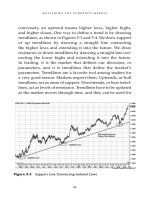
we don’t care if the market moves up or down. We are interested
only in going where the market wants to take us. There is no
opinion for us, no right or wrong price direction. We know it is
unreasonable to think we can predict what will happen tomor-
row, and so we always avoid getting attached to one outcome
over another. We do not predict which way a market will move;
we position ourselves to follow along with the market.
One of the first things the old-timers told us on the exchange
floors was to “lose your opinion, not your money.” Their point
was that if you stay attached to your opinions and make deci-
sions on that basis and on the emotions behind them, you’ll
probably lose money. That saying is one of the cornerstones of
what we are going to teach you.
In analyzing markets, there are many choices in the tools
we use, and choosing a chart is no different. In the charting
package I use, seven different kinds of charts are listed. We
will discuss the three most common ones now: line charts, bar
charts, and candlestick charts.
Line Charts
Line charts show only the market’s closing price and can be ben-
eficial in that they smooth out the price action, making a trend or
Mastering the Currency Market
52
direction easier to discern. Figure 3-1 shows a monthly line chart
for EURUSD.
The line chart is the most simple type of chart and can keep
traders from overreacting to price extremes on a short-term
basis. It also can make it easier to identify significant support
and resistance levels and chart patterns, both of which we will
be studying extensively in this book.
Bar Charts
Figure 3-2 shows a price bar from a bar chart. Bar charts show
a market’s open, high, low, and close on a vertical bar and
therefore provide more information than does a line chart. On
the left side of the bar a horizontal tab indicates the opening
price for the time period, and on the right side a horizontal tab
Charts for Trading
53
Figure 3-1 Line Chart
Mastering the Currency Market
54
Figure 3-2 Price Bar
Figure 3-3 Monthly Bar Chart
indicates the closing price. The height of the bar represents the
entire range of trading within that time frame; hence, it pro-
vides the high and the low.
Traditionally, bar charts were indicated in black and white,
but newer programs use color designations such as green and
red to indicate upward and downward movements in price.
Figure 3-3 shows a monthly bar chart.
In most charting packages the bars will be colored, with
green bars indicating the months that closed higher than the
previous month’s close and red bars marking months that
closed lower than the previous month’s close. In Figure 3-3,
notice the pattern of higher highs and higher lows before and
then again after the price correction in 2005. This price behav-
ior or pattern is characteristic of a bull market.
Candlestick Charts
Candlestick charts display basically the same information as
bar charts but in a somewhat different way. Figure 3-4 shows
that the “body” of the candle represents the difference between
the open and the close. If the body is white (or green), the mar-
ket moved up and the open is represented by the bottom edge.
If the body is black (or red), the market moved down and the
open is represented by the top edge. The shadows, which also
are called wicks, are the lines above and below the candle body
and represent the high and low of the time period. Figure 3-4
shows candles in black for a down candle and in white for an
up candle.
Charts for Trading
55
Bar Charts versus Candlestick Charts
Of the two chart types, many would argue that candlestick
charts are the preferred type for trading. They give similar
information when one is looking at a single time period, but
more important, they visually signal other clues about the mar-
ket when one is viewing a larger time frame. There are impor-
tant things to note about the differences between bar charts and
candlestick charts (see Figure 3-5):
• The color of the bar on the chart depends on the closing
price of the previous bar. If the closing price of the current
bar is higher than the closing price of the previous bar, the
bar will be green (or white).
• The color of the candlestick depends only on the position
of the close relative to the open for that time period.
Mastering the Currency Market
56
Figure 3-4 Individual Candlesticks
• If the market closes higher than it opened, the candle will
be green (or white).
• It’s usually easier for beginners to work with candlestick
charts.
• Candlesticks also provide the additional visual signals of
trend shifts.
For examples of both types of charts in color go to
www.Trading-U.com.
Candlestick Shapes: Body Size
One way candlesticks provide information about market behav-
ior is through the length of the candle body. Figure 3-6 shows can-
dles with long and short bodies. Long bodies indicate strong
price movement, and short bodies tend to indicate indecision.
Charts for Trading
57
Figure 3-5 Difference between a Candlestick and a Price Bar
Mastering the Currency Market
58
Figure 3-6 Different-Sized Candle Bodies Provide Information about
Price Behavior
Figure 3-7 Long Shadows Yield Further Insight into Price Behavior
Another way candlesticks provide information about mar-
ket behavior is through the length of the shadows or wicks.
Long shadows represent a failed attempt to move a market in
that direction (see Figure 3-7).
Candlestick Shapes: Doji
The doji (Figure 3-8) represents indecision regarding price and
frequently occurs near market highs or market lows. It is char-
acterized by a body that is very small and usually has long
wicks. We will talk more later in this chapter about how to use
the doji as a signal of a change in market direction.
Charts for Trading
59
Long-Legged
Doji
Dragony
Doji
Gravestone
Doji
Figure 3-8 Different Types of Dojis
Figure 3-9 Spinning Tops Are Similar to Dojis
Candlestick Shapes: Spinning Tops
Spinning tops (Figure 3-9) are similar to dojis in that they have
short bodies and long wicks, with both indicating indecision
in the market. They can occur at market tops or bottoms, but
they also can show up in sideways-moving markets and dur-
ing periods of low volume.
Bullish Candle Formations
Some of the most useful information can be gained from can-
dlesticks when they signal a change of direction in the market.
Figure 3-10 shows six common formations that may indicate
that the market is headed upward.
Mastering the Currency Market
60
Figure 3-10 Potentially Bullish Candle Patterns
Bearish Candle Formations
Figure 3-11 shows potentially bearish candlestick patterns.
Figure 3-12 shows a daily EURUSD candlestick chart.
An important aspect of price charts, whether bar charts, can-
dlestick charts, or line charts, is that they provide a historical per-
spective on a market’s previous behavior. We can’t overstress the
importance of having enough information or time on your
charts when you are analyzing a market that you potentially will
trade. If you were going to hire a person to work closely with
you, you would want to know more about that person than
what her last job was. You would want an accurate picture of
her entire work history before you made that commitment. You
probably would not want to waste time asking questions to see
Charts for Trading
61
Engulfing Pattern Evening Star Harami
Hanging ManShooting StarDark Cloud Cover
Figure 3-11 Potentially Bearish Candlestick Patterns
if she was qualified for the job at hand until you had enough of
a work history to give you some insight into her likely future
behavior. Similarly, we always start out analyzing a chart by
going back as far as we can to get a broad view of its long-term
behavior. As you get closer to a trading decision, it is okay to
home in and see specific candle behavior, but to start we want
to know how this market behaved historically.
Mastering the Currency Market
62
Figure 3-12 Daily Candlestick Chart
CHAPTER
Candlestick
Charts
Higher Time Frame Charts First
To gain the historical perpective needed to analyze markets,
we always start from the highest time frame chart. Figure 4-1
shows a monthly chart that supplies a fairly clear picture of the
levels that bound the USDJPY market from 1997 to 2008. Many
inexperienced traders make the mistake of thinking that a chart
with such a high time frame is not needed, particularly if they
are using charts with lower time frames. In our work we could
not disagree more. Any signal generated by a monthly chart
is significant.
We look at the long view first to get the big picture. On the
basis of where the market shown in Figure 4-1 has traded
over this long-term period, we can surmise that it’s not
unreasonable to see large, sustained price movements. This
63
4
market, which is USDJPY, could continue to provide us with
good trading opportunities. We see a pattern of lower highs
over this period and a habit of finding support plus or minus
2.5 or so points of 100.00 over those years. The next step
would be to take a look at the chart of the next lower time
frame, which would be the weekly chart:
The weekly chart in Figure 4-2 provides a picture of how
this market has traded over the years from 2004 to 2008. We
can see that this market is in the lower half of its six-year
range and is showing a pattern of lower lows over the last five
years. Here we are still just looking at the big picture, not
focusing on individual candles.
Mastering the Currency Market
64
Figure 4-1 Monthly USDJPY Chart
Candlestick Charts
65
Figure 4-2 Weekly USDJPY Chart
To get a more updated view of this market, we drop down
to a daily chart.
On the daily chart in Figure 4-3 we see that this market is in
a three-month downtrend, which is in line with the overall
downtrend in the higher time frames, as defined by the pattern
of lower highs and lower lows over the last year.
Thus, by glancing at these three charts—the monthly, the
weekly, and the daily—we’ve brought ourselves up to
historical speed with this market. At this point we can
hone in to take a closer look at what the candles are telling
us on a shorter-term basis, within the context of the long-
term picture.
Trending and Countertrending Markets
The individual candle indicates the market’s path of least resist-
ance for that period. When a candle has a long body, it is telling
us that the move has conviction; in other words, it is an impul-
sive move. Conversely, when the candle has a small body, it is
telling us that the move for this period is lacking in conviction
and probably is characterized by reactive behavior. The distinc-
tion between impulsive and reactive behavior, taken collectively,
is how we recognize whether a market is exhibiting trending or
countertrending behavior. This is an important aspect of market
Mastering the Currency Market
66
Figure 4-3 USDJPY Daily Chart
behavior to recognize. When we see that a market has strong
conviction, or momentum, by noting how long the rectangular
body of the candle is, we need to recognize that the market is
showing us its current trend. When we see sideways price
action, or ranging behavior, and candles with small bodies, we
know we are in a market trading counter to the trend, and we
don’t expect extended moves until we see a clear breach of that
range. This distinction between trending behavior and coun-
tertrending behavior can be seen clearly in Figure 4-4.
The two different types of price behavior shown in Figure 4-4
represent an important distinction that can provide insight into
Candlestick Charts
67
Figure 4-4 Trending and Countertrending Price Action
Q1 2008 USDJPY Treading and Countertrending
a market’s future direction. There are actually two types of impul-
sive or trending behavior to account for: one going with the long-
term or primary trend and the second marking the beginning of
an intermediate-term trend that also is known as a secondary
move. We will cover the subject of coordinating time frames in
detail in Chapter 9 in the section on quantifying trends.
Watching the Clock
The most important thing we need to know about an individual
candle is that we do not make an analytic, or trading, decision
until the candle is closed, which means that the time period is
complete. You will be hearing this again. Another important
aspect of individual candle analysis for forex intraday charts is
the time of day. In trading, even for the 24-hour-a-day market, all
time periods are not equal. If there is very little trading volume,
as is generally the case from the close of the U.S. financial mar-
kets through the Tokyo open, we do not place importance
on individual candles or patterns during this period. In forex
markets, it is widely known by experienced traders that volume
generally trails off noticeably leading up to noon EST and stays
very low until the Tokyo open. Regardless of your own experi-
ence in trading, you do not want to initiate short-term trades that
are based on individual candles or candle formations during
those hours. The exception to this would be U.S. stock indexes
such as the E-mini S&P future and the mini Dow futures contract,
which still have high volume and good trader participation rates.
In Chapter 11 we will cover trading for different periods and
define position trading, swing trading, and day trading.
Mastering the Currency Market
68
Individual Candles Can Exhibit
Noteworthy Behavior
The first two types of candles we want to point out to start are
dojis, which are candles in which the opening price is very close
to the closing price and there is a very small body; these can-
dles indicate market indecision. Change-of-direction candles
tend to reverse the previous pattern or direction of the highs
and lows. If the preceding candles were moving higher, a
change-of-direction candle would be a candle in which the close
was lower than the low of the preceding candle or candles.
Similarly, if the previous candles had developed a pattern of
lower lows, lower highs, or lower closes, a change-of-direction
candle would be a candle that closed above the high of the
previous candle or candles. Figure 4-5 is a daily chart of the
British pound from January 20, 2007 that exhibits its share of
both dojis and change-of-direction candles.
You will learn in Chapter 9 that change-of-direction candles
are used as trade signals. It is important that as analysts and
traders we understand that neither one of these candles means
that a market will or will not perform as we expect. Change-
of-direction candles do not mean the market is going to change
direction, just as a doji does not mean the market must take
a breather or must reverse. We never know what event could
happen at any time to change the behavior of the market. Over
time, though, these candles have proved to be a good hint or
heads-up that a particular market has shifted gears, and it’s
important that you file this information away as you will see
how we use it to home in on specific trade setups. Notice in
Figure 4-5 how twice we see a doji candle followed by the
Candlestick Charts
69
change-of-direction candle to put in a market top. This is inde-
cision followed by action as the British pound completes an up
move before swinging lower.
It’s important to recognize what behavior the candles or mul-
ticandle formations are exhibiting in the context of the overall
trends that already are in place. Taken by themselves, dojis or
any individual candle or candle formations may or may not be
significant. However, in the context of the current trends and
relative to significant support and resistance, they are worth our
attention as traders and, as you will see later, play a significant
role in helping identify trade setups and signals.
Mastering the Currency Market
70
Dojis and Change-of-Direction Candles
Figure 4-5 Dojis and Change-of-Direction Candles
In Chapter 3 we talked about some of the major candlestick
formations. Some of those formations (see Figure 4-6), which
can include dojis (depending on the size of the reversal candle
bodies), are shooting stars, which also are referred to as evening
doji stars, and hammers, which may be referred to as hammer
dojis. A candle we did not mention is the inside candle, which
can be either a reversal or a continuation signal. An inside
candle is essentially a candle that is engulfed by the previous
candle. If the market reverses after an inside candle, the
engulfed candle will go on to become a harami pattern; if that
does not happen, it will become a continuation pattern. What
Candlestick Charts
71
Shooting Star, Hammer, and Inside Candle
Figure 4-6 Shooting Star, Inside Candle, and Hammer
is significant about the inside candle is whether the market
closes above or below it, as price has a tendency to continue in
that direction.
Figure 4-6 is a 240-minute chart of EURUSD with a shooting
star doji in the upper left corner of the chart before a move
lower, then an inside bar toward the bottom of the chart with
the market stabilizing, and then a hammer doji, followed by
a change-of-direction candle before an up move.
The inside candle is telling us that the market lacks con-
viction in regard to its direction. The inside candle is consid-
ered pivotal in that the market is expected to increase
momentum in whichever direction it closes in relation to the
high and low of the inside candle. A close above the high of
the inside candle is considered bullish, and a close below the
low of that candle is considered bearish. When you are view-
ing intraday forex charts, keep in mind that low-volume can-
dles such as those between 17:00 and midnight Greenwich
Mean Time (GMT) should be discounted, as their behavior is
not considered nearly as significant as that of candles on
higher volume. The hammer, which is also a doji, is consid-
ered a bullish candle. A hammer is created after the market
trades lower after the opening before moving higher and clos-
ing in the top third of the range. What has happened is that
price probed lower during that period but found support as
buying came into the market to propel it higher. The long
shadow stands as evidence that lower prices were rejected.
When it is seen in a downtrend, this behavior can be taken as
indicative that the market is pausing or possibly trying to
reverse. The shooting star is also a doji and is similar to the
hammer but is considered a bearish candle. When it comes
Mastering the Currency Market
72
after a rally or uptrend, it indicates that the market could be
ready for a pause or a reversal. The long wick and short
body below it in Figure 4-6 emphasize that the higher prices
were rejected.
Always remember that individual candles and candle for-
mations do not necessarily predict what a market will do; that
is, they do not always work out in favor of our position. There
is always a danger in looking at a short-term indication such
as an individual candle that we may be missing something of
importance in the big picture. Candle patterns play an impor-
tant part in our analysis and trading and are especially useful
when combined with other aspects of technical analysis. We
should never take a trade solely on the basis of an individual
candle or bar or even chart pattern without considering addi-
tional factors, such as whether this price behavior came on
support or resistance.
For forex markets, we discount candles and formations dur-
ing low-volume, low-trade periods such as from lunchtime in
New York to the Tokyo open, and we do not make any analytic
or trading decisions until the candle is closed. You will find that
knowing that you do not have to make a trading decision until
the candle closes will keep you relaxed, as you know there is
no action to take until a specific time.
Two candle formations that often signal a market pause or
reversal are the bullish engulfing pattern and the bearish
engulfing pattern. Both also can be change-of-direction
candles, depending on their close in proximity to the
previous candle’s high or low. Another candle that can be
either one of these is a benchmark candle, which we will
cover shortly.
Candlestick Charts
73
A bullish engulfing pattern occurs when a green (white)
candle’s body surrounds or engulfs and then closes above the
previous candle’s red (black) body. A bearish engulfing pattern
occurs when a red (black) candle’s body surrounds or engulfs
and then closes below the previous candle’s green (white)
body. It is this close above the previous candle’s high or below
the previous candle’s low that makes engulfing candles
change-of-direction candles.
In Figure 4-7, in the middle of the chart, we see two hammer
dojis, with the second hammer followed by a bullish engulfing
candle. We see that the body of that hammer is surrounded by
the body of the engulfing candle and that the engulfing candle
closes above the high of the preceding candle.
Mastering the Currency Market
74
Bullish Engulfing Pattern
Figure 4-7 Hammers and Bullish Engulfing Candle
Figure 4-8 shows a shooting star doji that marks a top in
EURUSD on a 240-minute chart at approximately 160.00, fol-
lowed by a bearish engulfing candle that precludes a major
sell-off in the market. Note also the number of dojis and
inside candles on the right. That spells indecision on behalf of
influential players or traders in this market.
A benchmark candle (see Figure 4-9) is an elongated engulf-
ing candle with few or no wicks and leaves no doubt about
who won out at the end of the candle, the bulls or the bears.
The term benchmark candle came from the trader and author
John L. Person, president of www.nationalfutures.com. What
we will learn to appreciate about markets is that they have
Candlestick Charts
75
Bearish Engulfing Pattern
Figure 4-8 Shooting Star Followed by Bearish Engulfing Pattern
a tendency to pull back in the opposite direction after a bench-
mark candle to retest the previous conviction. A rule of thumb
is that if we see a retracement after a benchmark candle, we
should look for it to stop halfway into the candle, giving us
a 50 percent retracement, before resuming the direction set by
the benchmark. We will study a market’s tendency to retrace
further in the section on Fibonacci retracements and extensions
in the material on support and resistance in Chapter 5.
Figure 4-9 shows a classic example of a benchmark candle
in EURJPY on a 15-minute chart; this candle is also a bearish
engulfing candle or a change-of-direction candle. A benchmark
Mastering the Currency Market
76
Benchmark Candle
Figure 4-9 Benchmark Candle Followed by 50 Percent Retracement