Mastering the Currency Market Forex Strategies for High and Low_4 pptx
Bạn đang xem bản rút gọn của tài liệu. Xem và tải ngay bản đầy đủ của tài liệu tại đây (1.52 MB, 32 trang )
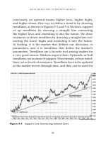
conversely, an uptrend means higher lows, higher highs,
and higher closes. One way to define a trend is by drawing
trendlines, as shown in Figures 5-3 and 5-4. We draw support
or up trendlines by drawing a straight line connecting
the higher lows and extending it into the future. We draw
resistance or down trendlines by drawing a straight line con-
necting the lower highs and extending it into the future.
In trading, it is the market that defines our decisions, or
parameters, and it is trendlines that define the market’s
parameters. Trendlines are a favorite tool among traders for
a very good reason: Markets respect them. Uptrends, or bull
trendlines, act as areas of support. Downtrends, or bear trend-
lines, act as levels of resistance. Trendlines have to be updated
as the market moves through time, and they can be used for
Mastering the Currency Market
84
Figure 5-3 Support Line Connecting Isolated Lows
both trading and forecasting. In drawing trendlines on
candlestick charts, we also have the option of drawing them
from the highs and lows of the wicks or from the highs and
lows of the bodies.
Figure 5-5 shows a monthly chart of GBPUSD with all sig-
nificant support and resistance levels and trendlines marked.
Note how in the summer of 2008 the support level that had
built up through the first half of that year gave way. It is essen-
tial that a trader monitor significant levels like this and be
aware of the possible market consequences for price when a
major level is breached and price closes beyond it. This price
breakdown was followed by penetration of the long-term bull
trendline, and a major sell-off followed.
Support and Resistance
85
Figure 5-4 Resistance Lines Connecting Isolated Highs
In this figure we can see from the pattern of higher highs and
higher lows from 2002 through 2007 that the trend is higher.
We also can see that just above the 210.00 level, supply started
to exceed demand and buying disappeared as sellers offered
aggressively lower prices. Conversely, when prices went below
194.00 in early 2008, demand picked up and buyers provided
support multiple times at this level. We also see a sideways
pattern of successive dojis that spells price indecision for the
first seven months of 2008.
Next, we examine a weekly chart of the same market extend-
ing back a little more than two years.
In Figure 5-6 we get a closer look at the correction or rest-
ing period GBPUSD was in through the first half of 2008.
Mastering the Currency Market
86
Figure 5-5 Support and Resistance Levels on a Monthly Chart
Regardless of this back-and-forth price action, by keeping
those trendlines drawn from the monthly chart in place, we
don’t lose sight of the long-term trend. There are always two
sides to a market, and we are reminded of this as supply
above the market shows its hand in March 2008 and rejects
the market’s attempts to rise above 204.00. Once again
demand dries up on the rally as buyers drop their bids and
sellers move prices down quickly to unload inventory. Once
prices pull back in May and again in June, we see the impor-
tance of the horizontal support level drawn from the January
lows. It becomes clear that we are in a long-term uptrend and
that buying support is rewarded as the British pound contin-
ues to have demand at the 194.00 level. As is always the case
Support and Resistance
87
Figure 5-6 Support and Resistance Levels on a Weekly Chart
in trading, this information is twofold as the bounces off
194.00 tell us there is support in place and at the same time
tell us that a close below that level would be a strong indica-
tion of market weakness or even a possible market reversal,
which is what did happen.
Figure 5-7 shows a weekly chart of the U.S. stock market as
represented by the S&P 500 stock index futures, in which
a break of the long-term trendline in late 2007–early 2008
marked a key reversal of the previous 4.5-year bull market.
The events might be easier to see now, but amid the emotions
of making a trading decision, all too often the student forgets
about the long-term trend in the face of a fluctuating account
balance. The more experience you gain as a trader, the more
respect you will develop for the long-term trend. Respecting
Mastering the Currency Market
88
Figure 5-7 Support Line Gives Way on a Weekly U.S. Stock Market Chart
long-term trendlines is a twofold process: You respect them
when they hold up and recognize that a big move may be in the
making when they do not hold up and the market settles
through them. As you can see from the chart in Figure 5-7,
charts and trendlines are not just for traders. Investors would
have been served well by exitinged long-term stock holdings
on the basis of the stock market’s trend reversal at the begin-
ning of 2008.
Short-Term, Intermediate-Term, and
Long-Term Trendlines
In doing trendline analysis, we need to understand that just as
there are long-term, intermediate-term, and short-term trends
Support and Resistance
89
Figure 5-8 Long-Term, Intermediate-Term, and Short-Term Trendlines
simultaneously unfolding in a market, there are long-term,
intermediate-term, and short-term trendlines. This is the case
because as a trend extends itself, its angle, or slope, may
increase or decrease as the market adjusts to the supply avail-
able for sale and the demand from buyers. To keep up with
these ebbs and flows in price action, we must update our trend-
lines continuously, as illustrated in Figure 5-8.
Market Corrections
In Figure 5-8, a USDCHF 240-minute chart, we see the long-
term trendline, then the intermediate-term trendline, and
then the short-term trendline. This is a good example of
how markets trend and serves as a reminder of why we
need to keep trendlines updated. It also shows another
aspect of trendlines, which is that not only do they serve as
support or resistance, they also serve as attractors. Note
what happens when the angle, or slope, between price and
the trendline becomes steeper as the market moves lower.
Similar to a mean reverting mechanism, the farther the
slope increases, the more likely it becomes that price will
react back toward the trendline. The slope can act as a rub-
ber band that when stretched too far snaps back, taking the
price the other way. These snapbacks, or retracements, are
to be expected. “Expect corrections” is essential advice for
traders. Once price does rally back on the USDCHF
240-minute chart, then falters, and then resumes the previ-
ous long-term downtrend or resumes its path of least resist-
ance, we draw a new trendline. The process of price motion
based on supply, demand, and the emotions of market
Mastering the Currency Market
90
participants plays out again in a cycle of lower highs and
lower lows until eventually it shifts to a pattern of higher
lows and then higher highs.
The daily chart in Figure 5-9 shows another example of a
market that corrects only after sharp sell-offs, leaving us to
update the new bear trendlines it creates.
Notice how every time the market increases its speed,
angles away from the oldest or longest trendline, and goes
vertical on the chart, it sets itself up to give us a snapback cor-
rection, or a countertrend rally back toward the older or
longer-term trendline. Experienced traders tend to trade
larger positions, and so it is their “covering,” or buying back
shares or contracts after the accelerated sell-offs, that starts
the countertrend process.
Support and Resistance
91
Figure 5-9 Price Corrections after Trendline Violations
Once the market makes a countertrend move and then
reverts lower, we draw a new, shorter-term trendline. These
newer trendlines are going to help us understand the when of
the next price correction. When we see price angling away from
the new trendline as it accelerates, we should understand that
in terms of time, that market is getting closer to a countertrend
correction. Think of a correction as a car traveling at a high
speed that needs to slow down before making a turn. A similar
dynamic is at work with markets, and the trendlines generally
tell us when that resting point occurs or where that turn is.
More specifically, they give us a heads-up about when an
impulsive, or trending, market will revert to a reactive, or coun-
tertrending, stance. Another way of putting this is that once a
market has reached a point at which its momentum is
exhausted, it’s time for a correction. The trendlines on the daily
USDJPY chart in Figure 5-9 provide that point. Each new trend-
line becomes steeper, leading us closer to the correction. For
traders, it’s difficult and unnecessary to calculate exactly when
the correction will come; we just need to monitor the market
when we see the slope of the trend increasing and exit a por-
tion of our position once we get a close above (or below) the
steepest or shortest-term trendline, being mindful that price has
a tendency to migrate back to its longer-term trendlines.
By using the EURUSD 60-minute chart shown in Figure 5-10,
we can take a closer look at price behavior by marking the pre-
vious daily lows and highs. We’ve also connected the isolated
highs on the left side of the chart with a bear trendline and
connected the isolated lows on the right side with a bull trend-
line. By marking both the previous highs and lows and the iso-
lated highs and lows used to draw the trendlines, we generate
Mastering the Currency Market
92
a simple visual that shows when this market shifted from lower
highs and lower lows to higher lows and higher highs. This
illustration makes the point that although the trendlines are
important, it is the previous highs and lows that we take as
the measurements and draw the lines from that help us deter-
mine direction. Marking these previous highs and lows is also
a valuable habit when it comes to operating in markets in which
an uptrend or downtrend is not so clear.
The tendency of price to increase the slope of its path of least
resistance over time, which we talked about before, and the
tendency of that behavior to hasten corrections also can help
alert us to the possibility of snapback moves or countertrend
price behavior.
Support and Resistance
93
Figure 5-10 Daily Highs and Lows and Trendlines Help Distinguish
Directional Shifts
Figure 5-11 shows how horizontal support and resistance
levels create a sideways channel. We know that support and
resistance levels mark key price levels at which either the
buyers or the sellers were proved right decisively. A support
level marks a clear-cut level below where the market is trad-
ing where demand, or buying, absorbed the selling pressure
through more aggressive bidding. It can be said that demand
at that level was strong enough to prevent lower prices.
Resistance, in contrast, is a clear-cut level above the market
where supply, or sellers, intimidated buyers into backing off to
establish dominance. It can be said that supply at that point
overwhelmed demand and that prices at that higher level were
Mastering the Currency Market
94
Figure 5-11 Horizontal Support and Resistance Create a Sideways Channel
unsustainable. We will cover price channels in Chapter 6 in the
section on price formations, but we can see now how it’s actu-
ally support and resistance levels and the trendlines drawn
from them that are the basis for chart formation.
Figure 5-12 shows a commonly seen situation. More often
than not a trading range proves to be a price pause before
resumption in the same direction in which the market was
moving before entering the range. This occurs because markets
tend to trend more than they reverse.
Trendlines can be horizontal or angular and connect to at least
two price points, with the third point adding validity. This is a
Support and Resistance
95
Figure 5-12 Horizontal Trading Range Provides a Pause before
Continuation in the Same Direction
very important concept because it is at these “third points” on
the trendline that one often sees a confluence of other support
or resistance levels in the form of previous highs and lows, pivot
points, and retracements, which we’ll discuss later in this chap-
ter. These confluences, or crossroads, of support will help us
highlight trade signals that we might not be homed in on if we
waited for the longer-term trendlines. Figure 5-13 shows that on
May 1 the trendline intersected with the previous day’s low. This
may not look that significant at first glance on the daily chart,
but for an intraday trader it proved to be a big move.
Another principle of technical analysis is that resistance
can turn into support levels and vice versa. Figure 5-14
Mastering the Currency Market
96
Figure 5-13 Third Point Confirms a Trendline
Support and Resistance
97
Figure 5-14 Resistance Lines Turn into Support Levels
shows a pair of trendlines that gave way; they did not hold
as resistance but remained in place and gave us support on
the retest. This highlights why we always have to update our
trendlines and also leave the trendlines in place as they will
aid us in spotting trend reversals, which often are marked by
support turning into resistance and vice versa.
It is very important to see how price reacts to support and
resistance levels before acting on them. We do this by waiting
for an individual candle to close and then updating our trend-
lines if necessary before committing to a direction or trade,
as shown in Figure 5-15. We do this to let the market gauge
the strength or weakness of the support or resistance level.
We always trade from the perspective that we do not know
whether the level will hold. We do not try to guess whether
the level will hold; we stay patient and let the market tell us if
it is respecting the potential support or resistance. Remember
to “lose your opinion, not your money.” Once the candle is
closed, we get a true snapshot of its behavior. For example, if
price stalls at a particular level and then briefly probes below
it before retreating, that is very different from what happens
when it moves right through that level and closes beyond it.
Figure 5-15 shows that price moved above the first trendline
before pulling back. This prompted us to update our trendline
and watch as the market made another move down before
turning up on May 22, 2008. This is why it is so important to
Mastering the Currency Market
98
Figure 5-15 Wait for Candle to Close above the Trendline
wait for the close of the candle before entering a trade. As
technical analysts we must be as flexible as the markets
we trade.
Trendlines are very useful for pointing out direction. Price
doesn’t have to go up to the trendline and give us a textbook
trigger every time. In many cases just having the trendline in
place on the chart will provide a reminder of a market’s cur-
rent direction. This is going to prove to be valuable informa-
tion once you gain a little experience at demo trading and start
to see firsthand how trending markets move a lot faster than
do countertrending markets. You may have an extra minute or
two to analyze a countertrend trigger, but with a trend trigger,
you are not going to have that extra blink to think about it; if
you wait, you will miss the bus.
The USDCHF 60-minute chart in Figure 5-16 provides a good
example of a buy signal in an uptrend in which if we had waited
for the market to give us a trendline test, we would have missed
out on a nice trade. We use trendlines to remind us of the over-
all direction of the trend just as much as we use them to show
support or resistance. It is very important to have your trend-
lines in place on the chart before starting to trade because if you
are trading on a short-term basis, you need to concentrate on
execution, not analysis. With your support levels in place, there
is no thinking or questioning whether you are trading with the
trend or counter to it. The difference lies in whether you observe
it more loosely and let the profit run—trend trade—or take a
profit or loss quickly, depending on short-term price behavior
such as candlestick formations and current structure charts (sup-
port and resistance); that is, countertrend trading depends on
the current long-term and short-term trendlines.
Support and Resistance
99
Pivot Points
We have looked at trendlines and the way they provide sup-
port and resistance, which we now know is what defines
a market’s parameters. We know that just as there are long-
term trends and short-term trends, there are trendlines on
different time frames. Now we need to cover another very
influential form of support and resistance, one that also can be
measured on different time frames: pivot points.
Pivot points are a popular and useful trader’s tool. Jay Norris
was introduced to them on the floor of the Chicago Board of
Trade many years ago, when they were used primarily by
professional traders. Pivot points are a simple rough-and-ready
Mastering the Currency Market
100
Figure 5-16 Existing Long-Term Trendlines Provide Direction
calculation that is used to determine underlying strength and
weakness and provide potential support and resistance levels
for a specific period. They are always calculated from the previ-
ous period’s high, low, and close. Here is the formula for the
different levels:
Resistance 3 = high + 2 * (pivot – low)
Resistance 2 = pivot + (R1 – S1)
Resistance 1 = (2 * pivot) – low
Central pivot point = (high + close + low)/3
Support 1 = (2 * pivot) – high
Support 2 = pivot – (R1 – S1)
Support 3 = low – 2 * (high – pivot)
Most charting packages will calculate these numbers for you,
but it’s important to understand the math behind the number.
Figure 5-17 shows a 240-minute EURUSD chart with the
weekly pivots displayed.
For charts that are less than 60 minutes we use daily piv-
ots, which are calculated from the previous daily range’s
high, low, and close; for charts 60 minutes or more we use the
weekly pivots, which are calculated from the previous week’s
high, low, and close; and for daily charts, we use the monthly
pivots, which are based on the previous month’s high, low,
and close. We also can calculate quarterly, yearly, presidential
cycle, and even decade pivots. Many professional traders
follow the shorter-term pivots, and that is why they tend to
work so well: The levels are self-fulfilling because influential
traders key off them. We view the central pivot point as sup-
port or resistance, depending on the side price opens and
Support and Resistance
101
then trades on. Price below the central pivot can be seen as
market weakness; similarly, price above the central pivot can
be viewed as market strength. Pivot levels can work particu-
larly well when there are no scheduled news releases or unex-
pected fundamental developments, leaving the market to
bracket back and forth between the pivots. In a flat or side-
ways environment the market will tend to wrap around its
central pivot, using pivot support 1 (S1) for support and pivot
resistance 1 (R1) for resistance. In an uptrend price often
tends to respect the central pivot or S1 as support and R2 as
resistance, whereas in a downtrend price tends to respect the
central pivot or R1 as resistance and S2 as support. Pivots
points, like trendlines, are potential support and resistance
Mastering the Currency Market
102
Figure 5-17 Weekly Pivot Points on a 240-Minute Chart
levels. Therefore, we do not guess whether they will hold; we
observe the market’s behavior in relation to them.
The daily GBPUSD chart in Figure 5-18 shows monthly
pivots. Note the difference from the previous example in that
the pivots change monthly. Clearly, the GBPUSD has a strong
tendency to respect its monthly pivots, as we see how the
central pivot provided resistance in February before providing
support in March. Then we see the central pivot again provide
resistance in April and again in late May, whereas S2 provides
support in May and S1 provides support in June. Note also
that in nearly every month on the chart the central pivot
played a key role in helping us gauge underlying strength and
weakness. The trading for this particular period can be called
Support and Resistance
103
Figure 5-18 Monthly Pivot Points on a Daily GBPUSD Chart
countertrending. We can see the sideways back-and-forth
action, which technically shows up as the market generally
staying within S1 and R1.
This example highlights the fact that pivots adjust from one
month to the next. This is a characteristic that is conducive to
both trend trading and countertrend trading. The farther
the market travels in one direction in one month, the more the
pivots expand to accommodate that direction in the next
month. Traders appreciate that because it supports the cardi-
nal rule of trend trading: “Let your profits run.” Similarly, as
a market slows, producing smaller ranges, the trader can visu-
alize this easily and adjust his or her trading style.
Mastering the Currency Market
104
Figure 5-19 Monthly Pivot Points on a Daily USDCHF Chart
Figure 5-19 shows a daily chart of USDCHF in which we can
see the influence of the monthly pivots. Notice how in April,
after a sharp sell-off in February and March, the market found
support on its daily central pivot, which is an indication of
underlying strength. A sharp rally followed at the end of April,
and after a sell-off in May, support again was found at the daily
central pivot. In June and July probes lower were stopped at
pivot support 1, as the market put in a second higher low after
the overall low of the move it put in during mid-March. Higher
lows and a market trading above its central pivot are an indi-
cation of strength that could be signaling that the overall bear
move in this market is pausing or even reversing.
Support and Resistance
105
Figure 5-20 Monthly Pivot Points on a Daily USDJPY Chart
Mastering the Currency Market
106
Figure 5-21 Monthly Pivot Points on a Daily GBPUSD Chart
Figure 5-20 shows a daily chart of USDJPY in which we see
the market put in a succession of higher lows in April, May, and
June, which happen to be right on their monthly central pivots.
The fact that it tested and found support on pivot support 1 in
July and put in another higher low showed the benefit of
buying support in an uptrend. June and July provided a good
example of the benefits of exiting or selling at R2 and buying at
S1 in an uptrend.
Figures 5-21, 5-22, and 5-23 are daily charts in various trend-
ing stages, with the monthly pivots overlaid for us to study.
In technical analysis there is no such thing as a good or bad
chart to study. There are lessons in all charts covering all time
frames. Note how the various markets respond to all the levels,
Support and Resistance
107
Figure 5-22 Monthly Pivot Points on a Daily EURJPY Chart
Figure 5-23 Monthly Pivot Points on a Daily EURUSD Chart
Mastering the Currency Market
108
Figure 5-24 Weekly Pivot Points on a 240-Minute USDJPY Chart
not just the central pivots. Also note how whether a market finds
support at S1 or resistance at R1 can set the direction going for-
ward. Also, you should start to notice when a market fails to
reach a particular level and consider what that is telling you in
regard to underlying strength and weakness. We will discuss the
concept of buying strength and selling weakness in Chapter 8.
Earlier in the chapter we talked about the validity of the
saying “expect corrections.” The chart in Figure 5-24 gives us
a hint that a correction may be coming. On this 240-minute
USDJPY chart we see that the market failed to clear R1 three
times and then fell quickly and sliced through its weekly
central pivot on July 11, which was a clear warning sign. It
struggled to get back above that central pivot the next week,