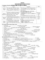
The essentials of branding doc
Bạn đang xem bản rút gọn của tài liệu. Xem và tải ngay bản đầy đủ của tài liệu tại đây (9.45 MB, 40 trang )
The essentials of branding
from The Big Book of Marketing
McGraw-Hill,
This is designed to be printed
double-sided to help you conserve paper.
Introduction
The difference between a brand and branding
Starting a branding project
Start with the right reason
Start with the right commitment
Start with the right business strategy
Start with the right focus: Customers
Analyze the brand’s equity
Uncover insights and identify opportunities
The brand strategy
Defining the brand idea
Defining the brand architecture
Defining the brand personality
Producing the creative brief
Creating the brand experience
Craing the verbal identity
Designing the visual and sensory identities
Testing verbal and visual identities
Delivering the brand experience
Managing a brand
Measuring the performance of a brand
Tracking brand strength
Measuring brand value
Case study: BP
Delivering the brand promise
© The McGraw-Hill Companies.
All rights reserved.
Landor Associates is one of the world’s
leading strategic brand consulting and
design firms. Landor is part of , one
of the largest global communications
services companies. Visit Landor
at landor.com.
Landor Associates
is the preferred choice in the minds of your key
audiences (whether customers, consumers,
employees, prospective employees, fans, donors,
or voters). The way in which the brand affects
business performance is illustrated in figure .
Business performance is based on the behavior
of customers, whether they choose to buy
a particular product or service. And that behavior
is based a great deal on the perception customers
have of the brand: how relevant it is to them and
how differentiated it is from the other brands in the
same category. In turn, customers derive their
perceptions of a brand from the interactions they
have with it. Finally, that customer experience,
ideally, is informed by a brand idea—what the
brand stands for: the promise it is willing to make
and keep in the marketplace. If the first part of this
chain of cause and effect is indistinct or irrelevant
to customers, there is little chance the rest of the
chain will work, and the brand will not affect the
business’ bottom line. Yet, despite the proliferation
of brands and their inextricable link to business
performance, it is not easy to define what a brand
is, along with how to create, manage, and value it.
Introduction
It is incredibly rare for a product or organization
to be without a brand. There are museum brands
(Guggenheim, Smithsonian), people brands (Martha
Stewart, David Beckham), political brands (Obama
versus McCain, Labour versus Conservatives),
destination brands (Australia, Hong Kong), sport
brands (Manchester United, New York Yankees,
Super Bowl), nonprofit brands (Red Cross, Oxfam,
), branded associations (, , Association
of Zoos and Aquariums), along with the product,
service, and corporate brands with which we are
all familiar. Many old marketing textbooks talk about
brands versus commodities (no-name products),
but in today’s world very few true commodities
are le. Even basic foodstuffs have some sort of
identifier on them, whether it is a private-label
store brand such as Walmart’s Great Value salt
or a major brand such as Morton Salt.
Brands help people make a choice, a choice among
salts, financial institutions, political parties, and so
on, and the choices are increasing. The number of
brands on grocery store shelves, for example, tripled
in the s from , to ,.
The purpose of
branding is to ensure that your product or service
This article was first published as Chapter
in The Big Book of Marketing: Lessons and
Best Practices from the World’s Greatest
Companies, edited by Anthony G. Bennett
(McGraw-Hill, ).
Sarah Wealleans is a consultant
and former senior client director with
Landor Associates. Additional input from
Trevor Wade, Hayes Roth, Susan Nelson,
Mich Bergesen, and Charlie Wrench.
The essentials
of branding
McKinsey & Company, “Strike Up the Brands” ().
Essentials of branding
Coke has worked incredibly hard at implanting
some of these brand associations in our minds:
The idea and delivery of refreshment (and the supply
management and distribution that are behind this),
product placement, the color red, the association
with a popular TV program, and the advertising all
make us feel good about the brand. Coke has not
controlled the buildup of these associations, but it
has tried, at every stage of our experience with the
brand, to positively influence them.
Accepting the second set of definitions poses more
of a challenge. The first definition suggests that the
brand is the purview of the marketing department—
just get the name, logo, design, and advertising right
and you have your brand. The second shows how
the brand is inextricably linked to the business. The
creation of the brand may begin in the marketing
department, but the experience of the brand has
to be driven through all parts of the organization.
Every interaction, or touchpoint, in a customer’s
experience of a brand makes a difference.
If you consider Apple, the quintessential brand
success story, the most powerful parts of the
customers’ experience of the brand are not confined
to traditional brand elements, such as the logo, the
name, or the advertising. It is the environment of
the Apple stores that encourages you to stay and
explore (and upgrade) and interact with its products
and its genius bar. It is iTunes as much as the iPod,
the applications as much as the iPhone. It is Apple’s
customer service and tone of voice that are
seamless, from the instruction manuals to the
real-time chat in the support section of the online
store. The brand is driven throughout this whole
experience, throughout every interaction.
The difference between a brand and branding
Most experts define what a brand is in one of two
ways. The first set of definitions focuses on some
of the elements that make up a brand:
• “The intangible sum of a product’s attributes:
its name, packaging, and price, its history, its
reputation, and the way it’s advertised.”
• “A name, sign, or symbol used to identify items
or services of the seller(s) and to differentiate
them from goods of competitors.”
The second set of definitions describes the
associations that come to mind when people
think about a brand:
• “Products are made in the factory, but brands
are created in the mind.”
• “A brand is a person’s gut feeling about a product,
service, or company.… It’s a person’s gut feeling,
because in the end the brand is defined by
individuals, not by companies, markets, or the
so-called general public. Each person creates
his or her own version of it.
What do we mean by “created in the mind”? When
we think of Coke, we may think of the time we went
to Disney World years ago. It was an incredibly hot
day, and we drank an ice-cold Coke from the iconic
glass Coke bottle and there was nothing more
refreshing. When we think about the can, we might
think red. Today perhaps we think of American Idol
(and wonder whether they are really drinking Coke
in those plastic cups). We think of how that
Christmas polar bear ad made us smile. Those of
us who are old enough may remember the “I’d like
to teach the world to sing” commercial. These
personal Coke brand associations are neither
positive nor negative, they just come to mind.
Business
performance
Customer
behavior
Brand
perception
Customer
experience
Brand
idea
David Ogilvy, primary.co.uk/viewpoints (accessed
May ).
Dictionary of Business and Management (Oxford
University Press, ).
Walter Landor, founder of Landor Associates.
Marty Neumeier, The Brand Gap: How to Bridge the
Distance between Business Strategy and Design
(AIGA New Riders, ).
Figure : Brand Affects Business Performance
Landor Associates
But if a brand exists in an individual’s mind, and if
it is delivered by the business, what is the role of
branding? Branding cannot control what people
think of a brand, it can only influence. A brand can
put some of the elements in place that will help
people understand why they should choose or prefer
a particular good, service, organization, or idea over
another. Branding and related marketing disciplines
can help influence and explain how many of these
associations in our minds have been built, and
whether they were built through advertising, ,
employee behavior, supply chain management,
and so on.
Branding is about signals—the signals people
use to determine what you stand for as a brand.
Signals create associations.
—Allen Adamson, BrandSimple
The bulk of this chapter will explain the process that
determines the foundational signals of a brand: what
a brand stands for (the brand idea); the attitude it
projects (the brand personality); its name and how
it talks (the verbal identity); what it looks like (the
visual identity); and what it feels and sounds like
(the sensory identity). Creating these foundational
signals is the core business of a branding agency.
Before foundational signals are created, however,
a certain amount of groundwork needs to be done
to ensure that the best conditions for success are
in place. The first two sections explain this essential
preparation. The third describes the creation of the
foundational signals. The final sections focus on
what to do next with these foundational signals
once they have been created, looking at delivery
of the brand experience, managing the brand, and
measuring the performance and value of brands.
Allen Adamson, BrandSimple: How the Best Brands Keep
It Simple and Succeed (Palgrave Macmillan, ).
Essentials of branding
Starting a branding project includes finding the right
reason, commitment, and strategy; analyzing brand
equity; and uncovering insights and opportunities.
Start with the right reason
Take care to get born well.
—George Bernard Shaw, playwright
Fundamentally, there are two reasons a business
needs branding. Either a new product or company
has been created or there is a desire to change
an existing brand to better reflect new business
objectives (most oen called a “rebrand”). There
must be a solid business reason to change, or
refresh, a brand and a brand idea. Without a solid
business objective and brand idea, the judging of
brand change becomes purely subjective. Suffice
it to say, when you embark on a rebrand it is critical
to ensure that you are rebranding for the right
business reason, and if there is a desire to alter
some visual or verbal elements, a clearly defined
brand idea is essential for guiding this change.
Start with the right commitment
It is critical to have the right steering committee
before starting a branding process. Because the
brand idea reflects what a company says it stands
for and its vision for the future, the must be
percent in agreement with it. And because
a brand is inextricably linked to the business, all
branding initiatives need to involve the business
leaders, not at every stage of managing the project,
but at every stage that a significant decision needs
to be made, particularly in the early stages when
the brand idea and personality are being defined.
The areas of the business that interact with
the target audience need to be represented on the
brand steering committee to ensure that the brand
idea will be delivered. If this means that the steering
committee increases to more than eight to ten
people, then “buy-in” stages are needed in the
process to keep decision making manageable
while ensuring that the areas of the business
responsible for living up to the brand are committed
to the process.
Finally, experts in the field of branding will also be
essential partners in the process. Branding agencies
are usually hired as partners and guides in the
process, since they are in the business of helping
to create and manage this kind of change. The
best agencies show strong strategic and creative
thinking and output and have relevant expertise
(not necessarily expertise in the same industry
or product category, but experience in handling
similar problems for similarly sized organizations
and products, or with similar target audiences).
The foundational signals of a brand need to last
at least a decade, and creating them is costly, so
investing in the right advice is important at both the
macro level (“How do we align our business with
the brand idea?”) and the micro level (“What should
we do about our printers to ensure the new brand
color reproduces well around the world?”). Because
creating a new brand or undertaking a rebrand
requires significant investment and signals change,
there is really only one opportunity to do it; so it
must be done right.
Starting a branding project
Landor Associates
customers and employees need to be considered.
But for both product and corporate brands, it
is important to understand insights into these
audiences to ensure that the brand idea resonates.
What is the benefit to customers? A company
should be able to articulate clearly, in a few words,
the unique aspect that differentiates its product
from the competition and provides a benefit to
its customers. This is called the “unique selling
proposition,” the “dominant selling idea,” the
“unique value proposition,” or the “universal
guarantor of performance.”
Start with the right focus: Customers
One of the most important first steps in a branding
project is to create a framework that identifies
and compares all possible interaction points where
a customer experiences the brand. This is oen
called a “customer journey,” and the interactions
are sometimes referred to as “touchpoints.” These
interactions can be physical, such as in a supermar-
ket, at an airline check-in desk, or in a showroom.
They can be digital, such as through a download
from a company website or on social media sites
like Twitter or YouTube. Interactions can be analog,
such as on the phone, via advertising on TV, or
through promotional events.
The important thing is to create the framework
from the customers’ point of view and not simply
compile a list of all things currently being executed
to build the brand. Doing only the latter will not help
you discover a new interaction that could better
connect the customer to your brand. Creating the
full framework, however, will foster understanding
of where you are delivering the brand promise,
Start with the right business strategy
Good branding cannot save a poor product
or business. In fact, the desire to rebrand can
sometimes mask a fundamental business problem
and can distract managers from actually addressing
it. Before you brand anything, it is important to have
a strong, clear answer to three simple questions:
() What are we selling? () Who is it intended for?
and () What is the benefit to customers?
What are we selling? In a very practical sense,
selling involves making tough decisions about
the market you are in, such as Intel’s decision to
abandon manufacturing computer memory chips
and focus on microprocessors. Or it can be about
deciding how you intend to describe the product
or service being offered. In Welcome to the Creative
Age, Mark Earls tells the story of working for Clarks,
one of the leading shoe companies in the United
Kingdom, and spending time in focus groups. His
agency hit on an idea that resonated well: not
a reexpression of the brand but a reevaluation of
what Clarks was selling. Clarks had defined the
business of selling shoes as a “replacement
business”—replacing shoes that were worn out.
The new model was about selling pleasure—
buying new shoes that give you a li.
Who is it intended for? The more specific and
targeted the answer to this question, the better.
For example, rather than focusing on “moms,”
target “moms who put their careers on hold and
are now back in the workforce trying to juggle career
advancement with guilt about not having the time
or energy to puree homemade baby food every
evening.” For corporate brands, it is more difficult
to focus on a single audience; at a minimum, both
The foundational signals
of a brand need to last
at least a decade.
Essentials of branding
For the redesign of the Gatorade packaging in ,
PepsiCo and Landor conducted equity research
with customers who were asked to draw the bottle.
This was a simple exercise, but one that resulted in
a marked consistency of output. The lightning bolt
seemed to be the most important and distinctive
design element associated with the brand; it was
recalled and drawn many times, and consumers
associated it with a “spark of energy.” Other
aspects (orange cap, brand colors, bottle shape)
also had strong recall, but did not evoke the same
emotional responses.
But equity is not simply about awareness—it is
also about relevance. The reason that Gatorade
increasingly focused on the bolt in subsequent
package designs and other marketing communica-
tions was not simply because people recalled it,
but because they associated it with the difference
Gatorade made to their athletic performance.
In , however, facing increasing pressure from
Coke’s VitaminWater and other competitors like
Powerade, PepsiCo instituted a dramatic redesign
for Gatorade that minimized the bolt and empha-
sized a collegiate-looking serif-type letter G as
the prominent label graphic. Apparently, PepsiCo
made this decision without conducting extensive
packaging research and, at this writing, the results
at point of sale have been mixed. It will be interest-
ing to see whether this dramatic rebranding helps
turn the brand’s fortunes around.
Consider also the spate of brands such as Atari
and Mini that have recently returned from the dead
to take up residence at retail once more. Part of
a phenomenon dubbed “dormandize” by consumer
trend spotters at trendwatching.com, these brands
where you are failing to keep it, where you need to
innovate to improve the experience, and where you
should spend your marketing dollars to generate the
most impact.
Analyze the brand’s equity
When a rebrand is undertaken, or if a new brand has
another brand attached to it (for example, through
a parent brand endorsement), it is important to
understand where current brand equity lies to avoid
inadvertently losing key elements that are actively
building consumer recognition and relevant brand
associations. To be clear, we are not talking about
the broadest definition of “equity”—the accumu-
lated value of a company’s brand assets, both
financially and strategically, which comprises
the overall market strength of a brand. Rather, we
are talking about the equity inherent in the brand
signals to help answer questions such as “Should
we keep the logo?” “Should the brand still be red?”
“Should we continue to use the same brandline?”
When embarking on a rebrand, provided it is not
occurring for a predominantly negative reason,
you will oen hear people within a company speak
about the strong equity inherent in the current brand
signals. “We can’t get rid of the tagline. We’ve had
it for five years. It has a lot of equity.” “People love
the logo. It’s who we are. You can’t change that.”
“Don’t get rid of ‘green.’ It’s a core brand color.”
Employees are likely to have some emotional
attachment to certain brand signals. But oen,
impartial brand equity research must be conducted
to truly understand where real equity lies and
whether it remains relevant moving forward.
Equity research conducted for Gatorade
found that the lightning bolt (depicted here
on bottles circa –) was the most
distinctive element of its brand.
Landor Associates
Uncover insights and identify opportunities
From an agency’s point of view, the process of
creating a new brand or a rebrand usually starts
with a “situation analysis,” oen called an “audit,”
or what Scott Bedbury calls a “big dig.”
Even in the
creation of a new brand you are never starting with
a completely clean slate. This big dig can be as small
or as large as you want to make it, and there are
various models and ways to structure it. It oen
involves consumer and/or customer research,
whether primary or secondary.
The most important thing to keep in mind about
a situation analysis, however, is that the ultimate
purpose is not to gather information. Its purpose is
to assemble insights about customers, the category,
competitors, or the brand itself in order to identify
an opportunity that will shape the brand idea.
What is an insight? Professor Mohanbir Sawhney
describes it as “a not yet obvious understanding
that can be the basis of a competitive advantage.”
Insights can be about a business, brand, category,
or customer. These insights come from interpreting
information available in a creative and analytical
way, oen using a framework, model, or map.
And opportunities are usually identified through
a combination of insights that connect multiple
areas such as competition; category; customers;
product or organization; heritage, ambition, and
stories; and brand architecture.
hope to capitalize on residual brand equity to
leapfrog competitors. Of course these revived
brands get a head start on awareness, but with
brands such as Atari, much more work needed to
be done to bring the brand out of eight-bit graphics
and give it relevance in the world of PlayStation and
Xbox. As Steven Mallas wrote, “Atari’s brand equity
doesn’t have that differentiated, maverick feel of
yesteryear when it was always associated with the
cutting edge of video game technology and was
worshipped by hardcore players at the forefront
of the video game revolution. Nowadays, it is an
all-purpose distributor that finds intense competition
in the likes of Electronic Arts and Activision.”
Atari’s
fiscal losses ($. million in , a significant
reversal of $. million profit in ) seem to affirm
the point. Just because people recognize a brand
does not mean they have positive impressions about
it or that they will purchase it.
Overemphasizing recognition in the brand equity
equation is a quick way to get an immensely
distorted picture of a brand’s value. Ultimately,
it can have the effect of making a company think
that everything is so good there is no need to
change anything. Yet if people know about the
brand, but it does not reflect what you want it to
stand for in their minds, then it is not relevant to
keep. walked away from the ubiquitous tagline
“We bring good things to life” because it no longer
encapsulated what it stood for as a business.
A rebrand is a marker of change. It should be
undertaken for a business reason.
Steven Mallas, “Atari’s Challenging Level,” The Motley Fool
( May ).
Scott Bedbury with Stephen Fenichell, A New Brand World:
Eight Principles for Achieving Brand Leadership in the
Twenty-First Century (Penguin Putnam, ).
Mohanbir Sawhney, “Insights into Customer Insights,”
Defying the Limits, vol. , (October ),
defyingthelimits.com (accessed March ).
The Xbox , with its integrated online
gaming and multimedia capabilities,
completely sold out when it was released
in .
Essentials of branding
The more visionary this idea, the more it can inspire
the people who are tasked to deliver it. And the
more relevant and differentiated it is, the better the
outcome. This idea of having a noble purpose above
and beyond the commercial or product equation
seems to be gaining more traction in the Internet
age. Consider Dove’s Campaign for real beauty, or
Ikea’s purpose being defined as Creating a better
everyday life for the many. Brands that claim a higher
purpose in their brand ideas, and those that do it
earlier than their competitors may connect better
with consumers in the long run.
However, the limits of differentiation are important
to note. The brand idea does not have to be, nor
is it likely to be, different from any other idea that
has ever been expressed by a brand before.
Difference is a relative term and is proportional
to a brand’s competition: other brands the target
audience might choose instead of yours. For
example, if the proposed brand idea for a child’s
new toy is “stimulating imagination,” this should
not be disregarded because also stands for
“imagination at work.” The child or parent is not
going to be making a choice between the toy
and a steam-assisted gravity drainage
produced water evaporator.
Similarly, you want the brand idea to be ownable;
not in the sense of patenting the idea or the words,
but rather in the sense of delivering the idea,
relentlessly and with commitment. This way, the
idea becomes so well associated with a given brand
that any competitor would be foolish to invest time
and money claiming it stands for the same thing.
Creating the brand signals includes defining
the brand idea, brand architecture, and brand
personality, and producing the creative brief.
Defining the brand idea
A good situation analysis leads to insights and
identifies areas of opportunity for a brand, but
a stake must then be placed in the ground to
define the brand idea: what you want the brand
to stand for. There is no magic formula or model
for this. It takes smart people, clarity, and creativity
of thought, debate, and sometimes more research
to determine the right brand idea.
The most important thing about your brand idea
is that it is differentiated from the competition and
relevant to your target audience. It is essential to
give the target audience a reason to choose your
brand over all others. If there is nothing different
about your brand, there is no reason to purchase
it; if you are different but that difference is not
important or meaningful to consumers, it is equally
unlikely your brand will be purchased.
Creating the brand idea also requires a leap of
faith to articulate something that captures the good
about the present state of the brand, and, more
importantly, a vision for its future. Mark Earls talks
about the brand idea having to create “a longer-term
trajectory for your business and your working life.
It is rooted in a dream of the world as it should be.
A dream that you feel and believe in with your whole
being, rather than the small part of yourself that
business normally connects with.”
The brand strategy
Mark Earls, Welcome to the Creative Age: Bananas,
Business, and the Death of Marketing (John Wiley &
Sons, ).
Landor Associates
brand idea is not clear, then all elements emanating
from it will be even weaker. Content will be spun
off ( messages, ad copy, websites, leadership
speeches, recruitment specs, blogs), and without
a clear idea to link back to, the brand will quickly
become disparate, hard to manage, and not
associated with anything distinct in the consumer’s
mind. The brand idea acts as a strategic filter for
the future; it is a waste of time to fill in models or
cra mission statements without spending time
clarifying the brand idea first.
Defining the brand architecture
One component of developing a brand strategy
requires establishing a clear structure and relation-
ship among brands in a portfolio. This process is
usually called “brand architecture.” Fundamentally,
brand architecture is about deciding what you
want to show as your face to the market and how
to present your goods and services to your target
audience. Many models and a great deal of
marketing terminology are used to describe
different approaches to brand architecture.
But all fall somewhere among three strategies:
Many models can be used to help encapsulate
the brand idea. Consumer goods companies with
large marketing departments usually have their
own models; branding agencies have theirs.
Companies oen want to incorporate a vision
statement, mission statement, and sometimes
add a brand positioning statement.
The most valuable piece of any of these models is
getting to a short, memorable phrase that encapsu-
lates the core of what the brand is about. This is not
a brandline or tagline, although it could become one.
Rather, the brand idea defines what the brand is
about at its most basic level. For example:
• is about going beyond.
• is about imagination at work.
• Nike is about authentic athletic performance.
• eBay aspires to be the global online marketplace.
• Ikea seeks to create a better everyday life for
the many.
These simple articulations can be fleshed out into
a paragraph, a positioning statement, a mission
statement, or a vision statement, but if the core
P&G’s brand architecture employs
a multibrand strategy, managing
its many global brands without
a parent endorsement.
Essentials of branding
will good brand architecture reflect the strategic
vision of the firm, but it should also improve
financial performance by helping organizations
direct resources to the best bets for future growth
by minimizing redundancy among brands and
cutting underperforming brands.
Brand architecture should not just rationalize an
existing portfolio and stretch the remaining brands
into new areas, as tempting as that may be. It is
important to be careful with assumptions about how
far current brands can stretch to cover future growth
areas by understanding what each brand stands for
in customers’ minds. For example, when Polaroid
began selling conventional camera film under the
Polaroid label, this brand extension did not work
because in the minds of consumers Polaroid stood
for instant photography, not generic photography.
The consumer’s idea of Polaroid would not stretch
enough to accommodate the new meaning.
In contrast, because Virgin stands for something
so broad (essentially the idea of challenging
convention), and because Virgin delivers its
promise so relentlessly, the company has extended
successfully into categories as diverse as financial
services, mobile phones, airlines, beauty products,
beverages, and space travel.
Although a very rational and analytical process,
brand architecture oen becomes an emotional
topic for a company because it is mistaken for an
attempt to change the organizational structure.
For example, when a company decides not to create
a subbrand for a business unit and instead uses the
master brand (for example, going to market as
“Deloitte” rather than as “Deloitte Tax”), employees
. A monobrand strategy (sometimes called
a “branded house”), in which one brand is
applied across everything. Examples are ,
Virgin, and .
. An endorsed or subbrand strategy, in which
the organization owns a variety of brands that
include the parent name in some way. Examples
are Nestlé, Cadbury, and Marriott.
. A multibrand strategy (or house of brands), in
which a company uses many different brands
with no parent endorsement. Examples are
Procter & Gamble (), Diageo, and
GlaxoSmithKline ().
Almost all brands, particularly those that have been
around for a while and have gone through various
mergers and acquisitions, sit somewhere in the
messy, real-life middle with a hybrid strategy. For
example, Starwood Hotels has a Sheraton brand
that itself endorses Four Points by Sheraton. It owns
standalone hotel brands, such as W Hotels, Westin,
and St. Regis, and yet shows its face to the market
as Starwood in its loyalty program that spans all its
hotels. Toyota endorses the Prius, Corolla, Tacoma,
and brands (along with others) but not its
luxury brand, the Lexus.
As these examples show, determining the best
portfolio strategy is oen difficult and rife with
tradeoffs. It is important to remember that brand
architecture is not about internal organizational
structure. Well-designed architecture will be
consumer-oriented and help customers make
choices between one product or brand and another.
It will use the minimum number of brands to cover
the maximum number of market opportunities,
while clearly differentiating among brands. Not only
Superior
Leading
Pace setting
Number one
World class
Trusted
Innovative
Inspirational
Creative
Passionate
Customer-focused
Figure : Popular Branding Words
Enhance
Improve
Grow
Success
Performance
Progress
Quality
Value
Peace
Harmony
Landor Associates
Christopher Booker, The Seven Basic Plots: Why We Tell
Stories (Continuum, ).
Rohit Bhargava, Personality Not Included: Why Companies
Lose Their Authenticity and How Great Brands Get It Back
(McGraw-Hill, ).
or long lasting enough to build a brand around,
and that benefit areas are not infinite in number,
defining the personality and expressing it across
all interactions with customers is an important
way to differentiate a brand and build relevance
with customers. But a discussion around brand
personality can be a difficult one to have in a
boardroom. Brand personality is usually seen as
an accepted part of what helps to differentiate
a smoothie or chips brand. But a financial institu-
tion? A petroleum company? A parcel delivery firm?
Not so acceptable. Yet oen it is these types of
companies that could benefit most by appearing
more human.
Bhargava describes personality as “the unique,
authentic, and talkable soul of your brand that
people can get passionate about.”
Defining
company values is oen the way large corporations
try to articulate this. But when working on the
creation of a brand idea, agencies are oen told:
“Don’t touch the values.” This may be because the
client has already gone through a huge program
internally to define them (or, just as likely, a group
of senior executives craed a values statement
in a board meeting years ago) or the values have
been in place since the founding of the firm and
are an inextricable piece of “who we are.” But when
we look at values across an industry they are oen
remarkably similar. Consider the big four accoun-
tancy firms: If we take out integrity, respect,
collaboration, and leadership (since at least three
of the big four share these values, which do nothing
to help differentiate the firms), we are le with
very little: some energy and enthusiasm from
Ernst & Young; seeking facts and providing insight
from ; and getting strength from cultural
can feel that their role is being downplayed, or even
in jeopardy. Such strategic decisions must therefore
be carefully and clearly managed to help employees
understand that brand architecture is not about
restructuring the internal organizational chart (which
addresses optimizing delivery and costs), but rather
about the company’s face to its markets (which
concerns maximizing revenue). One is not a mirror
image of the other.
Defining the brand personality
Many brand strategists may be uncomfortable with
the following statement: “There are not an infinite
number of brand ideas in the world, and many
brands occupy very similar territories.” If you look
across the list of global Fortune companies,
the statements about what the organizations stand
for generally use some combination of words similar
to those in figure .
We need not be downhearted by this. If, as
Christopher Booker says, there are only “seven
stories in the world,”
yet tens of millions of books,
films, and plays tell these stories differently, the
opportunity for relevant differentiation remains
strong. and Toyota both focus their ideas on
a sense of progress. However, nobody would say
these brands are the same. One way they differ is
through personality, and defining this is the next
important element in building a brand.
The premise behind Rohit Bhargava’s book
Personality Not Included illustrates how critical it
is for companies to move beyond being faceless
organizations and express authentic personalities
in order to thrive in the social media era. Given that
functional attributes and benefits are not unique
The yellow beam of the Ernst & Young
identity symbolizes a brand personality
that is dynamic, optimistic, and always
striving forward.
Essentials of branding
part of managing expectations when it comes to
reviewing work. Client sign-off should help to guide
discussions around the work at every stage.
Along with the brief, the meeting itself is very
important. This is oen the first time a creative
team will come into contact with a business or
product and its challenges. It pays to take time
to inspire and educate team members and involve
them in discussions about the business challenges
and the brand idea. Most brand signals need to last
at least a decade, so bringing the team charged with
creating them into the process early, and agreeing
on the brief together rather than simply handing it
to the agency team, will provide the best, most
engaged start.
diversity from Deloitte. Not exactly the foundations
of a brand personality to get passionate about.
One way of building internal passion for brands
is through the creation of stories. For example,
James Dyson’s inventiveness and tenaciousness
are hallmarks of the Dyson brand personality.
When defined its Beyond Petroleum strategy,
one of the first activities it undertook was to conduct
hundreds of interviews with employees within the
organization to get at these stories. The output was
something called the “ scroll” that was literally
rolled out in a board meeting to help demonstrate
that the audacious brand idea and personality
being proposed for the brand had roots in the
passion and actions of employees. Along with
the brand idea of going beyond, has four
values—performance, progressive, innovation,
and green—and people inside the company truly
embrace them; they can be expressed authentically
in communications.
Producing the creative brief
Once a brand idea and personality are in place,
the core visual and verbal symbols can be developed.
They are usually encapsulated in a “creative brief,”
literally a short document that a creative team
will work from as it designs and generates names,
brandlines, and visual and sensory identities. A good
brief is succinct (oen only one page), uses words
and pictures to help stimulate creativity, and has
the brand idea and personality at its core. It also
reflects learning about competitors and market
categories from the situation analysis (for example,
by including a section with things to avoid such
as a color that a competitor uses consistently).
Obtaining client sign-off on the brief is a critical
One way of building
internal passion for
brands is through the
creation of stories.
Landor Associates
• Be ownable and protectable as a trademark in
all countries in which you want to operate
• Have an available domain name
This criteria is oen given to an agency before it
begins to generate names. But how many brand
names can you think of that actually live up to all
this criteria? Coke? BlackBerry? Facebook? Audi?
Google? ? Target?
Name creation is an incredibly difficult business.
It demands an immense amount of creativity,
coupled with a heavy dose of practicality since
most of the names created will not be legally
available. In fact, almost percent of names
created will have to be rejected due to copyright
considerations. And this is the most important
thing to understand: A name is only one small part
of a brand. Its power to build positive associations
is limited when it is viewed in isolation. It only really
gains meaning over time and in combination with
all other brand signals.
Some brands create more than a name. They create
a naming device that allows them to link a series of
products together under a similar naming conven-
tion. The iMac spawned the iPod, iPhone, and iTunes.
The iPod spawned the podcast. People tweet on
Twitter and use devices such as Power Twitter to
improve their brand experience. A good name will
likely meet some of the criteria above, though not
all; fortunately, there are many other brand signals
to work with to help build a more complete picture
of what you want your brand to stand for. It is
most critical to make sure that the name is legally
protected and that due diligence has been applied to
check for negative connotations in other languages.
Creating the brand experience involves craing
the verbal identity, designing the visual and
sensory identities, and testing the verbal and
visual identities.
Craing the verbal identity
Naming A new brand needs a name whereas
a rebrand rarely has a name change. Indeed,
changing a name signals that something significant
has happened in the business, through forced
circumstances, through a merger and acquisition,
or through a negative event. A company that
changes its name is expected to change the way
it does business, too, so a name change should
never be undertaken lightly.
Names can take many forms. They can be acronyms:
, , . They can take the form of existing
words or phrases: Shell, Apple, Twitter. They can
be names constructed from other words: Spudulike,
Kwik Save, Accenture. They can be coined: Avensis,
Aventis, Avertis. And they can derive from the names
of specific people or families: Ferrari, Hershey,
Mercedes-Benz. See figure for more examples.
Ideally, a name should be the pure encapsulation of
the brand idea and, along with this audacious goal,
should meet other key criteria:
• Be easy to pronounce in every language
• Be memorable (being brief also helps)
• Help people understand what the business
is about
• Be able to stretch into other categories and areas
in the future
• Have no negative connotations in other languages
Creating the
brand experience
Essentials of branding
T.L. Stanley, “Taglines Lose Their Starring Role in Ads”
( November ) brandweek.com/bw/esearch/
article_display.jsp?vnu_content_id=
(accessed May ).
what the firm wants to be about as a brand—
going beyond. ’s Imagination at work captures
the driving mission of the company. The brand
overhaul of Citroën saw an end to the tagline Just
imagine what Citroën can do for you and replaced it
with a brandline that captures its business strategy:
Créative technologie.
Creating a brandline presents many of the same
challenges as creating a name (for example, it
needs to be legally protectable and oen needs
to work in different countries), which may be why
so many brands eschew a brandline altogether.
Other brands seem to feel that a brandline is
mandatory but create something that does not
work hard enough to help to differentiate them.
Look at PwC’s competitors: locks up three
words with its logo: Audit. Tax. Advisory. It tells
people what the firm does but nothing about why
it is different from its competitors (who are already
perceived as very similar). There is already very
little differentiation in this category, and ’s
brandline does nothing to help. Ernst & Young
is stuck with a legacy line from the immediate
post-Enron days, Quality in everything we do; surely
a given for one of the most regulated industries in
the world. It focuses on an unspecific parity point
(quality) with Ernst & Young’s competitors rather
than something that differentiates the organization.
Deloitte has chosen not to use one, which, accord-
ing to Brandweek, is an increasing trend.
Perhaps
some companies are finding that if you cannot
have a good one (that is, one that focuses on your
differentiation and relevance), it is better not to
have one at all.
Furthermore, prepare to develop a hard skin at the
launch of your new name. The media like nothing
more than a name change they can react to, and
their reaction is almost never positive. A name
only becomes imbued with true meaning postlaunch.
So as long as the homework has been completed up
front, it pays to be patient and focus on constructing
all of the many other signals that will help to support
and give weight to this meaning.
Brandline Because names can only do so much,
brandlines are oen developed in conjunction
with the name to help signal what the brand stands
for. Brandlines are oen called “taglines”; however,
taglines suggest a sign-off at the bottom of a piece
of communication, and they can change as different
marketing campaigns change. A brandline is
developed as a permanent brand element to be
used across different channels, oen everywhere
the logo appears. For example, FedEx’s brandline
is The world on time. It appears consistently on
FedEx trucks, planes, and packaging and has been
in place since . Since then, however, FedEx
has had many advertising campaigns that have
featured different taglines, such as When it
absolutely, positively has to be there overnight
and Relax, it’s FedEx.
Taglines can change (they are tactical), but
brandlines remain the same unless a significant
rebrand occurs. PricewaterhouseCoopers’
brandline, Connected thinking, is at the heart
of what the company says it stands for as an
organization. Beyond Petroleum works cleverly to
change associations with the name of the company
from British Petroleum to something that implies
Abstract
Associative
Descriptive
Apple
Egg
Lucent
Oracle
Sprint
British Airways
America Online
Computer Associates
Kodak
Avaya
Agilent
Clarica
Visteon
FedEx
Microso
Wikipedia
Figure : Names of Brands
Landor Associates
Although we cannot predict what external,
uncontrollable events might transpire during
, we can forecast with considerable
certainty that our valorous, caring, nimble,
good-hearted, and resilient people will ensure
that Southwest ends just the way it ended
—at the forefront of our industry.
—Southwest Airlines Annual Report
To help an organization understand tone of voice
and its implications for business communications,
a common step is to take some current pieces of
communication and rewrite them in the new tone.
It is better to show than to tell, and focusing on
high-profile, visible pieces of communication
helps ensure that the new brand voice is noticed.
Getting people to act on tone of voice is more
difficult, however.
Designing the visual and sensory identities
Great design gives people the shorthand markers
of identification and engagement with a product,
service, or organization. It stops us in our tracks
to think again about our usual choices. It helps us
find coffee, aids us in sending urgent documents
in an unfamiliar city, or can make us feel part of
a smarter or more stylish community. As we sit at
the neighborhood Starbucks, typing on a MacBook,
wearing Uggs or Adidas, minding a baby asleep in
a Bugaboo stroller, we may suddenly realize that all
these brands stand for something singular, that all
of them have a personality, and that all of them use
their visual and sensory identities to create powerful
associations that we connect with.
Tone of voice Tone of voice is another means of
conveying what a brand stands for. Tone of voice
is not messaging or writing; it is about how you
say things rather than what you say. For example,
a brand’s voice can be friendly, informative, precise,
grounded, real, honest, daring, playful, irreverent,
emotional, or witty. The brand voice can express
the personality of a friend or teacher, a geek or
gamer, a leader or an advocate, a visionary or
a knowledge seeker, a magician or an engineer.
When tone of voice is consistent, it gives the
consumer another means of recognizing the
brand and its promise.
When you consider how many people within
a company use words to communicate with a
target audience on a daily basis, tone of voice
would appear to be an incredibly important part
of branding. Yet, compared with the development
of a visual identity, creating tone of voice is less
common. Whatever the reason, many brands do
not have a consistent tone of voice, or their tone
of voice is not considered when creating the
foundational signals for a brand. Even brands
that have craed a tone of voice oen do very
little to train people on how and where to use it,
or to promote its use on an ongoing basis.
A few brands are known for their tone of voice,
and they deliver it consistently and memorably.
For example, tone of voice helps differentiate
maverick brands such as Virgin, as well as staid
brands such as the and the Economist.
Southwest Airlines has a tone of voice that links
strongly to its brand personality. The Southwest
style is fresh and immediate, expressing respect
and warm regard for people in general:
Good Co. Coffee’s brand voice uses clever,
lighthearted parody to brighten the day of
the overstressed corporate coffee drinker.
Essentials of branding
brand. It is notably progressive and innovative—
no other petroleum brand had done anything like
the sunflower symbol at the time it was created—
and it successfully represents ’s brand idea of
going beyond to become an environmental leader
and a truly great company. Incorporating green,
a heritage color for , the symbol captures the
feeling of pure energy, and its solar power initiative
represented in the sunburst flame evokes broader
environmental meanings for ’s future.
Some logos add essential communication that is
missing from the name alone. For instance, a literal
visualization of the word “Amazon” would take you
to rainforests or Greek mythology. But instead,
Amazon.com’s logo helps suggest the range of
products available (the arrow points from a to z)
and forms a smile to communicate a sense of the
welcoming, helpful, customer-friendly nature of
the brand. The FedEx logo incorporates a hidden
(negative space) arrow to subtly imply its speed
and guarantee that packages will always get there
on time. Evoking a story within the brand symbol
presents not only a visual metaphor for the brand,
but also a word-of-mouth communication campaign.
Over the years, many people have recounted the
story of discovering the arrow in the FedEx logo as
an amusing “aha” moment.
While virtually no brand identity can convey
everything about a product, service, or company,
a logo must be evaluated on its ability to communi-
cate at least one or two important concepts about
the brand. The brief should incorporate these
concepts, guiding both the creative team and the
client in appraising the recommended designs.
Logo There is something revered about the logo,
and it is probably the first thing that comes to mind
when we think about branding. It can mistakenly be
where the desire to rebrand begins (“The new
doesn’t like our logo”) and is oen where emotions
can ride high in a branding project. It may have to
do with the fact that the logo becomes personal
on our business cards, or perhaps it has acquired
such hallowed status that its role in branding is
oen overemphasized.
A logo becomes a visual shorthand for the meanings
people attach to a brand, but it is not the only strong
visual symbolism. As with a name, a logo will play
up some aspects of the brand but will not be able
to communicate others. However, it is also oen
undervalued, and stories about logos being “drawn
on a napkin over a pint” abound, suggesting there
is nothing difficult about their creation.
Most logos (also called “brandmarks,” “brand
identities,” or “corporate identities”) are made up
of several components: the wordmark (usually the
name of the company), a symbol (a graphic device
placed within, adjacent to, or around the logo), and
the colors chosen to reflect the brand. Some logos
comprise only a wordmark (such as Kiehl’s, Virgin,
Google, FedEx, ); a few use just a symbol (Nike,
Apple, Prince); and others combine a symbol and
a wordmark (The Body Shop, , ).
Some of the most memorable logos communicate
myriad meanings, breaking new ground while
respecting heritage. For example, the sunflower
symbol (officially called the Helios mark) is a highly
effective encapsulation of the core values of the
Some of the most memorable logos
communicate multiple meanings. The
Amazon.com logo forms a smile and
also suggests an a to z product range.
The FedEx logo incorporates an arrow,
implying speed and precision.
Landor Associates
This kind of “open branding” is not appropriate
for all brands, but what these examples highlight
is that there is no one-size-fits-all approach to logo
usage, and tools like animation, customization, and
flexibility need to be considered along with colors,
fonts, and symbols.
Color Logos are not designed in black and white.
The creation of a logo always introduces other core
aspects of the brand. For some brands, color is
one of the most important associations they have:
for example, the Tiffany robin’s-egg blue box, ’s
orange versus the blue and red of other financial
institutions, and Coca-Cola’s red.
There is much written about color theory and the
meaning of color in different societies. While white
is traditionally the color of death or mourning in Asia,
yellow means caution in the United States, and red
is the color the eye is drawn to most—differing
meanings of color should not be the overriding
reason to either choose or discount these colors
for a given brand. It is more important to go back
to the brand idea and personality, and the situation
analysis, to ensure that a color palette is chosen
that first and foremost differentiates the brand from
the competition and is relevant to what it is trying
to stand for. Without doing this, designers face the
inevitable risk of designing a logo and then being
asked, “Can we just see it in red/blue/yellow/pink/
aqua?” This exercise should rarely be necessary. If
you plot your competitors on a color wheel and are
clear about how color theory relates to your brand
idea, the choice of colors will be limited.
Logos were once designed as purely static,
two-dimensional devices with strict rules around
usage that no one could distort or change in any
way, on any application. This is still the case in
many instances, but there are some logos that are
designed to be more fluid. This trend started with
the logo in , but it can also be seen with
brands such as Google, which creates new designs
within its wordmark and encourages its audiences
to engage in the practice as well. The logo
builds the brand by associations with others
(iPod, Bono) and was created to work with brands
as diverse as Dell, American Express, Gap, Hallmark,
Converse, and Emporio Armani.
The Olympic logo created a negative media
frenzy when launched in the United Kingdom. Its
purpose was to be used in conjunction with other
brands, allowing partners to adapt the logo to their
own brand colors. But even this flexibility did not
go far enough for some who felt that the logo had
been “foisted on” the United Kingdom without
properly involving members of the community
it would represent.
By contrast, in creating the branding for Worldeka
(a social-networking platform that brings together
citizens who aim to change the world), Landor
provided some brand structure—including the
simplification of Worldeka to , the key insight
that encapsulates the brand’s collective voice—
but decided along with the client to let the online
community own the logo and the brandline. This
encouraged a multitude of design executions that
expanded the visual and verbal language (such as
allowing various interpretations of : Wrestling Evil,
Working Effectively, or World Engaged).
The Worldeka identity system encourages
myriad design executions.
Essentials of branding
to long and extensive awareness-building efforts
(and expenditures) while technically having little,
if anything, to do with the original brand idea or
personality of MetLife. Rather, Snoopy’s relationship
to MetLife began as an advertising idea, intended
to add warmth and borrowed interest to an
otherwise somber and impersonal industry.
Packaging A package may have only half a
second to engage with a consumer, yet it has
a laundry list of functions to fulfill. For example,
the structure needs to respect shelf space,
sustainability, and safety considerations; the
graphics need to include legal information such
as weight, nutritional facts, and bar codes, along
with names (parent brand, subbrand, flavor names,
unique ingredient names), illustrations, photography,
icons, logos, and the list goes on. Great package
design manages to serve the brand first and
foremost, while working within the mandatory
limits of legal and structural constraints.
It is important to understand what the brand idea
and personality are and project these associations
onto the packaging. Innocent smoothies are a
much-cited case of packaging success in the
United Kingdom. Every aspect of Innocent packaging
gets across its brand, from tone of voice and copy,
to its recycling efforts, to its name and logo design.
Moreover, Innocent packaging does not follow
category conventions. Its labels do not show
photographs or illustrations of cranberries or
raspberries—these images are not a means
of differentiation. Breaking traditional category
conventions is a simple way to stand apart, but
few brands have the courage to do it.
Look and feel, or “house style” Other graphic
elements that make up the visual identity can help
create something that becomes differentiated and
communicates the right associations about the
brand. Some agencies call this collection of
elements the “look and feel,” others the “house
style.” They consist of the color palette (main and
supporting colors), fonts, photography, imagery
style, and any other graphic element.
A successful rebrand can occur without ever
touching the logo, name, or brandline. Ernst &
Young’s rebrand is a case in point. Its brand idea
is about achieving potential, implying a personality
that is dynamic, optimistic, and always striving
to move forward. The yellow beam powerfully
translates this brand idea and personality into
a graphic element that allows an organization
of more than , people to create diverse
communications that nonetheless look and feel
like they came from one brand—Ernst & Young.
Absolut used a graphic element derived from its
unique bottle shape as a symbol that became far
more important than the actual logo in identifying
its brand. Target’s use of the bull’s-eye makes its
communications so distinctive that the name Target
is unnecessary. These graphic elements are all part
of a visual toolbox that help these brands become
differentiated and memorable.
Occasionally, however, the use of another graphic
element can detract from your brand idea. Snoopy,
although now associated with MetLife insurance,
is an icon created independently of this organization
and one also used by other, albeit nonfinancial
products. Yet the Peanuts canine character has
become virtually synonymous with MetLife owing
Crest Vivid White differentiates its whitening
toothpaste by using the visual cues of the
cosmetics category to position it as part
of a beauty regimen.
Landor Associates
Mary Zalla, “Creating Great Design Takes Guts: Daring to
Be Different Can Give Instant Boost to Market Share,”
Package Design (April ).
Martin Lindstrom, “Smashing Your Brand,”
martinlindstrom.com/pdf/articles/
Smashing%your%brand.pdf (accessed May ).
temperatures have reduced cleaning power. The
idea was to make the promotion the actual pack
design. The “Turn to °C” message is reinforced
visually by placing the Ariel logo on a washing
machine dial that mirrors the act of physically
turning the dial down. This concept maintains
Ariel brand equities while pushing the boundaries
of promotional packaging. Following the launch,
Ariel became the market leader.
As noted, package design is connected to both
graphics and structure. Branding has usually been
reserved for the former, while packaging structure
and materials are oen unfortunately designed
before the brand idea and personality have been
defined. A missed opportunity, but one some iconic
brands have fully grasped. Martin Lindstrom calls
this the “smash your brand” principle, explaining,
“Nearly a century ago, when the first-ever Coca-Cola
bottle was in the planning stages, the designer
received his marching orders. Company executives
wanted him to develop a bottle so distinctive that if
you smashed it against a wall, you would still be able
to recognize the pieces as part of a Coke bottle. The
designer obviously lived up to the requirement, and
to this day it works.”
But how many brands could
you smash today and still identify—Coke, Heinz
Tomato Ketchup, Marmite in the United Kingdom,
Gatorade, Absolut? And then it gets harder.
The deliberate use of structure to build brand
differentiation varies even within product categories.
Perrier, Johnnie Walker, Smirnoff, and other drink
brands use bottle shape as a distinctive brand
element, while graphics in the canned-drinks
market are generally the only differentiator. In
another sector, Ferrero Rocher chocolates’ gold
Another way of differentiating packaging is by
taking cues from innovation and design in other
categories. When Landor designed the packaging
for Crest Vivid White toothpaste, it took inspiration
from the cosmetic category. The package’s vertical
orientation, sans serif font, embossing, and clean
side panel clearly define a cosmetic product,
appealing to consumers who consider oral care
part of their beauty regimen. But the design speaks
just as loudly to consumers more focused on health
care. In the first three months following its launch,
Crest Vivid White exceeded sales forecasts by nearly
percent, and Vivid White was the top-selling
oral care item in Target stores in the United States
during the first quarter of . According to Mary
Zalla, managing director of both the Cincinnati and
Chicago offices of Landor Associates, “Just because
no company had ever designed a cosmetic-looking
oral care package didn’t mean it should never be
done. What has been done will only get you so far.
Great design is about what can be done.”
Packaging is usually created before all other
marketing communications, which may be why,
when there is something new to say, a branding
violator is added to the front of a pack to link it to
a current promotion or ad campaign. Why not use
the pack more creatively to link better to these other
brand associations that consumers are picking up
elsewhere? When U.K. laundry detergent brand
Ariel launched Ariel Cool Clean, it was the second
in a series of innovative brand-led approaches to
on-pack promotion. The goal was to advocate
Ariel’s effectiveness at °C and its inherent
energy cost savings to consumers by washing
at a lower temperature. One of Ariel Cool Clean’s
challenges was to overcome perceptions that lower
Ariel Cool Clean detergent turned its pack
into a promotion by depicting the physical
act of turning the dial down to °C.
Essentials of branding
Linda Tischler, “Smells Like Brand Spirit,” Fast Company
( December ).
Reena Amos Dyes, “Brands Target Sense of Smell,”
Emirates Business / ( June ).
See note .
, odors. According to the Sense of Smell
Institute, percent of all emotions we generate
are due to what we smell.
Some brands are synonymous with a smell.
Johnson’s has become the baby smell. The smell
of Crayola crayons is instantly recognizable and can
take most of us on a nostalgic trip back to childhood.
In fact, Crayola’s smell is ranked among the
most recognizable smells in the United States.
Kentucky Fried Chicken now regards its signature
aroma as one of its key “brand ambassadors.”
Scent branding is a relatively new field, but more
and more companies are realizing the power of
scent to build brand experiences. In , about
$ million was spent on aroma marketing around
the world; in , that figure is set to reach
$ million.
Some brands, such as Victoria’s Secret and
Starbucks, have used scents to connect with their
consumers for years. Singapore Airlines, which
regularly achieves top ranking as the world’s most
preferred airline, incorporates the Stefan Floridian
Waters scent in perfume worn by its flight atten-
dants, on hot towels, and in numerous other
elements of service.
Besides food, fashion retailers, and the occasional
airline, scent has been underused as a branding
symbol. Things are changing, however: Breathe
in Westin Hotels’ white tea signature fragrance or
the mandarin orange and vanilla scent in the Sony
Style stores. Furthermore, scent branding does not
need to be limited to a retail, service, or product
experience. Most corporations have office spaces
wrapping and clear container are essential parts
of the brand experience, while a low-cost chocolate
product’s propylene flow wrap is designed purely
to grab attention at the point of sale. Apple is expert
at designing packaging that engages us even aer
we have penetrated the first layer, as anyone who
has opened an iPod Nano box will attest.
Great package design will only become more
important as differentiation on-shelf gets harder.
Couple this with the increasing consumer interest
in ecofriendly options and better functionality,
and the stakes rise dramatically. In the
ImagePower® Green Brands Survey, one of the
most notable trends that surfaced is the attention
consumers are giving to sustainable packaging.
In , Amazon launched a Frustration-Free
Packaging initiative to make it easier for customers
to liberate products from their packages, focusing
on two kinds of items: those enclosed in hard plastic
cases known as “clamshells” (said to cause “wrap
rage,” as anyone who has tried to open one will
attest), and those secured with plastic-coated wire
ties, commonly used in toy packaging. These types
of packaging pose a challenge for brick-and-mortar
retailers attempting to prevent incidents of the.
Green and frustration-free are two other aspects
to juggle in the development of future packaging
that can create positive brand associations.
Smell Smell is one of the most powerful senses.
Memories, imagination, old sentiments, and
associations are more readily reached through
the sense of smell than through any other channel.
In humans there are four genes for vision, whereas
there are , allocated to scent, which means
we have the ability to differentiate more than
The ImagePower Green Brands Survey
is conducted annually by Landor and
partners to gauge consumer perceptions
of the “green market” around the world.
The Greenest Brands in
.. ..
Whole Foods The Body Shop
Burt’s Bees Marks & Spencer
Trader Joe’s Waitrose
Tom’s of Maine Tesco and Sainsbury’s (tie)
Toyota
Seventh Generation Dove and Google (tie)
Honda and GE (tie) The Co-operative Bank
Whirlpool -
Aveda Morrisons
Method Toyota and Nivea (tie)
Landor Associates
See note .
associations (United Airlines uses Gershwin’s
Rhapsody in Blue). These identifying sounds have
been a prominent signal of brand experience since
the invention of radio (such as the chimes), but
in today’s cluttered, multimedium, audiovisual, and
online world, sonic branding has evolved into an
increasingly serious business.
Originally used as a one-off piece of music for
a British Airways ad, Leó Delibes’ “The Flower Duet”
from the opera Lakmé became so connected to its
brand that when the airline dropped the music in
, it received such a volume of complaints that
it was reinstated. Today British Airways nurtures its
accidental sonic brand: even Dave Stewart from
the Eurythmics has worked on one of the many
British Airways–commissioned versions of the song.
However, trying to appropriate a famous song for
your brand, rather than composing something
original, is costly and oen unsuccessful. In France
some years ago, a David Bowie song was used to
dramatize the Vittel brand. Aer a few months,
consumers remembered David Bowie but forgot
Vittel. In essence, Vittel was asking consumers to
remember two brands, David Bowie and Vittel, but
the connection was strictly promotional and the
stronger brand dominated recall.
and lobbies into which prospective clients walk,
and where events, meetings, and interviews are
held. The effective use of a positive scent could
have a potentially dramatic impact on employees
and customers alike.
Choosing the right scent for your brand should link
back to the brand idea and personality attributes.
Alex Moskvin, director of BrandEmotions at
International Flavors & Fragrances, says he studies
the of the brand and its relationship to
consumers to figure out what resonates olfactorily.
In designing a hotel fragrance, for example, Moskvin
wants to know if the chain is trying to stand for
family-friendly hostelry (think chocolate chip
cookies) or a haute couture Zen-like retreat (think
sandalwood or hinoki). “We want to capture a smell
that makes people feel part of the club,” he says.
Sound Sonic brand identity, like its visual counter-
part, has many components. Sound can be used
as an identifier of a brand, the equivalent of a sonic
logo (like the Intel chime, McDonald’s “I’m lovin’ it,”
Nokia’s ring tone, or Yahoo’s yodel), or on the device
itself to accompany certain actions (such as the
always-welcome sound of Microso Windows and
Apple operating systems booting up). A longer piece
of music can also be used to create positive brand
regards its signature aroma as a core
brand equity.