Intermarket Technical Analysis - Trading Strategies Part 5 pptx
Bạn đang xem bản rút gọn của tài liệu. Xem và tải ngay bản đầy đủ của tài liệu tại đây (1.01 MB, 19 trang )
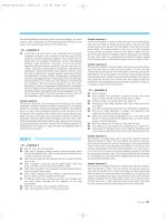
FIGURE 8.25
A COMPARISON OF SEVEN WORLD STOCK MARKETS FROM 1977 THROUGH 1989. IT CAN BE
SEEN THAT BULL MARKETS EXIST ON A GLOBAL SCALE. WORLD STOCK MARKETS GENERALLY
TREND IN THE SAME DIRECTION. IT'S A GOOD IDEA TO FACTOR OVERSEAS STOCK MAR-
KETS
INTO
TECHNICAL
ANALYSIS
OF
DOMESTIC
EQUITIES.
(CHART
COURTESY
OF
BUSINESS
CONDITIONS DIGEST.)
9
Stock Market Groups
It's often been said that the stock market is a "market of stocks." It could also be
said that the stock market is a "market of stock groups." Although it's true that most
individual stocks and most stock groups rise and fall with the general market, they
may not do so at the same speed or at exactly the same time. Some stock groups will
rise faster than others in a bull market, and some will fall faster than others in a bear
market. Some will tend to lead the general market at tops and bottoms and others
will tend to lag. In addition, not all of these groups react to economic news in exactly
the same way.
Many stocks groups are tied to specific commodity markets and tend to rise and
fall with that commodity. Two obvious examples that will be examined in this chap-
ter are the gold mining and energy stocks. Other examples would include copper,
aluminum, and silver mining shares. These commodity stocks tend to benefit when
commodity prices are rising and inflation pressures are building. On the other side
of the coin are interest-sensitive stocks that are hurt when inflation and interest rates
are rising. Bank stocks are an example of a group of stocks that benefit from declin-
ing interest rates and that are hurt when interest rates are rising. In this chapter,
the focus will be on savings and loan stocks and money center banks. Other exam-
ples include regional banks, financial services, insurance, real estate, and securities
brokerage stocks.
The stock market will be divided into those stocks that benefit from rising infla-
tion and rising interest rates and those that are hurt by such a scenario. The working
premise is relatively simple. In a climate of rising commodity prices and rising in-
terest rates, inflation stocks (such as precious metals, energy, copper, food, and steel)
should do better than financially-oriented stocks such as banks, life insurance com-
panies, and utilities. In a climate of falling inflation and falling interest rates, the
better plays would be in the financial (interest-sensitive) stock groups.
STOCK GROUPS AND RELATED COMMODITIES
This discussion of the intermarket group analysis touches on two important areas.
First, I'll show how stock groups are affected by their related commodity markets,
and vice versa. Sometimes the stock group in question will lead the commodity
market, and sometimes the commodity will lead the stock group. A thorough techni-
cal analysis of either market should include a study of the other. Gold mining shares
14<»
149
150 STOCK MARKET GROUPS
usually lead the price of gold. Gold traders, therefore, should keep an eye on what
gold raining shares are doing for early warnings as to the direction the gold market
might be taking. Stock traders who are considering the purchase or sale of gold mining
shares should also monitor the price of gold.
The second message is that intermarket analysis of stock groups yields important'
clues as to where stock investors might want to be focusing their attention and cap-
ital. If inflation pressures are building (commodity prices are rising relative to bond
prices), emphasis should be placed on inflation stocks. If bond prices are strength-
ening relative to commodity prices (a climate of falling interest rates and declining
inflation), emphasis should be placed on interest-sensitive stocks.
THE CRB INDEX VERSUS BONDS
In Chapter 3, the commodity/bond relationship was identified as the most important
in intermarket analysis. The fulcrum effect of that relationship tells which way infla-
tion and interest rates are trending. One way to study this relationship of commodities
to bonds is to plot a relative strength ratio of the Commodity Research Bureau Price
Index over Treasury bond prices. If the CRB Index is rising relative to bond prices,
this means inflation pressures are building and higher interest rates will be the likely
result, providing a negative climate for the stock market. If the CRB/bond relation-
ship is weakening, this would suggest declining inflation and falling interest rates, a
climate beneficial to stock prices.
Now this same idea will be used in the group analysis. However, this time that
relationship will help determine whether to commit funds to inflation or interest-
sensitive stocks. There's another bonus involved in this type of analysis and that is
the tendency for interest-sensitive stocks to lead other stocks.
In Chapter 4, the ability of bonds to lead the stock market was discussed at some
length. Rising bond prices are positive for stocks, whereas falling bonds are usually
negative. Interest-sensitive stocks are closely linked to bonds. Interest-sensitive stocks
are often more closely tied to the bond market than to the stock market. As a result,
(urns in interest-sensitive stocks often precede turns in the market as a whole.
What tends to happen at market tops is that the bond market will start to drop.
The bearish influence of falling bond prices (and rising interest rates) pulls interest-
sensitive stocks downward. Eventually, the stock market will also begin to weaken.
This downturn in the stock averages will often be accompanied by an upturn in
certain tangible asset stock groups, such as energy and gold mining shares.
COLD
VERSUS
GOLD
MINING
SHARES
The intermarket analysis of stock groups will begin with the gold market. This is a
logical point to start because of the key role played by the gold market in intermarket
analysis. To briefly recap some points made earlier regarding the importance of gold,
the gold market usually trends in the opposite direction of the U.S. dollar; the gold
market is a leading indicator of the CRB Index; gold is viewed as a leading indicator
of inflation; gold is also viewed as a safe haven in times of political and financial
turmoil.
A dramatic example of the last point was shown in the fourth quarter of 1989
and the first month of 1990 as gold mining shares became the top performing stock
group at a time when the stock market was just beginning to experience serious
deterioration. There is a strong positive link between the trend of gold and that of
COLD
VERSUS
GOLD
MINING
SHARES
151
gold mining shares. A technical analysis of one without the other is unwise and
unnecessary. The accompanying charts show why.
One of the key premises of intermarket analysis is the need to look to related
markets for clues. Nowhere is that more evident than in the relationship between the
price of gold itself and gold mining shares. As a rule, they both trend in the same di-
rection. When they begin to diverge from one another, an early warning is being given
that the trend may be changing. Usually one will lead the other at important turning
points. Knowing what is happening in the leader provides valuable information for
the laggard. Many people assume that commodity prices, being the more sensitive
and the more volatile of the two, lead the related stock group. It may be surprising
to learn, then, that gold mining shares usually lead the price of gold. However, that's
not always the case. In 1980, gold peaked eight months before gold shares. In 1986,
gold led again.
Figure 9.1 compares the price of gold futures (upper chart) with an index of gold
mining shares (source: Standard and Poors). The period covered in the chart is from
FIGURE 9.1
A
COMPARISON
OF
GOLD
AND
GOLD
MINING
SHARES
FROM
1985
INTO
EARLY
1990.
BOTH
MEASURES
USUALLY
TREND
IN THE
SAME
DIRECTION.
GOLD
LED
GOLD
SHARES
HIGHER
IN
1986.
HOWEVER,
GOLD
SHARES
TURNED
DOWN
FIRST
IN THE
FALL
OF
1987
AND
TURNED
UP FIRST IN THE FALL OF 1989.
Gold
S&P Cold Mining Share Index
152 STOCK MARKET GROUPS
the middle of 1985 into January of 1990. There are three points of particular interest
on the chart. Going into the summer of 1986, gold was going through a basing process
(after hitting a low in the spring of 1985). Gold shares, however, where drifting to
new lows. In July of 1986, gold prices turned sharply higher (influenced by a rising
oil market and bottom in the CRB Index). That bullish breakout in gold marked the
beginning of a bull market in gold mining shares. In this case, the price of gold clearly
led the gold mining shares.
From the summer of 1986 to the end of 1987, the price of gold appreciated about
40 percent, while gold stocks rose over 200 percent. This outstanding performance
gave gold stocks the top ranking of all stock groups in 1987. However, gold stocks
took a beating in October 1987 and became one of the worst performing stock groups
through the following year. Late in 1987, a bearish divergence developed between the
price of bullion and gold stocks and, in this instance, gold stocks led the price of
gold. From the October peak, the S&P gold index lost about 46 percent of its value.
The price of gold, however, after an initial selloff in late October, firmed again and
actually challenged contract highs in December.
While gold was threatening to move into new highs, gold stocks barely managed
a 50 percent recovery. This glaring divergence between gold and gold stocks was a
clear warning that odds were against the gold rally continuing. Gold started to drop
sharply in mid-December, and gold stocks dropped to new bear market lows. Back
in 1986, gold led gold stocks higher. At the 1987 top, gold stocks led gold lower. It
becomes increasingly clear that an analysis of either market is incomplete without a
corresponding analysis of the other.
As 1989 unfolded, it was becoming evident that an important bullish divergence
was developing between gold and gold shares. As gold continued to trend lower,
geld shares appeared to be forming an important basing pattern. During September
1989, the gold index broke through overhead resistance, correctly signaling that a new
uptrend had begun in gold mining shares. Shortly thereafter, gold broke a two-year
down trendline and started an uptrend of its own.
Figure 9.2 is an overlay chart of gold and gold shares over the same five years;
it shows gold shares leading gold at the 1987 top and the 1989 bottom. Figure 9.3
provides a closer view of the 1989 bottom and shows that, although the gold market
was forming the second trough of a "double bottom" during October, gold mining
shares were already rallying strongly (the last trough in the gold mining shares was hit
in June 1989, four months earlier). It's worth noting, however, that the real bull move
in gold mining shares didn't shift into high gear until gold completed its "double
bottom" at the end of October. Something else happened in October of 1989 that
helped catapult the rally in gold and gold mining shares: That was a sharp selloff in
the stock market.
As so often happens, events in one sector impact on another. On Friday, October
13, 1989, the Dow Jones Industrial Average dropped almost 200 points. In the ensuing
weeks, some frightened money flowing out of stocks found its way into the bond
market in a "flight to quality." A large portion of that money, however, found its
way into gold and gold mining shares. Gold-oriented mutual funds also experienced
a large inflow of capital. Figure 9.4 shows the S&P gold mining share index (upper
chart) and a ratio of the gold mining index divided by the S&P 500 stock index (lower
chart).
Figure 9.4 shows that, on a relative strength basis, gold shares actually began to
outperform the S&P 500 index in June of 1989 after underperforming stocks during
the preceding year. However, it wasn't until the end of October and early November
GOLD
VERSUS
GOLD
MINING
SHARES
153
FIGURE 9.2
ANOTHER COMPARISON OF GOLD AND THE S&P GOLD MINING INDEX FROM 1985 TO
JANUARY OF 1990. AT THE 1987 PEAK, GOLD SHARES SHOW A MAJOR BEARISH DIVERGENCE
WITH
GOLD.
IN
LATE
1989,
COLD
SHARES
TURNED
UP
BEFORE
GOLD.
Cold versus Cold Mining Shares
that an important down trendline in the ratio was broken and gold stocks really began
to shine. From the fall of 1989 through January of 1990, gold stocks outperformed all
other stock market sectors. Gold mutual funds became the big winners of 1989. Gold
had once again proven its role as a safe haven in times of financial turmoil. Figure
9.5 shows the bullish breakout in the gold shares coinciding with the October 1989
peak in the stock market.
Another intermarket factor that helped launch the bull move in gold was a sharp
selloff in the dollar immediately following the mini-crash of October 1989. The week
after the October stock market selloff, the U.S. dollar gapped downward and soon
began a downtrend (Figure 9.6). Stock market weakness forced the Federal Reserve to
lower interest rates in an effort to stem the stock market decline. Lower interest rates
(and expectations of more Fed easing to come) caused the flight of funds into T-bills
and T-bonds and pushed the dollar into a deep slide (lower interest rates are bearish
for the dollar). This slide in the dollar, in turn, helped fuel the strong rally in gold
and gold mining stocks.
154 STOCK MARKET GROUPS
FIGURE 9.3
A CLOSER LOOK AT COLD VERSUS GOLD STOCKS FROM 1987 THROUGH THE END OF 1989.
GOLD SHARES SHOWED A MAJOR BULLISH DIVERGENCE WITH GOLD IN 1989 AND COR-
RECTLY ANTICIPATED THE BULLISH BREAKOUT IN GOLD FUTURES IN THE AUTUMN.
Cold versus Cold Stocks
GOLD
VERSUS
GOLD
MINING
SHARES
155
FIGURE 9.4
THE UPPER CHART SHOWS THE BASING ACTIVITY AND BULLISH BREAKOUT IN THE S&P
GOLD MINING INDEX. THE BOTTOM CHART IS A RATIO OF GOLD STOCKS DIVIDED BY
THE S&P 500 STOCK INDEX AND SHOWS GOLD OUTPERFORMING THE MARKET FROM THE
SUMMER
OF
1989.
COLD
SHARES
REALLY
BEGAN
TO
GLITTER
IN
NOVEMBER.
S&P Cold Mining Index
156 STOCK MARKET GROUPS
FIGURE 9.5
GOLD SHARES VERSUS THE S&P 5OO STOCK INDEX. THE STOCK MARKET PEAK IN OCTOBER
1989
HAD A LOT TO DO
WITH
THE
FLIGHT
OF
FUNDS
INTO
GOLD
MINING
SHARES.
GOLD
AND
GOLD
MINING
SHARES
ARE A
HAVEN
IN
TIMES
OF
FINANCIAL
TURMOIL.
S&P 500 Index versus Gold
GOLD
VERSUS
GOLD
MINING
SHARES
157
FIGURE 9.6
A GLANCE AT ALL FOUR SECTORS IN THE FALL OF 1989. AFTER THE MINI-COLLAPSE IN THE
DOW INDUSTRIALS (UPPER RIGHT) ON OCTOBER 13,1989, T-BILLS (LOWER RIGHT) RALLIED
IN A FLIGHT TO QUALITY AND FED EASING. LOWER INTEREST RATES CONTRIBUTED TO A
SHARP
DROP
IN THE
DOLLAR (UPPER LEFT),
WHICH
FUELED
THE
STRONG
RALLY
IN
GOLD
(LOWER LEFT). _____
U.S. Dollar Index Dow Industrials
Gold
Treasury Bills
158 STOCK MARKET GROUPS
WHY GOLD STOCKS OUTSHINE GOLD
During 1987 gold rose only 40 percent while gold shares gained 200 percent. From
the fall of 1989 to January 1990, gold shares rose 50 percent while gold gained only
about 16 percent. The explanation lies in the fact that gold shares offer leverage
arising from the fact that mining profits rise more sharply than the price of the gold
itself. If it costs a company $200 an ounce to mine gold and gold is trading at $350,
the company will reap a profit of $150. If gold rises to $400, it will appreciate in
value by only 15 percent ($50/$350), whereas the company's profits will appreciate
by 33 percent ($50/$150). Figure 9.7 shows some gold mining shares benefiting from
the leveraged affect of rising gold prices.
OIL VERSUS OIL STOCKS
Another group that turned in a strong performance as 1989 ended was the energy
sector. Oil prices rose strongly in the fourth quarter and contributed to the rising
FIGURE 9.7
GOLD
VERSUS
THREE
GOLD
MINING
STOCKS.
GOLD
STOCKS
APPEAR
TO BE
LEADING
THE
PRICE OF COLD HIGHER AS 1990 IS BEGINNING.
Gold Futures Homestake Mining
OIL VERSUS OIL STOCKS 159
prices of oil shares. Rising oil prices help domestic and international oil companies
as well as other energy-related stocks like oilfield equipment and service stocks, and
oil drilling stocks. The discussion here will be limited to the impact of crude oil
futures prices on the international oil companies. The basic premise is the same;
Namely, that there is a strong relationship between the price of oil and oil shares. To
do a complete technical analysis of one, it is necessary to do a technical analysis of
the other.
Figures 9.8 and 9.9 compare the price of crude oil to an index of international
oil company shares (source: Standard and Poors) from 1985 to the beginning of 1990.
While oil shares have been much stronger than the price of oil during those five
years, the charts clearly show that turning points in the price of crude have had an
important impact on the price of oil shares. The arrows in Figure 9.8 pinpoint where
major turning points in the price of oil coincide with similar turning points in oil
shares. Important bottoms in oil shares in 1986, late 1987, late 1988, and late 1989
coincide with rallies in crude oil. Peaks in oil shares in 1987 and early 1988 coincide
with peaks in oil prices.
FIGURE 9.8
A COMPARISON OF CRUDE OIL FUTURES AND THE S&P INTERNATIONAL OIL INDEX FROM
1985
INTO
EARLY
1990.
ALTHOUGH
OIL
SHARES
HAVE
OUTPERFORMED
THE
PRICE
OF
OIL,
TURNING POINTS IN OIL FUTURES HAVE HAD A STRONG INFLUENCE OVER SIMILAR TURN-
ING POINTS IN OIL SHARES.
Crude Oil
Newmont Gold
Placer Dome
160 STOCK MARKET GROUPS
FIGURE 9.9
ANOTHER LOOK AT CRUDE OIL FUTURES VERSUS INTERNATIONAL OIL STOCKS. A STRONG
POSITIVE CORRELATION
CAN BE
SEEN
BETWEEN
BOTH INDEXES. IT'S
A
GOOD
IDEA
TO
WATCH BOTH.
Crude Oil versus International Oil Stocks
Figure 9.8 also shows oil prices challenging major overhead resistance near
$23.00 as 1990 begins. The inability of oil to clear that important barrier is causing
profit-taking in oil shares. Figure 9.9 uses an overlay chart to compare both markets
over the same five years. The strong positive correlation is clearly visible.
Figure 9.10 provides a closer look at oil and oil shares in 1988 and 1989. While
the two charts are not identical, it can be seen that turning points in the price of oil
had an impact on oil shares. The breaking of down trendlines by crude oil at the end
of 1988 and again in the fall of 1989 helped launch strong rallies in oil shares. Figure
9.11 provides an even closer look at the second half of 1989 and January of 1990.
In this case, oil shares showed a leading tendency. In November of 1989, oil shares
resolved a "symmetrical triangle" on the upside. This bullish signal by oil shares
led a similar bullish breakout by crude oil a couple of weeks later. A "double top"
appeared in oil shares as oil was spiking up to new highs in late December of that
year. This "double top" warned that a top in crude oil prices might be at hand.
ANOTHER DIMENSION IN DIVERGENCE ANALYSIS 161
FIGURE 9.10
A COMPARISON OF OIL AND INTERNATIONAL OIL SHARES IN 1988 AND 1989. UPSIDE BREAK-
OUTS
IN OIL
PRICES
COINCIDED
WITH
RALLIES
IN OIL
SHARES.
Crude Oil
As January of 1990 ended, both oil and oil shares are again trying to rally to-
gether. Figure 9.12 compares oil prices to individual oil companies—Texaco, Exxon,
and Mobil. The "double top" referred to earlier can be seen in the Exxon and Mo-
bil charts. The late December top in Texaco occurred at about the same time as
that in crude oil. As January is ending, crude oil is rallying for a challenge of con-
tract highs. All three oil companies appear to be benefiting from the rally in oil fu-
tures, but are clearly lagging well behind oil as the commodity is retesting overhead
resistance.
ANOTHER DIMENSION IN DIVERGENCE ANALYSIS
What these charts show is that a technical analysis of the price of crude oil can
shed light on prospects for oil-related stocks. At the same time, analysis of oil shares
often aids in analysis of oil itself. The principles of confirmation and divergence
are carried to another dimension when the analysis of stock groups such as oil and
gold are compared to analysis of their related commodities. The analyst is never sure
S&POil Croup Index
162 STOCK MARKET GROUPS
FIGURE 9.11
IN NOVEMBER 1989, A BULLISH BREAKOUT IN OIL SHARES PRECEDED A SIMILAR BREAKOUT
BY OIL PRICES A COUPLE OF WEEKS LATER. AS OIL SPIKED UPWARD IN DECEMBER 1989, OIL
STOCKS FORMED A "DOUBLE TOP," WARNING OF A POSSIBLE PEAK IN OIL.
Crude Oil Futures
ANOTHER DIMENSION IN DIVERGENCE ANALYSIS 163
FIGURE 9.12
CRUDE OIL FUTURES VERSUS THREE INTERNATIONAL OIL COMPANIES IN THE FOURTH
QUARTER OF 1989 AND EARLY 1990. TEXACO APPEARS TO BE TRACKING OIL VERY CLOSELY.
EXXON AND MOBIL TURNED DOWN BEFORE OIL BUT ARE BENEFITTING FROM THE BOUNCE
IN OIL FUTURES.
Crude Oil Futures Exxon
Oil Shares (S&P International)
Texaco
Mobil
164 STOCK MARKET GROUPS
FIGURE 9.13
THE UPPER CHART COMPARES INTERNATIONAL OIL SHARES TO THE S&P 500 STOCK INDEX
FROM JANUARY 1989 TO JANUARY 1990. THE BOTTOM CHART IS A RELATIVE STRENGTH
RATIO OF OIL SHARES DIVIDED BY THE S&P 500 INDEX. THE S&P OIL INDEX OUTPERFORMED
THE MARKET FROM SEPTEMBER 1989 TO JANUARY 1990.
which one will lead, or which one will provide the vital clue. The only way to know
is to follow both.
Figure 9.13 compares international oil shares to the broad market during 1989.
The upper chart plots the S&P oil share index versus the S&P 500 stock index. The
bottom chart is a ratio of oil shares divided by stocks. As the bottom chart shows, oil
stocks outperformed the broad market by a wide margin during the fourth quarter of
1989 and the first month of 1990. Clearly, the place to be as the old year ended was in
oil stocks (along with precious metals). One place not to be was in interest-sensitive
stocks.
INTEREST-SENSITIVE STOCKS
On January 31, 1990, Investor's Daily ranked its 197 industry groups for the prior
six months. The six best-performing groups were all commodity related: Gold Min-
ing (1), Food—Sugar Refining (2), Silver Mining (3), Oil & Gas—Field Services (4),
Oil & Gas—Offshore Drilling (5), Oil & Gas—International Integrated (6). Four other
oil groups ranked in the top 20 on the basis of relative strength. In sharp contrast, bank
SAVINGS AND LOANS VERSUS BONDS 165
stocks and savings &• loan stocks were ranked at the lower end of the list. Money
center banks were ranked 193 out of a possible 197 for the last five months of 1989
and the first month of 1990. Savings & loan shares did a bit better but still came in
a relatively weak 147 out of 197 groups. Although most commodity stocks ranked in
the top 10 percent, most bank stocks ranked in the bottom 25 percent during those
six months.
That wasn't the case throughout all of 1989, however. Earlier that year, financial
stocks had been the better performers, whereas gold and oil shares languished. What
changed toward the end of 1989 was a pickup in inflation pressures and a swing
toward higher interest rates. To make matters worse, the dollar and stocks came under
heavy downward pressure in the autumn of 1989, fueling inflation fears and a flight
from financial stocks to gold and energy shares. The very same forces that helped
inflation stocks, rising inflation and rising interest rates, hurt interest-sensitive stocks
like savings and loans and money center banks. The sharp drop in interest-sensitive
stocks that began in October of 1989 also warned that the broader market might be
in some trouble.
SAVINGS AND LOANS VERSUS THE DOW
Figure 9.14 compares the S&P Savings and Loan Group Index to the Dow Jones In-
dustrial Average from 1985 through the beginning of 1990. The tendency of the S&L
group to lead the broad market at tops can be seen both in the second half of 1987
and the last quarter of 1989. The S&L Index formed a major "head and shoulders"
topping pattern throughout 1986 and 1987. As stocks were rallying to new highs in
the summer of 1987, the S&Ls were forming a "right shoulder" as part of a topping
pattern. That bearish divergence was a warning that the stock market rally might be
in danger. To the far right of Figure 9.14, the sharp breakdown in the S&Ls in the
last quarter of 1989 again warned of impending weakness in the broad market. Figure
9.15 gives a closer view of the 1989 peak. Even though the Dow Industrials rallied for
a challenge of the October peak in December 1989, S&Ls and other interest-sensitive
stocks continued to drop sharply, sending a bearish warning that the stock market
rally was suspect.
SAVINGS AND LOANS. VERSUS BONDS
Figure 9.16 compares the S&L group index to Treasury bonds. The arrows pinpoint
the turning points in the S&L group relative to bond prices. Notice that bond price
movements have an important influence on S&L share prices. During 1986 and 1987,
the S&L group was caught in between the upward pull of rising stock prices and
the downward pull of a falling bond market. By the time the S&Ls were forming
their "right shoulder" peak in the summer of 1987, bonds had already begun their
collapse. It seems clear that the more bearish bond market (and the accompanying
rise in interest rates) hit the interest-sensitive sector before it hit the general market.
The bond market therefore became a leading indicator for the interest-sensitive stocks
which, in turn, became a leading indicator for the stock market as a whole.
Figure 9.16 shows the bond market rally stalling in the fourth quarter of 1989 and
finally turning lower in an apparent "double top." The loss of upward momentum
in bonds and the subsequent rise in interest rates contributed to the sharp selloff in
financial stocks. In this case, however, the actual price slide appears to have begun
in the interest-sensitive stocks with bonds following.
Relative Ratio of Oil Shares Divided by the S&P 500
SAVINGS AND LOANS VERSUS BONDS 167
FIGURE 9.15
THE S&L STOCKS PEAKED IN OCTOBER 1989 ALONG WITH THE DOW. HOWEVER, THE DE-
CEMBER RALLY IN THE DOW WASN'T CONFIRMED BY THE S&L STOCKS. THIS NEGATIVE Dl-
VERGENCE WAS A BEARISH WARNING FOR THE BROAD MARKET.
The Dow versus the S&Ls
168 STOCK MARKET GROUPS
FIGURE 9.16
THE S&L STOCKS SHOW A STRONG CORRELATION WITH TREASURY BONDS. THE DOWN-
WARD PULL OF BONDS IN 1987 CONTRIBUTED TO THE TOPPING ACTION IN THE S&L IN-
DEX.
IN THE
FALL
OF
1989,
THE
RALLY
FAILURE
IN
BONDS
HAD A LOT TO DO
WITH
THE
SUBSEQUENT COLLAPSE IN THE S&Ls.
S&Ls versus Bonds
SAVINGS AND LOANS VERSUS THE CRB INDEX
If the bond market trends in the same direction as interest-sensitive stocks, the CRB
Index should move inversely to both. Figure 9.17 compares the S&Ls to the CRB Index.
A rising CRB should be bearish for S&Ls; a falling CRB Index should be bullish. And
this is what Figure 9.17 shows. Figure 9.17 reveals the CRB Index tracing out a "head
and shoulders" bottom in 1986 and 1987, whereas the S&Ls are tracing out a "head
and shoulders" top. However, the patterns are not synchronous. The "left shoulder" in
the S&Ls in 1986 coincides with the middle trough (the head) in the CRB Index. The
third trough (the "right shoulder") in the CRB Index in the spring of 1987 coincides
with the middle peak (the head) in the S&Ls. The "right shoulder" in the S&Ls in
August of 1987 occurs well after the CRB Index has completed its basing pattern and
is linked to the stock market peak that month. Still, it appears that a lot of the action
in the S&Ls can be attributed to weakness in bonds and strength in the CRB Index.
The S&Ls remained under pressure from the summer of 1987 to the summer
of 1988. During that same time, the CRB Index continued to rally. In the summer
of 1988, the CRB Index peaked out and began a yearlong descent. During that same
MONEY CENTER BANKS VERSUS THE NYSE COMPOSITE INDEX 169
FIGURE 9.17
THE S&L INDEX SHOWS A STRONG NEGATIVE CORRELATION WITH THE CRB INDEX FROM
1985
TO
1990.
THE
1987
TOP IN THE
S&Ls
MIRRORED
A
SIMILAR
BOTTOM
IN THE CRB
INDEX.
THE
MID-1988
PEAK
IN THE CRB
HELPED
LAUNCH
THE S&L
RALLY.
THE
PEAK
IN THE
S&Ls
IN
THE AUTUMN OF 1989 COINCIDED WITH THE BREAKING OF A DOWN TRENIHINE BY THE
CRB INDEX.
S&Ls versus CRB Index
year, the S&Ls rallied sharply. In the fall of 1989, it can be seen that the peak in
the S&L stocks occurred at about the same time that the CRB Index was breaking
its yearlong down trendline. Since the S&Ls are so closely tied to the bond market,
and the bond market moves inversely to the CRB Index, it shouldn't be surprising to
discover a strong inverse relationship between the S&Ls and the CRB Index.
MONEY CENTER BANKS VERSUS THE NYSE COMPOSITE INDEX
Another group that suffered from rising interest rates as the 1980s came to a close
was the Money Center banks. Figure 9.18 compares the S&P Money Center Group
Index with the New York Stock Exchange Composite Index through 1989 and the
beginning of 1990. Up until October 1989, Money Center banks had easily kept pace
with the stock market. Both peaked together in October of that year. However, as the
NYSE Index rallied into early January, the Money Center bank shares continued to
plummet. Part of the reason for that sharp selloff is the same as for the S&Ls and
other interest-sensitive stocks—falling bond prices (rising interest rates) and firming
Bonds
CRB Index
170 STOCK MARKET GROUPS
FIGURE 9.18
MONEY CENTER BANKS VERSUS THE NYSE COMPOSITE INDEX. INTEREST-SENSITIVE MONEY
CENTER BANKS ALSO DROPPED SHARPLY FROM OCTOBER 1989 INTO JANUARY OF 1990.
FINANCIAL STOCKS FELL UNDER THE WEIGHT OF RISING INTEREST RATES AND FALLING
BOND PRICES. THIS WEAKNESS HELPED PULL THE MARKET LOWER.
commodity prices (especially oil). The weakness in the Money Center stocks also
provided another warning to the stock market technician that the attempt by the
broad stock market averages to recover to new highs was not likely to succeed, at
least not until the interest-sensitive stocks started to stabilize.
GOLD STOCKS VERSUS MONEY CENTER STOCKS
Figure 9.19 shows a couple of other ways to monitor the relationship between inflation
and disinflation stocks. The upper chart compares the S&P Gold Group Index to the
S&P Money Center Group Index. Up to the fall of 1989, the Money Center banks were
outperforming gold stocks by a wide margin. From October of 1989 on, however,
that relationship changed abruptly and dramatically. As the Money Center banks
collapsed, gold stocks began to rally sharply. Part of the explanation for this dramatic
shift between commodity and interest-sensitive stocks is seen in the bottom chart
which plots the ratio between the CRB Index and bonds.
SUMMARY 171
FIGURE 9.19
THE UPPER CHART COMPARES GOLD STOCKS TO MONEY CENTER STOCKS AS 1989 ENDED.
SOME MONEY FLEEING FINANCIAL STOCKS WENT TO GOLD SHARES. THE BOTTOM CHART
IS A RATIO OF THE CRB INDEX DIVIDED BY TREASURY BONDS. THE BASING PATTERN IN THE
RATIO SINCE AUGUST OF 1989 AND THE SUBSEQUENT UPSIDE BREAKOUT CONFIRMED THE
SHIFT TOWARD STRONGER COMMODITIES AND WEAKER BONDS. THIS BENEFITTED INFLA-
TION STOCKS, SUCH AS GOLD AND OIL, AND HURT INTEREST-SENSITIVE STOCKS.
Inflation Versus Disinflation Stocks
As long as the CRB/bond ratio was falling earlier in the year, odds favored the interest-
sensitive stocks. The CRB/bond ratio bottomed in August of 1989 and continued to
stabilize through the fourth quarter. In December, the ratio broke out to the upside and
confirmed that a trend change had, in fact, taken place. The pendulum, which had
favored bond prices for a year, now showed commodity prices in the ascendancy. That
crucial shift explains the dramatic move away from interest-sensitive stocks toward
commodity stocks. And, in doing so, this shift also warned of the uptick in interest
rates which began to push stock prices lower.
SUMMARY
This chapter showed the relevance of intermarket comparisons between various fu-
tures markets and related stock groups. It discussed how many stock groups are tied to
specific commodity markets (such as oil, gold, silver, copper, aluminum, and sugar).
Since those commodities and their related stopk groups usually trend in the same di-
rection, their relative performance should be studied and compared. Interest-sensitive
172 STOCK MARKET GROUPS
FIGURE 9.20
LONDON
COPPER PRICES
VERSUS
PHELPS
DODGE,
THE
LARGEST
COPPER
PRODUCER
IN THE
UNITED
STATES.
THE
MAJOR
"DOUBLE
TOP"
IN
COPPER
IN THE
AUTUMN
OF
1989
AND ITS
SUBSEQUENT
COLLAPSE
COINCIDED WITH
A
SHARP
DROP
IN THE
PRICE
OF
PHELPS
DODGE.
THE ARROWS SHOW THAT RALLIES IN THE PRICE OF COPPER HAVE BEEN BENEFICIAL TO
PHELPS DODGE SHARE PRICES.
London Copper
stocks, such as savings and loans and money center banks, usually trend in the same
direction as the bond market and in the opposite direction of commodity markets. By
monitoring the CRB Index/bond ratio, the intermarket trader is able to tell whether
money should be placed in inflation (commodity) or disinflation (interest-sensitive)
stocks. Because of their close relationship to bonds, interest-sensitive stocks have a
tendency to lead the stock market at major tops and bottoms.
Not all commodity groups trend in the same direction. Copper and aluminum
shares weakened in the second half of 1989 as copper and aluminum prices fell (along
with most industrial prices) (see Figure 9.20). Copper weakness in late 1989 was also
tied to stock market weakness as fear of recession intensified. Chapter 13 will discuss
the role of copper as an economic forecaster and its relation to the stock market. That
chapter will also discuss in more depth the relative performance of commodity and
interest-sensitive stocks at major cyclical turning points.
Another interest-sensitive group mentioned briefly in this chapter is the utilities.
In Chapter 10, we'll examine how intermarket analysis affects the Dow Jones Utility
Average and the usefulness of the Dow Utilities as a leading indicator of the Dow
Jones Industrial Average.
10
The Dow Utilities as a
Leading Indicator of Stocks
Dow Theory is based on the comparison of two Dow Jones averages—the Dow Jones
Transportation Average and the Dow Jones Industrial Average. One of the basic tenets
of Dow Theory is that these two averages should trend in the same direction. In other
words, they should confirm each other's trend. Many analysts pay less attention to
the third average published in the daily pages of the Wall Street Journal—the Dow
Jones Utility Average. Yet, the Dow Utilities have a respectable record of anticipating
turns in the Dow Industrials.
This leading tendency of utility stocks is based on their relatively close ties
to the bond market, which also is a leading indicator of stocks. The Dow Utilities
provide another link in the intermarket chain between the bond market and the
stock market. Because they are so interest-sensitive, utilities usually reflect interest
rate changes (as reflected in the bond market) before those changes are reflected in
the broader market of stocks. Since they are impacted by the direction of interest
rates and inflation, utilities are also affected by such things as the trend of the
dollar and commodity prices. For these reasons, the Dow Utilities are a part of the
intermarket picture.
DOW UTILITIES VERSUS THE DOW INDUSTRIALS
Before looking at a comparison of the Dow Utilities relative to the Dow Industrials
in more recent times, let's consider their relationship over a longer time span. Since
1970, five major turns in the Dow Industrials were preceded by a turn in the Dow
Utilities.
1. The November 1972 peak in the utilities preceded a similar peak in the Dow
Industrials two months later in January of 1973. Both averages dropped into the
second half of 1974.
2. In September 1974, a bottom in the utilities preceded a bottom in the industrials
three months later in December. Both averages rallied for two years.
173
Phelps Dodge
174
THE DOW UTILITIES AS A LEADING INDICATOR OF STOCKS
3. The utilities hit another peak in January of 1981, preceding a top in the
industrials three months later in April. Both averages declined together into 1982.
4. The utilities bottomed in July of 1982, preceding a major bottom in the industrials
one month later in August. Both averages rallied together until 1987.
5. In January of 1987, the utilities hit a major top, leading the peak in the industrials
seven months later in August 1987.
During these two decades, the Dow Utilities failed to lead a major turn in the Dow
Industrials only three times. In March of 1980, both averages bottomed together In
1970 the industrials bottomed one month before the utilities. In 1977 the industrials
peaked about six months before the utilities. Of the eight major turns since 1970
the utilities led the industrials five times, turned at the same time once and lagged
only twice. The leading tendency of the Dow Utilities at market tops is especially
impressive. *
Research provided by John G. McGinley, Jr. (Technical Trends, P.O Box 792
Wilton, CT 06897) shows that the Dow Utilities have led the Dow Industrials at every
peak since 1960 with only one exception-the 1977 peak. During those 30 years the
Dow Utilities peaked ahead of the Dow Industrials by an average of three months
although the actual lead time varied from ten months to one month Part of the
explanation as to why the utility stocks lead the industrial stocks can be found in
the relatively close correlation between the utility stocks and the bond market which
will be discussed later. Consider now the more recent record of how the utilities have
performed relative to the broad market.
Figures 10.1 and 10.2 compare the relative performance of the Dow Jones Utility
Average (upper chart) and the Dow Jones Industrial Average (lower chart) since 1983
As the various charts are examined, a long view will be given. Then a closer view
of the more recent action will be given and some other intermarket comparisons will
be incorporated to include bonds and commodities. Figure 10.1 shows both averages
generally rising and falling together. As long as the two averages are moving in the
same direction, they are merely confirming each other's trends. It's when one of them
begins to diverge from the other that we begin to take notice. Figure 10 2 provides a
closer view of the 1987 top.
The Dow Utilities hit its peak in January of 1987 and started to weaken. (It will be
demonstrated later that part of the reason for this weakness in the utilities was tied to
similar weakness in the bond market.) The selloff in the Dow Utilities set up a major
negative divergence with the Dow Industrials which continued to rally for another
seven months. As the industrials were hitting their peak in August, the utilities were
just forming a "right shoulder" in a "head and shoulders" topping pattern (in the
previous chapter, we discussed a similar topping pattern in the interest-sensitive
savings and loan stocks). Although the lead time in 1987 was a relatively long seven
months, the peak in the Dow Utilities provided plenty of warning that the rally in
stocks was approaching a dangerous stage and warned stock market technicians to be
especially alert to any technical signs of a breakdown in the stock averages.
Both averages rallied together into the second half of 1989. As 1989 ended how-
ever, another divergence developed, except this time, the Dow Utilities rallied to
new highs while the Dow Industrials failed to do so. (Both averages were in the
process of re-challenging their all-time highs that were set in 1987). Given their nor-
mal historical relationship, the rally to new highs in the utilities could be viewed
as a positive development. Many technicians took the view that the outlook for the
DOW UTILITIES VERSUS THE DOW INDUSTRIALS 175
FIGURE 10.1
A COMPARISON OF THE DOW JONES UTILITY AVERAGE AND THE DOW JONES INDUSTRIAL
AVERAGE FROM 1983 THROUGH 1989. GENERALLY, BOTH AVERAGES TREND IN THE SAME
DIRECTION. TREND CHANGES ARE USUALLY SIGNALED WHEN THEY DIVERGE. IN 1987, THE
DOW UTILITIES PEAKED SEVEN MONTHS BEFORE THE DOW INDUSTRIALS.
Dow Jones Utility Average
industrials would remain healthy as long as the utilities remained strong. Figure 10.3
gives a closer view of market events at the end of 1989.
Figure 10.3 compares the Dow Utilities to the Dow Industrials during the
fourth quarter of 1989 and the first two months of 1990. Both averages sold off
in mid-October and then rallied together into the beginning of January. Although
the two charts are closely related, the utilities did manage to rally to new highs
while the industrials were unable to clear their October peak. On a short-term basis,
however, the last rally attempt by the industrials was not confirmed by the utilities.
The utilities completed a "double top" and broke down during the first week of 1990.
The industrials broke down a week later.
Toward the end of January, the utilities also started to stabilize a few days before
the industrials. In both instances, the utilities led the industrials by a few days to a
week. The ability of the utilities to stabilize above their October lows was significant.
A violation of those lows by the Dow Utilities would have been viewed by technicians
as a particularly bearish development for the stock market as a whole.
Dow Jones Industrial Average
176 THE DOW UTILITIES AS A LEADING INDICATOR OF STOCKS
FIGURE 10.2
IN AUGUST 1987, AS THE DOW INDUSTRIALS WERE HITTING THEIR MAJOR PEAK, THE
UTILITIES
(WHICH
PEAKED
IN
JANUARY)
WERE
FORMING
A
"RIGHT
SHOULDER"
IN A
TOPPING PATTERN, THEREBY CREATING A BEARISH DIVERGENCE. BOTH RALLIED TOGETHER
INTO
THE
SECOND HALF
OF
1989.
AS
1989 ENDED,
THE
UTILITY
RALLY
WASN'T
CONFIRMED
BY THE INDUSTRIALS.
Dow Utilities
DOW UTILITIES VERSUS THE DOW INDUSTRIALS 177
FIGURE 10.3
IN THE FIRST WEEK OF 1990, THE DOW UTILITIES COMPLETED A "DOUBLE TOP" FORMATION
AND BROKE AN UP TRENDLINE, PRECEDING A SIMILAR BREAKDOWN BY THE DOW
INDUSTRIALS A WEEK LATER. AS JANUARY 1990 ENDED, THE UTILITIES STABILIZED A FEW
DAYS EARLIER THAN THE INDUSTRIALS.
Dow Jones Utilities
Dow industrials
Dow Jones Industrials
178 THE DOW UTILITIES AS A LEADING INDICATOR OF STOCKS
BONDS LEAD UTILITIES AT TOP
As revealed in Figure 10.3, the Dow Utilities peaked in the new year about a week
ahead of the Dow Industrials. Expanding the focus, it is evident what intermarket
forces pulled the Dow Utilities lower. Figure 10.4 compares the Dow Utilities to
Treasury bond futures during the same time span. First of all, notice that the rally in
the utilities during the fourth quarter of 1989 was not confirmed by the bond market.
As the utilities rallied to new highs, the bond market stayed in a trading range. During
the final week of 1989, bonds broke down and hit a two-month low. This breakdown
in bonds preceded the breakdown in the utilities by a week. Toward the right side of
the chart, the utilities are stabilizing while the bonds are probing for a bottom. The
rally in the interest-sensitive utilities appears to be hinting that bonds are also due
for a rally.
Widen the intermarket circle now to include commodities. Figure 10.5 shows
that the breakdown in bonds during the final week in 1989 (which contributed to the
FIGURE 10.4
DURING
THE
LAST WEEK
IN
DECEMBER
OF
1989,
BOND
FUTURES
SET A
TWO-MONTH
LOW,
PRECEDING THE BREAKDOWN IN THE UTILITIES A WEEK LATER. BONDS USUALLY LEAD THE
DOW UTILITIES. AS JANUARY 1990 ENDED, THE RALLY IN THE UTILITIES PROVIDED SOME
STABILITY TO THE BOND MARKET.
Dow Jones Utilities
BONDS LEAD UTILITIES AT TOP 179
FIGURE 10.5
THE BREAKDOWN IN BOND FUTURES THE LAST WEEK OF 1989 COINCIDED WITH A BULLISH
BREAKOUT
IN THE
COMMODITY
RESEARCH
BUREAU
FUTURES
PRICE
INDEX
(LOWER
CHART).
THE
RALLY
IN THE CRB
INDEX
FROM
LATE
SUMMER
OF
1989 PREVENTED
THE
BOND
MARKET
FROM RESUMING ITS UPTREND.
March Treasury Bond Futures
selloff in the utilities a week later) coincided with an upside breakout in the CRB
Index. As the bottom chart shows, the rise in commodity prices (which usually trend
in the opposite direction of bonds) was a primary reason that bonds were unable
to set new highs during the fourth quarter. The bullish breakout in the CRB Index
during the last week of the year finally pushed bond prices into a slide.
Figure 10.6 shows the main culprit that caused the commodity rally and the bond
and utilities to tumble. Crude oil prices (sparked by a virtual explosion in heating
oil) rallied sharply during December 1989. Probably more than any other factor, the
ensuing rally in oil prices sent inflation jitters through the financial markets (and
around the world) and contributed to the selloff in bonds. This oil rally hit bonds in
another way. Japan imports all of its oil. The jump in oil during December (combined
with a weak yen) pushed Japan's inflation rate sharply higher and caused a collapse
in Japanese bond prices. As discussed in Chapter 8, downward pressure on global
bond markets also pulled U.S. bonds lower. To the far right of both charts in Figure
10.6, the oil market has started to weaken, which is relieving downward pressure on
bonds (and the Dow Utilities and, in turn, the Dow Industrials).
March Treasury Bond Futures
Commodity Research Bureau Index
180 THE DOW UTILITIES AS A LEADING INDICATOR OF STOCKS
FIGURE 10.6
THE BULLISH BREAKOUT IN CRUDE OIL FUTURES IN MID-DECEMBER 1989 WAS A MAJOR
FACTOR IN THE BREAKDOWN IN BONDS. THE OIL RALLY CAUSED GLOBAL BOND MARKETS
(ESPECIALLY IN JAPAN) TO TUMBLE, WHICH ALSO HELPED PULL U.S. BOND PRICES LOWER.
March Treasury Bond Futures
A LONGER VIEW OF UTILITIES AND BONDS
The previous discussion showed the ripple effect that usually occurs among the
financial sectors. As 1989 ended, commodities (oil in particular) started to rally;
bonds started to drop; a week later the interest-sensitive utilities followed bonds
lower; a week later the broader stock market followed bonds and the utilities lower.
The key to understanding the relationship between the Dow Utilities and the Dow
Industrials lies in the recognition of the close relationship between the utilities and
bonds. As a general rule, the bond market (which is especially inflation-sensitive)
turns first. Utilities, being especially interest-sensitive, turn in the same direction as
bonds before the general market does. The general market, as reflected in the Dow
Jones Industrial Average, usually is the last to turn.
Figures 10.7 and 10.8 compare the Dow Jones 20 Bond Average to the Dow Jones
Utility Average. It can be seen that bonds and utilities are closely correlated. Both
peaked during the first half of 1987 several months before stocks, which didn't top
until August. (Although the Dow Jones 20 Bond Average set new highs in early
1987, Treasury bonds failed to do so, thereby forming a negative divergence with
THE CRB INDEX VERSUS BONDS AND UTILITIES 181
FIGURE 10.7
THERE IS A STRONG VISUAL CORRELATION BETWEEN THE DOW JONES UTILITY AVERAGE
(SOLID LINE) AND THE DOW JONES 20 BOND AVERAGE (DOTTED LINE). BOTH TURNED
DOWN TOGETHER IN THE FIRST HALF OF 1987 AND THEN RALLIED TOGETHER INTO THE
SECOND HALF OF 1989. AS 1989 ENDED, BOTH WEAKENED.
Bonds versus Utilities
the utilities.) Both rallied together to the fourth quarter of 1989. At the 1989 top,
bonds formed a "double top" and failed to confirm the rally to new highs by the
utilities (see Figure 10.8).
THE CRB INDEX VERSUS BONDS AND UTILITIES
If the Dow Utilities trend in the same direction as bonds, they should trend in the
opposite direction of commodity prices. Figure 10.9 compares Treasury bonds and
utilities (upper chart) to the CRB Index (lower chart). The upper chart shows the
negative divergence between Treasury bonds and the Dow Utilities in early 1987 and
again in late 1989. The bearish action in bonds pulled the utilities lower. However,
the bearish action in both bonds and utilities is closely correlated with rallies in the
CRB Index. The final top in the Dow Utilities and the final peak in the bonds in early
1987 coincided with a trough in the CRB Index. The breakdown in the two financial
markets in the spring of 1987 coincided with an upside breakout in the CRB Index.
182 THE DOW UTILITIES AS A LEADING INDICATOR OF STOCKS
FIGURE 10.8
A CLOSER LOOK AT THE DOW UTILITIES (SOLID LINE) VERSUS THE DOW JONES 20 BOND
AVERAGE (DOTTED LINE) IN 1989. THE BOND MARKET FAILED TO ESTABLISH A NEW HIGH
DURING THE FOURTH QUARTER, FORMED A "DOUBLE TOP" FORMATION, AND CREATED A
BEARISH DIVERGENCE WITH THE DOW UTILITY AVERAGE.
Utilities versus Bonds
THE CRB INDEX VERSUS BONDS AND UTILITIES 183
FIGURE 10.9
WEAKNESS IN TREASURY BONDS AND UTILITIES IN EARLY 1987 AND LATE 1989 (UPPER
CHART) IS LINKED TO STRENGTH IN THE CRB INDEX (BOTTOM CHART). THE RALLY IN
TREASURY BONDS AND UTILITIES FROM MID-1988 IS LINKED TO THE PEAK IN THE CRB
INDEX. BOTH FINANCIAL AVERAGES TREND IN THE OPPOSITE DIRECTION OF THE CRB INDEX.
TREASURY BONDS FAILED TO CONFIRM THE RALLY TO NEW HIGHS BY THE UTILITIES AT BOTH
THE 1987 AND THE 1989 PEAKS.
Dow Utilities versus Bond Futures
184 THE DOW UTILITIES AS A LEADING INDICATOR OF STOCKS
The CRB peak in mid-1988 helped launch the rallies in bonds and utilities that
lasted for a year. Finally, the CRB bottom in the autumn of 1989 began the topping
process in bonds and utilities. We've established that utilities are positively linked to
bonds, and that bonds are negatively linked to commodities. It follows, then, that the
Dow Utilities are also negatively linked to commodities. Any significant rally in the
commodity markets will push interest rates higher and bond prices lower, which is
bearish for the utilities. Downtrending commodity markets will be bullish for bonds
and eventually for utilities as well.
BONDS, UTILITIES, AND THE DOW INDUSTRIALS
The final comparison links bonds, the Dow Utilities, and the Dow Industrials. Fig-
ure 10.10 shows all three markets over the last five years. The upper chart overlays
Treasury bonds and the Dow Jones Utility Average. The bottom chart plots the Dow
Jones Industrial Average. The chart shows that the utilities are closely linked to bonds,
FIGURE 10.10
BONDS AND UTILITIES (UPPER CHART) USUALLY LEAD THE STOCK MARKET (BOTTOM CHART)
AT IMPORTANT TURNING POINTS. IN THE FIRST HALF OF 1987, BONDS AND UTILITIES
TURNED
DOWN
AND
PROVIDED
A
WARNING
THAT
THE
STOCK MARKET
RALLY
HAD
REACHED A DANGEROUS STAGE.
Utilities versus Bond Futures
SUMMARY 185
and that both bonds and utilities usually lead turns in the broader market. The 1987
peaks provide an excellent example of that interplay. The Dow Jones Utility Average
has become a part of the intermarket analysis and takes its place in the analysis of
the U.S. dollar, commodity prices, bonds, and stocks. Its proper place lies between
bonds and the industrial stock' market averages. Utilities provide another vehicle for
determining the impact inflation and interest rate trends are having on the stock
market as a whole. Analysis of the utilities also provides another way to measure
interest-sensitive stock groups, a topic discussed in Chapter 9.
SUMMARY
The Dow Jones Utility Average (which includes 15 utility stocks) is the most
widely-watched utility index. Because utility stocks are so interest rate-sensitive, they
usually are impacted by interest rate changes before the general market. As a result,
utilities usually follow the lead of bond prices and, in turn, usually lead the Dow
Industrials at important turns. With one exception, (1977), the Dow Utilities have
peaked ahead of the Dow Industrials every time since 1960 with an average lead
time of three months. The Dow Utilities have more of an impact on the industrials
during times when stocks are especially sensitive to interest rates. The reasons the
utilities are so interest-sensitive are because of their heavy borrowing needs and
their relatively high dividends (which compete directly with yields in money market
funds and certificates of deposit). The defensive qualities of utilities make them
especially attractive during economic downturns and also explain their relatively
strong performance at stock market bottoms.
Although most of the 15 stocks are electric utilities (which are more inter-
est-sensitive), some gas companies are included, which can be influenced by changes
in natural gas prices. At market peaks, in particular, natural gas companies have a
tendency to lag behind the electric utility stocks. The explosion in energy prices
toward the end of 1989, and the relatively strong performance of gas companies
during that fourth quarter, may partially explain why the Dow Utility Average set
new highs as 1989 ended.
Because of their strong link to bonds and their tendency to lead the stock
market, the utility stocks fit into the growing intermarket arsenal. The stock market is
influenced by the utility stocks, which are influenced by the bond market and interest
rates. Bonds and interest rates are influenced by commodity trends which, in turn,
are affected by the trend of the U.S. dollar. Given their impressive record as a leading
indicator of the Dow Industrials, I suspect that if Charles Dow were alive today, he'd
make the Dow Utilities an integral part of his Dow Theory.
Dow Jones Industrial Average