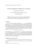
The graph below gives information on wages of Somecountry over a ten ppt
Bạn đang xem bản rút gọn của tài liệu. Xem và tải ngay bản đầy đủ của tài liệu tại đây (92.22 KB, 1 trang )
The graph below gives information on wages of Somecountry over a ten-year
period. Write a report for a university tutor describing the information shown.
You should write at least 150 words.
The linegraph describes the growth of wages in Somecountry from year 1993 to year
2003.
The growth starts at two percent in 1993, but it doesn�t stay there very long before it
rapidly doubles in 1994. Further on, the percentages decline to three percent in 1995,
stays steady for year, before it start to rise slowly and ends up just under four percent in
1997. 1998 is the best year where the wages peaked at six percent.
However, after 1998 the wages declines nearly every year. Only a year later , the
percentage drops to well under three percent, stays there on roughly three percent till
2000. In 2002 the wages reach the lowest point of just one percent growth. Luckily the
growth rises in 2003 at just under two percent.
Overall, the growth rate in wages in some countries has shown striking changes through
the ten years.
This is a good report. It covers the task, divided correctly into paragraphs and the
vocabulary is just right. Problems: it has less than 150 words (146) and there are some
grammatical errors. Assuming the corrections were made, looks like Band 7.