Apress pro Silverlight 3 in C# phần 2 doc
Bạn đang xem bản rút gọn của tài liệu. Xem và tải ngay bản đầy đủ của tài liệu tại đây (1.81 MB, 78 trang )
CHAPTER 1 ■ INTRODUCING SILVERLIGHT
26
<img src="
alt="Get Microsoft Silverlight" style="border-style:none"/>
</a>
</object>
<iframe id="_sl_historyFrame"
style="visibility:hidden;height:0px;width:0px;border:0px"></iframe>
</div>
</body>
</html>
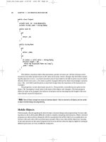
The key detail is the <div> element that represents the Silverlight content region. It
contains an <object> element that loads the Silverlight plug-in. The <object> element includes
four key attributes. You won’t change the data and type attributes–they indicate that the
<object> element represents a Silverlight content region using version 2 or later. However, you
may want to modify the height and width attributes, which determine the dimensions of the
Silverlight content region, as described next.
■ Note Be cautious about changing seemingly trivial details in the HTML test page. Some minor quirks are
required to ensure compatibility with certain browsers. For example, the comma at the end of the data attribute in
the <object> element ensures Firefox support. The invisible <iframe> at the bottom of the Silverlight <div> allows
navigation to work with Safari. As a general guideline, the only test page content you should change are the
width and height settings, the list of parameters, and the alternate content.
CHANGING THE TEST PAGE
If you’re using an ASP.NET website, the test page is generated once, when the ASP.NET website
is first created. As a result, you can modify the HTML page without worrying that your changes
will be overwritten.
If you’re using a stand-alone project without an ASP.NET website, Visual Studio generates
the test page each time you run the project. As a result, any changes you make to it will be
discarded. If you want to customize the test page, the easiest solution is to create a new test
page for your project. Here’s how:
1. Run your project at least once to create the test page.
2. Click the Show All Files icon at the top of the Solution Explorer.
3. Expand the Bin\Debug folder in the Solution Explorer.
4. Find the TestPage.html file, right-click it, and choose Copy. Then right-click the Bin\Debug
folder and choose Paste. This duplicate will be your custom test page. Right-click the new
file and choose Rename to give it a better name.
CHAPTER 1 ■ INTRODUCING SILVERLIGHT
27
5. To make the custom test page a part of your project, right-click it and choose Include in
Project.
6. To tell Visual Studio to navigate to your test page when you run the project, right-click your
test page, and choose Set As Start Page.
Sizing the Silverlight Content Region
By default, the Silverlight content region is given a width and height of 100 percent, so the
Silverlight content can consume all the available space in the browser window. You can
constrain the size of Silverlight content region by hard-coding pixel sizes for the height and
width (which is limiting and usually avoided). Or, you can place the <div> element that holds
the Silverlight content region in a more restrictive place on the page–for example, in a cell in a
table, in another fixed-sized element, or between other <div> elements in a multicolumn
layout.
Even though the default test page sizes the Silverlight content region to fit the available
space in the browser window, your XAML pages may include hard-coded dimensions. You set
these by adding the Height and Width attributes to the root UserControl element and specifying
a size in pixels. If the browser window is larger than the hard-coded page size, the extra space
won’t be used. If the browser window is smaller than the hard-coded page size, part of the page
may fall outside the visible area of the window.
Hard-coded sizes make sense when you have a graphically rich layout with absolute
positioning and little flexibility. If you don’t, you might prefer to remove the Width and Height
attributes from the <UserControl> start tag. That way, the page will be sized to match the
Silverlight content region, which in turn is sized to fit the browser window, and your Silverlight
content will always fit itself into the currently available space.
To get a better understanding of the actual dimensions of the Silverlight content
region, you can add a border around it by adding a simple style rule to the <div>, like this:
<div id="silverlightControlHost" style="border: 1px red solid">
You’ll create resizable and scalable Silverlight pages in Chapter 3, when you explore
layout in more detail.
Silverlight Parameters
The <object> element contains a series of <param> elements that specify additional options to
the Silverlight plug-in.
Table 1-1 lists some of basic the parameters that you can use. You’ll learn about many
other specialized parameters in examples throughout this book, as you delve into features like
HTML access, splash screens, transparency, and animation.
Table 1-1. Basic Parameters for the Silverlight Plug-In
Name Value
source A URI that points to the XAP file for your Silverlight
application. This parameter is required.
CHAPTER 1 ■ INTRODUCING SILVERLIGHT
28
Name Value
onError A JavaScript event handler that’s triggered when a
unhandled error occurs in the Silverlight plug-in or in
your code. The onError event handler is also called if
the user has Silverlight installed but doesn’t meet the
minRuntimeVersion parameter.
background The color that’s used to paint the background of the
Silverlight content region, behind any content that
you display (but in front of any HTML content that
occupies the same space). If you set the Background
property of a page, it’s painted over this background.
minRuntimeVersion This is the minimum version of Silverlight that the
client must have in order to run your application. If
you need the features of Silverlight 3, set this to
3.0.40624.0 (as slightly earlier versions may
correspond to beta builds). If Silverlight 2 is sufficient,
use 2.0.31005.0.
autoUpgrade A Boolean that specifies whether Silverlight should (if
it’s installed and has an insufficient version number)
attempt to update itself. The default is true. You may
set choose to set this to false to deal with version
problems on your own using the onError event, as
described in the “Creating a Friendly Install
Experience” section.
enableHtmlAccess A Boolean that specifies whether the Silverlight plug-
in has access to the HTML object model. Use true if
you want to be able to interact with the HTML
elements on the test page through your Silverlight
code (as demonstrated in Chapter 14).
initParams A string that you can use to pass custom initialization
information. This technique (which is described in
Chapter 6) is useful if you plan to use the same
Silverlight application in different ways on different
pages.
splashScreenSource The location of a XAML splash screen to show while
the XAP file is downloading. You’ll learn how to use
this technique in Chapter 6.
CHAPTER 1 ■ INTRODUCING SILVERLIGHT
29
Name Value
windowless A Boolean that specifies whether the plug-in renders
in windowed mode (the default) or windowless mode.
If you set this true, the HTML content underneath
your Silverlight content region can show through. This
is ideal if you’re planning to create a shaped Silverligh
t
control that integrates with HTML content, and you’ll
see how to use it in Chapter 14.
onSourceDownloadProgressChanged A JavaScript event handler that’s triggered when a
piece of the XAP file has been downloaded. You can
use this event handler to build a startup progress bar,
as in Chapter 6
onSourceDownloadComplete A JavaScript event handler that’s triggered when the
entire XAP file has been downloaded.
onLoad A JavaScript event handler that’s triggered when the
markup in the XAP file has been processed and your
first page has been loaded.
onResize A JavaScript event handler that’s triggered when the
size of a Silverlight content region has changed.
Alternative Content
The <div> element also has some HTML markup that will be shown if the <object> tag isn’t
understood or the plug-in isn’t available. In the standard test page, this markup consists of a
Get Silverlight picture, which is wrapped in a hyperlink that, when clicked, takes the user to the
Silverlight download page.
<a href="
style="text-decoration:none">
<img src="
alt="Get Microsoft Silverlight" style="border-style:none"/>
</a>
Creating a Friendly Install Experience
Some of the users who reach your test page will not have Silverlight installed, or they won’t have
the correct version. The standard behavior is for the Silverlight test page to detect the problem
and notify the user. However, this may not be enough to get the user to take the correct action.
For example, consider a user who arrives at your website for the first time and sees a
small graphic asking them to install Silverlight. That user may be reluctant to install an
unfamiliar program, confused about why it’s needed, and intimidated by the installation
terminology. Even if they do click ahead to install Silverlight, they’ll face still more prompts
asking them to download the Silverlight installation pack-age and then run an executable. At
any point, they might get second thoughts and surf somewhere else.
CHAPTER 1 ■ INTRODUCING SILVERLIGHT
30
■ Tip Studies show that Web surfers are far more likely to make it through an installation process on the
Web if they’re guided to do it as part of an application, rather than prompted to install it as a technology.
To give your users a friendlier install experience, begin by customizing the alternative
content. As you learned in the previous section, if the user doesn’t have any version of
Silverlight installed, the browser shows the Silverlight badge–essentially, a small banner with a
logo and a Get Silverlight button. This indicator is obvious to developers but has little meaning
to end users. To make it more relevant, add a custom graphic that clearly has the name and logo
of your application, include some text underneath that explaining that the Silverlight plug-in is
required to power your application and then include the download button.
The second area to address is versioning issues. If the user has Silverlight, but it
doesn’t meet the minimum version requirement, the alternative content isn’t shown. Instead,
the Silverlight plug-in triggers the onError event with args.ErrorCode set to 8001 (upgrade
required) or 8002 (restart required) and then displays a dialog box prompting the user to get the
updated version. A better, clearer approach is to handle this problem yourself.
First, disable the automatic upgrading process by setting the autoUpgrade parameter
to false:
<param name="autoUpgrade" value="false" />
Then, check for the version error code in the onSilverlightError function in the test
page. If you detect a version problem, you can then use JavaScript to alter the content of the
<div> element that holds the Silverlight plug-in. Swap in a more meaningful graphic that clearly
advertises your application, along with the download link for the correct version of Silverlight.
function onSilverlightError(sender, args) {
if (args.ErrorCode == 8001)
{
// Find the Silverlight content region.
var hostContainer = document.getElementById("silverlightControlHost");
// Change the content. You can supply any HTML here.
hostContainer.innerHTML = " ";
}
// (Deal with other types of errors here.)
}
To test your code, just set the minRuntimeVersion parameter absurdly high:
<param name="minRuntimeVersion" value="5" />
The Mark of the Web
One of the stranger details in the HTML test page is the following comment, which appears in
the second line:
<! saved from url=(0014)about:internet >
Although this comment appears to be little more than an automatically generated
stamp that the browser ignores, it actually has an effect on the way you debug your application.
CHAPTER 1 ■ INTRODUCING SILVERLIGHT
31
This comment is known as the mark of the Web, and it’s a specialized flag that forces Internet
Explorer to run pages in a more restrictive security zone than it would normally use.
Ordinarily, the mark of the Web indicates the website from which a locally stored page
was originally downloaded. But in this case, Visual Studio has no way of knowing where your
Silverlight application will eventually be deployed. It falls back on the URL about:internet,
which simply signals that the page is from some arbitrary location on the public Internet. The
number (14) simply indicates the number of characters in this URL. For a more detailed
description of the mark of the Web and its standard uses, see />us/library/ms537628(VS.85).aspx.
All of this raises an obvious question–namely, why is Visual Studio adding a marker
that’s typically reserved for downloaded pages? The reason is that without the mark of the Web,
Internet Explorer will load your page with the relaxed security settings of the local machine
zone. This wouldn’t cause a problem, except for the fact that Internet Explorer also includes a
safeguard that disables scripts and ActiveX controls in this situation. As a result, if you run a test
page that’s stored on your local hard drive, and this test page doesn’t have the mark of the web,
you’ll see the irritating warning message shown in Figure 1-13, and you’ll need to explicitly
allow the blocked content. Worst of all, you’ll need to repeat this process every time you open
the page.
Figure 1-13. A page with disabled Silverlight content
This problem will disappear when you deploy the web page to a real website, but it’s a
significant inconvenience while testing. To avoid headaches like these, make sure you add a
similar mark of the web comment if you design your own custom test pages.
CHAPTER 1 ■ INTRODUCING SILVERLIGHT
32
The Last Word
In this chapter, you took your first look at the Silverlight application model. You saw how to
create a Silverlight project in Visual Studio, add a simple event handler, and test it. You also
peered behind the scenes to explore how a Silverlight application is compiled and deployed.
In the following chapters, you’ll learn much more about the full capabilities of the
Silverlight platform. Sometimes, you might need to remind yourself that you’re coding inside a
lightweight browser-hosted framework, because much of Silverlight coding feels like the full
.NET platform, despite the fact that it’s built on only a few megabytes of compressed code. Out
of all of Silverlight’s many features, its ability to pack a miniature modern programming
framework into a slim 5-MB download is surely its most impressive.
33
CHAPTER 2
■ ■ ■
XAML
XAML (short for Extensible Application Markup Language and pronounced zammel) is a
markup language used to instantiate .NET objects. Although XAML is a technology that can be
applied to many different problem domains, it was initially designed as a part of Windows
Presentation Foundation (WPF), where it allows Windows developers to construct rich user
interfaces. You use the same standard to build user interfaces for Silverlight applications.
Conceptually, XAML plays a role that’s a lot like HTML, and is even closer to its stricter
cousin, XHTML. XHTML allows you to define the elements that make up an ordinary web page.
Similarly, XAML allows you to define the elements that make up a XAML content region. To
manipulate XHTML elements, you can use client-side JavaScript. To manipulate XAML
elements, you write client-side C# code. Finally, XAML and XHTML share many of the same
syntax conventions. Like XHTML, XAML is an XML-based language that consists of elements
that can be nested in any arrangement you like.
In this chapter, you’ll get a detailed introduction to XAML and consider a simple
single-page application. Once you understand the broad rules of XAML, you’ll know what is and
isn’t possible in a Silverlight user interface–and how to make changes by hand. By exploring
the tags in a Silverlight XAML document, you’ll also learn more about the object model that
underpins Silverlight user interfaces and get ready for the deeper exploration to come.
Finally, at the end of this chapter, you’ll consider two markup extensions that extend
XAML with Silverlight-specific features. First, you’ll see how you can streamline code and reuse
markup with XAML resources and the StaticResource extension. Next, you’ll learn how to link
two elements together with the Binding extension. Both techniques are a core part of Silverlight
development, and you’ll see them at work throughout this book.
■ What’s New The XAML standard hasn’t changed in Silverlight 3. However, Silverlight 3 does give you
increased flexibility with XAML resources by allowing you to define them in separate files and merge them
together when you need to use them (see the “Organizing Resources with Resource Dictionaries” section).
Silverlight 3 also gives you the ability to connect a property in one element to a property in another element
using data binding (see the “Element-to-Element” binding section).
CHAPTER 2 ■ XAML
34
XAML Basics
The XAML standard is quite straightforward once you understand a few ground rules:
• Every element in a XAML document maps to an instance of a Silverlight class. The
name of the element matches the name of the class exactly. For example, the element
<Button> instructs Silverlight to create a Button object.
• As with any XML document, you can nest one element inside another. As you’ll see,
XAML gives every class the flexibility to decide how it handles this situation.
However, nesting is usually a way to express containment–in other words, if you find
a Button element inside a Grid element, your user interface probably includes a Grid
that contains a Button inside.
• You can set the properties of each class through attributes. However, in some
situations an attribute isn’t powerful enough to handle the job. In these cases, you’ll
use nested tags with a special syntax.
■ Tip If you’re completely new to XML, you’ll probably find it easier to review the basics before you tackle
XAML. To get up to speed quickly, try the free tutorial at
Before continuing, take a look at this bare-bones XAML document, which represents a
blank page (as created by Visual Studio). The lines have been numbered for easy reference:
1 <UserControl x:Class="SilverlightApplication1.MainPage"
2 xmlns="
3 xmlns:x="
4 xmlns:d="
5 xmlns:mc="
6 mc:Ignorable="d" d:DesignWidth="640" d:DesignHeight="480">
7
8 <Grid x:Name="LayoutRoot">
9 </Grid>
10 </UserControl>
This document includes only two elements–the top-level UserControl element, which
wraps all the Silverlight content on the page, and the Grid, in which you can place all your
elements.
As in all XML documents, there can only be one top-level element. In the previous
example, that means that as soon as you close the UserControl element with the
</UserControl> tag, you end the document. No more content can follow.
XAML Namespaces
When you use an element like <UserControl> in a XAML file, the Silverlight parser recognizes
that you want to create an instance of the UserControl class. However, it doesn’t necessarily
CHAPTER 2 ■ XAML
35
know what UserControl class to use. After all, even if the Silverlight namespaces only include a
single class with that name, there’s no guarantee that you won’t create a similarly named class
of your own. Clearly, you need a way to indicate the Silverlight namespace information in order
to use an element.
In Silverlight, classes are resolved by mapping XML namespaces to Silverlight
namespaces. In the sample document shown earlier, four namespaces are defined:
2 xmlns="
3 xmlns:x="
4 xmlns:d="
5 xmlns:mc="
The xmlns attribute is a specialized attribute in the world of XML and it’s reserved for
declaring namespaces. This snippet of markup declares four namespaces that you’ll find in
every page you create with Visual Studio or Expression Blend.
■ Note XML namespaces are declared using attributes. These attributes can be placed inside any element
start tag. However, convention dictates that all the namespaces you need to use in a document should be
declared in the very first tag, as they are in this example. Once a namespace is declared, it can be used
anywhere in the document.
Core Silverlight Namespaces
The first two namespaces are the most important. You’ll need them to access essential parts of
the Silverlight runtime:
• is the core Silverlight
namespace. It encompasses all the essential Silverlight classes, including the
UserControl and Grid. Ordinarily, this namespace is declared without a namespace
prefix, so it becomes the default namespace for the entire document. In other
words, every element is automatically placed in this namespace unless you specify
otherwise.
• is the XAML namespace. It includes
various XAML utility features that allow you to influence how your document is
interpreted. This namespace is mapped to the prefix x. That means you can apply it
by placing the namespace prefix before the name of an XML element or attribute
(as in <x:ElementName> and x:Class="ClassName").
The namespace information allows the XAML parser to find the right class. For
example, when it looks at the UserControl and Grid elements, it sees that they are placed in the
default namespace. It then
searches the corresponding Silverlight namespaces, until it finds the matching classes
System.Windows.UserControl and System.Windows.Controls.Grid.
CHAPTER 2 ■ XAML
36
XML NAMESPACES AND SILVERLIGHT NAMESPACES
The XML namespace name doesn’t correspond to a single Silverlight namespace. Instead, all the
Silverlight namespaces share the same XML namespace. There are a couple of reasons the
creators of XAML chose this design. By convention, XML namespaces are often URIs (as they are
here). These URIs look like they point to a location on the Web, but they don’t. The URI format is
used because it makes it unlikely that different organizations will inadvertently create different
XML-based languages with the same namespace. Because the domain schemas.microsoft.com
is owned by Microsoft, only Microsoft will use it in an XML namespace name.
The other reason that there isn’t a one-to-one mapping between the XML namespaces
used in XAML and Silverlight namespaces is because it would significantly complicate your XAML
documents. If each Silverlight namespace had a different XML namespace, you’d need to specify
the right namespace for each and every control you use, which would quickly get messy.
Instead, the creators of Silverlight chose to map all the Silverlight namespaces that include user
interface elements to a single XML namespace. This works because within the different
Silverlight namespaces, no two classes share the same name.
Design Namespaces
Along with these core namespaces are too more specialized namespaces, neither of which is
essential:
• is the XAML
compatibility namespace. You can use it to tell the XAML parser what information
must to process and what information to ignore.
• is a namespace reserved for
design-specific XAML features that are supported in Expression Blend (and now
Visual Studio 2010). It’s used primarily to set the size of the design surface for a page.
Both of these namespaces are used in the single line shown here:
6 mc:Ignorable="d" d:DesignWidth="640" d:DesignHeight="480">
The DesignWidth and DesignHeight properties are a part of the
namespace. They tell the design tool to
make the page 640×480 pixels large at design-time. Without this detail, you would be forced to
work with a squashed up design surface that doesn’t give a realistic preview of your user
interface, or set a hard-coded size using the Width and Height properties (which isn’t ideal,
because it prevents your page from resizing to fit the browser window at runtime).
The Ignorable property is part of the />compatibility/2006 namespace. It tells the XAML design tool that it’s safe to ignore the parts of
the document that are prefixed with a d and placed in the
In other words, if the XAML parser
doesn’t understand the DesignWidth and DesignHeight details, it’s safe to continue because
they aren’t critical.
CHAPTER 2 ■ XAML
37
■ Note In the examples in this book, you’ll rarely see either of these namespaces, because they aren’t terribly
important. They’re intended for design tools and XAML readers only, not the Silverlight runtime.
Custom Namespaces
In many situations, you’ll want to have access to your own namespaces in a XAML file. The
most common example is if you want to use a custom Silverlight control that you (or another
developer) have created. In this case, you need to define a new XML namespace prefix and map
it to your assembly. Here’s the syntax you need:
<UserControl x:Class="SilverlightApplication1.MainPage"
xmlns:w="clr-namespace:Widgets;assembly=WidgetLibrary"
>
The XML namespace declaration sets three pieces of information:
• The XML namespace prefix: You’ll use the namespace prefix to refer to the namespace in
your XAML page. In this example, that’s w, although you can choose anything you want
that doesn’t conflict with another namespace prefix.
• The .NET namespace: In this case, the classes are located in the Widgets namespace. If
you have classes that you want to use in multiple namespaces, you can map them to
different XML namespaces or to the same XML namespace (as long as there aren’t any
conflicting class names).
• The assembly: In this case, the classes are part of the WidgetLibrary.dll assembly. (You
don’t include the .dll extension when naming the assembly.) Silverlight will look for that
assembly in the same XAP package where your project assembly is placed.
■ Note Remember, Silverlight uses a lean, stripped-down version of the CLR. For that reason, a Silverlight
application can’t use a full .NET class library assembly. Instead, it needs to use a Silverlight class library. You
can easily create a Silverlight class library in Visual Studio by choosing the Silverlight Class Library project
template.
If you want to use a custom control that’s located in the current application, you can
omit the assembly part of the namespace mapping, as shown here:
xmlns:w="clr-namespace:Widgets"
Once you’ve mapped your .NET namespace to an XML namespace, you can use it
anywhere in your XAML document. For example, if the Widgets namespace contains a control
named HotButton, you could create an instance like this:
<w:HotButton Text="Click Me!" Click="DoSomething"></w:HotButton>
CHAPTER 2 ■ XAML
38
You’ll use this technique throughout this book to access controls in the Silverlight add-
on assemblies and the Silverlight Toolkit.
The Code-Behind Class
XAML allows you to construct a user interface, but in order to make a functioning application,
you need a way to connect the event handlers that contain your application code. XAML makes
this easy using the Class attribute that’s shown here:
1 <UserControl x:Class="SilverlightApplication1.MainPage"
The x namespace prefix places the Class attribute in the XAML namespace, which
means this is a more general part of the XAML language, not a specific Silverlight ingredient.
In fact, the Class attribute tells the Silverlight parser to generate a new class with the
specified name. That class derives from the class that’s named by the XML element. In other
words, this example creates a new class named SilverlightProject1.MainPage, which derives
from the UserControl class. The automatically generated portion of this class is merged with the
code you’ve supplied in the code-behind file.
Usually, every XAML file will have a corresponding code-behind class with client-side
C# code. Visual Studio creates a code-behind class for the MainPage.xaml file named
MainPage.xaml.cs. Here’s what you’ll see in the MainPage.xaml.cs file:
using System;
using System.Collections.Generic;
using System.Linq;
using System.Net;
using System.Windows;
using System.Windows.Controls;
using System.Windows.Documents;
using System.Windows.Input;
using System.Windows.Media;
using System.Windows.Media.Animation;
using System.Windows.Shapes;
namespace SilverlightApplication1
{
public partial class MainPage : UserControl
{
public MainPage()
{
InitializeComponent();
}
}
}
Currently, the MainPage class code doesn’t include any real functionality. However, it
does include one important detail–the default constructor, which calls InitializeComponent()
when you create an instance of the class. This parses your markup, creates the corresponding
objects, sets their properties, and attaches any event handlers you’ve defined.
CHAPTER 2 ■ XAML
39
■ Note The InitializeComponent() method plays a key role in Silverlight content. For that reason, you should
never delete the InitializeComponent() call from the constructor. Similarly, if you add another constructor to your
page, make sure it also calls InitializeComponent().
Naming Elements
There’s one more detail to consider. In your code-behind class, you’ll often want to manipulate
elements programmatically. For example, you might want to read or change properties or
attach and detach event handlers on the fly. To make this possible, the control must include a
XAML Name attribute. In the previous example, the Grid control already includes the Name
attribute, so you can manipulate it in your code-behind file.
6 <Grid x:Name="LayoutRoot">
7 </Grid>
The Name attribute tells the XAML parser to add a field like this to the automatically
generated portion of the MainPage class:
private System.Windows.Controls.Grid LayoutRoot;
Now you can interact with the grid in your page class code by using the name
LayoutRoot.
■ Tip In a traditional Windows Forms application, every control has a name. In a Silverlight application,
there’s no such requirement. If you don’t want to interact with an element in your code, you’re free to remove its
Name attribute from the markup. The examples in this book usually omit element names when they aren’t
needed, which makes the markup more concise.
Properties and Events in XAML
So far, you’ve considered a relatively unexciting example–a blank page that hosts an empty
Grid control. Before going any further, it’s worth introducing a more realistic page that includes
several elements. Figure 2-1 shows an example with an automatic question answerer.
CHAPTER 2 ■ XAML
40
Figure 2-1. Ask the eight ball, and all will be revealed.
The eight ball page includes four elements: a Grid (the most common tool for
arranging layout in Silverlight), two TextBox objects, and a Button. The markup that’s required
to arrange and configure these elements is significantly longer than the previous examples.
Here’s an abbreviated listing that replaces some of the details with an ellipsis (. . .) to expose the
overall structure:
<UserControl x:Class="EightBall.MainPage"
xmlns="
xmlns:x="
Width="400" Height="300">
<Grid x:Name="grid1">
<Grid.Background>
</Grid.Background>
<Grid.RowDefinitions>
</Grid.RowDefinitions>
<TextBox x:Name="txtQuestion" >
</TextBox>
<Button x:Name="cmdAnswer" >
</Button>
<
TextBox x:Name="txtAnswer" >
</TextBox>
</Grid>
</UserControl>
CHAPTER 2 ■ XAML
41
In the following sections, you’ll explore the parts of this document–and learn the
syntax of XAML along the way.
Simple Properties and Type Converters
As you’ve already seen, the attributes of an XML element set the properties of the
corresponding Silverlight object. For example, the text boxes in the eight ball example configure
the alignment, margin, and font:
<TextBox x:Name="txtQuestion"
VerticalAlignment="Stretch" HorizontalAlignment="Stretch"
FontFamily="Verdana" FontSize="24" Foreground="Green" >
In order for this to work, the System.Windows.Controls.TextBox class must provide the
following properties: VerticalAlignment, HorizontalAlignment, FontFamily, FontSize, and
Foreground. You’ll learn the specific meaning for each of these properties in the following
chapters.
■ Tip There are several special characters that can’t be entered directly into an attribute string, including the
quotation mark, the ampersand (&), and the two angle brackets. To use these values, you must replace them
with the equivalent XML character entity. That’s
" for a quotation mark, & for the ampersand, <
for the < (less than) character, and
> for the > (greater than) character. Of course, this limitation is an XML
detail and it won’t affect you if you set a property in code.
To make the property system work, the XAML parser needs to perform a bit more work
than you might initially realize. The value in an XML attribute is always a plain text string.
However, object properties can be any .NET type. In the previous example, there are two
properties that use enumerations (VerticalAlignment and HorizontalAlignment), one string
(FontFamily), one integer (FontSize), and one Brush object (Foreground).
In order to bridge the gap between string values and nonstring properties, the XAML
parser needs to perform a conversion. The conversion is performed by type converters, a basic
piece of infrastructure that’s borrowed from the full .NET Framework.
Essentially, a type converter has one role in life–it provides utility methods that can
convert a specific .NET data type to and from any other .NET type, such as a string
representation in this case. The XAML parser follows two steps to find a type converter:
1. It examines the property declaration, looking for a TypeConverter attribute. (If present,
the TypeConverter attribute indicates what class can perform the conversion.) For
example, when you use a property such as Foreground, .NET checks the declaration of
the Foreground property.
CHAPTER 2 ■ XAML
42
2. If there’s no TypeConverter attribute on the property declaration, the XAML parser
checks the class declaration of the corresponding data type. For example, the
Foreground property uses a Brush object. The Brush class (and its derivatives) use the
BrushConverter because the Brush class is decorated with the
TypeConverter(typeof(BrushConverter)) attribute declaration.
3. If there’s no associated type converter on the property declaration or the class
declaration, the XAML parser generates an error.
This system is simple but flexible. If you set a type converter at the class level, that
converter applies to every property that uses that class. On the other hand, if you want to fine-
tune the way type conversion works for a particular property, you can use the TypeConverter
attribute on the property declaration instead.
It’s technically possible to use type converters in code, but the syntax is a bit
convoluted. It’s almost always better to set a property directly–not only is it faster but it also
avoids potential errors from mistyping strings, which won’t be caught until runtime. This
problem doesn’t affect XAML, because the XAML is parsed and validated at compile time.
■ Note XAML, like all XML-based languages, is case-sensitive. That means you can’t substitute <button> for
<Button>. However, type converters usually aren’t case-sensitive, which means both Foreground="White"
and
Foreground="white" have the same result.
Complex Properties
As handy as type converters are, they aren’t practical for all scenarios. For example, some
properties are full-fledged objects with their own set of properties. Although it’s possible to
create a string representation that the type converter could use, that syntax might be difficult to
use and prone to error.
Fortunately, XAML provides another option: property-element syntax. With property-
element syntax, you add a child element with a name in the form Parent.PropertyName. For
example, the Grid has a Background property that allows you to supply a brush that’s used to
paint the area behind the elements. If you want to use a complex brush–one more advanced
than a solid color fill–you’ll need to add a child tag named Grid.Background, as shown here:
<Grid x:Name="grid1">
<Grid.Background>
</Grid.Background>
</Grid>
The key detail that makes this work is the period (.) in the element name. This
distinguishes properties from other types of nested content.
This still leaves one detail–namely, once you’ve identified the complex property you
want to configure, how do you set it? Here’s the trick. Inside the nested element, you can add
another tag to instantiate a specific class. In the eight ball example (shown in Figure 2-1), the
background is filled with a gradient. To define the gradient you want, you need to create a
LinearGradientBrush object.
CHAPTER 2 ■ XAML
43
Using the rules of XAML, you can create the LinearGradientBrush object using an
element with the name LinearGradientBrush:
<Grid x:Name="grid1">
<Grid.Background>
<LinearGradientBrush>
</LinearGradientBrush>
</Grid.Background>
</Grid>
The LinearGradientBrush is part of the Silverlight set of namespaces, so you can keep
using the default XML namespace for your tags.
However, it’s not enough to simply create the LinearGradientBrush–you also need to
specify the colors in that gradient. You do this by filling the LinearGradientBrush.GradientStops
property with a collection of GradientStop objects. Once again, the GradientStops property is
too complex to be set with an attribute value alone. Instead, you need to rely on the property-
element syntax:
<Grid x:Name="grid1">
<Grid.Background>
<LinearGradientBrush>
<LinearGradientBrush.GradientStops>
</LinearGradientBrush.GradientStops>
</LinearGradientBrush>
</Grid.Background>
</Grid>
Finally, you can fill the GradientStops collection with a series of GradientStop objects.
Each GradientStop object has an Offset and Color property. You can supply these two values
using the ordinary property-attribute syntax:
<Grid x:Name="grid1">
<Grid.Background>
<LinearGradientBrush>
<LinearGradientBrush.GradientStops>
<GradientStop Offset="0.00" Color="Yellow" />
<GradientStop Offset="0.50" Color="White" />
<GradientStop Offset="1.00" Color="Purple" />
</LinearGradientBrush.GradientStops>
</LinearGradientBrush>
</Grid.Background>
</Grid>
■ Note You can use property-element syntax for any property. But usually you’ll use the simpler property-
attribute approach if the property has a suitable type converter. Doing so results in more compact code.
CHAPTER 2 ■ XAML
44
Any set of XAML tags can be replaced with a set of code statements that performs the
same task. The tags shown previously, which fill the background with a gradient of your choice,
are equivalent to the following code:
LinearGradientBrush brush = new LinearGradientBrush();
GradientStop gradientStop1 = new GradientStop();
gradientStop1.Offset = 0;
gradientStop1.Color = Colors.Yellow;
brush.GradientStops.Add(gradientStop1);
GradientStop gradientStop2 = new GradientStop();
gradientStop2.Offset = 0.5;
gradientStop2.Color = Colors.White;
brush.GradientStops.Add(gradientStop2);
GradientStop gradientStop3 = new GradientStop();
gradientStop3.Offset = 1;
gradientStop3.Color = Colors.Purple;
brush.GradientStops.Add(gradientStop3);
grid1.Background = brush;
Attached Properties
Along with ordinary properties, XAML also includes the concept of attached properties–
properties that may apply to several elements but are defined in a different class. In Silverlight,
attached properties are frequently used to control layout.
Here’s how it works. Every control has its own set of intrinsic properties. For example,
a text box has a specific font, text color, and text content as dictated by properties such as
FontFamily, Foreground, and Text. When you place a control inside a container, it gains
additional features, depending on the type of container. For example, if you place a text box
inside a grid, you need to be able to choose the grid cell where it’s positioned. These additional
details are set using attached properties.
Attached properties always use a two-part name in this form:
DefiningType.PropertyName. This two-part naming syntax allows the XAML parser to
distinguish between a normal property and an attached property.
In the eight ball example, attached properties allow the individual elements to place
themselves on separate rows in the (invisible) grid:
<TextBox Grid.Row="0">
</TextBox>
<Button Grid.Row="1">
</Button>
<TextBox Grid.Row="2">
</TextBox>
Attached properties aren’t really properties at all. They’re actually translated into
method calls. The XAML parser calls the static method that has this form:
DefiningType.SetPropertyName(). For example, in the previous XAML snippet, the defining type
is the Grid class, and the property is Row, so the parser calls Grid.SetRow().
CHAPTER 2 ■ XAML
45
When calling SetPropertyName(), the parser passes two parameters: the object that’s
being modified, and the property value that’s specified. For example, when you set the
Grid.Row property on the TextBox control, the XAML parser executes this code:
Grid.SetRow(txtQuestion, 0);
This pattern (calling a static method of the defining type) is a convenience that
conceals what’s really taking place. To the casual eye, this code implies that the row number is
stored in the Grid object. However, the row number is actually stored in the object that it
applies to–in this case, the TextBox object.
This sleight of hand works because the TextBox derives from the DependencyObject
base class, as do all Silverlight elements. The DependencyObject is designed to store a virtually
unlimited collection of dependency properties (and attached properties are one type of
dependency property).
In fact, the Grid.SetRow() method is actually a shortcut that’s equivalent to calling the
DependencyObject.SetValue() method, as shown here:
txtQuestion.SetValue(Grid.RowProperty, 0);
Attached properties are a core ingredient of Silverlight. They act as an all-purpose
extensibility system. For example, by defining the Row property as an attached property, you
guarantee that it’s usable with any control. The other option, making it a part of a base class
such as FrameworkElement, complicates life. Not only would it clutter the public interface with
properties that only have meaning in certain circumstances (in this case, when an element is
being used inside a Grid), it also makes it impossible to add new types of containers that require
new properties.
Nesting Elements
As you’ve seen, XAML documents are arranged as a heavily nested tree of elements. In the
current example, a UserControl element contains a Grid element, which contains TextBox and
Button elements.
XAML allows each element to decide how it deals with nested elements. This
interaction is mediated through one of three mechanisms that are evaluated in this order:
• If the parent implements IList<T>, the parser calls the IList<T>.Add() method and
passes in the child.
• If the parent implements IDictionary<T>, the parser calls IDictionary<T>.Add() and
passes in the child. When using a dictionary collection, you must also set the x:Key
attribute to give a key name to each item.
• If the parent is decorated with the ContentProperty attribute, the parser uses the
child to set that property.
For example, earlier in this chapter you saw how a LinearGradientBrush can hold a
collection of GradientStop objects using syntax like this:
<LinearGradientBrush>
<LinearGradientBrush.GradientStops>
<GradientStop Offset="0.00" Color="Yellow" />
<GradientStop Offset="0.50" Color="White" />
<GradientStop Offset="1.00" Color="Purple" />
</LinearGradientBrush.GradientStops>
CHAPTER 2 ■ XAML
46
</LinearGradientBrush>
The XAML parser recognizes the LinearGradientBrush.GradientStops element is a
complex property because it includes a period. However, it needs to process the tags inside (the
three GradientStop elements) a little differently. In this case, the parser recognizes that the
GradientStops property returns a GradientStopCollection object, and the
GradientStopCollection implements the IList interface. Thus, it assumes (quite rightly) that
each GradientStop should be added to the collection using the IList.Add() method:
GradientStop gradientStop1 = new GradientStop();
gradientStop1.Offset = 0;
gradientStop1.Color = Colors.Yellow;
IList list = brush.GradientStops;
list.Add(gradientStop1);
Some properties might support more than one type of collection. In this case, you
need to add a tag that specifies the collection class, like this:
<LinearGradientBrush>
<LinearGradientBrush.GradientStops>
<GradientStopCollection>
<GradientStop Offset="0.00" Color="Yellow" />
<GradientStop Offset="0.50" Color="White" />
<GradientStop Offset="1.00" Color="Purple" />
</GradientStopCollection>
</LinearGradientBrush.GradientStops>
</LinearGradientBrush>
■ Note If the collection defaults to null, you need to include the tag that specifies the collection class, thereby
creating the collection object. If there’s a default instance of the collection and you simply need to fill it, you can
omit that part.
Nested content doesn’t always indicate a collection. For example, consider the Grid
element, which contains several other elements:
<Grid x:Name="grid1">
<TextBox x:Name="txtQuestion" >
</TextBox>
<Button x:Name="cmdAnswer" >
</Button>
<TextBox x:Name="txtAnswer" >
</TextBox>
</Grid>
CHAPTER 2 ■ XAML
47
These nested tags don’t correspond to complex properties, because they don’t include
the period. Furthermore, the Grid control isn’t a collection and so it doesn’t implement IList or
IDictionary. What the Grid does support is the ContentProperty attribute, which indicates the
property that should receive any nested content. Technically, the ContentProperty attribute is
applied to the Panel class, from which the Grid derives, and looks like this:
[ContentPropertyAttribute("Children")]
public abstract class Panel : FrameworkElement
This indicates that any nested elements should be used to set the Children property.
The XAML parser treats the content property differently depending on whether or not it’s a
collection property (in which case it implements the IList or IDictionary interface). Because the
Panel.Children property returns a UIElementCollection, and because UIElementCollection
implements IList, the parser uses the IList.Add() method to add nested content to the grid.
In other words, when the XAML parser meets the previous markup, it creates an instance of
each nested element and passes it to the Grid using the Grid.Children.Add() method:
txtQuestion = new TextBox();
grid1.Children.Add(txtQuestion);
cmdAnswer = new Button();
grid1.Children.Add(cmdAnswer);
txtAnswer = new TextBox();
grid1.Children.Add(txtAnswer);
What happens next depends entirely on how the control implements the content
property. The Grid displays all the elements it holds in an invisible layout of rows and columns,
as you’ll see in Chapter 3.
BROWSING NESTED ELEMENTS WITH VISUALTREEHELPER
Silverlight provides a VisualTreeHelper class that allows you to walk through the hierarchy
elements. The VisualTreeHelper class provides three static methods for this purpose: GetParent(),
which returns the element that contains a specified element; GetChildrenCount(), which indicates
how many elements are nested inside the specified element; and GetChild(),which retrieves one
of the nested elements, by its index number position.
The advantage of VisualTreeHelper is that it works in a generic way that supports all
Silverlight elements, no matter what content model they use. For example, you may know that
list controls expose items through an Items property, layout containers provide their children
through a Children property, and content controls expose the nested content element through a
Content property, but only the VisualTreeHelper can dig through all three with the same seamless
code.
The disadvantage to using the VisualTreeHelper is that it gets every detail of an element’s
visual composition, including some that aren’t important to its function. For example, when you
use VisualTreeHelper to browse through a ListBox, you’ll come across a few low-level details that
probably don’t interest you, such as the Border that outlines it, the ScrollViewer that makes it
CHAPTER 2 ■ XAML
48
scrollable, and the Grid that lays out items in discrete rows. For this reason, the only practical
way to use the VisualTreeHelper is with recursive code—in essence, you keep digging through
the tree until you find the type of element you’re interested in, and then you act on it. The
following example uses this technique to clear all the text boxes in a hierarchy of elements:
private void Clear(DependencyObject element)
{
// If this is a text box, clear the text.
TextBox txt = element as TextBox;
if (txt != null) txt.Text = "";
// Check for nested children.
int children = VisualTreeHelper.GetChildrenCount(element);
for (int i = 0; i < children; i++)
{
DependencyObject child = VisualTreeHelper.GetChild(element, i);
Clear(child);
}
}
To set it in motion, call the Clear() method with the topmost object you want to examine.
Here’s how to dissect the entire current page:
Clear(this);
Events
So far, all the attributes you’ve seen map to properties. However, attributes can also be used to
attach event handlers. The syntax for this is EventName="EventHandlerMethodName".
For example, the Button control provides a Click event. You can attach an event
handler like this:
<Button Click="cmdAnswer_Click">
This assumes that there is a method with the name cmdAnswer_Click in the code-
behind class. The event handler must have the correct signature (that is, it must match the
delegate for the Click event). Here’s the method that does the trick:
private void cmdAnswer_Click(object sender, RoutedEventArgs e)
{
AnswerGenerator generator = new AnswerGenerator();
txtAnswer.Text = generator.GetRandomAnswer(txtQuestion.Text);
}
In many situations, you’ll use attributes to set properties and attach event handlers on
the same element. Silverlight always follows the same sequence: first it sets the Name property
(if set), then it attaches any event handlers, and lastly it sets the properties. This means that any
event handlers that respond to property changes will fire when the property is set for the first
time.
CHAPTER 2 ■ XAML
49
The Full Eight Ball Example
Now that you’ve considered the fundamentals of XAML, you know enough to walk through the
definition for the page in Figure 2-1. Here’s the complete XAML markup:
<UserControl x:Class="EightBall.MainPage"
xmlns="
xmlns:x="
<Grid x:Name="grid1">
<Grid.RowDefinitions>
<RowDefinition Height="*" />
<RowDefinition Height="Auto" />
<RowDefinition Height="*" />
</Grid.RowDefinitions>
<TextBox VerticalAlignment="Stretch" HorizontalAlignment="Stretch"
Margin="10,10,13,10" x:Name="txtQuestion"
TextWrapping="Wrap" FontFamily="Verdana" FontSize="24"
Grid.Row="0"
Text="[Place question here.]">
</TextBox>
<Button VerticalAlignment="Top" HorizontalAlignment="Left"
Margin="10,0,0,20" Width="127" Height="23" x:Name="cmdAnswer"
Click="cmdAnswer_Click" Grid.Row="1" Content="Ask the Eight Ball">
</Button>
<TextBox VerticalAlignment="Stretch" HorizontalAlignment="Stretch"
Margin="10,10,13,10" x:Name="txtAnswer" TextWrapping="Wrap"
IsReadOnly="True" FontFamily="Verdana" FontSize="24" Foreground="Green"
Grid.Row="2" Text="[Answer will appear here.]">
</TextBox>
<Grid.Background>
<LinearGradientBrush
>
<LinearGradientBrush.GradientStops>
<GradientStop Offset="0.00" Color="Yellow" />
<GradientStop Offset="0.50" Color="White" />
<GradientStop Offset="1.00" Color="Purple" />
</LinearGradientBrush.GradientStops>
</LinearGradientBrush>
</Grid.Background>
</Grid>
</Window>
Remember, you probably won’t write the XAML for a graphically rich user interface by
hand–doing so would be unbearably tedious. However, you might have good reason to edit the
XAML code to make a change that would be awkward to accomplish in the designer. You might
also find yourself reviewing XAML to get a better idea of how a page works.
CHAPTER 2 ■ XAML
50
XAML Resources
Silverlight includes a resource system that integrates closely with XAML. Using resources, you
can:
• Create nonvisual objects: This is useful if other elements use these objects. For
example, you could create a data object as a resource and then use data binding to
display its information in several elements.
• Reuse objects: Once you define a resource, several elements can draw on it. For
example, you can define a single brush that’s used to color in several shapes. Later in
this book, you’ll use resources to define styles and templates that are reused among
elements.
• Centralize details: Sometimes, it’s easier to pull frequently changed information into
one place (a resources section) rather than scatter it through a complex markup file,
where it’s more difficult to track down and change.
The resource system shouldn’t be confused with assembly resources, which are blocks
of data that you can embed in your compiled Silverlight assembly. For example, the XAML files
you add to your project are embedded as assembly resources. You’ll learn more about assembly
resources in Chapter 6.
The Resources Collection
Every element includes a Resources property, which stores a dictionary collection of resources.
The resources collection can hold any type of object, indexed by string.
Although every element includes the Resources property, the most common way to
define resources is at the page level. That’s because every element has access to the resources in
its own resource collection and the resources in all of its parents’ resource collections. So if you
define a resource in the page, all the elements on the page can use it.
For example, consider the eight ball example. Currently, the GradientBrush that paints
the background of the Grid is defined inline (in other words, it’s defined and set in the same
place). However, you might choose to pull the brush out of the Grid markup and place it in the
resources collection instead:
<UserControl x:Class="EightBall.MainPage"
xmlns="
xmlns:x="
<UserControl.Resources>
<LinearGradientBrush x:Key="BackgroundBrush">
<LinearGradientBrush.GradientStops>
<GradientStop Offset="0.00" Color="Yellow" />
<GradientStop Offset="0.50" Color="White" />
<GradientStop Offset="1.00" Color="Purple" />
</LinearGradientBrush.GradientStops>
</LinearGradientBrush>
</
UserControl.Resources>
</UserControl>


