Pro WPF in C# 2010 phần 5 docx
Bạn đang xem bản rút gọn của tài liệu. Xem và tải ngay bản đầy đủ của tài liệu tại đây (1.47 MB, 109 trang )
CHAPTER 13 ■ GEOMETRIES AND DRAWINGS
382
It makes sense to start by drawing the ellipse that represents the outer edge of the shape. Then,
using a CombinedGeometry with the GeometryCombineMode.Exclude, you can remove a smaller
ellipse from the inside. Here’s the markup that you need:
<Path Fill="Yellow" Stroke="Blue">
<Path.Data>
<CombinedGeometry GeometryCombineMode="Exclude">
<CombinedGeometry.Geometry1>
<EllipseGeometry Center="50,50" RadiusX="50" RadiusY="50"></EllipseGeometry>
</CombinedGeometry.Geometry1>
<CombinedGeometry.Geometry2>
<EllipseGeometry Center="50,50" RadiusX="40" RadiusY="40"></EllipseGeometry>
</CombinedGeometry.Geometry2>
</CombinedGeometry>
</Path.Data>
</Path>
This gets you part of the way, but you still need the slash through the middle. The easiest way to
add this element is to use a rectangle that’s tilted to the side. You can accomplish this using the
RectangleGeometry with a RotateTransform of 45 degrees:
<RectangleGeometry Rect="44,5 10,90">
<RectangleGeometry.Transform>
<RotateTransform Angle="45" CenterX="50" CenterY="50"></RotateTransform>
</RectangleGeometry.Transform>
</RectangleGeometry>
■ Note When applying a transform to a geometry, you use the Transform property (not RenderTransform or
LayoutTransform). That’s because the geometry defines the shape, and any transforms are always applied before
the path is used in your layout.
The final step is to combine this geometry with the combined geometry that created the hollow
circle. In this case, you need to use GeometryCombineMode.Union to add the rectangle to your shape.
Here’s the complete markup for the symbol:
<Path Fill="Yellow" Stroke="Blue">
<Path.Data>
<CombinedGeometry GeometryCombineMode="Union">
<CombinedGeometry.Geometry1>
<CombinedGeometry GeometryCombineMode="Exclude">
<CombinedGeometry.Geometry1>
<EllipseGeometry Center="50,50"
RadiusX="50" RadiusY="50"></EllipseGeometry>
</CombinedGeometry.Geometry1>
<CombinedGeometry.Geometry2>
<EllipseGeometry Center="50,50"
RadiusX="40" RadiusY="40"></EllipseGeometry>
</CombinedGeometry.Geometry2>
</CombinedGeometry>
CHAPTER 13 ■ GEOMETRIES AND DRAWINGS
383
</CombinedGeometry.Geometry1>
<CombinedGeometry.Geometry2>
<RectangleGeometry Rect="44,5 10,90">
<RectangleGeometry.Transform>
<RotateTransform Angle="45" CenterX="50" CenterY="50"></RotateTransform>
</RectangleGeometry.Transform>
</RectangleGeometry>
</CombinedGeometry.Geometry2>
</CombinedGeometry>
</Path.Data>
</Path>
■ Note A GeometryGroup object can’t influence the fill or stroke brushes used to color your shape. These details are set
by the path. Therefore, you need to create separate Path objects if you want to color parts of your path differently.
Curves and Lines with PathGeometry
PathGeometry is the superpower of geometries. It can draw anything that the other geometries can, and
much more. The only drawback is a lengthier (and somewhat more complex) syntax.
Every PathGeometry object is built out of one or more PathFigure objects (which are stored in the
PathGeometry.Figures collection). Each PathFigure is a continuous set of connected lines and curves
that can be closed or open. The figure is closed if the end of the last line in the figure connects to the
beginning of the first line.
The PathFigure class has four key properties, as described in Table 13-3.
Table 13-3.
PathFigure Properties
Name Description
StartPoint This is a point that indicates where the line for the figure begins.
Segments This is a collection of PathSegment objects that are used to draw the figure.
IsClosed If true, WPF adds a straight line to connect the starting and ending points (if they aren’t
the same).
IsFilled If true, the area inside the figure is filled in using the Path.Fill brush.
So far, this all sounds fairly straightforward. The PathFigure is a shape that’s drawn using an unbroken
line that consists of a number of segments. However, the trick is that there are several type of segments, all
of which derive from the PathSegment class. Some are simple, like the LineSegment that draws a straight
line. Others, like the BezierSegment, draw curves and are correspondingly more complex.
You can mix and match different segments freely to build your figure. Table 13-4 lists the segment
classes you can use.
CHAPTER 13 ■ GEOMETRIES AND DRAWINGS
384
Table 13-4.
PathSegment Classes
Name Description
LineSegment Creates a straight line between two points.
ArcSegment Creates an elliptical arc between two points.
BezierSegment Creates a Bézier curve between two points.
QuadraticBezierSegment Creates a simpler form of Bézier curve that has one control point
instead of two, and is faster to calculate.
PolyLineSegment Creates a series of straight lines. You can get the same effect using
multiple LineSegment objects, but a single PolyLineSegment is more
concise.
PolyBezierSegment Creates a series of Bézier curves.
PolyQuadraticBezierSegment Creates a series of simpler quadratic Bézier curves.
Straight Lines
It’s easy enough to create simple lines using the LineSegment and PathGeometry classes. You simply set
the StartPoint and add one LineSegment for each section of the line. The LineSegment.Point property
identifies the end point of each segment.
For example, the following markup begins at (10, 100), draws a straight line to (100, 100), and then
draws a line from that point to (100, 50). Because the PathFigure.IsClosed property is set to true, a final
line segment is adding connection (100, 50) to (0, 0). The final result is a right-angled triangle.
<Path Stroke="Blue">
<Path.Data>
<PathGeometry>
<PathFigure IsClosed="True" StartPoint="10,100">
<LineSegment Point="100,100" />
<LineSegment Point="100,50" />
</PathFigure>
</PathGeometry>
</Path.Data>
</Path>
■ Note Remember that each PathGeometry can contain an unlimited number of PathFigure objects. That means
you can create several separate open or closed figures that are all considered part of the same path.
CHAPTER 13 ■ GEOMETRIES AND DRAWINGS
385
Arcs
Arcs are a little more interesting than straight lines. You identify the end point of the line using the
ArcSegment.Point property, just as you would with a LineSegment. However, the PathFigure draws a
curved line from the starting point (or the end point of the previous segment) to the end point of your
arc. This curved connecting line is actually a portion of the edge of an ellipse.
Obviously, the end point isn’t enough information to draw the arc, because there are many curves
(some gentle, some more extreme) that could connect two points. You also need to indicate the size of
the imaginary ellipse that’s being used to draw the arc. You do this using the ArcSegment.Size property,
which supplies the X radius and the Y radius of the ellipse. The larger the ellipse size of the imaginary
ellipse, the more gradually its edge curves.
■ Note For any two points, there is a practical maximum and minimum size for the ellipse. The maximum occurs
when you create an ellipse so large that the line segment you’re drawing appears straight. Increasing the size
beyond this point has no effect. The minimum occurs when the ellipse is small enough that a full semicircle
connects the two points. Shrinking the size beyond this point also has no effect.
Here’s an example that creates the gentle arc shown in Figure 13-4:
<Path Stroke="Blue" StrokeThickness="3">
<Path.Data>
<PathGeometry>
<PathFigure IsClosed="False" StartPoint="10,100" >
<ArcSegment Point="250,150" Size="200,300" />
</PathFigure>
</PathGeometry>
</Path.Data>
</Path>
Figure 13-4.
A simple arc
CHAPTER 13 ■ GEOMETRIES AND DRAWINGS
386
So far, arcs sound fairly straightforward. However, it turns out that even with the start and end
points and the size of the ellipse, you still don’t have all the information you need to draw your arc
unambiguously. In the previous example, you’re relying on two default values that may not be set to
your liking.
To understand the problem, you need to consider the other ways that an arc can connect the same
two points. If you picture two points on an ellipse, it’s clear that you can connect them in two ways: by
going around the short side, or by going around the long side. Figure 13-5 illustrates these choices.
End Point
Large Arc
Small Arc
Start Point
F
Figure 13-5.
Two ways to trace a curve along an ellipse
You set the direction using the ArcSegment.IsLargeArc property, which can be true or false. The
default value is false, which means you get the shorter of the two arcs.
Even once you’ve set the direction, there is still one point of ambiguity: where the ellipse is placed.
For example, imagine you draw an arc that connects a point on the left with a point on the right, using
the shortest possible arc. The curve that connects these two points could be stretched down and then up
(as it does in Figure 13-4), or it could be flipped so that it curves up and then down. The arc you get
depends on the order in which you define the two points in the arc and the ArcSegment.SweepDirection
property, which can be Counterclockwise (the default) or Clockwise. Figure 13-6 shows the difference.
Clockwise
Counterclockwise
End Point
Start Point
F
Figure 13-6.
Two ways to flip a curve
CHAPTER 13 ■ GEOMETRIES AND DRAWINGS
387
Bézier Curves
Bézier curves connect two line segments using a complex mathematical formula that incorporates
two control points that determine how the curve is shaped. Bézier curves are an ingredient in
virtually every vector drawing application ever created because they’re remarkably flexible. Using
nothing more than a start point, an end point, and two control points, you can create a surprisingly
wide variety of smooth curves (including loops). Figure 13-7 shows a classic Bézier curve. Two small
circles indicate the control points, and a dashed line connects each control point to the end of the
line it affects the most.
Figure 13-7.
A Bézier curve
Even without understanding the math underpinnings, it’s fairly easy to get the “feel” of how
Bézier curves work. Essentially, the two control points do all the magic. They influence the curve in
two ways:
x At the starting point, a Bézier curve runs parallel with the line that connects it to
the first control point. At the ending point, the curve runs parallel with the line
that connects it to the end point. (In between, it curves.)
x The degree of curvature is determined by the distance to the two control points. If
one control point is farther away, it exerts a stronger “pull.”
To define a Bézier curve in markup, you supply three points. The first two points (BezierSegment.Point1
and BezierSegment.Point2) are the control points. The third point (BezierSegment.Point3) is the end point of
the curve. As always, the starting point is that starting point of the path or wherever the previous segment
leaves off.
The example shown in Figure 13-7 includes three separate components, each of which uses a
different stroke and thus requires a separate Path element. The first path creates the curve, the second
CHAPTER 13 ■ GEOMETRIES AND DRAWINGS
388
adds the dashed lines, and the third applies the circles that indicate the control points. Here’s the
complete markup:
<Canvas>
<Path Stroke="Blue" StrokeThickness="5" Canvas.Top="20">
<Path.Data>
<PathGeometry>
<PathFigure StartPoint="10,10">
<BezierSegment Point1="130,30" Point2="40,140"
Point3="150,150"></BezierSegment>
</PathFigure>
</PathGeometry>
</Path.Data>
</Path>
<Path Stroke="Green" StrokeThickness="2" StrokeDashArray="5 2" Canvas.Top="20">
<Path.Data>
<GeometryGroup>
<LineGeometry StartPoint="10,10" EndPoint="130,30"></LineGeometry>
<LineGeometry StartPoint="40,140" EndPoint="150,150"></LineGeometry>
</GeometryGroup>
</Path.Data>
</Path>
<Path Fill="Red" Stroke="Red" StrokeThickness="8" Canvas.Top="20">
<Path.Data>
<GeometryGroup>
<EllipseGeometry Center="130,30"></EllipseGeometry>
<EllipseGeometry Center="40,140"></EllipseGeometry>
</GeometryGroup>
</Path.Data>
</Path>
</Canvas>
Trying to code Bézier paths is a recipe for many thankless hours of trial-and-error computer coding.
You’re much more likely to draw your curves (and many other graphical elements) in a dedicated
drawing program that has an export-to-XAML feature or in Microsoft Expression Blend.
■ Tip To learn more about the algorithm that underlies the Bézier curve, you can read an informative Wikipedia
article on the subject at
The Geometry Mini-Language
The geometries you’ve seen so far have been relatively concise, with only a few points. More complex
geometries are conceptually the same but can easily require hundreds of segments. Defining each line,
arc, and curve in a complex path is extremely verbose and unnecessary. After all, it’s likely that complex
paths will be generated by a design tool, rather than written by hand, so the clarity of the markup isn’t all
CHAPTER 13 ■ GEOMETRIES AND DRAWINGS
389
that important. With this in mind, the creators of WPF added a more concise alternate syntax for
defining geometries that allows you to represent detailed figures with much smaller amounts of markup.
This syntax is often described as the geometry mini-language (and sometimes the path mini-language
due to its application with the Path element).
To understand the mini-language, you need to realize that it is essentially a long string holding
a series of commands. These commands are read by a type converter, which then creates the
corresponding geometry. Each command is a single letter and is optionally followed by a few bits of
numeric information (such as X and Y coordinates) separated by spaces. Each command is also
separated from the previous command with a space.
For example, a bit earlier, you created a basic triangle using a closed path with two line segments.
Here’s the markup that did the trick:
<Path Stroke="Blue">
<Path.Data>
<PathGeometry>
<PathFigure IsClosed="True" StartPoint="10,100">
<LineSegment Point="100,100" />
<LineSegment Point="100,50" />
</PathFigure>
</PathGeometry>
</Path.Data>
</Path>
Here’s how you could duplicate this figure using the mini-language:
<Path Stroke="Blue" Data="M 10,100 L 100,100 L 100,50 Z"/>
This path uses a sequence of four commands. The first command (M) creates the PathFigure and
sets the starting point to (10, 100). The following two commands (L) create line segments. The final
command (Z) ends the PathFigure and sets the IsClosed property to true. The commas in this string are
optional, as are the spaces between the command and its parameters, but you must leave at least one
space between adjacent parameters and commands. That means you can reduce the syntax even further
to this less-readable form:
<Path Stroke="Blue" Data="M10 100 L100 100 L100 50 Z"/>
When creating a geometry with the mini-language, you are actually creating a StreamGeometry
object, not a PathGeometry. As a result, you won’t be able to modify the geometry later on in your code.
If this isn’t acceptable, you can create a PathGeometry explicitly but use the same syntax to define its
collection of PathFigure objects. Here’s how:
<Path Stroke="Blue">
<Path.Data>
<PathGeometry Figures="M 10,100 L 100,100 L 100,50 Z" />
</Path.Data>
</Path>
The geometry mini-language is easy to grasp. It uses a fairly small set of commands, which are
detailed in Table 13-5. Parameters are shown in italics.
CHAPTER 13 ■ GEOMETRIES AND DRAWINGS
390
Table 13-5.
Commands for the Geometry Mini-Language
Command Description
F value Sets the Geometry.FillRule property. Use 0 for EvenOdd or 1 for Nonzero. This
command must appear at the beginning of the string (if you decide to use it).
M x,y Creates a new PathFigure for the geometry and sets its start point. This
command must be used before any other commands except F. However, you
can also use it during your drawing sequence to move the origin of your
coordinate system. (The M stands for move.)
L x,y Creates a LineSegment to the specified point.
H x Creates a horizontal LineSegment using the specified X value and keeping the
Y value constant.
V y Creates a vertical LineSegment using the specified Y value and keeping the X
value constant.
A radiusX, radiusY
degrees isLargeArc,
isClockwise x,y
Creates an ArcSegment to the indicated point. You specify the radii of the
ellipse that describes the arc, the number of degrees the arc is rotated, and
Boolean flags that set the IsLargeArc and SweepDirection properties
described earlier.
C x1,y1 x2,y2 x,y Creates a BezierSegment to the indicated point, using control points at (x1,
y1) and (x2, y2).
Q x1, y1 x,y Creates a QuadraticBezierSegment to the indicated point, with one control
point at (x1, y1).
S x2,y2 x,y Creates a smooth BezierSegment by using the second control point from the
previous BezierSegment as the first control point in the new BezierSegment.
Z Ends the current PathFigure and sets IsClosed to true. You don’t need to use
this command if you don’t want to set IsClosed to true. Instead, simply use M
if you want to start a new PathFigure or end the string.
■ Tip There’s one more trick in the geometry mini-language. You can use a command in lowercase if you want
its parameters to be evaluated relative to the previous point rather than using absolute coordinates.
CHAPTER 13 ■ GEOMETRIES AND DRAWINGS
391
Clipping with Geometry
As you’ve seen, geometries are the most powerful way to create a shape. However, geometries aren’t
limited to the Path element. They’re also used anywhere you need to supply the abstract definition of a
shape (rather than draw a real, concrete shape in a window).
Another place geometries are used is to set the Clip property, which is provided by all elements. The
Clip property allows you to constrain the outer bounds of an element to fit a specific geometry. You can
use the Clip property to create a number of exotic effects. Although it’s commonly used to trim down
image content in an Image element, you can use the Clip property with any element. The only limitation
is that you’ll need a closed geometry if you actually want to see anything—individual curves and line
segments aren’t of much use.
The following example defines a single geometry that’s used to clip two elements: an Image element
that contains a bitmap, and a standard Button element. The results are shown in Figure 13-8.
Figure 13-8.
Clipping two elements
Here’s the markup for this example:
<Window.Resources>
<GeometryGroup x:Key="clipGeometry" FillRule="Nonzero">
<EllipseGeometry RadiusX="75" RadiusY="50" Center="100,150"></EllipseGeometry>
<EllipseGeometry RadiusX="100" RadiusY="25" Center="200,150"></EllipseGeometry>
<EllipseGeometry RadiusX="75" RadiusY="130" Center="140,140"></EllipseGeometry>
</GeometryGroup>
</Window.Resources>
<Grid>
<Grid.ColumnDefinitions>
<ColumnDefinition></ColumnDefinition>
<ColumnDefinition></ColumnDefinition>
</Grid.ColumnDefinitions>
CHAPTER 13 ■ GEOMETRIES AND DRAWINGS
392
<Button Clip="{StaticResource clipGeometry}">A button</Button>
<Image Grid.Column="1" Clip="{StaticResource clipGeometry}"
Stretch="None" Source="creek.jpg"></Image>
</Grid>
There’s one limitation with clipping. The clipping you set doesn’t take the size of the element into
account. In other words, if the button in Figure 13-8 becomes larger or smaller when the window is
resized, the clipped region will remain the same and show a different portion of the button. One possible
solution is to wrap the element in a Viewbox to provide automatic rescaling. However, this causes
everything to resize proportionately, including the details you do want to resize (the clip region and
button surface) and those you might not (the button text and the line that draws the button border).
In the next section, you’ll go a bit further with Geometry objects and use them to define a
lightweight drawing that can be used in a variety of ways.
Drawings
As you’ve learned, the abstract Geometry class represents a shape or a path. The abstract Drawing class
plays a complementary role. It represents a 2-D drawing; in other words, it contains all the information
you need to display a piece of vector or bitmap art.
Although there are several types of drawing classes, the GeometryDrawing is the one that works
with the geometries you’ve learned about so far. It adds the stroke and fill details that determine how
the geometry should be painted. You can think of a GeometryDrawing as a single shape in a piece of
vector clip art. For example, it’s possible to convert a standard Windows Metafile Format (.wmf) into a
collection of GeometryDrawing objects that are ready to insert into your user interface. (In fact, you’ll
learn how to do exactly this in the “Exporting Clip Art” section a little later in this chapter.)
It helps to consider a simple example. Earlier, you saw how to define a simple PathGeometry that
represents a triangle:
<PathGeometry>
<PathFigure IsClosed="True" StartPoint="10,100">
<LineSegment Point="100,100" />
<LineSegment Point="100,50" />
</PathFigure>
</PathGeometry>
You can use this PathGeometry to build a GeometryDrawing like so:
<GeometryDrawing Brush="Yellow">
<GeometryDrawing.Pen>
<Pen Brush="Blue" Thickness="3"></Pen>
</GeometryDrawing.Pen>
<GeometryDrawing.Geometry>
<PathGeometry>
<PathFigure IsClosed="True" StartPoint="10,100">
<LineSegment Point="100,100" />
<LineSegment Point="100,50" />
</PathFigure>
</PathGeometry>
</GeometryDrawing.Geometry>
</GeometryDrawing>
CHAPTER 13 ■ GEOMETRIES AND DRAWINGS
393
Here, the PathGeometry defines the shape (a triangle). The GeometryDrawing defines the shape’s
appearance (a yellow triangle with a blue outline). Neither the PathGeometry nor the GeometryDrawing
is an element, so you can’t use either one directly to add your custom-drawn content to a window.
Instead, you’ll need to use another class that supports drawings, as described in the next section.
■ Note The GeometryDrawing class introduces a new detail: the System.Windows.Media.Pen class. The Pen
class provides the Brush and Thickness properties used in the previous example, along with all the stroke-related
properties you learned about with shapes (StartLine, EndLineCap, DashStyle, DashCap, LineJoin, and MiterLimit).
In fact, most Shape-derived classes use Pen objects internally in their drawing code but expose pen-related
properties directly for ease of use.
GeometryDrawing isn’t the only drawing class in WPF (although it is the most relevant one when
considering 2-D vector graphics). In fact, the Drawing class is meant to represent all types of 2-D
graphics, and there’s a small group of classes that derive from it. Table 13-6 lists them all.
Table 13-6.
The Drawing Classes
Class Description Properties
GeometryDrawing Wraps a geometry with the brush that fills it and
the pen that outlines it.
Geometry, Brush, Pen
ImageDrawing Wraps an image (typically, a file-based bitmap
image) with a rectangle that defines its bounds.
ImageSource, Rect
VideoDrawing Combines a MediaPlayer that’s used to play a
video file with a rectangle that defines its
bounds. Chapter 26 has the details about WPF’s
multimedia support.
Player, Rect
GlyphRunDrawing Wraps a low-level text object known as a
GlyphRun with a brush that paints it.
GlyphRun, ForegroundBrush
DrawingGroup Combines a collection of Drawing objects of any
type. The DrawingGroup allows you to create
composite drawings, and apply effects to the
entire collection at once using one of its
properties.
BitmapEffect,
BitmapEffectInput, Children,
ClipGeometry, GuidelineSet,
Opacity, OpacityMask,
Transform
CHAPTER 13 ■ GEOMETRIES AND DRAWINGS
394
Displaying a Drawing
Because Drawing-derived classes are not elements, they can’t be placed in your user interface. Instead,
to display a drawing, you need to use one of three classes listed in Table 13-7.
Table 13-7.
Classes for Displaying a Drawing
Class Derives From Description
DrawingImage ImageSource Allows you to host a drawing inside an Image element.
DrawingBrush Brush Allows you to wrap a drawing with a brush, which you can then use
to paint any surface.
DrawingVisual Visual Allows you to place a drawing in a lower-level visual object. Visuals
don’t have the overhead of true elements, but can still be displayed
if you implement the required infrastructure. You’ll learn more
about using visuals in Chapter 14.
There’s a common theme in all of these classes. Quite simply, they give you a way to display
your 2-D content with less overhead.
For example, imagine you want to use a piece of vector art to create the icon for a button. The most
convenient (and resource-intensive) way to do this is to place a Canvas inside the button, and place a
series of Shape-derived elements inside the Canvas:
<Button >
<Canvas >
<Polyline >
<Polyline >
<Rectangle >
<Ellipse >
<Polygon >
</Canvas>
</Button>
As you already know, if you take this approach, each element is completely independent, with its
own memory footprint, event handling, and so on.
A better approach is to reduce the number of elements using the Path element. Because each path
has a single stroke and fill, you’ll still need a large number of Path objects, but you’ll probably be able to
reduce the number of elements somewhat:
<Button >
<Canvas >
<Path >
<Path >
</Canvas>
</Button>
CHAPTER 13 ■ GEOMETRIES AND DRAWINGS
395
Once you start using the Path element, you’ve made the switch from separate shapes to distinct
geometries. You can carry the abstraction one level further by extracting the geometry, stroke, and fill
information from the path, and turning it into a drawing. You can then fuse your drawings together in a
DrawingGroup and place that DrawingGroup in a DrawingImage, which can in turn be placed in an
Image element. Here’s the new markup this process creates:
<Button >
<Image >
<Image.Source>
<DrawingImage>
<DrawingImage.Drawing>
<DrawingGroup>
<GeometryDrawing >
<GeometryDrawing >
<GeometryDrawing >
</DrawingGroup>
</DrawingImage.Drawing>
</DrawingImage>
<Image.Source>
</Image>
</Button>
This is a significant change. It hasn’t simplified your markup, as you’ve simply substituted one
GeometryDrawing object for each Path object. However, it has reduced the number of elements and
hence the overhead that’s required. The previous example created a Canvas inside the button and added
a separate element for each path. This example requires just one nested element: the Image inside the
button. The trade-off is that you no longer have the ability to handle events for each distinct path (for
example, you can’t detect mouse clicks on separate regions of the drawing). But in a static image that’s
used for a button, it’s unlikely that you want this ability anyway.
■ Note It’s easy to confuse DrawingImage and ImageDrawing, two WPF classes with awkwardly similar names.
DrawingImage is used to place a drawing inside an Image element. Typically, you’ll use it to put vector content in
an Image. ImageDrawing is completely different—it’s a Drawing-derived class that accepts bitmap content. This
allows you to combine GeometryDrawing and ImageDrawing objects in one DrawingGroup, thereby creating a
drawing with vector and bitmap content that you can use however you want.
Although the DrawingImage gives you the majority of the savings, you can still get a bit more
efficient and remove one more element with the help of the DrawingBrush. One product that uses this
approach is Expression Blend.
The basic idea is to wrap your DrawingImage in a DrawingBrush, like so:
<Button >
<Button.Background>
<DrawingBrush>
<DrawingBrush.Drawing>
CHAPTER 13 ■ GEOMETRIES AND DRAWINGS
396
<DrawingGroup>
<GeometryDrawing >
<GeometryDrawing >
<GeometryDrawing >
</DrawingGroup>
</DrawingBrush.Drawing>
</DrawingBrush>
</Button.Background>
</Button>
The DrawingBrush approach isn’t exactly the same as the DrawingImage approach shown earlier,
because the default way that an Image sizes its content is different. The default Image.Stretch property is
Uniform, which scales the image up or down to fit the available space. The default DrawingBrush.Stretch
property is Fill, which may distort your image.
When changing the Stretch property of a DrawingBrush, you may also want to adjust the Viewport
setting to explicitly tweak the location and size of the drawing in the fill region. For example, this markup
scales the drawing used by the drawing brush to take 90% of the fill area:
<DrawingBrush Stretch="Fill" Viewport="0,0 0.9,0.9">
This is useful with the button example because it gives some space for the border around the
button. Because the DrawingBrush isn’t an element, it won’t be placed using the WPF layout process.
That means that unlike the Image, the placement of the content in the DrawingBrush won’t take the
Button.Padding value into account.
■ Tip Using DrawingBrush objects also allows you to create some effects that wouldn’t otherwise be
possible, such as tiling. Because DrawingBrush derives from TileBrush, you can use the TileMode property to
repeat a drawing in a pattern across your fill region. Chapter 12 has the full details about tiling with the
TileBrush.
One quirk with the DrawingBrush approach is that the content disappears when you move the
mouse over the button and a new brush is used to paint its surface. But when you use the Image
approach, the picture remains unaffected. To deal with this issue, you need to create a custom control
template for the button that doesn’t paint its background in the same way. This technique is
demonstrated in Chapter 17.
Either way, whether you use a DrawingImage on its own or wrapped in a DrawingBrush, you should
also consider refactoring your markup using resources. The basic idea is to define each DrawingImage or
DrawingBrush as a distinct resource, which you can then refer to when needed. This is a particularly
good idea if you want to show the same content in more than one element or in more than one window,
because you simply need to reuse the resource, rather than copy a whole block of markup.
Exporting Clip Art
Although all of these examples have declared their drawings inline, a more common approach is to
place some portion of this content in a resource dictionary so it can be reused throughout your
CHAPTER 13 ■ GEOMETRIES AND DRAWINGS
397
application (and modified in one place). It’s up to you how you break down this markup into
resources, but two common choices are to store a dictionary full of DrawingImage objects or a
dictionary stocked with DrawingBrush objects. Optionally, you can factor out the Geometry objects
and store them as separate resources. (This is handy if you use the same geometry in more than one
drawing, with different colors.)
Of course, very few developers will code much (if any) art by hand. Instead, they’ll use
dedicated design tools that export the XAML content they need. Most design tools don’t support
XAML export yet, although there are a wide variety of plug-ins and converters that fill the gaps.
Here are some examples:
x has a free XAML plug-in for Adobe
Illustrator.
x has a free XAML converter for Adobe
Flash files.
x Expression Design, Microsoft’s illustration and graphic design program, has a
built-in XAML export feature. In can read a variety of vector art file formats,
including the Windows Metafile Format (.wmf), which allows you to import
existing clip art and export it as XAML.
However, even if you use one of these tools, the knowledge you’ve learned about geometries and
drawings is still important for several reasons.
First, many programs allow you to choose whether you want to export a drawing as a combination of
separate elements in a Canvas or as a collection of DrawingBrush or DrawingImage resources. Usually, the
Canvas choice is the default, because it preserves more features. However, if you’re using a large number of
drawings, your drawings are complex, or you simply want to use the least amount of memory for static
graphics like button icons, it’s a much better idea to use DrawingBrush or DrawingImage resources. Better
still, these formats are separated from the rest of your user interface, so it’s easier to update them later. (In
fact, you could even place your DrawingBrush or DrawingImage resources in a separately compiled DLL
assembly, as described in Chapter 10.)
■ Tip To save resources in Expression Design, you must explicitly choose Resource Dictionary instead of Canvas
in the Document Format list box.
Another reason why it’s important to understand the plumbing behind 2-D graphics is that it makes
it far easier for you to manipulate them. For example, you can alter a standard 2-D graphic by modifying
the brushes used to paint various shapes, applying transforms to individual geometries, or altering the
opacity or transform of an entire layer of shapes (through a DrawingGroup object). More dramatically,
you can add, remove, or alter individual geometries. These techniques can be easily combined with the
animation skills you’ll pick up in Chapter 15 and Chapter 16. For example, it’s easy to rotate a Geometry
object by modifying the Angle property of a RotateTransform, fade a layer of shapes into existence using
DrawingGroup.Opacity, or create a swirling gradient effect by animating a LinearGradientBrush that
paints the fill for a GeometryDrawing.
CHAPTER 13 ■ GEOMETRIES AND DRAWINGS
398
■ Tip If you’re really curious, you can hunt down the resources used by other WPF applications. The basic technique
is to use a tool such as .NET Reflector (
to find the assembly with
the resources. You can then use a .NET Reflector plug-in (
) to extract one
of the BAML resources and decompile it back to XAML. Of course, most companies won’t take kindly to developers
who steal their handcrafted graphics to use in their own applications!
The Last Word
In this chapter, you delved deeper into WPF’s 2-D drawing model. You began with a thorough look at
the Path class, the most powerful of WPF’s shape classes, and the geometry model that it uses. Then
you considered how you could use a geometry to build a drawing, and to use that drawing to display
lightweight, noninteractive graphics. In the next chapter, you’ll consider an even leaner approach—
forgoing elements and using the lower-level Visual class to perform your rendering by hand.
C H A P T E R 14
■ ■ ■
399
Effects and Visuals
In the previous two chapters, you explored the core concepts of 2-D drawing in WPF. Now that you have
a solid understanding of the fundamentals—such as shapes, brushes, transforms, and drawings—it’s
worth digging down to WPF’s lower-level graphics features.
Usually, you’ll turn to these features when raw performance becomes an issue, or when you need
access to individual pixels (or both). In this chapter, you’ll consider three WPF techniques that can help
you out:
x
Visuals.
If you want to build a program for drawing vector art, or you plan to
create a canvas with thousands of shapes that can be manipulated individually,
WPF’s element system and shape classes will only slow you down. Instead, you
need a leaner approach, which is to use the lower-level Visual class to perform
your rendering by hand.
x
Pixel shaders.
If you want to apply complex visual effects (like blurs and color
tuning) to an element, the easiest approach is to alter individual pixels with a
pixel shader. Best of all, pixel shaders are hardware-accelerated for blistering
performance, and there are plenty of ready-made effects that you can drop into
your applications with minimal effort.
x
The WriteableBitmap.
It’s far more work, but the WriteableBitmap class lets you own
a bitmap in its entirety—meaning you can set and inspect any of its pixels. You can use
this feature in complex data visualization scenarios (for example, when graphing
scientific data), or just to generate an eye-popping effect from scratch.
■ What’s New Although previous versions of WPF had support for bitmap effects, WPF 3.5 SP1 added a new effect
model. Now the original bitmap effects are considered obsolete, because they don’t (and never will) support hardware
acceleration. WPF 3.5 SP1 also introduced the WriteableBitmap class, which you’ll explore in this chapter.
Visuals
In the previous chapter, you learned the best ways to deal with modest amounts of graphical content.
By using geometries, drawings, and paths, you reduce the overhead of your 2-D art. Even if you’re
CHAPTER 14 ■ EFFECTS AND VISUALS
400
using complex compound shapes with layered effects and gradient brushes, this is an approach that
performs well.
However, this design isn’t suitable for drawing-intensive applications that need to render a huge
number of graphical elements. For example, consider a mapping program, a physics modeling program
that demonstrates particle collisions, or a side-scrolling game. The problem posed by these applications
isn’t the complexity of the art, but the sheer number of individual graphical elements. Even if you
replace your Path elements with lighter weight Geometry objects, the overhead will still hamper the
application’s performance.
The WPF solution for this sort of situation is to use the lower-level visual layer model. The basic idea
is that you define each graphical element as a Visual object, which is an extremely lightweight ingredient
that has less overhead than a Geometry object or a Path object. You can then use a single element to
render all your visuals in a window.
In the following sections, you’ll learn how to create visuals, manipulate them, and perform hit
testing. Along the way, you’ll build a basic vector-based drawing application that lets you add squares to
a drawing surface, select them, and drag them around.
Drawing Visuals
Visual is an abstract class, so you can’t create an instance of it. Instead, you need to use one of the
classes that derive from Visual. These include UIElement (which is the root of WPF’s element model),
Viewport3DVisual (which allows you to display 3-D content, as described in Chapter 27), and
ContainerVisual (which is a basic container that holds other visuals). But the most useful derived class
is DrawingVisual, which derives from ContainerVisual and adds the support you need to “draw” the
graphical content you want to place in your visual.
To draw content in a DrawingVisual, you call the DrawingVisual.RenderOpen() method. This
method returns a DrawingContext that you can use to define the content of your visual. When you’re
finished, you call DrawingContext.Close(). Here’s how it all unfolds:
DrawingVisual visual = new DrawingVisual();
DrawingContext dc = visual.RenderOpen();
// (Perform drawing here.)
dc.Close();
Essentially, the DrawingContext class is made up of methods that add some graphical detail to your
visual. You call these methods to draw various shapes, apply transforms, change the opacity, and so on.
Table 14-1 lists the methods of the DrawingContext class.
Table 14-1.
DrawingContext Methods
Name Description
DrawLine(),
DrawRectangle(),
DrawRoundedRectangle(),
and DrawEllipse()
Draw the specified shape at the point you specify, with the fill and
outline you specify. These methods mirror the shapes you saw in
Chapter 12.
DrawGeometry () and
DrawDrawing()
Draw more complex Geometry objects and Drawing objects.
CHAPTER 14 ■ EFFECTS AND VISUALS
401
Name Description
DrawText()() Draws text at the specified location. You specify the text, font, fill, and
other details by passing a FormattedText object to this method. You
can use DrawText() to draw wrapped text if you set the
FormattedText.MaxTextWidth property.
DrawImage()() Draws a bitmap image in a specific region (as defined by a Rect).
DrawVideo()() Draws video content (wrapped in a MediaPlayer object) in a specific
region. Chapter 26 has the full details about video rendering in WPF.
Pop()() Reverses the last PushXxx() method that was called. You use the
PushXxx() method to temporarily apply one or more effects, and the
Pop() method to reverse them.
PushClip() Limits drawing to a specific clip region. Content that falls outside this
region isn’t drawn.
PushEffect () Applies a BitmapEffect to subsequent drawing operations.
PushOpacity() and
PushOpacityMask()
Apply a new opacity setting or opacity mask (see Chapter 12) to make
subsequent drawing operations partially transparent.
PushTransform() Sets a Transform object that will be applied to subsequent drawing
operations. You can use a transformation to scale, displace, rotate, or
skew content.
Here’s an example that creates a visual that contains a basic black triangle with no fill:
DrawingVisual visual = new DrawingVisual();
using (DrawingContext dc = visual.RenderOpen())
{
Pen drawingPen = new Pen(Brushes.Black, 3);
dc.DrawLine(drawingPen, new Point(0, 50), new Point(50, 0));
dc.DrawLine(drawingPen, new Point(50, 0), new Point(100, 50));
dc.DrawLine(drawingPen, new Point(0, 50), new Point(100, 50));
}
As you call the DrawingContext methods, you aren’t actually painting your visual; rather, you’re
defining its visual appearance. When you finish by calling Close(), the completed drawing is stored in the
visual and exposed through the read-only DrawingVisual.Drawing property. WPF retains the Drawing
object so that it can repaint the window when needed.
The order of your drawing code is important. Later drawing actions can write content overtop of what
already exists. The PushXxx() methods apply settings that will apply to future drawing operations. For
example, you can use PushOpacity() to change the opacity level, which will then affect all subsequent
drawing operations. You can use Pop() to reverse the most recent PushXxx() method. If you call more than
one PushXxx() method, you can switch them off one at a time with subsequent Pop() calls.
CHAPTER 14 ■ EFFECTS AND VISUALS
402
Once you’ve closed the DrawingContext, you can’t modify your visual any further. However, you
can apply a transform or change a visual’s overall opacity (using the Transform and Opacity properties
of the DrawingVisual class). If you want to supply completely new content, you can call RenderOpen()
again and repeat the drawing process.
■ Tip Many drawing methods use Pen and Brush objects. If you plan to draw many visuals with the same stroke
and fill, or if you expect to render the same visual multiple times (in order to change its content), it’s worth
creating the Pen and Brush objects you need upfront and holding on to them over the lifetime of your window.
Visuals are used in several different ways. In the remainder of this chapter, you’ll learn how to place
a DrawingVisual in a window and perform hit testing for it. You can also use a DrawingVisual to define
content you want to print, as you’ll see in Chapter 29. Finally, you can use visuals to render a custom-
drawn element by overriding the OnRender() method, as you’ll see in Chapter 18. In fact, that’s exactly
how the shape classes that you learned about in Chapter 12 do their work. For example, here’s the
rendering code that the Rectangle element uses to paint itself:
protected override void OnRender(DrawingContext drawingContext)
{
Pen pen = base.GetPen();
drawingContext.DrawRoundedRectangle(base.Fill, pen, this._rect,
this.RadiusX, this.RadiusY);
}
Wrapping Visuals in an Element
Defining a visual is the most important step in visual-layer programming, but it’s not enough to
actually show your visual content onscreen. To display a visual, you need the help of a full-fledged
WPF element that can add it to the visual tree. At first glance, this seems to reduce the benefit of
visual-layer programming—after all, isn’t the whole point to avoid elements and their high overhead?
However, a single element has the ability to display an unlimited number of elements. Thus, you can
easily create a window that holds only one or two elements but hosts thousands of visuals.
To host a visual in an element, you need to perform the following tasks:
x Call the AddVisualChild() and AddLogicalChild() methods of your element to
register your visual. Technically speaking, these tasks aren’t required to make the
visual appear, but they are required to ensure it is tracked correctly, appears in the
visual and logical tree, and works with other WPF features such as hit testing.
x Override the VisualChildrenCount property and return the number of visuals
you’ve added.
x Override the GetVisualChild() method and add the code needed to return your
visual when it’s requested by index number.
When you override VisualChildrenCount and GetVisualChild(), you are essentially hijacking that
element. If you’re using a content control, decorator, or panel that can hold nested elements, these
CHAPTER 14 ■ EFFECTS AND VISUALS
403
elements will no longer be rendered. For example, if you override these two methods in a custom window,
you won’t see the rest of the window content. Instead, you’ll see only the visuals that you’ve added.
For this reason, it’s common to create a dedicated custom class that wraps the visuals you want to
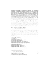
display. For example, consider the window shown in Figure 14-1. It allows the user to add squares (each
of which is a visual) to a custom Canvas.
Figure 14-1.
Drawing visuals
On the left side of the window in Figure 14-1 is a toolbar with three RadioButton objects. As you’ll
discover in Chapter 25, the ToolBar changes the way some basic controls are rendered, such as buttons.
By using a group of RadioButton objects, you can create a set of linked buttons. When you click one of
the buttons in this set, it is selected and remains “pushed,” while the previously selected button reverts
to its normal appearance.
On the right side of the window in Figure 14-1 is a custom Canvas named DrawingCanvas, which
stores a collection of visuals internally. DrawingCanvas returns the total number of squares in the
VisualChildrenCount property, and uses the GetVisualChild() method to provide access to each visual in
the collection. Here’s how these details are implemented:
public class DrawingCanvas : Canvas
{
private List<Visual> visuals = new List<Visual>();
protected override int VisualChildrenCount
{
get { return visuals.Count; }
}
protected override Visual GetVisualChild(int index)
{
return visuals[index];
}
CHAPTER 14 ■ EFFECTS AND VISUALS
404
Additionally, the DrawingCanvas includes an AddVisual() method and a DeleteVisual() method to
make it easy for the consuming code to insert visuals into the collection, with the appropriate tracking:
public void AddVisual(Visual visual)
{
visuals.Add(visual);
base.AddVisualChild(visual);
base.AddLogicalChild(visual);
}
public void DeleteVisual(Visual visual)
{
visuals.Remove(visual);
base.RemoveVisualChild(visual);
base.RemoveLogicalChild(visual);
}
}
The DrawingCanvas doesn’t include the logic for drawing squares, selecting them, and moving
them. That’s because this functionality is controlled at the application layer. This makes sense because
there might be several different drawing tools, all of which work with the same DrawingCanvas.
Depending on which button the user clicks, the user might be able to draw different types of shapes or
use different stroke and fill colors. All of these details are specific to the window. The DrawingCanvas
simply provides the functionality for hosting, rendering, and tracking your visuals.
Here’s how the DrawingCanvas is declared in the XAML markup for the window:
<local:DrawingCanvas x:Name="drawingSurface" Background="White" ClipToBounds="True"
MouseLeftButtonDown="drawingSurface_MouseLeftButtonDown"
MouseLeftButtonUp="drawingSurface_MouseLeftButtonUp"
MouseMove="drawingSurface_MouseMove" />
■ Tip By setting the background to white (rather than transparent), it’s possible to intercept all mouse clicks on
the canvas surface.
Now that you’ve considered the DrawingCanvas container, it’s worth considering the event
handling code that creates the squares. The starting point is the event handler for the MouseLeftButton.
It’s at this point that the code determines what operation is being performed—square creation, square
deletion, or square selection. At the moment, we’re just interested in the first task:
private void drawingSurface_MouseLeftButtonDown(object sender,
MouseButtonEventArgs e)
{
Point pointClicked = e.GetPosition(drawingSurface);
if (cmdAdd.IsChecked == true)
CHAPTER 14 ■ EFFECTS AND VISUALS
405
{
// Create, draw, and add the new square.
DrawingVisual visual = new DrawingVisual();
DrawSquare(visual, pointClicked, false);
drawingSurface.AddVisual(visual);
}
}
The actual work is performed by a custom method named DrawSquare(). This approach is useful
because the square drawing needs to be triggered at several different points in the code. Obviously,
DrawSquare() is required when the square is first created. It’s also used when the appearance of the
square changes for any reason (such as when it’s selected).
The DrawSquare() method accepts three parameters: the DrawingVisual to draw, the point for the
top-left corner of the square, and a Boolean flag that indicates whether the square is currently selected,
in which case it is given a different fill color.
Here’s the modest rendering code:
// Drawing constants.
private Brush drawingBrush = Brushes.AliceBlue;
private Brush selectedDrawingBrush = Brushes.LightGoldenrodYellow;
private Pen drawingPen = new Pen(Brushes.SteelBlue, 3);
private Size squareSize = new Size(30, 30);
private void DrawSquare(DrawingVisual visual, Point topLeftCorner, bool isSelected)
{
using (DrawingContext dc = visual.RenderOpen())
{
Brush brush = drawingBrush;
if (isSelected) brush = selectedDrawingBrush;
dc.DrawRectangle(brush, drawingPen,
new Rect(topLeftCorner, squareSize));
}
}
This is all you need to display a visual in a window: some code that renders the visual, and a container
that handles the necessary tracking details. However, there’s a bit more work to do if you want to add
interactivity to your visuals, as you’ll see in the following section.
Hit Testing
The square-drawing application not only allows users to draw squares, but it also allows them to
move and delete existing squares. In order to perform either of these tasks, your code needs to be
able to intercept a mouse click and find the visual at the clicked location. This task is called hit
testing.
CHAPTER 14 ■ EFFECTS AND VISUALS
406
To support hit testing, it makes sense to add a GetVisual() method to the DrawingCanvas class.
This method takes a point and returns the matching DrawingVisual. To do its work, it uses the static
VisualTreeHelper.HitTest() method. Here’s the complete code for the GetVisual() method:
public DrawingVisual GetVisual(Point point)
{
HitTestResult hitResult = VisualTreeHelper.HitTest(this, point);
return hitResult.VisualHit as DrawingVisual;
}
In this case, the code ignores any hit object that isn’t a DrawingVisual, including the DrawingCanvas
itself. If no squares are clicked, the GetVisual() method returns a null reference.
The delete feature makes use of the GetVisual() method. When the delete command is selected and
a square is clicked, the MouseLeftButtonDown event handler uses this code to remove it:
else if (cmdDelete.IsChecked == true)
{
DrawingVisual visual = drawingSurface.GetVisual(pointClicked);
if (visual != null) drawingSurface.DeleteVisual(visual);
}
Similar code supports the dragging feature, but it needs a way to keep track of the fact that dragging
is underway. Three fields in the window class serve this purpose—isDragging, clickOffset, and
selectedVisual:
private bool isDragging = false;
private DrawingVisual selectedVisual;
private Vector clickOffset;
When the user clicks a shape, the isDragging field is set to true, the selectedVisual is set to the visual
that was clicked, and the clickOffset records the space between the top-left corner of the square and the
point where the user clicked. Here’s the code from the MouseLeftButtonDown event handler:
else if (cmdSelectMove.IsChecked == true)
{
DrawingVisual visual = drawingSurface.GetVisual(pointClicked);
if (visual != null)
{
// Find the top-left corner of the square.
// This is done by looking at the current bounds and
// removing half the border (pen thickness).
// An alternate solution would be to store the top-left
// point of every visual in a collection in the
// DrawingCanvas, and provide this point when hit testing.
Point topLeftCorner = new Point(
visual.ContentBounds.TopLeft.X + drawingPen.Thickness / 2,
visual.ContentBounds.TopLeft.Y + drawingPen.Thickness / 2);
DrawSquare(visual, topLeftCorner, true);
clickOffset = topLeftCorner - pointClicked;
isDragging = true;
if (selectedVisual != null && selectedVisual != visual)


