Professional DotNetNuke ASP.NET Portals wrox phần 5 doc
Bạn đang xem bản rút gọn của tài liệu. Xem và tải ngay bản đầy đủ của tài liệu tại đây (1.57 MB, 45 trang )
Skins
You should recall from earlier in this chapter that the only difference between working with skins from
the Admin menu and working with skins from the Host menu is the target location of the upload, which
determines availability to other Portal Administrators. For additional information on skins and skinning,
see Chapters 4 and 13, respectively.
Summary
In this chapter you learned just about everything there is to know about administering a collection of
portals, their environment, and runtime features as the Host (or SuperUser) of a DotNetNuke installa-
tion. Key Host functions that you should understand include
❑ Host Settings
❑ Portals
❑ Module Definitions
❑ File Managers
❑ Vendors
❑ SQL
❑ Schedule
❑ Languages
❑ Search Admin
❑ Lists
❑ SuperUsers Accounts
❑ Skins
You should have some understanding of which Portal Administrator–level functions contain Host con-
figurable settings. These Portal Admin functions include
❑ Site Settings
❑ Skins
❑ Log Viewer
You should understand the location and relevance of the Host Root directory (\Portals\_default) versus
the Portal Root directory (\Portals\<portalid>), and know that Host default settings are used to create
individual portals, but that changing them has no effect on existing portals.
Your SuperUser powers should now be fully enabled and you should be prepared to assume leadership
of your very own DotNetNuke “Justice League” (cape and super hero sidekick not included).
150
Chapter 5
09_595636 ch05.qxd 5/10/05 9:57 PM Page 150
Modules
Now that you are familiar with the Host and Administration capabilities available within
DotNetNuke, this chapter looks at a concept familiar to most portals — modules.
A module is a pluggable user interface component that processes requests and generates dynamic
content. This definition is similar to that of an ASP.NET page, with the exception that a module can
only appear on an ASP.NET page, and that page can contain any number of module “instances.”
Modules are also defined by another important characteristic known as its type. The module type
governs what functionality it provides. DotNetNuke provides a number of modules out of the
box; these modules range from FAQs and Announcements to Documents. You can even author
your own modules that provide alternate functionality.
By the end of the chapter, you should have a good understanding of the architecture surrounding
modules and how they relate to the DotNetNuke Portal System. This chapter also discusses the
practical aspects regarding modules such as management and installation, and provides an intro-
duction to each of the modules included within DotNetNuke.
Module Architecture
This section explains the concepts of a portal, page, module container, and the module itself.
A walkthrough of how a page is constructed is also presented.
Portal
As discussed in earlier chapters, a portal can be defined as a web-based application that provides
content aggregation from different sources and hosts the presentation layer (modules) of informa-
tion systems.
10_595636 ch06.qxd 5/10/05 10:01 PM Page 151
Figure 6-1 depicts a portal’s basic architecture. To help explain the diagram, DotNetNuke needs to per-
form a number of steps in order to process a page request. The following steps execute during the initial-
ization of the page. This event occurs at initialization so that modules can handle their own life cycle and
process events such as initialization, load, and render.
Figure 6-1
First Step
The first step is to retrieve the modules for the requested page. The retrieval step comprises a number of
important pieces of information such as the modules that appear on the page, the section of the page on
which they will appear (known as content panes), and finally, the security roles associated with each
module.
Second Step
The second step is to make some decisions about the security information retrieved in the previous step.
By examining the current user roles (whether a registered user or anonymous) and the view roles associ-
ated with each module, a list of “authorized” modules is formed for the current page.
Third Step
The third (and final) step is to dynamically inject the “authorized” modules into the corresponding con-
tent panes of the page. Once each of the modules has been loaded, each module is then able to execute
its own series of events and render content.
HTTP
HTML
Portal Engine
Portal Skin
Content Pane
Modules
Content Pane
Modules
Conent Pane
Modules
152
Chapter 6
10_595636 ch06.qxd 5/10/05 10:01 PM Page 152
Page
Figure 6-2 depicts the basic portal page components. The page itself represents a complete markup docu-
ment consisting of a number of “content panes,” and in each content pane a number of modules. In
addition to the modules, a page also consists of navigation areas and site banners. To learn more about
how to customize the look of these other areas, see Chapter 13.
Figure 6-2
Each module consists of a title, decorations, and the content produced by the module. The decorations
can include buttons, links, and a hover menu that can change the module’s state or perform functional-
ity specific to that module.
Module
As mentioned previously, a portal is a web-based application that processes requests and generates
dynamic content. Each module produces its own piece of markup (known as a fragment) and together
with the skin’s markup shows a complete document.
153
Modules
10_595636 ch06.qxd 5/10/05 10:01 PM Page 153
Because each module produces its own markup, they can be viewed as tiny applications within a larger
application. Usually, users interact with the content produced by each module by clicking links or sub-
mitting forms that are then processed by the portal system, and the actions are passed to the correct
module.
Module Container
The decorations surrounding a module is known as the module container. Through this container, a user
is able to interact with the module and perform such actions as minimize/maximize or more advanced
features (if the user has edit privileges on that module).
Figure 6-3 shows the module container of a “links” module when logged in as a user with edit access.
The diagram shows a number of items, such as the hover menu with a list of administration options
(discussed later in this chapter), the title of the module, and the minimize/maximize option.
Figure 6-3
154
Chapter 6
10_595636 ch06.qxd 5/10/05 10:01 PM Page 154
Types of Modules
Now that you are familiar with the concepts surrounding modules, this section examines the 15 user con-
tent modules that are bundled with DotNetNuke. Another four modules exist that are not really content
modules, so we will not discuss the Search or User Account Management modules that you can utilize in
your portal pages. We list each module and include a brief description.
Before starting, however, let’s discuss the core team’s policy surrounding bundled modules. The aim of
the core team has not been to include every new module within the core, but to provide an extensible
and rich platform. By concentrating on the core platform, third parties have an opportunity to build
upon the functionality that is missing within the bundled modules. However, that being said, the bun-
dled modules are designed to meet the majority of needs.
Announcements Module
The Announcements module allows you to create short articles for your visitors and even allows you to
expire the older articles as the content becomes obsolete. This module provides an easy-to-use interface
for keeping your content fresh and rotated. You can use the module as a method of displaying news
releases, a collection of related articles, or merely as a teaser to other content in your portal. You will
now add an Announcements module to your base installation and see exactly how this module works.
Start by opening your web browser to the application and logging in with the administrator account to
add the module to your page. Then you will add some content to your module instance.
We should note here that you do not have to be the administrator in order to accomplish this task. If you
wanted, you could set up a role with edit permission to your page and offload this task to another indi-
vidual in your organization. This is made possible by the roles-based security the application employs to
control access to content and administration.
First, add the module on your page. You use the Add Module function as shown in Figure 6-4 to accom-
plish this task. This process will be the same for every type of module you add. For clarity, we are
including the exact steps you will need to take to add the Announcements module, but as we discuss
the other modules available we will just cover the specifics related to the particular module. Look at
Figure 6-4 to begin this process.
Figure 6-4
When you log in to your portal and navigate to a page where the user has edit privileges, you will see
the control panel shown in Figure 6-4. You may remember from earlier in the chapter that we used this
interface to add a new page to our portal using the page functions. You are now going to use the module
section of this interface to add your Announcements module. This is the interface you will use to add
any module to your portal pages. As in the page function section, the titles of the available functions are
self-documenting. The Module drop-down control lists all the types of modules you have installed in
155
Modules
10_595636 ch06.qxd 5/10/05 10:01 PM Page 155
your DotNetNuke instance and you will be able to select any available module type from the list. One
thing new to version 3 is the ability to add an existing module instance with content to a page. If you
select the Add Existing Module radio button, the content of the Module DDL will change to reflect
instances of other modules you have already added elsewhere in your portal instance. Assume you have
a navigation module you need to show only on certain pages to enable navigation to deeper content
areas of your site, but you do not want to show on all pages of the portal. This function allows you to
easily duplicate your navigation for only the pages for which you need the functionality to be available.
The Module control enables you to specify the pane where you want the module to appear and how you
need the module aligned inside that pane, with the Pane and Align DDL controls, respectively. Notice
that you can also specify the title for the module instance as you add the instance. The preceding direc-
tions do not apply only to the Announcements module; they apply to any module you add to a page.
Now that you understand all the functions available, take a look at Figure 6-5, add the Announcements
module, and set the settings of your module instance.
Figure 6-5
156
Chapter 6
10_595636 ch06.qxd 5/10/05 10:01 PM Page 156
You’ve now added your announcements instance and navigated to the settings for your module. You
will notice the Module Settings control looks familiar to the Page Settings control used earlier in the
chapter. This is by design because it decreases the learning curve associated with managing the applica-
tion. Notice that this control utilizes the same type of field-level help available in the Page Settings con-
trol, which allows you to get a description of the type of content the application expects for this module
instance. Table 6-1 describes these associated settings.
Table 6-1: Announcements: Basic and Advanced Module Settings
Setting Description
Module Title As the name suggests, this is the title for your module.
Permissions This is where you set which roles will have access to edit the content in
your module. As you can see, several options are available for controlling
the security of the module’s content.
Display Module Enabling this check box allows you to define a module that will appear
On All Pages on all pages within your portal. This is very useful when defining adver-
tising or navigation-type modules you need to display to your users
regardless of the page they are visiting.
Header Here you can define content to display above your module’s content.
Footer Here you can define content to display below your module’s content.
Start Date This is the date you want the content to start displaying to your users.
This is very useful for planning content that you only need to appear after
a certain date.
End Date This setting allows you to expire content that is no longer current.
These settings options are pretty much concurrent across all instances of the various modules. Notice the
Page Settings panel below the Modules Settings panel. This is where we set our container for the Links
module earlier in this chapter. Figure 6-6 shows the panel for the Page Settings of our module, and
Table 6-2 explains each of these functions for this area. Note that although this may appear exactly like
the Page Settings covered in Chapter 3, there are some differences and these settings have some unique
settings just for our current module instance. Figure 6-6 illustrates page settings you will see in the base
modules throughout the application.
157
Modules
10_595636 ch06.qxd 5/10/05 10:01 PM Page 157
Figure 6-6
Table 6-2 lists each of these settings. You will encounter this section throughout the modules in the
application.
Table 6-2: Module Page Settings Panel
Setting Description
Icon This is an interesting function that you can use to enhance the dis-
play of your module. Setting an icon for your module replaces the
title with an image. The file you use for this must reside in one of the
areas defined in your file manager area. To set the image you use the
File Location and File Name DDLs to specify the file’s location.
Alignment This setting allows you to specify the alignment of your module in
the pane.
Color This setting allows you to specify the background color of the con-
tent that appears in this module.
Border This setting allows you to specify a border width for your content in
the module.
158
Chapter 6
10_595636 ch06.qxd 5/10/05 10:01 PM Page 158
Visibility DotNetNuke exposes methods to allow your users to expand and
collapse content to save real estate. These options allow you to define
the default visibility behavior of the module and whether you want
the users to be able to hide or display the module’s content.
Display Title This check box enables you to display or hide the module’s title from
the users.
Allow Print This function allows you to expose the print module action, which
displays a print icon your users can select to print the module’s con-
tent in a print-friendly format.
Allow Syndicate This function allows you to expose your module’s content in an XML
format, which allows other web authors to consume and display
your content on another web site.
Module Container Here you can set the container to use for the module’s display in the
portal.
Cache Time DotNetNuke utilizes caching to increase the performance of the
application. Here you can set the number of seconds you would like
for this module to remain cached in memory.
Set As Default Settings This setting allows you to utilize this module’s settings as the default
for all the modules you add to your portal.
Apply To All Modules This is a time-saver if you decide you want the default behavior of all
modules to be different than your original settings. You can apply the
settings to one module and push those settings out to all instances of
modules in the portal.
Move To Page This setting allows you to move this module instance to another page
in the portal.
The settings listed in this section are implemented from the base module settings class, so this informa-
tion is pertinent to all modules that inherit the classes, and it is a programming requirement that mod-
ules inherit the class. This means that you will have the above functionality no matter which module
you are working with, whether it’s a base module or another third-party module you have obtained
from one of the many module developers. Now that you have your module settings updated, you can
go ahead and add a couple of announcements for your users. Figure 6-7 illustrates the view the
Announcements module will now contain as a result of your changes to the settings.
Figure 6-7
159
Modules
10_595636 ch06.qxd 5/10/05 10:01 PM Page 159
Because you set up your module to Allow Print and Allow Syndicate, you will notice the XML and Print
icons showing up in the module instance. If you had not enabled these options, those icons would not be
available. Click the Add New Announcement command link, which will navigate you to the edit control
for your Announcements module. Here, you can define your announcement, as shown in Figure 6-8.
Figure 6-8
Like the other areas of the portal, the names are self-explanatory, but Table 6-3 lists and describes each
option.
Table 6-3: Adding Announcements
Option Description
Title This is the title that describes the individual announcement. By default the
date the announcement is created is appended to the title you define here.
If you do not want this date to appear to your users, uncheck the Add Date
check box.
Description Here you type the content for your announcement. This module utilizes
the Free Text Box (FTB) control to make it easier for users to format the dis-
play of the text. If this particular announcement does not require Rich Text
formatting functionality, you can use the text box option, which will
dynamically remove the instance of FTB and allow you to only use a text
box for this function.
160
Chapter 6
10_595636 ch06.qxd 5/10/05 10:01 PM Page 160
Link This section allows you to specify a location where the user can obtain
more information about the announcement. When you enable this option,
a link is created at the end of your announcement, which when clicked by
the user will allow navigation to the link you define. You have several
options here to define what kind of link you will create. The default is a
link to an external site. If you select Page or File, the Location control will
change to a DDL, which will allow selecting the page or file where your
additional information resides. Auditing information can be defined with
the other controls in this section, so you can capture information on your
users’ actions and behavior for further analysis.
Expires This allows you to set a date when the content should expire and no longer
be viewable by your users.
View Order By default, announcements are displayed in ascending order according to
the date the announcement was created. Setting the view order allows you
to define the order you want announcements to appear.
You now have all the knowledge necessary to create and maintain announcements for your portal. The
other base portal modules follow similar methods for creating content. Because many of these modules
use the same methods for the common functions, we will not cover these methods in detail in the later
module descriptions, but we will emphasize the differences. One thing to keep in mind if you have
aspirations of creating your own modules to extend DotNetNuke is that the code contained in the
Announcements module is a good head start for creating the layout of your own modules. For more
on developing your own modules, refer to Chapters 9 through 12, which cover module development.
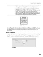
Banner Module
The Banner module provides a method of offering advertisements in the DotNetNuke application.
Administering this module is a little different than any of the other base modules because this module
works in conjunction with the Vendors module, which is an administrator-only module. Advertisement
can be controlled from the Host level or Portal level and the host or SuperUser account controls this
behavior.
Probably the first thing you will notice when you add this module to a page is that you only see a
Banner Options action and not Add New Action, like the other modules display. This is because the ban-
ners will need to be added from either the Admin Vendors page or from the Host Vendors page. This is
one of the functions that makes DotNetNuke a viable host platform, because you can offer free or inex-
pensive portals for your users and then recuperate your hosting costs from offering advertising on the
individual portals in your DotNetNuke installation.
Exactly how to add these is covered in the next two chapters, which discuss the Host and Admin func-
tions. For now, assume you have already added a vendor and are ready to display a banner advertise-
ment for that vendor. After you add the module to a page, click the Banner Options action. You are
presented with the Edit Control in Figure 6-9.
161
Modules
10_595636 ch06.qxd 5/10/05 10:01 PM Page 161
Figure 6-9
As you can see, there is no option to add a banner to this control. Those actions are handled in the
respective Vendors module by the Host or Portal Administrator, and this module is the mechanism you
will use to display those settings to the user. For a full description of managing the Vendor functions in
DotNetNuke, refer to Chapters 4 and 5. A description of each of the Edit Banner functions is shown in
Table 6-4.
Table 6-4: Edit Banner Options
Setting Description
Banner Source Selecting one of these radio buttons allows you to specify whether the
vendor banners shown in this module should originate from the host or
from the portal.
Banner Type This dictates the type of banner that should be shown in this module.
Banner types include Banner, MicroButton, Button, Block, Skyscraper,
Text, and Script. It should be noted that selecting a specific type means
the vendor must have that type assigned to its account or the module
will not show that particular vendor’s advertisements.
Banner Group This setting allows you to associate a group of banners together in the
administrator vendor’s module, such as Site Banner group. Entering the
banner group here will allow you to group the same types of banners
together.
Banner Count Here you can define the number of times a banner will display to the
users.
Orientation This defines the orientation of the banner. The type of banner you chose
usually dictates what you choose in this setting.
Border Width This setting allows you to define a border.
Border Color This setting allows you to set the border color.
Row Height This setting allows you to set a row height for your banner.
Row Width This setting allows you to set a row width for your banner.
162
Chapter 6
10_595636 ch06.qxd 5/10/05 10:01 PM Page 162
Once you have set up your vendor accounts on the vendor pages, you will be able to earn revenue from
your DotNetNuke installation. As you saw, there is really no direct editing of content from this module.
This is a design decision, so you can let other roles in your installation handle these remedial types of
tasks while you can control your revenue generation from the higher accounts. You will still need to set
up the module settings for this module, but because this module contains the same functions as the
Announcements module, we will not cover those settings again.
Contacts Module
Almost every web site, regardless of content area, needs a method to provide information to contact the
site’s owners and employees. This is the purpose of the Contacts module. You can add your contact
information and provide an easy-to-use interface for updating it to maintain current information. You
can create an entire company directory from this module or display contact info for only a few individu-
als. The types of information you can display include the name, employee role, e-mail address, and tele-
phone numbers for the individuals listed. Look at the settings control in Figure 6-10 to add a Contacts
module to your test portal.
Figure 6-10
Here you can enter in the information for each contact you want to display and the module will display
the information to the roles you approve. When the module information is entered, the e-mail will be
formatted as a mailto link; your users will be able to use this link to send e-mail to the contact using their
default mail client.
Discussions Module
The Discussions module is a lightweight forum module your users can use to share information. This
module is not designed to be a full-fledged forum platform, but it will work for light forum activities
you may need to offer on your web site. This module uses the same settings as the previous modules
have used so we do not need to cover those activities again. Figure 6-11 shows the interface for creating
new threads in the module.
As you can see, this is the simplest interface we’ve encountered so far. This module is very simple to
use — you just enter a title and write your message. In order for users to reply to your thread they must
click on the thread and click Reply. We suggest you play around with this module because it may meet
your needs to provide this functionality to your users. Several other full-fledged forum modules are
available for DotNetNuke. Some of these are free and some require a small license fee. Refer to the
DotNetNuke web site if you require a more robust forum system for your portal.
163
Modules
10_595636 ch06.qxd 5/10/05 10:01 PM Page 163
Figure 6-11
Documents Module
The Documents module allows you to offer files that your users can download from your site. This is a
fairly useful module because you will likely need to offer examples or additional information in the
form of Word documents or other types of files to your users. The types of files you can use with this
module is controlled by the file type settings under the Host Settings page. By default, DotNetNuke will
allow the following extensions:
❑ .jpg
❑ .jpeg
❑ .jpe
❑ .gif
❑ .bmp
❑ .png
❑ .doc
❑ .xls
❑ .ppt
❑ .txt
164
Chapter 6
10_595636 ch06.qxd 5/10/05 10:01 PM Page 164
❑ .xml
❑ .xsl
❑ .css
❑ .zip
If you require additional file types not allowed by default, you will need to add the extension under the
Host Settings page in the File Upload Extensions field. If you are going to allow your users to upload
files, you should be careful as to the type of files allowed because it’s possible users may introduce
viruses or other undesirable files into your portal file system. The application offers no default protec-
tion in this area, so diligence is needed to protect the integrity of the system.
Figure 6-12 shows the interface you use to add new documents to this module. As in other areas of the appli-
cation, the files you make available through this module will reside in your portal default file directory.
Figure 6-12
Here you will enter the title, link, and category for your module. You may notice the Link section appears
almost exactly like the links control in the Announcements module. Here is another example of the object-
oriented programming of DotNetNuke at work. We attempt to reuse code wherever possible to enable a
simpler user interface for the user and to promote best programming practices when possible. You will
notice there are some differences between the links control in the Announcements module and this one in
the Documents module. The only difference between the two is that in the Announcements module you
have an option to select a page in your portal as one of the links. Because it should never be necessary to
offer a page for download, this option is not included in the Documents module. You will also notice that
like the Announcements module, the Documents module allows the tracking of your users’ actions so you
will be able to determine the content that your users are most interested in receiving. The Category field
offers you the ability to logically group the files in this module. This category will be displayed as part of
the Documents module so your users will understand the type of file they are about to download or view.
165
Modules
10_595636 ch06.qxd 5/10/05 10:01 PM Page 165
Events Module
The Events module allows you to list upcoming events to announce to your users. This module has
some additional settings that control the display of the module. The rest of the module settings are the
same as the ones we have already covered, so we will only look at the settings that are unique to this
module. See Figure 6-13.
Figure 6-13
As you can see from Figure 6-13, the Events module can be displayed as either a list or a calendar control
depending on your needs. The other two options are pertinent only if you select the Calendar option.
Selecting the List option will format the information you enter into the module into a sequential list of
the upcoming events you have entered. Once you’ve decided on the view for the events, you can add the
event as shown in Figure 6-14.
You will notice you have many of the same functions available in this module as you do in the other
modules. It should be noted that if you use the calendar view you will want to limit the amount of text
in the description, because there is only limited room in the calendar view for events. If your events
need a longer description to convey the meaning to your users, you will need use the list view for the
Events module. Table 6-5 explores each of the options available in this module.
166
Chapter 6
10_595636 ch06.qxd 5/10/05 10:01 PM Page 166
Figure 6-14
Table 6-5: Edit Events Module
Settings Description
Title Here you can enter the title of your individual event.
Description Here you can enter a description for your event that will provide your user
with detailed information that is not included elsewhere in the module.
Image You can select an image to be associated with your event. This is usually
used to easily convey more information about your event to your users.
Alternate Text This is information describing your image. This is important for meeting
508 accessibility for visually challenged users who may access your site
using screen readers.
Occurs Every Here you can define how often this event will occur. Options are to set the
event to occur periodically based on day, week, month, or year. This is a
time-saver because if you have recurring events to announce, you only
need to set the event once and the module will take care of the rest for you.
Table continued on following page
167
Modules
10_595636 ch06.qxd 5/10/05 10:01 PM Page 167
Start Date This is the first date your event will occur. We should note that unlike the
Announcements module your content will be visible before the date you
enter here. This date signifies the start of your event.
Time This is the time of day your event will occur.
Expiry Date The last day of your event. This is useful when you are using the Occurs
Every function and you no longer need to show the event, but would like
to keep earlier events of this type for reference.
As you can see, the Events module is very useful, and you are sure to find many other uses for it as well.
FAQs Module
You can use the FAQs or Frequently Asked Questions module to answer questions your users may have
about your web site or products. This is a very useful module for disseminating information that you
receive questions about on an ongoing basis. This is one of the simpler modules in DotNetNuke, but it
is also one of the more powerful ones because it will save you many hours of replying to e-mails if you
utilize its functionality. The interface for adding a new FAQ is very simple and warrants little discussion.
Basically, you enter a question you want to provide an answer for and then enter the answer for that ques-
tion. The module offers the ability to utilize the Rich Text editor so that you can format your questions
and answers in a way that is easy for your users to understand and to convey the intended message.
Figure 6-15 shows the interface for the Edit functions of the module.
Figure 6-15
168
Chapter 6
10_595636 ch06.qxd 5/10/05 10:01 PM Page 168
Feedback Module
The Feedback module offers you a mechanism for allowing users to contact you without exposing your
e-mail address to the many SPAM Bots that regularly scan the Internet. The module does not have an
Add function like the other modules we have explored because the purpose of the module does not
need this functionality. Basically users are adding feedback when they send you feedback. The module
does contain some settings you can use to control the display of the module to users and to specify the
e-mail address to which you want the e-mails created from the module to be sent. Prior to version 3 of
the portal, the only option to send these requests to was the administrator account. With this version you
have the option to change this behavior. One thing to be aware of is that this module relies on the mail
server settings on the Host Settings page to function properly. Ensure you have successfully added your
mail server and tested the settings before attempting to utilize this module’s functionality. You will
notice in Figure 6-16 that you also have the option of setting the width and rows of this module, which
controls the display of the module to your users.
Figure 6-16
IFrame Module
The IFrame module allows you to display web pages from other web sites in your portal. When you set
the page, the module should display and add an IFrame tag to your page and load the remote site into
the frame. One of the main uses for this module mentioned in the DotNetNuke forums is to utilize
legacy applications that were created with ASP or some other dynamic language that must still be used
for some functionality. This allows companies to take advantage of the benefits of DotNetNuke while
still utilizing other functionality they had in previous applications. This is usually a short-term fix peo-
ple employ. As they become more familiar with DotNetNuke module development, they can convert
their legacy applications to fully compliant DotNetNuke modules to take advantage of full integration
with DotNetNuke roles and user control functions. The settings available for the IFrame module are
illustrated in Figure 6-17.
169
Modules
10_595636 ch06.qxd 5/10/05 10:01 PM Page 169
Figure 6-17
The Source of the IFrame module is the location of the web page you would like to add to display in your
module. The Width and Height fields determine the size of the IFrame and should be adjusted to fit the
page you need to display. These fields can be entered either as pixels or a percent depending on your
needs. Title is a little confusing here because the title is not the module title, nor will it be shown to normal
users. This title is a requirement for 508 accessibility compliance and you should enter a descriptive value
in this field. Scrolling determines whether the IFrame should add scrollbars for the frame. This is important
if the target web page is larger than you can show in your portal without impeding the display or omitting
certain content of the target page. Your options are auto, yes, and no. Auto is usually the best choice here
because the module will determine whether or not the bars are needed based on the target page dimen-
sions. The last option is to define whether you want a border to appear around your target page.
Image Module
The Image module offers you an easy way to add images to your portal. The module allows you to add
an image to a page where it would not make sense to have a skin element and you do not require the
ability to link to another site from the image. The image you display can reside either in your portal file
system or on an external resource. Figure 6-18 shows the options available for adding a link.
Figure 6-18
170
Chapter 6
10_595636 ch06.qxd 5/10/05 10:01 PM Page 170
You will notice the same familiar file picker interface you have seen in other modules. Selecting the URL
option for the link type will produce a post back and present you with a text box to enter in the path to
the remote image. If you want to use an image that resides in your portal directories, you can select the
image from the drop-down lists. This interface also allows you to enter in the Alternate Text for the
image and specify the Width and Height of the image. Leaving the proportion text boxes blank will
cause the image to be displayed in its actual size.
Links Module
The Links module is probably one of the most used modules in DotNetNuke installations; it probably is
only used less than the HTML/Text and Announcements modules. As its name suggests, this module
allows you to add links your users can use to navigate to other areas of your site or to remote web sites.
This module has a few unique settings you need to be familiar with. Figure 6-19 shows the Module
Settings pane for the Links Settings.
Figure 6-19
As you can see, you have several options for controlling the behavior and view of the Links module.
Selecting the Control Type will allow you to define whether the link list will display as a drop-down list
or a normal data-bound list. You also have the option of displaying the orientation of the list with the
List Display Format option. The last option available is whether you want to show the user a short
description of the web page where the link navigates to. This is a useful option to allow some additional
keywords to be associated with the link. Figure 6-20 shows your options for adding links to your mod-
ules. For this example, just accept the defaults in the Link Settings in Figure 6-19 and move on to adding
your link as shown in Figure 6-20.
171
Modules
10_595636 ch06.qxd 5/10/05 10:01 PM Page 171
Figure 6-20
The title is what users will see as the link. You also use the file picker control in this module and you
have the options of defining an external, page, or internal file in your module. The audit controls on this
module let you track your visitors’ behavior. The Description is the information we mentioned earlier is
where you select the info link in the settings then the user will see an additional link where they can
read the information you enter in this field. The View Order allows you to organize the order in which
your links are displayed in the module.
News Feed (RSS)
The News Feed module allows you to consume RSS content from another resource and display it to your
users. Many web sites offer syndicated feeds that you can consume and display relevant content for
your portal. Many of these resources are available on the Internet, some of which are free and some that
require a fee to consume. The News Feed module allows you to consume both of these types of feeds
and display the information according to your feed style sheet, as shown in Figure 6-21.
The Source is the location of the source you want to consume. You also have the option of specifying the
style sheet to use with the feed. Most news feeds provide a style sheet especially for their feed that you
can use or you can specify your own style sheet. DotNetNuke offers the flexibility to use the style sheet
that meets your business needs. Some feeds require you to present credentials authorizing access to their
content before you can consume a feed. The Username and Password text boxes are where you enter this
type of authentication information.
172
Chapter 6
10_595636 ch06.qxd 5/10/05 10:01 PM Page 172
Figure 6-21
HTML/Text Module
The HTML/Text module, or HTML mod for short, is probably one of the most used modules in
DotNetNuke portals. It allows you to format your content with the easy-to-use Free Text Box editor
and it also allows for a large amount of content to be displayed. This module also fits with what most
webmasters need for their content display. You have the option of using the editor or, if you’re a hard-
core HTML programmer, you can type in your HTML directly with out relying on the controls rendering
your markup. The HTML/Text interface is very straightforward and includes only two controls, as
shown in Figure 6-22.
The first option is where you will enter your content to be displayed in the module and the second is a
search summary. The DotNetNuke 3 search functions have the ability to index all the content in this
module. The type of content entered in this module may become quite large, so the core team felt it
would be pertinent to allow a mechanism for the module administrator to add a summary of the content
for the search engine to utilize. This accomplishes two functions. First, it allows you to provide the gist
of the content that will be displayed to users when they search for similar content and, second, it helps
with the performance of the search engine because there is no need to index all of the content that may
appear in this type of module.
173
Modules
10_595636 ch06.qxd 5/10/05 10:01 PM Page 173
Figure 6-22
User Defined Table Module
The User Defined Table is a catch-all type of module. This module allows you to define your own data
type and display this information to your users in an organized manner. The easiest way to understand
the use of this module is through an example. Suppose you need an additional field for your portal’s
contacts. You could open up the Contacts project and modify the code to add your field and then recom-
pile, but you could also use the User Defined module to accomplish the same task. First, add the module
to your page and open the Manage User Defined Table action item. Click the Add New Column link.
You are presented with the screen shown Figure 6-23.
Figure 6-23
174
Chapter 6
10_595636 ch06.qxd 5/10/05 10:01 PM Page 174


