designing for the social webj PHẦN 6 potx
Bạn đang xem bản rút gọn của tài liệu. Xem và tải ngay bản đầy đủ của tài liệu tại đây (7.73 MB, 20 trang )
ptg
88 DESIGNING FOR THE SOCIAL WEB
Appeal to Authority
If someone with authority uses your software, it makes sense to leverage
that fact by talking about how they use it. On the AdaptiveBlue site, for
example, they promote their software by explaining how Seth Godin,
an authority in the marketing world, uses their SmartLinks feature.
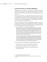
Figure 4.22 If a well-known authority uses
your software, tell people! This element
from AdaptiveBlue doesn’t oversell Seth
Godin’s involvement, it simply lets people
know that he uses to the software to
promote his books.
The Power of Authority
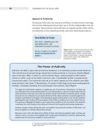
Authority, the ability to give order and enforce obedience, is an extremely powerful social infl uencer.
The most famous social psychology experiment involving authority is a study by Stanley Milgram
done in the early 1960s, in which he, as the authority fi gure, ordered people to infl ict electric
shocks on others, even as the others cried out in pain. A remarkable number of people simply
followed the orders. (The experiment was set up to make it appear as if the subjects were really
being shocked; they weren’t.) Nevertheless, the results of that single study have reverberated for
decades, completely reshaping how psychologists view authority. Says Milgram:
The legal and philosophic aspects of obedience are of enormous importance, but they say
very little about how most people behave in concrete situations. I set up a simple experiment at
Yale University to test how much pain an ordinary citizen would inflict on another person simply
because he was ordered to by an experimental scientist. Stark authority was pitted against the
subjects’ [participants’] strongest moral imperatives against hurting others, and, with the subjects’
[participants’] ears ringing with the screams of the victims, authority won more often than not.
The extreme willingness of adults to go to almost any lengths on the command of an authority
constitutes the chief fi nding of the study and the fact most urgently demanding explanation.
Ordinary people, simply doing their jobs, and without any particular hostility on their part, can
become agents in a terrible destructive process.
Moreover, even when the destructive effects of their work become patently clear, and they are
asked to carry out actions incompatible with fundamental standards of morality, relatively few
people have the resources needed to resist authority.
3
3 See for the fascinating details of the
Milgram experiment.
ptg
CHAPTER 4 DESIGN FOR SIGN-UP 89
Authority works because it makes people pay attention. The mere fact
that Seth Godin uses this software is impressive. But notice, too, that
this element doesn’t overplay Godin’s involvement. It simply states
that he uses the software. More importantly, it describes what he uses
it for: to promote his books. That’s enough information to grab those
folks who might use it for the same purpose. You can bet that people
who are interested in promoting their books are very interested in how
Seth Godin uses this product.
Hypotheticals Are OK
If you’re early on in launching your software, you may not yet have
many people using it. In this case it might make sense to give people
hypothetical ways to use it.
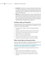
A good example is Backpack (created by 37signals, who also created
Basecamp). In promoting Backpack, the design team came up with a
bunch of hypothetical example uses. This is a great way to get people
thinking about how best to use the software if they aren’t sure.
Figure 4.23 A list of hypothetical uses for the app Backpack. This list gets people
thinking about how it might be useful for them.
WHEN Can People Use It? Now!
Sometimes it seems as if all web software is free nowadays. But if you
offer a pay-for application, consider offering a way for people to try it
out for free. This is a great way for people to get excited about your
service without first having to make a hard decision about budgeting
or pricing.
Letting people try out your application also has an interesting effect. By
giving people something for free, you’ve evoked the feeling of reciprocation:
people are much more likely to stick with you for it. You’ve given them
something for free, and they’re more likely to give something in return
(their business).
Goplan, a project management application, offers a version of their soft-
ware that anybody can try for free. It is a limited version without some
ptg
90 DESIGNING FOR THE SOCIAL WEB
of the bells and whistles of the more expensive plans, but is enough to
get you started and pique your interest. Sometimes people don’t realize
the value of something until they’ve actually used it.
Figure 4.24 Goplan offers a free version of their project management application. It’s a
great way to get people hooked on your software.
Reciprocity
Robert Cialdini’s book Infl uence: The Psychology of Persuasion (mentioned previously in this
chapter) also talks about the power of reciprocity. Many of us are familiar with it even if we don’t
use that term to describe it. Think of the unexpected Christmas gift you received that made you
feel guilty for not being able to reciprocate with a gift in kind.
Cialdini notes that reciprocity can be used for both good and bad. Being “indebted” to someone
else is a horrible thing if you don’t feel a mutual respect. An obvious example is seen in mob movies
all the time: the mobster will do a “favor” for an unwitting person out of the blue, and all will be
well until the mobster wants something in return. Then the recipient of the gift feels compelled to
comply with the mobster’s wishes.
Cialdini adds that it might be the most powerful way to infl uence others:
One of the reasons reciprocation can be used so effectively as a device for gaining another’s
compliance is its power. The rule possesses awesome strength, often producing a “yes”
response to a request that, except for an existing feeling of indebtedness, would have surely
been refused.
4
4 Robert Cialdini, Infl uence: The Psychology of Persuasion. Quill William Morrow, 1984.
ptg
CHAPTER 4 DESIGN FOR SIGN-UP 91
WHERE Can People Use Your Application?
Until recently, the question of “where” you can use web applications
wasn’t that interesting. However, expanding mobile phone use is chang-
ing that, allowing people to use web applications anywhere they can
use their phone.
In some cases, mobile access changes the entire value proposition of
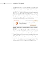
social software. Consider the case of Google Maps, a mapping platform
that becomes much more useful when you’re on the go.
The Maps design team has done a good job of explaining the benefits
of using their application while on the move.
Figure 4.25 The mobile page for Google Maps is a good example of highlighting some
of the interesting uses of their application while on the move.
The secret to designing for mobile use is context. What sorts of activities
are people going to use your software for when they’re on the move? If
the answer is a specific set of activities like on Google Maps, it makes
sense to call these out specifically.
ptg
92 DESIGNING FOR THE SOCIAL WEB
Reduce Sign-up Friction
So now we’ve answered a person’s basic questions about our web applica-
tion. In some cases we focused on what value the application provides,
while in others we focused on more social issues like who is using it.
The journalism technique covers most of those bases.
If we’ve done our job right, people are motivated to take the next step
and use the application. With luck we’ve now got everyone in the “Ready
to Go” mindset. The key at this point is to reduce sign-up friction as
much as possible.
Don’t Make Creating an Account a
Requirement (until You Need to)
TripIt.com has an excellent way to get started using their service with
very little friction. Say you book at flight at Orbitz.com. You’ll get an
email from them confirming your flight details. Simply forward that
email to and they create a page for your itinerary.
They send you an email back with a link to your newly-created page.
You’ve essent ially started using their applicat ion without creating an
account, or even visiting the site!
Another great example is Netvibes, a web-based desktop application.
They invite you to start using their service immediately by configuring
your own desktop.
Netvibes makes creating an account seem almost like an afterthought.
They provide value way before they make you sign up. Here’s the text:
This is your personalized page, you can now modify everything:
move modules, add new RSS/ATOM feeds, change the parameters
for each module, etc. Your modifications are saved in real-time and
you’ll find your page when you get back on Netvibes.com. If you want
to be able to access your page from any computer, you can sign in
(at the top right) with your email and a password.
The Netvibes example highlights a larger principle of form design. I don’t
know if it is written in stone somewhere, but it should be:
Upon signup, ask only for information that’s absolutely necessary
In the case of Netvibes, nothing is required to start using their applica-
tion. Talk about a frictionless process. Only after you start using it do
they remind you that if you want to save what you’ve done, you have
to sign up.
Figure 4.26 TripIt makes
starting a snap. All you
have to do is forward an
existing email to the service
and they create an itinerary
for you.
ptg
CHAPTER 4 DESIGN FOR SIGN-UP 93
Figure 4.27 Netvibes kindly lets you play with the tool before having to create an
account. In fact, they almost make creating an account seem like an afterthought…
what a novel idea!
Progressive Engagement
Interface designer Luke Wroblewski calls this technique progressive
engagement.
5
Progressive engagement allows people to get started using
software without committing fully or filling out a sign-up form. They
engage with the software slowly instead of having to scale the hurdle
of a sign-up form before engaging.
Both Netvibes and Tripit practice progressive engagement. Contrast
the experience of those sites with that of the Wall Street Journal. When
reading an article snippet on wsj.com, you’re asked to subscribe to the
service for full access. When you press “subscribe,” you’re presented
with a daunting form. Not only do you have to pay money (a hurdle in
itself), not only does this form contain more fields than necessary, but
it’s only one of four pages!
Now, someone might argue that “It’s the Wall Street Journal, the most
respected newspaper in the world, so they can do what they want.”
Not so. What the Wall Street Journal has done is to increase signup fric-
tion. The only way to overcome that increased friction is to increase
motivation by using the techniques mentioned above. While readers
5 Luke explores progressive engagement in his book: Web Form Design: Filling in the Blanks http://
www.rosenfeldmedia.com/books/webforms/
ptg
94 DESIGNING FOR THE SOCIAL WEB
of the Wall Street Journal might be highly motivated, that shouldn’t be a
requirement just to fill out a form!
Figure 4.28 The Wall Street Journal has an incredible amount of friction in their
signup process. This daunting form is only one of four pages!
Conclusion
The moment a person signs up for your software is crucial: it’s the
moment when they decide to start a relationship with you. If it’s a bad
experience and they can’t quite muster up the motivation to sign up,
they may never return.
By using the simple and effective journalism technique to answer the
basic questions of inquiry, you can go a long way to getting (or keeping)
people motivated to use your software.
In the next chapter we’ll talk about keeping that momentum during
actual use of your software and helping people get up to speed with
regular use.
ptg
95
5
Design for
Ongoing Participation
How to keep people happy and
participating over the long term
Even a casual trip through cyberspace will turn up evidence
of hostility, selfishness, and simple nonsense. Yet the wonder of
the Internet is not that there is so much noise, but that there is
any significant cooperation at all. Given that online interaction
is relatively anonymous, that there is no central authority, and
that it is difficult or impossible to impose monetary or physical
sanctions on someone, it is striking that the Internet is not
literally a war of all against all.”
1
— Peter Kollock, Professor of Sociology, UCLA
1 Peter’s research and writing on online motivation is fantastic, supporting many of the ideas in this
chapter. You can fi nd out more about his work at: />“
ptg
96 DESIGNING FOR THE SOCIAL WEB
So you’ve started having authentic conversations (Chapter 3), and you’ve
optimized your screens for sign-up (Chapter 4). You’re generating good
will and clearly communicating the value of your service.
The hard part is over, right?
Well, no. While those initial steps are important, they only help someone
get up to speed. Once they start using your web app on a regular basis,
all that initial momentum goes out the window. The honeymoon phase
of software is over in a hurry. The really high hurdle is ahead: keeping
people regularly visiting your site over the long term.
Figure 5.1 To get people using
your web app regularly, you need
to motivate them appropriately
and design interfaces that
encourage those motivations.
The difficulty of this problem explains why I hear the following about
once a week:
We launched our web application a few months ago. We had good
initial interest, lots of people signed up at first. But that has dropped
off and instead of growing steadily, our usage is barely rising. We’re
having trouble simply getting people to participate. How do we
encourage that?
Contrary to popular belief, the answer is not more advertising or more
features or more funding.
The answer is motivation.
If you can discover how to motivate people in the right way, then you
don’t need those stopgaps. If you pay attention to and take care of the
people on your site, you will do just fine. The investors, advertisers,
and features will come in time. Those will be symptoms of success, not
causes of it! The cause of success will be a happy population of people
who love your software.
There are two parts to getting ongoing participation right:
1. Identifying the right motivations for use. Understand why people
are participating in the first place
2. Creating interfaces that support and encourage those motivations.
Interfaces elicit participation by supporting those motivations
appropriately
First-time use Regular use
Return visits
ptg
CHAPTER 5 DESIGN FOR ONGOING PARTICIPATION 97
Let’s explore the core motivations for participation and how to create
interfaces to support them. First, the primary question.
Why Do People Participate?
At first it would seem like there are countless reasons to participate
online. After all, we do a million things on the web, from serious busi-
ness to mindless fun.
However, while the activities we do are very different—as we discussed
in Chapter 2—the basic reasons why we do each of them are not. Most
people participate for relatively common reasons. For example, many
people write reviews on Amazon because of a feeling of reciprocity—they
recognize the value they get from the site and want to give back. Others
write reviews out of a sense of efficacy, as they feel the urge to tell others
about their experience so as to help them make a tough decision.
The key, then, is to identify the basic motivational model—the two or
three core motivations—of your users and spend most of your design
energy building out your software to support them.
Here’s a list of motivations that I’ll spend the rest of the chapter exploring.
Notice that I’ve left out the common reason we think motivates people:
money (economic capital). As I mentioned in Chapter 1, social design
is not about economic but social capital. That’s what these motivations
are all about.
.
Identity. People use social web apps to manage their identity within
their social groups
.
Uniqueness. People use social web apps because they feel that their
contribution is unique and valuable
.
Reciprocity. People participate because they either want to give back
or because they expect others to give back to them
.
Reputation. People participate to build their reputation and improve
their relationships with others
. Sense of efficacy. People participate in order to do good work and
have a positive effect
. Control. People want control over how their information is shared
and displayed
. Ownership. People participate because they feel a sense of owner-
ship over their content online
ptg
98 DESIGNING FOR THE SOCIAL WEB
. Attachment to a group. People seek to find like-minded people who
share the same values and/or activities
. Fun. It’s fun to participate and play!
The following design tactics are ways to motivate people that are all
born of regular human interaction. They are not tricks. If we asked
people who participate in social web sites, they might recognize these
principles in action. Some might even agree and say “Yep, that’s what
I’m doing. I’m trying to build my reputation on this service.”
Enable Identity Management
Everyone has an identity. Identity is what makes us who we are. Identity
is the sum of the characteristics we recognize each other by. Eye color,
height, personality, physical abilities, intelligence: these are some of
the things that make up our identity. We take this identification for
granted in the offline world.
Online, on the other hand, we have the freedom to represent ourselves
in any way we choose. Since we’re not interacting face-to-face, we have
total control over what identifying information we present.
Online identity can be as simple as a username or as complex as a
personalized profile page and set of social relationships. By providing
people with tools to identify themselves and interact with others, we
enable identity.
The power of identity
What happens when a site doesn’t have it? When identity isn’t enabled, you tend to get:
. SPAM. People sending unsolicited messages to large numbers of others
. Gaming. People using the system in ways it wasn’t intended
. Comment trolls. People leaving inappropriate comments in an attempt to ruffl e feathers
. Deception. People pretending to be somebody they are not
In general, a lack of identity leads to bad behavior. Without a clear form of identity, there
is no way to hold someone accountable, and thus no way to punish (or reward) them for
their behavior.
ptg
CHAPTER 5 DESIGN FOR ONGOING PARTICIPATION 99
Accounts
Most social web sites require the people who use them to create an
account, which consists of a username or email identifier. When this
simple “handle” is exposed in the interface, say next to a comment, it
goes a long way toward providing a basic level of identity.
Figure 5.2 Google Groups shows a simple handle next to each post. This is enough to
carry on a conversation with someone over time.
With a handle, people can identify each other enough to:
. Have a conversation with someone
. Build up a history and remember that person over time
. Refer to that person when speaking with others
ptg
100 DESIGNING FOR THE SOCIAL WEB
As we mentioned in the last chapter, making accounts mandatory makes
the sign-up process more difficult. It acts as a barrier to entry. An account
allows the site owner to remove someone from a system when they do
bad things. In some cases, however, it can’t stop ne’er-do-wells. People
who are really dedicated can simply create a new account.
Now, this raises the question, won’t people simply pretend to be some-
body else?
Actually, people don’t do that very often. Clay Shirky explains one case
in particular, in which a woman portrayed a sick teenager
2
and was
vehemently denounced by the readership she had established:
You see things like the Kaycee Nicole stor y, where a woman in Kansas
pretended to be a high school student, and then because the invented
high school student’s friends got so emotionally involved, she then
tried to kill the Kaycee Nicole persona off. “Oh, she’s got cancer and
she’s dying and it’s all very tragic.” And of course, everyone wanted
to fly to meet her.
Now a number of people point to this and say “See, I told you about
that identity thing!” But the Kaycee Nicole story is this: changing
your identity is really weird. And when the community understands
that you’ve been doing it and you’re faking, that is seen as a huge
and violent transgression. And they will expend an astonishing
amount of energy to find you and punish you. So identity is much
less slippery than [naysayers] would lead us to believe.
3
Profile Pages
Profile pages are public or semi-public pages that identify someone (or
something) within a social application. They are a collection of informa-
tion about a person, group, or organization. Profile pages are initially
created out of the information a person enters when they sign up for
an account, but usually contain much more information that people
add over time.
Profile pages often contain several of the following:
. A unique avatar (photo/handle) (should be large enough to identify
the person)
. A short biography or about section
. Appropriate demographics (age, location, etc.)
. Activities or accomplishments
3 This is an excerpt from Clay Shirky’s now classic (and must-read) piece “A group is its own worst
enemy” />ptg
CHAPTER 5 DESIGN FOR ONGOING PARTICIPATION 101
. A list of the latest activities involving the person
. Likes/dislikes
. Friends list
. Group affiliations
The Profile Has to Fit the Domain
Profiles work best when the elements they contain are aligned with the
purpose of the application. Following are three examples of profiles from
very different domains. Each is tailored for a particular purpose.
Profiles on LinkedIn, a social networking application for business pro-
fessionals, contain information suited to professional interaction, like
places worked, education, former and current colleagues, and profes-
sional skills. You won’t see information like religious denomination,
sexual preference, or someone’s medical condition or other information
inappropriate in a professional setting.
Figure 5.3 Profi les on LinkedIn are kept to business-related information. You won’t fi nd
favorite movies or religious preference here.
ptg
102 DESIGNING FOR THE SOCIAL WEB
On PatientsLikeMe, a site for people with similar medical conditions,
the profiles are very different from those on LinkedIn. On a profile of
somebody with multiple sclerosis, for example, you might find out
important dates like when they first had symptoms or when they were
diagnosed. The “about me” section focuses on their experience with
the disease, while several graphing tools show how their treatment
is progressing.
Unlike LinkedIn, professional information is largely irrelevant when
talking about someone’s medical condition, so you won’t see that infor-
mation mentioned in a PatientsLikeMe profile.
Figure 5.4 Profi les on PatientsLikeMe.com, a site for people with similar medical
conditions, appropriately display relevant medical information.
Similarly, the information within profile pages on Amazon have little
overlap with those of LinkedIn and PatientsLikeMe. The Amazon profile
shows all your latest activity on Amazon, including items you’ve added
to your wish list, any reviews you’ve written, and what your friends
have done on the site.
ptg
CHAPTER 5 DESIGN FOR ONGOING PARTICIPATION 103
Figure 5.5 Profi les on Amazon have everything to do with your activity on that
site. There is no professional information or medical information as on LinkedIn or
PatientsLikeMe, respectively.
These three examples illustrate how specialized profile pages can be.
It would be easy for each of these sites to ask for more comprehensive
information about each person, but that would make them end up look-
ing like a general-purpose social network site. Competing with Facebook
and MySpace is not the primary purpose of these sites. Instead, they
are well-structured for their specific niche.
Show What’s Happening
As social web applications became more popular over the last few years,
designers started to realize that profiles suffer from being too static. If
the information on them doesn’t change quickly enough, they become
uninteresting. And, if you’re reading biographical information about an
existing friend, not much of it is going to be new to you. In other words,
profiles grow old fast.
ptg
104 DESIGNING FOR THE SOCIAL WEB
Therefore, several new features that display dynamic content have
emerged to address the problem.
.
Lifestream. Aggregates and displays the latest activity from
all sources
. Comment wall. A list of comments left by visitors for all to see
. Status. A small statement that describes your current status
(e.g. “writing a chapter in my new book”)
.
Notifications. An announcement that something of interest has
happened (invitations, birthdays, holidays)
Simply showing what’s happening is a great way to garner interest.
These elements cause the profile to change often, which is much more
interesting than the same old content.
Watch Out for “Social Network Fade”
A word of warning about profiles. Managing profiles isn’t itself a rea-
son for an application to exist. If managing profiles is the only activity
your social app is supporting, you probably won’t last long. You’ll end
up like the people who used Friendster, of which a product manager
said, “There really wasn’t much to do once you set up your network and
found your old friends.”
4
I call this social network fade. It happens when there is a rush of energy
to fill out a profile upon sign-up and then a gradual fade-away after
that. The fade continues until the person simply has no reason to come
back. They’ve added all their friends, their friends have added them,
and that’s it. There’s nothing else to do.
Remember the AOF Method from Chapter 2—Activities, Objects,
Features? A point from that method bears repeating. Don’t simply set
up profiles (or any feature) if it doesn’t support a primary activity! The
three profiles in this section are good examples of profiles that support
their primary activity.
Get Out of the Way
Of all the design elements that people use, the profile is the most per-
sonal. It is how people express themselves within the world that is
your application. When it is core to the experience, tread lightly. A good
4 A good article on Friendster’s downfall:
yourmoney/15friend.html?pagewanted=3
ptg
CHAPTER 5 DESIGN FOR ONGOING PARTICIPATION 105
rule of thumb: don’t impose too many restrictions on how people can
manage their profile, and what information is found there. Simply get
out of the way. Designing profiles is about showing what’s happening
and getting out of the way.
Emphasize the
Person’s Uniqueness
I vividly remember a day in high school when a teacher pointed out, to
the great pleasure of my class, that the “alternative” kids—the mysterious
ones wearing black shirts and lots of piercings in places they probably
regret now—all looked the same. In their shared nonconformity they
were actually conforming with each other. Instantly their mysterious
aura vanished.
Those kids were like most of us. We like to view ourselves as unique.
Even if we’re pretty normal, we like to see our contributions as unique
and valuable.
Keep this tendency in mind when designing and writing. Be sure to
reinforce how unique someone’s contributions are or will be. What might
they add that others can’t? In any given niche, what distinguishes a
person as unique?
Netflix.com, a movie-rental-by-mail service, is an excellent place to find
uniqueness at work. The goal of their service is to get the best movies
into your hands. Part of their strategy to do that is to get people to invest
time and energy in rating movies. The more movies people rate, the
better Netflix gets at its recommendations.
The Netflix Movies For You screen is built around your unique movie
preferences. Each element on the screen is in some way related to which
movies you’ve enjoyed and rated within the system. Netflix makes
recommendations based on your history of reviews, so at every turn,
they try to get you to give more ratings, which then improves future
recommendations. This is personalization at its best, when all a person
can see are the elements of their uniqueness.
ptg
106 DESIGNING FOR THE SOCIAL WEB
Figure 5.6 The Netfl ix Movies for You screen reeks of uniqueness. The success of the
service relies almost entirely on recognizing a person’s individual movie preferences.
Another interesting use of this technique is on Alistapart.com, which
challenges would-be commenters with the question “Got something
to say?” This challenges readers to ask themselves what sort of unique
contribution they could make.
Figure 5.7 The comments section on Alistapart.com emphasizes a person’s unique
contribution by challenging them.
ptg
CHAPTER 5 DESIGN FOR ONGOING PARTICIPATION 107
An Experiment in Uniqueness
Research suggests that uniqueness can have a positive effect on people’s willingness to par-
ticipate. In a 2005 study called “Using social psychology to motivate contributions to online
communities,”
5
a research team of twelve social psychologists found that when a person’s
uniqueness was emphasized on copy in a movie-rating application, they rated more movies.
The way they tested this was by emphasizing uniqueness in periodic emails sent to participants.
Some members of the study received emails containing mentions of uniqueness of contribu-
tion, while other members didn’t. The members who did have uniqueness mentioned ended up
contributing more than those who didn’t.
This is an important fi nding, because it suggests ways forward in writing copy and designing
fl o w s . F o r e x a m p l e , w e c a n :
. Add uniqueness copy in and around activities that ask for participation
. Emphasize that the person is making a positive contribution
. Expose what benefi t is realized from their unique contribution
. Remind people over time of their uniqueness
. Create views and fl ows that show differences between their content and others’ content
(for example: books I have bought that my friends haven’t)
. Create screens that highlight the differences between people, thus emphasizing the unique-
ness of the individual
Leverage Reciprocity
Reciprocity means exchange for mutual benefit. If you can design
an interface to elicit a feeling of reciprocity, people will feel they
should contribute because they have benefited from others’ previ-
ous contributions.
Reciprocity is common on web sites at which you are invited to rate
or review items. Someone browsing the vast collection of restaurant
reviews at Yelp.com can easily recognize the benefit they are receiving:
thousands of people adding their opinion help them make a decision
about which restaurant to try.
5 For more on this experiment, see />