The Best-Practice Guide to xHTML and CSS phần 4 doc
Bạn đang xem bản rút gọn của tài liệu. Xem và tải ngay bản đầy đủ của tài liệu tại đây (8.95 MB, 34 trang )
|
chApter 4: ImAges
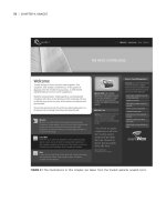
FIGURE 4.1 The illustrations in this chapter are taken from the Vivabit website (vivabit.com).
The img Element
The img element allows you to plonk an image straight into your HTML.
<img src=”images/sifaka.jpg” alt=”Leaping sifaka” />
The required src attribute points to the location of the image file.
The alt attribute, which is also required, is for specifying alternative text. It serves
an important accessibility task: It provides an “alternative” to the image for those
who cannot see the image itself (such as those reliant on screen-readers). As an
added bonus, most browsers use this attribute to provide placeholder text while the
image is downloading. The value can give an idea of what the image represents,
but doesn’t have to—it can be anything that would adequately serve as alternative
content to the image.
www.htmldog.com/examples/images1.html
You can also use the longdesc attribute, the value of which would be the location
(in the form of a URL) of a description of the image. The idea behind this is that
when there is a very detailed image (such as a map or a chart) that may need a
solid, long explanation, you don’t necessarily want to bog down the page with mas-
sive alt attributes (which should be short and sweet). longdesc gives the user an
option to navigate to a page that will explain what is going on.
BorDer anniHilation
Note that if you include an img element inside a link, browsers will tend to
apply a border to the image by default. You can easily annihilate the border with
CSS—img { border: 0; }. See Chapter 3 for more on links and Chapter 5 for
more on borders.
the Img element
|
|
chApter 4: ImAges
FIGURE 4.2 Even in a graphically rich web page, img elements tend to be few and far
between. Take a sub-page from this website, for example…
FIGURE 4.3 The only img elements in the HTML are the logo and the headshots.
the Img element
|
0
|
chApter 4: ImAges
wiDtH? HeigHt? in Html?
The width and height attributes can be quite useful. They let the browser know
how much space to reserve on a page even before the image itself starts to
download. Without this information, the browser will only know the image size
once the image starts to download, which can mean that it needs to redraw the
page, causing surrounding content to jump all over the place. For example, if
there is an
img element without width and height settings in a page surrounded
by a whole load of text, the browser will render the text first, leaving a small
default area for the image. When it comes to download the image and realizes
that it is actually bigger than the space it left, it will need to readjust where the
text flows to accommodate the image.
<img src=”images/sifaka.jpg” alt=”Leaping sifaka” width=”500”
height=”129” />
But hold on a minute! Width and height are spatial concepts—completely pre-
sentational; shouldn’t this be something that is done with CSS? Well, ideally,
yes, with the
width and height properties (width: 500px; height: 129px;
for example—see Chapter 5). But this approach isn’t always practical. If you
had a lot of different
img elements on a page (or across a whole site, for that
matter) and they all had different dimensions (if it was some kind of online
photo album, for example), then you would need to create classes for every
image (see Chapter 1, “Getting Started”), which could lead to an unwieldy
amount of CSS. In such a case, although it messes with the whole structure/
presentation philosophy, the
width and height attributes might be the most
practical route to take.
Jpeg, gif, or png?
This is a little outside the realms of HTML and CSS, but because it is so impor-
tant in the construction of a web page with images it is worth briefly noting the
different image file formats for any beginners out there.
JPEG, GIF, and PNG use compression algorithms to deliver lightweight images
for web pages. These algorithms work in different ways and each is suitable for
different situations. Most decent image manipulation software programs will give
you some control over the degree of compression, allowing you to strike a bal
-
ance between quality and file size (the more compressed an image, the smaller
the file size and the lower the quality).
JPEGs should normally be used for detailed images such as photographs.
GIFs should be used for images with solid blocks of color. This format allows
up to 256 colors, including transparency. The fewer the colors in an image, the
smaller the file size.
PNGs achieve a similar result to GIFs but in a more sophisticated way. They allow
more colors and also “alpha” transparency, which means individual pixels can
be set to a certain degree of transparency (ranging from opaque to completely
transparent). Unfortunately, the alpha transparency in PNGs is not supported in
the commonly used Internet Explorer 6, although IE7 will be more well behaved.
Image Maps
Let’s keep this brief: Image maps, which allow a user to click on various parts within
an image, are not widely used (certainly not in a good way, anyway) and there are
usually better alternatives.
the Img element
|
1
|
chApter 4: ImAges
There are two flavors: server-side image maps, which belong in Satan’s toolbox
and are discussed in Chapter 9, “Forms,” and client-side image maps, which are
cobbled together with the map and area elements.
<img src=”atlast.gif” alt=”Atlas” usemap=”atlas” />
<map name=”atlas” id=”atlas”>
<area shape=”rect” coords=”0,0,115,90” href=”northamerica.html”
alt=”North America” />
<area shape=”poly” coords=”113,39,187,21,180,72,141,77,117,86”
href=”europe.hmtl” alt=”Europe” />
<area shape=”poly” coords=”119,80,162,82,175,102,183,102,175,148
,122,146” href=”africa.html” alt=”Africa” />
</map>
In this example, the img element is the image. The map element then links onto
that image via the usemap attribute in the img element matching the name attribute
in the map element. Each area element then defines an area on the image (with a
shape and coordinates) and provides a link. So if this were a map of the world, then
you could make each continent clickable.
Why aren’t these much use? Because there aren’t many valid applications for them
(geographical maps are the most obvious use), and even when you have a valid use
(splitting one big image into navigational links, a popular crime of the past, is not
a valid use) they’re not very user friendly because it’s not immediately obvious that
the image is a clickable map. They may seem clever, but they’re perhaps too clever
for their own good.
Background Images
Because images are so often used in a purely presentational capacity, rather than
as genuine content, CSS is usually preferable to HTML for dealing with them. img
elements used to be prolific—plastered any and everywhere to achieve even the
slightest presentational effect (and are still commonly used as such today). But now,
in the web standards era, the image niche is dominated by another, slicker animal—
the CSS background image.
The background-image property can be used to specify an image to be used as a
background for just about any element box—from the page body to a paragraph to a
link. Use it on its own, and the image will magically tile itself across the background
of the element starting from the top left corner and repeating horizontally and verti-
cally, filling the box.
body { background-image: url(images/sifakabg.gif); }
www.htmldog.com/examples/images2.html
FIGURE 4.4 Spot the background images. They’re all over the place—15 in this screenshot
alone.
You can control aspects of the background image with the background-attachment,
background-repeat, and background-position CSS properties.
background-attachment determines whether the background image should scroll
with the content of a box. It can be used to specify whether the image should scroll
bAckground ImAges
|
|
chApter 4: ImAges
with the rest of the page (which it normally would do) or whether it should be fixed
to the viewport (the viewing area of the browser window, rather than the page).
body {
background-image: url(images/sifakabg.gif);
background-attachment: fixed;
}
This example will plaster the “sifakabg.gif” image across the page, and, rather than
the pattern scrolling as it would do on a long page with lots of content, it will stick
right where it is, with the rest of the page scrolling over the top.
You don’t have to have the background image tiled (repeated over and over, horizon-
tally and vertically as space allows). By using the background-repeat property you
can decide whether you want it to repeat just horizontally (repeat-x), just vertically
(repeat-y), or not at all (no-repeat).
body {
background-image: url(images/sifakabg.gif);
background-repeat: no-repeat;
}
www.htmldog.com/examples/images3.html
Those areas of the element that are not taken up by the background image will be
transparent, unless coupled with a background color (see Chapter 1), which would
paint the rest of the area that color.
Background images will start at the top left corner of a box by default, but you can
change this with the background-position property, which is particularly useful
when background-repeat is set to no-repeat, for example.
Values can be top, right, bottom, left, center, a length, a percentage, or a combi-
nation of these (such as top left).
body {
background-image: url(images/sifakabg.gif);
background-repeat: no-repeat;
background-position: center;
}
FIGURE 4.5 The leaf image is set to background-repeat: no-repeat to achieve just one
instance of it. The little spots that make up rest of the strip are one small tessellating
image set to repeat.
Another one of those funky shorthand properties is background, which can combine
some or all of background-color (which we came across in Chapter 2, “Text”),
background-image, background-repeat, background-attachment, and background-
position into one.
body { background: #0084c7 url(images/sifakabg.gif) top left fixed
no-repeat; }
Although all of the examples so far have been applying backgrounds to the body
element box, you can apply them to any visible element on the page, be it a para-
graph, a link, a table, or even a partially transparent img element, if you really
want to.
bAckground ImAges
|
|
chApter 4: ImAges
teCHniQue: rounDeD Corners
Background images aren’t just about the bigger picture—they are used for every
decorative effect. In Figure 4.6 two rounded corners are applied to a content
area. The first is applied to the area’s container and the last is applied to the
bottom paragraph, so there is no need for any extra markup.
FIGURE 4.6 Two rounded corners are applied to a content area.
As long as you have enough elements to latch CSS onto, you can apply more than
one background to a part of the page. For example, you could add one rounded
corner to a paragraph by applying a background image to the top left of a
p
element, but if you had something like
<p><span><span><span>whatever
</span></span</span></p> then you could apply a rounded corner to each of
the elements (p for the top left corner, p span for the top right corner, p span
span for the bottom left corner, and p span span span for the bottom right
corner) using something like this:
p {
background: white url(images/sifakaptl.gif) top left no-
repeat;
}
p span {
background: url(images/sifakaptr.gif) top right no-repeat;
}
p span span {
background: url(images/sifakapbr.gif) bottom right no-repeat;
}
p span span span {
background: url(images/sifakapbl.gif) bottom left no-repeat;
}
The p element applies one of the corner images (top left) and also sets the back-
ground color of the box. Each of the nested span elements then applies another
corner.
www.htmldog.com/examples/images3_2.html
FIGURE 4.7 In this example, some extra HTML span tag
“scaffolding” is necessary so that there is something
to hook each corner onto.
bAckground ImAges
|
|
chApter 4: ImAges
FIGURE 4.8 With four separate corners,
the box can accommodate different
widths and heights…
FIGURE 4.9 …and if the user bumps up the text size, there isn’t a problem.
Image Replacement: Providing Graphical
Alternatives for Text
Image replacement is the process of using CSS to replace functional text with a
graphical representation of that text. It has become an important part of web stan-
dards design, relegating img elements to a purely content-focused role in the same
way that CSS layout has relegated tables.
A meaningful heading (for example) is simply something like “Plastic Banana
Factory,” which is easily sorted, as it should be, with text in HTML. If you want that
heading presented with fancy yellow letters made up of bananas, for example, you
shouldn’t try and do that with HTML and an img tag because that carries no more
meaning. What do we use for presentation, boys and girls? “CSS!” I hear you har-
monize. Well done.
So the structured content is in place—simple, functional, accessible text in HTML.
But we don’t actually want to see that text—what we need to do is make it invisible
and replace it with an alternative visual representation in the form of a CSS back-
ground image.
By keeping the images controlled by the CSS, you can also change them as you
choose from one location. If you used it for a site-wide logo, for example, and the
logo changes, you can swap the images globally with one small change to the CSS
file. Rollovers too, where the image changes when the user moves the cursor over a
link, can be achieved simply, without the need for JavaScript.
The CSS Zen Garden (csszengarden.com) is an excellent example of image replace-
ment techniques, where the underlying HTML remains unchanged across all designs
and includes no images at all. The headings are often replaced with images using
CSS to achieve the desired look.
There are a number of ways to apply the technique. The basic idea is to hide the
functional text somehow and then slap a background image in the “empty” box.
FIGURE 4.10 Before: “Welcome” as func-
tional text (in a bold, Arial font)…
FIGURE 4.11 …and after: The “Welcome” text
is pushed out of sight and replaced by a
background image showing “Welcome” as
graphical text, using the Dax font type.
ImAge replAcement: proVIdIng grAphIcAl AlternAtIVes for text
|
0
|
chApter 4: ImAges
We could start with HTML like this:
<h1><span>Sifaka</span></h1>
and then apply…
h1 {
background-image: url(images/sifakalogo.gif);
width: 300px;
height: 129px;
}
h1 span {
display: none;
}
The above example applies a background image to the h1 element (which is made the
same size as the image) and then the span element within it is hidden, hiding the text.
This traditional method is known as the Fahrner Image Replacement (FIR) tech-
nique. Unfortunately, it has one rather serious flaw. One of the supposed benefits
of using image replacement techniques is that it aids accessibility. When display:
none is used, however, not only can you not see that element, but most screen-read-
ers will also ignore it; when a screen-reader comes across the FIR, it simply won’t
read anything at all.
The way around this isn’t too difficult—you just need to use another way of hiding
an element such as:
h1 span {
display: block;
height: 0;
overflow: hidden;
}
(See Chapter 5 for more on these properties, in particular display: none
alternatives.)
For all intents and purposes the span element within the h1 is still displayed there—
whereas to the eye zero height equals invisibility, to something that cares nothing for
spatial parameters (such as a screen-reader) the element lives on in all its glory.
www.htmldog.com/examples/images4.html
Another image replacement method removes the need for the span tag scaffolding,
so with the following slimline HTML:
<h1>The Sifaka</h1>
We can apply this CSS:
h1 {
background-image: url(images/sifakalogo.gif);
width: 300px;
height: 129px;
font-size: 1px;
text-indent: -999em;
}
This applies the background image as before but by using a large negative text-
indent the containing text is yanked out of view. The font-size is set to one pixel for
the sole reason that otherwise it could push out the height of the h1 element (any
height less than the height of the image would do).
www.htmldog.com/examples/images5.html
The problem with these image replacement techniques is that they fail to show
anything at all when images are turned off but CSS is on—the image won’t load
and the text will be hidden. The issue isn’t only that it affects people who choose
to switch off images for faster page downloads, but it also means that there is no
placeholder text while the replacement image loads, so it doesn’t have an advantage
that the img alt text has.
Another image replacement technique gets around this CSS on/images off problem
by reintroducing the span tag scaffolding, but in a slightly different arrangement:
<h1><span></span>Sifaka</h1>
To this we can apply the following CSS:
h1 {
position: relative;
width: 300px;
height: 129px;
ImAge replAcement: proVIdIng grAphIcAl AlternAtIVes for text
|
1
|
chApter 4: ImAges
font-size: 50px;
}
h1 span {
position: absolute;
top: 0;
width: 300px;
height: 129px;
background-image: url(images/sifakalogo.gif);
}
This effectively lays the span element on top of the text in the h1 element. The only
restrictions are that the image background cannot be transparent (or else the under-
lying text will show through) and the text needs to be equal to or less than the size
of the image (otherwise it will spill out from under the image).
www.htmldog.com/examples/images6.html demonstrates this method and shows up
the problem of the necessity for a solid background: If the width of the browser is
too narrow, the blue background of the logo will overlap the background of the page.
For a good rundown of the different techniques, hop on over to mezzoblue.com/
tests/revised-image-replacement/
In theory, there are similar methods that can be used but do not require the span
tag scaffolding, including manipulating the :before pseudo-element or, even easier,
using the CSS3 content property (h1 { content: url(images/sifakalogo.gif); },
which replaces the content of an element, such as text, with something else, such
as an image). Unfortunately, at the moment very few browsers (and Internet Explorer
isn’t one of them) can handle such Space Age methods, so there isn’t much point in
going into them here.
chapter
Layout
PRET T Y TE XT and fancy images are all well and nice, but in terms of real
layout—placing bits of a page exactly where you want them—things are
a bit linear so far in this book.
Before CSS 2 became widely supported, the only practical way of laying
out a page in anything other than a long single column was with HTML
tables, transparent “spacer.gif” images, and lots of non-breaking spaces:
nbsp; …
Now that CSS 2 is widely supported, you can manipulate the position
of every HTML element on a page with style sheets. Not only does this
approach dramatically reduce page weight and download time (those
multiple nested table elements and spacer images didn’t half fatten
things up), CSS layout also leads to more manageable, flexible, and
uniform page layouts throughout a whole website from a single file. And,
as a nice little bonus, it improves accessibility—thanks to the logical
order of the underlying HTML (which isn’t disturbed or compromised by
presentational markup).
There’s a fair bit to get through, but it’ll all be worth it in the end.
Starting with the basics of padding, borders, and margins of the box
model through to the display property and positioning, this chapter ends
with some practical examples to show how the theory can be brought
together to achieve solid CSS page layouts.
|
chApter 5: lAyout
The Box Model
Grand multicolumn page layouts might be your ultimate goal, but before moving on
to see how that kind of thing can be achieved let’s start with the basics of laying
out elements: the box model. Every element on a web page is surrounded by a force
field—a simple multi-layered box that can be manipulated to create sophisticated
effects.
FIGURE 5.1 The mighty box model. At the center is the content itself. Surrounding that
is the padding. Surrounding that is the border and surrounding that is the margin.
FIGURE 5.2 The box model applies to all elements displayed on a web page. Paragraphs, for
example…
FIGURE 5.3 …images…
FIGURE 5.4 …or lists, not to mention links, tables, forms, strong elements, etc., etc., etc.
Width and Height
You can set the width and height of an element using the width and height CSS
properties.
These set the dimensions of the inner (content) box only, and do not take into
account the padding, border, or margin. So if you set width to 100px and have a
50-pixel border, 50-pixel padding, and 50-pixel margin, the total width of the box
will actually be 400 pixels (100px + 50px left border + 50px right border + 50px
left padding + 50px right padding + 50px left margin + 50px right margin).
the box model
|
|
chApter 5: lAyout
FIGURE 5.5 The dimensions of a box set to width: 100px
(the width of the inner-most rectangle), height: 50px (the
height of the innermost rectangle), padding: 50px (the rect-
angle around the innermost rectangle), border: 50px solid
(the rectangle around that), and margin: 50px (the outer-
most rectangle).
The CSS standard also allows min-width, min-height, max-width, and max-height
properties to set minimum and maximum widths and heights, but since Internet
Explorer 6 doesn’t support these properties, unfortunately they aren’t a practical
option at this time (although the problem is remedied in IE 7).
Overflow
If content is too large to fit into a box with a specified height and width, then the
“overflow”—that portion of the content that doesn’t fit in the box—can be set to do
a number of things with the overflow property. This can be set to:
visible (which is the default), whereby the overflow spills over the box.
hidden, where any content that doesn’t fit in the box will be “clipped”—cut
off at the edge of the box.
•
•
scroll, which displays scrollbars, allowing the user to scroll the box to see
the overflow.
auto, which displays scrollbars only if they are necessary (whereas overflow:
scroll will show them even if the content of the box fits without any overflow).
Internet Explorer slips into a state of undignified discombobulation when it comes
to overflow:visible (which is the default behavior on all boxes). It will expand the
box’s height beyond that specified, effectively interpreting height as min-height
should be interpreted.
The clip property can also be used with absolutely positioned boxes (described later
in this chapter) to specify an area of a box that is visible.
clip: rect(10px 120px 120px 10px), for example, will clip a region starting at
10px in from the left and 10px in from the top and end at 120px in from the left
(the “right” part) and 120px from the top (the “bottom” part), leaving a 110px by
110px area.
Padding
Individual sides of the box can be padded by using the padding-top, padding-right,
padding-bottom, and padding-left properties (for example, padding-top: 2em).
If you want to set the padding on more than one side, though, you can use the pad-
ding property, with which you can apply different amounts of padding to each side
of a box if you so choose (see “Shorthand Values” sidebar).
#header {
padding-bottom: 1em;
}
#content {
padding: 1em 2em;
}
Backgrounds, be they images or colors, will fill the area of the content and the padding.
•
•
the box model
|
|
chApter 5: lAyout
sHortHanD values
With padding, border-width, and margin you can provide a single value to
specify uniform padding/border width/margin in a box. To set different values for
different sides you could use properties like
padding-top and padding-left or
border-right-width and border-bottom-width, for example, but you can also
apply different values to different sides of a box in one shorthand property. By
specifying two, three, or four values to padding, border-width, or margin, you can
target different sides as the following table indicates:
Values Example Applies to
1
padding: 1em all sides
2 margin: 10px 2em [top and bottom] [left and right]
3 border-width: 1px 5px 2px [top] [right and left] [bottom]
4 padding: 10px 10px 1em 1em [top] [right] [bottom] [left](clockwise)
Note that the values don’t all have to be the same—you can mix up pixels, ems,
and more if that floats your boat.
Borders
Borders have a bit more to them than padding because not only can you specify
their width, you can specify their style and color.
Border width works much in the same way padding does—you can specify measure-
ments for individual sides (using border-top-width, border-right-width, border-
bottom-width, and border-left-width) or you can specify multiple sides at once
using border-width with one, two, three, or four values.
Before border-width does anything, however, you need to specify what kind of bor-
der you want with border-style.
Some values for border-style, which are as mad as a particularly mad clown in a
mental asylum, include groove, ridge, inset, and outset. These render differently
in different browsers, look pretty nasty due to their generic “embossed” style any-
way, and, therefore, are almost as useful as a saucepan made out of cream cheese.
This property’s most commonly used values are the self-descriptive solid, dotted, or
dashed, which are a tad more useful. Whereas browsers will normally render dotted
borders as a series of equally separated dots, Internet Explorer 6 (and earlier versions),
in an interesting quirk, will render them as dashed lines if the border is 1 pixel wide.
You can specify different styles for different sides of the border using border-
top-style, border-right-style, border-bottom-style, and border-left-style or
specify more than one value with border-style (following the same principles as
the border-width shorthand—see sidebar). border-style: solid dotted dashed
solid, for example, will apply a solid border to the top, a dotted border to the right,
a dashed border to the bottom and a solid border to the left of the box.
border-color (and border-top-color, border-right-color, border-bottom-color,
and border-left-color) can be used to change the color of a border.
If a border color is not specified, it will assume the color of the color property of
the box.
You can further simplify things by combining border settings with the border short-
hand property, which allows you to set the border-width, border-style, and bor-
der-color styles in one handy property. border-top, border-right, border-bottom,
and border-left achieve the same things for individual sides of the border.
border: 1px solid black, for example, will set a one-pixel-wide solid black border
to a box. If you don’t want a uniform border, you can follow the border declaration
with separate specific declarations:
#orangutan {
border: dotted red;
border-width: 2px 10px;
}
#chimpanzee {
border: 2px solid;
border-color: black #333 #666 #999;
}
www.htmldog.com/examples/border.html
the box model
|
100
|
chApter 5: lAyout
FIGURE 5.6 Some examples of different border styles and property combinations. See www.
htmldog.com/examples/borders.html.
Margin
And so to margins—the transparent outer wrapping of the box. We return to the
simplicity of padding in terms of defining them—you simply specify the width. Once
more, you can set the sides individually with margin-top, margin-right, margin-
bottom, and margin-left, or use margin with one, two, three, or four values:
#bonobo {
margin-top: 1em;
}
#human {
margin: 3em 1em;
}
Margin Collapsing
If two or more vertical margins come into contact, a phenomenon known as mar-
gin collapsing will occur. The distance between two boxes will be the distance of
the greater of the two margins, rather than the sum of both. The smaller margin
will “collapse” and disappear—only the larger margin will remain to space out the
two boxes.
So if you had a number of paragraphs, one after the other, and their margin was set
to 1em, the margin between each paragraph would be 1em, not 2.


