Designing the Mobile User Experience phần 5 potx
Bạn đang xem bản rút gọn của tài liệu. Xem và tải ngay bản đầy đủ của tài liệu tại đây (290.68 KB, 26 trang )
il /
DETAILED DESIGN RECOMMENDATIONS 91
•
Simulator code is frequently different from the real code, so your
application will behave differently.
•
The underlying system architecture is not the same on mobile and
full-sized devices, so your application may behave differently even
with an emulator.
•
Devices have myriad rendering and implementation idiosyncrasies,
both feature and user interface, that are not captured in the
emulator.
•
Using screen buttons to operate an emulated device is very artificial,
so usability test results will be biased towards avoiding their use.
•
The emulator is almost certainly not the device the usability testing
participant will use or is accustomed to using.
•
User behavior sitting in front of a screen is very different from when
holding a device, whether in a quiet office or a crowded bar.
Emulators and simulators can be used by developers for interac-
tive debugging of logic; they can be used for usability testing to
understand some components of the information architecture. Do
not use them for system testing, unit testing, or user acceptance
testing.
5.5 DETAILED DESIGN RECOMMENDATIONS
From the discussion in this chapter, it should be clear that detailed
design recommendations have to focus on a particular platform, and
perhaps also on a particular set of devices. Fortunately, there are
several good sources for design recommendations, frequently called
style guides.
This chapter cannot provide a comprehensive list of guide-
lines, but can give you some good suggestions on where to find
recommendations.
5.5.1 Platform Providers
Platform providers are the most obvious source of design recommenda-
tions, as they know the development environment and design intentions
intimately. In theory, if applications work well, the platform will be
more widely adopted. In practice some providers do not provide a
comprehensive set of recommendations.
il /
92 MOBILE DESIGN PRINCIPLES
•
Windows Mobile Design Guidelines, from n.
microsoft.com
•
MIDP 2.0 Style Guide for the Java 2 Platform, Micro Edition, by
Cynthia Bloch and Annette Wagner of Sun Microsystems
•
Graphical Browser Application Style Guide, and similar documents,
from
•
UIQ Style Guide, from the developer and technology section of
•
User Interface Design Guidelines, at
•
Palm OS
®
User Interface Guidelines, at
5.5.2 Standards Organizations
Standards organizations also provide design guidelines, ones that often
reflect a particular agenda. The W3C, for example, is pushing guide-
lines that will make applications work on both full-sized and mobile
devices, which may not be ideal. The Open Mobile Alliance, in a former
incarnation, provided a WAP style guide for designing ‘generic’ sites
to run on Ericsson, Nokia, and Openwave WML 1.x browsers despite
radical rendering differences. This was a least common denominator
approach, and sites designed with those ‘generic’ rules were at best
very simple.
•
Mobile Web Banner (‘WAP’) Advertising Specifications standard-
izes web banners for advertising on mobile phones. These guide-
lines ensure consistency and adequate usability. See http://www.
mmaglobal.com.
•
Mobile Web Best Practices is the W3C’s attempt at specifying how to
write once and run anywhere. The guidelines are largely reasonable.
See />5.5.3 Carriers and Device Manufacturers
Carriers have the most motivation to have useful and usable software
and web sites, since these drive increased usage and revenue. Device
manufacturers want users to purchase their devices a second, third,
in fact many times, so a good device and purchased-software user
experience is important to carriers. In our experience the carrier and
manufacturer style guides are the most comprehensive for developing
for the limited environment of the carrier or device type.
il /
DETAILED DESIGN RECOMMENDATIONS 93
As devices support different platforms, each of these sources may
have several guidelines. More companies and their developer programs
are listed in the Companies appendix.
•
Forum Nokia has an extensive technical, marketing, and design
library for Java ME, Series 40, Series 60, Series 80, and web appli-
cations with separate documents for games. See um.
nokia.com
•
Sprint Nextel has web, Java ME, and multimedia style guides, but
some guidelines are only available if you have a partnership with
the company. See
•
Sony Ericsson has some limited guidelines for various platforms. See
•
Verizon information is found at />•
Motorola provides support for specific devices. See http://developer.
motorola.com.
5.5.4 Third-Party Guidelines
Occasionally a third party, either an individual designer or a usability
consultancy, will write design guidelines. Serco Usability Services may
have been the first company to do this, but their WAP guidelines
are neither current nor currently available. Bloggers and other online
writers make design recommendations, but their recommendations
tend to be rather subjective and the rationale for design choices are
seldom clear or well defended. In short, online resources tend not to
be very strong. There are, however, at least two exceptions to this
general rule.
•
Little Springs Design
11
offers style guidelines intended to cover
all devices for a platform. These are available for web, Java
ME MIDP 2, and media content production. See http://www.
littlespringsdesign.com
•
Serco Usability Services provides a varying source of guidelines in
their Research section. Most of these guidelines are not connected
to a specific platform. See />11
Barbara Ballard is principal of Little Springs Design, which also writes many of the Sprint
guideline documents.
il /
6
Mobile User Interface Design
Patterns
User interface (UI) design patterns are good solutions to standard
user interface design problems. While neither standard practice nor
academic research has yet formalized what a pattern is and is not,
patterns have become a good method for a new user interface designer
to learn good, well-practiced solutions. At a minimum, UI patterns
provide a good starting point for specific parts of an application.
Clearly there is no end to the list of all possible design patterns, and
a single chapter within a book is not going to describe the majority of
them. Thus the patterns identified in this chapter provide more of a
set of examples from which a pattern library could be built. Many of
the patterns are also good examples of how mobile design is different
than desktop design, or how mobile device type and user interface style
influences design.
6.1 ABOUT USER INTERFACE PATTERNS
A design pattern documents known good solutions to frequently occur-
ring design problems. In some cases, the solutions themselves become
encoded as user expectations: an application that violates the common
design could jar user expectations.
User interface design patterns are generally identified and articulated
by design experts. They can then be used by less experienced designers
or by designers wishing to create a consistency in user experience.
Designing the Mobile User Experience Barbara Ballard
© 2007 John Wiley & Sons, Ltd
96 MOBILE USER INTERFACE DESIGN PATTERNS
If writing about ‘usability patterns’ is included, there are three types
of UI design pattern: patterns of practice, user interface design struc-
tures, and corporate patterns. Patterns of practice are closer to best
practices in development, such as processes for targeting multiple
markets, and are not reflected in this book.
User interface design patterns, or ‘universal patterns’, are solutions
that likely work across a wide range of applications and on different
platforms, although some patterns are platform-specific. In addition,
organizations with a complex set of offerings may also create a set of
highly specific, fully stylized, ‘corporate patterns’ in a pattern library
frequently with code associated with each pattern.
6.1.1 Mobilization
While the world of desktop design patterns all assume a consistent set
of capabilities of the computer, patterns targeted at the mobile space
must take into account the varying capabilities and user interface styles
of the native operating system.
Some UI design patterns, particularly the aforementioned ‘usability
patterns’, are identical to desktop design. Other patterns vary due
to size of screen, cost of connectivity, input mechanism, technologies
available, etc. In general, be suspicious of any desktop navigation or
screen layout pattern – it may not mobilize well.
Mobile design patterns do not follow a strict categorization by appli-
cation development platform. There are some portions of the wml
namespace that, if present, enable interaction like AJAX or even Java
ME. Thus a solution for one platform might be useful for a wildly
different platform.
Using a Device Hierarchy
Desktop UI design patterns are reasonably stable regardless of plat-
form. Tab navigation may look different in a Windows dialog box than
it does on the Apple web site, but the basic concepts are the same. Only
when multiple rows of tabs are needed does the underlying platform
have much influence over design.
In contrast, mobile patterns rely on both device user interface style
and platform. Whereas tabs are a useful mechanism on a stylus-driven
device (web or local application), they are less useful on a scroll-and-
select device application, and should be implemented as horizontal
ABOUT USER INTERFACE PATTERNS 97
navigation instead. The same navigation in a web browser on a
scroll-and-select device should either avoid the problem altogether, or
use a drop-down list.
Since good design depends so frequently on device characteristics, a
device hierarchy is helpful when working with mobile UI design. The
hierarchy organizes devices into relevant device classes, with varying
degrees of specificity based on the level in the tree.
There is no one correct hierarchy. Any hierarchy design will have
its challenges. The Figure 6.1 sample hierarchy shows one possible
organization, assumed by the designs in this chapter.
Thehighestnodeinthehierarchy,asillustratedinFigure6.1,isamobile
device. The distinction with the most impact on UI design is scroll-and-
select versus stylus devices,so that may be the secondlevel. Within stylus-
driven devices, the operating system likely has the next most impact on
design decisions. Within scroll-and-select devices, softkey management
paradigms may have the next most relevant impact.
Feeding into the hierarchy at the lowest level are devices themselves,
as reported in a device description repository. Several of these exist,
as they are included in both WURFL and J2ME Polish. The W3C
envisions myriad device description repositories available.
Figure 6.1 Device hierarchy, fed by content from a device description repository.
Each UI design pattern applies to one or more nodes in the hierarchy. Some patterns
apply to all devices. Others apply only to lower nodes in the hierarchy. Most apply
to the entire hierarchy, with different versions for different nodes. In this chapter
are patterns in all three categories. Figure 6.2 illustrates how patterns may apply
to different nodes in the hierarchy
98 MOBILE USER INTERFACE DESIGN PATTERNS
Building and maintaining this hierarchy cannot yet be done without
human editing, as available device description repositories do not have
information about user interface paradigms. The devices themselves do
not report this information. Further, the hierarchy will be different for
different platforms. Softkey management is largely irrelevant to a web
site, very important to a Java ME or Flash application, and absolutely
critical to a native application.
Each UI design pattern applies to one or more nodes in the hierarchy.
Some patterns apply to all devices. Others apply only to lower nodes
in the hierarchy. Most apply to the entire hierarchy, with different
versions for different nodes. In this chapter are patterns in all three
categories. Figure 6.2 illustrates how patterns may apply to different
nodes in the hierarchy.
When designing an application, use information about target users,
their devices, their training, and their diversity to help determine devel-
opment strategy. Combine user and device information with project
needs, application complexity, and organizational capabilities to decide
what set of nodes to target.
Figure 6.2 Mobile UI patterns apply to different nodes in hierarchy. One pattern
can have different implementations for different nodes
ABOUT USER INTERFACE PATTERNS 99
A corporate intranet application might not have a large enough user
population to justify multiple designs, and a generic design might be
possible. In some companies, a generic scroll-and-select design might
be optimal if few or no employees have PDA devices. A very simple
web site is likely to work well with a generic mobile design. On
the other hand, a highly interactive application or a frequently used
application like a browser or email client will be well-served with a
stylus version and different versions for various scroll-and-select user
interface paradigms.
Designs within the hierarchy are inheritable. If targeting the Nokia-
style softkey node, a design situation with no Nokia-specific design
simply inherits the scroll-and-select pattern. Similarly if no scroll-and-
select softkey design is present, the generic mobile pattern is inherited.
In this way, targeting three nodes does not mean three times the design
and coding work of targeting a single node.
The device hierarchy is an efficient, repeatable process for achieving
class-based design, as discussed in Chapter 5.
Creating a Mobile UI Design Pattern from Scratch
To mobilize a current desktop design pattern, it helps to be familiar
with a wide variety of mobile applications. There is a general process:
•
Start from scratch for the design. Reuse the design situation, but
design a new user interface.
•
Decide what device classes you need for this particular pattern. It
likely will be either your standard set of classes or a more generalized
set, such as ‘all scroll-and-select devices’.
•
Consider user needs, device context, platform capabilities, and
device input and display mechanisms.
•
Determine whether a pattern already exists for this need. Research
existing mobile UI patterns, which can be found in various places
on the web, in this chapter, and in some style guides for carriers or
platform providers. Modify it if necessary, particularly for different
device types.
•
If no mobile pattern exists, use good design and usability practices
to create the pattern. Mark the pattern as untested until it has been
successfully used in a variety of situations.
•
Determine whether different versions of the design are needed for
different nodes in your device hierarchy.
•
Test. Use the pattern in various applications and test with users.
100 MOBILE USER INTERFACE DESIGN PATTERNS
6.1.2 Universal Patterns
Universal UI design patterns can perhaps be called simple ‘best
practices’. They are the pure version of user interface design patterns,
and apply to a wide variety of applications and across platforms. The
examples in this chapter are universal mobile UI design patterns.
Most of the mobile UI design patterns found on the Internet are
universal patterns. As of 2006, none of the large corporations who
published their desktop UI patterns had published any mobile patterns.
6.1.3 Corporate Patterns (Library)
Many organizations, such as Yahoo!, standardize their design process
using not just style guides, but a pattern library. Each pattern contains
all the same information as general patterns, with the addition of
specific style requirements, a concrete visual design, and frequently
application code snippets.
UI pattern libraries are a logical extension of companies’ icon libraries.
SAS Institute, for example, makes statistical software with dozens or
even hundreds of semi-independent modules; each module needs dozens
of icons. Before creating a searchable, manageable library, graphic
designers had to know through direct experience whether a same or
similar function had an icon in a different module. Icons might conflict
with each other between modules, or the same function might have
different icons in different modules. Learnability and the overall user
experience suffered, as many or even most users use multiple modules.
UI pattern libraries serve the same need as icon libraries, but apply
to more than just icons. They also suffer many of the same challenges.
Having a list of patterns or icons is insufficient: the library must be
navigable with search, tags, and cross-links. Keeping the information
up to date requires effort: adding and editing information must be easy
and incorporated into the job description.
Despite the challenges, pattern libraries have several key benefits.
Consistency of user experience eases learning, as users do not have to
learn a new practice. The design pattern can be well-tested in user testing,
with minor updates over time optimizing the design. The patterns help
the user interface become part of the brand along with the visual design.
Developers can assign templates, sample code, or even actual code
to each pattern. A notification system can alert them when a pattern
with code in use has been updated, so they can in turn update the live
application.
SCREEN DESIGN 101
Even if developers do not code the pattern as an object for reference,
they will become quite expert at implementing a pattern simply due
to repeated use. Either way, development time will be accelerated,
and there will be fewer bugs in the code. This will reduce testing
time.
UI pattern libraries may be even more important for mobile appli-
cations than for desktop applications. Beyond the advantages offered
by desktop patterns, hierarchy-dependent mobile patterns offer further
advantages:
•
There is insulation from a rapidly increasing set of target devices.
•
There is a significant reduction in number of design decisions for a
given application. Where desktop design is only one or two designs
for a given situation, mobile design can contain many more due to
number of target devices.
•
There is higher compliance with device user interface paradigms,
across applications.
•
There is accelerated creation of support scripts and web information.
•
There is reduced testing with regards to devices. An application built
with patterns that were well-tested on devices is extremely likely to
work on those same devices without failure or trouble.
6.2 SCREEN DESIGN
The screen design patterns apply to the design of individual screens in
myriad situations. Many have implications for application architecture
or the design of other screens.
6.2.1 List-based Layout
Mobile devices vary in their screen dimension ratios as well as size.
Some have a longer horizontal dimension; others are vertical or close
to square. Unless a device is QVGA or larger, the screen orientation is
an important organizing principle.
Design
A web page or application screen should be designed vertically, using
lists or similar mechanisms. Paragraphs wrap, spilling down the screen.
102 MOBILE USER INTERFACE DESIGN PATTERNS
Each link should be on its own line. Form controls should be on their
own line. Occasionally a pair of closely related controls can go on the
same line; consider this a variant on the list theme as opposed to a
horizontal layout. Almost all the example screens in this chapter use a
list-based layout.
Applicable Devices and Platforms
This layout is suitable for any scroll-and-select device with a small
screen taller than wide and is smaller than QVGA (240 × 320 pixels).
Most stylus devices are large enough to support two columns.
When Used
It can be used for most non-game screens that do not serve as the main
screen of an application, and almost all web pages.
Rationale
Most mobile phones are oriented vertically, with screens taller than
they are wide. Horizontal layout mechanisms, like side bars, tables,
and horizontally oriented control strips at best will look squished on a
mobile phone. Additionally, navigating through these mechanisms on
a scroll-and-select device can be confusing and unpredictable and only
variably supported by devices.
6.2.2 Table-based Layout
Many devices and applications have a launch screen, with two or three
columns of icons, from which major components can be started. Stylus
devices in particular have these screens as application launchers; Palm
has used such a screen for over a decade.
Design
A table-based layout screen is simple, with little need for softkeys
or buttons. It should have a title, two or three columns of cleanly
SCREEN DESIGN 103
designed icons, and a label for each icon underneath it. This design is
often repeated across devices and platforms; it is likely that the device
currently in your possession has a launch screen with this design as
one launch screen option.
On scroll-and-select devices, place the focus in the center of the
layout, not the top. This reduces keypresses necessary to reach any
given icon. Do not use this technique if the items do not fit on a single
screen.
If at all possible, restrict the number of items to those that will fit
on a single screen. If necessary and the application users can continue
to see icon details, reduce icon size to make this possible. If this is not
possible, consider a different design – especially for scroll-and-select
devices.
Avoid using tables as layout on web sites; if a column layout is
desired, use CSS.
Applicable Devices and Platforms
The table layout is particularly effective for stylus-driven devices but
can be used in very limited amounts in local applications on scroll-
and-select devices. Do not use a table to lay out a web page on a
scroll-and-select device.
When Used
Use on launch screens, either for a device or for a frequently used
application. Do not use it on a screen with frequently changing options.
Consider other designs for a launch screen with more options than
can be displayed simultaneously without scrolling, especially for scroll-
and-select devices.
Rationale
Caution with using a table layout is a direct corollary of the reasons
behind the list-based layout, combined with the need for graceful
degradation on web pages in browsers that do not work well with
tables.
Tables, with icons, are good for presenting more options on the
screen and promoting location memory. Users know that the browser
104 MOBILE USER INTERFACE DESIGN PATTERNS
option is in the top right corner, so they can quickly tap there. Even
scroll-and-select users get some benefit from position memory, but at
the expense of complex scrolling control. If the list of options frequently
changes, this position memory benefit disappears.
For a set of items that cannot fit on a single screen, a table
layout introduces extra complexity for a scroll-and-select device. The
user has to manage decision making for each item, left and right
cursor movement, up and down cursor movement, and page scrolling.
This extra complexity can make the task of activating an item too
complex.
6.2.3 Location Selection
This is a generic interface to obtain, save, and manage the user’s
location across a variety of applications and device capabilities.
Design
When needing user location, provide a screen that enables a number
of methods to set it, not just automatic location or postal code entry.
As illustrated in Figure 6.3, the complete set includes:
•
Home, which can be the user’s postal code entered during registra-
tion or can be empty until first used. Provide a ‘Change’ page for the
rare case when the user’s home region changes. May not be useful
for travel applications.
•
Favorites, which should be an automatically generated list of loca-
tions, with the most frequently used locations at the top of the
list. Especially useful when use is likely to center around known
locations; may even be useful for travel applications.
•
Find Me, which activates the device’s location fetching API. Do not
include if automatic location detection is not supported.
•
Elsewhere, allowing the user to enter postal code, city, or address.
When necessary, take the user to a disambiguation page to
clarify input. Do not require the user to enter any more than
necessary.
•
Name location, applied to any ‘Find Me’ or ‘Elsewhere’ location
specified. The screen also needs ‘Save’ and ‘Cancel’ softkeys, buttons,
or links.
SCREEN DESIGN 105
Figure 6.3 Controls to set location
Applicable Devices and Platforms
It is suitable for all mobile devices and applications.
When Used
Use when location is needed at discrete, infrequent points in time.
For applications that need frequent or continuous updates, rely on
automatic location only.
Rationale
Devices, and plans, have varying ability to use location services on the
phone. Indeed, some users may have location turned off due to privacy
concerns. This should not prevent many location-enabled applications
to be useful on all devices.
This design gives the user a variety of methods for entering location
data, and saves data for further use without getting in the user’s way.
6.2.4 Returned Results
Designers frequently ask, ‘How many items should be displayed on
the screen?’ For older browsers, the maximum page size limited things
closely. Many current browsers display entire desktop web pages on a
small screen, but the user experience is less than enjoyable for many
sites. What is the balance between scrolling for more results and
fetching them?
See also ‘Alphabetic Listings’, both short and long.
106 MOBILE USER INTERFACE DESIGN PATTERNS
Design
The optimal length for the number of items displayed from a longer
list depends especially on the time to refresh the list.
Platform or node Implementation Rationale
Web pages (no
scripting)
Limit the list to a maximum
of two to three screens of
results based on the current
distribution of screen sizes.
Place controls to navigate
to the next screen at the
bottom of the list.
A network request
introduces a delay.
Applications Display exactly one screen
worth of results, so no
scrolling is necessary.
Provide navigation to the
next and previous screens
as controls at the top of the
screen.
With no delay in fetching
the next page, keeping the
display limited to just the
current screen eliminates
the need for scrolling at
all. Next and Previous
controls at the top of the
screen allow quick
navigation.
Web pages
(scripting)
Use scripting (AJAX) to
achieve the same user
experience as applications,
above. Keep both the next
and previous set of results
in memory, displayable
with no delay.
Same as applications.
If providing numbered access to pages, like Google results, provide
those numbers at the bottom of the page. They are less frequently
used and their presence at the top of the page would cause extra
scrolling.
Applicable Devices and Platforms
All devices and platforms are suitable.
When Used
Use for list display whenever an application returns a list of results,
unless the results naturally are alphabetic.
SCREEN DESIGN 107
Rationale
There are two relevant costs to the user associated with navigating
lists: scrolling through lists, and navigating between pages. The
Next/Previous method of navigating between pages is well understood
amongst Internet users, so the cognitive cost of using it is quite low. If
the Next button has focus when the screen is drawn (either by it being
the first control or by manipulating focus, depending on the platform),
then a single keypress will get the user to the next page.
If there is a fetch delay, then scrolling will have some advantages
over many fetches. The list is limited to approximately the size that
will avoid the user being lost on a very long page.
6.2.5 Menus
A menu is a list of commands. It can be the main screen of an appli-
cation, or a set of commands applicable to an item or part of the
application.
Design
If the number of actions available for a given screen exceeds ten, divide
the list into frequent and infrequent commands, where the number
of frequent commands is eight or fewer. Provide numbered access to
the frequent commands, and unnumbered, or even submenu, access to
the infrequent commands. Figure 6.4 illustrates a mix of frequent and
infrequent commands.
If a command is used in multiple places across the application,
and is frequently used, keep both the label and the number the same
throughout. This policy increases learnability for the entire application.
Figure 6.5 illustrates common commands with the same numbers, even
though the numbers are not consecutive.
Limit the number of commands listed on a page to roughly fifteen.
Keep frequent commands clustered together at the top of the list.
Exception: if the device has an alphabetic keyboard and the plat-
form supports letter input, construct the menu with appropriate alpha-
betic shortcuts instead. Limit the list to the number of items that can
reasonably be displayed and mapped to letters. Any additional items
should be relegated to ‘More’, ‘Other’, or the equivalent.
108 MOBILE USER INTERFACE DESIGN PATTERNS
shareholder lawsuit
settlement
Also
more (42 pages left)
Next conversation
1 Reply
2 Reply to all
3 Forward
4 Move to Inbox
Contacts
0 Inbox
8 Compose Mail
7 Trash message
6 Add star
5 Mark unread
Figure 6.4 Common commands available for a Gmail message are numbered;
less frequent items are unadorned links
Inbox
Mark Wickersham
Payroll
1 – 1 of 1
8 Compose Mail
0 Inbox
Contacts
more views
Sign out
©2005 Google
Help
Figure 6.5 Gmail commands replicated in the inbox have the same number, even
though the numbers are not consecutive
Applicable Devices and Platforms
Use this design on all scroll-and-select devices with platforms that
support button input for navigation.
When Used
Use where the user may want to build expertise, navigating quickly
using numbers rather than scrolling.
SCREEN DESIGN 109
Numbered access to commands applies to any application using a
page model rather than a screen model, in which vertical scrolling is
assumed. This includes most list-based applications. Numbered access
can be used on a non-scrolling application, but the incremental value
of the numbers is lower.
Rationale
Keypresses should be kept to a minimum for common actions. Unlike
on a desktop, a keypress is not simply a mouse click, but the number
of times the cursor has to be moved to get to a command, then
the command itself. For a Gmail message, for example, getting to
‘Archive’ or ‘Next Message’ can be ten or more keypresses. Numbered
access allows that to be one keypress, although it is restricted to users
who choose to learn more about the application. On the other hand,
numbers do not harm usability by novices and indeed provide visual
cues that certain commands are somehow different.
Keeping items clustered based on frequency is a standard heuristic
for screen and control panel layout inherited from human factors.
It restricts the area users have to scan for the most common items.
Structure within the frequent commands can reduce scan time further.
6.2.6 Tab Navigation
Tabs are a common mechanism used to arrange more controls than
can fit on a single page. Common desktop examples include Windows
preferences dialog boxes and Apple.com or Amazon.com web sites.
Design
There are no changes from desktop tab navigation: what works on
the desktop works on mobile, if on appropriate devices. Restrict the
number of tabs to that which will fit in one row on the screen.
Applicable Devices and Platforms
It is suitable for stylus devices. Tabs are also acceptable when all of
the following apply:
•
a scroll and select device
•
with four-way navigation (including left and right)
110 MOBILE USER INTERFACE DESIGN PATTERNS
•
a platform with access to left and right controls
•
a platform that allows vertical scrolling to go line-to-line and not
just control-to-control
•
a platform with focus control
•
initial focus is placed below the tabs.
None of the major browsers support all of the above. MIDP 1 doesn’t
support it. MIDP 2 can, but will have to be designed very carefully
and tested on all devices.
When Used
Use in the same situations as desktop tab navigation.
Rationale
Same as for desktop tab navigation. The limitations on scroll-and-select
devices arises from the small width and the need to scroll past each
of the tabs individually. The experience can be replicated on many
desktop sites: try using a site with only tab, shift-tab, letters, numbers,
and Enter/Return. No mousing allowed. Tabs become quite tedious,
as do left-side navigation.
6.2.7 Breadcrumbs
Breadcrumbs are a popular mechanism for locating the user within a
site and providing supplemental navigation.
Design
Breadcrumb design for stylus devices is similar to breadcrumb design
for desktop devices. Use the same rules of thumb for font size and
color, with the caveat that some mobile devices support only one font.
Ensure that the breadcrumbs are meaningful, and enabled as links.
Consider restricting the breadcrumbs to only one line, with a link like
‘<<<’ on the left edge for access higher in the hierarchy. The right
side of Figure 6.6 illustrates breadcrumbs for a stylus device.
SCREEN DESIGN 111
Figure 6.6 Breadcrumb navigation on scroll-and-select and stylus devices
The traditional style of breadcrumbs is not appropriate for scroll
and select devices. To provide the orientation and navigation capabil-
ities offered by breadcrumbs, use a drop-down list near the top of the
screen as illustrated on the left side of Figure 6.6. If scripting is avail-
able, simply go to the relevant page when an item in the drop-down is
selected. Otherwise, include a Go button. If at all possible, set the default
focus below the breadcrumb controls. Note that this implementation
shares much in common with computer folder navigation mechanisms.
Applicable Devices and Platforms
Breadcrumbs are most popular on web sites but can be used in applica-
tions as well. The enhanced navigation capabilities available to appli-
cations make breadcrumbs less important on non-web platforms.
When Used
Breadcrumbs are most typically used in complex, hierarchically
arranged web sites. It can be used elsewhere, but the breadcrumbs tend
to designate locations in the hierarchy.
Rationale
Breadcrumbs have a lot of text. ‘Home > Products > Printers > HP
6131 > Specs’ can have a smaller font and be unobtrusive on a desktop
112 MOBILE USER INTERFACE DESIGN PATTERNS
site; on a mobile phone with only one or two font sizes, that infor-
mation will take two or three of a device’s 8 to 15 available lines of
text, and is further in the most valuable place on the page. The space
is much better used for content, not supplemental navigation.
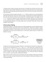
6.3 APPLICATION NAVIGATION
Application navigation is the first place where developers from the
desktop world get introuble. Even if connectivity, cursornavigation, and
text input were the same as for the desktop, the small screen means that
less information is displayedon each page or screen. If allthe information
from the desktop screen is valuable for the mobile device, then the extra
information has to go somewhere, typically another page or perhaps the
same page accessible through large amounts of scrolling.
These patterns address some of the common navigation issues faced
by mobile applications.
6.3.1 List Navigation
Navigating between items in a list quickly causes navigation challenges.
Design
When viewing an item from a list, provide navigation both back to the
list and to the next and previous item. In this case, an ‘item’ can be an
individual story or picture, or it can be a subset of list of results.
There are three commands for each design: ‘Next’, which takes the
user to the next item or page of results; ‘Previous’, which takes the
user to the previous item or page of results; and ‘Done’ which returns
the user to the screen that called the first item.
Platform or
Node Implementation Rationale
Web page Below the title but above the content,
place links labeled (in text or
graphically) ‘Next’ and ‘Done’.
Rely on the device’s back button to
achieve Previous.
With no access to the
softkeys, the best
solution involves
on-screen controls.
APPLICATION NAVIGATION 113
Application:
stylus
If content is less than one screen tall,
put ‘Previous’, ‘Next’, and ‘Done’
buttons below the content.
Otherwise, the buttons should be
below the title but above the
content.
Control buttons on stylus
devices tend to go
below the content, and
the decision regarding
whether the next page
is needed tends to
happen after scanning
the content.
Application:
Nokia-style
softkeys
‘Next’ is the first item in the Options
menu. ‘Previous’ is the second.
‘Done’ is the third.
This is the cleanest design
with Next within two
clicks. Keeping Next
and Previous together
helps predictability.
Application:
other softkeys
Make the left softkey be ‘Next’ and
‘Done’ to the right softkey. Map
the Back button, if available, to
‘Previous’. If not, use an on-screen
command to access Previous.
Softkeys and the back
button will be the
fastest method of
accessing these
high-frequency
controls.
On platforms that support it, ‘Done’ should also remove items from
the history. Thus if the user goes to a Flickr.com album from a friend’s
home page, views some pictures, returns to the album overview screen,
and then presses Back, she will return to her friend’s home page rather
than the most recently viewed image.
Applicable Devices and Platforms
It is suitable for any mobile platform, but implementation varies based
on platform and input method
When Used
Use with lists within categories, in which users may not understand
the categories as well as you do.
Rationale
Generally speaking, there are two behaviors when viewing a set of
items, whether they are news stories, pictures, email messages, or
anything that may find the user viewing more than one of the set. Users
exhibiting the first behavior pick an item from the list, view the item,
114 MOBILE USER INTERFACE DESIGN PATTERNS
and return to the list. With the other behavior, users view an item, and
navigate directly to the next or previous item from there.
Some users prefer the pick-and-view method all the time; others
almost always prefer the view-in-sequence method. Other users will
switch based on device, context, or information. In most situations,
half of the users will choose one method, and half will choose the
other.
Some of the recommended designs above recommended relegating
‘Previous’ to the Back button, even though the two commands are
not the same. This decision is a tradeoff between providing the extra
functionality of a Previous function with the extra user interface
complexity of providing a Previous function. Since most of the time
the Back function achieves the same goal, the simpler design has been
chosen.
6.3.2 Game Navigation
While games vary greatly, the navigation structure to support the game
should not.
Design
The basic navigation for games is fairly standard, but screen design
varies with device and game. Figure 6.7 illustrates key elements of the
most commonly used game architecture.
Upon launch, a splash screen identifies the application and developer.
Typically next the game displays a main menu, with a first item, already
highlighted, to play. Other actions such as Options (always including
volume on /off and vibrate on /off), High Scores, Instructions, and Exit
are in the main menu. If a game has been saved, the application displays
the in-game Paused menu.
Within the play of the game itself, there must be a quick Pause
function. This is frequently the right softkey but can be any number
of things. When the game is paused, the ‘paused menu’ is displayed,
which allows the user some context-specific functions including Exit.
The first item in this menu is Continue, allowing immediate one-click
return to the game.
When the device interrupts the user with an incoming call or message,
the game should automatically pause itself.
Other screens within the game should follow best practice design.
APPLICATION NAVIGATION 115
Figure 6.7 Architecture for the non-play portions of a game. Representations of
Options, High Scores, and Instructions have been removed from the diagram but
should remain in the actual applications
Applicable Devices and Platforms
The game pattern is suitable for downloaded applications and some
scripted browser web pages.
When Used
Even games that need not have a pause function due to a lack of time
pressure can use this structure. Be sure to not count pause time in any
game timers.


