presentation zen Simple ideas on presentation design and delivery phần 1 docx
Bạn đang xem bản rút gọn của tài liệu. Xem và tải ngay bản đầy đủ của tài liệu tại đây (1.8 MB, 24 trang )
presentationzen
Simple ideas on presentation design and delivery
Garr Reynolds
To Mom & DadTable of Contents
Acknowledgments, vii
Foreword by Guy Kawasaki, viii
INTRODUCTION
Presenting in Today's World, 5
PREPARATION
Creativity, Limitations, and Constraints, 31
Planning Analog,
45 Crafting the Story, 75
DESIGN
Simplicity: Why it Matters, 103
Presentation D
esign: Principles and Techniques, 119 Sample Slides, 165
DELIVERY
The Art of Being Completely Present, 185 Connecting With an Audience, 201
THE NEXT STEP
The Journey Begins, 217
Photo Credit
s, 224
Index, 226Acknowledgments
This book would not have been possible
without a lot of help and support. I'd like to
thank the following people for their
contributions and encouragement:
Nancy Duarte and Mark Duarte and
all the kick-butt staff at Duarte Design in
Silicon Valley, including Victoria Davis,
Trish Gilfoil, and Paula Tesch for their
constant support.
At New Riders: Michael Nolan (Project
Editor), who asked me to write this book
and gave me the freedom to do it my way
(yeah, like the song). Marta Justak
(Development Editor), who was amazing at
bringing more clarity to my writing. Rose
Weisburd (Proofreader), who has magical
powers for finding errors and offering advice
for making the writing better. Mimi Heft for
her help with the design and the cover. Hilal
Sala (Production Editor) for her talent and
great patience.
Guy Kawasaki, Seth Godin, David S.
Rose, Daniel Pink, Dan Heath and Rick
Heath, Rosamund Zander, Jim Quirk, Deryn
Verity for their enlightened advice and
content in the early stages of the process.
Garth Johnson and all the cool people
at iStockphoto.com
for their tremendous
support with the images and the special
offer that's included at the back of this
book.
Designer Mayumi Nakamoto for
teaching me more than I wanted to know
(or thought possible) about Adobe
InDesign. June Cohen and Michael Glass
at TED for their help with the images.
Daniel Lee at Mojo for his help with the
credits. Aaron Walker, Tom Grant's
producer in Japan, for his great assistance.
The Design Matters Japan community
including Toru Yamada, Shigeki Yamamoto,
Tom Perry, Darren Saunders, Daniel
Rodriguez, Kjeld Duits, David Baldwin,
Nathan Bryan, Jiri Mestecky, Doug Schafer,
Barry Louie, and many, many others.
Back in the States, a big thank you to
those who contributed ideas and support
including Debbie Thorn, CZ Robertson,
David Roemer, and Gail Murphy. And to
Mark and Liz Reynolds for their fantastic
B&B at the beach.
I'd like to thank the thousands of
subscribers to the Presentation Zen blog
and to all the blog readers who have
contacted me over the years to share their
stories and examples, especially Les Posen
in Australia.
Though I could not include all the slides
in this book, I want to thank all the people
who submitted sample slides including: Jeff
Brenman, Chris Landry, Scott B. Schwertly,
Jill Cadarette, Kelli Matthews, Luis Iturriaga,
Dr. Aisyah Saad Abdul Rahim, Marty
Neumeier, Markuz Wernli Saito, Sangeeta
Kumar, Allysson Lucca, Pam Slim, Jed
Schmidt, Merlin Mann, and many others.
And of course my biggest supporter in
all of this was my wife, Ai, who was always
understanding and a great source of
inspiration and ideas (and occasionally,
chocolate chip cookies).
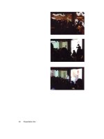
Foreword by Guy Kawasaki
Since this is a book about presenting better with slides, I
thought it would be appropriate to show the foreword as a slide
presentation. As far as I know, this is the first foreword in history
presented in a book as a series of PowerPoint slides. Now, good
slides should enhance a live talk; slides are not meant to tell the
whole story with
out you there. But from these slides on the next
page I think you can get my point. If I were to give a live talk
about why you should buy this book, the slides would look
something like this.
Guy Kawasaki
Managing Director,
Garage Technology Ventures Co-
founder of Truemois
www.guykawasaki.com
Simplicity is the ultimate sophistication.
- Leonardo da Vinci
Presenting in
Today's World
With successful presentations in Tokyo behind me, I boarded the 5:03pm Super
Express bound for Osaka complete with my ekiben (a special kind of Japanese
lunch
box or bento sold at train stations) and a can of Asahi beer in hand. The
quintessential
"Japan experience" for me is zipping through the Japanese
countryside aboard cutting-edge rail technology while sampling traditional
Japanese delicacies with my chopsticks, sipping Japanese beer, and catching
glimpses of temples, shrines, and even Mount Fuji out the spacious side window.
It's a wonderful juxtaposition of the old and the new, and a pleasant way to end
the day.
While in the midst of savoring the contents of my bento, I glanced to my right
across the aisle to see a Japanese businessman with a pensive look on his face
reviewing a printed deck of PowerPoint slides. Two slides per page, one page after
another filled with boxes crammed with reams of Japanese text in several different
colors. No empty space. No graphics except for the company logo at the top of
each slide box. Just slide after slide of text, subject titles, bullet points, and logos.
Were these slides used for visual support in a live oral presentation? If so, I
sympathize with the audience. Since when can an audience read and listen to
someone talk at the same time (even if they could actually see the 12-point text on
the screen well enough to read it)? Were the slides used merely as a kind of
document printed in PowerPoint? If so, I pity both the author and the reader
because PowerPoint is not a tool for document creation. Boxes of bullet points and
logos do not make for a good handout or report. And judging by the way the man
was flipping back and forth between the printed slides, perhaps frustrated by the
ambiguity of the content, this was becoming apparent to him.
What a contrast in the presentation of content, I thought to myself: The beautifully
efficient, well-designed Japanese bento before me containing nothing superfluous,
compared with the poorly-designed, difficult-to-understand deck of printed
PowerPoint slides across the aisle. Why couldn't the design and presentation
Chapter I Presenting in Today's World 5
of business and technical content for a live talk have more in common with the
spirit of the simple bentos sold at Japanese train stations? For example, the
Japanese bento contains appropriate content arranged in the most efficient,
graceful manner. The bento is presented in a simple, beautiful, and balanced
way. Nothing lacking. Nothing superfluous. Not decorated, but wonderfully
designed. It looks good, and it tastes good. A satisfying, inspiring, and fulfilling
way to spend 20 minutes. When was the last time you could say the same about
a presentation?
A delicious Japanese bento and a PowerPoint presentation may seem to
have nothing in common, but it was at that moment in time many years ago,
rolling across Japan at 200 miles an hour, that I had an insight or an
"awakening." With this flash of awareness, I realized that something needed to
be done to end the scourge of bad, PowerPoint slides and the lifeless narration
that accompanies them, and that I could do something to help. In Japan, just
like everywhere else in the world, professionals suffer through poorly designed
presentations on a daily basis. Presentations in which the slides often do more
harm than good. It is not enjoyable, and it is not effective. I knew that if I could
begin to help others look at preparation, design, and delivery of so-called
"PowerPoint presentations" in a different way, perhaps I could do my small part
to help others communicate far more effectively. That moment on the Bullet
Train—somewhere between Yokohama and Nagoya—was when I began writing
this book by sharing my thoughts on the Presentation Zen Web site, a blog that
would go on to become the most visited site on presentation design on the net.
This book has three sections: Preparation, Design, and Delivery. Along the way
I'll provide a good balance of principles and concepts, inspiration, and practical
examples. I'll even show you before/after photos of the actual bento on the
Bullet Train that was the inspiration for this book. Before reviewing the
current state of presentations today and why
presentations matl than ever before, let's first look at
what is meant by “Presentation Zen”
6 Presentation Zen
The Presentation Zen Approach
This is not a book about Zen; this is a book about communication and about
seeing presentations in a slightly different way, a way that is in tune with our times.
Although I make several references to Zen and the Zen arts along the way, my
references to Zen are far more in the realm of an analogy, rather than being literal.
Literally, the tradition of Zen or Zen practice has nothing to do directly with "the art"
of presenting in today's world. However, our professional activities—especially
professional communications—can share the same ethos as Zen. That is, the essence
or the spirit of many of the principles found in Zen concerning aesthetics,
mindfulness, connectedness, and so on can be applied to our daily activities,
including presentations.
A teacher for one who seeks enlightenment would say that the first step for the
student is to truly see that life is somehow out of sync or off-kilter, that there is
"suffering" if you will. And that this "out-of-kilterness" is a consequence of our own
attachment to things that are inconsequential. Likewise, the first step to creating and
designing great presentations is to be mindful of the current state of what passes for
"normal" PowerPoint presentations and that what is "normal" today is out of sync
and off-kilter with how people actually learn and communicate.
Each situation is different. But we all know; through our own experience, that the
current state of presentations in business and academia causes its own degree of
"suffering" for audiences and for presenters alike. If we desire to communicate with
more clarity, integrity, beauty, and intelligence, then we must move beyond what is
considered to be "normal" to something different and far more effective. The
principles I am most mindful of through every step of the presentation process are
restraint, simplicity, and naturalness: Restraint in preparation. Simplicity in design.
Naturalness in delivery. All of which, in the end, lead to greater clarity for us and for
our audience.
In many ways, few of the basics have changed since the time of Aristotle some
2300 years ago, or from the basic advice given by Dale Carnegie in the 1930s. But
what may seem like common sense regarding presentations is not common practice.
The Presentation Zen approach challenges the conventional wisdom of making
PowerPoint presentations in today's world and encourages people to think
differently about the design, and delivery of their presentations.
Chapter I Presenting in Today's World 7
An Approach, Not a Method
Presentation Zen, however, is not a method. Method
implies a step-by-step systematic process, something
very much planned and linear, with a definite proven
procedure that you can pick off a shelf and follow A
to Z in a logical orderly fashion. Presentation Zen,
then, is more of an approach. An approach implies a
road, a direction, a frame of mind, perhaps even a
philosophy, but not a formula of proven rules to be
followed. Methods are important and necessary. But
there are no panaceas, and I offer no prescriptions
for success. Success depends on you and your own
unique situation. However, I do offer guidelines and
some things to think about that may run contrary to
conventional wisdom on how to make a live
presentation with multimedia.
Similarly, Zen itself is an approach to life and a way
of being, rather than a set of rules or dogma to be
followed by all in the same way. Indeed, there are
many paths to enlightenment. At the heart of Zen is
the need for personal awareness and the ability to
see and discover. Zen is practical and is concerned
with the here and now. And the practical and the
here and now is what we're concerned with here too
with presentations. The aim of this book is to help
professionals free themselves from the pain of
creating and delivering presentations by helping
them see presentations in a way that is different,
simpler, more visual, more natural, and ultimately far
more meaningful.
8 Presentation Zen
Each Case Is Different
Not all presentation situations are appropriate for
using multimedia. For example, if you have a small
audience and data-intensive materials to discuss, a
handout of the materials with a give-and-take
discussion is usually more appropriate. There are
many situations when a whiteboard or flipcharts or a
paper with detailed figures make for better support.
Each case is different. The discussions in this book,
however, center among those presentations when
multimedia is a good fit with your unique situation.
This book is not directly about software tools. Yet,
by keeping principles such as restraint and simplicity
in mind, you can use the lessons here to help you
design better visuals appropriate for your situation.
When it comes to software functions, I don't think the
challenge is to learn more, but rather to ignore more
and forget more so that you can focus on the
principles and the few techniques that are important.
Software techniques are simply not our chief concern.
Characterizing master swordsman Odagiri Ichiun's
ideas on technique, Zen scholar Daisetz Suzuki says,
" the first principle of the art is not to rely on tricks of
technique. Most swordsmen make too much of
technique, sometimes making it their chief concern "
And most presenters make the software their chief
concern in the preparation process and in the delivery.
This often ends up in cluttered visuals and cluttered
talks that are neither engaging nor memorable.
Yes, the basics of software are important to know.
Delivery techniques and "dos and don'ts" are useful to
understand. But it's not about technique alone. The
"art of presentation" transcends technique and
enables an individual to remove walls and connect
with an audience
to inform or persuade in a very meaningful, unique
moment in time.
Chapter I Presenting in Today's World 9
Where We Are Today:
Really Bad PowerPoint
It seems as if PowerPoint has been around forever, but in truth it's only been in
common use for about 15-20 years. PowerPoint 1.0 was created in Silicon Valley in
1987 by Robert Gaskins and Dennis Austin as a way to display presentation images
on a Mac. It was cool. And it worked. They sold the application later that year to
Microsoft. A version for the PC would hit the market a couple years later, and (oy
vey!) the world hasn't been the same since.
PowerPoint became popular in the 1990s, and by the year 2000 the use of the
application was ubiquitous in businesses and schools across the globe. But all was
not good. It was around this time, in fact, that the term "Death by PowerPoint"
began to be tossed around. In 2001, marketing guru and bestselling author Seth
Godin—who's seen more bad presentations than any man should be subjected to—
had had enough. Seth decided he'd try to make a difference. So he wrote a 10-page
e-book called Really Bad PowerPoint that he sold on Amazon for $2 (money went to
charity), and it became the best-selling e-book of the year.
"PowerPoint could be the most powerful tool on your computer, but it's not,"
Seth said. "It's actually a dismal failure. Almost every PowerPoint presentation sucks
rotten eggs." Visual communications guru Edward Tufte, who has written some
wonderful books on the proper ways to display quantitative information,
such as Beautiful Evidence and Visual Explanations (Graphics Press), joined the
chorus of those deriding the PowerPoint tool in a September 2003 Wired Magazine
article simply titled "PowerPoint Is Evil." "At a minimum," says Tufte, "a
presentation format should do no harm. Yet the PowerPoint style routinely disrupts,
dominates, and trivializes content. Thus PowerPoint presentations too often
resemble a school play—very loud, very slow, and very simple."
Millions of presentations are now given every day with the aid of PowerPoint or
other slideware.* Yet, most presentations remain mind-numbingly dull, something to
be endured by both presenter and audience alike. Presentations are generally
* Slideware is a term, which to my knowledge, originated with Edward Tufte to describe PowerPoint and similar
applications, such as Keynote.
10 Presentation Zen
ineffective, not because presenters lack intelligence or creativity, but because they
have learned bad habits and lack awareness and knowledge about what makes for a
great presentation (and what does not). The typical slide presentation of today
consists of a speaker presenting streams of information to slides with general titles,
clip art, and bulleted list after bulleted list in the all-too familiar topic/subtopic
hierarchical format. Presenting with slides is so much apart of our culture now that
people can hardly imagine preparing for a meeting and presenting at that meeting
without slides.
The Scourge of the Deck
Conferences also have perpetuated the bullet-filled deck by asking presenters to
follow a "standard slide format." Kathy Sierra, co-author of Head First Java (O'Reilly
Media), as well as
the Creating Passionate Users weblog, has attended and
presented at a lot of conferences. Here's what she said on her website in 2005 in a
post entitled "Stop your presentation before it kills again": "Given how many
people hate slide presentations," Sierra says, "why is it universally assumed that
where there is 'a talk,' there's PowerPoint (or its much cooler cousin, Apple's
Keynote)? Conference coordinators rarely ask speakers if they'll be projecting slides.
They send out the slide templates, then start demanding your slides several weeks
before the show. Saying you don't have slides is like saying you'll give your talk
naked." And what kind of "visuals" are people using to support their conference
talks? "Visuals are more memorable than words, but bullet points are still the
prevailing content of most slides, and they usually add nothing," says Sierra.
Chapter I Presenting in Today's World 11
Is It Finally Time to Ditch Power Point?
In the spring of 2007, The Sydney Morning Herald ran an article entitled
"Researcher points finger at PowerPoint," by Anna Patty, which generated quite a
stir. The article highlighted findings by researchers from the University of New
South Wales, including John Sweller, who developed the cognitive load theory in
the 1980s. One of the findings mentioned in the article: it is more difficult to
process information if it is coming at you both verbally and in written form at the
same time. Since people cannot read and listen well at the same time, the reporter
suggested, this might mean "the death of the PowerPoint presentation." The
assumption being that a presentation made with the aid of slideware, such as
PowerPoint or Keynote, must necessarily include lines of text projected on a screen
that mirrors the spoken word of the presenter. The article generated a lot of
attention, due in part to this quote by Professor Sweller:
"The use of the PowerPoint presentation has been a disaster.
It should be ditched.
"
— John Sweller
Professor Sweller's comment makes a provocative headline and adds to the long
list of professi
onals and researchers deriding the PowerPoint tool. What Professor
Sweller surely means is that the way PowerPoint is used should be ditched. And with
that I agree. Ther
e is some truth to the idea that the templates and all the bells and
whistles added to PowerPoint through the years have contributed to some of the
"really bad PowerPoint." But PowerPoint (or Keynote, etc.) is not a method; it is a
tool that can be used effectively with appropriate design methods or ineffectively
with inappropriate methods.
The Times They Are a-Changing
So, is it finally time to ditch PowerPoint? Hardly, but it is long past time to ditch the
use of the ubiquitous bulleted-list templates found in both PowerPoint and Keynote.
And it's long past time that we realized that putting the same information on a slide
in text form that is coming out of our mouths usually does not help in fact, does not
12 Presentation Zen
help in fact, it hurts our message. Most of us know intuitively that when
we've got 20 minutes to make a presentation, presenting to an audience
with a screen of text-filled slides does not work. Research supports the
idea that it is indeed more difficult for audiences to process information
when it is being presented to them in spoken and written form at the same
time. So perhaps it would be better to just remain silent and let people
read the slides. But this raises the issue: Why are you there?
A good oral presentation is different than a well-written document, and
attempts to merge them result in poor presentations and poor documents.
The bad news is that most oral presentations accompanied by multimedia
are quite mediocre today. But the good news is that this is an opportunity
for you to be different. The bar is pretty low now, so even improving in
small steps may make a big difference. However, as more and more
people realize that the "conventional wisdom" about presenting is out of
sync with reality, expectations will surely rise.
Chapter I Presenting in Today's World 13
Presentations in
"The Conceptual Age"
My favorite book in the summer of 2006 was Daniel Pink's best-seller, A Whole New
Mind (Riverhead Trade). Tom Peters called the book "a miracle." There's a reason.
A Whole New Mind sets the context for the "Presentation Zen approach" to
presenting in tod
ay's world, an era that Pink and others have dubbed "the
conceptual age" where "high-touch" and "high-concept" aptitudes are first among
equals. "The future belongs to a different kind of person," Pink says. "Designers,
inventors, teachers, storytellers—creative and empathetic right-brain thinkers whose
abilities mark the fault line between who gets ahead and who doesn't."
In A Whole New Mind, Pink paints an accurate and vivid picture of the threats
and opportunities f
acing professionals today. Pink claims we're living in a different
era, a different age. An age in which those who "Think different" will be valued
even more than ever. We're living in an age, says Pink, that is " animated by a
different form of thinking and a new approach to life—one that prizes aptitudes that
I call 'high concept' and 'high touch.' High concept involves the capacity to detect
patterns and opportunities, to create artistic and emotional beauty, to craft a
satisfying narrative "
Now, Pink is not saying that logic and analysis (so-called "left-brain reasoning"),
which are so important in "the information age," are not important in "the
conceptual age" of today. Indeed, logical thinking is as important as it ever has
been. So-called "right-brain reasoning" alone is not going to keep the space
shuttle up or cure disease. Logical reasoning is a necessary condition. However, it's
increasingly clear that logic alone is not a sufficient condition for success for
individuals and for organizations. Right-brain thinking is every bit as important
now—in some cases more important—than left-brain thinking. (The right-brain/left-
brain distinction is a metaphor based on real differences between the two
hemispheres; a healthy person uses both hemispheres for even simple tasks.)
Particularly valuable in A Whole New Mind are the "six senses" or the six "right-
brain directed ap
titudes," which Pink says are necessary for successful
professionals to possess in the more interdependent world we live in, a world of
increased automation and out-sourcing.
14 Presentation Zen