User Interface Design for Mere Mortals PHẦN 8 ppsx
Bạn đang xem bản rút gọn của tài liệu. Xem và tải ngay bản đầy đủ của tài liệu tại đây (10.21 MB, 31 trang )
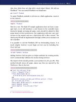
Therefore, if you want to add pop-up messages elsewhere in the system, such
as when the user moves the mouse pointer over the new flag column in the
product table to view the number of products remaining in the stores, the
pop-up message box must adhere to the look and feel of other pop-up mes-
sages when you develop the product. You don’t need to duplicate the look
and feel of pop-up messages for the paper prototype test, but be sure to have
the additional text in the pop-up message piece of the test.
If you have an existing pop-up menu, you may want to add more information
in that pop-up menu as a usability enhancement. For example, when you
move the mouse pointer over the product in the product table, the product
table will also include information about how many stores have each product.
This additional functionality meets the users’ goals of getting as much infor-
mation as possible as quickly as possible; therefore, you can add this addi-
tional message text as a surprise for your testers so you can get their reactions
when they encounter it during the test.
The application also has several audio cues. Evan needs to be particularly
mindful of these because he will be acting as the computer during the test. If
the user does something to activate one of these audio cues during the paper
prototype test, Evan will have to sound out those cues when appropriate dur-
ing the test. For example, when the user does something wrong, Evan needs
to give the system error noise (or a reasonable impression of it).
The application also includes online help text. When the user accesses online
help about a new feature (such as the product availability page),you will need
to show that the online help window appears. You don’t need to add the
actual online help text—only show that the online help text will appear
when the user accesses the help system.
In sum, you need to familiarize yourself with the application so that you can
accurately replicate some of the features (such as audio cues) in the test.
The application is Web-based, so you and Evan also need to be aware of Web
interaction within the interface. You’ll learn about applying Web interaction
to your paper prototype test in the next chapter.
Summary
This chapter began by creating a list of requirements after you established
personas in Chapter 6, and then designing a persona-based interaction frame-
work. These are the third and fourth steps, respectively, of the Goal-Directed
194 Chapter 7
Design Process. Creating a list of requirements is a five-step process. Your
requirements list needs to pay attention to real-world requirements that will
affect your design, including business requirements, customer and partner
requirements, and technical requirements. You learned about the six-step
process for creating a persona-based interaction framework to construct key
path scenarios so that you will understand what you want users to see in your
interface.
Interaction design was covered next. You learned about how to apply design
principles and patterns to the four good design imperatives of being ethical,
purposeful, pragmatic, and elegant. You learned about conceptual, interac-
tion,and interface-level principles that define what a product is,how it should
behave, and the interface look and feel, respectively. You also learned about
identifying postural, structural, and behavioral patterns that you can apply to
problems as they come up in your project.
Next, you learned about the type of postures that programs take and how to
design them to match the users’work requirements. For example,you learned
that the sovereign posture is for users who use a program for long periods of
time. Sovereign postures include a number of tools in the user interface so
that users can manipulate objects and controls.
A discussion about interface behavior followed. We discussed this behavior in
the context of primary input and output devices for manipulating and view-
ing objects, respectively, in a desktop GUI: the mouse and the window. The
“Using the Mouse Pointer” section discussed the rules for using the mouse to
manipulate objects, including buttons, as well as mouse alternatives such as
keyboard shortcuts. In the “Window Behaviors”section,you learned about the
window manipulation rules, moving windows around, and using keyboard
combination shortcuts as an alternative to closing windows.
The section on helping users find information followed. This section dis-
cussed various cues that you can employ to help people use the interface,
including visual, audio, pop-up windows, and search engines. You learned
about some of the drawbacks of these cues. For example,audio cues are unap-
preciated by users who are hard of hearing.
Next came the discussion of communicating with the users. You learned
about features that make information and help easier to find, including con-
sistently applied standards, a well-designed online help system that is
designed to meet users’ expectations of finding information quickly, and the
use of assistants and wizards to help get users up to speed and performing
tasks more quickly and easily.
Designing a User Interface 195
The chapter ended with a discussion of the fifth and final step in the Goal-
Directed Design Process: refining the program and interface form and behav-
ior, and then finalizing the design so that you can share the information with
stakeholders. You learned that you will have to go through several iterations
of drafting the look and feel, and then you construct the validation scenarios
that show how different people in a persona use the interface. At last, you
finalize the design and share it with different stakeholders in the company.
Review Questions
Now it’s time to review what you’ve learned in this chapter before you move
on to Chapter 7. Ask yourself the following questions, and refer to Appendix
A to double-check your answers.
1. Why do you need to plan for real-world requirements?
2. Why are paper prototyping and storyboarding important when con-
structing key path scenarios?
3. What are the three levels of design principles that guide you toward
minimizing the work of the user?
4. Why is it important to create patterns?
5. What are the four desktop-based GUI postures?
6. What application characteristics make up an auxiliary application?
7. What happens when you click the right mouse button on an object?
8. Why should you avoid visual noise and clutter?
9. Why is it important to have a well-designed online help system?
10. What is the advantage of a pop-up menu over an icon?
11. What does the use of consistency standards in the design of your inter-
face do for its users?
12. When should you use assistants and wizards?
13. Why should you construct validation scenarios?
14. How can you share the finalized design with stakeholders in your
company?
196 Chapter 7
8
Designing a Web Site
“Some men give up their designs when they have almost reached the
goal; While others, on the contrary, obtain a victory by exerting, at
the last moment, more vigorous efforts than ever before.”
—Herodotus
Topics Covered in This Chapter
Web Versus GUI: Similarities and Differences
Web Myths
Web Postures
Why You Need Web Engineering
Web Standards
The Four Rules
When Do You Break the Rules?
Implementing applications on the Web has become a popular alternative to
developing operating system applications, particularly if you want to develop
applications for different operating system platforms.
However, a Web GUI interface has similarities and differences from a desktop
GUI application that you must be aware of. Both interfaces adhere to some of
the same rules, yet the Web must adhere to its own standards that are dictated
by the Hypertext Markup Language (HTML), as well as related Web languages
regarding the placement of text and objects on a Web page.
Technologies are beginning to blur the line between the desktop GUI and the
Web, and more companies are developing Internet-enabled applications that
allow users to use desktop software that interacts with the Web.
197
If you’re going to develop for the Web, there are plenty of Web myths out
there that have been dispelled. You need to know about these myths so that
you’re aware of what affordances and constraints you have with Web design.
Like GUI interfaces,Web interfaces have different postures for different types
of Web sites.
Web engineering is an integral part of Web design. Without the programming
and database development behind the interface, you won’t be able to create
an effective Web site if you want to include e-commerce,Web form(s), or user
databases with your Web site.
You should also understand Web standards and the four rules of Web design.
The rules don’t apply all the time, so this chapter tells you when it’s okay to
break the rules.
Web Versus GUI: Similarities and Differences
When you design for the Web, you need to be aware of the differences
between desktop GUI interfaces and Web interfaces. They contain different
types of constraints.
GUI Rules
A GUI contains a specific set of rules for how the user interacts with the com-
puter. Following are these rules:
• A desktop metaphor uses icons to represent files and programs.
• The mouse (or an alternative device such as a trackball) and keyboard
can be used to manipulate objects.
• Windows allow you to view and manipulate data within each window.
• The arrangement and storage of windows allow you to work on more
than one program at once.
• Rigidly enforced standards ensure that windows look and feel reason-
ably the same. This cuts down on the learning curve needed to learn a
new program because the interface is similar.
198 Chapter 8
Web Rules
Web sites also have rules, some of which overlap with GUI rules:
• The Web uses a specific program called a browser that runs in the GUI
to access the Web site. Therefore, when the user accesses the site, the
user is required to open a window and use the mouse to manipulate
objects there.
• The Web is constrained by requirements in HTML and other Web lan-
guages regarding placement of objects on a Web page. Although new
Web technologies (such as Adobe’s Flash animation software) are blur-
ring the line between the desktop and the browser, most people still
use browsers; therefore, browsers still constrain Web design.
• The look of a Web page is constrained by a set number of colors and
fonts that all Web browsers can display, called Web-safe colors and
fonts. Using Web-safe colors and fonts, the look of the Web page will
look reasonably the same way on all computers running all available
browsers. The Amazon Web site uses Web-safe colors and fonts, as
shown in Figure 8.1.
Designing a Web Site 199
Figure 8.1 The Amazon Web site has Web-safe colors and fonts.
© Amazon.com, Inc. or its affiliates. All Rights Reserved.
200 Chapter 8
The look of a Web page is not constrained by rigid standards, although there
are generally accepted usability conventions that you should adhere to for
the look and feel of a Web page. I’ll discuss these standards in more detail
later in this chapter.
Internet-Based Applications
The GUI desktop and the browser have been blurring as more and more
users equate the desktop computing experience with the Web experience.
People are using technologies such as the Java programming language, the
ActiveX and PHP scripting languages,Adobe’s Flash animation software,AJAX
and Dynamic HTML, and even more proprietary solutions such as Microsoft
.NET languages and related software to create richer, more interactive Web
applications.
These technologies make it easier than ever to create a Web-centric applica-
tion that’s available from the desktop and transparent to the user. That is, the
user will not be able to tell when the application is accessing the Web to
exchange information with online resources such as one or more databases.
The user will be able to use the desktop GUI to manage online resources
without having to use a browser, and your Internet-centric application will
have a richer interface and richer feedback than a Web interface.
Therefore, you will find that both GUI and Web affordances and constraints
will apply in those situations. Be aware that many affordances and constraints
in designing an Internet-based application will depend on the technologies
you use to build your application. As always, consult your personas and find
out whether an Internet-based application is the path that your users want
you and your project team to take.
Web Myths
There are plenty of myths about Web site design, and if you adhere to any of
them, you’ll make your users’ experiences worse rather than better. And that
will translate into people leaving your site and not coming back.
This group of myths comes from several different sources, including Cooper
and Reimann (2003), Web sites that discuss Web myths, and your author.
These myths fall into several different categories:
• Usage
• Design
• Accessibility
Before you design for the Web, be aware of these myths so that you can dispel
them in the planning stages.
Usage
Web usage myths have only grown over the years, and a lot of frustration
about using the Web has come from misconceptions about how to use the
Web. Before you design for the Web, understand the myths about how people
use it. (The myths are bold, and the truth appears after the myth.)
•
A Web interface is easy to use
—If all you have is a static Web page with
some text and a few links, this may be true. However, in recent years,
the Web has become much more interactive, including forms, frames,
scripts, and other embedded applications that have made Web interface
design as complicated as interface design for a desktop application.
Web interfaces don’t yet provide all the rich feedback and flow of a
desktop application, so there are also design constraints of which
designers must be aware.
•
The Web and Internet are one and the same
—The Web is only
the graphical interface that allows people to share information over
the Internet. The Internet is a network that can transfer large amounts
of data including multimedia files, email messages, and newsgroup
messages.
•
Web design is all a
about browsers
—Technologies are already expanding
Web technologies beyond the browser and onto the desktop as well as
to other devices. For example, Adobe’s Rich Internet Applications use
Flash to create a Web site that looks and functions much more like a
desktop, as discussed in the previous section. There are already Web-
enabled connections for searching the Web built into Windows Vista.
And my Palm Treo already connects to the Web to use Web-based appli-
cations that exchange data between the Web site and the Treo.
•
Peopl
e are patient, and they will stay on the Web site to explore
—
Some users are online to research, but many visitors to your Web site go
there because they want specific information about something you
Designing a Web Site 201
202 Chapter 8
offer. They don’t want to spend time reading through long HTML pages
or clicking through a large number of links to try to find what they want.
Design
Some of my business clients have believed in the following Web design
myths. My business designed several Web sites for clients who believed that
visitors expected some design features listed here only to realize later that
their customer base really didn’t care for it. (In some cases I had to report
feedback, and in other cases I had to put my foot down, which lost me a cou-
ple of clients.)
•
Designing for the Web is different from designing in other media
—
Yes . . . and no. It’s true that designing for the Web is different. You do
have a different flow of information. And there are some constraints in
Web design that are similar to GUI design and some that are quite dif-
ferent, as the previous section discussed. However, designing for the
Web still means that you have to take care to prepare. You still have to
interview users and learn about the behaviors they’re looking for to
make your Web site user friendly.
•
Animation and a lot of graphi
ics are a necessity
—The Web provides
opportunities for you to add graphics and animation, but you must be
polite to your users in that you shouldn’t overwhelm them with Web
graphics. Like a newspaper or any other print medium, you need a
good balance between graphics and text. Of particular note is the ani-
mated graphic, which can get your users’ attention but can also serve
as a distraction when the user is trying to see something else on your
Web site. Too many graphics or animated graphics can also distract
users from what you want them to see on a Web site. In the end, the
user will become annoyed and likely won’t return to your site. Further,
overuse of cutting-edge graphical technologies can prevent users of
some Web browsers from using your application if those browsers
don’t support these technologies.
•
Background sound is a necessity on a Web site
—You can embed sound
files to play in the background when users visit your Web site. How-
ever, this can quickly become annoying, especially if users can’t turn it
off short of turning the volume on their speakers to 0 or mute. Listen-
ing to the same melody over and over again can quickly become tiring.
What’s more, if your application depends on sound, you might
be excluding users from your user base who might have hearing
difficulties.
•
Content is all that matters in Web design
—When you design for the
Web, you’re not just designing Web pages that have static content that
you want people to read. You’re designing a system that includes the
form that information takes, the behaviors of your system and how the
Web site flows from one page to another, and the content itself. And if
the content is not easy to access, users will become frustrated and dis-
satisfied with your application.
•
Presentation is the only thing that matters, not any
y “plumbing” behind
the scenes
—When you create a Web site, obviously you want your Web
site to look good, all the links to work properly, and your interface to be
accessible by all visitors to your site. However, after you start adding
forms, scripts, or other Web application code that changes your Web
site into a Web application, you need to build code behind the scenes
using languages such as PHP and Java. And if the infrastructure of your
site is not solid, you can risk usability problems, or worse, data or pri-
vacy loss for your users.
•
Plumbing is something you can do by yourself
—It’s easy to produce
the visible pages of your Web site because the rules are straightforward,
and if you have merely an informational Web site, usually Web pages are
all you need to design. If you are designing a Web application, however,
unless you have a lot of expertise in the code required to make your
site transactional, you should hire qualified companies to come in and
do the work for you. Even though code packages are available for
things like e-commerce, you may have some integration issues with
your site that you may need someone else or another company to look
at. Web development is still far from trivial and should be entrusted to
those who are experienced with Web technologies.
Accessibility
Your site will be available to millions of potential viewers, and those
viewers have different computer setups that are as individual as they are.
Therefore,it’s important to be aware of Web site accessibility myths and what
the truths are.
Designing a Web Site 203
204 Chapter 8
•
All I have to do is design for the most popular and most recent
browser, and everyone will be able to see my site
—Not everyone uses
the latest version of Microsoft Internet Explorer, which as of this writing
is the most popular browser with about 90 percent market share. Peo-
ple use a variety of other browsers on a variety of platforms that you
must take into consideration. For example,you may have users who use
Firefox in Windows, Netscape in Linux, and Safari in the Mac OS.
•
Accessi
ble pages must appeal to the lowest common denominator ver-
sion of a brows
ser
—HTML, the language for designing Web pages, con-
tains backward compatibility when it comes to accessibility features.
The most current version of HTML, version 4.0, is supported by all
major browsers, and all current versions of Web design software such
as Dreamweaver and FrontPage support HTML 4.0 development. Ver-
sion 4.0 of HTML is backward compatible with versions of HTML going
back to Version 2.0, so you don’t need to worry about designing a Web
site or application using an earlier version of HTML. However, the same
isn’t true for many other web technologies outside of HTML. For exam-
ple, there are numerous differences in JavaScript in various Web
browsers.
•
Accessible pages have to be text only
—You can still have different col-
ors, graphics, and other materials such as multimedia clips on your Web
site. However, you need to have alternative tags, or ALT tags, attached
to every graphic and multimedia object on the Web site, as discussed in
more detail in Chapter 2,“Concepts and Issues.”Users should have
alternate ways of using the site that do not depend on sophisticated
audio or visual effects.
•
Accessible pages don’t have to make graphics accessib
ble for people
who can’t see them
—The Web is a multimedia environment. People
who are sight impaired can still experience Web sites through accessi-
bility features available through their operating system. If you know
that you’ll have sight-impaired users visiting your Web site, you may
also want to have audio links so those users can listen to features on
your site.
Also note that roughly 25 to 30 percent of users don’t load images on their
Web sites for reasons that include sight impairment, bandwidth issues, con-
cerns about viruses, and frustration with the prevalence of image-intensive
commercial advertisements. Although the use of broadband connections like
DSL and cable is growing, there are still quite a few people accessing the
Internet through dial-up connections, and of those people, you’ll probably
have quite a few who don’t want to spend the time waiting for an image to
load. Having an ALT tag attached to a graphic or multimedia object will give
your users an idea of what you’re trying to communicate through the graphic
or object.
Web Postures
In Chapter 7,“Designing a User Interface,”you learned about the postures in a
desktop GUI application. To review, there are four types of postures in a desk-
top GUI application (Cooper and Reimann, 2003):
•
Sovereign
—An application that keeps the user’s attention for long peri-
ods
•
Transient
—A task-specific, need-based application that the user uses
occasionally
•
Daemonic
—An application that usually doesn’t interact with the user
and runs in the background
•
Auxiliary
—An application that exhibits the characteristics of both sov-
ereign and transient applications
Do these postures also apply to Web sites? Yes,but because Web sites have dif-
ferent functionality,they have different names. What’s more,different types of
Web sites require different postures.
Different Types of Web Sites
There are three different types of sites you can create for the Web. These sites
have different names from the postures for GUI applications (Cooper and
Reimann, 2003):
•
Informational sites
—These do not require complicated transactional
features. Informational sites are as advertised: they provide information
that the user can search for by clicking on links to go to other pages
within the site, and these pages contain more information. The MSNBC
News Web site is an informational site, as shown in Figure 8.2.
Designing a Web Site 205
•
Application sites
—These require a significant level of data transactions
using scripts that manipulate that data behind the scenes. The user will
never see what level of data is being transacted. The transactions can
be as simple as the user filling in contact information in a form and
sending the data in an email message or as complex as a full-scale e-
commerce system where data has to be stored in a database and data
on the site must be updated dynamically. The Amazon Web site, shown
in Figure 8.3, is an application site.
•
Portal sites
—These provide information for the user about things hap-
pening with the company and links that tell the user how to get some-
where else. These sites are connected to services such as AOL and
Yahoo!, as well as portals that are available through the browser, such as
the Netscape portal for the Netscape browser, as shown in Figure 8.4,
and the MSN portal for Internet Explorer.
The types of postures for each of these sites depend on the type of Web site
you’re creating—some sites include more than one posture (Cooper and
Reimann, 2003).
206 Chapter 8
Figure 8.2 The MSNBC News Web site is an informational site.
Designing a Web Site 207
Figure 8.3 The Amazon Web site is an application site.
© Amazon.com, Inc. or its affiliates. All Rights Reserved.
Figure 8.4 The Netscape portal site.
Netscape and the “N” Logo are registered trademarks of Netscape Communications Cor-
poration. Netscape content © 2007. Used with permission.
208 Chapter 8
Informational Sites
Informational sites have both sovereign and transient posture characteristics
depending on what you’re displaying.
An informational Web site has a sovereign posture if there is detailed infor-
mation displayed on the user’s screen. Unfortunately, it’s difficult to know
what sort of display resolution the user will use to view a site. The standard
maxim for Web sites is to design for a size slightly smaller than Super VGA res-
olution, or 800 × 600 pixels. This ensures that everyone can see the text on
the screen, but it could also mean users will have to keep scrolling down to
read all the information on the screen.
If screen resolution is a significant concern, make it a point to ask your users
during the interview process what screen resolution they use. Then you can
determine the screen resolution from the primary persona. Otherwise, if you
design your site for a larger resolution and users complain, you will have to
spend time and money changing the site or potentially lose current and
prospective customers.
If your primary persona doesn’t access your site often,your site has a transient
posture. A good example is the Microsoft Windows Update Web site, which
users don’t visit often unless they need a critical update or they want to see
about installing noncritical updates for their Windows installation.
Good navigation is always a rule, but it’s especially important for transient
sites because people don’t want to keep clicking the same links to get to
their desired page. Many sites use cookies, which are small text files that Web
sites place on your computer, to store your site preferences and load them
the next time you access the site. For example, the Google News site allows
you to personalize your opening Google News Web page. Google saves the
information in cookies so that your personalized Google News page appears
the next time you open the site.
Application Sites
Application sites can also have different postures, but because the interaction
is more complex, the postures can differ depending on the needs of the pri-
mary persona.
For example, if the application is for consumers only, such as an e-commerce
site that customers visit on an occasional basis, the site must include ele-
ments of sovereign and transient postures. E-commerce sites need to have
sovereign elements because they usually have a variety of products to choose
Designing a Web Site 209
from, and people want to compare different products and read about what
each product does. Application sites also have a sovereign posture if the user
uses the application site regularly,as does the owner of a business who needs
to check the inventory on his Web site every day.
However, the site must also reflect a transient posture to users because they
generally don’t visit application sites every day. The transient posture on an e-
commerce site includes a shopping cart that is always visible (sometimes
with the current items in the cart listed as well), good navigational aids, as
well as the use of cookies to tell the system what the user last viewed or mak-
ing suggestions about similar products.
Cooper and Reimann (2003) suggest that transient Web applications should
follow the same guidelines as transient GUI applications. However, they list
several other guidelines you should be aware of:
• Clearly telegraph the application site’s functionality. Make affordances
obvious and visible, such as the ability to find a certain type of clothing
by clicking a link on the page. You can also give hints if necessary, such
as a reference in the text or in the ALT text that’s associated with a
photo. For example, if you have a photo of a sweater, as soon as the
user moves the mouse pointer over the photo, she’ll see text that
reminds her to click the Sweaters link to find more sweaters.
• Make the application site simple, direct, and to the point. Remember
that users have set goals when they visit your site, and you need to tell
the users just enough so that you meet their needs. If you become too
verbose or try to add too much functionality, you’ll lose their interest.
• Make the application site fit in the users’ mental models and flow in
the context of the Web site. When you develop the site, pay close atten-
tion to the workflow of your Web site and what your users expect the
site to be. For example, if your site is a clothing store, be sure that the
site constantly reinforces the fact that you can buy different types of
clothing in your online store. If you have a different application from
your store site that isn’t in line with what you’re trying to sell, you run
the risk of making that link look like an advertisement. Web users have
long been desensitized to Web ads, particularly banner ads that you’ve
probably seen at the tops of pages.
• For e-commerce sites, employ transactional features as much as possi-
ble to reduce confusion. This is especially true of the checkout
210 Chapter 8
process, which is usually the most confusing and frustrating part of e-
commerce. However, if you carefully create the flow and design of the
process to include clear input, instructions, and feedback, as well as a
clear start-to-finish process, you will have happier customers and a
more successful e-commerce site.
• Plan carefully regarding access to user data. Most transient Web appli-
cations can’t save user data on the client side, so if you need users to
log into a particular area on your page (or to the remainder of the Web
site), make this functionality as seamless and obvious as possible. For
example, you may have a user ID and password so the user can log into
the preferred customers’ page.
Fortunately, modern Web browsers (like Internet Explorer) help users
by allowing them to save their user ID and password information so
they will only have to enter the ID without having to remember the
password. You may also want to provide information to your users
about creating a secure password.
• Make application sites with a sovereign posture nearly indistinguish-
able from similar desktop sites. The Rich Internet Application is one
such example; with it, people can develop Web interfaces using Flash
that look and behave similar to the user’s desktop. Like desktop appli-
cations with sovereign postures, a sovereign application site should
consist of full-screen applications with controls and objects that the
user can easily access to gain as much control over the interface as pos-
sible.
Web Portals
You probably have heard about “portal” Web sites, which provide a lot of
information in one location. There are several different types of portals you
may encounter on the Web (Cooper and Reimann, 2003):
•
Consumer oriented
—These provide access to content and functional-
ity related to a specific topic or a group of topics. For example, the
MSN.com portal (shown in Figure 8.5) has content related to news and
weather headlines as well as links to other services such as the Web
search feature at the top of the page.
•
Enterprise portals
—These provide information you can access for com-
pany information and business tools. For example, Web site hosting
services allow you to log into your site remotely using an enterprise
portal, an example of which is shown in Figure 8.6. After you log in,
you can make changes to your site such as add an e-mail address or
look at your statistics.
•
Environmental portals
—These are Web sites where actual work is
done. The portal that the Web site hosting service offers is an excellent
example. The hosting service environmental portal shown in Figure 8.7
allows hosting customers to make changes to their service information
by accessing tools that are represented by icons and menu choices.
Designing a Web Site 211
Figure 8.5 The MSN.com portal.
212 Chapter 8
Figure 8.6 An enterprise portal for accessing a hosting service control panel.
Figure 8.7 An environmental portal for the hosting service.
Consumer and enterprise portals usually have a transient posture, because
users go to the portal to find something they want, and as soon as they click
on the link they want, they’re out of the portal. Within an environmental por-
tal, however, you’re running a number of individual program elements simul-
taneously. These elements also have two postures: auxiliary and transient.
Most environmental portal elements have an auxiliary posture because they
usually present sets of information that the user wants constant access to. For
example, in the case of a Web site hosting service portal, the user will want
access to her list of e-mail addresses. The environmental portal also includes
transient elements that are used for short periods when the user needs it,
such as submitting a support ticket to the technical support staff at the host-
ing service.
Why You Need Web Engineering
Web design is not just the design of Web pages, but the design of a Web sys-
tem. This holistic approach reflects that Web design now involves Web sites
interacting with Web applications. Web applications involve many transac-
tions based on the interactivity between the visitor and your site. If you
require this sort of work, you need a Web engineer to work with your design-
ers to create an integrated, holistic system that works the way you and your
visitors expect.
“Back-End” Programming
Web sites provide information through a Web browser and connect to other
sites using links. Web applications,on the other hand,can produce Web pages
that change depending on the input they receive from the visitor. That can
include the number of shirts the user wants to order from your e-commerce
site or the type of catalog the user asks for when she fills out an online form
requesting more information from your company.
Much of the functionality of Web pages happens out of the visitor’s sight. Web
application programming is also referred to as back-end programming.The
front end is what the user actually sees, while the heavy lifting goes on in the
back. Web pages and Web services work in a two-way, content-to-transaction
relationship. The content can drive the transaction,such as on an e-commerce
site, but the transaction can also drive the content.
Designing a Web Site 213
Form Processing
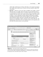
One example of content driving the transaction is a Web site form, an exam-
ple of which is shown in Figure 8.8. This form contains one or more text
boxes that allow the visitor to type information into the boxes and then click
a button at the end of the form to send the form information to the server. If
the back-end programming considers that the visitor completed all appropri-
ate fields satisfactorily, it processes the form and sends it to its intended recip-
ient(s) via email.
The transaction can also drive the content, because after the Web site has
completed the transaction, the programming directs the posting of a thank-
you message on the Web site.
One other variable that you must be aware of is security. All current browsers
provide pretty good security so people can’t hack into the form and steal
credit card numbers and other sensitive information. When you work with a
Web engineer, be sure that he is up-to-date on security issues and program-
ming—or find another engineer who is. You can have only one Web page that
214 Chapter 8
Figure 8.8 An example of a form.
Designing a Web Site 215
takes sensitive information, but if this Web page is not secure,visitors will not
give you their information. If visitors do give you their information and that
information is stolen, you could face serious legal issues.
Databases
Back-end Web programming commonly interfaces with databases, which
hold information about data that the Web visitor may be interested in. For
example, an e-commerce Web site usually contains information about prod-
ucts for sale. The database then drives the content, because the Web site dis-
plays the number of products available as well as how many products are
available for purchase (or if the company is sold out).
The visitor can order one or more products and specify how many of each
product to order. After the visitor enters his shipping and credit card infor-
mation, the database updates the information, processes the order, and tells
the Web site to display a thank-you page. When the database changes, the
back-end programming automatically changes the quantity of products avail-
able and may or may not reflect this updated quantity on the Web site.
Web Standards
Like a user interface, a Web interface must be consistent across all pages of
the site, because that consistency gives your visitors the impression that the
site is part of a unified whole. (Yes, it’s that holistic idea again.)
Colors and Text
Colors and text are still limited by browsers. Computer users have different
fonts installed on their computers. They also display different ranges of col-
ors. For example, my computer can show more than 4 million colors on the
screen, but another person’s computer may only be able to show 65,536 col-
ors. Although browsers and Web design software such as Adobe’s
Dreamweaver let you create any colors you want in your Web site,you should
design your Web site for the least common denominator when it comes to
text and graphics. That denominator is the Web-safe set of several common
fonts and a set of 256 colors that all browsers can display. Also, be careful to
avoid colors that might have cultural implications, or colors that might cause
a problem for colorblind users.
216 Chapter 8
Also, design your site so that visitors can read the text on your site properly.
What looks cool to you may look to a visitor like you’re trying to give her a
seizure. It’s important to keep the issues of contrast and simplicity in mind.
For example,you should have a black font on a white background for the best
contrast. You should also consider what font is the most readable. Many peo-
ple find the Arial font to be more readable onscreen than Times New Roman.
What’s the point of designing to the “least common denominator” for your
visitors? Keep in mind that you want your site to look the same across all
browsers; differences could result in your site not looking the way you
intended. For example, if you use a font not on your visitor’s computer, the
visitor’s computer may show a different font that wrecks the spacing on the
site—or it may not show the site at all. If the visitor’s computer can’t view
one or more of the colors that you have on your site, that computer will dis-
play a color that it thinks is the next best thing—and your visitor may be sur-
prised at the color he sees. For example, if you attempted to use a red color
to indicate a serious condition, but the color substituted by your computer
does not convey the importance, you won’t get your message across.
Also, be sure to use tasteful colors and fonts. If you use a lot of bright colors,
colors that don’t coordinate well together, or fonts that are whimsical and
unprofessional, it can reflect on the perception that your users have of your
company.
Graphics
If you’ve done any Web surfing,chances are that you’ve seen examples of bad
graphics on a site. The telltale signs of bad use of graphics can include one or
more of the following:
• Flashing text, a flashing block of text, or both. These are generally used
in banner advertisements that users have grown accustomed to ignor-
ing.
• Animated graphics that distract the user from looking elsewhere in the
text.
• Too many graphics within an area of the page that not only distract you
from looking at any text on the site, but result in frustration because all
the graphics compete for your attention at the same time.
• Graphics that are pixelated and jagged.
Your site should avoid using your graphics badly. Above all,however, your site
should have only enough graphics on the page to communicate to the user
effectively.
In some cases, you may only need one graphic for your company logo. If you
have an e-commerce Web site, it should have a limited number of graphics
spaced out so the user can see what the product is but not be overwhelmed
with so many graphics in one area of the page. Amazon.com is a company
that does this well on its home page. The Amazon site has numerous graphics
hawking various wares, but the graphics are spaced well apart and combined
with text, and the text and graphics blocks are separated by a healthy amount
of white space.
Navigation
Your site should be easy to navigate—meaning that if you don’t have links to
other related pages of your site readily available so visitors can get back to
where they were,your visitors will become frustrated and leave. If you’re sell-
ing things on your Web site,users leaving can mean lost business for you. And
if you don’t have visitors on your site, what’s the point of having a Web site in
the first place?
Bread Crumbs
As part of having good navigation, your site needs to include links that take
users back to the home page or a higher-level page (such as a shopping cart)
on each subpage. These bread crumbs can be links that appear on the page,
as shown in Figure 8.9. Alternatively, you can have a navigation bar or area
that appears the same way on each page for your visitors’ use.
Designing a Web Site 217
218 Chapter 8
The Four Rules
You should adhere to four rules when you design a Web site so that your site
is as usable as possible: keep your site simple, keep it consistent, keep it cur-
rent, and keep navigation to three clicks.
Keep It Simple
From the previous section, you probably got a good idea that your Web site
should be as simple as possible, whenever possible. There are exceptions, as
I’ll detail in the next section, but you should make your layout as easy as pos-
sible. Also, remember from Chapter 7 that the readers’ eyes in Western coun-
tries follow from left to right, and from top to bottom. However, this may not
always be the case, so my advice from Chapter 7 applies—you should per-
form a user and task analysis of your users to find out where they‘re coming
from and what they’re looking for on your site.
Keep It Consistent
As with a user interface, your Web site interface must be consistent across all
pages. If your Web site suddenly changes its look, users may become con-
fused and think that they’re on a completely different site. In the case of your
user interface for a software application, such a tactic would result in calls
Figure 8.9 A bread crumb on a Web site that leads the user back to the home
page.