Business Intelligence in Microsoft SharePoint 2010 phần 8 ppt
Bạn đang xem bản rút gọn của tài liệu. Xem và tải ngay bản đầy đủ của tài liệu tại đây (1.78 MB, 42 trang )
268 Chapter 8 Bringing It All Together
Dashboard (Web Part) Pages in SharePoint
The lightest-weight dashboard authoring tool is a simple web browser that takes advantage
of the user interface that SharePoint has provided to build dashboard pages that use Web
Parts.
Web Parts are logical containers in SharePoint pages that can display content. The Web Part
framework in SharePoint provides easy drag-and-drop interactivity, includes a Settings page,
and includes other user-interface features to make conguring pages fairly simple. Web
Part pages are generally essential for creating a dashboard-like experience in SharePoint.
You would typically use Web Parts when you need to display content from different les
or products (such as Excel Services, Visio Services, Reporting Services, and so on) in a page,
when you want to display that content side by side with other SharePoint content, or when
that content needs to interact with other SharePoint entities in the same page (such as lists or
other Web Parts).
PerformancePoint dashboard pages are ordinary Web Part pages that contain various com-
ponents as connected Web Parts. The Filter, Scorecard, Report, and Stack Web Part are dis-
cussed in more detail in the section “Create a Dashboard” in Chapter 7.
To create a dashboard page in SharePoint
1. Go to the SharePoint site where you want to add your dashboard page, expand the
Site Actions drop-down list, and choose More Options, as shown in the following
illustration.
Dashboard (Web Part) Pages in SharePoint 269
2. When the Create page opens, on the right-hand side of the page, under Pages And
Sites, choose Web Part Page.
Alternatively, depending on whether Silverlight is enabled, you might see a slightly dif-
ferent user interface. On the Create page, in the Browse From list, choose Filter By Page
and then choose the Web Part Page option as shown in the following illustration. Then
click Create (on the right-hand side of the page).
Now you must make some choices. As shown in the following illustration, you need
to select your preferred page layout, enter a name for the page, and specify where to
store the page.
270 Chapter 8 Bringing It All Together
3. Accept the defaults, and name the page WebPartPage. Feel free to experiment with the
different layout options available—whatever you nd pleasing. The Save Location is the
document library where SharePoint stores your new page.
4. Click Create to display a new blank Web Part page, as shown in the following
illustration.
Use Excel Services in the Dashboard
To make the dashboard more interesting, you can use the next exercise to get some data
from an Excel workbook and show it on the page by using the Excel Web Access Web Part.
Before doing that though, you need an Excel workbook.
You can use almost any workbook to do this. The following example walks you through the
steps to create a simple workbook that works with some of the lters you can add to the
page in later sections of this chapter.
Create the Excel Workbook
The workbook creation process has two parts. First you need to add a pivot table connected
to OLAP data in Analysis Services, and then you can generate a chart from that data.
Use Excel Services in the Dashboard 271
To add a pivot table to a workbook
1. Start the data connection wizard in Excel, click the Data tab, click From Other Sources,
and select From Analysis Services, as shown in the following illustration.
2. Complete the Data Connection Wizard to connect to the Contoso Retail DW database,
select the Sales cube, and click Finish.
3. In the Import Data dialog box, choose PivotTable Report to create a new pivot table
report in your sheet.
272 Chapter 8 Bringing It All Together
4. In the PivotTable Field List dialog box, choose Sales from the topmost lter to see only
those elds relevant for the Sales data.
5. Scroll through the eld list, selecting the check box next to the following elds: Sales
Amount, Product, and Calendar YWD. This adds the primary data to the spreadsheet
that we are working with.
6. Drag the Calendar YWD eld from the Column Labels area to the Report Filter area, as
shown in the following before-and-after illustrations.
Use Excel Services in the Dashboard 273
Before After
You should end up with a pivot table in your workbook, as shown in the following
illustration.
274 Chapter 8 Bringing It All Together
To add a simple chart to the workbook
1. Continuing with the same le you created in the preceding procedure, make sure your
cell selection is located in the pivot table, and on the Insert tab, click Pie to choose a
Pie chart.
2. To format the chart so that it looks a little better in the report, move the chart and then
grab its corner to resize it so that it ts next to your pivot table.
3. Optionally, choose a chart style that you like from the chart ribbon.
4. On the Chart Analyze tab, in the Field group, click Hide All.
You should now have a nished report that resembles the following illustration.
5. Save the workbook to SharePoint, and view it in a browser by using Excel Services.
When you view the workbook on the server, make sure the pivot table refreshes and that all
your data connectivity is working. If it isn’t, see the section “External Data Conguration” in
Chapter 4, “Excel Services,” for some steps that should help.
Prepare the Workbook for the Dashboard: Add Parameters
Because the ultimate goal is to end up with multiple Web Parts on a dashboard page, you
need a way to lter the data on the page at the same time. You can use a SharePoint lter
to do this. A SharePoint lter is yet another Web Part on the page that takes a given value
Use Excel Services in the Dashboard 275
and sends it to other Web Parts on the page. Then, based on the value provided by the
SharePoint lter Web Part, the other Web Parts can change or lter the data they display.
This simple mechanism enables users to choose a given value and then see all the different
Web Parts on the page get ltered by their choice. SharePoint lters are created either in a
SharePoint Web Part page user interface or in SharePoint Designer.
Before conguring the Excel Services Web Parts so that they can be ltered, you need to
make some simple modications to the workbook le so that it can be ltered in the dash-
board. You must modify the workbook so that it can accept a lter value and recalculate
based on that value. You do this by specifying workbook parameters.
A workbook parameter is a single cell in Excel that accepts input values when the le is
loaded on the server. This provides a way to modify a cell’s contents even in read-only or
view-only permission situations, without allowing the rest of the workbook to be edited.
Workbook parameters are single-cell named ranges that don’t contain any formulas.
To specify a workbook parameter
In the following exercise, the goal is to allow users to change the date lter for the pivot
table. First you need to give it a name.
Note
This exercise uses the same workbook you created earlier in the chapter.
1. In column B of row 1, select the date lter cell (showing “All” in the following illustra-
tion) on the pivot table, type DateFilterCell in the box to the left of the formula bar,
and press Enter. Now you can refer to that cell by name, which makes it easy to specify
it as a parameter later.
2. Click File, click Save & Send, and then click Save To SharePoint.
276 Chapter 8 Bringing It All Together
3. Click Publish Options (as shown in the right pane of the preceding illustration) to open
the Publish Options dialog box, and then, to dene the workbook parameters, click the
Parameters tab, shown in the following illustration.
4. In the Publish Options dialog box, click Add to display the Add Parameters dialog box,
shown in the following illustration, where you can choose which single-cell named
ranges to add as parameters.
Use Excel Services in the Dashboard 277
5. In the Add Parameters dialog box, select the DateFilterCell cell that you dened earlier
and click OK.
6. Click OK to close the Publish Options dialog box.
7. Save the le in SharePoint. (If you opened the le directly from SharePoint, you can
simply click Save, or you can click Save As to overwrite the earlier version of the le.)
The workbook you just saved in SharePoint now allows users to set values in the DateFilterCell
cell even if the workbook is in read-only or view-only mode. Changing the cell value triggers
a refresh of both the pivot table and pivot chart. You’ll use this parameter later when we
associate it with a SharePoint lter.
Show the Workbook in Web Parts
Now it’s time to show the pivot table and chart in separate Web Parts on the dashboard
page. The rst step is to add the Excel Web Access Web Parts to the page and congure
them.
To add an Excel Web Access Web Part
1. From the Page tab of your browser, navigate to the Web Part page you created before.
(Remember that it might be in the Site Assets library of your site, depending on where
you saved it.)
278 Chapter 8 Bringing It All Together
2. Pick a zone, and then click Add A Web Part to expand the top of the page so that you
can choose which Web Part to add.
3. As shown in the preceding illustration, select Business Data in the Categories area,
choose Excel Web Access in the Web Parts area, and then click Add to add the Web
Part to the page in the zone you selected previously.
4. You should now have an empty Excel Web Access Web Part on the page. You can use
this Web Part to load and display Excel workbooks using Excel Services.
Use Excel Services in the Dashboard 279
To congure the Web Part
Now you can congure the Web Part to display the workbook you created earlier.
1. In the Select A Workbook page, shown in the preceding illustration, click the Click Here
To Open The Tool Pane link to expand the tool pane for the Web Part, displaying all the
conguration options.
2. Under the Workbook Display area, click the blue button to browse for a workbook to
display. A webpage dialog box opens, enabling you to navigate within SharePoint to
pick a workbook. Use that dialog box to select the workbook you saved in SharePoint
from the previous steps, or just type the URL to the workbook directly.
You should end up with a URL for the workbook you want to display, as shown in the
following illustration.
3. Scroll down to the bottom of the Web Part properties tool pane, and click OK. You
should now see your workbook displayed in the Web Part, as shown in the following
illustration.
280 Chapter 8 Bringing It All Together
Notice that the workbook looks just like an Excel le at this point. You can click the
sheet tabs, see the chart, interact with the pivot table, and so forth.
You can control what the Web Part actually shows—for example, you can have it show
only the chart.
4. Click the drop-down arrow and select Edit Web Part, as shown in the following illustra-
tion, to open the Web Part Properties tool pane.
5. In the tool pane, under Named Item, type in Chart 1. (This works only if you have cre-
ated a workbook with at least one chart in it and have not changed the default name of
the chart. If you did rename your chart, type the name you gave to the chart.)
Use Excel Services in the Dashboard 281
6. Click either OK or Apply at the bottom of the Web Part Properties tool pane, and the
Web Part displays the chart named Chart 1, as shown in the following illustration.
Notice that the Web Part no longer displays this page as a spreadsheet. Instead, it displays
each item, one at a time, in the Web Part. This viewing mode is referred to as the Named
Item View. When users expand the View drop-down list, they can choose to display any of
the other items in the workbook.
The Named Item View is the view used in most Web Parts, because most people just want
to see the parts of a workbook that are interesting and related in a dashboard. This is also
the mode that is used when the workbook author publishes only a selection of items from
Excel (as described in the “To publish and Excel le” procedure in Chapter 4). That is, because
the workbook author chose to display only certain items rather than full sheets, each item
appears in Named Item View.
Therefore, in the case where the author chose to show only a set of items from the workbook,
the Web Part shows whichever is the rst item in the workbook (sorted alphabetically)—even
if you don’t specify the name of an item in the Named Item Web Part Text box. However, you
can also specify which item should appear rst in the workbook by using the Named Item
text box in the Web Part properties task pane.
Set Other Web Part Properties
Open the Web Part properties tool pane again. Notice that many properties that can affect
how the workbook is displayed are listed. You won’t explore all the properties here, but gen-
erally, you can nd properties for controlling whether the toolbar is visible, what commands
282 Chapter 8 Bringing It All Together
are on the toolbar (if it is visible), whether or not the Named Item drop-down list is displayed,
and what types of interactivity you want to allow for the Web Part (such as sorting, ltering,
recalculation, and so on).
For now, turn the toolbar off. Under Type Of Toolbar, choose None from the drop-down list,
as shown in the following illustration.
Then scroll down and expand the appearance section. Notice the width and height controls.
These controls are used frequently for adjusting dashboards that have many objects on the
page, to get the right look and feel. You need to adjust these to make the Web Part t the
displayed Excel content in a way that doesn’t show unnecessary scrollbars. Finally, click OK to
close the Web Part Properties tool pane.
Add More Web Parts and Finish
Repeat the steps in the preceding section, but this time set the Named Item to PivotTable1
to display the pivot table you created earlier. Notice that in the Excel client you can see the
name of each item in the ribbon for that item. Feel free to add any other Web Parts to the
page as well.
Add a SharePoint Filter to the Page 283
On the ribbon at the top of the SharePoint page, click Stop Editing. Until now, the Web Part
page has displayed in Edit mode. This mode shows all the various zones, drop-downs for
displaying edit menus, editing ribbons, and so forth. When you click Stop Editing, the Web
Part page displays in the way that visitors to the site will see it. This page has many other set-
tings that you can use to make the page cleaner (such as turning off Web Part titles). You can
freely experiment with these options to learn how they modify the look and feel of the page.
As shown in the preceding illustration, our example has two Web Parts on the page—one
showing a chart and the other showing a pivot table. Both come from the same workbook.
However, at this point, when you drill down on the pivot table, the chart does not update.
This is because each Web Part loads its own copy of the workbook—that is, it gets its own
session on the server. Each session is completely separate, so changes from one session don’t
affect other sessions. This is the reason why you can have a single Web Part page viewable by
many users at the same time, yet one user’s operations (lter, sort, drill, and so on) affect only
that user.
Note
The example in this section is for illustrational purposes only. It’s intended to show how
you can have multiple Web Parts interacting on the same page. In a real-world scenario, the
power of multiple Web Parts becomes apparent when you have items from different workbook
les that can be viewed side by side, rather than items from the same le.
The next section shows you how to put a single lter on the page that enables both the chart
and the pivot table to update.
Add a SharePoint Filter to the Page
SharePoint provides many different kinds of lters right out of the box. You can also add new
custom lters to SharePoint—but that is beyond the scope of this book. The lters that ship
as part of SharePoint can take data from many different sources, including a SharePoint list, a
predened set of values, Analysis Services, user-entered values, and many more.
284 Chapter 8 Bringing It All Together
This section focuses on using an Analysis Services lter. The goal is to allow users to select a
date from Analysis Services and then see other Web Parts on the page update to reect the
chosen date.
Create a Reusable Data Connection
Because you want to use the Analysis Services lter in SharePoint, you rst need to provide
it with the Analysis Services connection information. The ideal way to do that is to reuse the
same connection that the workbook uses. SharePoint and other Ofce products (like Excel)
provide features for connection reuse, sharing, and management. While most of those topics
are out of scope for this book, the following “bare minimum” procedure shows you how to
easily reuse the connection you created earlier for the workbook.
The goal here is to save the connection information from the Excel workbook as a separate
connection le (an .odc le) to SharePoint so that other workbooks, Visio les, or SharePoint
lters can easily reuse the same connection.
To save the connection information to SharePoint
1. Open the Excel workbook that contains the pivot table and chart you have been work-
ing with in this chapter.
2. On the Data tab, click Connections, as shown in the following illustration.
The Workbook Connections dialog box opens.
Add a SharePoint Filter to the Page 285
3. For each connection (only one is shown in the preceding illustration, but there could be
more if you have more connections in your workbook), select the connection and then
click Properties.
4. In the Connection Properties dialog box, click the Denition tab, as shown in the follow-
ing illustration.
5. Click Export Connection File to open the File Save dialog box.
6. In the File Save dialog box, type the path to the SharePoint site where you are creating
your dashboard, and press Enter to save your le.
Note
Don’t worry about typing the name of the connection le at this point. Just type
the name of the SharePoint site; the dialog box lets you navigate to the specic library
where you want to save it.
7. When the dialog box displays the SharePoint user interface, as shown in the following
illustration, you can choose where to save your le. In this case, you should save it in a
Data Connection Library (if you have one); if not, in the Document Libraries list, simply
double-click Shared Documents to save it there.
286 Chapter 8 Bringing It All Together
8. Type the name of the le that you want to use—Contoso Retail DW Sales in this case—
and click Save.
Now the data connection information is neatly packaged up as a le that you can reuse for
other workbooks, diagrams, or, in this case, for lters on the page. Now you can add the
Analysis Services lter.
Add the Filter to the Dashboard
Many types of lters are available in SharePoint, but for this example, the goal is to let users
lter by date (the year), in the same Analysis Services cube that the workbook is using.
To add an Analysis Services lter to a dashboard page
1. Navigate to the dashboard page in your browser, and make sure it is in Edit mode. (You
might need to click the Page tab on the webpage and then click Edit Page to get to Edit
mode.)
2. Click the Add a Web Part link in the left-column zone of the page.
3. Under Categories, choose Filters. Under Web Parts, choose SQL Services Analysis
Services Filter, and then click Add.
Add a SharePoint Filter to the Page 287
You should now have an empty lter on the page, ready to be congured.
Congure the Filter
Now you need to congure the lter to get the right data from Analysis Services. At this
point, it is connected to the cube but isn’t getting the date values. The goal is to grab values
from the same date eld that the pivot table and chart use so that you can pass those values
to the other Web Parts on the page.
To congure the Analysis Services lter
1. In the lter Web Part, as shown in the preceding illustration, click the Open The Tool
Pane link to open the properties task pane for that lter.
2. Under the Pick a Data Connection From section, select A SharePoint Data Connection
Library, and then click the Browse icon next to the Ofce Data Connection File text box.
3. Use the SharePoint dialog box to navigate to where you saved the .odc le earlier,
select it, and click OK to close the dialog box.
288 Chapter 8 Bringing It All Together
4. In the properties task pane, in the Dimension drop-down list, choose Date. (You might
have to wait a few seconds for the Dimension combo box to enable, because the page
needs to refresh and populate the drop-down list from Analysis Services.)
5. Choose Calendar YWD from the Hierarchy drop-down list, as shown in the following
illustration.
6. Click Ok to close the task pane.
The lter is now connected to Analysis Services. If you expand the lter, you can see the same
calendar year date choices as you saw in our pivottable in Excel.
Connect the Filter to Other Web Parts
At this point, you have a lter that allows users to choose date values from Analysis Services
on the page, but changing the selected date has no effect on the rest of the dashboard. To
make the lter meaningful, you need to connect it to the other Web Parts on the page so
Add a SharePoint Filter to the Page 289
that it can pass the selected date value and so that the other Web Parts can lter their data
accordingly.
To connect a lter to other Web Parts
1. In the Web Part containing your chart, click the drop-down arrow that appears at the
upper-right corner of the Web Part page. This displays a drop-down list containing
options for the Web Part.
2. From the drop-down list, choose Connections | Get Filter Values From | SQL Server Analysis
Services Filter, as shown in the following illustration. The Congure Connection Webpage
Dialog dialog box opens. (You might need to allow pop-up windows in your browser to
view this dialog box.) This dialog box shows all the available workbook parameters to
which you can send the lter value. In this example, there is only one: the DateFilterCell
parameter you created earlier.
3. In the Congure Connection Webpage Dialog dialog box, shown in the following
illustration, make sure that the DateFilterCell parameter is selected and then click Finish
to accept the parameter.
290 Chapter 8 Bringing It All Together
The lter is now be connected to the Web Part and should refresh automatically after
the dialog box closes. Depending on your server’s settings, you might be prompted
to continue with a data refresh in the Excel Web Access Web Part. The Excel Services
administrator can control this setting. (It is a Trusted File Location setting–see the
“Server Security” section in Chapter 4 for more information.)
4. Repeat Steps 1–3 to connect the lter to the Web Part that shows the pivot table.
5. Click Stop Editing, as shown in the following illustration, to take the page out of edit
mode.
The lter is now connected and should work. To test it, expand the lter drop-down list,
choose values (you can choose multiple values), and notice how both of the Excel Services-
based Web Parts update.
Note
The Contoso data set might not be fully populated—that is, not all years contain data. If
you get an empty pivot table and chart, change the lter to another year. The years 2008 and
2009 should have data.
Add SharePoint KPIs
SharePoint natively provides some simple KPIs and some detailed views of them, along with
some Web Parts to integrate them into dashboards. Other products, like Excel or PowerPivot,
have KPIs or formatting that you can use to create KPIs. But if you don’t need a full spread-
sheet, don’t have more advanced calculations for KPIs, don’t want to spend the time devel-
oping Performance Point KPIs, and just want something quick and simple, SharePoint KPIs
might be the way to go.
Add a SharePoint Filter to the Page 291
SharePoint KPIs are stored as items in a list (like most things in SharePoint). This list is a spe-
cial type of list—a status list.
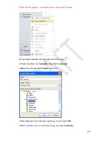
To create a new status list
1. Navigate to the site where your Web Part page is located.
2. From the Site Actions menu, choose More Options.
3. From the Create dialog box, under the Filter By section in the left-hand side of the dia-
log box, select List, and then select Status List in the main dialog box section. On the
far right-hand side of the dialog box, give your new list a name, and click Create. A new,
empty status list appears in the browser.
292 Chapter 8 Bringing It All Together
Four basic types of KPIs can be added to your list. The KPIs can be based on values
from a SharePoint list, values from a cell in an Excel spreadsheet (recalculated using
Excel Services when the user views the KPI), KPIs stored and managed in Analysis
Services, and a KPI that has a goal, threshold, and current value that are manu-
ally entered and updated. In this exercise, we want to create a KPI based on Analysis
Services data.
4. Expand the New drop-down list on the toolbar in your status list, and choose SQL
Server Analysis Services Based Indicator to open the New Item dialog box.
5. In the New Item dialog box, click the browse icon next to the Data Connection text box.
Note You might see some red text under the text box shown in the preceding illustration,
warning you about your connection not being encrypted. You can ignore this text because
you’re most likely learning about these technologies in a test environment. In general,
when setting up solutions in a production environment, make sure that your conguration
is in compliance with whatever local security policies your company might have in place.
6. In the Select an Asset – Webpage dialog box that enables you to browse and choose a
data connection le, choose the Contoso Retail DW Sales.odc le you used in Step 3 of
the procedure “To congure the Analysis Services lter,” earlier in this chapter.
7. Select Revenue under the Status List section from the right-hand side of the dialog box,
and leave the Include Child Indicators check box selected.