mcts 70-562 Microsoft .NET Framework 3.5, ASP.NET Application Development phần 2 docx
Bạn đang xem bản rút gọn của tài liệu. Xem và tải ngay bản đầy đủ của tài liệu tại đây (1.87 MB, 108 trang )
Lesson 2: Exploring Common Server Controls CHAPTER 2 79
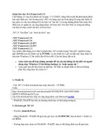
FIGURE 2-16 Defining properties of the RadioButton control on a Web page
Quick Check
1. What are the two types of Web server Button controls that can be created?
2. How do you create a TextBox for retrieving a password from a user?
3. How do you make a CheckBox cause immediate PostBack to the server?
Quick Check Answers
1. The two types of Web server Button controls are submit and command buttons.
2. You can mask the user’s entered password by setting the TextMode property of
the TextBox control to Password.
3. You can force an immediate PostBack for a CheckBox control by setting its Auto-
PostBack property to true.
Lab Working with Web Server Controls
In this lab, you work with the Web server controls that are defi ned in this chapter.
If you encounter a problem completing an exercise, the completed projects are available
on the companion CD in the Code folder.
Quick Check
1
. What are the two types of Web server
Button
controls that can be created?
2
. How do you create a
TextBox
for retrieving a password from a user?
TextBox for retrieving a password from a user?TextBox
3
. How do you make a
CheckBox
cause immediate PostBack to the server?
CheckBox cause immediate PostBack to the server?CheckBox
Quick Check Answers
1
. The two types of Web server
Button
controls are submit and command buttons.
2
. You can mask the user’s entered password by setting the
TextMode
property of
the
TextBox
control to
TextBox control to TextBox
Password
.
3
. You can force an immediate PostBack for a
CheckBox
control by setting its
CheckBox control by setting its CheckBox
Auto-
PostBack
property to
PostBack property to PostBack
true
.
1
2
3
1
2
3
80 CHAPTER 2 Adding and Configuring Server Controls
ExErcisE 1 Adding Controls to the Web Page
In this exercise, you add Web server controls to a Web page.
1. Open Visual Studio and create a new Web site called WebServerControls.
2. Open the Default.aspx Web page in Design view.
3. Drag a Label, CheckBox, TextBox, three RadioButtons, and a Button control onto the
Web page. Change the Text properties of these controls to match Figure 2-17.
In addition, name these items LabelInformation, CheckBoxAdmin, TextBoxUser-
Name, RadioButton1, RadioButton2, RadioButton3, and ButtonSave, respectively.
Also, set the GroupName for the radio buttons to ApplicationRole.
FIGURE 2-17 Drag Web server controls onto the page as shown
4. Right-click the Web page and select View Code to open the code-behind page. Notice
that no additional code was added to the code-behind page.
5. Run the Web application. Click the Button, CheckBox, and RadioButton controls. Ob-
serve the behavior of these controls. Notice that the Button is the only control that
performs a PostBack to the server. Also notice that the RadioButton controls are not
mutually exclusive.
6. Open the page in Design view. Select the TextBox control and set its MaxLength prop-
erty to 12 to restrict user input.
7. Run the page and type in the TextBox control. Notice that you cannot type more than
12 characters into the control.
Lesson 2: Exploring Common Server Controls CHAPTER 2 81
8. Double-click the CheckBox control to add the CheckedChanged event handler. Add
code to replace its Text property based on whether or not the user has selected the
check box. Your code should look like the following:
'VB
Protected Sub CheckBoxAdmin_CheckedChanged(ByVal sender As Object, _
ByVal e As System.EventArgs) Handles CheckBoxAdmin.CheckedChanged
If CheckBoxAdmin.Checked Then
CheckBoxAdmin.Text = "System Administrator"
Else
CheckBoxAdmin.Text = "Check to set as system administrator"
End If
End Sub
//C#
protected void CheckBoxAdmin_CheckedChanged(object sender, EventArgs e)
{
if (CheckBoxAdmin.Checked)
{
CheckBoxAdmin.Text = "System Administrator";
}
else
{
CheckBoxAdmin.Text = "Check to set as system administrator";
}
}
9. Run the page. Notice that changing the CheckBox control has no effect. Click Save and
notice that the text changes as the button causes a PostBack. Return to the page and
set the AutoPostBack property of the CheckBox control to true. Rerun the page and
select the CheckBox to see the results.
10. To make the RadioButton controls mutually exclusive, these controls must have the
same GroupName property setting. Assign ApplicationRole to the GroupName prop-
erty of all three RadioButton controls.
11. Run the page and select each of the radio buttons. Notice that they are now mutually
exclusive.
12. Open the page in Design view. Double-click the Button control to add the button’s
Click event handler to your code-behind fi le. Add the following code to populate the
Label indicating the page’s data has been saved:
'VB
Protected Sub ButtonSave_Click(ByVal sender As Object, _
ByVal e As System.EventArgs) Handles ButtonSave.Click
'VB
Protected Sub CheckBoxAdmin_CheckedChanged(ByVal sender As Object, _
ByVal e As System.EventArgs) Handles CheckBoxAdmin.CheckedChanged
If CheckBoxAdmin.Checked Then
CheckBoxAdmin.Text = "System Administrator"
Else
CheckBoxAdmin.Text = "Check to set as system administrator"
End If
End Sub
//C#
protected void CheckBoxAdmin_CheckedChanged(object sender, EventArgs e)
{
if (CheckBoxAdmin.Checked)
{
CheckBoxAdmin.Text = "System Administrator";
}
else
{
CheckBoxAdmin.Text = "Check to set as system administrator";
}
}
'VB
Protected Sub ButtonSave_Click(ByVal sender As Object, _
ByVal e As System.EventArgs) Handles ButtonSave.Click
82 CHAPTER 2 Adding and Confi guring Server Controls
LabelInformation.Text = "User information saved."
End Sub
//C#
protected void ButtonSave_Click(object sender, EventArgs e)
{
LabelInformation.Text = "User information saved.";
}
13. Run the page, click Save, and notice the results.
Lesson Summary
n
The Label control displays text at a specifi c location on the Web page using the prop-
erties that have been assigned to the Label control.
n
The TextBox control collects text from the user.
n
The Button control displays a push button on the Web page that can be clicked to trig-
ger a PostBack to the Web server.
n
The CheckBox control gives the user the ability to select between true and false.
n
The RadioButton control gives the user the ability to select between mutually exclusive
RadioButton controls in a group.
Lesson Review
You can use the following questions to test your knowledge of the information in Lesson 2,
“Exploring Common Server Controls.”
The questions are also available on the companion CD if you prefer to review them in
electronic form.
NOTE ANSWERS
Answers to these questions and explanations of why each answer choice is right or wrong
are located in the “Answers” section at the end of the book.
1. If you want multiple RadioButton controls to be mutually exclusive, what property must
you set?
A. Exclusive
B. MutuallyExclusive
C. Grouped
D. GroupName
LabelInformation.Text = "User information saved."
End Sub
//C#
protected void ButtonSave_Click(object sender, EventArgs e)
{
LabelInformation.Text = "User information saved.";
}
NOTE
ANSWERS
Answers to these questions and explanations of why each answer choice is right or wrong
are located in the “Answers” section at the end of the book.
Lesson 2: Exploring Common Server Controls CHAPTER 2 83
2. You are creating a Web page that has several related buttons, such as fast forward,
reverse, play, stop, and pause. You want to create a single event handler that processes
the PostBack from these Button controls. Other than the normal submit button, what
type of button can you create as a solution?
A. OneToMany
B. Command
C. Reset
D. ManyToOne
3. In Design view, what is the simplest way to create an event handler for the default
event of a server control?
A. Open the code-behind page and write the code.
B. Right-click the control and select Create Handler.
C. Drag an event handler from the Toolbox to the desired control.
D. Double-click the control.
84 CHAPTER 2 Adding and Confi guring Server Controls
Lesson 3: Exploring Specialized Server Controls
It was not long ago when creating something as basic as a calendar on a Web page was a
time-consuming task involving the creation of HTML tables with hyperlinks on each date. You
also had to create JavaScript to process the selection of a date, and more. With ASP.NET, com-
mon tasks such as creating a calendar involve simply dragging and dropping a feature-rich
control on your Web page.
The previous lesson covered some of the more basic controls used to build Web pages.
There are, of course, many more controls available for use. This lesson covers the more spe-
cialized Web server controls. These are controls that go beyond those basic controls but are
not covered elsewhere in the chapter.
After this lesson, you will be able to:
n
Use the following Web server controls:
n
Literal
n
Table, TableRow, and TableCell
n
Image
n
ImageButton
n
ImageMap
n
Calendar
n
FileUpload
n
Panel
n
MultiView
n
View
n
Wizard
Estimated lesson time: 60 minutes
The Literal Control
The Literal control is similar to the Label control in that both controls are used to display static
text on a Web page. The Literal control does not inherit from WebControl, as shown in the
Literal control’s object model in Figure 2-18. The Literal control does not provide substantial
functionality and does not add any HTML elements to the Web page, whereas the Label is
rendered as a <span> tag. This means that the Literal control does not have a style property,
and you therefore cannot apply styles to its content.
After this lesson, you will be able to:
n
Use the following Web server controls:
n
Literal
n
Table
,
TableRow
, and
TableRow, and TableRow
TableCell
n
Image
n
ImageButton
n
ImageMap
n
Calendar
n
FileUpload
n
Panel
n
MultiView
n
View
n
Wizard
Estimated lesson time: 60 minutes
Estimated lesson time: 60 minutes
Lesson 3: Exploring Specialized Server Controls CHAPTER 2 85
FIGURE 2-18 The Literal control object model
The Literal control is useful when you need to add text to the output of the page dynami-
cally (from the server) but do not want to use a Label. If your text is static, you can simply add
it to the markup of the page (you do not need a Label or a Literal control). The Literal control
contains the Mode property, which is used to specify particular handling of the content of the
Text property. The modes available and their descriptions are shown in Table 2-4.
TABLE 2-4 The Literal Control’s Mode Property
MODE DESCRIPTION
PassThrough The Text content is rendered as is. This includes HTML markup and
script. These items are output to the page and processed by the browser
as HTML and script.
Encode The Text content is HTML-encoded; that is, any HTML markup or script is
actually treated like text and not HTML or script.
Transform The Text content is converted to match the markup language of the
requesting browser, such as HTML, Extensible Hypertext Markup
Language (XHTML), Wireless Markup Language (WML), or Compact Hy-
pertext Markup Language (cHTML). If the markup language is HTML or
XHTML, the content is passed through to the browser. For other markup
languages, invalid tags are removed.
86 CHAPTER 2 Adding and Configuring Server Controls
As an example, consider a Web page with three Literal controls, one for each Mode prop-
erty setting. Suppose the following code is added to the code-behind page to demonstrate
the use of the Literal control and the effect of the Mode property:
'VB
Protected Sub Page_Load(ByVal sender As Object, _
ByVal e As System.EventArgs) Handles Me.Load
Literal1.Text = _
"This is an <font size=7>example</font><script>alert(""Hi"");</script>"
Literal2.Text = _
"This is an <font size=7>example</font><script>alert(""Hi"");</script>"
Literal3.Text = _
"This is an <font size=7>example<script>alert(""Hi"");</script>"
Literal1.Mode = LiteralMode.Encode
Literal2.Mode = LiteralMode.PassThrough
Literal3.Mode = LiteralMode.Transform
End Sub
//C#
protected void Page_Load(object sender, EventArgs e)
{
Literal1.Text =
@"This is an <font size=7>example</font><script>alert(""Hi"");</script>";
Literal2.Text =
@"This is an <font size=7>example</font><script>alert(""Hi"");</script>";
Literal3.Text =
@"This is an <font size=7>example</font><script>alert(""Hi"");</script>";
Literal1.Mode = LiteralMode.Encode;
Literal2.Mode = LiteralMode.PassThrough;
Literal3.Mode = LiteralMode.Transform;
}
Figure 2-19 shows the rendered output of the Literal control when the Web page is dis-
played. The alert message was displayed twice: once for Transform and once for PassThrough.
Note that this is a security risk if you are setting the Text property of the Literal control
dynamically from user input. However, the encoded version of the Literal control encodes the
HTML and script and displays it to the browser window.
Lesson 3: Exploring Specialized Server Controls CHAPTER 2 87
FIGURE 2-19 Literal controls rendered using different Mode settings
The Table, TableRow, and TableCell Controls
Web developers have been using tables to format information displayed on Web pages since
the fi rst HTML pages. Tables are useful for tabular data, but they can also help with the layout
of graphics and controls on a form. The concept of columns and rows is a powerful layout
technique for Web pages.
HTML provides the <table> tag for defi ning a table, the <tr> tag for creating a row, and
the <td> tag for defi ning a column in the row. Web developers should be very familiar with
these tags. ASP.NET provides the Table control for creating and managing tables without
these tags. Like its HTML counterpart, the Table control can be used to display static informa-
tion on a page. However, the Table control’s real power comes from the ability to program-
matically add TableRow and TableCell controls from your code at run time. If you only need to
display static information, consider using the HTML tags instead.
EXAM TIP
There is also an HtmlTable control. It can be created from the HTML <table> tag by adding
the runat=”server” attribute to the tag and assigning an ID to the tag. However, the Table
control is easier to use because it provides a programming model that is consistent with
the TableRow and TableCell controls.
88 CHAPTER 2 Adding and Configuring Server Controls
Again, the Table control is the right choice when you need to programmatically add rows
and cells to a table at run time. The rows are added using the TableRow control and the cells
are added using the TableCell control. You add these rows and cells in a similar manner as you
would dynamically create other controls on a page. This also means the same rules apply to
these dynamically created controls. That is, for them to be available at PostBack they need to
be re-created when the page posts back to the server. Your page might only be for display or
it might be simple enough to manage. In either case you should be fine to use a Table control.
However, if your needs are more complicated, you have a lot of data, and you need it to sur-
vive PostBack, consider using the Repeater, DataList, or GridView controls. The Table control is
also very useful for control developers who use a table as part of a custom control.
The Table control provides an object model that is consistent with other Web controls.
Figure 2-20 shows the Table control’s object model.
FIGURE 2-20 The Table control’s object mode
Notice that the Table control contains a Rows collection property (shown as a collection
association in Figure 2-20). This property is a collection of TableRow controls. It is used to add
and access the rows of your table. The TableRow control contains a Cells collection property
(also shown as a collection association). This property represents a collection of TableCell
controls. These are the actual cells (or columns) within the given row.
The Table, TableRow, and TableCell all inherit from the WebControl class. This class provides
base properties such as Font, BackColor, and ForeColor. If you set these properties at the Table
level, you can override them in TableRow instances, and in turn, the TableRow settings can be
overridden in the TableCell instances.
Lesson 3: Exploring Specialized Server Controls CHAPTER 2 89
Adding Rows and Cells Dynamically to a Table Control
Visual Studio provides a designer for adding rows and cells to Table controls on your page.
You access this design tool from the Table control’s Rows property in the Properties window.
From here you can add rows to your table. Each row also allows you to manage its Cells col-
lection in a similar manner. Figure 2-21 shows this dialog box in action.
FIGURE 2-21 The TableRow collection editor in Visual Studio
The real power of the Table control, however, is being able to work with it from your code.
The following steps show how to dynamically add TableCell and TableRow objects to an exist-
ing Table control.
1. Open a Visual Studio Web site or create a new one. Open (or create) a Web page with
which to work.
2. From the Toolbox, drag a Table control onto your page.
3. Open the code-behind file for the given page and add a PreInit event to the page.
4. Inside the PreInit event write a for loop to create five new rows in the table.
5. Inside this loop, add another for loop to create three columns for each row.
6. Inside this loop, modify the TableCell.Text property to identify the row and column.
The following code provides an example:
'VB
Protected Sub Page_PreInit(ByVal sender As Object, _
ByVal e As System.EventArgs) Handles Me.PreInit
90 CHAPTER 2 Adding and Configuring Server Controls
Table1.BorderWidth = 1
For row As Integer = 0 To 4
Dim tr As New TableRow()
For column As Integer = 0 To 2
Dim tc As New TableCell()
tc.Text = String.Format("Row:{0} Cell:{1}", row, column)
tc.BorderWidth = 1
tr.Cells.Add(tc)
Next column
Table1.Rows.Add(tr)
Next row
End Sub
//C#
protected void Page_PreInit(object sender, EventArgs e)
{
Table1.BorderWidth = 1;
for (int row = 0; row < 5; row++)
{
TableRow tr = new TableRow();
for (int column = 0; column < 3; column++)
{
TableCell tc = new TableCell();
tc.Text = string.Format("Row:{0} Cell:{1}", row, column);
tc.BorderWidth = 1;
tr.Cells.Add(tc);
}
Table1.Rows.Add(tr);
}
}
In the code example, notice that the code starts by setting the BorderWidth property of
the Table control to 1, which causes the Table to have a line around its outside edges. The
TableCell objects also have their BorderWidth set to 1, which causes each TableCell to be out-
lined as well. When the Web page is displayed, it will look like the page shown in Figure 2-22.
Lesson 3: Exploring Specialized Server Controls CHAPTER 2 91
FIGURE 2-22 A Web page showing the result of dynamically creating TableRow and TableCell controls
The Image Control
The Image control can be used to display an image on a Web page. Again, this control should
be used when you need to manipulate the properties of the control in server-side code. If you
simply need to embed a static image on your page you can use the HTML <img> tag. In fact,
when the Image control is rendered to a page it generates an <img> element.
The Image control inherits directly from the WebControl class. The ImageMap and Image-
Button controls inherit directly from the Image control. Figure 2-23 shows the class hierarchy
of the Image control.
The Image control is represented as the <asp:Image> element in the source and has
no content embedded between its opening and closing tags. Therefore you can write this
element as a singleton (closing the tag with /> instead of using a separate closing tag). It is
important to understand that the image itself is not embedded in the Web page; instead,
when the browser encounters the <img> element with the href attribute, the browser initiates
a separate request for the image from the server.
92 CHAPTER 2 Adding and Configuring Server Controls
FIGURE 2-23 The Image control hierarchy
The Image control’s primary property, ImageUrl, indicates the path to the image that is
downloaded from the browser and displayed on the page. This property maps directly to the
href attribute of the <img> element in HTML. Some additional properties to consider when
working with the Image control are as follows:
n
The Image control also contains a property called AlternateText. You can set this prop-
erty to display a text message in the user’s browser when the image is not available or
the browser is set to not render the image.
n
The ImageAlign property of the Image control can be set to NotSet, Left, Right, Base-
line, Top, Middle, Bottom, AbsBottom, AbsMiddle, or TextTop. These settings specify the
alignment of the image in relation to the other objects on the Web page.
n
The DescriptionUrl property is an accessibility feature that is used to provide further
explanation of the content and meaning of the image when using nonvisual page
readers. This property sets the longdesc attribute of the <img> element that is gener-
ated. This property should be set to the Uniform Resource Locator (URL) of a page that
contains details of the image in text or audio format.
n
Setting the GenerateEmptyAlternateText property to true will add the attribute alt=””
to the <img> element that the Image control generates. From the accessibility per-
spective, any image that does not contribute to the meaning of the page, such as a
blank image or a page-divider image, should always carry this attribute; it causes the
nonvisual page readers to simply ignore the image.
The following code provides an example of a Web page with an Image control. An image
file called Whale.jpg is inside a folder called Images. An HTML page called WhaleImage-
Description.htm, which contains a description that can be used by nonvisual page readers,
was also created. The following code demonstrates setting the Image control’s properties
programmatically inside the page’s code-behind file.
Lesson 3: Exploring Specialized Server Controls CHAPTER 2 93
'VB
Protected Sub Page_Load(ByVal sender As Object, _
ByVal e As System.EventArgs) Handles Me.Load
Image1.ImageUrl = "images/whale.jpg"
Image1.DescriptionUrl = "WhaleImageDescription.htm"
Image1.AlternateText = "This is a picture of a whale"
End Sub
//C#
protected void Page_Load(object sender, EventArgs e)
{
Image1.ImageUrl = "images/whale.jpg";
Image1.DescriptionUrl = "WhaleImageDescription.htm";
Image1.AlternateText = "This is a picture of a whale";
}
Figure 2-24 shows the rendered Web page. This includes the alternate text displayed as a
ToolTip.
FIGURE 2-24 The rendered Image control displaying the AlternateText property as a ToolTip
94 CHAPTER 2 Adding and Configuring Server Controls
The ImageButton Control
The Image control does not have a Click event. In situations in which a Click event is neces-
sary, you can use ImageButton or ImageMap instead. These controls allow you to treat an
image like a clickable button. In addition, you can retrieve the x- and y-coordinates of the
user’s click. This is useful for determining where on the given image the user has clicked. You
can use this information on the server to perform different actions, depending on the area
clicked by the user.
The ImageButton control is used to display a clickable image on a Web page that can be
used to PostBack to the Web server when the image is clicked. This control generates an
<input type=”image”> element when rendering to HTML. The ImageButton control inherits
directly from the Image control class as shown in Figure 2-25.
FIGURE 2-25 The ImageButton control hierarchy
The ImageButton control is represented as an <asp:ImageButton> element in Source view
and has no content, so you can write this element as a singleton element. Like the Image
control, the ImageButton control’s primary property, ImageUrl, indicates the path to an image
that can be downloaded from the browser and displayed. This property maps directly to the
src attribute of the <input> element in HTML. Because the ImageButton inherits from the Im-
age control, it also contains the AlternateText, DescriptionUrl, ImageAlign, and GenerateEmpty-
AlternateText properties.
The ImageButton control has a Click and Command event that functions like the Button
control. The second argument of the Click event has a data type of ImageClickEventArgs,
which lets you retrieve the x- and y-coordinates of the user’s click.
Lesson 3: Exploring Specialized Server Controls CHAPTER 2 95
Here’s another example: A Web page was created and an ImageButton control was added
to the page. This control uses an image that is both red and blue (redblue.jpg). The following
code was added to the code-behind page to show how the ImageButton control’s properties
can be set programmatically and the Click event can be implemented.
'VB
Partial Class ImageControl
Inherits System.Web.UI.Page
Protected Sub Page_Load(ByVal sender As Object, _
ByVal e As System.EventArgs) Handles Me.Load
ImageButton1.ImageUrl = "images/redblue.jpg"
ImageButton1.AlternateText = _
"This is a button. The left side is red. The right is blue."
End Sub
Protected Sub ImageButton1_Click(ByVal sender As Object, _
ByVal e As System.Web.UI.ImageClickEventArgs) Handles ImageButton1.Click
ImageButton1.AlternateText = _
String.Format("Button Clicked at {0},{1}", e.X, e.Y)
End Sub
End Class
//C#
public partial class ImageButton_Control : System.Web.UI.Page
{
protected void Page_Load(object sender, EventArgs e)
{
ImageButton1.ImageUrl = "images/redblue.jpg";
ImageButton1.AlternateText =
"This is a button. The left side is red. The right is blue.";
}
protected void ImageButton1_Click(object sender, ImageClickEventArgs e)
{
ImageButton1.AlternateText =
string.Format("Button Clicked at {0},{1}", e.X, e.Y);
}
}
This code sets the ImageButton control properties in the Page_Load event handler. In the
ImageButton1_Click event handler, the x- and y-coordinates are retrieved and placed into the
96 CHAPTER 2 Adding and Configuring Server Controls
AlternateText property, as shown in Figure 2-26. In this example you can use this information
to determine the area (or color) on which the user clicked and make a decision accordingly.
FIGURE 2-26 The rendered ImageButton displaying the AlternateText message after the ImageButton was
clicked
The ImageMap Control
The ImageMap control is used to display a clickable image on a Web page that can be used to
PostBack to the Web server when the image is clicked. This control differs from the Image-
Button control in that the ImageMap control allows you to define regions or “hot spots” that
cause a PostBack, whereas clicking anywhere on an ImageButton causes a PostBack.
The ImageMap control generates an <img usemap=”#myMap”> element in HTML. In ad-
dition, a <map name=”myMap”> element with nested <area> elements is also created when
rendering to HTML.
The ImageMap control inherits directly from the Image control class. Figure 2-27 shows the
class hierarchy.
Like the Image control, the ImageMap control’s primary property, ImageUrl, indicates the
path to the image that can be downloaded from the browser and displayed. This property
maps directly to the src attribute of the <img> element in HTML. Because the ImageMap
inherits from the Image control, it also contains the AlternateText, DescriptionUrl, ImageAlign,
and GenerateEmptyAlternateText properties.
In Source view, the ImageMap control is represented as an <asp:ImageMap> element and
has nested hot spot elements that can be CircleHotSpot, RectangleHotSpot, and Polygon-
HotSpot elements.
Lesson 3: Exploring Specialized Server Controls CHAPTER 2 97
FIGURE 2-27 The ImageMap and HotSpot control hierarchy
The ImageMap control has a Click event that functions like the ImageButton control. The
second argument of the Click event has a data type of ImageMapEventArgs, which lets you
retrieve the PostBackValue of the associated hot spot that the user clicked.
Working with HotSpot Controls
A hot spot is a predefined area on an image that can be clicked to perform an action. Hot
spots can be created to define areas on the image that are displayed by the ImageMap con-
trol. You can define many overlapping areas, with each layer based on the HotSpot definition
order. The first HotSpot defined takes precedence over the last HotSpot defined. The HotSpot
object model is also shown in Figure 2-27. The classes that inherit from the HotSpot are the
CircleHotSpot, RectangleHotSpot, and PolygonHotSpot. Table 2-5 contains a list of HotSpot
properties.
TABLE 2-5 H otSpot Properties
PROPERTY DESCRIPTION
AccessKey The keyboard shortcut for a HotSpot. You can place only a single
character into this property. If this property contains “C,” for
example, a Web user can press Alt+C to navigate to the HotSpot.
AlternateText The text that is displayed for a HotSpot when the image is unavail-
able or renders to a browser that does not support images. This
also becomes the ToolTip.
98 CHAPTER 2 Adding and Confi guring Server Controls
PROPERTY DESCRIPTION
HotSpotMode The behavior of the HotSpot when it is clicked. Can be NotSet,
Inactive, Navigate, or PostBack.
NavigateUrl The URL to navigate to when a HotSpot object is clicked.
PostBackValue The string that is passed back to the Web server and is available in
the event argument data when the HotSpot is clicked.
TabIndex The tab index number of the HotSpot.
Target The target window or frame that displays the Web page and is
linked to the HotSpot.
Understanding the HotSpotMode Property
The HotSpotMode property is used to specify how the HotSpot behaves when clicked. You
can specify the HotSpotMode on either the HotSpot or the ImageMap control. If you set the
HotSpotMode on the HotSpot and the ImageMap, the HotSpot takes precedence. This means
that you can specify the HotSpotMode on the ImageMap control to set a default HotSpot
behavior, but the HotSpotMode of the HotSpot must be set to NotSet to inherit the behavior
from the ImageMap.
Specifying Navigate for the HotSpotMode causes the HotSpot to navigate to a URL when
clicked. The NavigateUrl property specifi es the URL to which to navigate.
NOTE HOTSPOTMODE DEFAULT
If the ImageMap and HotSpot have their HotSpotMode set to NotSet, the HotSpot defaults
to Navigate.
Specifying PostBack for the HotSpotMode causes the HotSpot to generate a PostBack to
the server when the HotSpot is clicked. The PostBackValue property specifi es a string that is
passed back to the Web server in the ImageMapEventArgs event data when the HotSpot is
clicked and the Click event is raised.
Specifying Inactive for the HotSpotMode indicates that the HotSpot does not have any
behavior when it is clicked. This is used to create an inactive HotSpot region within a larger
active HotSpot, thus allowing you to create complex HotSpot zones within an ImageMap
control. You must specify the inactive HotSpot before you designate the active HotSpot in the
ImageMap control.
The following code presents an example of a Web page that contains a Label and Image-
Map control. The ImageMap control is set to use a stoplight image (red, yellow, green). The
following code was added to the code-behind page to show how the ImageMap control’s
properties can be set programmatically and how the Click event can be implemented to dis-
play the HotSpot that is clicked:
NOTE
HOTSPOTMODE
DEFAULT
HOTSPOTMODE DEFAULTHOTSPOTMODE
If the
ImageMap
and
HotSpot
have their
HotSpot have their HotSpot
HotSpotMode
set to
NotSet
, the
NotSet, the NotSet
HotSpot
defaults
HotSpot defaults HotSpot
to
Navigate
.
Lesson 3: Exploring Specialized Server Controls CHAPTER 2 99
'VB
Partial Class HotSpotVb
Inherits System.Web.UI.Page
Protected Sub Page_Load(ByVal sender As Object, _
ByVal e As System.EventArgs) Handles Me.Load
ImageMapStopLight.ImageUrl = "images/stoplight.jpg"
ImageMapStopLight.AlternateText = "Stoplight picture"
ImageMapStopLight.HotSpotMode = HotSpotMode.PostBack
Dim redHotSpot As New RectangleHotSpot()
redHotSpot.Top = 0
redHotSpot.Bottom = 40
redHotSpot.Left = 0
redHotSpot.Right = 40
redHotSpot.PostBackValue = "RED"
ImageMapStopLight.HotSpots.Add(redHotSpot)
Dim yellowHotSpot As New RectangleHotSpot()
yellowHotSpot.Top = 41
yellowHotSpot.Bottom = 80
yellowHotSpot.Left = 0
yellowHotSpot.Right = 40
yellowHotSpot.PostBackValue = "YELLOW"
ImageMapStopLight.HotSpots.Add(yellowHotSpot)
Dim greenHotSpot As New RectangleHotSpot()
greenHotSpot.Top = 81
greenHotSpot.Bottom = 120
greenHotSpot.Left = 0
greenHotSpot.Right = 40
greenHotSpot.PostBackValue = "GREEN"
ImageMapStopLight.HotSpots.Add(greenHotSpot)
End Sub
Protected Sub ImageMapStopLight_Click(ByVal sender As Object, _
ByVal e As System.Web.UI.WebControls.ImageMapEventArgs) Handles ImageMapStopLight.
Click
Label1.Text = "You clicked the " + e.PostBackValue + " rectangle."
End Sub
End Class
1 0 0 CHAPTER 2 Adding and Configuring Server Controls
//C#
public partial class HotSpotControl : System.Web.UI.Page
{
protected void Page_Load(object sender, EventArgs e)
{
ImageMapStopLight.ImageUrl = "images/stoplight.jpg";
ImageMapStopLight.AlternateText = "Stoplight picture";
ImageMapStopLight.HotSpotMode = HotSpotMode.PostBack;
RectangleHotSpot redHotSpot = new RectangleHotSpot();
redHotSpot.Top = 0;
redHotSpot.Bottom = 40;
redHotSpot.Left = 0;
redHotSpot.Right = 40;
redHotSpot.PostBackValue = "RED";
ImageMapStopLight.HotSpots.Add(redHotSpot);
RectangleHotSpot yellowHotSpot = new RectangleHotSpot();
yellowHotSpot.Top = 41;
yellowHotSpot.Bottom = 80;
yellowHotSpot.Left = 0;
yellowHotSpot.Right = 40;
yellowHotSpot.PostBackValue = "YELLOW";
ImageMapStopLight.HotSpots.Add(yellowHotSpot);
RectangleHotSpot greenHotSpot = new RectangleHotSpot();
greenHotSpot.Top = 81;
greenHotSpot.Bottom = 120;
greenHotSpot.Left = 0;
greenHotSpot.Right = 40;
greenHotSpot.PostBackValue = "GREEN";
ImageMapStopLight.HotSpots.Add(greenHotSpot);
}
protected void ImageMapStopLight_Click(object sender, ImageMapEventArgs e)
{
Label1.Text = "You clicked the " + e.PostBackValue + " rectangle.";
}
}
In the sample code, clicking a HotSpot on the ImageMap causes a PostBack of the Post-
BackValue to the server. The ImageMapEventArgs contains the PostBackValue. Inside the click
event, the PostBackValue is placed into the Text property of the Label control. Figure 2-28
shows the page after the image has been clicked.
Lesson 3: Exploring Specialized Server Controls CHAPTER 2 101
FIGURE 2-28 The rendered ImageMap displaying the PostBackValue message in the Label after the image
was clicked
The Calendar Control
The Calendar control allows you to display a calendar on a Web page. The calendar can be
used when asking a user to select a given date or series of dates. Users can navigate between
years, months, and days. The Calendar control is a complex, powerful Web server control
that you can use to add calendar features to your page. The Calendar control inherits directly
from the WebControl class as shown in Figure 2-29.
The Calendar control is represented as an <asp:Calendar> element in Source view. It can
contain style elements to change the look of the control. When rendered to a user’s browser,
the control generates an HTML <table> element and a set of associated JavaScript.
The Calendar control can be used to select a single date or multiple dates. The Selection-
Mode property controls this. It can be set to one of the following settings:
n
Day Allows selection of a single date.
n
DayWeek Allows the selection of either a single date or a complete week.
n
DayWeekMonth Allows selection of single date, a complete week, or the whole
month.
n
None Does not allow you to select any date.
The Calendar control contains many additional properties that can be used to adjust the
format and behavior of this control. Table 2-6 contains a list of the Calendar properties and
their associated descriptions.
1 0 2 CHAPTER 2 Adding and Configuring Server Controls
FIGURE 2-29 The Calendar control hierarchy
TABLE 2-6 Calendar Properties
PROPERTY DESCRIPTION
Caption The text that is rendered in the Calendar.
CaptionAlign The alignment of the caption: Top, Bottom, Left, Right, or
NotSet.
CellPadding The space between each cell and the cell border.
CellSpacing The spacing between each cell.
DayHeaderStyle The style to be applied to days of the week.
DayNameFormat The format for the names of the days of the week: FirstLetter,
FirstTwoLetters, Full, Short, Shortest.
DayStyle The default style for a calendar day.
FirstDayOfWeek The day of the week to display in the first column of the
Calendar control.
Lesson 3: Exploring Specialized Server Controls CHAPTER 2 103
PROPERTY DESCRIPTION
NextMonthText The text to be displayed in the next month navigation con-
trol; “>” is the default. This only works if ShowNextPrevMonth
property is true.
NextPrevFormat The tool that sets the format of the next and previous navi-
gation controls. Can be set to CustomText (default), Full-
Month (for example, January), or ShortMonth (for example,
Jan).
NextPrevStyle The style to be applied to the next and previous navigation
controls.
OtherMonthDayStyle The tool that specifies the style for days on the calendar that
are displayed and are not in the current month.
PrevMonthText The text to be displayed in the previous month navigation
control, which defaults as “<”. This only works if the Show-
NextPrevMonth property is true.
SelectedDate The date selected by the user.
SelectedDates A collection of DateTime values that represents all of the
dates that were selected by the user. This property contains
only a single date if the SelectionMode property is set to
CalendarSelectionMode.Day, which allows only single date
selection.
SelectedDayStyle The style of the selected day.
SelectionMode A value that indicates how many dates can be selected. Value
can be Day, DayWeek, DayWeekMonth, or None.
SelectMonthText The text displayed for the month selection column. The
default value is “>>”.
SelectorStyle The style for the week and month selectors.
SelectWeekText The text of the week selection in the week selector.
ShowDayHeader An indicator that shows whether the day header should be
displayed.
ShowGridLines An indicator that tells whether grid lines should be displayed.
ShowNextPrevMonth An indicator for whether the next and previous month selec-
tors should be displayed.
ShowTitle An indicator for whether the title should be displayed.
TitleFormat A tool that sets the format for displaying the month (Month),
or the month and year (MonthYear).
TitleStyle The style for the title.


