Microsoft Excel 2010: Data Analysis and Business Modeling phần 7 ppt
Bạn đang xem bản rút gọn của tài liệu. Xem và tải ngay bản đầy đủ của tài liệu tại đây (850.7 KB, 67 trang )
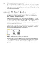
414 Microsoft Excel 2010: Data Analysis and Business Modeling
sales of each product by month. Selecting Count, for instance, would count the number of
transactions for each product during each month; selecting Max would compute the largest
sales transaction for each product during each month. The Consolidate dialog box should be
lled out as shown in Figure 47-5.
After clicking OK, the new worksheet looks like the one shown in Figure 47-6. (See le
Eastandwestconsolidated.xlsx.) You can see, for example, that 1,317 units of Product A were
sold in February, 597 units of Product F were sold in January, and so on.
FIGURE 47-5 Completed Consolidate dialog box.
FIGURE 47-6 Total sales after consolidation.
Now go to cell C2 of East.xlsx and change the February Product A sales from 263 to 363.
Notice that in the consolidated worksheet, the entry for February Product A sales has also
increased by 100 (from 1,317 to 1,417). This change occurs because the Create Links To
Source Data option was selected in the Consolidate dialog box. (By the way, if you click
the 2 right below the workbook name in the consolidated worksheet, you’ll see how Excel
grouped the data to perform the consolidation.) The nal result is contained in the le
Eastandwestconsolidated.xlsx.
Chapter 47 Consolidating Data 415
If you frequently download new data to your source workbooks (in this case, East.xlsx and
West.xlsx), it’s a good idea to name the ranges including your data as a table. Then new data
is automatically included in the consolidation. You might also choose to select some blank
rows below the current data set. When you populate the blank rows with new data, Excel
picks up the new data when it performs the consolidation. A third choice is to make each
data range a dynamic range (see Chapter 22, “The OFFSET Function,” for more information).
Problems
The following problems refer to the data in les Jancon.xlsx and Febcon.xlsx. Each le
contains the unit sales, dollar revenues, and product sold for each transaction during the
month.
1. Create a consolidated worksheet that gives the total unit sales and dollar revenue for
each product by region.
2. Create a consolidated worksheet that gives the largest rst-quarter transaction for each
product by region from the standpoint of revenue and units sold.
417
Chapter 48
Creating Subtotals
Questions answered in this chapter:
■
Is there an easy way to set up a worksheet to calculate total revenue and units sold
by region?
■
Can I also obtain a breakdown by salesperson of sales in each region?
Joolas is a small company that manufactures makeup. For each transaction, it tracks the
name of the salesperson, the location of the transaction, the product sold, the units sold, and
the revenue. The managers want answers to questions such as those that are the focus of this
chapter.
PivotTables can be used to slice and dice data in Microsoft Excel. Often, however, you’d like
an easier way to summarize a list or a database within a list. In a sales database, for example,
you might want to create a summary of sales revenue by region, a summary of sales revenue
by product, and a summary of sales revenue by salesperson. If you sort a list by the column
in which specic data is listed, the Subtotal command allows you to create a subtotal in a list
on the basis of the values in the column. For example, if you sort the makeup database by
location, you can calculate total revenue and units sold for each region and place the totals
just below the last row for that region. As another example, after sorting the database by
product, you can use the Subtotal command to calculate total revenue and units sold for
each product and display the totals below the row in which the product changes. In the next
section, we’ll look at some specic examples.
Answers to This Chapter’s Questions
Is there an easy way to set up a worksheet to calculate total revenue and units sold by
region?
The data for this question is in the le Makeupsubtotals.xlsx. In Figure 48-1 you can see a
subset of the data as it appears after sorting the list by the Location column.
To calculate revenue and units sold by region, place the cursor anywhere in the database,
and then click Subtotal in the Outline group on the Data tab. In the Subtotal dialog box, ll in
the values as shown in Figure 48-2.
By
selecting Location from the At Each Change In list, you ensure that subtotals are created
at each point in which the value in the Location column changes. This corresponds to the
different regions. Selecting Sum from the Use Function box tells Excel to total the units
and dollars for each different region. By selecting the Units and Dollars options in the Add
418 Microsoft Excel 2010: Data Analysis and Business Modeling
Subtotal To area, you indicate that subtotals should be created on the basis of the values in
these columns. The Replace Current Subtotals option causes Excel to remove any previously
computed subtotals. Because you haven’t created any subtotals, it doesn’t matter whether
this option is selected for this example. If the Page Break Between Groups option is selected,
Excel inserts a page break after each subtotal. Selecting the Summary Below Data check box
causes Excel to place subtotals below the data. If this option is not selected, the subtotals are
created above the data used for the computation. Clicking Remove All removes subtotals
from the list.
FIGURE 48-1 After sorting a list by the values in a specic column, you can easily create subtotals for that
data.
FIGURE 48-2 Subtotal dialog box.
Chapter 48 Creating Subtotals 419
A sample of the subtotals results is shown in Figure 48-3. You can see that 18,818 units were
sold in the East region, earning revenue of $57,372.09.
FIGURE 48-3 Subtotals for each region.
Notice that in the left corner of the window, below the Name box, buttons with the numbers
1, 2, and 3 appear. Clicking the largest number (in this case 3) yields the data and subtotals. If
you click the 2 button, you see just the subtotals by region, as shown in Figure 48-4. Clicking
the 1 button yields the Grand Total, as shown in Figure 48-5. In short, clicking a lower
number reduces the level of detail shown.
FIGURE 48-4 When you create subtotals, Excel adds buttons that you can click to display only subtotals or
both subtotals and details.
FIGURE 48-5 Displaying the overall total without any detail.
420 Microsoft Excel 2010: Data Analysis and Business Modeling
Can I also obtain a breakdown by salesperson of sales in each region?
If you want to, you can nest subtotals. In other words, you can obtain a breakdown of
sales by each salesperson in each region, or you can even get a breakdown of how much
each salesperson sold of each product in each region. (See the le Nestedsubtotals.xlsx.)
To demonstrate the creation of nested subtotals, let’s create a breakdown of sales by each
salesperson in each region.
To begin, you must sort your data rst by Location and then by Name. This gives a
breakdown for each salesperson of units sold and revenue within each region. If you sort
rst by Name and then by Location, you would get a breakdown of units sold and revenue
for each salesperson by region. After sorting the data, you proceed as before and create
the subtotals by region. Then you click Subtotal again and ll in the dialog box as shown in
Figure 48-6.
FIGURE 48-6 Creating nested subtotals.
You now want a breakdown by Name. Clearing the Replace Current Subtotals box ensures
that you will not replace your regional breakdown. You can now see the breakdown of sales
by each salesperson in each region as shown in Figure 48-7.
Chapter 48 Creating Subtotals 421
FIGURE 48-7 Nested subtotals.
Problems
You can nd the data for this chapter’s problems in the le Makeupsubtotals.xlsx. Use the
Subtotal command for the following computations:
1. Find the units sold and revenue for each salesperson.
2. Find the number of sales transactions for each product.
3. Find the largest transaction (in terms of revenue) for each product.
4. Find the average dollar amount per transaction by region.
5. Display a breakdown of units sold and revenue for each salesperson that shows the
results for each product by region.
423
Chapter 49
Estimating Straight Line
Relationships
Questions answered in this chapter:
■
How can I determine the relationship between monthly production and
monthly operating costs?
■
How accurately does this relationship explain the monthly variation in plant
operating costs?
■
How accurate are my predictions likely to be?
■
When estimating a straight line relationship, which functions can I use to get the
slope and intercept of the line that best ts the data?
Suppose you manage a plant that manufactures small refrigerators. National headquarters
tells you how many refrigerators to produce each month. For budgeting purposes, you want
to forecast your monthly operating costs and need answers to the questions that are the
focus of this chapter.
Every business analyst should have the ability to estimate the relationship between important
business variables. In Microsoft Excel, the trend curve, which I’ll discuss in this chapter as well
as in Chapter 50, “Modeling Exponential Growth,” and in Chapter 51, “The Power Curve,” is
often helpful in determining the relationship between two variables. The variable that ana-
lysts try to predict is called the dependent variable. The variable you use for prediction is
called the independent variable. Here are some examples of business relationships you might
want to estimate.
Independent variable Dependent variable
Units produced by plant in a month Monthly cost of operating plant
Dollars spent on advertising in a month Monthly sales
Number of employees Annual travel expenses
Company revenue Number of employees (headcount)
Monthly return on the stock market Monthly return on a stock (for example, Dell)
Square feet in home Value of home
The rst step in determining how two variables are related is to graph the data points (by
using the Scatter Chart option) so that the independent variable is on the x-axis and the
424 Microsoft Excel 2010: Data Analysis and Business Modeling
dependent variable is on the y-axis. With the chart selected, you click a data point (all data
points are then displayed in blue), click Trendline in the Analysis group on the Chart Tools
Layout tab, and then click More Trendline Options (or right-click and select Add Trendline).
You’ll see the Format Trendline dialog box, which is shown in Figure 49-1.
FIGURE 49-1 Format Trendline options.
If your graph indicates that a straight line is a reasonable t to the points, choose the Linear
option. If the graph indicates that the dependent variable increases at an accelerating rate,
the Exponential (and perhaps Power) option probably ts the relationship. If the graph shows
that the dependent variable increases at a decreasing rate, or that the dependent variable
decreases at a decreasing rate, the Power option is probably the most relevant.
In this chapter, I’ll focus on the Linear option. In Chapter 50, I’ll discuss the Exponential
option, and in Chapter 51, I’ll cover the Power option. In Chapter 58, “Using Moving Averages
to Understand Time Series,” I’ll discuss the moving average curve, and in Chapter 80, “Pricing
Products by Using Tie-Ins,” I’ll discuss the polynomial curve. (The logarithmic curve is of little
value in this discussion, so I won’t address it.)
Chapter 49 Estimating Straight Line Relationships 425
Answers to This Chapter’s Questions
How can I determine the relationship between monthly production and monthly
operating costs?
The le Costestimate.xlsx, shown in Figure 49-2, contains data about the units produced and
the monthly plant operating cost for a 14-month period. You are interested in predicting
monthly operating costs from units produced, which helps the plant manager determine the
operating budget and better understand the cost to produce refrigerators.
FIGURE 49-2 Plant operating data.
Begin by creating an XY chart (or a scatter plot) that displays the independent variable (units
produced) on the x-axis and the dependent variable (monthly plant cost) on the y-axis. The
column of data that you want to display on the x-axis must be located to the left of the col-
umn of data you want to display on the y-axis. To create the graph, select the data in the
range C2:D16 (including the labels in cells C2 and D2). Then click Scatter in the Charts group
on the Insert tab, and select the rst option (Scatter With Only Markers) as the chart type.
You’ll see the graph shown in Figure 49-3.
FIGURE 49-3 Scatter plot of operating cost vs. units produced.
426 Microsoft Excel 2010: Data Analysis and Business Modeling
If you want to modify this chart, you can click anywhere inside the chart to display the Chart
Tools contextual tab. Using the commands on the Chart Tools Design tab, you can:
■
Change the chart type.
■
Change the source data.
■
Change the style of the chart.
■
Move the chart.
Using the commands on the Chart Tools Layout tab, you can:
■
Add a chart title.
■
Add axis labels.
■
Add labels to each point that give the x and y coordinate of each point.
■
Add gridlines to the chart.
Looking at the scatter plot, it seems reasonable that a straight line (or linear relationship)
exists between units produced and monthly operating costs. You can see the straight line
that best ts the points by adding a trendline to the chart. Click within the chart to select it,
and then click a data point. All the data points are displayed in blue, with an X covering each
point. Right-click, and then click Add Trendline. In the Format Trendline dialog box, select
the Linear option, and then select the Display Equation On Chart and the Display R-Squared
Value On Chart check boxes, as shown in Figure 49-4.
FIGURE 49-4 Selecting trendline options.
Chapter 49 Estimating Straight Line Relationships 427
After clicking Close, you’ll see the results shown in Figure 49-5. Notice that I added a title to
the chart and labels for the x-axis and y-axis by selecting Chart Tools and clicking Chart Title
and then Axis Titles in the Labels group on the Layout tab.
FIGURE 49-5 Completed trend curve.
If you want to add more decimal points to the values in the equation, you can select the
trendline equation, and after selecting Layout from Chart Tools, choose Format Selection.
Now after selecting Number, you can choose the number of decimal places to be displayed.
How does Excel determine the best tting line? Excel chooses the line that minimizes (over
all lines that could be drawn) the sum of the squared vertical distance from each point to the
line. The vertical distance from each point to the line is called an error, or residual. The line
created by Excel is called the least-squares line
. You minimize the sum of squared errors rath-
er than the sum of the errors because in simply summing the errors, positive and negative
errors can cancel each other out. For example, a point 100 units above the line and a point
100 units below the line cancel each other if you add errors. If you square errors, however,
the fact that your predictions for each point are wrong is used by Excel to nd the best
tting line.
Thus, Excel calculates that the best tting straight line for predicting monthly operating costs
from monthly units produced as follows:
(Monthly operating cost)=37,894.0956+64.2687(Units produced)
By copying the formula 64.2687*C3+37894.0956 from cell E3 to the cell range E4:E16, you
compute the predicted cost for each observed data point. For example, when 1,260 units are
produced, the predicted cost is $123,118. (See Figure 49-2.)
You should not use a least-squares line to predict values of an independent variable that
lie outside the range for which you have data. The line in this example should only be used
428 Microsoft Excel 2010: Data Analysis and Business Modeling
to predict monthly plant operating costs during months in which production is between
approximately 450 and 1,300 units.
The intercept of this line is $37,894.10, which can be interpreted as the monthly xed cost. So,
even if the plant does not produce any refrigerators during a month, this graph estimates
that the plant will still incur costs of $37,894.10. The slope of this line (64.2687) indicates that
each extra refrigerator produced increases monthly costs by $64.27. Thus, the variable cost of
producing a refrigerator is estimated to be $64.27.
In cells F3:F16, I computed the errors (or residuals) for each data point. I dened the error for
each data point as the amount by which the point varies from the least-squares line. For each
month, error equals the observed cost minus the predicted cost. Copying from F3 to F4:F16
the formula D3-E3 computes the error for each data point. A positive error indicates a point
is above the least-squares line, and a negative error indicates that the point is below the
least-squares line. In cell F1, I computed the sum of the errors and obtained –0.03. In reality,
for any least-squares line, the sum of the errors should equal 0. (I obtained –0.03 because I
rounded the equation to four decimal points.) The fact that errors sum to 0 implies that the
least-squares line has the intuitively satisfying property of splitting the points in half.
How accurately does this relationship explain the monthly variation in plant operating
cost?
Clearly, each month both the operating cost and the units produced vary. A natural question
is, What percentage of the monthly variation in operating costs is explained by the monthly
variation in units produced? The answer to this question is the R
2
value (0.69 shown in
Figure 49-5). You can state that the linear relationship explains 69 percent of the variation in
monthly operating costs. This implies that 31 percent of the variation in monthly operating
costs is explained by other factors. Using multiple regression (see Chapters 53 through 55),
you can try to determine other factors that inuence operating costs.
People always ask, what is a good R
2
value? There is really no denitive answer to this
question. With one independent variable, of course, a larger R
2
value indicates a better t of
the data than a smaller R
2
value. A better measure of the accuracy of your predictions is the
standard error of the regression, which I’ll describe in the next section.
How accurate are my predictions likely to be?
When you t a line to points, you obtain a standard error of the regression that measures
the “spread” of the points around the least-squares line. The standard error associated
with a least-squares line can be computed with the STEYX function. The syntax of this
function is STEYX(yrange,xrange), where yrange contains the values of the dependent
variable, and xrange contains the values of the independent variable. In cell K1, I computed
the standard error of the cost estimate line in the le Costestimate.xlsx using the formula
STEYX(D3:D16,C3:C16). The result is shown in Figure 49-6.
Chapter 49 Estimating Straight Line Relationships 429
Approximately 68 percent of the points should be within one standard error of regression
(SER) of the least-squares line, and about 95 percent of the points should be within two SER
of the least-squares line. These measures are reminiscent of the descriptive statistics rule of
thumb that I described in Chapter 42, “Summarizing Data by Using Descriptive Statistics.”
In this example, the absolute value of around 68 percent of the errors should be $13,772
or smaller, and the absolute value of around 95 percent of the errors should be $27,544 (or
2*13,772) or smaller. Looking at the errors in column F, you can see that 10 out of 14, or
71 percent, of the points are within one SER of the least-squares line and all (100 percent) of
the points are within two standard SER of the least-squares line. Any point that is more than
two SER from the least-squares line is called an outlier. Looking for causes of outliers can
often help you improve the operation of your business. For example, a month in which ac-
tual operating costs are $30,000 higher than anticipated would be a cost outlier on the high
side. If you could ascertain the cause of this high cost outlier and prevent it from recurring,
you would clearly improve plant efciency. Similarly, consider a month in which actual costs
are $30,000 less than expected. If you could ascertain the cause of this low cost outlier and
ensure it occurred more often, you would improve plant efciency.
FIGURE 49-6 Computation of slope, intercept, RSQ, and standard error of regression.
When estimating a straight line relationship, which functions can I use to get the slope
and intercept of the line that best ts the data?
The Excel SLOPE(yrange,xrange) and INTERCEPT(yrange,xrange) functions return the slope
and intercept, respectively, of the least-squares line. Thus, entering in cell I1 the formula
SLOPE(D3:D16,C3:C16) (see Figure 49-6) returns the slope (64.27) of the least-squares line.
Entering in cell I2 the formula INTERCEPT(D3:D16,C3:C16) returns the intercept (37,894.1)
of the least-squares line. By the way, the RSQ(yrange,xrange) function returns the R
2
value
associated with a least-squares line. So, entering in cell I3 the formula RSQ(D3:D16,C3:C16)
returns the R
2
value of 0.6882 for the least-squares line.
Problems
The le Delldata.xlsx contains monthly returns for the Standard & Poor’s stock index and for
Dell stock. The beta of a stock is dened as the slope of the least-squares line used to predict
the monthly return for a stock from the monthly return for the market.
1. Estimate the beta of Dell.
2. Interpret the meaning of Dell’s beta.
430 Microsoft Excel 2010: Data Analysis and Business Modeling
3. If you believe a recession is coming, would you rather invest in a high beta or a low
beta stock?
4. During a month in which the market goes up 5 percent, you are 95 percent sure that
Dell’s stock price will increase between which range of values?
The le Housedata.xlsx gives the square footage and sales prices for several houses in
Bellevue, Washington.
5. You are going to build a 500-square-foot addition to your house. How much do you
think your home value will increase as a result?
6. What percentage of the variation in home value is explained by variation in house size?
7. A 3,000-square-foot house is selling for $500,000. Is this price out of line with typical
real estate values in Bellevue? What might cause this discrepancy?
8. We know that 32 degrees Fahrenheit is equivalent to 0 degrees Celsius, and that 212
degrees Fahrenheit is equivalent to 100 degrees Celsius. Use the trend curve to deter-
mine the relationship between Fahrenheit and Celsius temperatures. When you create
your initial chart, before clicking Finish, you must indicate that data is in columns and
not rows, because with only two data points, Excel assumes different variables are in
different rows.
9. The le Betadata.xlsx contains the monthly returns on the Standard & Poor’s index
as well as the monthly returns on Cinergy, Dell, Intel, Microsoft, Nortel, and Pzer.
Estimate the beta of each stock.
10. The le Electiondata.xlsx contains, for several elections, the percentage of votes
Republicans gained from voting machines (counted on election day) and the percent-
age Republicans gained from absentee ballots (counted after election day). Suppose
that during an election, Republicans obtained 49 percent of the votes on election day
and 62 percent of the absentee ballot votes. The Democratic candidate cried “Fraud.”
What do you think?
431
Chapter 50
Modeling Exponential Growth
Question answered in this chapter:
■
How can I model the growth of a company’s revenue over time?
If you want to value a company, it’s important to have some idea about its future revenues.
Although the future might not be like the past, you often begin a valuation analysis of a
corporation by studying the company’s revenue growth during the recent past. Many ana-
lysts like to t a trend curve to recent revenue growth. To t a trend curve, you plot the year
on the x-axis (for example, the rst year of data is Year 1, the second year of data is Year 2,
and so on), and on the y-axis, you plot the company’s revenue.
Usually, the relationship between time and revenue is not a straight line. Recall that a
straight line always has the same slope, which implies that when the independent variable
(in this case, the year) is increased by 1, the prediction for the dependent variable (revenue)
increases by the same amount. For most companies, revenue grows by a fairly constant
percentage each year. If this is the case, as revenue increases, the annual increase in rev-
enue also increases. After all, revenue growth of 10 percent of $1 million means revenue
grows by $100,000. Revenue growth of 10 percent of $100 million means revenue grows
by $10 million. This analysis implies that a trend curve for forecasting revenue should grow
more steeply and have an increasing slope. The exponential function has the property that
as the independent variable increases by 1, the dependent variable increases by the same
percentage. This relationship is exactly what you need to model revenue growth.
The equation for the exponential function is y=ae
bx
. Here, x is the value of the independent
variable (in this example, the year), whereas y is the value of the dependent variable (in this
case, annual revenue). The value e (approximately 2.7182) is the base of natural logarithms. If
you select Exponential from Excel’s trendline options, Excel calculates the values of a and b
that best t the data. Let’s look at an example.
Answers to This Chapter’s Question
How can I model the growth of a company’s revenue over time?
The le Ciscoexpo.xlsx, shown in Figure 50-1, contains the revenues for Cisco for the years
1990 through 1999. All revenues are in millions of dollars. In 1990, for example, Cisco’s
revenues were $103.47 million.
432 Microsoft Excel 2010: Data Analysis and Business Modeling
FIGURE 50-1 Cisco’s annual revenues for the years 1990 through 1999.
To t an exponential curve to this data, begin by selecting the cell range A3:B13. Next, on
the Insert tab, in the Charts group, click Scatter. Selecting the rst chart option (Scatter With
Only Markers) creates the chart shown in Figure 50-2.
FIGURE 50-2 Scatter plot for the Cisco trend curve.
Fitting a straight line to this data would be ridiculous. When a graph’s slope is rapidly
increasing, as in this example, an exponential growth will usually provide a good t to the
data.
To obtain the exponential curve that best ts this data, right-click a data point (all the points
turn blue), and then click Add Trendline. In the Format Trendline dialog box, select the
Exponential option in the Trendline Options area, and also select the Display Equation On
Chart and Display R-Squared Value On Chart check boxes. After you click Close, you’ll see the
trend curve shown in Figure 50-3.
The estimate of Cisco’s revenue in year x (remember that x=1 is the year 1990) is computed
from the following formula
Estimated Revenue=58.552664e
.569367x
Chapter 50 Modeling Exponential Growth 433
I computed estimated revenue in the cell range C4:C13 by copying from C4 to C5:C13 the
formula =58.552664*EXP(0.569367*A4). For example, the estimate of Cisco’s revenue in 1999
(year 10) is $17.389 billion.
FIGURE 50-3 Exponential trend curve for Cisco revenues.
Notice that most of the data points are very close to the tted exponential curve. This pat-
tern indicates that exponential growth does a good job of explaining Cisco’s revenue growth
during the 1990s. The fact that the R
2
value (0.98) is very close to 1 is also consistent with the
visual evidence of a good t.
Remember that whenever x increases by 1, the estimate from an exponential curve increases
by the same percentage. You can verify this fact by computing the ratio of each year’s esti-
mated revenue to the previous year’s estimated revenue. To compute this ratio, copy from
D5 to D6:D13 the formula=C5/C4. You’ll nd that the estimate of Cisco’s growth rate is 76.7
percent per year, which is the best estimate of Cisco’s annual growth rate for the years 1990
through 1999.
Of course, to use this estimated annual revenue growth rate in a valuation analysis, you need
to ask yourself whether it’s likely that this growth rate can be maintained. Be forewarned
that exponential growth cannot continue forever. For example, if you use the exponential
trend curve to forecast revenues for 2005 (year 16), Cisco’s 2005 predicted revenues would
be $530 billion. If this estimate were realized, Cisco’s revenues would be triple the 2002 rev-
enues of the world’s largest company (Walmart). This seems highly unrealistic. The moral is
that during its early years, the revenue growth for a technology company follows exponential
growth. After a while, the growth rate slows down. If Wall Street analysts had understood
this fact during the late 1990s, the Internet stock bubble might have been avoided. Note that
during 1999, Cisco’s actual revenue fell well short of the trend curve’s estimated revenue.
This fact may well have indicated the start of the technology slowdown, which began during
late 2000.
434 Microsoft Excel 2010: Data Analysis and Business Modeling
By the way, why must you use x=1 instead of x=1990? If you used x=1990, Excel would have
to juggle numbers around the size of e
1990
. A number this large causes Excel a great deal of
difculty.
Problems
The le Exponentialdata.xlsx contains annual sales revenue for Staples, Walmart, and Intel.
Use this data to work through the rst ve problems for this chapter.
1. For each company, t an exponential trend curve to its sales data.
2. For which company does exponential growth have the best t with its revenue growth?
3. For which company does exponential growth have the worst t with its revenue
growth?
4. For each company, estimate the annual percentage growth rate for revenues.
5. For each company, use your trend curve to predict 2003 revenues.
6. The le Impalas.xlxs contains the price of 2009, 2008 2007, and 2006 Impalas during
2010. From this data, what can you conclude about how a new car loses it value as it
grows older?
435
Chapter 51
The Power Curve
Questions answered in this chapter:
■
As my company produces more of a product, it learns how to make the product more
efciently. Can I model the relationship between units produced and the time needed
to produce a unit?
A power curve is calculated with the equation y =ax
b
. In the equation, a and b are constants.
Using a trend curve, you can determine the values of a and b that make the power curve best
t a scatter plot diagram. In most situations, a is greater than 0. When this is the case, the
slope of the power curve depends on the value of b, as follows:
■
For b>1, y increases as x increases, and the slope of the power curve increases as x
increases.
■
For 0<b<1, y increases as x increases, and the slope of the power curve decreases as x
increases.
■
For b=1, the power curve is a straight line.
■
For b<0, y decreases as x increases, and the power curve attens out as x increases.
Here are examples of different relationships that can be modeled by a power curve. These
examples are contained in the le Powerexamples.xlsx.
If you are trying to predict total production cost as a function of units produced, you might
nd a relationship similar to that shown in Figure 51-1. Notice that b equals 2. As I men-
tioned previously, with this value of b, the cost of production increases with the number of
units produced. The slope becomes steeper, which indicates that each additional unit costs
more to produce. This relationship might occur because increased production requires more
overtime labor, which costs more than regular labor.
FIGURE 51-1 Predicting cost as a function of the number of units produced.
436 Microsoft Excel 2010: Data Analysis and Business Modeling
If you are trying to predict sales as a function of advertising expenditures, you might nd a
curve similar to that shown in Figure 51-2.
FIGURE 51-2 Plotting sales as a function of advertising.
Here, b equals 0.5, which is between 0 and 1. When b has a value in this range, sales increase
with increased advertising but at a decreasing rate. Thus, the power curve allows you to
model the idea of diminishing return—that each additional dollar spent on advertising will
provide less benet.
If you are trying to predict the time needed to produce the last unit of a product based on
the number of units produced to date, you often nd a scatter plot similar to that shown in
Figure 51-3.
Here you nd that b equals –0.1. Because b is less than 0, the time needed to produce each
unit decreases, but the rate of decrease—that is, the rate of “learning”—slows down. This
relationship means that during the early stages of a product’s life cycle, huge savings in labor
time occur. As you make more of a product, however, savings in labor time occur at a slower
rate. The relationship between cumulative units produced and time needed to produce the
last unit is called the learning or experience curve.
FIGURE 51-3 Plotting the time needed to produce a unit based on cumulative production.
Chapter 51 The Power Curve 437
A power curve has the following properties:
■
Property 1 If x increases by 1 percent, y increases by approximately b percent.
■
Property 2 Whenever x doubles, y increases by the same percentage.
Suppose that demand for a product as a function of price can be modeled as 1000(Price)
–2
.
Property 1 then implies that a 1 percent increase in price will lower demand (regardless
of price) by 2 percent. In this case, the exponent b (without the negative sign) is called the
elasticity. I will discuss elasticity further in Chapter 79, “Estimating a Demand Curve.” With this
background, let’s take a look at how to t a power curve to data.
Answer to This Chapter’s Question
As my company produces more of a product, it learns how to make the product more
efciently Can I model the relationship between units produced and the time needed to
produce a unit?
The le Fax.xlsx contains data about the number of fax machines produced and the unit cost
(in 1982 dollars) of producing the “last” fax machine made during each year. In 1983, for
example, 70,000 fax machines were produced, and the cost of producing the last fax machine
was $3,416. The data is shown in Figure 51-4.
FIGURE 51-4 Data used to plot the learning curve for producing fax machines.
Because a learning curve tries to predict either cost or the time needed to produce a unit
from data about cumulative production, I’ve calculated in column C the cumulative num-
ber of fax machines produced by the end of each year. In cell C4, I refer to cell B4 to show
the number of fax machines produced in 1982. By copying from C5 to C6:C10 the formula
SUM($B$4:B4), I compute cumulative fax machine production for the end of each year.
You can now create a scatter plot that shows cumulative units produced on the x-axis and
unit cost on the y-axis. After creating the chart, you click one of the data points (the data
points will be displayed in blue), then right-click and click Add Trendline. In the Format
Trendline dialog box, select the Power option and then select the Display Equation On
438 Microsoft Excel 2010: Data Analysis and Business Modeling
Chart and the Display R-Squared Value On Chart check boxes. With these settings, you
obtain the chart shown in Figure 51-5. The curve drawn represents the power curve that best
ts the data.
FIGURE 51-5 Learning curve for producing fax machines.
The power curve predicts the cost of producing a fax machine as follows:
Cost of producing fax machine=65,259(cumulative units produced)
2533
Notice that most data points are near the tted power curve and that the R
2
value is nearly 1,
indicating that the power curve ts the data well.
By copying from cell E4 to E5:E10 the formula 65259*C4^–0.2533, you compute the
predicted cost for the last fax machine produced during each year. (The carat symbol [^],
which is located over the 6 key, is used to raise a number to a power.)
If you estimated that 1,000,000 fax machines were produced in 1989, after computing the
total 1989 production (2,744,000) in cell C11, you can copy the forecast equation to cell E11
to predict that the last fax machine produced in 1989 cost $1,526.85.
Remember that Property 2 of the power curve states that whenever x doubles, y increases by
the same percentage. By entering twice cumulative 1988 production in cell C12 and copying
your forecast formula in E10 to cell E12, you’ll nd that doubling cumulative units produced
reduces the predicted cost to 83.8 percent of its previous value (1,516.83/1,712.60). For this
reason, the current learning curve is known as an 84-percent learning curve. Each time you
double units produced, the labor required to make a fax machine drops by 16.2 percent.
If a curve gets steeper, the exponential curve might t the data as well as the power curve
does. A natural question is which curve ts the data better? In most cases, this question can
be answered simply by eyeballing the curves and choosing the one that looks like it’s a bet-
ter t. More precisely, you could compute the Sum of Squared Errors (SSE) for each curve
( obtained by adding up for each data point the square of the curve value minus the actual
value) and choose the curve with the smaller SSE.
Chapter 51 The Power Curve 439
The learning curve was discovered in 1936 at Wright-Patterson Air Force Base in Dayton,
Ohio, when it was found that whenever the cumulative number of airplanes produced
doubled, the time required to make each airplane dropped by around 15 percent.
Wikipedia gives the following learning curve estimates for various industries:
■
Aerospace: 85 percent
■
Shipbuilding: 80–85 percent
■
Complex machine tools for new models: 75–85 percent
■
Repetitive electronics manufacturing: 90–95 percent
■
Repetitive machining or punch-press operations: 90–95 percent
■
Repetitive electrical operations: 75–85 percent
■
Repetitive welding operations: 90 percent
■
Raw materials: 93–96 percent
■
Purchased parts: 85–88 percent
Problems
1. Use the fax machine data to model the relationship between cumulative fax machines
produced and total production cost.
2. Use the fax machine data to model the relationship between cumulative fax machines
produced and average production cost per machine.
3. A marketing director estimates that total sales of a product as a function of price will be
as shown in the following table. Estimate the relationship between price and demand,
and predict demand for a $46 price. A 1 percent increase in price will reduce demand
by what percentage?
Price Demand
$30.00 300
$40.00 200
$50.00 110
$60.00 60
440 Microsoft Excel 2010: Data Analysis and Business Modeling
4. The brand manager for a new drug believes that the annual sales of the drug as a
function of the number of sales calls on doctors will be as shown in the following table.
Estimate sales of the drug if 80,000 sales calls are made on doctors.
Sales calls Units sold
50,000 25,000
100,000 52,000
150,000 68,000
200,000 77,000
5. The time needed to produce each of the rst ten airplanes produced is as follows:
Unit Hours
1 1,000
2 800
3 730
4 630
5 600
6 560
7 560
8 500
9 510
10 510
Estimate the total number of hours needed to produce the next ten airplanes.