advanced Flex Application Development Building Rich Media X phần 5 pps
Bạn đang xem bản rút gọn của tài liệu. Xem và tải ngay bản đầy đủ của tài liệu tại đây (12.46 MB, 51 trang )
Upgrading the Flex application
Now that you know the service is working, you can move on to rewiring your Flex app to use your new
service. For this, you’re going to create a clone of Chapter7_Exercise1, so open up Flex Builder and
create a new Flex project using the same process as you did for the last project and entitle it
Chapter7_Exer
cise2
. There will be two enhancements to this version of the application. The first will be
the addition of a form that will allow users to enter keywords to search the database for. The second
will be a page indicator in the form of
x–y of z. Once you have your application file open, copy the fin-
ished code from the previous exercise and paste it into this file.
Just like before, you want to add your interface elements to the stage before adding any more code.
The simplest of the two enhancements is the page indicator. It will be nothing more than a Text com-
ponent bound to a variable that will be set based on the current results. Ensure you’re in code view,
and then insert the following code between the MXML markup for the two navigation buttons:
<mx:Text x="500" y="244" text="{pageText}" color="0xffffff"/>
Modularization
With one of the design enhancements completed, you could switch to design view and drag out a
TextInput component and a Button component and be done with the visualization, but this seems like
an excellent opportunity to implement
modularization. In this context, the goal is to group similar
application elements into their own component file. One benefit is that any interactions necessary
with these elements is confined to this component file, making debugging a little easier if something
This brings up a good point: always reuse code whenever possible. And, since this
project is very similar to the last, it’s a prime candidate for this methodology.
184
CHAPTER 7
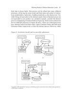
Figure 7-14. Using the search service Figure 7-15. Results of the search service
8962CH07.qxd 11/7/07 11:42 AM Page 184
should go wrong. It also keeps your main application
f
ile lean and mean while promoting reusability. Before
c
reating the search component, you need to add the
folder structure to the project first.
Next, you want to create a new MXML component and
place it inside the
components folder. Although you
could also create the component in the application
root, if you are going to modularize your application
into different pieces, it’s also best to organize those
pieces in their own space, so to speak. Right-click the
components folder and select New ➤ MXML Component.
Specify the values shown in Figure 7-16 for
Filename
and Based on.
Once Flex finishes creating the component, it’s time to
start adding the visual elements. This component will
be visual-only—its functionality will be coded in the
main application. In your choice of either design view
or code view, add a TextInput component and a Button
component. Once you have added those components,
switch to code view and ensure both of these compo-
nents have the same attributes as the following code:
<?xml version="1.0" encoding="utf-8"?>
<mx:HBox xmlns:mx=" /><mx:TextInput id="keywords"/>
<mx:Button
id="searchButton"
label="Search"
click="parentApplication.searchClickHandler(event)"/>
</mx:HBox>
After you have saved your work, you can close your
SearchBox component and jump back over to the main
application to integrate it. Before you can add SearchBox
to your application, you first need to create a
namespace,
which is basically a mapping that tells the compiler where
your component class files are located. To do so, add
xmlns:components=“components.*” beneath the default
namespace definition, as shown in Figure 7-17.
After adding the namespace, you can add the MXML
markup for the SearchBox component by inserting the fol
-
lowing code between the closing
</mx:Script> tag and the
opening
<mx:DataGrid> tag:
<components:SearchBox id="searchBox" x="{dgProducts.width-100}" ➥
top="40"/>
185
SECONDARY NAVIGATION
Figure 7-16. Naming the new component
Figure 7-17. Creating the components namespace
8962CH07.qxd 11/7/07 11:42 AM Page 185
The curly brace notation for the x-coordinate ensures that SearchBox will be neatly aligned to the
r
ight edge of the DataGrid. With all the visual elements in place, you can now modify the code in the
<
mx:Script>
b
lock to accommodate these changes.
Enhancing the code
First, you want to add any new variables that the enhancements will require. What variables do you
need? Well, you’ll need a variable to hold the contents of the TextInput component inside SearchBox.
You’ll also need two variables to hold the low and high limits for the current page. And finally, you’ll
need the
pageText variable, which is to be bound to the text property of the page indicator compo-
nent. So insert the following code at the end of your variable declarations section at the top of the
<mx:Script> block:
[Bindable] private var keywords:String = '';
[Bindable] private var lowLimit:uint;
[Bindable] private var highLimit:uint;
[Bindable] private var pageText:String;
This will take care of all the variable declarations for this project. The next thing you can do is to cre-
ate the
searchClickHandler() method that you assigned for the Button inside of the SearchBox com-
ponent. This method will allow you to access the current keywords input by the user, call the required
services, and modify the Button’s label based on the current state of the component. Here’s the code
that comprises
searchClickHandler()—add this beneath the setButtonVisibility() method:
public function searchClickHandler(event:MouseEvent):void{
var button:Button = event.target as Button;
var widget:Object = button.parentDocument;
if(button.label == 'Search'){
keywords = widget.keywords.text;
if(keywords != ''){
searchProducts(0);
button.label = 'Cancel';
widget.keywords.enabled = false;
} else {
Alert.show('Please enter something to search for.',
➥
'Search Error:');
}
} else {
keywords = '';
widget.keywords.text = '';
getProducts(0);
button.label = 'Search';
widget.keywords.enabled = true;
}
}
Here you create local variables for both the Button as well as the SearchBox component itself so that
you can easily communicate with the component. Next, you use conditional logic to determine the
186
CHAPTER 7
8962CH07.qxd 11/7/07 11:42 AM Page 186
current label of the clicked button. If it’s “Search,” you want to grab the text from the TextInput and
s
tore that in the
k
eywords
v
ariable, and then you want to do a quick integrity check to ensure that
k
eywords
i
s not empty. If it’s not, you want to call the
s
earchProducts()
m
ethod, which you’ll soon
write, change the Button’s label to “Cancel,” and disable the TextInput to prevent unexpected behav-
ior; otherwise, you want to notify the user that your application doesn’t like performing empty
searches. Now, on the other hand, if the Button’s label is “Cancel,” you want to clear both the
key-
words
variable and the TextInput’s text value. Additionally, you want to call the original product
browse() method getProducts(). And finally, you want to change the Button’s label to “Search” again
and reenable the TextInput for user interaction.
That was the most intensive part of the application enhancements—the remaining methods are essen-
tially clones of other methods you’ve already created. The first of the clones is the
searchProducts()
method. It is very similar to getProducts() except for the actual service called, the result handler, and
the passing of an additional argument. Insert the following code for the
searchProducts() method
into your
<mx:Script> block:
private function searchProducts(startID:uint):void{
amfphp.call('com.almerblank.ISBN8962.Ch7.Products.search',
➥
searchResultHandler, faultHandler, keywords, startID);
CursorManager.setBusyCursor();
}
The searchResultHandler() method is even more similar to its counterpart, resultHandler(). The
only difference besides the name of the method is the addition of a call to a soon-to-be-created
method,
setPageText(), and the language of the trace for trapped errors. Add the following code
immediately below the
searchProducts() method:
private function searchResultHandler(result:Array):void{
try {
productsDP = new ArrayCollection(result);
var total:uint = productsDP.length - 1;
pageSize = productsDP.getItemAt(total).pageSize;
offset = productsDP.getItemAt(total).offset;
totalProducts = productsDP.getItemAt(total).totalProducts;
setPageText();
setButtonVisibility();
trace('offset = '+offset+'\npageSize =
➥
'+pageSize+'\ntotalProducts = '+totalProducts);
} catch(error:*) {
trace('search products error: '+error.message);
} finally {
CursorManager.removeBusyCursor();
}
}
The setPageText() method also needs to be added to resultHandler() since it needs to determine
the text for the page indicator component regardless of the service used. The method is pretty
straightforward. It sets the values of the
lowLimit, highLimit, and pageText variables, nothing more,
nothing less. Insert the following code for
setPageText() into your <mx:Script> block:
187
SECONDARY NAVIGATION
8962CH07.qxd 11/7/07 11:42 AM Page 187
private function setPageText():void{
lowLimit = offset+1;
highLimit = (totalProducts > 5) ? lowLimit+4 : totalProducts;
pageText = 'Displaying items '+lowLimit+' - '+highLimit+'
➥
o
f '+totalProducts;
}
Let’s briefly examine this method. lowLimit is derived by adding a value of 1 to the current offset
value. This is done because the offset index is a 0-based index, and while that’s fine for computer pro-
gramming, it would be pretty weird reading something like “Displaying items 0–4 of 20.”
highLimit is
obtained by first checking to see whether the value for
totalProducts is greater than 5. If it is,
highLimit should be set to the value for lowLimit plus 4, since the index is 0-based and the page size
is five products per page. With those two variables defined, the value for
pageText should be obvious,
since it just creates a variable text phrase based on those previously derived values.
The last of the new methods for this project is
fetchPage(). Its sole purpose is to be a traffic con-
troller to the navigation buttons. It will first check to see whether the value for the
keywords variable
is an empty string or not. If it’s not, the
searchProducts() method should be called; but if it is,
the
getProducts() method should be called. Insert the following code at the bottom of your
<mx:Script> block:
private function fetchPage(startID:uint):void{
if(keywords != ''){
searchProducts(startID);
} else {
getProducts(startID);
}
}
That completes the application enhancements.
All that’s left to do is to update the navigation
buttons to call this latest method instead of
getProducts() and pass the same arguments as
before. Figure 7-18 shows the updated
click
properties for both buttons.
Although this is not the only way to search-
enable a Flex application, you now have an
application that successfully allows you to both
browse and search a product catalog. In the
next section, I’ll show you options for enabling
history management in the application.
History management
What is history
management? Flex’s
HistoryManager lets users navigate through a Flex application by
using the web browser’s back and forward navigation commands. For example, a user could make use
of a T
abNavigator component to navigate through various views of an application. Since the
T
abNavigator component is history management–enabled, the user could use the web browser
’s
Back
188
CHAPTER 7
Figure 7-18: Updating the navigation buttons
8962CH07.qxd 11/7/07 11:42 AM Page 188
button to traverse back through those views and eventually return the application to its initial state. In
o
ther words, it allows you to keep track of where you are in an application; however, it doesn’t pro-
v
ide undo/redo functionality (that is, it doesn’t “remember” what you have done along the way).
History management is made possible in Flex applications by implementing a set of files that are ref-
erenced in the application’s wrapper.
Wrapper in this context collectively refers to the HTML page that
houses the Flex SWF file and the JavaScript file that embeds that SWF into the HTML page. Flex
Builder’s default wrapper comes prewired to support history management, but if you’re compiling via
the command line or are implementing a custom wrapper, you will have to wire the wrapper to
include this support. Fear not though. Some wrapper templates are included with your Flex Builder
installation. You can find the following wrapper template directories in your
/flex_builder_install_
path/Flex SDK 2/resources/html-templates
directory:
/client-side-detection-with-history
/express-installation-with-history
/no-player-detection-with-history
When creating a customized wrapper with history management support, remember to keep your
JavaScript separate from the HTML page. When you put the JavaScript inside the HTML, you ensure
that you will invoke the wrath of the great and powerful Internet Explorer Eolas patent god
(
Other than that, it’s not difficult to
enable history management in your custom wrapper. Here’s a list of what’s typically required:
your_wrapper.html
your_flex_app.swf
history.js
history.htm
history.swf
The last three files on the list can be obtained from the templates directory I mentioned earlier, or if
you’re using Flex Builder, they are added to the
html-template folder of your Flex project automati-
cally. And, the good thing is that you don’t have to modify them when using a custom wrapper; you
just ensure your wrapper references them. For
history.js, use a <script/> tag in your HTML page’s
<body> to reference the file. For history.htm, use an <iframe/> tag placed at the bottom of the
HTML page just before the closing
</body> tag to reference it. Additionally, the name of the iframe
element must be set to _history, and the width of the element must be set to a minimum of 22 to
ensure smooth sailing with Internet Explorer. I’ll discuss in a moment how Flex interacts with these
files to provide this functionality, but first
, here are code examples of the required tags for your cus
-
tom wrapper:
<script language="JavaScript" type=➥
"text/javascript" src="history.js">➥
</script>
<iframe name="_history" src="history.htm" frameborder="0"
➥
scrolling="no" width="22" height="0"></iframe>
History management is enabled by default for the Accordion and TabNavigator containers but dis-
abled in the ViewStack container. To toggle this feature on or off for one of these controls, set the
189
SECONDARY NAVIGATION
8962CH07.qxd 11/7/07 11:42 AM Page 189
container’s historyManagementEnabled property to true or false, respectively. Now, this doesn’t
mean that other elements in your Flex app are left out—quite the contrary. To enable custom history
management for other objects in an application, you’ll need to do the following:
1. Implement the IHistoryManagerClient interface (mx.managers.IHistoryManagerClient).
2. Register the component with the HistoryManager’s register() method.
3. Save the component’s state when its state changes.
4. Implement the interface’s saveState() and loadState() methods.
So, say for example you have created a component, YourComponent.mxml, with several view states,
and you want to enable history management for the component. Here’s some example code on how
to make that happen:
<! YourComponent.mxml >
<?xml version="1.0" encoding="utf-8"?>
<mx:Canvas
xmlns:mx=" />implements="mx.managers.IHistoryManagerClient"
creationComplete="initComp()"
currentStateChange="viewChanged()">
<mx:Script>
<![CDATA[
import mx.managers.HistoryManager;
import mx.states.States;
private function initComp():void{
HistoryManager.register(this);
}
private function viewChanged():void{
HistoryManager.save();
}
public function saveState():Object{
return {currentState: currentState};
}
public function loadState(state:Object):void{
var newState:State = state ? state.currentState : '';
if(newState != currentState) currentState = newState;
}
]]>
</mx:Script>
<mx:states>
<mx:State name="Welcome">
<mx:RemoveChild target="{button}"/>
<mx:AddChild>
190
CHAPTER 7
8962CH07.qxd 11/7/07 11:42 AM Page 190
<mx:Text text="Welcome to my site!!"/>
</mx:AddChild>
</mx:State>
</mx:states>
<mx:Button id="button" label="Enter Here"
➥
click="this.currentState='Welcome'"/>
</mx:Canvas>
This effectively registers YourComponent with the HistoryManager class and satisfies the other
requirements for enabling history management for custom components. But, how does
HistoryManager integrate with the web browser? First, it uses navigateToURL() to invisibly load your
<iframe> into the current browser window. Next, it encodes your Flex application’s navigation states
into the
iframe’s URL query parameters. From here, history.swf, which lives inside history.htm,
decodes those parameters and sends the navigation state back to the
HistoryManager class. This
sequence is illustrated in Figure 7-19.
Figure 7-19. HistoryManager flowchart
191
SECONDARY NAVIGATION
8962CH07.qxd 11/7/07 11:42 AM Page 191
That’s just a basic overview of what happens behind the scenes. But, rather than delve too deeply into
c
ustom history management theory, I’ll show you how you can further enhance the previous exercises
t
o include basic history management.
So, create a new project the same way you did in the “Search integration” section and name it
Chapter7_Exercise3. This project will start as a clone of Chapter7_Exercise2, so copy the contents of
the Chapter7_Exercise2 application file and paste it into Chapter7_Exercise3 once Flex Builder finishes
creating your application file. Also, remember to copy over the
com and components folders to the
new project as well. The following list details the enhancements to be made in this project:
Adding a header to the main view
Creating a component to display detailed product information
Adding a ViewStack container to house both the main view and detail view
Enabling history management on the ViewStack
The header that you’re going to add to the application will be comprised of a Label and Text compo-
nent. The Label will serve as the view’s title, while the Text will serve as instructions to the end user on
how to view more information about a particular product. Insert the following code just above your
SearchBox component:
<mx:Label x="141" fontSize="18" fontWeight="bold" ➥
text="Product Catalog" top="30"/>
<mx:Text x="141" text="Select a product to view more details"
➥
top="50"/>
The next step is to build a product details component that can display extended information about a
selected product as well as give the option to purchase the product. Follow the same steps to create
this component as you did in the “Search integration” section for the SearchBox component, but
name it
ProductDetails. Once the component file has been created, add the following code to the file:
<! ProductDetails.mxml >
<?xml version="1.0" encoding="utf-8"?>
<mx:Canvas xmlns:mx=" /><mx:Form id="productInfoForm">
<mx:FormHeading label="Product Details" fontSize="18"
➥
fontWeight="bold"/>
<mx:FormItem id="productImage">
<mx:Image
➥
source="{parentApplication.selectedProduct.product_img}"/>
</mx:FormItem>
<mx:FormItem id="productID" label="SKU#">
<mx:Text text="{parentApplication.selectedProduct.product_id}"/>
</mx:FormItem>
<mx:FormItem id="productName" label="Name:">
<mx:Text
➥
text="{parentApplication.selectedProduct.product_name}"/>
</mx:FormItem>
<mx:FormItem id="productDesc" label="Desc:">
<mx:Text
➥
192
CHAPTER 7
8962CH07.qxd 11/7/07 11:42 AM Page 192
text="{parentApplication.selectedProduct.product_desc}"/>
</mx:FormItem>
<mx:FormItem id="productCost" label="Price:">
<mx:Text
➥
t
ext="${parentApplication.selectedProduct.product_price}"/>
</mx:FormItem>
<mx:FormItem id="productRating" label="Rating:">
<mx:Text text=
➥
"{parentApplication.selectedProduct.product_rating} stars"/>
</mx:FormItem>
</mx:Form>
<mx:ApplicationControlBar x="60" y="{productInfoForm.height}">
<mx:Button label="Back"
➥
click="parentApplication.productViews.selectedIndex=0"/>
<mx:Button label="Purchase"/>
</mx:ApplicationControlBar>
</mx:Canvas>
In addition to the fields displayed in the DataGrid, the ProductDetails component will also display a
thumbnail for the product, as well as the average rating for the product. This component also
provides the means for the user to navigate back to the catalog browser. Purchasing ability will be
added at a later time.
This component also makes reference to a property of the parent application named
selectedProduct,
but this variable has yet to be defined. Switch back to the main application and add a new, bindable
public variable named
selectedProduct of type
Object to the end of your variable declarations sec-
tion. While you’re there, import the
ListEvent class
found in the
mx.events package. This class will allow
you to capture and process the user selections as you
see fit. How exactly will that happen? By assigning a
new method,
fetchProductDetails(), to the
DataGrid’s
itemClick event property, you’ll be able to
learn which product the user clicked and initialize
ProductDetails with that data. Figure 7-20 shows the
opening tag for the DataGrid with the
itemClick
property added.
The code for
fetchProductDetails() is relatively simple in that it takes the currently selected
DataGrid item, which is of type
Object, and assigns it to the selectedProduct you just created. The
selectedProduct object is in turn bound to the various form items of your ProductDetails compo
-
nent. This method also switches the
selectedIndex of the ViewStack to the index occupied by your
component. Insert the code for this method at the end of your
<mx:Script> block in your main appli-
cation file:
private function fetchProductDetails(event:ListEvent):void{
selectedProduct = event.target.selectedItem;
productViews.selectedIndex = 1;
}
193
SECONDARY NAVIGATION
Figure 7-20. Assigning an event handler for the DataGrid’s
itemClick event
8962CH07.qxd 11/7/07 11:42 AM Page 193
The only thing left to do now is set the historyManagementEnabled property of your ViewStack to
true in order to use the web browser’s navigation buttons with your application. Save your work and
run the application.
Summary
In this chapter, I covered some of the development features and concepts that are important to a Flex
developer in architecting usable applications. I showed you what pagination is, when it’s needed and
when it’s not, and how to employ this technique in a Flex application tied to a PHP/MySQL back end.
I also touched on search integration. You learned one method of search-enabling a Flex app and how
to determine what amount of search functionality is right for a project. Additionally, I talked about
history management and how this built-in feature of Flex’s can help to alleviate some of the com-
plaints about multimedia applications and browser navigation integration. You’ll learn even more
about history management, search functionality, and pagination as you explore additional features of
the Flex framework throughout the remainder of the book. In the next chapter, you will be able to
apply these concepts and techniques as you learn a little about how we syndicate, aggregate, and
access the RMX’s content.
When developing with Flex’s HistoryManager, you’ll get sandbox errors when trying
to use this feature locally. To avoid this setback, either publish the app to your local
web server or mess around with your security sandbox settings.
194
CHAPTER 7
8962CH07.qxd 11/7/07 11:42 AM Page 194
8962CH07.qxd 11/7/07 11:42 AM Page 195
8962CH08.qxd 11/7/07 10:09 AM Page 196
Forms and validation are areas in which Flex natively excels compared to other tech-
nologies like HTML, which have provided a more traditional and common way of
handling input from users (and generally require a page refresh—ugh!).
In this chapter, I will talk about how I handle the forms for the RMX while exploiting
the great features that Flex offers. You will also learn about Flex validators by extend-
ing a validator to customize it. So let’s get started!
Data transfer objects
By the time I start thinking of building a form, I usually have finished writing all the
basic data transfer objects, or DTOs. Still, there will be times that I need a new DTO
that I had not planned for, and so before I start a new form, I analyze whether I need
to produce any new DTOs.
Why use DTOs?
I use DTOs in my coding for a couple of reasons. When I’m in the middle of coding a
Flex form in ActionScript, the last thing I want to do is distract myself by having to
open a PHP file to reference what data object structure is expected by the remote
service call. By setting up the properties of the object in a DTO class, I no longer need
197
FORMS AND VALIDATION
By Omar Gonzalez
Chapter 8
8962CH08.qxd 11/7/07 10:09 AM Page 197
to worry about having to remember the structure of the object because it will all be built into the class
a
nd will come up in the Flex Builder code hints.
I
also use DTOs to bind display objects to the properties in those DTOs. This way I can use the DTOs
to send data to the display when I get a return from a remoting call. I’ll talk more about using DTOs
throughout this chapter. First, I talk about setting up the DTOs for the RMX application in this chapter.
Setting up a DTO
The examples in this chapter are based on the RMX form for member registration. With that in mind,
the DTO I set up first is the
Member.as DTO. The structure of the DTO class for a member is based on
the object that the PHP remoting method is expecting. The PHP method would start something
like this:
class Members
{
var $username;
var $password;
var $email;
function addMember($memberInfo)
{
$this->username = $memberInfo["username"];
$this->username = $memberInfo["username"];
$this->username = $memberInfo["username"];
}
}
The PHP method accepts a single object as an argument. I use this setup because it makes it easier to
add additional properties to the method's single argument object as needed, as opposed to modifying
the method definition each time. It also helps keep code better organized.
In the first lines of the method, the member information is stored in the class variables; these property
names are the names that will be used in the DTO. With that in mind, the DTO would look like this:
package com.almerblank.rmx.dto
{
[Bindable]
public class Member extends Object
{
public var username:String;
public var password:String;
public var address1:String;
public var address2:String;
public var city:String;
public var state:String;
public var zip:String;
public var email:String;
198
CHAPTER 8
8962CH08.qxd 11/7/07 10:09 AM Page 198
public function Member()
{
super();
}
}
}
All the DTOs for the application go in the dto folder. The class is simply a basic class that extends an
Object with one public property for each piece of data that you are sending to the remote PHP
method. For this
Member DTO, I have set up basic user information for the example in this chapter.
Although the
Object class is the default package, I like to specify it anyway in my written code simply
because I prefer my code to be as detailed and clear as possible.
The properties of a DTO are usually all public since they are meant to store data that should be avail-
able for transferring easily throughout the application, which also allows the properties to be used for
binding. By using the
Bindable metadata tag, the properties can be used as bindable variables to
display data when it is returned from a remote method. I’ll expand more on this as I cover setting up
a form.
Setting up a form
Unlike the <form> tag in XHTML, the Flex <mx:Form/> tag is not required to process data in input
fields. This tag is still useful in Flex, though, because it helps to lay out a form easily with the
<mx:FormHeading/> and <mx:FormItem/> tags. Along with the layout capabilities are other properties
I will go over throughout this section. It is still possible to process a form without the use of these
form-specific tags; however, the use of these tags helps with traditional form layouts.
The <mx:Form/> tag
With a DTO ready for the member registration form, I can start the application. In the rmx folder, I
have a
forms folder to keep all the forms used in the RMX. To start a new class here, I right-click the
folder and choos
e New ➤ ActionScript Class.
The
New ActionScript Class dialog box through which the class is created will appear. This is a really
nice feature because it not only writes the class out for you, but also gives you all the options you
would need when creating a new class like public and internal modifiers, superclass explorer, and
others. It also helps reduce the possibility of human error when writing out long folder paths for pack-
ages or constructor names. With the options filled out properly, the dialog box should look like what
you see in Figure 8-1.
199
FORMS AND VALIDATION
8962CH08.qxd 11/7/07 10:09 AM Page 199
Figure 8-1. The dialog box for creating a new ActionScript
class, ready to create the NewMemberForm class
Clicking Finish creates the ActionScript file and writes the class for you, including imports and the
options you chose for the class. The output for this example looks like this:
package com.almerblank.rmx.forms
{
import mx.containers.Form;
public class NewMemberForm extends Form
{
public function NewMemberForm()
{
super();
}
}
}
Now I can use this class to start the layout of the form. In the MemberRegistration application, I can
simply open a tag and begin to type the class
name
NewMemberForm. The class will appear in the code
hints, and I can select it from the drop-down list to start the form, as you can see in Figures 8-2
and 8-3.
200
CHAPTER 8
8962CH08.qxd 11/7/07 10:09 AM Page 200
Figure 8-2. The code hints in Flex Builder bring up custom classes to use easily in MXML.
Figure 8-3. Flex Builder makes the xml namespace for you—forms is the package and
NewMemberForm is the class.
After selecting my class from the drop-down list, Flex Builder adds the xml namespace for the pack-
age that contains the form class and starts the tag for me. For now
, the class simply acts as a normal
form, but this is all I need it to do while I set up the layout of the form.
The <mx:FormHeading/> tag
The first form-specific
tag I’m going to talk about is the
<mx:FormHeading/> tag. This creates a simple
component meant to be used to give a form a heading. It only requires one property, the
label prop-
erty, to display text as a heading in the form. You can then apply any styling you wish to all form
headings in CSS using the
<mx:FormHeading/> tag, as an example of how you might work with this tag.
201
FORMS AND VALIDATION
8962CH08.qxd 11/7/07 10:09 AM Page 201
After I add a form heading of Member Registration with the <mx:FormHeading/> tag to the form being
built, the MXML now looks like this:
<?xml version="1.0" encoding="utf-8"?>
<mx:Application
width="560" height="300"
xmlns:mx=" layout="vertical"
xmlns:forms="com.almerblank.rmx.forms.*">
<forms:NewMemberForm
width="100%" height="100%">
<mx:FormHeading label="Member Registration"/>
</forms:NewMemberForm>
</mx:Application>
The form now has a form heading of Member Registration. I also make slight modifications to the
previous example of the code by giving the
<mx:Application/> tag dimensions, as well as the
NewMemberForm. Compiled, the form so far looks like Figure 8-4.
Figure 8-4. The default look of the <mx:FormHeading/> tag
The form is ready for the fields it is going to submit. Next, I’ll talk about the <mx:FormItem/> tag.
202
CHAPTER 8
8962CH08.qxd 11/7/07 10:09 AM Page 202
The <mx:FormItem/> tag
The <mx:FormItem/> tag is the main tag used to house the different elements of the form. It is
the container for each TextInput or TextArea component of the form. The main property of the
<
mx:FormItem/>
t
ag is the
l
abel
p
roperty, which places a label for the contents of the
<
mx:FormItem/>
.
Another property that really comes in handy is the
required property. This property inserts a red
asterisk by default, indicating a field is required. If I add username and password fields to the form, as
required, the MXML code would look like this:
<?xml version="1.0" encoding="utf-8"?>
<mx:Application
width="560" height="300"
xmlns:mx=" layout="vertical"
xmlns:forms="com.almerblank.rmx.forms.*">
<forms:NewMemberForm
width="100%" height="100%">
<mx:FormHeading label="Member Registration"/>
<mx:FormItem label="Username:" required="true">
<mx:TextInput id="tf_username"/>
</mx:FormItem>
<mx:FormItem label="Password:" required="true">
<mx:TextInput id="tf_password"/>
</mx:FormItem>
</forms:NewMemberForm>
</mx:Application>
The <mx:FormItem/> tags will stack
one on top of the other as if they
were in a VBox container. Because
the
<mx:FormItem/> tags are within
the
<mx:Form/> tag, the FormItems
take on dynamic width attributes
that adjust the width of all the label
displays of the form, making the
labels all the same in relation to
the widest label. The labels also
become right-aligned, including
space for the required asterisk, as
you can see in Figure 8-5.
203
FORMS AND VALIDATION
Figure 8-5. <mx:FormItem/> tags inside a form make laying out a form easy.
8962CH08.qxd 11/7/07 10:09 AM Page 203
In the same fashion, I add the rest of the basic fields for a member registration. In addition, I add a
B
utton component, also in a
<
mx:FormItem/>
t
ag. With the rest of the fields in place, the MXML now
l
ooks like this:
<?xml version="1.0" encoding="utf-8"?>
<mx:Application
width="560" height="300"
xmlns:mx=" layout="vertical"
xmlns:forms="com.almerblank.rmx.forms.*">
<forms:NewMemberForm
width="100%" height="100%">
<mx:FormHeading label="Member Registration"/>
<mx:FormItem label="Username:" required="true">
<mx:TextInput id="tf_username"/>
</mx:FormItem>
<mx:FormItem label="Password:" required="true">
<mx:TextInput id="tf_password"/>
</mx:FormItem>
<mx:FormItem label="Confirm Password:" required="true">
<mx:TextInput id="tf_confirmPassword"/>
</mx:FormItem>
<mx:FormItem label="Email:" required="true">
<mx:TextInput id="tf_email"/>
</mx:FormItem>
<mx:FormItem label="Confirm Email:" required="true">
<mx:TextInput id="tf_confirmEmail"/>
</mx:FormItem>
<mx:FormItem>
<mx:Button id="btn_submit" label="Sign up"/>
</mx:FormItem>
</forms:NewMemberForm>
</mx:Application>
For a basic member registration, I will add an Email field and Confirm Password and Confirm Email
fields. I’ll talk more about confirming the values later in the section “Validating user input.” For now,
the form is set up to have its functionality fleshed out
. Here I include the
id properties to the text
components that will be gathering data. Compiled, the form appears as shown in Figure 8-6.
204
CHAPTER 8
8962CH08.qxd 11/7/07 10:09 AM Page 204
Figure 8-6. The completed form layout
Now that the layout is complete, the next step is to make this form collect user input as data. In the
next section, I show you how to do just that.
Handling user input
To make this form work, a few things are needed. First, the form needs to have a place to store data.
Then the data can be stored. But the form should first make sure the data being collected is complete
and correct. Once the data is ready, a submit button should send the form data to the server to be
processed and respond to the server’s response. I will use the Flex validators to validate data on the
client side and explore other features to help with data validation. First, let’s take a look at collecting
data.
Collecting the user input
The first step in processing the form is to collect the data in it. Before that happens, the code needs a
couple of changes. First, I add an instance of the DTO I made at the beginning of the chapter to store
the data in the
NewMemberForm class:
package com.almerblank.rmx.forms
{
import mx.containers.Form;
import com.almerblank.rmx.dto.Member;
public class NewMemberForm extends Form
{
[Bindable]
public var memberInfo:Member = new Member();
205
FORMS AND VALIDATION
8962CH08.qxd 11/7/07 10:09 AM Page 205
public function NewMemberForm()
{
super();
}
}
}
An instance of the Member DTO is added as memberInfo. I also make the property bindable, so I can
bind the text fields to the object’s properties. Now there is a place to store the data. To update the
object, I use the
change event of the text fields, right in the MXML. With all the fields connected to
their respective properties in the DTO object, the MXML should now look like this:
<mx:Application
width="560" height="300"
xmlns:mx=" layout="vertical"
xmlns:forms="com.almerblank.rmx.forms.*">
<forms:NewMemberForm id="newMemberForm"
width="100%" height="100%">
<mx:FormHeading label="Member Registration"/>
<mx:FormItem label="Username:" required="true">
<mx:TextInput id="tf_username"➥
change="this.newMemberForm.memberInfo.username =➥
this.tf_username.text"/>
</mx:FormItem>
<mx:FormItem label="Password:" required="true">
<mx:TextInput id="tf_password"➥
change="this.newMemberForm.memberInfo.password =➥
this.tf_password.text"/>
</mx:FormItem>
<mx:FormItem label="Confirm Password:" required="true">
<mx:TextInput id="tf_confirmPassword"/>
</mx:FormItem>
<mx:FormItem label="Email:" required="true">
<mx:TextInput id="tf_email"➥
change="this.newMemberForm.memberInfo.email =➥
this.tf_email.text"/>
</mx:FormItem>
<mx:FormItem label="Confirm Email:" required="true">
<mx:TextInput id="tf_confirmEmail"/>
</mx:FormItem>
<mx:FormItem>
<mx:Button id="btn_submit" label="Sign up"/>
</mx:FormItem>
</forms:NewMemberForm>
</mx:Application>
206
CHAPTER 8
8962CH08.qxd 11/7/07 10:09 AM Page 206
First change is to the NewMemberForm opening tag, where I add an id value. Giving the tag an id lets
me talk to the properties of the class from the scope of the other objects within the main application.
Then, in the
change event of the U
sername
, P
assword
, and E
fields, the relevant property is set to
the field’s
text property. This is all that needs to happen to have the object updated every time a user
i
nputs a value. If you were to compile this application now, you would see nothing has changed. But
the values typed in the three fields would be properly updated as they are being typed. If you were to
enter a password, you would notice that it is visible. To change this and hide the password, I simply
add the
displayAsPassword property to the Password and Confirm Password fields. The MXML should
look like this now:
</mx:FormItem>
<mx:FormItem label="Password:" required="true">
<mx:TextInput id="tf_password"
displayAsPassword="true"➥
change="this.newMemberForm.memberInfo.password =➥
this.tf_password.text"/>
</mx:FormItem>
<mx:FormItem label="Confirm Password:" required="true">
<mx:TextInput id="tf_confirmPassword"
displayAsPassword="true"/>
</mx:FormItem>
<mx:FormItem label="Email:" required="true">
After these changes, anything typed into the Password and Confirm Password fields is now hidden
from view. I placed the
displayAsPassword properties after the id property only because of personal
preference. I like to read the identifiers first, but the placement of properties in an MXML tag is com-
pletely up to you. By default, Flex uses asterisks to hide password characters, as shown in Figure 8-7.
Figure 8-7. The password is hidden by asterisks as it is typed when
displayAsP
assword is set to true.
207
FORMS AND VALIDATION
8962CH08.qxd 11/7/07 10:09 AM Page 207
Validating user input
The form is now gathering the data it needs to send to the server, but the Confirm Password and
Confirm Email fields don’t do anything, and I don’t necessarily need to input an e-mail address in the
E
o
r
C
onfirm Email
f
ields. In this section, I show you how I handle the data validation on all the Flex
forms on the RMX. Using the Flex built-in validation classes, I show how to validate the data as it gets
entered and on form submission.
The validators array
To make the validation of the fields easy on submission, the Validator class (which is the parent class
of all the built-in validators) provides a method to fire multiple validators. To do this, an array of all
the validators of the form is required. While there are several ways to harness the validator events, in
this case I preferred to make an array in the MXML, which I can then access from within the class. I set
up the array in the MXML like this:
<?xml version="1.0" encoding="utf-8"?>
<mx:Application
width="560" height="300"
xmlns:mx=" layout="vertical"
xmlns:forms="com.almerblank.rmx.forms.*">
<mx:Array id="formValidators">
</mx:Array>
<forms:NewMemberForm id="newMemberForm"
width="100%" height="100%">
</mx:Application>
The array must be right under the Application tag, so that the validators compile correctly. To refer-
ence the array of validators from the
form class, I add a bindable public property that can be used to
reference the array. The class change should look like this:
package com.almerblank.rmx.forms
{
import mx.containers.Form;
import com.almerblank.rmx.dto.Member;
public class NewMemberForm extends Form
{
[Bindable]
public var memberInfo:Member = new Member();
[Bindable]
public var validators:Array;
208
CHAPTER 8
8962CH08.qxd 11/7/07 10:09 AM Page 208


