The best of drawing
Bạn đang xem bản rút gọn của tài liệu. Xem và tải ngay bản đầy đủ của tài liệu tại đây (29.55 MB, 148 trang )
Best of Drawing 2009 cover:Portrait Highlights cover
CRASH COURSE ON DRAWING PEOPLE
11/2/10
11:44 AM
Page C1
AMERICAN
MATERIALS MADE EA SY
ARTIST
®
The Best of
www.myAmericanArtist.com
Drawing
®
Learn the
Secrets of
The Most Comprehensive
Collection of Drawing Instruction
Ever to Appear in Any Magazine!
52
ARTISTS
More Than 150
Drawings from
Top Draftsmen
SUREFIRE
TIPS & HELP
For Dramatic
Improvements
3-Part Drawing
Course
that trained
Van Gogh
Strathmore Paper ad:best of drawing 2009
9/18/09
9:32 AM
Page C2
We care for
artists and their
environment.
No need to compromise.
We know that as a professional artist, you have always
chosen the highest qualtity papers for your creations.
You have also been green long before it became the
latest trend. By selecting Strathmore®, you don’t
need to choose between the two. We offer artists
more choices in the finest quality art papers
that are also kind to the environment.
Green is in our nature.
You’ll find a longstanding
tradition of environmental
stewardship at Strathmore. From
pioneering the industry’s first line of
recycled artist papers in 1972, to today’s
first line of artist papers manufactured with
100% certified renewable energy, we continue
to develop the finest in eco-friendly products.
And our support of environmental solutions does not compromise
our paper performance, appearance, or price. It’s all part of our
commitment to give you the greener choices you want, with all the
Strathmore quality you’ve come to expect for more than 100 years.
Look for all of our environmentally friendly papers
at fine art and craft stores.
Windpower™
Energy
Recycled
Materials
Tree-Friendly
Fibers
Learn more about our “Greener Options in
Naturally
Fine Art Papers” at www.strathmoreartist.com
® used under license from Mohawk Fine Papers Inc.
Blick Colored Pencils ad:best of drawing 2009
9/18/09
9:36 AM
Page 1
huge selection of
colored pencils
from the premier
artists’ resource.
Prismacolor
Faber-Castell
Derwent
Caran d’Ache
Stabilo
Cretacolor
Koh-I-Noor
Lyra
Staedtler
Blick
and more at
DickBlick.com/ColoredPencils
Best SERVICE, Best SELECTION, Best PRICE
DickBlick.com
800.828.4548
CATALOG • WEB • STORES
DRAW SIP 09 Contents:AA feature
9/18/09
2:45 PM
Page 2
AMERICAN
ARTIST
The Best of
®
Drawing
®
M AT E R I A L S
Materials and Techniques of Renaissance Drawing
by M. Stephen Doherty
6
Graphite: The Drawer’s Humble Tool
by Bob Bahr
20
Custom and Handmade Paper
by Bob Bahr
36
MASTE R S & APPROAC H E S
The Revival of an Influential Drawing Course
by M. Stephen Doherty
44
Studying Drawing With Professor Eakins
by Gerard Haggerty
58
THE FIGURE
The Human Form: How to Put It All Together
by Dan Gheno
64
Representing a Studio Model in an Outdoor
Setting
by Sharon Allicotti
84
The Creative Possibilities of Draping a Model
by Sharon Allicotti
86
Eleven Reasons to Attend Figure-Drawing Sessions
by Sharon Allicotti
88
LANDSCAPES
Constable’s Sketchbooks
by Lynne Bahr
96
44
Master Landscape Drawings: Evidence &
Interpretation
by M. Stephen Doherty
104
D R AW I N G F O R O T H E R M E D I A
From Drawing to Canvas
by Joseph C. Skrapits
116
The Tradition of Drawing From Memory
by Joseph C. Skrapits
124
Capturing the Muse: Drawings by Sculptors
by Joseph C. Skrapits
132
Drawing Logic: Drawing for Sculpture
by John Taye
88
20
142
DRAW SIP 09 Contents:AA feature
9/18/09
4:54 PM
Page 3
COVER
Bargue plate drawing by Jayme del Rosario,
courtesy of Judith Pond Kudlow’s NYK Academy.
Photo by Nathan Kraxberger
104
Copyright © 2009 by Interweave,
a division of Aspire Media,
all rights reserved. Title registered ® in U.S. Patent Office.
The contents of this publication
may not be reproduced either
in whole or in part without consent of the copyright owner.
American Artist The Best of
Drawing is printed in the U.S.A.
124
36
64
96
132
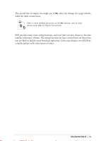
DRAW SIP 09 Editor's Note:Editor's Note
9/18/09
2:52 PM
Page 4
AMERICAN
ARTIST
Editor’s Note
The Best of
Drawing
®
EDITORIAL
EDITOR-IN-CHIEF
The Big Picture
M. Stephen Doherty
We’ve tried to present a wide range of articles in Drawing magazine over the
last six years so that our readers could find stories in every issue that
addressed their exact needs. To do so, we needed to space out articles on particular topics across several years—we may have to wait a while to run another article on landscape drawing, for example, if we are going to make an
effort to present all the topics readers want covered. That’s why a special
issue such as this one is so exciting—it allows us to group together previously published articles to create a very focused publication that’s a perfect fit for
readers who want something specific from our artist-writers.
The title of this publication is The Best of Drawing, but it may be better to
think of this as a carefully curated overview of the drawing process. We went
through all our issues of Drawing and chose articles that covered the essential
areas of draftsmanship. We start with materials, the first thing a draftsman must
have to begin. Our editor-in-chief, M. Stephen Doherty, fully explored the materials of the Renaissance and the artwork of a great Italian Renaissance draftsman,
Parmigianino, to help readers understand Western drawing’s classical roots
(page 6). I had much too much fun researching and writing the lengthy piece on
graphite—arguably the most common drawing material of the modern world
(page 22). A look at custom-made paper closes out that section (page 36).
Two popular articles were chosen for the Masters & Approaches section—
one on the Bargue drawing course, which Van Gogh utilized early in his
career (page 44), and a look at American master Thomas Eakins’ systematic
approach to draftsmanship (page 58).
Drawing the figure is a practice that can immensely help artists from their
beginning exercises to their dying day—we can express the breadth of human
emotion and experience through depictions of the human body, a neverdepleted well of inspiration. Dan Gheno offers an overview of figure drawing
in his piece (page 64), which was previously only available in a special issue
published two years ago. Specific instruction on figure drawing from Sharon
Allicotti (pages 84, 86, and 88) round out this section.
Prehistoric artists depicted the land (and the beasts that inhabited it), and
this subject matter has never left the draftsman’s repertoire. Lynne Bahr and
Steve Doherty cover this aspect of drawing on pages 96 and 104. In many
cases drawings of landscapes were done as preparatory work for paintings or
other forms of art. The last section of this special issue addresses this function of drawing. You’ll find informative, instructional articles on drawing for
sculpture (page 132), transferring drawings to another substrate (page 116),
and honing your drawing skills through memory training (page 124).
The Best of Drawing is, we hope, the best way to survey the essential
aspects of draftsmanship through Drawing magazine’s lens—one that places
an emphasis on traditional techniques, competence in key skills, and representational art as the ideal jumping off point for any kind of art you may
choose to pursue.
MANAGING EDITOR
Brian F. Riley
SENIOR EDITOR
Allison Malafronte
ART DIRECTOR
James B. Bogner III
ASSOCIATE EDITOR
Austin R. Williams (646) 841-0050
PROJECT MANAGER
Bob Bahr
PUBLISHING
PUBLISHER
David Pyle
MEDIA SALES DIRECTOR
Jim McIntosh (513) 961-0034
MEDIA SALES MANAGER
Mary McLane (970) 290-6065
ONLINE PRODUCT DEVELOPMENT MANAGER
Karyn Meyer-Berthel
AD TRAFFICKERS
Teresa Warren • Melissa Brown
CIRCULATION DIRECTOR
Bob Kaslik
CIRCULATION MANAGER
Sheila Derrington
WEB BUSINESS DEVELOPMENT MANAGER
Tricia Gdowik
MARKETING MANAGER
Annie Hartman Bakken
PRODUCTION
PRODUCTION DIRECTOR
Nancy M. Pollock
PRODUCTION EDITOR
Nancy Arndt
FOUNDER, CREATIVE DIRECTOR:
CEO:
PRESIDENT
Linda Ligon
Clay B. Hall
: Marilyn Murphy
CFO:
Troy Wells
VICE PRESIDENT, CONSUMER MARKETING:
Bob Kaslik
& MARKETING: Stephen Koenig
: Trish Faubion
VICE PRESIDENT, TECHNOLOGY: T.J. Harty
VICE PRESIDENT AND DIVISION PUBLISHER FOR ART AND JEWELRY: David Pyle
VICE PRESIDENT, SALES
VICE PRESIDENT, PRODUCTION
Send editorial mail to American Artist magazine, 29 W. 46th Street, 3rd Floor,
New York, NY 10036.
The contents of this publication may not be reproduced in whole or in part
without the consent of the copyright owner, Interweave Press, a division of
Aspire Media.
Attention Retailers: To carry AMERICAN ARTIST in your store, call IPD at
1-866-473-4800, or write: American Artist Dealer Dept., c/o IPD Source
Interlink Companies, 6195 Lusk Blvd., San Diego, CA 92121-2729.
PRINTED IN U.S.A.
Bob Bahr
Project Manager
4
THE BEST OF DRAWING
DRAW SIP 09 Contribs:AA feature
9/18/09
4:55 PM
Page 5
Contributors
Sharon Allicotti ("Representing a
Studio Model in an Outdoor Setting,"
"The Creative Possibilities of Draping a
Model," "Eleven Reasons to Attend
Figure-Drawing Sessions") is an artist
who lives and works in Glendale,
California. View her art or contact her at
www.allicotti.com.
Course,” “Master Landscape Drawings:
Evidence & Interpretation”) is the editorin-chief of Drawing.
Dan Gheno (“The Human Form: How to
Lynne Bahr (“Constable’s Sketchbook”)
is a freelance editor and writer based in
New York City.
Put It All Together”) is a New York artist
whose work can be found in many private and public collections, including the
Museum of the City of New York and the
New Britain Museum of American Art, in
Connecticut. He teaches drawing and
painting at the Art Students League of
New York and at the National Academy
School of Fine Arts, both in New York
City. He is a professor emeritus at the
Lyme Academy College of Fine Arts in
Old Lyme, Connecticut.
M. Stephen Doherty (“Materials and
Techniques of Renaissance Drawing,”
“The Revival of an Influential Drawing
Gerard Haggerty (“Studying Drawing
With Professor Eakins”) is an artist and
writer who teaches at Brooklyn College.
Bob Bahr (“Graphite: The Drawer’s
Humble Tool,” “Custom and Handmade
Paper.”) is a freelance editor and writer
based in New York City.
Here is your ticket for sketching, designing and writing
while you're away from your
home base. This style features a lovely imitation leather
cover with a magnetic closure
flap. Sketch style books feature 60 sheets of paper (150
grms) that will accept virtually
any media. Grid style books
feature 96 sheets (80 grms).
These books are stylish and
dependable! Available only in
Black.
Item
Squares
Squares
Squares
Sketch
Sketch
Sketch
Size
A6-4.1x5.8"
A5-5.8X8.3"
A4-8.3X11.7"
A6-4.1x5.8"
A5-5.8X8.3"
A4-8.3X11.7"
Cat. #
83464
83465
83466
83467
83468
83469
His work has won the support of the
National Endowment for the Arts, the
National Endowment for the Humanities,
and the Ford Foundation.
Joseph C. Skrapits (“From Drawing to
Canvas,” “The Tradition of Drawing from
Memory,” “Capturing the Muse: Drawings
by Sculptors”) is an artist and freelance
writer who frequently contributes to
American Artist, Watercolor and
Drawing.
John Taye (“Drawing Logic: Drawing for
Sculpture”) is a Fellow in the National
Sculpture Society. He is an emeritus professor at Boise State University, in
Idaho, and has taught many drawing and
sculpture classes and workshops. Taye
has exhibited widely, and his work has
appeared in many publications.
Elite is the choice of professionals looking for an
upscale book but still within a reasonable price
point. Sketch style books have 80 sheets of paper
(110 grms) for a total of 160 pages. The grid paper
style has 96 sheets of paper (80 gram) for a total of
192 pages.
List
$9.95
17.95
29.95
9.95
17.95
29.95
Sale!
$4.97
8.97
14.48
4.97
8.97
14.48
Item
Squares
Squares
Squares
Sketch
Sketch
Sketch
Squares
Squares
Squares
Sketch
Sketch
Sketch
Color
Black
Black
Black
Black
Black
Black
Red
Red
Red
Red
Red
Red
Size
A6-4.1x5.8"
A5-5.8X8.3"
A4-8.3X11.7"
A6-4.1x5.8"
A5-5.8X8.3"
A4-8.3X11.7"
A6-4.1x5.8"
A5-5.8X8.3"
A4-8.3X11.7"
A6-4.1x5.8"
A5-5.8X8.3"
A4-8.3X11.7"
Cat. #
83470
83471
83472
83473
83474
83475
83476
83477
83478
83479
83480
83481
List
$11.95
21.95
34.95
11.95
21.95
34.95
11.95
21.95
34.95
11.95
21.95
34.95
Sale!
$5.99
10.99
17.49
5.99
10.99
17.49
5.99
10.99
17.49
5.99
10.99
17.49
$10 Off Any Purchase of $50 or More at www.jerrysartarama.com
Order by phone at 1-800-827-8478. Use Source Code DR0709 when calling or upon checking out of our website. Offer valid for one order only and is not
combinable with any other coupons or discounts. See website or call for appropriate shipping and handling charges. Offer Expires December 31st 2009.
DRAW SIP 09 Parmagianino:AA feature
9/18/09
1:09 PM
Page 6
Materials
Techniques
Renaissance
Drawing
and
of
A 2004 exhibition at the Frick Collection included a rich
collection of drawings by Parmigianino, “one of the most undeniably
distinguished but also endlessly surprising artists of the Italian
Renaissance,” writes the show’s curator. by M. Stephen Doherty
DRAW SIP 09 Parmagianino:AA feature
9/18/09
5:48 PM
Page 7
Self-Portrait in Profile
ca. 1530–1540, brown ink, 4 x 41⁄2. Graphische Sammlung Albertina, Vienna, Austria.
THE BEST OF DRAWING
7
DRAW SIP 09 Parmagianino:AA feature
9/18/09
Drawings
often reveal more about an artist’s personality, ideas, and methods than any
other aspect of their art. That is certainly the case with Girolamo Francesco
Maria Mazzola (1503–1540), known as
Parmigianino, whose remarkable drawings provide evidence of his prodigious
talent, his quick hand, and his fatal tendency to procrastinate.
In honor of the 500th anniversary of
his birth in Parma, Italy, the National
Gallery of Canada in Ottawa (October 3,
2003, through January 4, 2004) and
The Frick Collection in New York
(January 27 through April 18, 2004)
presented a major exhibition titled “A
Beautiful and Gracious Manner: The
Art of Parmigianino.” The show included 51 exquisite drawings, seven jewellike oil paintings, and a dozen historic
prints considered to be some of the first
ever created personally by an artist (as
opposed to a professional engraver). It
was curated by David Franklin, the
deputy director and chief curator of the
National Gallery of Canada, and coordinated by Denise Allen, an associate
curator at The Frick.
Parmigianino was fortunate to have
been born into a family of artists
when some of the greatest artists of all
time were active, including Leonardo
da Vinci, Raphael, and Michelangelo.
Although he was orphaned at age 2,
Parmigianino was raised by two
uncles who were well-established
painters and ran the Mazzola family
workshop. The prodigious young man
received training in a workshop filled
with prints and plaster casts of antique
sculptures, as well as copies of contemporary works in Florence and
Rome, and there is some indication he
may have also studied with Correggio.
As a telling indication of events to
follow, Parmigianino’s talent was first
recognized in his drawings. His repre8
THE BEST OF DRAWING
1:09 PM
Page 8
DRAW SIP 09 Parmagianino:AA feature
9/18/09
1:09 PM
Page 9
OPPOSITE PAGE, TOP
Studies of Female
Heads, a Griffin, and
Finials
ca. 1522–1524, red chalk
and brown ink, 71⁄8 x 55⁄8.
Private collection.
OPPOSITE PAGE, BELOW LEFT
Female Martyr
ca. 1522–1524, oil
on panel, 173⁄8 x 101⁄8.
Collection Städelsches
Kunstinstitut und Städtische
Galerie, Frankfurt, Germany.
OPPOSITE PAGE, BELOW RIGHT
Circumcision
ca. 1523–1524, oil
on panel, 161⁄4 x 121⁄4.
Collection Detroit Institute
of Arts, Detroit, Michigan.
RIGHT
Circumcision
ca. 1523–1524, brown ink
and brown wash with white
heightening, 101⁄4 x 8.
Collection the Louvre,
Paris, France.
sentations of figures, griffins, and
finials revealed a perceptive vision, a
quick and accurate hand, and a skillful
use of materials. He surpassed his
contemporaries in handling the three
most common drawing materials: red
or sanguine colored chalk, black chalk,
and pen-and-ink.
“The range of styles Parmigianino
essayed in red chalk during these early
years is impressive,” writes David
Ekserdjian in the catalog for the exhibition (Yale University Press, New
Haven, Connecticut). “One approach ...
is effortlessly polished and tautly disciplined, but also very delicate. ... By contrast, Parmigianino concurrently
employed red chalk to achieve dramatically energetic effects, whether in a
fully resolved compositional study for
an unexecuted altarpiece or in a garzone study for the figure of Saint
Vitalis in one of his frescoes for San
Giovanni Evangelista. Red chalk was
generally used in this period for highly
finished solutions, and Parmigianino
was well aware of its potential for heavily chiaroscural, sculptural drawing.
“Parmigianino’s use of pen—in isolation, or with wash—in this first
Parmesan period is equally manysided,” Ekserdjian continues. “There is
nothing in the work of Correggio or
any of Parmigianino’s other Parmesan
rivals that satisfactorily explains his
precocious confidence with pen and
wash. One possible explanation might
be the influence of Leonardo da Vinci
upon Lombard draughtsmanship.
“Another novelty that may date
from this moment is his use of pen
and wash on blue paper. This type of
paper, which was originally produced
in Arabia but within Italy appears to
have been a Venetian specialty,
allowed artists to experiment with a
colored ground without any need for
preparation. In Venice itself, blue
paper tended to be used by artists
such as Carpaccio as a backdrop for
meticulously disciplined pen and wash
drawings, sometimes heightened with
white, a more forgiving medium than
metalpoint that achieved a comparable
visual effect. ... Also around this time,
or perhaps a bit later, Parmigianino
began to exploit the potential of naturally buff-colored paper, not for pen
and wash but instead for a combination of black and white chalks.”
THE BEST OF DRAWING
9
DRAW SIP 09 Parmagianino:AA feature
9/18/09
5:48 PM
Page 10
ABOVE
Virgin and Child in Glory With Saints
Jerome and John the Baptist, also
known as the Vision of Saint Jerome
ca. 1526–1527, oil on panel, 1333⁄4 x 58. Collection
National Gallery, London, England.
LEFT
Entombment
(first version), ca. 1524–1527, etching, 103⁄4 x 8.
Collection The British Museum, London, England.
Reba F. Snyder, a paper conservator
at the Morgan Library in New York City,
points out that while Parmigianino may
have created exceptional drawings
early in his career, there was nothing
innovative about his choice of materials. “Red and black chalk were quite
common drawing materials long
before the Renaissance, and they continued to be used extensively by artists
until more mechanical drawing instruments were introduced in the 18th
century,” she explains.
“The obvious reason these materials were used so extensively is that red
and black chalk were naturally occurring minerals in many parts of Italy,”
Snyder continues. “It was mined, or cut
10
THE BEST OF DRAWING
from the ground, until the supply eventually became exhausted. Parmigianino
and his contemporaries had available a
plentiful supply of chalks in varying
shades of red depending on the
amount of iron in the ground. The
chalk was used by the artists just the
way it came from the earth, a natural
combination of clay and iron oxide. It
might be shaped in their hands and put
in a holder, and the artists could sharpen the end to draw fine lines or round
it off for broader strokes. While working, the artists are likely to have had
available three or four different pieces
of chalk of varying colors and degrees
of softness. They would sometimes
smear the chalk with their fingers or a
stump, scrape it with a sharp tool, or
wet it with water to create a wash.”
The pens and ink Parmigianino used
to make drawings with hatched and
crosshatched lines were also quite different from the steel nib pens, technical
pens, and bottled inks used today.
“Artists made their own pens by carving
the ends of feathers or reeds,” Snyder
indicates. “There was nothing exotic
about the materials, and they likely used
the feathers readily available from ducks
or crows, which varied in size and could
be shaped into fine or broad points.
With different amounts of pressure,
these could be used to inscribe thin,
faint lines, or dark, wide marks.
“The ink was probably iron gall
DRAW SIP 09 Parmagianino:AA feature
9/18/09
1:10 PM
Page 11
ABOVE RIGHT
Drapery Study
for the Vision of
Saint Jerome
ca. 1526–1527, black
and white chalk,
9 x 63⁄4. Collection
Ashmolean Museum,
Oxford, England.
RIGHT
Study of the
Virgin and Child
for the Vision of
Saint Jerome
ca. 1526–1527, red
chalk, 93⁄4 x 61⁄2.
Collection École des
Beaux-Arts, Paris,
France.
THE BEST OF DRAWING
11
DRAW SIP 09 Parmagianino:AA feature
9/18/09
1:10 PM
Page 12
LEFT
Madonna of the Rose
ca. 1529–1530, oil on
panel, 421⁄2 x 341⁄2. Collection
Gemaldegalerie, Dresden, Germany.
RIGHT
made from oak galls,” Snyder adds.
“The husk was produced by a tree in
response to wasp stings or disease.
The oak galls were steeped in water,
and other ingredients, including iron
salts, were added to make the ink.
There were many formulas, some of
which produced brittle, dark brown
ink that eventually flaked off the drawing. Black ink was also made from carbon and gum, and natural sepia ink
was made from the cuttlefish. Sepia
was not commonly used in the 16th
century; however, it did appear in seaside towns like Venice where the cuttlefish was readily available. In the
18th century, bistre, another brown
ink made from the soluble components of soot, was popular with artists.
Of course all of these inks varied in
color and density depending on the
formulas used to make them and the
aging of the ink on paper.”
Most of Parmigianino’s drawings are
relatively small, with figures no more
than a couple of inches in height. In part
that is because paper was a precious
commodity in the 16th century. “Large
sheets were available, but most drawings
were done on relatively small pieces of
paper,” explains Snyder. “Unless artists
were preparing cartoons for a wall or
ceiling fresco, they usually made small
drawings, often using both sides of a
sheet. There were paper mills all over
Italy making various kinds of papers, but
artists used those papers very purposefully. Every square inch was filled with
figure studies or compositional sketches,
12
THE BEST OF DRAWING
Study for the
Madonna of the Rose
ca. 1526–1529, black chalk
with white heightening, 101⁄2 x 73⁄8.
Private collection.
BOTTOM
Sleeping Man
ca. 1527–1530, red chalk,
71⁄2 x 101⁄2. Devonshire Collections,
Chatsworth, England.
with the paper being turned in different
directions to use all the available space.
“Another explanation for the scale
of the surviving Renaissance drawings
is that collectors often cut drawings
into several pieces,” Snyder adds.
“They did so because they thought the
presentation of the drawings would be
more beautiful. The condition of these
drawings speaks to the history of
drawing connoisseurship.”
Snyder points out that the red and
black chalks available today are not
exactly like those used by Parmigianino.
“Over the centuries, the highest quality
sources of chalk were exhausted and
the variety of chalks was diminished,”
she explains. “By comparison, the natural materials available today are not
nearly as plentiful or as varied, but we
Grumbacher ad:best of drawing 2009
9/18/09
9:37 AM
Page 13
DRAW SIP 09 Parmagianino:AA feature
9/18/09
5:48 PM
Page 14
Adoration of the Magi
ca. 1527–1530, brown ink and brown wash
with white heightening, 131⁄4 x 91⁄2. Collection
Städelsches Kunstinstitut und Städtische Galerie,
Frankfurt, Germany.
now have a great variety of manufactured artists’ materials.
“The revolution in artists’ materials
occurred in painting, not in drawing,”
Snyder says in summary. “Oil painting
was new, but drawing with chalk and
ink was not. Our appreciation for artists
like Parmigianino is based on their creative use of those standard materials.”
There are aspects of Parmigianino’s
work that do appear to be quite innovative. He may have been the first artist
to create prints with his own hands
rather than in collaboration with a
craftsman who would translate his
drawings into etchings. While he did
prepare drawings for interpretation as
engravings, etchings, and chiaroscuro
14
THE BEST OF DRAWING
woodcuts, there is evidence that he was
so obsessive about supervising the
adaptation of his images that he may
have taken over from the craftsmen
hired to make the etchings. “If this
analysis is broadly correct,” writes
David Franklin, “then Parmigianino’s
perfectionism would have the unintended effect of making him the de
facto father of Italian etching.”
At age 21, Parmigianino traveled to
Rome with four portable paintings
and a collection of drawings he
intended to use as calling cards to
solicit commissions from Pope
Clement VII and wealthy patrons. He
made use of his time by drawing
copies of the figures in Michelangelo’s
Sistine Chapel ceiling and Raphael’s
Vatican frescoes, and he also made
drawings directly from live models.
Unfortunately, Parmigianino’s time in
Rome proved almost fruitless in terms
of major commissions, in part
because the city was undergoing military turmoil that finally erupted in
1527, forcing Parmigianino to flee to
Bologna. He eventually returned to
Parma in 1530 and made hundreds of
drawings in preparation for painting
fresco decorations and panels.
Throughout all these travels,
Parmigianino made both studies and
independent drawings that were not
preparatory for paintings. In addition to
working on figure compositions, he
designed architectural frames for altarpieces, tomb sculptures, bronze statuettes, arms and armor, jewelry, and
cutlery. He is even known to have created a few erotic drawings. Indeed,
Parmigianino was so obsessed with
making drawings of all sorts of subjects
that “his industry was often directed
towards avoiding his real professional
responsibilities,” observes Eskerdjian. A
number of important painting commissions went unfinished, including fresco
decorations for the vault and apse of
Santa Maria della Steccata in Parma.
About 100 drawings for the project survive, underscoring the artist’s insistence
on perfection and on an endless process
of refinement. After eight years of work,
Parmigianino had still not completed
the fresco and his patrons put him in
jail. A sympathetic collector bailed him
out, perhaps in exchange for a group of
drawings, but the artist fled Parma,
became ill, and died at the age of 37.
Despite Parmigianino’s tragic death
at a young age, Eskerdjian concludes
his essay on the artist’s drawings by
stating, “It is first and foremost the
beauty, richness, and range of his
graphic works that make him one of
the most undeniably distinguished but
also endlessly surprising artists of the
Italian Renaissance.”
Hartford Fine Art ad:best of drawing 2009
9/18/09
9:39 AM
Page 15
DRAW SIP 09 Parmagianino:AA feature
9/18/09
1:11 PM
Page 16
M
ABOVE
Virgin in Glory With
the Adoration of the
Shepherds and Saint
Francis
ca. 1529–1530, brown ink
and gray wash with white
heightening on blue paper,
pricked for transfer, 15 x 121⁄2.
Collection Ashmolean
Museum, Oxford, England.
LEFT
Study for the Steccata
Ceiling, With Three
Canephori and the
Vault
ca. 1531–1533, brown ink
and green, blue, and brown
washes with white heightening,
81⁄4 x 7. Collection The British
Museum, London, England.
16
THE BEST OF DRAWING
atthew J. Collins, the principal assistant to artist Charles
H. Cecil and a teacher of
painting and drawing in the Charles
H. Cecil Studio in Florence, Italy, confirms Reba Snyder’s conclusion about
the differences between modern and
Renaissance drawing materials. “I’ve
been studying Old Master drawings for
the past 10 years, and it has been difficult finding drawing materials and
papers that even come close to those
used by the masters,” Collins says.
“I first became interested in learning
more about the masters’ work in 1993
when I saw an exhibition of Italian
Florentine drawings at The Art Institute
of Chicago,” Collins remembers. “I
made copies of drawings by Cristofano
Allori (1577–1621) and his father,
Allesandro (1535–1607), and I realized it
was difficult to emulate the variety of
colors and marks they achieved with the
materials available today. I decided to
conduct research to see if I could locate
or prepare materials that had the same
qualities as those used in the 16th and
17th centuries.
“The natural sanguine the masters
used was more fluid and velvety than
the Conté crayons we use today,” Collins
explains. “Conté is grainy and gritty
compared to the soft material the
Italians once mined in the earth. It
doesn’t allow for the same flowing,
rhythmic lines or the subtle blends
Parmigianino achieved in the 16th century. Cretacolor brand drawing pencils
are the best commercially manufactured
drawing pencils I have found so far.
“In some ways the modern black and
sanguine pencils are suited to the world
of photographs that influence contemporary artists and not to the elegant
forms observed by the masters,” Collins
continues. “It is important to rediscover
those earlier materials so contemporary
artists have a better chance of achieving
the same rhythms in their drawings.
“There is some evidence that
Michelangelo mixed wax with chalk to
make a slightly harder drawing material that could be sharpened into a fine
point,” Collins adds. “For that reason
I’ve been experimenting with making
my own drawing instruments by first
Artograph ad:best of drawing 2009
9/18/09
9:41 AM
Page 17
Create your masterpiece with
inspiration from Open Studio.
Organize and simplify your workspace with
Open Studio Furniture from Artograph.
Designed with the serious artist in mind, the Open Studio line allows
you to create a flexible environment that maximizes space and keeps
your supplies at hand. These mobile worktables and carts give you the
freedom to adapt your workspace to fit any project – big or small.
Let the functional simplicity of Open Studio Furniture be your inspiration
Super Prism and Animation Disc
Light Box not included in the
Open Studio line.
to create a beautiful workspace. Designed by artists. For artists.
Visit www.artograph.com today to get inspired (and organized)!
DRAW SIP 09 Parmagianino:AA feature
9/18/09
1:11 PM
Page 18
RIGHT
Saturn and Philyra
ca. 1531–1535, oil on panel, 291⁄2 x 25.
Private collection.
ABOVE
Saturn and Philyra
ca. 1531–1535, brown ink and brown
wash over black chalk, 61⁄2 x 41⁄4. Collection
The British Museum, London, England.
LEFT
Saturn and Philyra
ca. 1531–1535, brown ink and gray
wash with white heightening, 41⁄4 x 3.
Collection Royal Library, Windsor Castle,
Her Majesty Queen Elizabeth II.
18
THE BEST OF DRAWING
making a paste of beeswax and turpentine, then adding sanguine dust
to form a stick of red chalk.”
In his pursuit of the perfect drawing
materials, Collins has consulted Sandro
Zecchi, a well-known art-material retailer in Florence and an expert on art
materials. “Even though the original
sources of sanguine in Corsica are
depleted, Zecchi says he has found a
supply in France,” Collins explains.
“He won’t tell anyone where he gets
the clay, but he sells chunks of stone of
varying degrees of quality that can be
cut into slices and put into a holder for
drawing. The stones are rather expensive and a customer at Zecchi’s has to
sort through all the ones available to
find the best. The stones have to be cut
into strips or slices with a saw, and
those slices have to be cut down into
little sticks that can be sanded to fit into
a holder and sharpened to a point.”
While Collins has made some
progress in locating and adapting modern drawing materials, he has had less
success finding papers that come close
to those available in the Renaissance. “I
have a small stash of 19th-century
papers that are exquisite, and I use
small pieces of them to make drawings, but most of my drawings are
done on cream-colored sheets of Modir
Italian paper that has a slightly textured
surface. The tone of the paper allows
me to add highlights with white chalk.
“Most of the other papers I’ve tried
either have a grain so distinct that it
distracts from the drawn lines, or
they are too smooth and don’t pull
enough chalk off the stick,” Collins
goes on to say. “I’ve also tried a number of handmade papers, and I’ve
found them to be too spongy. I have
talked to several mills about the qualities I am looking for in a drawing
paper in hopes they will come up
with something more satisfactory.”
Collins adds that he likes doing silverpoint drawings on papers that he
prepares. He coats the surfaces of
cold-pressed watercolor paper with a
Legion Paper_Revere ad:best of drawing 2009
9/18/09
9:42 AM
Page 19
I N T R O DU C I N G A N E W P R I N T M A K I N G PA P E R F R O M M AG N A N I
“
© Wolf Kahn
Since 1968 I have worked with some of the
most respected and demanding artists in the
world, including Wolf Kahn, Donald Sultan,
Joan Mitchell and Frank Stella.
As a Master Printer I have used every major
mould-made paper in the world, and I can
honestly say that Revere outperforms
them in all areas:
Full range of shades and finishes
Receives ink from both strong and delicate lines
Versatile across all types of printing:
Aquatint, Mezzotint, Dry Point,
Etching, and Lithography
Paper dries flat
Reliable, Respected, Revered
”
These are some of the reasons why Revere
has become my paper of choice.
anthony kirk
artistic director/master printer
center for contemporary printmaking
www.contemprints.org
W W W. L E G I O N PA P E R .C O M t I N F O L E G I O N PA P E R . C O M t 1 . 8 0 0 . 2 7 8 . 4 4 7 8 N Y t 1 . 8 0 0 . 7 2 7. 3 7 16 L A
DRAW SIP 09 Parmagianino:AA feature
9/18/09
5:49 PM
Page 20
LEFT
Portrait of Victor Edelstein
by Matthew J. Collins, 1996, sanguine
on cream paper, 71⁄2 x 6. Collection
the artist.
OPPOSITE PAGE ABOVE
Female Study
by Matthew J. Collins, 2004,
sanguine and white chalk
on cream paper, 10 x 7.
Collection the artist.
OPPOSITE PAGE BELOW
Copy of Cristofano Allori
Drawing for Judith With the
Head of Holofernes
by Matthew J. Collins, 1994, black
and white Conté on blue Canson
Ingres paper, 10 x 71⁄2.
Collection the artist.
liquid made from a combination of
glycerin, gum arabic, and bone-white
chalk and allows the surface to dry to a
hard finish that can be scratched with
strands of sterling silver. “The coating
is made using the formula Cennini
recommended in his classic book on
artists’ materials” (The Craftsman’s
Handbook, by Cennino D’Andrea
Cennini, translated by Daniel V.
Thompson Jr., Dover Publications,
Mineola, New York), he explains.
20
THE BEST OF DRAWING
Collins concludes by saying his
research is intended to support the education program of the Cecil Studio. “Our
school is different from others in that
we look at nature through the language
and rhythms of the Renaissance masters,” he explains. “We are concerned
with investigating the idea of beauty and
the means of expressing beauty.”
For more information on Zecchi’s art
supplies, write: Zecchi Colori Belle ArtiRestauro, Via dello Studio 19/r, 50122
Florence, Italy; call: 011-39-055-21-14-70;
or fax: 011-39-055-21-06-90. For more
information on the Charles H. Cecil
Studio, write: Ms. Danielle DeVine,
Dept. DRAW, Borgo San Frediano 68,
50124 Florence, Italy; call: 011-39-055-2851-02; or e-mail:
For more information on the
Parmigianino exhibition and a copy of
the catalog, call The Frick Collection at
(212) 288-0700, or visit the museum’s
website at www.frick.org.
❖
DRAW SIP 09 Parmagianino:AA feature
9/18/09
1:12 PM
Page 21
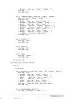
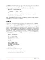
Raw Materials for Drawing in
Ink, Charcoal, and Silver
The raw materials shown above are used by New
York artist Karen Gorst to create drawings in the
manner of artists in the 15th and 16th centuries.
Starting in the lower left-hand corner of the photograph is a reed pen filled with a sliver of sterling
silver that Gorst uses for silverpoint drawings on
prepared papers and boards. Next is a rolled
paper stump for carefully smudging charcoal; two
bamboo-reed pens for ink drawing; natural galls to
be boiled with ferrosulphate to make ink (see the
formula below); left- and right-handed quill pens
made from goose feathers; additional natural
galls; a bottle of ferrosulfate; two pieces of willow
charcoal; particles of gum arabic used in making
ink; and pieces of both sanguine and white chalk.
Stated briefly, her formula for making ink is to
mix 3 parts boiled oak galls, 2 parts ferrosulfate,
and 1 part gum arabic. “Boil the oak galls and
water to the consistency of tea and let that sit for
two to three weeks so the liquid will ferment,”
Gorst explains. “Add the ferrosulfate and strain
the liquid. It should immediately turn black. Then,
add the gum arabic.”
Gorst teaches medieval techniques of drawing
and calligraphy at a number of New York locations, including the Center for Book Arts (phone:
212-481-0295; www.centerforbookarts.org) and
Kremer Pigments (phone:212-219-2394; www.
kremerpigments.com). She also conducts workshops in public schools and art centers around
the country. For more information, contact Gorst
at
THE BEST OF DRAWING
21
DRAW SIP 09 Graphite:AA feature
9/18/09
3:10 PM
Page 22
Graphite:
The Drawer’s
Humble Tool
The graphite in pencils is common and largely uncelebrated, but its history, applications, and physical properties are worth a closer look. by Bob Bahr
H
ow little does our society think of graphite
pencils? Well, small ones that cost about
three cents are given away free at some
government offices where forms need to be filled
out. Ditto at horse-racing tracks—even at miniature-golf courses. In these situations, they are likely used for just a few seconds, then thrown away.
The pencil’s luck is little better in the art world.
Graphite pencils compete with charcoal as the
least valued media—at least in terms of asking
price for a finished piece—a further insult when
one considers that a detailed graphite drawing can
take much longer to execute than an oil painting.
It wasn’t always this way: Graphite used to be
a rare commodity—rare enough to spawn imitators. Counterfeiters would sell pencil-shaped
wood with the “lead” merely painted on. Others
would make pencils with graphite in place only
for the first inch or so of the writing end. The
mineral was so valued at one point that graphite
mining involved the kind of security used for the
extraction of a closely related form of carbon: diamond. Operators of the graphite mine at
22
THE BEST OF DRAWING
Borrowdale, in England’s Lake District, locked the
entrance to the mine each night and searched the
miners at the end of each day for smuggled
pieces. According to Henry Petroski’s exhaustive—and somewhat exhausting—book on the
subject [The Pencil: A History of Design and
Circumstance (Knopf, New York, New York)], a
saying in the Lake District in the 17th century
held that “a mouthful [of graphite] was as good as
a day’s wages.” As the reserves dwindled in that
mine, which was renowned for its pure, highquality product, the owners occasionally flooded
the pit in the late 1600s to control supply of the
material and to prevent its illegal removal.
Graphite’s ups and downs are directly tied to
its usefulness. Artists and tradesmen had long
known about graphite’s ability to make marks,
but it was rarely found in pure form and therefore didn’t distinguish itself from other marking
materials. Artists interested in fine lines worked
in metalpoint using silver, gold, zinc, or true lead,
which left a faint, metallic line that could be
removed using the soft parts of fresh bread,
DRAW SIP 09 Graphite:AA feature
9/18/09
3:11 PM
Page 23
Graphite leads at the
Caran d’Ache factory
in Switzerland.