Business statistics communicating with numbers 1st edition jaggia test bank
Bạn đang xem bản rút gọn của tài liệu. Xem và tải ngay bản đầy đủ của tài liệu tại đây (5.15 MB, 165 trang )
Chapter 02
Tabular and Graphical Methods
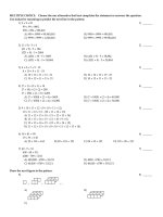
True / False Questions
1.
A frequency distribution for qualitative data groups this data into classes called intervals and
records the total number of observations in each class.
True
2.
False
The relative frequency of a category is calculated by dividing the category's frequency by the total
number of observations.
True
3.
The percent frequency of a category equals the frequency of the category multiplied by 100%.
True
4.
False
False
A pie chart is a segmented circle that portrays the categories and relative sizes of some
quantitative variable.
True
False
© 2013 by McGraw-Hill Education. This is proprietary material solely for authorized instructor use. Not
authorized for sale or distribution in any manner. This document may not be copied, scanned, duplicated,
forwarded, distributed, or posted on a website, in whole or part.
5.
A bar chart depicts the frequency or relative frequency of each category of qualitative data as a
bar rising vertically from the horizontal axis. It is also acceptable for the bar to extend horizontally
from the vertical axis.
True
6.
False
To approximate the width of a class in the creation of a bar chart, we may use this formula:
.
True
7.
False
For quantitative data, a cumulative frequency distribution records the number of observations that
fall below the upper limit of each class.
True
8.
False
For quantitative data, a cumulative relative frequency distribution records the proportion (fraction)
of values that fall below the upper limit of each class.
True
9.
False
A histogram is a series of rectangles where the width and height of each rectangle represent the
frequency (or relative frequency) and the width of the class, respectively.
True
False
10. A polygon connects a series of neighboring points where each point represents the midpoint of a
particular class and its associated frequency or relative frequency.
True
False
© 2013 by McGraw-Hill Education. This is proprietary material solely for authorized instructor use. Not
authorized for sale or distribution in any manner. This document may not be copied, scanned, duplicated,
forwarded, distributed, or posted on a website, in whole or part.
11. An ogive is a graph that plots the cumulative frequency (or the cumulative relative frequency) of
each class above the lower limit of the corresponding class.
True
False
12. A stem-and-leaf diagram is useful in that it gives an overall picture of where quantitative data are
centered and how the data are dispersed from the center.
True
False
13. A scatterplot is a graphical tool that helps determine whether or not two quantitative variables are
related.
True
False
14. When constructing a scatterplot for two quantitative variables, we usually refer to one variable as x
and another one as y. Typically, we graph x on the vertical axis and y on the horizontal axis.
True
False
Multiple Choice Questions
15. Frequency distributions may be used to describe which of the following types of data?
A. Nominal and ordinal data only
B. Nominal and interval data only
C. Nominal, ordinal, and interval data only
D. Nominal, ordinal, interval, and ratio data
© 2013 by McGraw-Hill Education. This is proprietary material solely for authorized instructor use. Not
authorized for sale or distribution in any manner. This document may not be copied, scanned, duplicated,
forwarded, distributed, or posted on a website, in whole or part.
16. In order to summarize qualitative data, a useful tool is a _________.
A. Histogram
B. Frequency distribution
C. Stem-and-leaf diagram
D. All of the above
17. For both qualitative and quantitative data, what is the difference between the relative frequency
and the percent frequency?
A. The relative frequency equals the percent frequency multiplied by 100.
B. The percent frequency equals the relative frequency multiplied by 100.
C. As opposed to the relative frequency, the percent frequency is divided by the number of
observations in the data set.
D. As opposed to the percent frequency, the relative frequency is divided by the number of
observations in the data set.
18. For which of the following data sets will a pie chart be most useful?
A. Heights of high school freshmen
B. Ambient temperatures in the U.S. Capitol Building
C. Percentage of net sales by product for Lenovo in 2011
D. Growth rates of firms in a particular industry
© 2013 by McGraw-Hill Education. This is proprietary material solely for authorized instructor use. Not
authorized for sale or distribution in any manner. This document may not be copied, scanned, duplicated,
forwarded, distributed, or posted on a website, in whole or part.
19. Exhibit 2-1. An auto parts chain asked customers to complete a survey rating the chain's customer
service as average, above average, or below average. The following shows the results from the
survey:
Refer to Exhibit 2-1. The proportion of customers that felt the customer service was average is
closest to ______.
A. 0.20
B. 0.33
C. 0.46
D. 0.53
© 2013 by McGraw-Hill Education. This is proprietary material solely for authorized instructor use. Not
authorized for sale or distribution in any manner. This document may not be copied, scanned, duplicated,
forwarded, distributed, or posted on a website, in whole or part.
20. Exhibit 2-1. An auto parts chain asked customers to complete a survey rating the chain's customer
service as average, above average, or below average. The following shows the results from the
survey:
Refer to Exhibit 2-1. A rating of Average or Above Average accounted for what number of
responses to the survey?
A. 3
B. 7
C. 8
D. 10
© 2013 by McGraw-Hill Education. This is proprietary material solely for authorized instructor use. Not
authorized for sale or distribution in any manner. This document may not be copied, scanned, duplicated,
forwarded, distributed, or posted on a website, in whole or part.
21. Exhibit 2-2. The following is a list of five of the world's busiest airports by passenger traffic for 2010.
Refer to Exhibit 2-2. The percentage of passenger traffic in the five busiest airports that occurred in
Asia is closest to __________.
A. 18%
B. 21%
C. 25%
D. 38%
© 2013 by McGraw-Hill Education. This is proprietary material solely for authorized instructor use. Not
authorized for sale or distribution in any manner. This document may not be copied, scanned, duplicated,
forwarded, distributed, or posted on a website, in whole or part.
22. Exhibit 2-2. The following is a list of five of the world's busiest airports by passenger traffic for 2010.
Refer to Exhibit 2-2. How many more millions of passengers flew out of Atlanta than flew out of
Chicago?
A. 13
B. 21
C. 23
D. 25
© 2013 by McGraw-Hill Education. This is proprietary material solely for authorized instructor use. Not
authorized for sale or distribution in any manner. This document may not be copied, scanned, duplicated,
forwarded, distributed, or posted on a website, in whole or part.
23. Exhibit 2-3. A city in California spent six million dollars repairing damage to its public buildings in
2010. The following table shows the categories where the money was directed.
Refer to Exhibit 2-3. How much did the city spend to fix damage caused by mold?
A. $360,000
B. $720,000
C. $1,440,000
D. $1,800,000
© 2013 by McGraw-Hill Education. This is proprietary material solely for authorized instructor use. Not
authorized for sale or distribution in any manner. This document may not be copied, scanned, duplicated,
forwarded, distributed, or posted on a website, in whole or part.
24. Exhibit 2-3. A city in California spent six million dollars repairing damage to its public buildings in
2010. The following table shows the categories where the money was directed.
Refer to Exhibit 2-3. How much more did the city spend to fix damage caused by termites
compared to the damage caused by water?
A. $360,000
B. $720,000
C. $960,000
D. $1,320,000
© 2013 by McGraw-Hill Education. This is proprietary material solely for authorized instructor use. Not
authorized for sale or distribution in any manner. This document may not be copied, scanned, duplicated,
forwarded, distributed, or posted on a website, in whole or part.
25. Exhibit 2-4. Students in Professor Smith's Business Statistics course have evaluated the overall
effectiveness of the professor's instruction on a five-point scale, where a score of 1 indicates very
poor performance and a score of 5 indicates outstanding performance. The raw scores are
displayed in the accompanying table:
Refer to Exhibit 2-4. What is the most common score given in the evaluations?
A. 2
B. 3
C. 4
D. 5
© 2013 by McGraw-Hill Education. This is proprietary material solely for authorized instructor use. Not
authorized for sale or distribution in any manner. This document may not be copied, scanned, duplicated,
forwarded, distributed, or posted on a website, in whole or part.
26. Exhibit 2-4. Students in Professor Smith's Business Statistics course have evaluated the overall
effectiveness of the professor's instruction on a five-point scale, where a score of 1 indicates very
poor performance and a score of 5 indicates outstanding performance. The raw scores are
displayed in the accompanying table:
Refer to Exhibit 2-4. What percentage of students gave Professor Smith an evaluation higher than
3?
A. 20%
B. 30%
C. 50%
D. 80%
© 2013 by McGraw-Hill Education. This is proprietary material solely for authorized instructor use. Not
authorized for sale or distribution in any manner. This document may not be copied, scanned, duplicated,
forwarded, distributed, or posted on a website, in whole or part.
27. Exhibit 2-4. Students in Professor Smith's Business Statistics course have evaluated the overall
effectiveness of the professor's instruction on a five-point scale, where a score of 1 indicates very
poor performance and a score of 5 indicates outstanding performance. The raw scores are
displayed in the accompanying table:
Refer to Exhibit 2-4. What percentage of students gave Professor Smith an evaluation of 2 or less?
A. 6.7%
B. 13.3%
C. 20%
D. 80%
© 2013 by McGraw-Hill Education. This is proprietary material solely for authorized instructor use. Not
authorized for sale or distribution in any manner. This document may not be copied, scanned, duplicated,
forwarded, distributed, or posted on a website, in whole or part.
28. Exhibit 2-4. Students in Professor Smith's Business Statistics course have evaluated the overall
effectiveness of the professor's instruction on a five-point scale, where a score of 1 indicates very
poor performance and a score of 5 indicates outstanding performance. The raw scores are
displayed in the accompanying table:
Refer to Exhibit 2-4. What is the relative frequency of the students who gave Professor Smith an
evaluation of 3?
A. 0.3
B. 0.5
C. 9
D. 15
© 2013 by McGraw-Hill Education. This is proprietary material solely for authorized instructor use. Not
authorized for sale or distribution in any manner. This document may not be copied, scanned, duplicated,
forwarded, distributed, or posted on a website, in whole or part.
29. In the following pie chart representing a collection of cookbooks, which author has more titles?
A. Jeff Smith
B. Julia Child
C. Rachel Ray
D. Paula Deen
© 2013 by McGraw-Hill Education. This is proprietary material solely for authorized instructor use. Not
authorized for sale or distribution in any manner. This document may not be copied, scanned, duplicated,
forwarded, distributed, or posted on a website, in whole or part.
30. The accompanying chart shows the numbers of books written by each author in a collection of
cookbooks. What type of chart is this?
A. Bar chart for qualitative data
B. Bar chart for quantitative data
C. Frequency histogram for qualitative data
D. Frequency histogram for quantitative data
© 2013 by McGraw-Hill Education. This is proprietary material solely for authorized instructor use. Not
authorized for sale or distribution in any manner. This document may not be copied, scanned, duplicated,
forwarded, distributed, or posted on a website, in whole or part.
31. The accompanying chart shows the number of books written by each author in a collection of
cookbooks. What type of data is being represented?
A. Quantitative, ordinal
B. Quantitative, ratio
C. Qualitative, nominal
D. Qualitative, ordinal
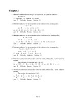
32. When constructing a frequency distribution for quantitative data, it is important to remember that
____________.
A. Classes are mutually exclusive
B. Classes are collectively exhaustive
C. The total number of classes usually ranges from 5 to 20
D. All of the above
© 2013 by McGraw-Hill Education. This is proprietary material solely for authorized instructor use. Not
authorized for sale or distribution in any manner. This document may not be copied, scanned, duplicated,
forwarded, distributed, or posted on a website, in whole or part.
33. Which of the following best describes a frequency distribution for qualitative data?
A. It groups data into histograms and records the proportion (fraction) of observations in each
histogram.
B. It groups data into categories and records the number of observations in each category.
C. It groups data into intervals called classes and records the proportion (fraction) of observations
in each class.
D. It groups data into intervals called classes and records the number of observations in each class.
34. What graphical tool is best used to display the relative frequency of grouped quantitative data?
A. Ogive
B. Pie chart
C. Bar chart
D. Histogram
35. Exhibit 2-5. The following data represent scores on a pop quiz in a statistics section:
Refer to Exhibit 2-5. Suppose the data on quiz scores will be grouped into five classes. The width
of the classes for a frequency distribution or histogram is closest to _____.
A. 10
B. 12
C. 14
D. 16
© 2013 by McGraw-Hill Education. This is proprietary material solely for authorized instructor use. Not
authorized for sale or distribution in any manner. This document may not be copied, scanned, duplicated,
forwarded, distributed, or posted on a website, in whole or part.
36. Exhibit 2-5. The following data represent scores on a pop quiz in a statistics section:
Refer to Exhibit 2-5. Suppose the data is grouped into 5 classes, and one of them will be "30 up to
44"—that is, {x; 30 ≤ x < 44}. The frequency of this class is ____.
A. 0.20
B. 0.25
C. 4
D. 5
37. Exhibit 2-5. The following data represent scores on a pop quiz in a statistics section:
Refer to Exhibit 2-5. Suppose the data is grouped into five classes, and one of them will be "30 up
to 44"—that is, {x; 30 ≤ x < 44}. The relative frequency of this class is ____.
A. 0.20
B. 0.25
C. 4
D. 5
© 2013 by McGraw-Hill Education. This is proprietary material solely for authorized instructor use. Not
authorized for sale or distribution in any manner. This document may not be copied, scanned, duplicated,
forwarded, distributed, or posted on a website, in whole or part.
38. Exhibit 2-6. The following data represent the recent sales price (in $1,000s) of 24 homes in a
Midwestern city.
Refer to Exhibit 2-6. Suppose the data on house prices will be grouped into five classes. The width
of the classes for a frequency distribution or histogram is closest to ______.
A. 15
B. 20
C. 25
D. 30
© 2013 by McGraw-Hill Education. This is proprietary material solely for authorized instructor use. Not
authorized for sale or distribution in any manner. This document may not be copied, scanned, duplicated,
forwarded, distributed, or posted on a website, in whole or part.
39. Exhibit 2-6. The following data represent the recent sales price (in $1,000s) of 24 homes in a
Midwestern city.
Refer to Exhibit 2-6. Suppose the data is grouped into five classes, and one of them will be "115 up
to 140"— that is, {x; 115 ≤ x < 140}. The relative frequency of this class is _____.
A. 6/24
B. 7/24
C. 6
D. 7
© 2013 by McGraw-Hill Education. This is proprietary material solely for authorized instructor use. Not
authorized for sale or distribution in any manner. This document may not be copied, scanned, duplicated,
forwarded, distributed, or posted on a website, in whole or part.
40. Exhibit 2-6. The following data represent the recent sales price (in $1,000s) of 24 homes in a
Midwestern city.
Refer to Exhibit 2-6. Suppose the data is grouped into five classes, and one of them will be "165 up
to 190"— that is, {x; 165 ≤ x < 190}. The frequency of this class is ____.
A. 6/24
B. 7/24
C. 6
D. 7
© 2013 by McGraw-Hill Education. This is proprietary material solely for authorized instructor use. Not
authorized for sale or distribution in any manner. This document may not be copied, scanned, duplicated,
forwarded, distributed, or posted on a website, in whole or part.
41. Exhibit 2-7. Thirty students at Eastside High School took the SAT on the same Saturday. Their raw
scores are given next.
Refer to Exhibit 2-7. Consider a frequency distribution of the data that groups the data in classes of
1400 up to 1600, 1600 up to 1800, 1800 up to 2000, and so on. How many students scored at least
1800 but less than 2000?
A. 3
B. 7
C. 12
D. 18
© 2013 by McGraw-Hill Education. This is proprietary material solely for authorized instructor use. Not
authorized for sale or distribution in any manner. This document may not be copied, scanned, duplicated,
forwarded, distributed, or posted on a website, in whole or part.
42. Exhibit 2-7. Thirty students at Eastside High School took the SAT on the same Saturday. Their raw
scores are given next.
Refer to Exhibit 2-7. Consider a frequency distribution of the data that groups the data in classes of
1400 up to 1600, 1600 up to 1800, 1800 up to 2000, and so on. What percent of students scored
less than 2200?
A. 10%
B. 20%
C. 80%
D. 90%
© 2013 by McGraw-Hill Education. This is proprietary material solely for authorized instructor use. Not
authorized for sale or distribution in any manner. This document may not be copied, scanned, duplicated,
forwarded, distributed, or posted on a website, in whole or part.
43. Exhibit 2-7. Thirty students at Eastside High School took the SAT on the same Saturday. Their raw
scores are given next.
Refer to Exhibit 2-7. Consider a frequency distribution of the data that groups the data in classes of
1400 up to 1600, 1600 up to 1800, 1800 up to 2000, and so on. What is the approximate relative
frequency of students who scored more than 1600 but less than 1800?
A. 0.17
B. 0.23
C. 0.40
D. 0.77
© 2013 by McGraw-Hill Education. This is proprietary material solely for authorized instructor use. Not
authorized for sale or distribution in any manner. This document may not be copied, scanned, duplicated,
forwarded, distributed, or posted on a website, in whole or part.