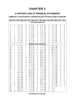
Statistics for business decision making and analysis robert stine and foster chapter 03
Bạn đang xem bản rút gọn của tài liệu. Xem và tải ngay bản đầy đủ của tài liệu tại đây (869.75 KB, 28 trang )
Chapter 3
Describing Categorical
Data
Copyright © 2011 Pearson Education, Inc.
3.1 Looking At Data
Which hosts send the most visitors to
Amazon’s Web site?
Data set consists of 188,996 visits
Host is a categorical variable
To answer this question we must describe the
variation in Host
3 of 28
Copyright © 2011 Pearson Education, Inc.
3.1 Looking At Data
Frequency and Relative Frequency Tables
The distribution of a categorical variable is a list
of values with its associated count (frequency)
A frequency table summarizes the distribution of
a categorical variable
A relative frequency table shows the proportion
(or percentage) in each category
4 of 28
Copyright © 2011 Pearson Education, Inc.
3.1 Looking At Data
5 of 28
Copyright © 2011 Pearson Education, Inc.
3.2 Charts of Categorical Data
Bar Charts and Pie Charts
Unless you need to know exact counts, charts are
better than tables for summarizing more than five
categories
The two most common displays of a categorical
variable are a bar chart and a pie chart
6 of 28
Copyright © 2011 Pearson Education, Inc.
3.2 Charts of Categorical Data
The Bar Chart
Uses horizontal or vertical bars to show the
distribution of a categorical variable
Is called a Pareto chart when the categories are
sorted by frequency (popular in quality control)
Becomes cluttered with too many categories
Is appropriate for ordinal categorical variables
7 of 28
Copyright © 2011 Pearson Education, Inc.
3.2 Charts of Categorical Data
Bar Chart (Horizontal) of Top 10 Hosts
8 of 28
Copyright © 2011 Pearson Education, Inc.
3.2 Charts of Categorical Data
Bar Chart (Vertical) of Top 10 Hosts
9 of 28
Copyright © 2011 Pearson Education, Inc.
3.2 Charts of Categorical Data
The Pie Chart
Uses wedges of a circle to show the distribution of
a categorical variable
Commonly chosen to illustrate market shares or
sources of revenue for a company
Less useful than bar charts if we want to compare
actual counts (easier to compare bars than angles
of wedges)
10 of 28
Copyright © 2011 Pearson Education, Inc.
3.2 Charts of Categorical Data
Pie Chart of Top 10 Hosts
11 of 28
Copyright © 2011 Pearson Education, Inc.
3.3 The Area Principle
The Fundamental Rule for Data Displays
The area occupied by a part of the graph/chart
that displays data should be proportional to the
amount of data it represents
Charts decorated to attract attention often violate
the area principle
12 of 28
Copyright © 2011 Pearson Education, Inc.
3.3 The Area Principle
An Example Violating the Area Principle
13 of 28
Copyright © 2011 Pearson Education, Inc.
3.3 The Area Principle
The Same Example Respecting the Area Principle
14 of 28
Copyright © 2011 Pearson Education, Inc.
4M Example 3.1: ROLLING OVER
Motivation
Are certain types of vehicles more prone to rollover accidents than others?
15 of 28
Copyright © 2011 Pearson Education, Inc.
4M Example 3.1: ROLLING OVER
Method
Data gathered from Fatality Analysis Reporting
System (FARS) for roll-over accidents on
interstate highways. Cases that make up the
rows are accidents resulting in roll-overs in 2000.
The column of interest is model of the car
involved.
16 of 28
Copyright © 2011 Pearson Education, Inc.
4M Example 3.1: ROLLING OVER
Mechanics
17 of 28
Copyright © 2011 Pearson Education, Inc.
4M Example 3.1: ROLLING OVER
Mechanics
18 of 28
Copyright © 2011 Pearson Education, Inc.
4M Example 3.1: ROLLING OVER
Message
Ford Broncos were involved in more than twice as
many roll-over accidents as the next-closest
model.
19 of 28
Copyright © 2011 Pearson Education, Inc.
4M Example 3.2: CHIP SALES
Motivation
Infineon pled guilty to price fixing for DRAM’s
in September 2004. Did Infineon gain a
larger share of the market for chips during
this period?
20 of 28
Copyright © 2011 Pearson Education, Inc.
4M Example 3.2: CHIP SALES
Method
21 of 28
Copyright © 2011 Pearson Education, Inc.
4M Example 3.2: CHIP SALES
Mechanics
22 of 28
Copyright © 2011 Pearson Education, Inc.
4M Example 3.2: CHIP SALES
Message
Infineon and Samsung increased their shares
from 1999 to 2002. It appears to have
been at the expense of smaller companies.
23 of 28
Copyright © 2011 Pearson Education, Inc.
3.4 Mode and Median
Mode
Category with the highest frequency
The longest bar in a bar chart
The widest slice in a pie chart
Two or more categories can tie with the highest
frequency (bimodal or multimodal)
24 of 28
Copyright © 2011 Pearson Education, Inc.
3.4 Mode and Median
Median
Not appropriate for nominal data
Data must be ordinal
It is the category label of the middle observation
in ordered data
25 of 28
Copyright © 2011 Pearson Education, Inc.