BA0363 logo of letters tủ tài liệu bách khoa
Bạn đang xem bản rút gọn của tài liệu. Xem và tải ngay bản đầy đủ của tài liệu tại đây (2.73 MB, 28 trang )
Before&After
BAmagazine.com
®
i U X
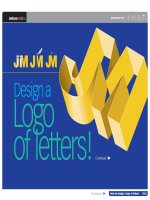
Designa
Logo
ofletters!
Continued
Continued
Howtodesignalogoofletters 0363
Before&After
BAmagazine.com
®
i U X
Howtodesignalogoofletters
Areyouknownbyyourinitials?Turnthoselettersintoaterrificsignature!
JackintheBox
www.jackinthebox.com
Companies of every kind sign their names with
linked letters called ligatures. Ligature means
to tie. Ligatures make excellent business signatures. They’re handsome, simple and compact.
And they’re fun, too—we all have initials! Some
letters link in one typeface but not another.
Others link in lowercase but not in upper. What
follows are a variety of ways to get your letter
pairs beautifully together.
Cotton
Incorporated
www.cottoninc.
com
®
®
AmericanDentalAssociation
www.ada.org
CableNewsNetwork
www.cnn.com
®
GeneralElectric|www.ge.com
2 of 18
Howtodesignalogoofletters 0363
Before&After
®
How to design a logo of letters
BAmagazine.com
3 of 18
i U X
Fortypefacenames,see Article
resources,pages13–17.
Usesharedstrokes
Many letter pairs form natural
links; they have identical parts
or complementary shapes
that fit like hand in glove. Let’s
begin with the easiest letters
to link—those that have identical adjacent strokes.
Almost-identicalstrokes
Pairs like UR share not-quiteidentical strokes, yet often
flow naturally together. To link
neatly, you must usually sacrifice some parts; here, the R
gave up a foot, the U a serif.
HKareanidealpair;eachletterisdistinctfromthe
other,buttheiradjacentstemsareidentical.Linkby
removingeitherstemandabuttingtheletters.Two
colorsputtheemphasisononeletterortheother.
Thisisagoodwaytohandleanacronyminwhichthe
secondletteristhemoreimportant.
InIllustrator,settheletters,CreateOutlines,andmove
together.Cutawaytheunneededpieces,leavingthe
remaindersoverlapped,theninthePathfinderdialog,
selectAddtoshapearea(below).
3 of 18
Howtodesignalogoofletters 0363
Before&After
®
How to design a logo of letters
BAmagazine.com
4 of 18
i U X
Angledtovertical
Angled strokes often link well
to vertical strokes. The easiest
technique is simply to cut the
angled letter in half.
HalvingtheAjoineditneatlytotheB,butthecrossbarsdid
notalign.BorrowingtheflourishfromatoptheAwasaneasy
andartfulsolution.
Ifyourletterstrokesdon’tquitematch...
AN an AN AN
Trychangingcase
Thelowercasealphabetismuchdifferentfrom
uppercase,andmanylettersthatdonotlinkinone
willlinkintheother.Asarule,lowercaseimpartsa
lessformal,morecasualimage.
Tryadifferentfont
Similarly,lettersthatdon’tlinkinonetypefacemaylinkin
another.Trymany!Typefacesthatwouldbetoostylizedfor
everydayuseoftenmakeexcellentligatures.
4 of 18
Howtodesignalogoofletters 0363
Before&After
®
How to design a logo of letters
Curvedtovertical
The more decorative the
typeface, the more easily dissimilar strokes can be linked.
Even a curving stroke can
replace a vertical. You need
gentle curves, though, circles
won’t do (far right).
Uppercase-lowercase
Uppercase letters can often
link to lowercase with excellent
results. An uppercase I, though,
won’t link to anything—its
body just disappears! But a
lowercase i has the advantage
of its distinctive dot and can
link with many letters.
BAmagazine.com
5 of 18
i U X
Manyletterpairscanbemadetolinkbutshouldn’tbe;
forexample,thisoddassemblylookslikewe’veinvented
anewcharacter!Akeyattributeofagoodligatureisthat
itslettersreadasindividualsevenafterbeingjoined.
DistanceColorStyle
Howfarapart?...
Here,alowercaseihasbeendoctoredtolinkwithan
uppercaseM.Letterscanbeseparatedbydistance,color,
typestyleoranycombination.
5 of 18
Howtodesignalogoofletters 0363
Before&After
®
How to design a logo of letters
BAmagazine.com
6 of 18
Horizontalcrossbars
A few letter pairs share top
crossbars, which are easy
to link. Similarly, some
typefaces have exaggerated
serifs that can be linked.
OUTFITTERS
i U X
Crossbarslinksoobviouslythatinsan-serif
typefacestheycanappeartobemerelytightly
kerned.Toavoidthisimpression,addapattern
(above)oranoutline(left).Betteristousea
seriftypefaceandsharetheserif(left)).
Mid-lettercrossbars
Many letters, such as ABEFHPR, have mid-letter crossbars that can be connected
with a little help—just cut the
letter apart and s-t-r-e-t-c-h
the bar!
Keytothistechniqueistokeeptheletterformsdistinct.
Youcandothisbyseparatingtheletterswithtwo
colors(above)orforaone-colorligaturebymakinga
gapintheintersectingstroke(left).
6 of 18
Howtodesignalogoofletters 0363
Before&After
®
How to design a logo of letters
Removeastroke
Here, a phantom stroke hints
at what’s not there! This is particularly effective with Modern typestyles such as Bodoni
and Didi that have extremely
thin strokes.
Removepartofastroke
Letters with angled and overhanging arms—FKTVWXYZ—
benefit from this technique,
which is especially attractive
in serif typestyles. The illusion
is that of a stencil; the line is
interrupted, yet our eyes “fill
in” the missing part!
BAmagazine.com
7 of 18
i U X
Removeonelegandmovetheletterstogether.
cosmetics
What’sinthenegativespace?
Negativespaceistheareainandaroundyourletters;ithasshapeandvolumeandalwaysaffectsthe
viewer’sperception.Negativespaceisalwayspresent.Inthebestdesignitplaysanactiverole,asit
doesintheTPabove.Watchyournegativespace!
7 of 18
Howtodesignalogoofletters 0363
Before&After
®
How to design a logo of letters
BAmagazine.com
8 of 18
i U X
Sharethelove!
E-mailthisarticle!
Reversethefield
Put negative space to positive
use! Add a same-color field
behind your letter, then reverse
the second letter out of the field.
Especially effective with threecharacter acronyms.
YO! YO!
Settightly...
...addafield...
(Colorsadded
(forclarity)
...color.
Crop!
Your intrigued reader will linger for valuable moments on
this design! Crop away the bottoms of your letters, and the
viewer’s eye must complete the
image. Add a company name
or other horizontal graphic to
span the gap (far right).
Reversingthefield(light
ondark)modifiesthe
lookandoftenimproves
it.Alwayscheck!
8 of 18
Howtodesignalogoofletters 0363
Before&After
®
How to design a logo of letters
BAmagazine.com
9 of 18
Followthewhiteline
Create the illusion of attachment! Rather than abut letters,
leave a gap, then make a flowing centerline that draws the
eye smoothly around.
i U X
Don’tcloseit!Doing
sobreakstheflow.
Disconnectandattach
An entertaining ligature unique
to the T, disconnect one arm
and attach it to its neighbor!
Tomaintaintheformofbothletters,
keepthestrokewidthsthesame.
9 of 18
Howtodesignalogoofletters 0363
Before&After
®
How to design a logo of letters
Interlock
Circular letters flow most
naturally into other circular
letters. Interlocked here like
wedding bands or Olympic
rings, two complete letters
function as one.
BAmagazine.com
10 of 18
Set
InIllustrator,set
theletters,Create
Outlines,andmove
together.
Divide
Selectbothletters,
theninthePathfinderdialog,click
Divide(below).
i U X
Cut
UsetheDirect
SelectionToolto
clickanintersection,thenCut.
Overlay
A simple alternative to interlocking is to lay one letter atop
the other, then “link” with a
common fill or stroke. Here,
a colorful gradient turns two
letters into one object.
Whatcolors?
Easilycreateapleasinggradientbyusing
analogouscolors(colorsadjacentonthewheel),
inthiscasegreentoblue.Analogouscolors
alwaysworkwelltogether.
10 of 18
Howtodesignalogoofletters 0363
Before&After
®
How to design a logo of letters
BAmagazine.com
11 of 18
i U X
There’salotmoretoBefore
&After! Subscribe.
Buildbridges
This technique works when
nothing else will! Abut your
letters, then conceal the
junction with a decorative
graphic, line or a series of
lines and shapes. Easy, fun
and always engaging.
Layontop
Evenlyspaceddotsjustlayontop.
Pasteinto
Diagonallinesare“pastedinto”(InDesign).
Replaceletterparts
Barelytouchinglettersarebroughttogether
byplayfulshapesandcolors.
Fillaspace
Thediamonddoesdoubleduty—itlinksthe
lettersandhelpsformtheshapeoftheR!
11 of 18
Howtodesignalogoofletters 0363
Before&After
®
How to design a logo of letters
Usetransparency
Transparency softens. Create
a gossamer effect on even the
boldest ligature by lowering the
opacity of one or more characters. Here, all three letters are
set at 50%.
BAmagazine.com
12 of 18
abc
interior design
i U X
Designbetter!
Subscribe.
abc
Doyouliketheoverlapeffectbutneed
strongcolors?Keepyourcolorsat100%
opacity,butintheBlendingmodedialog
selectMultiply,whichaddsthecolors
ofanobjecttothe
onesbeneathit.
Colorthenegativespaces
Finally, some stubborn letters
just won’t link physically. So try
linking the background! Put the
letters in a box, and color the
negatives spaces; you can get all
kinds of energetic results!
Nosoftwarestuntshere.Justdraw
andcolorfunnyshapesbehindtheletters,thenpasteeverythingintoabox.
12 of 18
Howtodesignalogoofletters 0363
Before&After
®
How to design a logo of letters
BAmagazine.com
13 of 18
i U X
Articleresources
Typefaces
1
10
Colors
2
1AdobeGaramondBold
11
2ITCSerifGothicHeavy
12
3ITCGoudySansBook
13
4FuturaMedium
5HelveticaNeueStdRoman
3
14
7
AN an
AN
6RussellSquareRoman
11 C70M60Y0K10
12 C0M100Y85K30
13 C0M15Y100K0
14 C0M70Y0K30
4
7Spring
4
8Avenir55Roman
5
9BodoniRoman
6
10 C100M60Y0K50
15 C26M7Y24K3
16 C73M15Y38K6
17 C37M66Y6K3
9
16
17
8
15
13 of 18
Howtodesignalogoofletters 0363
Before&After
®
How to design a logo of letters
BAmagazine.com
14 of 18
i U X
Articleresources
Typefaces
1ClarendonRoman
1
8
9
2
10 11
1
Colors
2HelveticaNeueStdHeavyItalic
3GillSansBold
4EurostileExtended#2(Modified)
OUTFITTERS
5Didi
6HelveticaNeueStdUltraLight
7CenturyOldStyleStdRegular
4
3
C26M91Y100K35
9
C46M27Y100K35
10 C43M68Y51K70
11 C40M35Y65K25
12 C89M25Y87K23
13 C0M91Y91K0
13
12
8
14 C20M100Y0K0
14
15 C7M24Y37K0
16 C20M100Y100K15
17 C100M0Y30K5
5
7
15
16
cosmetics
6
7
17
14 of 18
Howtodesignalogoofletters 0363
Before&After
®
How to design a logo of letters
BAmagazine.com
15 of 18
i U X
Articleresources
Typefaces
2
1
9
10
11
3
Colors
1FuturaExtraBold
2BernhardModernRoman
3ITCLeawoodBook
4HelveticaNeueStdBlack(Modified)
5ITCGoudySansBoldItalic
6FuturaBoldOblique
7ITCFranklinGothicStdHeavy
8AdobeGaramondRegular
4
12
5
9
C0M50Y100K0
10 C33M93Y0K0
11 C0M53Y26K0
12 C72M22Y42K0
13 C100M60Y0K10
14 C100M90Y0K0
15 C29M63Y53K8
13
16 C11M43Y67K8
14
17 C0M100Y85K0
18 C0M20Y100K0
6
15
16
7
8
17
18
15 of 18
Howtodesignalogoofletters 0363
Before&After
®
BAmagazine.com
16 of 18
How to design a logo of letters
i U X
Articleresources
Typefaces
1
6
2
9
Colors
1FuturaBook
2ITCKabelStdDemi
3ITCGoudySansBold
7
4BauerBodoniRoman
8
5GillSansUltraBold
6
C100M0Y90K30
7
C100M0Y40K0
8
C100M60Y0K0
9
C0M30Y100K0
10 C40M80Y0K0
3
10
11 C60M100Y0K0
4
12 C80M0Y100K0
9
11
5
12
16 of 18
Howtodesignalogoofletters 0363
Before&After
®
How to design a logo of letters
BAmagazine.com
17 of 18
i U X
Articleresources
abc
interior design
Typefaces
Colors
1Vectora95Black
4
C0M100Y100K40
5
C40M35Y65K25
5
6
C60M30Y10K15
6
7
C19M37Y59K0
8
C4M6Y4K0
9
C20M0Y100K19
1
2SloopScriptOne
4
3ITCGoudySansBold
2
7
10 C0M53Y100K0
3
11 C40M45Y0K0
8
9
10
11
17 of 18
Howtodesignalogoofletters 0363
Before&After
®
How to design a logo of letters
BAmagazine.com
18 of 18
SubscribetoBefore&After
Did you learn from this article? Subscribe, and
become a more capable, confident designer
for pennies per article. To learn more, go to
/>E-mailthisarticle
To pass along a free copy of this article to
others, click here.
Joinoure-list
To be notified by e-mail of new articles as
they become available, go to
/>
i U X
Before&Aftermagazine
Before&Afterhasbeensharingitspracticalapproach
tographicdesignsince1990.Becauseourmodernworld
hasmadedesignersofusall(readyornot),Before&
Afterisdedicatedtomakinggraphicdesignunderstandable,usefulandevenfunforeveryone.
JohnMcWadePublisherandcreativedirector
GayeMcWadeAssociatepublisher
VincentPascual Staffdesigner
DexterMarkAbelleraStaffdesigner
Designadvisor GwenAmos
Before&Aftermagazine
323LincolnStreet,Roseville,CA95678
Telephone916-784-3880
Fax916-784-3995
E-mail
www
Copyright©2005Before&Aftermagazine,ISSN
1049-0035.Allrightsreserved
Youmaypassthisarticlearound,butyoumaynotalter
it,andyoumaynotchargeforit.Youmayquotebrief
sectionsforreview.Ifyoudothis,pleasecreditBefore
&Aftermagazine,andletusknow.Tofeaturefree
Before&AfterarticlesonyourWebsite,pleasecontact
us.Forpermissiontoincludeallorpartofthisarticlein
anotherwork,pleasecontactus.
18 of 18
| Printing formats
Howtodesignalogoofletters 0363
Before&After
BAmagazine.com
®
i U X
Before&Afterismadetofityourbinder
Before & After articles are intended for permanent reference. All are titled and numbered.
For the current table of contents, click here. To save time and paper, a paper-saver format of this article,
suitable for one- or two-sided printing, is provided on the following pages.
Forpresentationformat
Print:(Specifypages1–18)
Forpaper-saverformat
Print:(Specifypages20–28)
Print
Format:Landscape
PageSize:FittoPage
Save
Presentationformator
Paper-saverformat
Back
| Paper-saver format
Designa
Logo
ofletters!
JackintheBox
www.jackinthebox.com
Companies of every kind sign their names with
linked letters called ligatures. Ligature means
to tie. Ligatures make excellent business signatures. They’re handsome, simple and compact.
And they’re fun, too—we all have initials! Some
letters link in one typeface but not another.
Others link in lowercase but not in upper. What
follows are a variety of ways to get your letter
pairs beautifully together.
Cotton
Incorporated
www.cottoninc.
com
®
®
AmericanDentalAssociation
www.ada.org
0363 Howtodesignalogoofletters!
CableNewsNetwork
www.cnn.com
Before&After|www.bamagazine.com
1 of 9
®
GeneralElectric|www.ge.com
Howtodesignalogoofletters! 0363
Usesharedstrokes
Many letter pairs form natural
links; they have identical parts
or complementary shapes
that fit like hand in glove. Let’s
begin with the easiest letters
to link—those that have identical adjacent strokes.
HKareanidealpair;eachletterisdistinctfromthe
other,buttheiradjacentstemsareidentical.Linkby
removingeitherstemandabuttingtheletters.Two
colorsputtheemphasisononeletterortheother.
Thisisagoodwaytohandleanacronyminwhichthe
secondletteristhemoreimportant.
Almost-identicalstrokes
Pairs like UR share not-quiteidentical strokes, yet often
flow naturally together. To link
neatly, you must usually sacrifice some parts; here, the R
gave up a foot, the U a serif.
InIllustrator,settheletters,CreateOutlines,andmove
together.Cutawaytheunneededpieces,leavingthe
remaindersoverlapped,theninthePathfinderdialog,
selectAddtoshapearea(below).
Angledtovertical
Angled strokes often link well
to vertical strokes. The easiest
technique is simply to cut the
angled letter in half.
HalvingtheAjoineditneatlytotheB,butthecrossbarsdid
notalign.BorrowingtheflourishfromatoptheAwasaneasy
andartfulsolution.
Ifyourletterstrokesdon’tquitematch...
AN an AN AN
Trychangingcase
Thelowercasealphabetismuchdifferentfrom
uppercase,andmanylettersthatdonotlinkinone
willlinkintheother.Asarule,lowercaseimpartsa
lessformal,morecasualimage.
0363 Howtodesignalogoofletters!
Tryadifferentfont
Similarly,lettersthatdon’tlinkinonetypefacemaylinkin
another.Trymany!Typefacesthatwouldbetoostylizedfor
everydayuseoftenmakeexcellentligatures.
Before&After|www.bamagazine.com
2 of 9
Howtodesignalogoofletters! 0363
Curvedtovertical
The more decorative the
typeface, the more easily dissimilar strokes can be linked.
Even a curving stroke can
replace a vertical. You need
gentle curves, though, circles
won’t do (far right).
Manyletterpairscanbemadetolinkbutshouldn’tbe;
forexample,thisoddassemblylookslikewe’veinvented
anewcharacter!Akeyattributeofagoodligatureisthat
itslettersreadasindividualsevenafterbeingjoined.
Uppercase-lowercase
Uppercase letters can often
link to lowercase with excellent
results. An uppercase I, though,
won’t link to anything—its
body just disappears! But a
lowercase i has the advantage
of its distinctive dot and can
link with many letters.
DistanceColorStyle
Howfarapart?...
Here,alowercaseihasbeendoctoredtolinkwithan
uppercaseM.Letterscanbeseparatedbydistance,color,
typestyleoranycombination.
Horizontalcrossbars
A few letter pairs share top
crossbars, which are easy
to link. Similarly, some
typefaces have exaggerated
serifs that can be linked.
Crossbarslinksoobviouslythatinsan-serif
typefacestheycanappeartobemerelytightly
kerned.Toavoidthisimpression,addapattern
(above)oranoutline(left).Betteristousea
seriftypefaceandsharetheserif(left)).
OUTFITTERS
Mid-lettercrossbars
Many letters, such as ABEFHPR, have mid-letter crossbars that can be connected
with a little help—just cut the
letter apart and s-t-r-e-t-c-h
the bar!
Keytothistechniqueistokeeptheletterformsdistinct.
Youcandothisbyseparatingtheletterswithtwo
colors(above)orforaone-colorligaturebymakinga
gapintheintersectingstroke(left).
0363 Howtodesignalogoofletters!
Before&After|www.bamagazine.com
3 of 9
Howtodesignalogoofletters! 0363
Removeastroke
Here, a phantom stroke hints
at what’s not there! This is particularly effective with Modern typestyles such as Bodoni
and Didi that have extremely
thin strokes.
Removeonelegandmovetheletterstogether.
cosmetics
Removepartofastroke
Letters with angled and overhanging arms—FKTVWXYZ—
benefit from this technique,
which is especially attractive
in serif typestyles. The illusion
is that of a stencil; the line is
interrupted, yet our eyes “fill
in” the missing part!
What’sinthenegativespace?
Negativespaceistheareainandaroundyourletters;ithasshapeandvolumeandalwaysaffectsthe
viewer’sperception.Negativespaceisalwayspresent.Inthebestdesignitplaysanactiverole,asit
doesintheTPabove.Watchyournegativespace!
YO! YO!
Reversethefield
Put negative space to positive
use! Add a same-color field
behind your letter, then reverse
the second letter out of the field.
Especially effective with threecharacter acronyms.
Settightly...
...addafield...
(Colorsadded
(forclarity)
...color.
Crop!
Your intrigued reader will linger for valuable moments on
this design! Crop away the bottoms of your letters, and the
viewer’s eye must complete the
image. Add a company name
or other horizontal graphic to
span the gap (far right).
0363 Howtodesignalogoofletters!
Reversingthefield(light
ondark)modifiesthe
lookandoftenimproves
it.Alwayscheck!
Before&After|www.bamagazine.com
4 of 9
Howtodesignalogoofletters! 0363
Followthewhiteline
Create the illusion of attachment! Rather than abut letters,
leave a gap, then make a flowing centerline that draws the
eye smoothly around.
Don’tcloseit!Doing
sobreakstheflow.
Disconnectandattach
An entertaining ligature unique
to the T, disconnect one arm
and attach it to its neighbor!
Tomaintaintheformofbothletters,
keepthestrokewidthsthesame.
Interlock
Circular letters flow most
naturally into other circular
letters. Interlocked here like
wedding bands or Olympic
rings, two complete letters
function as one.
Set
InIllustrator,set
theletters,Create
Outlines,andmove
together.
Divide
Selectbothletters,
theninthePathfinderdialog,click
Divide(below).
Cut
UsetheDirect
SelectionToolto
clickanintersection,thenCut.
Overlay
A simple alternative to interlocking is to lay one letter atop
the other, then “link” with a
common fill or stroke. Here,
a colorful gradient turns two
letters into one object.
Whatcolors?
Easilycreateapleasinggradientbyusing
analogouscolors(colorsadjacentonthewheel),
inthiscasegreentoblue.Analogouscolors
alwaysworkwelltogether.
0363 Howtodesignalogoofletters!
Before&After|www.bamagazine.com
5 of 9
Howtodesignalogoofletters! 0363
Buildbridges
This technique works when
nothing else will! Abut your
letters, then conceal the
junction with a decorative
graphic, line or a series of
lines and shapes. Easy, fun
and always engaging.
Usetransparency
Transparency softens. Create
a gossamer effect on even the
boldest ligature by lowering the
opacity of one or more characters. Here, all three letters are
set at 50%.
Layontop
Evenlyspaceddotsjustlayontop.
Pasteinto
Diagonallinesare“pastedinto”(InDesign).
Replaceletterparts
Barelytouchinglettersarebroughttogether
byplayfulshapesandcolors.
Fillaspace
Thediamonddoesdoubleduty—itlinksthe
lettersandhelpsformtheshapeoftheR!
abc
interior design
Colorthenegativespaces
Finally, some stubborn letters
just won’t link physically. So try
linking the background! Put the
letters in a box, and color the
negatives spaces; you can get all
kinds of energetic results!
0363 Howtodesignalogoofletters!
abc
Doyouliketheoverlapeffectbutneed
strongcolors?Keepyourcolorsat100%
opacity,butintheBlendingmodedialog
selectMultiply,whichaddsthecolors
ofanobjecttothe
onesbeneathit.
Nosoftwarestuntshere.Justdraw
andcolorfunnyshapesbehindtheletters,thenpasteeverythingintoabox.
Before&After|www.bamagazine.com
6 of 9
Howtodesignalogoofletters! 0363