Bài giảng Tiếng Anh 11 - Unit 07: World population (Writing)
Bạn đang xem bản rút gọn của tài liệu. Xem và tải ngay bản đầy đủ của tài liệu tại đây (542.95 KB, 7 trang )
Competition –Pie chart drawing
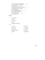
The table shows the number of
students in a class who
achieved each grade.
Grade
Number of
Students
Distinction
5
Merit
8
Pass
9
Fail
2
Student Grades
Fail
8%
Distinction
21%
Pass
38%
Merit
33%
1. There are three parts in the description of a chart: introduction, body and
conclusion.
Introduction should describe what the chart is about, its dates and location,
and say what overall trends you see.
Body should describe the most important trends, while all information is
summarized to avoid unnecessary details. Notes how many distinctive features
diagram has.
Important! You need to write about all the periods of time and all the subjects
of graph. Remember, summarizing doesn’t mean through away information.
The secret here is to select what’s important, organize it, compare and contrast.
Conclusion should sum up the global trends shown on the figure and compare
them if possible.
2. Language use:
The language and structures are given in the book.
Other language items:
+ make up less than … percent,
+ the most + adj, the second most + adj,
+ … substantially/ somewhat/ slightly more + adj than …,
+ … is about twice as + adj + as …, … three times as + adj + as …
UNIT 7: WORLD POPULATION
D. WRITING
The graph shows the chief uses of the
apple crop in the US. Overall, the bulk
of the harvest is either eaten fresh or
made into juice.
The biggest slice of the piechart is
taken up by fresh fruit. About 60% of
the crop is eaten fresh. This is three
times as much as the next use, which us
for juice. Less than 20% of apples in the
US are turned into apple juice. A further
12% is canned, and a total of 5% is
either frozen or dried. Other remaining
uses, such as apple vinegar, account for
just 5% of the crop.
It’s clear that although a small amount
of apples are processed into frozen,
dried or canned products, most of the
crop is sold straight from the tree.
Uses of Apples,
USA
Frozen Dried
3% Other
2%
5%
Canned
12%
Juice
18%
Fresh Fruit
60%
UNIT 7: WORLD POPULATION
D. WRITING
Sample writing
The pie chart shows the distribution of
the world population by region. Overall,
more than half of the world’s population
lives in South and East Asia.
South Asia is the biggest region, making
up 32% of the world population. The
second largest area is East Asia with
26% less than South Asia. Europe ranks
third with 15%. Coming next is Africa
with 11%. Together, Latin America and
North America have 14 % of the world
population. Finally, Oceania is the least
populated region with the smallest
percentage of 2%.
As can be seen, the greatest
concentration of the world’s population
is in Asia, with Europe far behind.
The world population
Oceania
2%
Northern
America
6%
Latin
America
8%
Africa
11%
South Asia
32%
x
x
Europe
15%
East Asia
26%
x
HOMEWORK
Complete the passage and compare with your partner .