Tài liệu LWUIT 1.1 for Java ME Developers- P4 ppt
Bạn đang xem bản rút gọn của tài liệu. Xem và tải ngay bản đầy đủ của tài liệu tại đây (1.34 MB, 50 trang )
Chapter 6
[ 137 ]
We could have also used a constructor that does not specify rows and columns.
TextArea demoText = new TextArea();
In that case, the text area would appear as shown in the following screenshot:
The Select key needs to be clicked on to enter text into the text area. This will open a
javax.microedition.lcdui.TextBox for editing. By default, a text area is editable.
Editability can be disabled by calling the setEditable method as follows:
demoText.setEditable(false);
Text can be entered using the keyboard of the actual physical device on which the
application is running. Clicking on the Cancel command will abort editing, while
the Menu command provides an option for saving the entered text so that it can be
displayed in the text area.
This material is copyright and is licensed for the sole use by William Anderson on 26th August 2009
4310 E Conway Dr. NW, , Atlanta, , 30327Please purchase PDF Split-Merge on www.verypdf.com to remove this watermark.
TextArea and TextField
[ 138 ]
Although we can specify the size of a text box (in terms of rows and columns) while
creating it, a text box can be subsequently resized. The following statements, when
uncommented, will alter the number of rows and columns.
//demoText.setRows(2);
//demoText.setColumns(5);
The resulting text box will look like this:
When the content grows beyond a single line, the text is rendered with a default gap
of two pixels between successive lines.
This gap between the two lines can be changed by using the following statement:
demoText.setRowsGap(20);
This increases the interline gap to 20 pixels, as we can see in the following screenshot:
This material is copyright and is licensed for the sole use by William Anderson on 26th August 2009
4310 E Conway Dr. NW, , Atlanta, , 30327Please purchase PDF Split-Merge on www.verypdf.com to remove this watermark.
Chapter 6
[ 139 ]
A text area has the exibility to grow beyond the rows and columns originally set
by the constructor. This is a default property, and we can see the increase in size as
we enter input beyond the original capacity. However, this elasticity is subject to the
limit set by the maximum size dened for the instance.
This automatic increase in size can be disabled by using the statement below:
demoText.setGrowByContent(false);
The fact that the text area will not grow with increasing content does not mean that
input beyond the original setting for the number of rows will be restricted. What will
happen is the dimensions of the text area will remain xed at the original value, and
a scrollbar will be added when required.
A text area, in its basic form, is unable to handle formatting characters like "\\t",
the tab character. Furthermore, certain font settings may cause problems with some
specic characters. The TextArea class has two methods that allow developers to
make provisions for handling such cases. The rst method is setUnsupportedCha
rs(String unsupportedChars)
, which denes a string of problematic characters
that can be removed while rendering the text area content. The other method is the
protected method preprocess(String text), which can be used in a subclass of
TextArea to replace such characters as "\\t" with a predened number of spaces to
implement tab setting.
This material is copyright and is licensed for the sole use by William Anderson on 26th August 2009
4310 E Conway Dr. NW, , Atlanta, , 30327Please purchase PDF Split-Merge on www.verypdf.com to remove this watermark.
TextArea and TextField
[ 140 ]
Earlier we had seen that the TextArea class provides a set of constraints that allow
us to specify the nature of the input that can be accepted by the text area instance—
subject to native platform support. One of the common types of input that an
application usually handles is a password. A password may be allowed to include
any character. However, the actual entry is required to be obfuscated by substituting
a symbol (usually '*') for the characters entered. To implement this capability in our
text area, we need to use the statement shown:
demoText.setConstraint(TextArea.ANY|TextArea.PASSWORD);
This will make sure that the password is hidden during editing as shown in the
following screenshot:
When the password has been entered and the main screen is displayed, the password
continues to remain hidden.
An interesting feature of TextArea is that we can control the number of lines for
scrolling. The following statements will set a multiline text, and specify that scrolling
should move the text by three lines.
//set a multiline text
demoText.setText("Line1\nLine2\nLine3\nLine4\nLine5\nLine6\nLine7\
nLine8\nLine9\nLine10\nLine11\nLine12\nLine13\nLine14\nLine15");
//set number of lines for scrolling
demoText.setLinesToScroll(3);
This material is copyright and is licensed for the sole use by William Anderson on 26th August 2009
4310 E Conway Dr. NW, , Atlanta, , 30327Please purchase PDF Split-Merge on www.verypdf.com to remove this watermark.
Chapter 6
[ 141 ]
The previous screenshot shows that Line5 is the rst line on the text area. Now, if we
scroll down by pressing the Down button once, then we can expect Line8 to take the
top-most position. The next screenshot shows that our objective has been achieved:
A text area conveys that it has been modied by ring an ActionEvent. In the
following snippet, we add an ActionListener to print a message on the console:
demoText.addActionListener(new ActionListener()
{
public void actionPerformed(ActionEvent ae)
{
System.out.println("Text Area Modified");
}
});
This material is copyright and is licensed for the sole use by William Anderson on 26th August 2009
4310 E Conway Dr. NW, , Atlanta, , 30327Please purchase PDF Split-Merge on www.verypdf.com to remove this watermark.
TextArea and TextField
[ 142 ]
Now, if we edit the text, the message will be printed when the editing is completed,
and the text area comes back on the screen.
The TextArea class provides a multiline space for text display. In order to create a
single-line text display that can allow
in situ editing without invoking a text box, we
can use an instance of TextField, as we shall see in the next section.
The TextField class
The TextField class is an inelastic single-line version of the TextArea class that can
be edited optionally without opening a separate screen. While it never grows beyond
a single line, it can accept long texts. The limitation lies in the fact that only one line
will be displayed, and the line width will be limited by the available screen area.
Creating a TextField
We can choose from a set of four constructors for creating an instance of the
TextField class.
Constructor Parameters Description
TextField()
Creates an empty text eld.
TextField(int
columns)
columns—the number
of columns
Creates an empty text eld with
the given number of columns.
TextField(String
text)
text—initial text to
be displayed
Creates a text eld with the
given initial text.
TextField(String
text,
int
columns)
text—initial text to
be displayed
columns—the number
of columns
Creates a text eld with the
given initial text and the number
of columns.
This material is copyright and is licensed for the sole use by William Anderson on 26th August 2009
4310 E Conway Dr. NW, , Atlanta, , 30327Please purchase PDF Split-Merge on www.verypdf.com to remove this watermark.
Chapter 6
[ 143 ]
When we compare the list of constructors mentioned in the given table with that
for TextArea, we can see that there is no mention of constraints here. This is because
constraints are not fully implemented for this class, and the only constraint that
works for a text eld is TextArea.PASSWORD.
The methods of the TextField class
A signicant difference between TextField and TextArea is that the former
supports "in place" editing, that is, editing without opening a native text box. So we
nd a wide range of methods that deal with the various aspects of in situ editing
here. In addition to these, the
TextField class has methods for styling and for
specifying other behavioral aspects like the corresponding methods of TextArea. The
TextField class also inherits a number of methods from its superclass TextArea.
We shall now build a
TextField example, just as we did for TextArea, and see how
this widget can be congured using the constructors and methods of the class.
Checking out TextField
The rst part of the MIDlet—DemoTextField—initializes Display and creates the
form. This part is the same as in our other examples. The difference begins when we
add more commands to the form than we have been doing so far.
//commands for changing text field behaviour
Command REPLACE_CMD = new Command("Overwrite");
Command INSERT_CMD = new Command("Insert");
.
.
.
demoForm.addCommand(new Command("Exit"));
demoForm.addCommand(new Command("Resize"));
demoForm.addCommand(REPLACE_CMD);
As the form now has three commands and we are using it in the two soft button
mode, the last two commands will be shown through a menu. Commands on a menu
are implemented as a list. The styling for this can be done through the corresponding
renderer, which is the MenuCellRenderer in this case. So our next step is to install
the MenuCellRenderer and to style it after setting the base (background) color for
the menu.
demoForm.getMenuStyle().setBgColor(0x555555);
DefaultListCellRenderer dlcr = new DefaultListCellRenderer();
demoForm.setMenuCellRenderer(dlcr);
Style mStyle = new Style();
mStyle.setFgColor(0x99cc00);
This material is copyright and is licensed for the sole use by William Anderson on 26th August 2009
4310 E Conway Dr. NW, , Atlanta, , 30327Please purchase PDF Split-Merge on www.verypdf.com to remove this watermark.
TextArea and TextField
[ 144 ]
mStyle.setFgSelectionColor(0xffffff);
mStyle.setBgSelectionColor(0x0000ff);
mStyle.setFont(Font.createSystemFont(Font.FACE_SYSTEM,Font.
STYLE_PLAIN,Font.SIZE_MEDIUM));
dlcr.setStyle(mStyle);
Style sbStyle = new Style();
sbStyle.setBgColor(0x555555);
sbStyle.setFgColor(0x99cc00);
sbStyle.setFont(Font.createSystemFont(Font.FACE_PROPORTIONAL,
Font.STYLE_BOLD,Font.SIZE_MEDIUM));
UIManager.getInstance().setComponentStyle(
"SoftButton", sbStyle);
The above snippet also shows that the style for all soft buttons has been set. This
determines the styling for the soft buttons associated with the menu. However, the
soft buttons for the form have been styled separately, and they are not affected by
the styling done here.
Having taken care of the menu, we now turn our attention to creating a text eld.
Before invoking a text eld constructor, we shall install a style for the text elds.
Style txtStyle = new Style();
txtStyle.setFgColor(0xe8dd21);
txtStyle.setFgSelectionColor(0xe8dd21);
txtStyle.setBgColor(0xff0000);
txtStyle.setBgSelectionColor(0xff0000);
txtStyle.setBgTransparency(80);
txtStyle.setFont(Font.createSystemFont(Font.FACE_PROPORTIONAL,
Font.STYLE_BOLD,Font.SIZE_MEDIUM));
txtStyle.setBorder(Border.createRoundBorder(10, 7, 0xe8dd21));
UIManager.getInstance().setComponentStyle(
"TextField", txtStyle);
demoText = new TextField(5);
This results in a text eld without any initial content and with a width of 5 columns.
We can see this text eld in the following screenshot. Note the cursor shown as a line
at the left edge of the text eld.
This material is copyright and is licensed for the sole use by William Anderson on 26th August 2009
4310 E Conway Dr. NW, , Atlanta, , 30327Please purchase PDF Split-Merge on www.verypdf.com to remove this watermark.
Chapter 6
[ 145 ]
A click on the Menu soft button causes the menu to pop up. The styling of the menu
can be seen clearly in the following screenshot:
It is not necessary to use the menu to enter text. All we need to do is click on the
Select key. This sets up the text eld for editing in place without opening a native text
box. The input mode is shown on the right edge. In this case, the mode is the normal
text entry mode in which the rst letter of a sentence is capitalized.
Text entry is now possible through a numeric keypad, as we do on a phone; press
key '2' once to enter 'a' and twice in rapid succession to enter 'b' and so on.
This material is copyright and is licensed for the sole use by William Anderson on 26th August 2009
4310 E Conway Dr. NW, , Atlanta, , 30327Please purchase PDF Split-Merge on www.verypdf.com to remove this watermark.
TextArea and TextField
[ 146 ]
If we continue to enter text, then it will be accepted, but only a small part of it will be
displayed. However, we can resize the text eld if we want by selecting the Resize
command on the menu.
The resizing code is in the actionPerformed method of the MIDlet:
public void actionPerformed(ActionEvent ae)
{
Command cmd = ae.getCommand();
if(cmd.getCommandName().equals("Exit"))
{
notifyDestroyed();
}
else
{
if(cmd.getCommandName().equals("Overwrite"))
{
demoText.setOverwriteMode(true);
demoForm.removeCommand(REPLACE_CMD);
demoForm.addCommand(INSERT_CMD);
}
else
{
if(cmd.getCommandName().equals("Insert"))
{
demoText.setOverwriteMode(false);
demoForm.removeCommand(INSERT_CMD);
demoForm.addCommand(REPLACE_CMD);
}
else
{
if(cmd.getCommandName().equals("Resize"))
{
if(demoText.getColumns() < 20)
{
This material is copyright and is licensed for the sole use by William Anderson on 26th August 2009
4310 E Conway Dr. NW, , Atlanta, , 30327Please purchase PDF Split-Merge on www.verypdf.com to remove this watermark.
Chapter 6
[ 147 ]
demoText.setColumns(20);
}
else
{
demoText.setColumns(5);
}
}
}
}
}
.
.
}
The setColumns method is used to change the size of demoText on the y. The code
uses the getColumns method to access and check the present size of the text eld. If
the size is less than 20 columns, then it is increased to 20. Otherwise, it is reduced to
5. The Resize command thus effectively toggles the size of demoText between 5 and
20 columns.
The other commands that are handled in the
actionPerformed method (other than
the ubiquitous Exit command) are Overwrite and Insert. These commands control
the mode of text entry—in the Insert mode, new characters are inserted at the cursor
position, whereas in the Overwrite mode, the character at the cursor position is
replaced by the one entered. The code for handling these commands ensures that
only one of these two commands appears on the menu at a particular time. So, while
the Insert mode is active, the Overwrite command is on the menu and vice versa. The
default mode is Insert.
The other input mode, as we have already noted, is the one that is shown on the right
edge of the text eld while editing. During text entry, we can select other modes
(numeric, all caps or all lower case) by pressing the # key. Incidentally, the mode
control function of this key can be shifted to any other key by calling the
setDefaul
tChangeInputModeKey(int keycode)
method, which sets the key specied by the
parameter keycode as the one that will change this input mode.
This material is copyright and is licensed for the sole use by William Anderson on 26th August 2009
4310 E Conway Dr. NW, , Atlanta, , 30327Please purchase PDF Split-Merge on www.verypdf.com to remove this watermark.
TextArea and TextField
[ 148 ]
The TextField class allows us to track changes in its content through a
DataChangedListener. The addDataChangeListener method can be called to
add a
DataChangedListener as we have done here. This listener has to implement
the
dataChanged method, which gets two parameters—type and index, both of
which are
ints. The parameter type indicates what kind of change has taken place.
The possible values are ADDED, CHANGED, and REMOVED, and the corresponding int
values are 1, 2, and 0. The other parameter—index is the position where the change
has taken place. Our new DataChangedListener prints out a message when a new
character is entered.
Let us now take a look at the menu as it appears during editing. You will see that
two new commands have been added. These commands are Clear and Edit.
These commands are added by LWUIT when in-place editing is initiated. The actual
name of the command that appears as Edit here is T9, and it opens a native text box.
We have used the static method setT9Text to change this name to Edit. As this is
a static method, it effects the change for all text elds that are instantiated after this
method is invoked. In our MIDlet, the statement for renaming the T9 command is
placed just before demoText is created.
This material is copyright and is licensed for the sole use by William Anderson on 26th August 2009
4310 E Conway Dr. NW, , Atlanta, , 30327Please purchase PDF Split-Merge on www.verypdf.com to remove this watermark.
Chapter 6
[ 149 ]
When these two commands are added, the original commands of the form are
removed by default. To prevent the form commands in our example from being
removed, the following statement has been used:
demoText.setReplaceMenu(false);
Note that the handling of commands here is different from that in our other
examples. Here we act on the basis of a command's name rather than its ID. One
reason for doing this is to emphasize the convenience (and neatness) of using the
ID-based approach. But there is another reason too. When a command is created
using only its name, the ID defaults to 0. The IDs of both commands added for
editing (Clear and Edit) have this default value, and this would cause a problem
since our Exit command also has an ID of 0. Of course, we could have solved this
problem in other ways too. For example, we could have used non zero IDs for our
commands. However, I wanted to use this opportunity to show how neat the ID
based approach can be, especially when a signicant number of commands have
to be acted on.
The
TextArea class uses a number of constraints as an indication for entering special
types of data such as a password. The TextField class, as we know, ignores all such
elds except TextField.PASSWORD. As in a text area, the following line of code hides
a password in a text eld:
demoText.setConstraint(TextArea.PASSWORD);
A password entered would now look like this.
TextField, unlike TextArea, displays a blinking cursor to mark the current text
entry position. We can shift the cursor programmatically, and we can also change the
blink on and off times. To set the blink times, uncomment the following lines in the
MIDlet. You will see that the default blink on time (800 milliseconds) and off time
(200 milliseconds) have changed, and the cursor now stays visible for 2 seconds and
invisible for 2 seconds.
//demoText.setCursorBlinkTimeOn(2000);
//demoText.setCursorBlinkTimeOff(2000);
This material is copyright and is licensed for the sole use by William Anderson on 26th August 2009
4310 E Conway Dr. NW, , Atlanta, , 30327Please purchase PDF Split-Merge on www.verypdf.com to remove this watermark.
TextArea and TextField
[ 150 ]
We can shift the cursor position quite easily. Uncomment the statements shown
below (the rst one in the
startApp method and the rest in the actionPerformed
method). A new command, Home, will now be added to the menu. Enter some
text, and then select the Home command. The cursor will move to the extreme
left position.
//demoForm.addCommand(new Command("Home"));
.
.
.
/*if(cmd.getCommandName().equals("Home"))
{
demoText.setCursorPosition(0);
}*/
During in-place editing, the interval for automatic commit of an entry is 1 second. If
the same key press is repeated within this time, then it is considered to be a multiple
stroke, and the character to be entered is determined accordingly. On the other
hand, if no key press occurs within this time, then the character determined by the
last press is committed. The default value of 1 second for the commit timeout can be
changed through the setCommitTimeout(int commitTimeout) method, where the
commitTimeout parameter is the desired new value in milliseconds.
Summary
In this chapter, we have seen how to use text areas and text elds. These two widgets
provide very exible but easy to use UIs for the display, entry, and editing of text. A
text area supports an operating region with adjustable dimensions that can be larger
than that available with a text eld and with input constraints that permit us to tailor
the component instance for specic types of input. This makes a text area suitable
for showing and writing comparatively large and varied text contents. On the other
hand, a text eld is a component that is very convenient for short texts. A special
feature of text elds is that they can be edited in-place through a simple but highly
versatile interface. Together, these two components provide attractive text handling
capabilities with a uniform look and feel over a wide range of devices.
This material is copyright and is licensed for the sole use by William Anderson on 26th August 2009
4310 E Conway Dr. NW, , Atlanta, , 30327Please purchase PDF Split-Merge on www.verypdf.com to remove this watermark.
Arranging Widgets with
Layout Managers
Arranging components on a screen can be a tricky business. For instance, any
manual arrangement that depends on a particular display dimension to look
good is very likely to disappoint on a device with a different screen size. LWUIT
provides a number of classes that automate the process of laying out components
on a container. These layout managers produce screen arrangements that are device
independent to a considerable extent. However, each class has its own characteristics
and needs to be used while keeping its capabilities in mind.
The root class for the layout classes is Layout, and it has six subclasses that perform
component arrangement, each in accordance with its operating algorithm. The six
layout classes are:
BorderLayout
BoxLayout
CoordinateLayout
FlowLayout
GridLayout
GroupLayout
There is also a supporting class LayoutStyle that takes care of the gaps between
two adjacent components and between a component and an adjoining edge of its
parent container.
In this chapter, we shall study all these classes, and as usual, we will analyze sample
code to see how they can be used.
•
•
•
•
•
•
This material is copyright and is licensed for the sole use by William Anderson on 26th August 2009
4310 E Conway Dr. NW, , Atlanta, , 30327Please purchase PDF Split-Merge on www.verypdf.com to remove this watermark.
Arranging Widgets with Layout Managers
[ 152 ]
The demos for this chapter are derived from the DemoLabel MIDlet. This MIDlet
has been modied to include the code for all six types of layout managers in clearly
demarcated sections. The sections are commented out, and the relevant portion will
have to be uncommented to try out an example of a specic type of layout. Just make
sure that the sections for other layout types have all been commented out.
Layout class
This is an abstract class that embodies the quintessential qualities of all the layout
managers. All the six layout classes are subclasses of Layout.
The default and only constructor of this class is
Layout(). However, we cannot
directly create an instance of this class, as it is abstract. To use a specic type of
layout, we have to instantiate an object of the corresponding class.
The methods of
Layout provide essential support for laying out elements on a
container. The following table lists these methods:
Method Parameters Description
void addLayoutCompo
nent(Object value,
Component comp,
Container c)
value—optional metadata
information like alignment
orientation.
comp—component to
be added.
c—parent container.
Provides an option allowing
users to furnish hints on
object positioning.
Object
getComponentCostraint
(Component comp)
comp—component whose
constraint is to be returned.
Returns the optional
constraint of the specied
component such as the
compass direction for a
component specied in a
border layout.
Dimension
getPreferredSize(
Container parent)
parent—the parent container Returns the preferred size
of the container. This is an
abstract method that must
be implemented by concrete
subclasses.
boolean
isOverlapSupported()
Returns true if components
are allowed to overlap.
void
layoutContainer(
Container parent)
parent—the parent container
for which layout is to be done.
Arranges elements for
the container. This is an
abstract method that must
be implemented by concrete
subclasses.
This material is copyright and is licensed for the sole use by William Anderson on 26th August 2009
4310 E Conway Dr. NW, , Atlanta, , 30327Please purchase PDF Split-Merge on www.verypdf.com to remove this watermark.
Chapter 7
[ 153 ]
Method Parameters Description
void
removeLayoutComponent
(Component comp)
comp—the component to be
removed.
Removes the specied
component from the layout.
This method will work
only if the layout manager
maintains references of the
components laid out by it.
The LayoutStyle class
The LayoutStyle class is used for specifying the spacing between two components
or between a component and an edge of the parent container. The spacing can
depend upon whether the components are logically grouped together or not. The
grouping relationship is used for accessing the preferred gap between components.
The eld LayoutStyle.RELATED indicates a logical grouping, while LayoutStyle.
UNRELATED
indicates that two components under reference are not related.
LayoutStyle does have a default constructor, but the usual way of getting an
instance of this class is to use the static method getSharedInstance(), which
returns the appropriate layout style instance.
The two other methods of this class provided for general use are tabulated below:
Method Parameters Description
int
getContainerGap(
Component component,
int position,
Container parent)
component—the component to
be positioned.
position—the position of
the component relative to the
container.
parent—the parent container.
Returns the space
between the component
and the container edge.
The specied position
must be one of the layout
constraints dened in
GroupLayout.
int
getPreferredGap(
Component component1,
Component component2,
int type, int position,
Container parent)
component1—the reference
component for placing
component2.
component2—the component
being placed.
type—the positional reletionship
as specied by RELATED,
UNRELATED or INDENT.
position—the desired position
of component2 relative to
component1.
parent—the parent container.
Returns the spacing to
be used between the
two components. The
specied position must
be one of the layout
constraints dened in
GroupLayout.
This material is copyright and is licensed for the sole use by William Anderson on 26th August 2009
4310 E Conway Dr. NW, , Atlanta, , 30327Please purchase PDF Split-Merge on www.verypdf.com to remove this watermark.
Arranging Widgets with Layout Managers
[ 154 ]
BorderLayout
BorderLayout provides ve positions for placing widgets on a screen—NORTH,
SOUTH, EAST, WEST, and CENTER. The gure below shows how these positions
are dened.
SOUTH
W
E
S
T
E
A
S
T
NORTH
CENTER
BorderLayout inserts components in the following order.
Position Insertion Order Remarks
NORTH First Expands laterally to occupy all available
horizontal space. Height determined by content.
SOUTH Second Expands laterally to occupy all available
horizontal space. Height determined by content.
EAST Third Expands to occupy all available vertical space.
Width determined by content.
WEST Fourth Expands to occupy all available vertical space.
Width determined by content.
CENTER Last Expands to occupy all remaining space.
In order to see how a border layout is used, refer to the code for the DemoLayout
MIDlet. The relevant section for border layout is given below:
/*****Start of BorderLayout statements*****/
BorderLayout testLayout = new BorderLayout();
demoForm.setLayout(testLayout);
demoForm.setTitle("BorderLayout");
//demoForm.setScrollableX(true);
//tLabel.setFocusable(true);
//imLabel.setFocusable(true);
//bothLabel.setFocusable(true);
This material is copyright and is licensed for the sole use by William Anderson on 26th August 2009
4310 E Conway Dr. NW, , Atlanta, , 30327Please purchase PDF Split-Merge on www.verypdf.com to remove this watermark.
Chapter 7
[ 155 ]
demoForm.addComponent(BorderLayout.NORTH, tLabel);
//demoForm.addComponent(BorderLayout.EAST, tLabel);
demoForm.addComponent(BorderLayout.SOUTH, imLabel);
//demoForm.addComponent(BorderLayout.WEST, imLabel);
demoForm.addComponent(BorderLayout.CENTER, bothLabel);
/*****End of BorderLayout statements*****/
To create an instance of BorderLayout, we use the default (and only) constructor
of the class, and install it on demoForm using the setLayout(Layout layout)
method. At this point, let us recollect that the default layout manager for
Form is
the BorderLayout (refer to Chapter 3). One can therefore legitimately ask why is
it necessary to install a brand new instance of BorderLayout, if a form already has
a default border layout. The answer is that components are not added directly to
a form but to its content pane, and the default layout manager for a content pane
is FlowLayout. The setLayout method actually installs a layout manager for the
content pane.
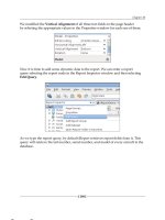
By default, a form is not scroll enabled along the x-axis. Calling the
setScrollableX
method on a form enables the horizontal scroll bar. The next three statements
explicitly override a default characteristic of labels and make them capable of
receiving focus. We do all this to see how screens are laid out when there are more
widgets than the layout manager can accommodate within the width of the device.
These statements have been commented out in the code listing. We shall uncomment
them later to check out their effect on the screen layout.
Let us now add three labels in the NORTH, SOUTH, and CENTER positions. The
method that has to be used is
addComponent(Object constraints, Component
cmp)
, where the value of the desired position is passed as constraints and can be
one of NORTH, SOUTH, EAST, WEST or CENTER. The rst combination we try is:
Component Position
tLabel NORTH
imLabel SOUTH
bothLabel CENTER
This material is copyright and is licensed for the sole use by William Anderson on 26th August 2009
4310 E Conway Dr. NW, , Atlanta, , 30327Please purchase PDF Split-Merge on www.verypdf.com to remove this watermark.
Arranging Widgets with Layout Managers
[ 156 ]
The screen looks like this:
As expected, tLabel was added rst. Its height was determined by the font size of its
text, and the width was increased to take up all the horizontal space on the form. The
same holds true for imLabel, which was added next. Finally, bothLabel was added,
and all the remaining space was allocated to it.
Next, we shall change the positioning, as specied by the statements shown below.
//demoForm.addComponent(BorderLayout.NORTH, tLabel);
demoForm.addComponent(BorderLayout.EAST, tLabel);
//demoForm.addComponent(BorderLayout.SOUTH, imLabel);
demoForm.addComponent(BorderLayout.WEST, imLabel);
demoForm.addComponent(BorderLayout.CENTER, bothLabel);
This material is copyright and is licensed for the sole use by William Anderson on 26th August 2009
4310 E Conway Dr. NW, , Atlanta, , 30327Please purchase PDF Split-Merge on www.verypdf.com to remove this watermark.
Chapter 7
[ 157 ]
The result is shown in the following screenshot.
We see here that bothLabel has practically disappeared. The sequence of component
insertion by BorderLayout explains this. The rst component to be handled this time
was tLabel. Its width was determined by the width of the string, and its height was
set so that all the available vertical space could be occupied. The next component to
be sized was
imLabel, and the horizontal space allocated to it was calculated on the
basis of the image size. By the time the last component—
bothLabel—could be taken
up, the remaining space along the x-axis was only sufcient to render the borders.
This material is copyright and is licensed for the sole use by William Anderson on 26th August 2009
4310 E Conway Dr. NW, , Atlanta, , 30327Please purchase PDF Split-Merge on www.verypdf.com to remove this watermark.
Arranging Widgets with Layout Managers
[ 158 ]
The solution to this problem is to enable the horizontal scrollbar and to make the
labels focusable. We can now see that the scrollbar has been added for the x-axis.
Also, the directional navigation keys can be used to move focus from one label to
another, thereby scrolling the screen to the left or to the right.
Before moving on, let's try one more combination of positions.
demoForm.addComponent(BorderLayout.NORTH, tLabel);
//demoForm.addComponent(BorderLayout.EAST, tLabel);
//demoForm.addComponent(BorderLayout.SOUTH, imLabel);
demoForm.addComponent(BorderLayout.WEST, imLabel);
demoForm.addComponent(BorderLayout.CENTER, bothLabel);
This time tLabel will be added rst and can be expected to take up all the horizontal
space along its x-axis. imLabel is added next and will take up the vertical space left
after sizing tLabel. Finally, bothLabel will get the remaining space. The following
screenshot shows that this is indeed what happens:
This material is copyright and is licensed for the sole use by William Anderson on 26th August 2009
4310 E Conway Dr. NW, , Atlanta, , 30327Please purchase PDF Split-Merge on www.verypdf.com to remove this watermark.
Chapter 7
[ 159 ]
When components on a screen are arranged without due consideration for an
appropriate layout manager, the result can be disappointing if the application runs
on devices with different screen dimensions. In order to appreciate this, let us see
what happens when we run the DemoButton example (using FlowLayout) that we
encountered in Chapter 4 on a device with a smaller screen than that of the device
used earlier.
This material is copyright and is licensed for the sole use by William Anderson on 26th August 2009
4310 E Conway Dr. NW, , Atlanta, , 30327Please purchase PDF Split-Merge on www.verypdf.com to remove this watermark.
Arranging Widgets with Layout Managers
[ 160 ]
The resulting display is quite different from what we saw in the original example
and is denitely not what we would want. The consistency of a layout can improve
signicantly when we use
BorderLayout. The next screenshot shows the result
achieved with
BorderLayout for a device with a comparatively large screen.
On a device with a smaller screen, the arrangement remains essentially the same
with a vertical scrollbar automatically added to accommodate all the buttons within
a relatively smaller area.
This material is copyright and is licensed for the sole use by William Anderson on 26th August 2009
4310 E Conway Dr. NW, , Atlanta, , 30327Please purchase PDF Split-Merge on www.verypdf.com to remove this watermark.
Chapter 7
[ 161 ]
One limitation of BorderLayout is that it can handle a maximum of ve components
(one in each position). It also changes dimensional proportions to use up the
available space, and this can distort the appearance of a widget. The choice of a
layout manager is therefore dependent on the type of components that are to be
laid out. One notable example of an appropriate use of BorderLayout is the form
itself, which adds the title bar in the NORTH position, the menu bar in the SOUTH
position, and the content pane in the CENTER position. Now we understand why
the default layout manager of a form is BorderLayout and not FlowLayout, as in the
case of a container.
BoxLayout
This layout manager places widgets along a row or a column in accordance with
the specied orientation. The code for using BoxLayout in our sample MIDlet is
given below.
/*****Start of BoxLayout statements*****/
BoxLayout testLayout = new BoxLayout(BoxLayout.X_AXIS);
//BoxLayout testLayout = new BoxLayout(BoxLayout.Y_AXIS);
demoForm.setLayout(testLayout);
demoForm.setTitle("BoxLayout");
//demoForm.setScrollableX(true);
tLabel.setFocusable(true);
imLabel.setFocusable(true);
bothLabel.setFocusable(true);
demoForm.addComponent(tLabel);
demoForm.addComponent(imLabel);
demoForm.addComponent(bothLabel);
/*****End of BoxLayout statements*****/
BoxLayout has one constructor, which takes an orientation eld as its only
parameter. The orientation is horizontal when the parameter is X_AXIS and
vertical when the parameter is Y_AXIS.
This material is copyright and is licensed for the sole use by William Anderson on 26th August 2009
4310 E Conway Dr. NW, , Atlanta, , 30327Please purchase PDF Split-Merge on www.verypdf.com to remove this watermark.


