Tài liệu 3D Game Programming All in One- P15 pdf
Bạn đang xem bản rút gọn của tài liệu. Xem và tải ngay bản đầy đủ của tài liệu tại đây (928.24 KB, 30 trang )
Hair and Hands
Next we'll tackle the hair and
hands of the Standard Male.
We'll do these two together
because they both use skin
(flesh) tones (the guy is going to
have a bald spot). Once these
are done, we are finished with
the skin part of the skin. Or
something like that.
Both of the next subsections
will be using the skin layer in
addition to other layers.
Hair Textures
Hair has a pattern, though not a specific pattern. There is often quite a bit of randomness,
but nonetheless there is a grain, if you will, like the grain in a wooden plank or the lay of
a lawn. There's a clue there!
Try this:
1. Locate the hair portion of the UV template in your working file, player.psp.
2. Draw an object that encompasses the hair, and set the fill to match the color of the
hair you used in the bits that show in the head area as in Figure 9.32.
3. Copy that object and paste the
copy into another new layer.
Modify the fill of that object.
(Reminder: You can do this by
double-clicking on the object with
the Object Select tool and then
clicking on the Fill color box.)
4. Set the hair RGB color value to
those listed in Table 9.5.
5. Select the Texture check box.
6. Click the Current Texture dis-
play box and select Grass02 from the list that pops up.
7. Set Angle to 90 and Scale to 50.
Making a Player Skin 327
Figure 9.31 Finished face and neck.
Figure 9.32 Filled hair template area.
Team LRN
Please purchase PDF Split-Merge on www.verypdf.com to remove this watermark.
8. Click OK to close the Color dialog box and then again to close the Properties dia-
log box. You will get something similar to Figure 9.33.
9. Merge the new layers you created with your skin layer, using the Merge Visible
technique I showed you earlier.
10. After you do this, the layer will be named "Merged". Rename it to "Skin" again, by
right-clicking on the layer's name in the Layer palette, choosing Rename, and then
typing in the name.
11. Now for the bald spot. If you look at
how the triangles in the UV template
are arranged you can see that the
upper-left corner of the hair area and
the upper-right corner of the hair area
meet when they are wrapped back
onto the model. The place where they
meet is the crown of the head, which
just so happens to be one of the two
places where classic male-pattern
baldness begins!
Choose the Air Brush and set its size
to about 32, its density to about 25,
and its foreground color to the high-
light flesh tone found in Table 9.4.
12. In each of the corners, spray some
bald skin on, sparser toward the inner
areas and denser as you move toward
the corners, until you have a substan-
tial patch of bare skin and a sur-
rounding area of varying thinness
(see Figure 9.34). Don't worry about
overspraying the edges, those areas
outside are not going to be rendered.
Chapter 9
■
Skins328
Table 9.5 Hair Color RGB Settings
Color Component Value
Red 251
Green 178
Blue 129
Figure 9.33 Textured hair.
Figure 9.34 The font of wisdom under
construction—the bald spot.
Team LRN
Please purchase PDF Split-Merge on www.verypdf.com to remove this watermark.
The Hands
The hands need to be skinned on three sides. You should use the basic
flesh tone, with some shadow color for areas between the fingers.
1. Once again using the Pen tool with the Point to Point Segment
Type, draw an object that surrounds the area that comprises the
hand UV template (Figure 9.35).
2. Set the fill color of the object you just made to the basic flesh
tone.
3. Start a new vector layer.
4. Using the Pen tool with the Segment Type set to Freehand, Line
Width set to 2.0, and Color set to black, draw the lines that sep-
arate the fingers. Use Figure 9.36 as a guide.
5. Put the Pen tool back into Point to Point mode, and draw a fin-
gernail. Make sure the line color is black, and use a
fairly bright pink for the fill color.
6. Place your lines and fingernails appropriately (as
in Figure 9.36), and fiddle with the shapes until
you are happy.
7. Set the opacity of the layer to about 10 or so. That
bright pink fingernail color is not so bright any-
more.
8. Merge the two layers you just created into the skin
layer.
9. Using the touchup brushes (ninth from the bot-
tom of the Tools toolbar) and the Air Brush tool,
add shading and irregularity to the lines as in Fig-
ure 9.37.
10. Weaken some of the darker lines. Add lighter high-
lights around the main knuckles and darker wrin-
kles around the other knuckles.
11. Eventually you will arrive at something that works
for you, similar to Figure 9.38.
The Clothes
We'll spend most of our time remaining in this chapter
working on the jacket. You've already learned and applied
almost all of the new skills required to do the clothing.
Making a Player Skin 329
Figure 9.35
Hand area.
Figure 9.36 Finger lines and
fingernails.
Figure 9.37 Adding hand
details.
Team LRN
Please purchase PDF Split-Merge on www.verypdf.com to remove this watermark.
The Jacket
It's a leather jacket. Quite a nice one too. Wouldn't mind
one like that myself! The color is a basic brown, with the
usual darker shadows and lighter highlights, just like with
the flesh tones. Things to note are that the jacket "blouses"
at the waist and at the cuffs. This is a wrinkling effect that
occurs as the material is gathered in for the seam work in
those areas.
1. Start off by drawing objects around the back, the front,
the waist, the cuffs, the collar, and the sleeves in a fash-
ion similar to what we've done in the past (see Figure
9.39). Make sure you do this on a new layer and name
it "Jacket".
2. Set the fill color to the basic brown, using the values
shown in Table 9.6.
3. On the Tool Options palette, just to the right of the
Presets box, is another box with brush configuration
choices. Click on that box, and then choose Small Bris-
tles Hard from the icon list.
4. To get that stippled leathery look,
choose the Air Brush and set it as
shown in Table 9.7.
Chapter 9
■
Skins330
Figure 9.38 The finished
hands.
Figure 9.39 The jacket pieces.
Table 9.6 Jacket Color RGB
Settings
Color Component Value
Red 140
Green 68
Blue 62
Team LRN
Please purchase PDF Split-Merge on www.verypdf.com to remove this watermark.
5. Merge all your new layers onto the skin layer.
6. Spray the leather areas of the jacket with short sharp strokes—just enough to get
the stippled look to appear. Do this for all the leather areas: back, front, collar, and
sleeves. Figure 9.40 gives an idea what I've done: The back (on the left) has the
stippled look, while the visible part of the front (on the right) does not.
7. Use the Lighten/Darken brush (the tenth brush down in the Tool palette) to make
the contours of the gathers at the bottom of the front of the jacket.
8. Use the Smudge brush and the other touchup brushes to tweak the contours to
your liking (for example, as in Figure 9.41).
9. You can create the zipper and the zipper flap by using the Pen tool to draw a line
from the neck to the bottom. Make one line with a width of about 3.0, and then
copy it and paste the copy next to
the original line.
10. Edit the properties of the new line
and change its width to 7. This will
be the flap.
11. Merge the new layers to the skin
layer, and then touch up the zipper
area with stippling and make other
tweaks to get it to coordinate with
the other areas of the jacket.
12. You can do all the other areas of
the jacket in the same way as
shown in steps 4 to 11.
Making a Player Skin 331
Table 9.7 Air Brush Settings
Setting Value
Shape Round
Size 26
Hardness 100
Step 10
Density 50
Thickness 100
Rotation 0
Opacity 90
Blend Mode Normal
Rate 5
Figure 9.40 Getting close to that leathery look.
Team LRN
Please purchase PDF Split-Merge on www.verypdf.com to remove this watermark.
The Trousers
The trousers can be done using exactly
the same techniques as used for the jack-
et. You just need to use different colors
and perhaps a different texture or air-
brush density or step value. By now, you
should be pretty handy with the toolkit
in Paint Shop Pro, so I'll leave you to do
the trousers on your own. Don't forget to
make a belt—it goes at the bottom of the
trouser area in the UV template.
The Boots
The final area to apply texture to is the boot area. Again, you've practiced all the tech-
niques required to make the boots as well. There is one thing I want to show you, though,
that will help, and that is the built-in textures in the Color dialog boxes.
If you click on the Color box in the Materials palette, or the Color box in the Properties
dialog box of an object, you will see a tab for Patterns, and then to the right side, a box for
Textures. The textures will be applied to whatever color mode (tab) you have selected, so
that you can have, say, tex-
tures applied to patterns. In
the Pattern list there is a
Tire Tread pattern that
would be suitable for the
bottom of the heel of a
boot, and in the Textures
list there are many textures
that would be suitable for
different parts of the boot.
Make sure you save your
work in player.psp, and
then save another version
as C:\3DGPAi1\resources\
ch9\player.jpg.
Figure 9.42 shows the com-
plete skin for the Standard
Male.
Chapter 9
■
Skins332
Figure 9.41 That leathery look.
Figure 9.42 Standard Male skin.
Team LRN
Please purchase PDF Split-Merge on www.verypdf.com to remove this watermark.
Trying It On for Size
As you learned earlier in the chapter, you can use the Show Book Models shortcut and load
the player.dts model. You will be able to view the Standard Male character with your new
skin on it. You'll probably see areas that need fixing up, and so go ahead and do just that.
Moving Right Along
In this chapter you learned how UV unwrapping relates to the texture files known as skins.
And you learned how to apply that understanding to images for game objects ranging
from the simple (a soup can) to the complex (a human character).
I hope you also take away from the chapter the idea that hand-drawn concept artwork is
a useful tool. Draw everything in sketch form before you start working on your models.
It's a great help.
Finally, you can see that a fully featured image processing tool like Paint Shop Pro has
quite a few features to ease the effort of creating images for skins. We've only scratched the
surface of what the program can do. Don't be shy about using Paint Shop Pro's built-in
Help utility. It's well done and chock-a-block-full of information.
If you want to make great skins, you are going to need to practice, practice, and practice
some more. Here are some of the many ways to do this:
■
Create your own models and make the skins.
■
Make skins for other people's models.
■
Make skins for other people for popular games like Half-Life and Tribes.
■
Make monster skins, policeman skins, airplane skins, light pole skins.
■
Make a set of stock skins.
■
Make skin templates that you can use to make the skinning task easier.
But most of all, get down and do it!
In the next chapter, we will continue with the visual aspects of developing our game, but
this time we will be looking at how to create graphical user interface (GUI) elements, by
using Torque script to insert images and controls.
Moving Right Along 333
Team LRN
Please purchase PDF Split-Merge on www.verypdf.com to remove this watermark.
This page intentionally left blank
Team LRN
Please purchase PDF Split-Merge on www.verypdf.com to remove this watermark.
335
Creating GUI
Elements
chapter 10
A
s you've seen by now, there is more to a 3D game than just the imaginary world
into which the player plunks his avatar. There is the real need to provide the play-
er with some method to make selections and otherwise control the game activi-
ties. Generally, we provide a Graphical User Interface (GUI) to the player to interact with
the program. The menu we employed at the start-up of the program, where the player
clicks on buttons to launch the game, change the setup, or quit; the dialog box that shows
the client's loading progress; the dialog box that asks if the player really wants to quit—
these screens are all examples of GUIs.
If you take a look at Figure 10.1, you can see a sample of the variety of elements found
within these interface screens.
Some of the elements are
things we can interact with:
■
push buttons
■
radio buttons
■
edit boxes
■
check boxes
■
menus
■
sliders
Figure 10.1 Common graphical user interface elements.
Team LRN
Please purchase PDF Split-Merge on www.verypdf.com to remove this watermark.
Some of the elements are things we can just look at:
■
frames
■
labels
■
backgrounds
Also, during the course of discussions about graphical user interfaces, you may find the
terms GUI, window, interface, and screen used interchangeably. I'll stick to the words inter-
face and screen as much as possible, although contextually it might make more sense to
use GUI or window from time to time. GUI is best used to describe the entire game inter-
face with the player as a whole. Window is a term that most people tend to associate with
the operating system of their computer.
The names of GUI items that are available by default with Torque don't differentiate
between whether they are interactive and noninteractive GUI elements.
If you are familiar with X-Windows or Motif, you will probably have encountered the
term widgets. If so, your definition of widgets may be a fair bit broader than the one I am
about to use here. In our situation, widgets are simply visual portions of a displayed GUI
control. They convey information or provide an aesthetic appearance and offer access to
defined subcontrol elements.
For example, Figure 10.2 portrays a scroll bar. Within the scroll bar are the thumb, arrow,
and bar widgets. These aren't controls in their own right but rather are necessary special-
ized components of the control to which they belong.
It is possible for a control to use another control as a
widget. In fact, every control in a screen can be consid-
ered a widget within the control that defines the screen.
This will become clearer later on. I will only use the term
widget to refer to a specialized component of a control
that is not itself a control.
Worth noting is the fact that you can create your own GUI elements using Torque Script
if the ones that are available by default don't suit your needs.
Controls
The name says it all—controls are graphical items provided to the program user to control
what the program will do. In Torque, interactive controls are used by clicking on them or
click-dragging the mouse across them. Some controls, like edit boxes, also require you to
type in some text from the keyboard. Some of the controls have built-in labels that iden-
tify their purpose, and some will require you to create an accompanying noninteractive
control to provide a label. Noninteractive controls, as the name implies, are used to only
display information and not to capture user input.
Chapter 10
■
Creating GUI Elements336
Figure 10.2 Scroll bar widgets.
Team LRN
Please purchase PDF Split-Merge on www.verypdf.com to remove this watermark.
Torque provides a number of default controls right out of the box; the most commonly
used ones are listed next. You will have encountered a few of these controls in earlier chap-
ters, and we will discuss several more of them in this chapter. You can use them as is; you
can modify them by adjusting the control's profile; or you can use them as the basis for
defining new controls.
Figure 10.3 shows a screen used to select missions to play. There is a list of available mis-
sions on the client, some buttons to run the mission or go back to the main menu, and a
check box to indicate whether you want to host this mission for other players. Note, too,
that there is a background, which is the same as the background used for our Emaga game
program's start-up menu.
What we'll do is examine each of the screen's GUI elements in detail.
GuiChunkedBitmapCtrl
The GuiChunkedBitmapCtrl class is usually used for the large backgrounds of interfaces,
like menu screens. Figure 10.4 shows such a background. The name derives from the con-
cept of breaking up an image into a collection of smaller ones (chunked bitmaps) in order
to improve display performance.
Here is an example of a GuiChunkedBitmapCtrl definition:
new GuiChunkedBitmapCtrl(MenuScreen) {
profile = "GuiContentProfile";
horizSizing = "width";
vertSizing = "height";
Controls 337
GuiArrayCtrl
GuiAviBitmapCtrlGuiBackgroundCtrl
GuiBitmapBorderCtrl
GuiBitmapButtonCtrl
GuiBitmapButtonTextCtrl
GuiBitmapCtrl
GuiBorderButtonCtrl
GuiBubbleTextCtrl
GuiButtonBaseCtrl
GuiButtonCtrl
GuiCanvas
GuiCheckBoxCtrl
GuiChunkedBitmapCtrl
GuiClockHud
GuiConsole
GuiConsoleEditCtrl
GuiConsoleTextCtrl
GuiControlListPopUp
GuiCrossHairHud
GuiEditCtrl
GuiFadeinBitmapCtrl
GuiFilterCtrl
GuiFrameSetCtrl
GuiHealthBarHud
GuiInputCtrl
GuiInspector
GuiMenuBackgroundCtrl
GuiMenuBar
GuiMenuTextListCtrl
GuiMessageVectorCtrl
GuiMLTextCtrl
GuiMLTextEditCtrl
GuiMouseEventCtrl
GuiNoMouseCtrl
GuiPlayerView
GuiPopUpBackgroundCtrl
GuiPopUpMenuCtrl
GuiPopUpTextListCtrl
GuiProgressCtrl
GuiRadioCtrl
GuiScrollCtrl
GuiShapeNameHud
GuiSliderCtrl
GuiSpeedometerHud
GuiTerrPreviewCtrl
GuiTextCtrl
GuiTextEditCtrl
GuiTextEditSliderCtrl
GuiTextListCtrl
GuiTreeViewCtrl
GuiWindowCtrl
Team LRN
Please purchase PDF Split-Merge on www.verypdf.com to remove this watermark.
position = "0 0";
extent = "640 480";
minExtent = "8 8";
visible = "1";
bitmap =
"./interfaces/emaga_back-
ground";
// insert other controls
here
};
The first thing to note about this
definition is the line "// insert
other controls here". Typically, a
GuiChunkedBitmapCtrl control
would contain other controls,
functioning as a sort of super-
container. All other controls in a
given screen using this control
would be children, or subele-
ments, of this control. This line
is a comment, so in and of itself,
it has no effect on the control's
definition. I include it here to
indicate where you would start
nesting other controls.
Note the
extent
property,
which specifies a width of 640
and a height of 480. These are
"virtual pixels" in a way. Any
subelements you insert in this
control will have a maximum
area of 640ϫ480 to work with for positioning and sizing. These virtual pixels are scaled
in size according to the actual canvas size, which you can change by setting the value of
the global variable
$pref::Video::windowedRes
and then calling
CreateCanvas
, or if you
already have a canvas, calling
Canvas.Repaint
;—we used
CreateCanvas
in Chapter 7.
The
minExtent
property specifies the smallest size that you will allow this control to be
shrunk down to when using the Torque built-in GUI Editor. We will use that editor later
in this chapter.
Chapter 10
■
Creating GUI Elements338
Figure 10.3 Start mission interface screen.
Figure 10.4 GuiChunkedBitmapCtrl background sample.
Team LRN
Please purchase PDF Split-Merge on www.verypdf.com to remove this watermark.
GuiControl
The GuiControl class, as shown in Figure 10.5, is a sort of generic control container. It's
often used as a tablike container, or as what other systems often call a frame. With it, you
can gather together a collection of other controls and then manipulate them as a group.
Here is an example of a GuiControl definition:
new GuiControl(InfoTab) {
profile = "GuiDefaultProfile";
horizSizing = "width";
vertSizing = "height";
position = "0 0";
extent = "640 480";
minExtent = "8 8";
visible = "1";
};
Probably the property you will be most interested in is the
visible
property. You will
probably want to programmatically make the control visible or invisible based on the con-
tents (the other controls) you place within the control. You can do that this way:
InfoTab.visible = true;
InfoTab.visible = false;
Note that
true
is the same as 1 or "1" and
false
is the same as 0 or "0".
GuiTextCtrl
The GuiTextCtrl, as shown in
Figure 10.6, is a straightforward,
commonly used control. You can
use it to display any text you want.
You can put it on an interface with
no text and then fill in the text as
the game progresses.
Here is an example of a
GuiTextCtrl definition:
new GuiTextCtrl(PlayerNameLabel) {
profile = "GuiTextProfile";
horizSizing = "right";
vertSizing = "bottom";
position = "183 5";
extent = "63 18";
Controls 339
Figure 10.5 GuiControl sample.
Figure 10.6 GuiTextCtrl sample.
Team LRN
Please purchase PDF Split-Merge on www.verypdf.com to remove this watermark.
minExtent = "8 8";
visible = "1";
text = "Player Name:";
maxLength = "255";
};
You would specify the text font and other characteristics with your choice of
profile
.You
can change the contents quite easily in this example by doing the following:
PlayerNameLabel.text = "Some Other Text";
The
maxLength
property allows you to limit the number of characters that will be stored
with the control. Specifying fewer characters saves memory.
GuiButtonCtrl
The GuiButtonCtrl, as shown in Figure 10.7, is another clickable control class. Unlike
GuiCheckBoxCtrl or GuiRadioCtrl, this class does not retain any state. Its use is normal-
ly as a command interface control, where the user clicks on it with the expectation that
some action will be immediately invoked.
Here is an example of a
GuiButtonCtrl
definition:
new GuiButtonCtrl() {
profile = "GuiButtonProfile";
horizSizing = "right";
vertSizing = "top";
position = "16 253";
extent = "127 23";
minExtent = "8 8";
visible = "1";
command = "Canvas.getContent().Close();";
text = "Close";
groupNum = "-1";
buttonType = "PushButton";
};
The most significant property is the
command
property. It contains a script statement to be
executed when the button is pressed. This example will close the interface screen being
shown in the canvas.
Chapter 10
■
Creating GUI Elements340
Figure 10.7 GuiButtonCtrl sample.
Team LRN
Please purchase PDF Split-Merge on www.verypdf.com to remove this watermark.
Another feature is the
buttonType
property. This can be one of the following:
■
ButtonTypePush
■
ButtonTypeCheck
■
ButtonTypeRadio
The property
groupNum
is used when the
buttonType
is specified to be
ButtonTypeRadio
. Radio
buttons in an interface screen that have the same
groupNum
value are used in an exclusive
manner. Only the most recently pressed radio button will be set to the checked value
(true); all others in the group will be unchecked. Otherwise, the radio button type works
the same as the GuiCheckBoxCtrl class, described in the next section.
This control is also used as a base for deriving the three button classes shown previously.
You would probably be better off to use the specialized classes GuiCheckBoxCtrl and
GuiRadioCtrl for types
ButtonTypeCheck
and
ButtonTypeRadio
, rather than this control,
because they have additional properties.
So the upshot is, if you use this control, it will probably be as a
ButtonTypePush
.
GuiCheckBoxCtrl
The GuiCheckBoxCtrl, as shown in Figure 10.8, is a specialized derivation of the
GuiButtonCtrl that saves its current state value. It's analogous to a light switch or, more
properly, a locking push button. If the box is empty when you click the control, the box
will then display a check box. If it is checked, it will clear the check mark out of the box
when you click the control.
Here is an example of a GuiCheckBoxCtrl definition:
new GuiCheckBoxCtrl(IsMultiplayer) {
profile = "GuiCheckBoxProfile";
horizSizing = "right";
vertSizing = "bottom";
position = "155 272";
extent = "147 23";
minExtent = "8 8";
visible = "1";
variable = "Pref::HostMultiPlayer";
text = "Host Mission";
maxLength = "255";
};
If you specify the
variable
property, then the value
of the specified variable will be set to whatever the
current state of the control is after you've clicked it.
Controls 341
Figure 10.8 GuiCheckBoxCtrl sample.
Team LRN
Please purchase PDF Split-Merge on www.verypdf.com to remove this watermark.
When the control is first displayed, it will set its state according to the value in the speci-
fied variable. You need to make sure that the variable you use contains appropriate data.
You can also specify the text label that will be displayed next to the check box using the
text
property.
Note that the GuiRadioCtrl control functions much like this control, except that it auto-
matically enforces the principle that only one button in the same group will be checked.
GuiScrollCtrl
The GuiScrollCtrl class, as shown in Figure 10.9, is used for those famous scrolling lists
that everyone likes. Okay, so not everyone may like them, but everyone has used them.
Here is an example of a GuiScrollCtrl definition:
new GuiScrollCtrl() {
profile = "GuiScrollProfile";
horizSizing = "right";
vertSizing = "bottom";
position = "14 55";
extent = "580 190";
minExtent = "8 8";
visible = "1";
willFirstRespond = "1";
hScrollBar = "dynamic";
vScrollBar = "alwaysOn";
constantThumbHeight = "0";
childMargin = "0 0";
defaultLineHeight = "15";
// insert listing control here
};
Normally we would populate a scroll
control with a list, usually defined by
the contents of a GuiTextListCtrl con-
trol. The control containing the list
would be added as a subelement of
this control.
The
willFirstRespond
property is used
to indicate whether we want this
control to respond to arrow keys
Chapter 10
■
Creating GUI Elements342
Figure 10.9 GuiScrollCtrl sample.
Team LRN
Please purchase PDF Split-Merge on www.verypdf.com to remove this watermark.
when they are pressed (to control scrolling) or to let other controls have access to
arrow key inputs first.
Both the
hScrollBar
and
vScrollBar
properties—referring to the horizontal and vertical
bars, respectively—can be set to one of these modes:
■
alwaysOn. The scroll bar is always visible.
■
alwaysOff. The scroll bar is never visible.
■
dynamic. The scroll bar is visible only when the list exceeds the display space.
The property
constantThumbHeight
indicates whether the thumb, the small rectangular wid-
get in the scroll bar that moves as you scroll, will have a size that is proportional to the num-
ber of entries in the list (the longer the list, the smaller the thumb) or will have a constant
size. Setting this property to 1 ensures a constant size; 0 will ensure proportional sizing.
The property
defaultLineHeight
defines in virtual pixels how high each line of the control's
contents would be. This value is used to determine how much to scroll when a vertical
arrow is clicked, for example.
Finally,
childMargin
is used to constrain the viewable space inside the parent control that
would be occupied by whatever control contained the list to be scrolled. In effect, it cre-
ates a margin inside the scroll control that restricts placement of the scroll list. The first
value is the horizontal margin (for both left and right), and the second is the vertical mar-
gin (both top and bottom together).
GuiTextListCtrl
The
GuiTextListCtrl
, as shown in Figure 10.10, is used to display 2D arrays of text values.
Here is an example of a
GuiTextListCtrl
definition:
new GuiTextListCtrl(MasterServerList) {
profile = "GuiTextArrayProfile";
horizSizing = "right";
vertSizing = "bottom";
position = "2 2";
extent = "558 48";
minExtent = "8 8";
visible = "1";
enumerate = "0";
resizeCell = "1";
columns = "0 30 200 240 280 400";
fitParentWidth = "1";
clipColumnText = "0";
noDuplicates = "false";
};
Controls 343
Figure 10.10 GuiTextListCtrl sample.
Team LRN
Please purchase PDF Split-Merge on www.verypdf.com to remove this watermark.
The
enumerate
property indicates which line of text is presented as highlighted.
You can allow the cells to be resized with the GUI Editor by setting the
resizeCell
prop-
erty to
true
.
Each record, or line, in the array has space-delimited fields. You can format the display of
these fields by using the
columns
property to indicate at which column number each field
will be displayed.
The
fitParentWidth
property indicates whether the control will be enlarged in size to fill
the available display space of any control that might contain this control.
We can decide whether overlong text in each column is to be clipped, or will be left to
overrun adjoining columns, by setting the
clipColumnText
property.
We can automatically prevent the display of duplicate record entries by setting the
noDuplicates
property to
true
.
GuiTextEditCtrl
The
GuiTextEditCtrl
, as shown in Figure 10.11, provides a tool for users to manually enter
text strings.
Here is an example of a
GuiTextEditCtrl
definition:
new GuiTextEditCtrl() {
profile = "GuiTextEditProfile";
horizSizing = "right";
vertSizing = "bottom";
position = "250 5";
extent = "134 18";
minExtent = "8 8";
visible = "1";
variable = "Pref::Player::Name";
maxLength = "255";
historySize = "5";
password = "0";
sinkAllKeyEvents = "0";
helpTag = "0";
};
With this control, the
variable
property is the key
one. When the user types a string of text into the
control's edit box, that string is entered into the
variable indicated. When the control is first dis-
played, the contents of the indicated variable are
stuffed into the edit box for display.
Chapter 10
■
Creating GUI Elements344
Figure 10.11 GuiTextEditCtrl sample.
Team LRN
Please purchase PDF Split-Merge on www.verypdf.com to remove this watermark.
Text edit controls have a nifty history feature that can be quite handy. All of the previous
entries—up to a maximum specified by
historySize
—are saved and can be recalled using
the Up Arrow key to go back in history or the Down Arrow key to go forward.
If you are using this control to accept a password, then set the
password
property to
true
.
The control will substitute asterisks ("*") in place of whatever is typed by the user so that
bystanders can't see what is being typed.
The
sinkAllKeyEvents
property, when set to
true
, causes the control to throw away any key-
strokes that it receives but doesn't understand how to handle. When
sinkAllKeyEvents
is set
to
false
, these keystrokes will be passed to the parent.
The Torque GUI Editor
Torque has an editor built in for creating and tweaking interfaces. You can invoke the GUI
Editor by pressing the F10 key (this is defined in the common code base scripts, but you
can change it if you want). You are perfectly free to ship your game with this editor code,
or you can remove it in any shipping version to ensure that people will not fiddle with the
interfaces. Or you can modify it to suit your heart's desire!
The Cook's Tour of the Editor
When you launch the editor by pressing the F10 key, the editor will appear and load what-
ever interface is current, making it ready for editing.
Visually, there are four components to the GUI Editor: the Content Editor, the Control
Tree, the Control Inspector, and the Tool Bar. Figure 10.12 shows the GUI Editor open and
working with one of the earlier main menu screens from the Emaga sample game.
The Content Editor
The Content Editor is where
you can place, move, and resize
controls. In Figure 10.12 the
Content Editor is the large rec-
tangular area at the upper left
in the GUI Editor view.
Selection
Normally, you select a control
by clicking the mouse on it.
Some controls can be difficult
to select because of their
The Torque GUI Editor 345
Figure 10.12 The Torque GUI Editor.
Team LRN
Please purchase PDF Split-Merge on www.verypdf.com to remove this watermark.
positions. Another way to select controls is by using the Control Tree, which is covered
in a later section.
If you hold down the Shift key while clicking the mouse (shift-clicking) on several controls,
you can select more than one control at once. Each time you shift-click you add that con-
trol to the selection. The sizing knobs turn white and can no longer be used to size the
control. You can still move the controls. Only controls that share the same parent can be
selected at the same time.
Movement
Move a control by clicking and dragging its content area after selecting it. When you move
controls, be aware of which controls they may be contained by—when you drag the con-
trol to one side or another, you may be dragging it outside the display area of its parent
control, and you don't want that.
Resizing
You resize a control after selection by clicking on and dragging one of the eight black siz-
ing knobs. As with movement, you need to stay aware of how the control you are resizing
is related to other controls. The sizing might be restricted by a parent control's display
area. Figure 10.12 shows the sizing knobs, attached to the Start Mission button.
Adding
The parent control of the currently selected control is outlined with a yellow and blue
band. This control is known as the Current Add Parent. Any new control created from the
toolbar or pasted from the Clipboard will be added to this control. The Current Add
Parent control can be set manually by either clicking one of its children or right-clicking
the control itself.
The Control Tree
The Control Tree shows the current content control hierarchy. It is in the upper-right cor-
ner of the GUI Editor view.
Parent controls, also called containers—controls that contain other controls—have a little
box to the left of their entry in the tree. If the box is a plus sign, clicking it will expand that
control into the list, bringing the child controls into view. If you click it when it looks like
a minus sign, it will contract the control's list back to a single entry comprising solely the
parent control.
Clicking any control in the tree will cause it to be selected in the Content Editor view and
cause the control's properties to be displayed in the Control Inspector view. You can see
this effect by looking back at Figure 10.12.
Chapter 10
■
Creating GUI Elements346
Team LRN
Please purchase PDF Split-Merge on www.verypdf.com to remove this watermark.
The Control Inspector
The Control Inspector is where the currently selected control's attributes are displayed. It
is located in the lower-right corner of the GUI Editor, below the Control Tree. All of the
properties of a control are displayed in the Inspector and can be changed here. After
changing a value, you must click the Apply button to assert the changes.
When first displayed, all of the properties are collapsed visually within categories, such as
Parent, Misc, and Dynamic Fields. To access the properties within those categories, simply
click the buttons in the Inspector view that have those category names, and the list expands,
giving you edit boxes and buttons with which you can manipulate the properties.
The Tool Bar
The Tool Bar contains functions for creating new controls and for aligning and spacing
them. It has several command buttons that operate on the current selection set, and create
and save GUIs. The Tool Bar also has pop-up menus for creating new controls and chang-
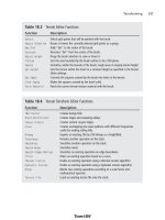
ing the currently edited GUI. The functions of the buttons are described in Table 10.1.
The Torque GUI Editor 347
Table 10.1 Tool Bar Button Functions
Button Description
Align Left Aligns the left edge of all selected controls to the leftmost point of all the
selected controls.
Align Right Aligns the right edge of all selected controls to the rightmost point of all the
selected controls.
Center Horiz Horizontally centers all selected controls in the rectangle that bounds all the
selected controls.
Align Top Aligns the top edge of all selected controls to the topmost point of all the
selected controls.
Align Bottom Aligns the bottom edge of all selected controls to the bottommost point of all
the selected controls.
Help Displays the Help dialog box.
Space Vert Vertically spaces all selected controls evenly.
Space Horiz Horizontally spaces all selected controls evenly.
Bring Front Arranges the selected control in front of its sibling controls.
Send Back Arranges the selected control behind its sibling controls.
New Brings up a dialog box with which the user can create and name a new
control for editing.
Save
Brings up a dialog box with which the user can save the current interface to a file.
New Control (pop-up) Displays a list of all controls from which the user can select one to add to the
current content control.
Show GUI (pop-up) Displays the name of the interface (GUI) currently being edited. Selecting
this pop-up allows the user to choose a screen to edit from all loaded interfaces.
Team LRN
Please purchase PDF Split-Merge on www.verypdf.com to remove this watermark.
Keyboard Commands
In addition to using mouse selection and GUI button clicks, the user has a number of key-
board commands available. Table 10.2 shows these commands.
Creating an Interface
In this section, you will see how easy it is to create and employ an interface using the
Torque GUI Editor.
You should note that the Torque GUI Editor assumes your screen resolution is set to a
minimum resolution of 800ϫ600. You may find it more useful to use a higher resolution,
to allow the different views more room to display their data.
1. Using Windows Explorer, browse into the C:\3DGPAi1 folder and then double-
click on the Run fps Demo shortcut.
2. When the GarageGames/Torque menu screen appears, press the F10 key.
The editor controls will appear on the bottom and right side of the screen and
enable you to immediately start editing the screen you were previously viewing.
3. Click the New button and enter a name for the new interface—do not use spaces
in the name. Use "MyFirstInterface" for the name.
4. Leave the class as GuiControl, and then press the Create button. You will now have
a nice new interface to work with.
5. In the Tree view, select the control named "MyFirstInterface". Its properties should
appear in the Inspector view.
6. In the Inspector view, click the Expand button.
7. Locate the
profile
property and click the button next to it to get the pop-up
menu.
Chapter 10
■
Creating GUI Elements348
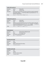
Table 10.2 GUI Editor Keyboard Commands
Keys Name Description
Ctrl+A Select All Selects all the controls in the Current Add Parent.
Ctrl+C Copy Copies the currently selected control(s) to the Clipboard.
Ctrl+X Cut Cuts the currently selected control(s) to the Clipboard.
Ctrl+V Paste Pastes any control on the Clipboard into the Current Add Parent.
Arrow Keys Movement Moves the current control selection 1 pixel in the direction of the
arrow.
Shift+Arrow Keys Movement Moves the current control selection 10 pixels in the direction of
the arrow.
Delete/Backspace Delete Deletes the current control selection.
Team LRN
Please purchase PDF Split-Merge on www.verypdf.com to remove this watermark.
8. Scroll through the menu until you locate the GuiContentProfile and select that.
9. Click Apply.
Now you have a Content Control to which you can add other controls.
10. Click the New Control button and choose GuiButtonCtrl from the pop-up menu.
11. Select the button using one of the two techniques you've learned (via the Content
Editor or via the Control Tree).
12. Look in the Control Inspector view and locate the text property for this new con-
trol. Put some text in it.
13. Enter "quit();" in the command property.
14. Click Apply.
15. Click the Save button.
16. The Save feature will automatically use the top-level control in your interface for
the file name, so leave that as is.
17. At the top of the Save dialog box is a button that you can use to select which folder
in which to save the file. Choose the fps folder.
18. Click Save.
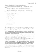
There, you've created an interface using the Torque GUI Editor!
Now let's break it! No…I mean, let's test it!
1. Open the console using the Tilde key ("~").
2. Type in the following, pressing the Enter key when you're done:
exec("fps/MyFirstInterface.gui");
3. Now type in the following, again pressing the Enter key when you're done:
canvas.setContent("MyFirstInterface");
Your interface should pop up on the screen. Just go ahead—press that button! Now you
see that the whole program quits, because that's what you programmed it to do.
Of course, this is a simple interface. They can get as complex as you need. You can see that
there is a lot of power available in Torque to address your interface needs. And if Torque
doesn't have it, you can create it yourself!
Moving Right Along
So now you should have a reasonable understanding of how controls are made and added
to an interface. You've seen the innards of some of the more common controls that are
available in Torque.
Moving Right Along 349
Team LRN
Please purchase PDF Split-Merge on www.verypdf.com to remove this watermark.
You've also learned how to use one of the valuable built-in tools that Torque supplies, the
GUI Editor. It's worth your while to practice making a few interfaces, even goofy ones that
have no purpose if you like, just to reinforce the steps involved and to become comfort-
able using the GUI Editor.
Staying with the visual aspects of a game, in the next chapter we will examine structural
material textures.
Chapter 10
■
Creating GUI Elements350
Team LRN
Please purchase PDF Split-Merge on www.verypdf.com to remove this watermark.
351
Structural Material
Textures
chapter 11
I
n earlier chapters we encountered textures used to enhance the 3D game environ-
ment in the resources included with the Emaga sample game. We only caressed the
topic with the most feathery of touches. As the book progresses we'll explore the topic
in depth from many different angles. In this chapter we'll look at one aspect of 3D game
textures—those used to define 3D structures, like buildings, walls, sidewalks, and other
virtual world artifacts.
You can judiciously and creatively use textures in several important ways. We'll use a pre-
built scene with a few basic and more complex structures to illustrate some of these prin-
ciples, including the following:
■
Project information. One of the most basic uses of textures in a 3D game is to
define the object containing the textures. A simple box shape can become an elec-
trical transformer, a house, a crate of weapons, or an air conditioner, merely by
applying different textures to the shape.
■
Convey mood. We can set a mood in a scene using different styles of textures. The
amount of subtlety is up to the designers; a somewhat unremarkable and neutral
air vent high on a wall can become an ominous clue to an unseen threat by adding
a graphic of slime or other unmentionable stuff oozing from its louvers.
■
Establish space and place. A cramped machine room full of noise and whirling
parts might have shapes built with textures jammed with pipes, wires, knobs, and
other mechanical items. The machinery shapes would probably be busy-looking
affairs, even in static form. On the other hand textures for the walls in a high-
ceilinged, multistory hall might have only vertically oriented lines and long, thin
curves, with high-contrast shading.
Team LRN
Please purchase PDF Split-Merge on www.verypdf.com to remove this watermark.


