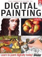
The complete guide to digital painting vol 1
Bạn đang xem bản rút gọn của tài liệu. Xem và tải ngay bản đầy đủ của tài liệu tại đây (49.14 MB, 260 trang )
FREE
CD
DIGITAL
PAINTING
THE COMPLETE GUIDE TO…
TUTORIALS FOR CREATING DIGITAL MASTERPIECES
VOLUME ONE
256
Pages of guides
for Windows
and Mac
Learn to paint digitally today!
Official Magazine
FROM THE MAKERS OF…
Imagine Publishing Ltd
Richmond House
33 Richmond Hill
Bournemouth
Dorset BH2 6EZ
☎ +44 (0) 1202 586200
Website: www.imagine-publishing.co.uk
Editor in Chief
Jo Cole
Designed by
Lora Sykes
Production
Rosie Tanner
Proofed by
Helen Laidlaw, Daniel Peel
and Amy Squibb
Group Art Editor
Ross Andrews
Editorial Director
Dan Slingsby
Printed by
William Gibbons, 26 Planetary Road, Willenhall,
West Midlands, WV13 3XT
Disclaimer
The publisher cannot accept responsibility for any unsolicited material
lost or damaged in the post. All text and layout is the copyright of
Imagine Publishing Ltd. Nothing in this magazine may be reproduced
in whole or part without the written permission of the publisher.
All copyrights are recognised and used specifically for the purpose
of criticism and review. Although the magazine has endeavoured
to ensure all information is correct at time of print, prices and
availability may change. This bookazine is fully independent and
not affiliated in any way with the companies mentioned herein.
Trademark(s) or registered trademark(s) of Corel Corporation and/or its
subsidiaries in Canada, the US and/or other countries. Screenshots
are ©Copyright 2008 Corel Corporation, reprinted by permission
The Complete Guide to Digital Painting © 2008 Imagine Publishing Ltd
ISBN 978-1-906078-08-9
Welcome
This is the ultimate art package for people wanting to
start digital art, or those looking to extend their skills
It doesn’t matter whether or not you have natural artistic ability – with
Corel Painter on your side you can create luscious pieces of digital art.
This title will show you exactly what can be achieved with the program.
We have dedicated tutorials on turning photos into art, where the
brushes take colour and shape information from the source photo. If
you’re more con�ident, use the tutorials that begin with a line drawing
and see how to apply layers of digital paint to build up a masterpiece.
We also delve into the arena of traditional art. The Paint Like tutorials
show how to re-create an artist’s style in Corel Painter, from Van Gogh’s
Sun�lowers to the iconic work of Edward Hopper. Our Art Skills section
brings together some fundamental techniques for creating better
artwork, looking at topics such as composition, perspective and using
light and shade. You’ll �ind tutorial source �iles on the disc along with a
90-day trial of Corel Painter X, so load them up, pick a tutorial and have
a go!
Happy painting!
An in-depth guide to the features of Painter X
16 Get creative using Clone Color
Achieve amazing artistic effects with cloning
26 Quick Clone
Create a painting with this command
32 Clone and Glaze
Create a stunning oil painting from a photo
with this technique
38 Watercolour masterclass
Discover the wonderfully washy world
of watercolours
44 Resources
Extend the capabilities of Painter
50 Interview: Bruce Dorn
The inspirations and techniques of this
amazing artist
56 Impressionist landscapes
Use the Impressionist Cloner to paint in the
style of Monet
60 Painting a still life
Create a stunning timeless painting
66 Improve the backgrounds
of
photos
Give images a boost with this nifty range
of techniques
72 Get to grips with the Corel
Painter brushes
An in-depth guide to the program’s most
useful brushes
80 Chiaroscuro charcoal portrait
Produce a classic charcoal portrait drawing in
Corel Painter
86 Paint perfect skin
Give character portraits a fl awless complexion
92 Paint a Victorian portrait
Create this traditional style from scratch
98 Design a concept car
Lessons in how to create the ultimate dream
machine completely in Painter
Interview: Chet Phillips
The master of character art reveals his secrets
Perfect portrait underpainting
Discover how to build up beautiful fl esh tones
Coloured pencil still life
Transform the humble pencil into a wonderful
intricate art form
Paint realistic fur
A comprehensive guide to painting lifelike
animals good enough to stroke
80
104
110
118
124
04
06 Get to know Painter
118
104
32
110
Art Skills introduction
you will learn
Understand the rules
of perspective
Learn to use depth and proportion
correctly in your work
Understand the rules
of composition
Discover what makes a perfect
visual arrangement
Understand light and shade
Illuminating advice on shadow and
highlight application
How to paint trees
Get to grips with troublesome trunks and
tricky twigs
How to paint hair
Learn the art of painting luscious locks
How to paint clouds
From light and fl uffy to dark and angry
How to paint fabric
Achieve perfect fl ow and texture with
this guide
Get online
Discover how to create your own
web gallery today
What’s on the disc
Take a look at the complementary
interactive disc
194
130
244
A roundup of all the artistic techniques
Art skills
section
05
Paint dramatic seascapes
Whip up the waves to create this stunning
stormy image
An introduction to airbrushing
Create an authentic Art Deco travel poster
with this great effect
Create ice-cool images
Refi ne your colour palette to paint a winter-
themed portrait
Interview: Daniel Conway
Learn how this amazing Painter Master honed
his skills
Create metallic textures
Get the perfect sheen and gleam with these
metal effect techniques
Paint like: Vincent van Gogh
Paint the famous sunfl owers for yourself
Paint like: Edward Hopper
Re-create this iconic American painting
Paint like: Claude Monet
Try your hand at his Impressionist style
Paint like: Paul Gauguin
Produce one of his bold, bright classics
Paint like: Constable
Reproduce one of his famous beautiful
English landscapes
Paint like: Edvard Munch
Re-create one of the most iconic images about
Paint like: L.S. Lowry
Paint in this unique ‘matchstick’ style
130
140
146
152
158
164
172
180
188
194
202
208
256
258
216
218
224
232
240
244
248
252
Feature Get to know Corel Painter X
Get to know
Read on for an in-depth look at the new
and enhanced features in Corel Painter X
Original artwork by Philip Straub
7
Within its diverse audience, the
program is most popular with �ine
artists, with more and more moving
from traditional methods of creating
art to working in Corel Painter. Artists
can get such outstanding results that
their work is being exhibited around
the world. And this is the perfect
demonstration of what Corel Painter is
all about – acting as a bridge between
traditional art techniques and cutting-
edge digital technology, giving users
the best of both worlds.
While it’s true that the professional community absolutely loves
the program, it can also be found in the homes of curious creatives
who are eager to try their hand at digital art. Whatever a person’s
ability, there is a function in Corel Painter that will allow them to
create something to be truly proud of. Whether it’s using a photo
as a basis for a painting or sketching out a form freehand and then
applying layers of virtual paint, there’s enough functionality to
keep everyone’s imagination busy.
With Painter X, Corel has built and expanded on all of the core
features and produced a program that blurs the distinction
between traditional art media and the digital format even more.
Corel worked closely with the world’s best Painter users and
responded to their ideas and suggestions about how the program
should develop. The result is a piece of software that gives users
the ability to emulate the look of real media like never before.
Features include the new RealBristle Painting System, which
delivers an incredibly responsive brush system; the Divine
Proportion tool, for composing images using traditional art
theory; and the new and enhanced features of the Photo
Painting System, giving �irst-time users an excellent automatic
base to start from.
Over the next few pages, we’re going to look at these features
in more depth, guiding you through these new elements of Corel
Painter X, and providing some handy hints along the way. So sit
back, see how Corel Painter X can improve your work and then
get creating!
Corel’s Painter software has always been dedicated to
bringing users the ultimate digital art studio. From its
very beginning, the program has merged real media
effects with digital technology and enabled tens of thousands
of users to produce art above and beyond what they had ever
dreamed of. For years, the program has allowed professional
artists, designers and photographers to edit and create images
to be proud of. Digital creatives from the entertainment industry
use the program to make matte paintings, design characters or
manufacture special textures. Corel Painter has been used to
make popular videogames as well as movies from household
names such as Lucas�ilm and Disney. Professional photographers
have also been drawn to the program, having noticed the
potential Corel Painter provides in turning their photos into
paintings. This has provided them with a new client base and
helped increase revenue.
This new brush category
illustrates the core values of Corel
Painter perfectly
Feature Corel Painter X
ROUNDNESS Determines
how round the width of the
brush is. If you start with a
round brush, a low value will
give you an elliptical shape. A
low value on a �lat brush will
give angular corners.
BRISTLE LENGTH
Use this slider to set the length
of your bristles. This setting
revolves around some maths
– the length is worked out by
multiplying the brush size by
the length you set. So if you
have a size 15 brush and you
set the Bristle Length to 2, the
bristles will be 30.
PROFILE LENGTH
This sets the length of the
brush’s pro�ile.
BRISTLE RIGIDITY
This is a very interesting
setting, as it allows you to
control how �lexible the
bristles are. If you go for a
low value, the bristles will
be more �lexible. Set them
higher and the brush will be
more rigid.
FANNING Pretty obvious
one this – the higher the
Fanning value, the more
spread out the bristles.
F R I C TI O N Sets how the
bristles glide over the canvas.
A low value will result in
smooth brushstrokes; a high
setting will give much more
textured results. Use this
setting alongside the Rigidity
be found.
We’re going to look at the new
features in more depth on these
pages, providing you with the basis
to go out and create the best Corel
Painter artwork you can. So here
it is, a whistle stop tour of where
everything lives in the interface…
The Corel
Painter X
workspace
Find your way around
the new workspace
and see where the
new features live
The brushes have always been at the heart of the program and
with this new set, the line between traditional art media and
digital art media is blurred beyond recognition. The RealBristle
brush category was developed by Painter Master Cher Threinen-
Pendarvis and replicates traditional art media with phenomenal
precision. With this brush category, users can work as they
would do with a traditional brush. You can see the individual
bristles of the brush and also determine how the paint �lows and
in what direction. As the brush moves, the bristles will splay and
bend just as if you were working a traditional brush on a canvas.
The brush variants of this category replicate what you would
expect a ‘real’ artist to use. The different brush tips give you all
the control you need to create exactly the art you want but they
can be further tweaked with the RealBristle palette (found in
Window>Brush Controls). From here you can determine the
dynamics of the brushes. You can start by clicking an icon to
set the tip pro�ile and then further re�ine your choice using
the subsequent sliders. Here’s a look at what they do:
8
Enjoy the look
of a fan brush
with the new
RealBristle
brush category
RealBristle Painting System
In addition to looking like the real thing,
the RealBristle set also interacts with the
canvas as a real brush would
DIVINE PROPORTION
Alongside the new Layout Grid tool,
the Divine Proportion option lets
you bring up a guide that helps you
compose your artwork or photo
according to a ratio used by famous
artists such as Leonardo da Vinci.
Anyone who is familiar with Corel
Painter won’t be too horrified when
they open up the new version. The
overall look is the same as previous
versions of the program, although
once you start delving deeper,
there are many new goodies to
DODGE AND BURN
These two new additions to the
toolbox enable users to highlight
and darken areas of a photo or
image. By adjusting the opacity
and size, you can apply your
changes very intuitively and
achieve amazing results.
This brush category will delight any artist who
works from scratch and will be very intuitive
to anyone who has worked with traditional art
materials. But you can also apply the RealBristle
palette settings to the existing Static Bristle,
Camel Hair, Bristle Spray and Blend Camel
brushes and turn them into RealBristle brushes!
The RealBristle
variants in full
Helping your image blossom
The RealBristle
category allows you
to emulate traditional
brush effects like
never before
Real Blender Flat
Real Blender Round
Real Blender Tapered
Real Fan Short
Real Fan Soft
Real Flat Opaque
Real Flat
Real Oils Short
Real Oils Smeary
Real Oils Soft Wet
Real Round Bristle
Real Round
Real Tapered Bristle
Real Tapered Flat
Real Tapered Round
Real Tapered Wet Flat
9
setting for some
spectacular results.
HEIGHT This
setting is very interesting
indeed. A traditional artist
will change how much of the
brush is pressed on the canvas.
This setting does the same – a
high value will only use the
very tip of the brush, while low
values compress the bristles
against the canvas. This causes
them to spread out.
UNIVERSAL MIXER PALETTE
Mixing colours has never been easier
than with the new Universal Mixer
palette. When used with the right
brushes, you can mix colours up and
apply them directly on the canvas.
REALBRISTLE
PAINTING SYSTEM
This exciting new brush
category allows users
to mimic the effect of
traditional brushes to
the extent of revealing
individual bristle marks!
MATCH PALETTE
The Effects menu houses a new addition
in the shape of the Match Palette effect.
You can use this to match the colour
values of one image to another.
10
Feature Get to know Corel Painter X
Before any painting can take
place, an artist needs to work out
the arrangement of a piece, and
the next couple of new features we’ll look
at help with exactly this
The Divine Proportion tool takes a classic compositional theory
and brings it direct to your digital art studio. It works around the
ratio of roughly three to �ive, which results in a composition that’s
aesthetically pleasing. The term ‘divine proportion’ was created
by Luca Pacioli way back in 1509. He wrote a treatise about the
subject, which was illustrated by none other than Leonardo da
Vinci, who also applied the ratio to his own work, such as the Mona
Lisa and The Last Supper.
The concept is simple. According to the ratio, there are certain
‘hot spots’ in an area. By placing focal points of an image in these
hot spots, an artist can ensure that as a viewer’s eye travels around
an image it will �ind the points of interest.
The Divine Proportion tool is found in the toolbox. Once enabled,
a guide will appear on the canvas consisting of a grid, a spiral and
an axis. You can keep all lines on, or just select the ones you �ind
of the guide and also save out certain presets for common tasks.
By using this tool, you can arrange your photos or paintings
according to tried and tested artistic methods. Even if you don’t
follow it exactly, the guide can be used to see where the important
areas of an image are, and will help you position accordingly. You
can use it to roughly mark out a blank canvas, or apply it to a photo
before cropping.
Another great compositional tool is the new Layout Grid. This
works along similar principles to the Divine Proportion tool, in
that it allows you to visually divide the grid up into sections and
plan where your most important features go. It comes with three
presets ready to use (Rule of Thirds, 3x5, 5x5) but you can use the
Layout Grid palette to create divisions of your choosing. Simply
adjust the Divisions slider to the setting you want.
The Layout Grid is an exceptionally useful feature. For example,
if you are creating a painting from a photo reference, you can apply
the same grid to the source image as to your canvas. This allows
you to break the reference down into separate chunks and you can
then sketch the information in each of these chunks to create the
basics for the painting. It is also a good way of seeing how best to
crop a photo or image according to where the lines lie.
the Mona Lisa
The options within the Divine
Proportion box give you total control
over the tool
Compositional tools
The Layout Grid also allows you to improve the composition in your photos or images
Leonardo da
Vinci applied the
principles of divine
proportion in his
work, including on
most useful. It’s possible to change the size, angle and orientation
The Layout Grid also allows you to improve the composition in your photos or images
11
Using the Divine Proportion tool allows you to arrange artwork in the most aesthetically pleasing way
Get the best composition
Applying divine proportion
01
E
n
able the tool
Before you can start
positioning anything, you need to fi rst
apply the tool. Go to Window>Show Divine
Proportion to call up the palette. Once the palette
appears, click Enable Divine Proportion.
02
Resize to fi t
To make sure the grid fi ts with
your image, use the Size slider to increase or
decrease the grid. You can also rotate the grid.
03
Remove lines
You may fi nd that you don’t need all of the
guidelines. To remove one, simply click the tick box next to it.
In this case we removed the spiral and instead lined the horses’s eye with
one of the axes. The tail could be expanded to reach the other one.
Using the Divine Proportion tool means you can see how an artwork is shaping up and whether you are
missing a potential compositional no-no. Even if you don’t stick to the guides exactly, a rough adherence will
reap rewards.
12
Feature Get to know Corel Painter X
A great command to introduce you to the program is the Photo
Painting System. With this you can literally sit back while
Corel Painter does the hard work for you. Created
in three stages, you get to set up some controls
and then hit a Play button. Corel Painter will
apply paint strokes to a clone of a photo and
produce a painting.
Your �irst step is to open up the
Underpainting palette. In traditional art,
an underpainting establishes the basic
colour values of a painting. The same
principle applies in Corel Painter – open up
the Underpainting palette and choose one of
the default selections from the Color Schemes
menu to set the photo’s colours. These are based
on media styles such as Watercolor, Impressionist,
Sketchbook and Chalk Drawing. You can then make use
of the new Photo Enhance menu to further edit the photo,
whether it’s adjusting the lightness or contrast, or adding a
decorative border effect.
The next stage takes you into the Auto-Painting palette. This
is where you make the �inal adjustments before setting Corel
Painter loose on your photo. From this palette, you set the
program to automatically apply strokes of paint that change
direction, pressure and size. You set the type of brushstroke and
determine how the brush works with the canvas.
To enhance this process even further, Corel Painter X also
bene�its from the new Smart Stroke Painting option. This
incredible feature automatically detects
the edges of the original photo, and will
dynamically alter the brush size, stroke
length and pressure according to the detail on
the original photo. Once you set Corel Painter off to do
its thing, you can stop the process at any time to adjust the
settings and begin again.
Once your painting is prepared, you can improve upon it even
more by opening up the Restoration palette to bring back detail
from the original photo. This is particularly useful for people
portraits, because you can bring back important details such as
eyes and other facial features.
The Auto-Painting command is a useful creative tool to have.
It’s a great way to quickly try out a photo and see if it will work as
a painting, plus it is also a handy method of generating a starting
base on which to start laying down manual brushstrokes.
Set Corel Painter X up to do the hard work
Create an Auto-Painting
01
Set the scene
Open up the photo you want to use and then
go to Window>Show Underpainting. This will bring up the
palette with all the options for applying settings to your photo.
02
The scheme
Visit the Color
Scheme pull-down menu and
apply one of the presets. We picked the
Watercolor option here. You can then
use the new Photo Enhance menu to
further tweak the effect or apply an
edge effect. Click Quick Clone.
03
Paint away
Time to visit the Auto-
Painting palette. Click the new Smart
Stroke Painting and Smart Settings checkboxes
and set the Speed slider to something high
like 80%. Hit the Play button and watch as
brushstrokes are applied to the photo.
The Auto-Painting option is a handy tool to get to know because it allows
you to test out effects without having to do any actual work. Of course,
if you’re a beginner to the program, it is an excellent way of creating a
rough painting to then practise your skills on.
Although a lot of creative professionals use
Corel Painter, you shouldn’t for one minute
think that it is the sole domain of accomplished
artists. There are lots of tools and functions that mean
anyone can get started with the program, whatever
their artistic ability may be
Auto art
You can apply colour sets to a photo
and then let the Auto-Painting
controls turn it into art
Bring detail back to your
images by using the
Restoration tools
13
First up is a new effect. The Match Palette effect will match
colour and intensity between two images. This means that
to alter the overall colour of one image, you can just open up
another image with the desired colour and bring the effect into
play. The Match Palette command also comes with controls
for dictating the level of colour, brightness and intensity. The
command is excellent for adjusting photos, but it is also good for
quickly trying out new effects. Let’s say you have a landscape
painting with very blue colours. Open up the Match Palette
command and import a sunset photo. Apply the colour values
to your painting and you can get an idea of whether it’s worth
turning the painting into a sunset scene!
Photographers have been using Dodge and Burn tools for
years to selectively darken and lighten areas of an image. You
can enjoy the same control with the brand new Dodge and Burn
tools. Found inside the toolbox, you use the Dodge tool to lighten
pixels and the Burn tool to darken them. Although they are very
simple, they are also powerful creative tools. If you are prepping
a photo for painting, you can use the Dodge and Burn tools to
lighten or darken areas without affecting the whole image. They
are also useful in paintings, because you can apply shadow and
highlights without having to paint in anything extra.
The Dodge and Burn tools come with their own options to
make sure that you get the exact effect you want. With these
options, you can adjust the size of the tool as well as how opaque
it is. A low opacity and large size will produce a subtle, soft
effect. The Jitter setting lets you set random dabs outside the
brushstroke. These can be very effective and soften the �inal
look even more.
The Mixer palette revolutionised the way colour was blended
and applied and the task has got even more sophisticated with
the new Universal Mixer palette. With this users can blend their
colour and paint straight onto the canvas, as long as they are
using one of the brush variants that supports mixing. These are
Artists’ Oils, RealBristle brushes, Camel Hair, Flat, Bristle Spray,
Watercolor Camel, Watercolor Flat and Watercolor Bristle. After
mixing your colours in the palette, you can now paint directly on
the canvas using one of these brushes. The last colour that was
used on the Apply Color tool or Mix Color tool is loaded onto the
brush and can be applied to the canvas.
Having complete control over
colour options is of utmost
importance to any artist and
Corel Painter X comes with new tools to
help users get the exact colour they want
Colour control
01
The two
images
First, open up the
two images that
you wish to use.
The image you
want the colours
applied to needs to
be the one selected.
Go to Effects>
Tonal Control>
Match Palette.
02
Slide around
In the palette that appears, pick the image you’re taking
the colour from in the Source drop-down. Now alter the sliders to get the
desired effect. Don’t put the values too high or you risk over-saturation.
Alter the look of an image by applying different colours
Match colours
Th
e new Match Palette effect is a handy tool that allows you to transfer the colour values of one
image onto another. You can control how much colour is applied and also the brightness.
Lighten areas in
a photo with the
Dodge tool, or
darken sections
using the Burn tool
First up is Universal Binary support, so the program is optimised
for both Intel and PowerPC-based Macs. There is also support for
Windows Vista and Mac OS X 10.5, which has resulted in a much
faster and far superior creative environment.
Another bonus for users is the new Secure Saving and Auto-
Backup system. This helps ensure that you won’t lose any of your
precious work if you suffer a power surge or computer crash.
To help users get the very best from Corel Painter X, there
are a number of excellent learning resources that ship with the
program. The �irst of these is a series of tutorials from Painter
Masters. These help you get started with the program and
provide an insight into how the professionals work. There are
also training videos from Jeremy Sutton that help you become
attuned to the program and also a Painter on the Net tab. Found
on the Welcome book, this directs you straight towards the very
best online resources for the Painter community. There are also
handy tips and tricks for getting more from the program.
Feature Get to know Corel Painter X
14
To help with all the new features,
Corel Painter X also offers extra
performance capabilities
Performance
enhancements
Access extra learning tools from the
Welcome book
Custom displays for improved performance
Set up workspaces
02
Check it out
When you’ve fi nished,
click Done. Have a look in one of the
palettes and see what’s happened. As you can
see here there’s fewer brushes than normal.
03
Save for the future
You can save
your customised workspaces for
future use. Go to Window>Workspaces>New
Workspace and then save. You’ve now got
your on specialised area for the type of work
you prefer.
Just as an artist will use certain paints or brushes for different types of
work, you can set up specific workspaces for various types of art. They
are easy to do and can be exported or imported from other machines.
01
Start customising
Go to Window>Workspace>Customize
Workspace to bring up this window. Click an arrow to open a
palette and click the eye icon shut to deselect a tool. Go through all of
them until you have only the ones you want.
www.imagineshop.co.uk
for back issues
and subscriptions
Offi cial Corel Painter
online shop at
Visit the
Visit us online at www.paintermagazine.com
Create your own art gallery for FREE • Meet other
artists on the forum • Subscribe and save money!
DAVID COLE
TITLE Steve sitting
WEBSITE
www.davidcolepictures.co.uk
JOB TITLE Retired
Like his father, David Cole was
an amateur watercolourist,
and discovered digital artwork
late in life. For Cole, it was
pretty much love at fi rst sight.
He says, “The bane of the
watercolourist is not being
able to get back to white
paper when you need to redo
something and, of course, this
is easy in digital painting.” Now
retired, he dedicates his time
completely to digital artwork.
showcase
Not convinced you can get artistic effects with
cloning? David Cole shows how you can
Feature Get creative by using Clone Color
Get creative by
using Clone Color
CLONING
SPECIAL
17
The right direction
Use the brushes in a sensitive way for the ultimate
cloned image
he dif�iculty facing Cloners is that
sceptical artists – non-cloning
artists – and others, tend to
think that it’s the computer that
does all the work. To some extent this is,
of course, true; the software is essential,
but colour cloning will re�lect as little or
as much artistic �lair as you bring to it.
Making good artistic judgements is the
bit that the software, however good it
is, cannot do for you. It is for this reason
that the three demonstrations of colour
cloning that follow are in ascending order
of dif�iculty, not because they become
technically harder, but because the artistic
decisions they require in order to get a
satisfying result become more dif�icult and
require more artist input.
This shouldn’t put you off. You can quite
easily make some decent clones using
just a Cloner brush or two. But you will
�ind it hard to turn a source photo into
a convincing natural-media painting
if you are not at all familiar with
the way that natural media looks
in reality, for example, the way that oil
colours mix in a brush stroke or the
beautiful sedimentation that can occur
in watercolour as the pigment dries. So
to make good simulations of paintings,
you need to look at the real thing. Search
on Google for pictures by the greats – for
example, portraits by John Singer Sargent
(for whom there is a speci�ic Corel Painter
brush), Van Gogh, Rembrandt, Wyeth
– you’ll know who your favourites are. Go
to galleries when possible to see the real
thing. It will help enormously and will also
enhance your ability to make good and
interesting creative decisions as you tackle
your colour-cloned paintings.
Now, on to the practicalities. When you
�irst see colour cloning in action, it looks
like magic. It is like magic, but it doesn’t
have to be complicated magic.
At its simplest, when in Clone Color
mode, the colour of one image gets
transferred to precisely the same
place on an identically sized image, but
reinterpreted through the characteristics
SENSITIVE MARKS
To make the painting work, it’s essential that you follow the lines and contours of what it is you are
painting. The Tracing Paper allows you to see the outlines, so use this to brush the paint on. How close
you stick to the lines depends on you and the kind of effect you are after. For maximum interest, mix
loose brushstrokes with more defined marks.
Three steps for ensuring
great artwork
When it comes to cloning a photo, the battle is always
against creating something that looks very digital or
clinical. To avoid this, build your image up in three
stages. This brings a texture and depth reminiscent of
traditional media.
Here we have applied the first stage. This is simply a case of
applying the chosen brush over the cloned picture very quickly
and loosely. You are basically doing what we said to avoid in the
left-hand box! The idea is to block in the colours and give nice rough
shapes that will be refined.
With the colours blocked in, pick a smaller brush and go over the
areas again. Don’t worry about pin-sharp detail – the key is to
add more definition to the forms. Don’t worry about covering the
canvas – the areas that are missed on the top and bottom-right will
help give a more authentic look.
The final stage involves an even smaller brush being applied
to make forms sharper and to finish the painting off. Just how
detailed you go is up to you. The key is to leave some of the earlier
rough strokes showing, but add refinement where you want it.
Apply Surface Texture for the final sprinkling of realism.
SCRIBBLED MARKS
Just because you are using the
cloning features, you still need to
be sensitive to a photo’s form and
move the brush as you would if
you were painting from scratch.
Here we’ve used the Watercolor
brush and used a scribbling
motion. As you can see, there is no
detail at all.
x
Feature Get creative by using Clone Color
of the particular brush you are using. The
small Clone Color mode button (found on
the Colors palette) decides whether you
paint in Clone Color mode or you just paint
with the colour selected. You can also
enable this to turn brushes into cloners.
The supplied option
However, you don’t have to turn brushes
into cloners – there is a whole category of
brushes speci�ically designed for cloning.
These are aptly named the Cloners. You can
access these from the Brush Selector bar, or
choose the Quick Clone option from the File
menu to load them automatically.
When it comes to picking the brushes
for your cloned paintings, there are some
things to consider beyond the obvious
choice of media. One of the most important
is how the brush behaves. Some brushes
have the word ‘Grainy’ in their name. This
means that they can reveal the underlying
paper you have selected for the picture
in their brushstrokes. You can adjust the
amount of Grain in the Brush Property
toolbar. Set the paper, or Surface Texture,
for your picture from the Papers toggle
switch towards the bottom of the Tools
palette. You can also apply the paper
you have chosen via Effects>Surface
Control>Apply Surface Texture. The
signi�icance of the paper or texture is that
with careful application, it can help to give
your image the look of a real painting on
canvas or watercolour paper, or even a
textured chalk drawing.
If you have Corel Painter X, you can set
the program to automatically clone. This
is thanks to the Underpainting, Auto-
Painting and Restoration functions. These
provide quick and subtle preparations for
your pictures in relation to lighting, colour
and simpli�ication (Underpainting), new
sophisticated hands-free painting functions
using special brushes (Auto-Painting) and
the ability to easily restore areas of your
image back to an earlier state (Restoration).
The newly-released Painter Essentials
4 also boasts Underpainting and Auto-
Painting features. While not the same as
doing things for yourself, they do allow you
to see how an effect will look.
Over the coming pages we are going to
see exactly how sophisticated a cloned
painting can be. We hope to prove that they
are not an ‘easy’ way of creating art, but
rather a useful tool in experimenting with
effects and becoming a better artist.
“CLONING LETS YOU PAINT USING
THE COLOURS AND DETAILS
DIRECTLY FROM YOUR PHOTOS”
The clone choices reside in the File menu. From here you can jump into a Quick Clone, set an image as the Clone
Source, or simply create a duplicate of an already-open image
The Auto-Painting and Underpainting commands in Corel Painter X and Essentials 4
allow you to automatically alter the colour of a photo and then paint it
Getting your photos ready
for the clone process
Although you can use most photos straight out of the bat, it’s worth
prepping them before you unleash the Cloner tools. The best way of
doing this is to alter the photo’s colour. Think about what style you
are emulating and edit accordingly.
This photo is okay – it’s a bit washed out, but fundamentally it’s okay.
However, to turn it into the perfect clone source, it’s going to need some
work. Corel Painter has a good assortment of photo-editing tools in the
Effects>Tonal Controls menu
The Adjust Colors command has allowed us to boost the shadows, and
give a warm glow. It looks bad now, but will make a lovely oil painting
The Tracing Paper allows you to see the photo and you
can alter the Opacity to your liking
18
19
01
Quick Clone set up Open the image from the CD and select
Quick Clone from the drop-down File menu. The image now appears
semi-opaquely. When you left-click and hold the cursor over the little square
icon below the red Close cross, a drop-down list of degrees of transparency
appears. Toggling the icon on and off switches between the transparency
you have selected from the menu and complete white opaqueness. We have
chosen complete whiteness here.
02
Chalk cloner Select Artists’ Canvas
from the Papers icon in the Tools palette.
This determines the kind of grain that Grainy
brushes show. Use the Chalk cloner from the list
of Cloners in the brush category, and making sure
that the brush Size is around 52, Opacity is 59 per
cent and Grain 12 per cent, brush lightly, leaving
streaks of white showing through here and there.
03
Oil Brush cloner To give some body
to the brushstrokes, now apply the Oil
Brush cloner over the canvas (also in the Cloners
category). At this point, we are not yet tracing the
fl owers using a semi-transparent paper setting.
Think all the time about how a large, real oil brush
would be making marks on the canvas.
04
Smeary Bristle cloner Now bring back detail using the
Smear y Bristle cloner, set to a Size of 12 and an Opacity of 100
per cent. As we are going for an impression of the fl owers, we don’t want
to restore all the edges and detail. Swapping between the working cloned
image and the original ( by toggling the transparency switch), bring back the
fl ower edges and details here and there, concentrating the restored detail in
clumps rather than evenly all-over.
06
Sharpen the image We have lef t
Sharpening until the last step because it
is ver y important. It should be the last thing you do
to the image and should not be over-applied. You
can tell when an image is over-sharpened by the
light halo effect around the edges. Less is more in
this case. The picture is now fi nished, so resist the
temptation to fi ddle with it!
05
Adding contrast To fi nish the
picture off, add a little contrast. These
sort of fi nishing touches, like extra brightness
and colour saturation, are entirely a matter of
personal preference. On this occasion, we have
only increased the Contrast slider to dramatise the
image a little.
First option
The logical place to start our journey in cloning is with the
Quick Clone facility. This enables you to prepare an image for
cloning in one step. Simply open a photo, go to File>Quick Clone
and tracing paper will appear over your image and the Cloners
brush category will automatically load. In our example here,
we are going to create a light covering of colour texture using
the Chalk cloner, then add some broader brushstrokes with
an Oil cloner. We’ll then bring in some detail, still keeping the
brushwork loose. The aim is to keep the picture looking more
like a painting than a photograph as we add brushstrokes and
detail. The temptation is always to paint wherever there is a
gap, but the trick is not to paint too much, and not to keep all
the edges in the image. To help the illusion of an oil painting,
we need to have a little canvas texture showing through here
and there, keeping the brushstrokes free, and just adding back
detail here and there.
Quick clone
Ba sic
✐ ✐✐
Level:
ORIGINAL PHOTO
FINAL
CLONED PAINTING
HERE’S HOW…
1
Feature Get creative by using Clone Color
01
Bring it to life Open up the boat photo from
the CD. To give the photo more vivacity, go to
Effects>Tonal Control and pick Adjust Color. Increase the
Saturation by 34 per cent and select File>Clone, All from the
Select drop-down menu and Clear from the Edit menu.
02
Get the cloning ready A click on the
Transparency icon shows that the photo
is still there. Watercolour paper is often off-white
so use the Fill tool to add a light yellow colour (H:
47 per cent, S:100 per cent, V: 93 per cent) to the
white. Check under File>Clone Source that the
right source image is selected.
03
Select
a paper
Choose a texture now.
We chose Hot Press
from the list, which
is a fairly smooth
watercolour paper
surface. We went for
this because a rough
watercolour paper
might interfere with
the line drawing. We
decided to pick a
Grainy brush because
it shows the paper
texture well.
Second option
In this section, we are going to take on a trickier subject.
Before you start making the clone, it’s important to consider
what medium will work best with the scene. The challenges
with this ‘boat and houses’ photo are the dark shadows and
all the intersecting horizontal, vertical and angled lines. We
decided to go for a simulation of a pencil drawing that had
watercolour pencils and some watercolour washes applied
to it. Our aim was to give the �inal image a light transparent
look. We’ll use the prepared photo as the clone source, a lightly
coloured ground (paper), Watercolor brushes (none of the
purpose-built Cloners) and a line drawing derived from the
Sketch function.
Using other
paint brushes
In termediate
✐✐✐
Level:
HERE’S HOW…
2
ORIGINAL PHOTO
FINAL
CLONED PAINTING
20
21
04
Start painting We used the
Grainy Wash Bristle variant from the
Watercolors category with an Opacity of 26 per
cent. With a light touch, cover in most of the
image. Avoid going up to the edges and make
sure you leave some gaps where the yellow paper
shows through. The composite method changes
to Gel. This happens by default with new or
duplicated watercolour layers.
05
Develop the brushed coverage
We used the Wash Bristle brush here to
add some additional colour, with the Opacity set
to 26 per cent. The main purpose of this brush is
to suggest some of the parallel marks made by the
watercolour pencils which, at this stage, have not
yet fully dissolved.
06
Add more body to the image
Now duplicate the image to give the
picture more body via Select>All, then choosing
Edit>Copy>Paste in Place. Select this rather than
Paste. An identical, though slightly darker, layer
appears above the current layer. Reduce the
Opacity of the new layer to 30 per cent to keep the
fuller colours and values, but lower the darkening
that the Gel composite method introduces.
07
Prepare to add a grey pencil
outline
With the original photo (the
adjusted one) active, again choose Select>All
and Edit>Copy. Then, with the cloned version
active, select Edit/Paste in Place (again, not Paste).
The original photo appears at the top of the layer
stack. You need to use the original photo so that
the sketch from it will have crisp outlines.
08
Create the pencil sketch Go to
Effects>Surface Control>Sketch and
the Sketch parameters box will appear. Type in the
following settings: Sensitivity: 1.00, Smoothing
1.20, Grain: 0.00, Threshold High: 40 per cent,
Threshold Low: 10 per cent. This will produce a
black-on-white outline drawing. Then change the
Layer composite mode to Multiply so that you can
see the coloured image below the line drawing.
09
Add a new layer and more
colour
Reduce the Opacity of the
sketch layer so that there’s a nice balance between
the line drawing and watercolour layer. Then
create a new watercolour layer by clicking on
the blue droplet icon at the bottom of the Layers
palette. Use the Diffuse Bristle brush at an Opacity
of 45 per cent to add some more paint, again
making sure not to cover the whole picture evenly.
10
Save as RIFF This is wor th a separate
step. Get into the habit of saving layered
images as RIFFs – Painter’s native fi le format. This
will preserve your stacked layers. You should do
this after every level has been completed. You can
always delete them later. It’s better to have too
many than risk losing the whole layer stack. You
can use the Iterative Save function for this, too.
11
Add some clean yellow paper The
edges need a little more air so save the
whole image as a TIF, close the saved RIFF image
and open the TIF version. This is no longer a
watercolour layer so you can make changes easily.
Sample the background colour and use a Fine
Feathering Oils 30 brush (from the Oils) to paint in
a little more unused paper around the edges.
12
Apply Surface Texture and fi nal
sharpening
First, add a little more
Saturation at about 14 per cent, and then some
Surface Texture, using Hot Press paper all-over as
before. The settings are shown above. Finally, add
some sharpening via Effects>Focus>Sharpen. Use
the Gaussian Opening settings with the Amount
set to 1.77, and the Highlight and Shadow both at
100 per cent.
Traditional media in a digital world
Pencils, paper and Corel Painter
We used the Surface
Control menu to
access the Sketch
effect here, but it’s
worth trying the
other ones on offer.
The Woodcut is very
interesting, especially
when used on very
bold photos. The
dark lines it applies
can give a good
depth to a painting,
but try the various
composite methods
to get the perfect
look. The key is to use
effects such as Sketch
and Woodcut as an
enhancement to the
painting – not
a distraction.
More effects
When it comes to
art media such as
watercolour, it is
very important that
you pick a suitable
paper texture at the
beginning and be sure
to employ a brush
that has ‘Grainy’ in
the title. By having
something that has
tooth and texture,
you can ensure that
your painting looks as
realistic as possible.
Whenever you pick a
paper, always make
sure that you open the
Papers palette and
adjust the sliders to
get the precise look
that you want.
Using texture
Third option
This section is called Advanced, but the title does not re�lect the
technical complexity of the �inal picture alone. In some ways, it
is less dif�icult than the Intermediate picture. We have deemed
it more dif�icult because of the personal creative choices we
have had to make and which, to a large extent, cause the picture
to succeed or fail. In particular, the overall style for the picture
and for the brushstrokes, and how to handle the composition
and especially the background. There is also a fair amount of
free brushing in this image, all over but again, especially in
the background. These factors make it more tricky but also
ultimately more satisfying. En route, we’ll bring in most of
the cloning techniques we have covered and a few additional
ones as well. Instead of using Watercolor brushes, we will go
back to opaque media like Oils and Acrylics and cover brush
customisation and how to use the Selection command.
Get creative
with brushes
Ad va n ced
✐✐✐
Level:
Feature Get creative by using Clone Color
“WE WENT FOR A
LIGHT BLUE WHICH
WAS COMPLEMENTARY
FOR SOME OF THE SKIN
COLOURS, AND HELPED
C R E A TE TE N S I O N ”
ORIGINAL PHOTO
FINAL
CLONED PAINTING
3
22
03
Changing the background colour
At this stage, we decided that the green
background wasn’t going to work for the image.
Go to Effects>Adjust Selected Colours and use
the Dropper tool to select the green background.
Then change H Extents to 20 per cent, H Feather
to 10 per cent, Hue Shift to -34 per cent, Value to
-16 per cent and Saturation to -91 per cent. This
gives us a brown background that works better.
04
Setting up the colour cloning To
set up the colour cloning, head to File
and click on Clone. Then follow Select>All, and
Edit>Clear. This will create a new ‘Clone of josh…’
image, which should be all white. Fill this with a
cool brown (H:40 per cent, S: 5 per cent, V: 55 per
cent) using the Fill tool.
05
Set up the
paper
Now
you need to set up the
paper that will provide
the surface texture
for the cloned image.
Choose Artists’ Canvas
from the drop-down list
of papers accessed from
the Papers icon at the
bottom of the toolbox.
Then launch the Papers
palette using the Papers
fl y-out. This will allow
you to see all the paper’s
parameters and adjust
them if you want.
06
Customising the fi rst brush
We’re going to use the Artists’ Sargent
brush to lay down texture onto the painting. This
will require some customisation. First, select the
Sargent brush in the Artists’ brush category. Then
open up the Show Brush Creator link, which is
accessed from the fl y-out arrow to the right of the
Brush Selector palette.
07
Customising the Sargent brush Select the General categor y
from the list on the left-hand side of the Stroke Designer page in
the Brush Creator and make the following changes: Stroke Type set to Rake;
Method set to Cover; Sub Category set to Grainy Hard; Expression set to
Pressure; and the Grain set to 18 per cent. Remember that the visible paper
texture increases as the value set reduces. Aim to use about 16 per cent.
08
Changing the Sargent Brush’s
Size settings
Select Size from the left
of the Stroke Designer page. Change the brush
profi le to the pointed one top-left, Size to 37.8 per
cent, Minimum Size to 8 per cent, Expression to
Pressure and Size Step to 1 per cent.
01
Saturation Open the photo from
the disc. It’s evident that the head in the
photo needs some room to breathe, so to begin
with, add 200 pixels left and 100 pixels right to
produce the canvas dimensions you want. This
puts the head slightly off-centre in the frame.
02
Painting in missing background From the Oils palette, use
the Tapered Round Oils 15 brush to roughly continue the existing
green background, as well as the patch of pinstripe jacket into the white
border areas. Although you probably won’t use the green background, it will
ensure that the values remain consistent. Increase the Contrast a little to give
the image some more energy.
23
HERE’S HOW…
09
Changing the Sargent Brush’s
Well parameters
Open the Well
settings and change Resaturation to 76 per cent,
Bleed to 0 per cent, Expression to 0 and Dryout to
268.6. Finally, change Rake to ten and make sure
that Impasto, which gives depth to brushstrokes,
is turned off.
Feature Get creative by using Clone Color
10
Saving the customised Sargent
Brush
You’ll need to save the
customised brush – it is easy to forget to do this!
Open the fl y-out menu next to the Brush Selector
and click on Save Variant. Name it ‘Grainy Sargent’
and it will then appear at the bottom of the list of
brushes in the Artists’ category, without replacing
the Sargent brush.
11
Checking value relationships between the face and the
plain background
Before you start painting, check how the face
will fi t in with the brown background. Use the Eye Dropper tool to confi rm
that the brown for the background matches the tonal value of a number of
the background areas. If you want to let the background show through the
painted image, you now know where to do this with the correct values.
12
Initial brushing with the
customised brush
At this stage, make
some brushstrokes with the new brush with the
original image completely obscured by the brown.
This is always a very exciting part of the process
as you see the image beginning to emerge.
The later stages of restoring the facial features
following facial contours using the image in semi-
transparent mode is a more technical exercise.
13
Setting up the Bristle brush Our aim is to try to keep this
portrait loose. To help achieve this, for the next stage of painting,
use the Bristle brush in the Artists’ Oils category. Use this as it comes, with the
following settings: Size: 5.4; Opacity: 79 per cent; Grain: 17 per cent; Viscosity:
50 per cent; Blend: 100 per cent, Wetness: 75.
14
Using the Bristle brush The Bristle’s brush stroke has a streaky
nature to it, its own bristly character. Now, begin to make the
brushstrokes follow the contours of the face. This means toggling frequently
back and forth between Transparency and Opacity using the Transparency
icon. Don’t worry too much about detail at this stage.
15
Close-up on the eyes Even though the image is being cloned, and
should in theory replicate exactly what is in the original photography,
the marvellous thing about some of the Corel Painter brushes like the Bristle
is that they do not deposit paint with photographic precision, but with some
randomness. This is crucial to making an image look painted. Eyes should not
be painted identically – eyes are not identical, so it is important to paint them
with their own character.
16
Developing the picture Now you need to begin to develop
some ideas for the background. Work up some detail too, using a
smaller Bristle brush. Make sure that there are a few ‘lost edges’ where the
face and background seem to merge – this helps to integrate them and avoid
a stuck-on effect.
It’s time to lay down the first paint application
Start painting!
It sounds obvious, but
always make sure you
pick the correct brush
size for the job. In our
case, we wanted to
keep a loose style so
that means picking
the largest brush you
can get away with.
The idea is to give
recognisable form
without entering
into photo-quality
sharpness. If you
wanted more detail,
then obviously go for
a smaller brush size.
We’ve given guidelines
here, but you may feel
more comfortable
with a different size.
Brush size
24
17
More work on the head and
background
Using the Grainy Sargent
brush again, but with a larger Size (25.3) and
Opacity (82 per cent), restore the underpainted
brown, letting some of the original photo’s dark
brown show through to give the background
some energy.
18
Fixing the background Still using
the Grainy Sargent, introduce some
blocked-in dark olive into the background.
This colour is a darker value of the subject’s iris
colour. The dark tone helps to model the face by
introducing an element of chiaroscuro. Use a Size
of 37.8, Opacity of 57 per cent and Grain of 18 per
cent. The dark patch is obviously not cloned and
its developing shape, tone and colour just works.
19
Bringing back more detail in
the face
For the details, fi rst select
Oils>Thick Wet Oils 10 (Size: 2, Opacity: 9 per
cent, Resat: 10, Bleed: 65 per cent, Jitter: 0.02.
Also check that Impasto is off) to block in the key
features. Then use the Tapered Round Oils 15 to
restore more precise details, set to a Size of 2.6, an
Opacity of 87 per cent, Resat set to 100, Bleed to
83 per cent and Feature set to 2.3.
20
Developing the eyes You can see that the brushstrokes making
up the eyes are adding to the features with streaks and slabs of
colour, and not just reproducing the photograph precisely. Now make general
strokes with the original photo showing through the transparency. Stay with
the largest brush you can. Using very small brushes will quickly remove loose-
looking brushstrokes, so stay away from them!
21
Painting the hair Still using the Tapered Round Oils brush, bring
back the hair from the dark brown underpainting. Don’t paint all the
hairs individually, just those strands that are crucial to getting the illusion of
hair. In this case, the hair is tricky because there are not many settled, even
areas, but lots of spikes instead. The hair is actually emerging from the dark
background which helps to integrate the picture into it.
22
Finishing touches At this stage,
you may decide that the background
needs something more. We tried various shapes
and colours to create harmonies and interest, but
went for a light blue which was complementary
for some of the skin colours. It created tension
and helped bring alive the background and push
forward the face. This is a decision you have to
make for yourself – you can’t clone it.
23
Final adjustments To give the picture
a little more contrast, follow Select>All,
and Edit>Copy>Paste in Place. This will duplicate
the fi rst layer. Then change the composite method
to Gel and reduce the Opacity of the new layer
to six per cent. Under the Photo menu, use a little
Dodge and Saturation Add on the irises to reveal
them a little more.
24
Finished work For some last-
minute adjustments, add some colour
Saturation to the skin (Adjust Selected Colours
Sat: 30), and a little sharpening (0.88).
Get in that pilot’s seat and take control of your image
Personal touches
While the focus of
this feature is about
using photography
as the foundation for
a painting, don’t be
afraid to go freestyle!
You can achieve very
realistic results if
you leave the Clone
Color environment
and paint in colours
over the cloned
areas. In our example
here, we manually
painted in parts of
the background to
complement the
colours in the face. It
didn’t take great skill,
but helped elevate
the image beyond a
straight clone.
Merge forms
Traditional artists
apply layer after layer
of paint to build up
depth. All you have to
do is duplicate a layer
and then experiment
with the composite
methods! These allow
you to darken or boost
a painting and you
can control the effect
using the Opacity
slider. We used the Gel
composite method in
this tutorial, but other
good ones are Darken,
Multiply, Lighten and
Screen. It all depends
on your painting’s
colours and the effect
you want, so try them
out to see what works.
Layer choices
25