Pixel Perfect Precision: Guide to Design in Adobe Photoshop and Illusrator
Bạn đang xem bản rút gọn của tài liệu. Xem và tải ngay bản đầy đủ của tài liệu tại đây (6.63 MB, 165 trang )
Version 2
Produced by ustwo™
@pppustwo
@gyppsy
Pixel Perfect
Precision™
Contentsustwo™ studios 2013 / PPP™
Photoshop + ustwo™
Photoshop: Colour Profiles
Photoshop: Pixel Precision
Photoshop: Techniques
Photoshop: Organisation
Photoshop: Export
Photoshop: Tips
Illustrator
Appendix
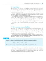
Introduction
Acknowledgements
The Essentials
Pixel Perfect Principles
Pixel Perfect Details
Accessibility
I love pixels! They’re the building blocks of all the visual design we do
here at ustwo™, but are so often relegated to a mere afterthought in
the excitement of working with colours and styles. The aim of this Pixel
Perfect Precision™ handbook is to bring them back to the forefront of
our thoughts, to make sure we get the simple things right before
moving onto the detail.
Why is this important though? Isn’t it just wasting time worrying about
every last pixel on the page? Like a lot of things in life, when
something’s done right it should become invisible to you, but when it’s
done badly it becomes an annoyance. Blurred edges, objects that jump
in position between pages, and colour mismatches are just a few things
that a user will notice and become distracted by if your designs aren’t
done properly, leaving them with a poor impression of the product.
For this latest release we’ve separated the Photoshop-specific advice
from the core principles (and expanded on them) to make the
handbook more useful across a range of disciplines; we know that there
are lots of interaction designers and developers out there who want to
learn about this area of design, so we’ve made the handbook a more
relevant resource for you. There’s also a completely revised section on
Accessibility, an area we feel needed the PPP™ treatment to give you
the essentials you need to know in an easy-to-understand way.
Gyppsy xx
1ustwo™ studios 2013 / PPP™
Introduction
Acknowledgements
There’s a few people out there who I’d like to thank: first of all Shiro, for
showing me the true meaning of pixel precision all those years ago; all
the designers out there who share their knowledge, such as Teehan
+Lax, Marc Edwards, Daniel Cooper, and Tobias Ahlin to name but a few;
and most of all I’d like to thank ustwo™ for letting me indulge my
passions and create this handbook!
2ustwo™ studios 2013 / PPP™
This first section covers a lot of core principles and topics that apply to
all digital design and its relevant tools. For seasoned designers it can act
as a refresher for things to look out for and consider, and for those
starting out it offers a quick start guide to some of the processes and
thinking that we apply to projects.
3ustwo™ studios 2013 / PPP™
The Essentials
Pixel Perfect
Principles
Sharp Edges
Straight edges should be on-pixel and sharp –
blurred edges are a no-no!
Naughty
5ustwo™ studios 2013 / PPP™
Nice
Alignment &
Spacing
Once you’ve mastered the art of getting
everything sharp the next step in your journey
towards pixel perfection is to get the
alignment and spacing right.
6ustwo™ studios 2013 / PPP™
y
x x
y
y
Naughty Nice
Consistency
Alignment of objects across multiple screens is
just as important. Margins and placement of
common items such as title bars, back
buttons, and footers should be the same
throughout the interface to prevent objects
jumping around.
The best way of doing this is to set yourself up
a grid, which will define a structure that can
be followed throughout your screens.
7ustwo™ studios 2013 / PPP™
Environment
Environment refers not only to the platform
you’re designing for, but also how it will be
operated and the physical space that it will be
used in. For example, TVs have a completely
different set of variables to mobile phones –
they are viewed from a much greater distance,
are almost always used indoors, and are
operated via remote. This in turn means
different considerations for things like text
size, colours, and contrast within the interface.
8ustwo™ studios 2013 / PPP™
Accessibility
Accessibility is a broad topic, being relevant to
every one of your users – not just those with
some kind of disability. Good practice such as
ease of use and clarity are a given and go a
long way in this area, but there are also steps
you can take to make your work more
accessible for those with conditions such as
colour blindness and dyslexia. See the
Accessibility chapter for more information.
9
Title
ustwo™ studios 2013 / PPP™
Random Text
Squeezed in to Fit
Object Description that runs off the edge o
Object Description that runs off the edge o
Object Description that runs off the edge o
Object Description that runs off the edge o
Object Description that runs off the edge o
Object Description that runs off the edge o
Object Description that runs off the edge o
Object Description that runs off the edge o
Object Description that runs off the edge o
Object Description that runs off the edge o
Object Description that runs off the edge o
Naughty Nice
Object
Description
Object
Description
Object
Description
Object
Description
Affordance
Affordance is an object’s ability to convey its
function through sensory means, for example
by being slightly raised a button suggests that
you press it; by being the right size and
position for a hand a door handle suggests
that you pull it.
This technique can also be used in digital
design to hint at how objects should be
interacted with: commonly used affordances
include buttons which are given depth like in
the real world, and text which flows off the
page so it looks like it scrolls.
10ustwo™ studios 2013 / PPP™
Lorem ipsum dolor sit
amet, consectetur
adipisicing elit, sed do
eiusmod tempor incididunt
ut labore et dolore magna
aliqua. Ut enim ad minim
veniam, quis nostrud
exercitation ullamco laboris
nisi ut aliquip ex ea
commodo consequat.
Duis aute irure dolor in
reprehenderit in voluptate
velit esse cillum dolore eu
Colour & Shape
Some colours and shapes have become
synonymous with certain functions and
messages within interface design. Be mindful
of these, as mixing them up can cause
confusion for the user if they’re expecting the
opposite. Green and ticks are commonly used
to infer good, likewise red and crosses bad, but
by jumbling the two up you create a mixed
message. Similarly, yellow and triangles are
often associated with warnings, blue and
circles with information.
11ustwo™ studios 2013 / PPP™
Naughty Nice
Visual Hierarchy
Layout, colours and typography have a huge
influence on how information is seen, and
what the eye is drawn to. Think about what
you want the user to look at on the page, and
in what order, then start designing around
that hierarchy. Grab attention with high
contrast and large, bold type, or push items
back with lower contrast and smaller, lighter
type weights. Culture also plays a part: for
example Westerners will naturally start near
the top of a screen as that’s the way we read.
12ustwo™ studios 2013 / PPP™
Title
Title
Object
Description
Object
Description
Object
Description
Object
Description
Naughty Nice
Object
Description
Object
Description
Object
Description
Object
Description
Typography
Typography is an often overlooked part of the
digital experience, but since most information
is conveyed through text it’s one of the most
important parts of a design. The same basic
principles as for any other medium apply – is it
a comfortable size for reading without
squinting? Is there enough leading and are the
line lengths short enough to make reading
comfortable? Don’t just accept the default
font settings in your design environment –
treat type with the respect it deserves!
13ustwo™ studios 2013 / PPP™
Naughty Nice
Lorem ipsum dolor sit amet,
consectetur adipisicing elit, sed do
eiusmod tempor incididunt ut labore et
dolore magna aliqua. Ut enim ad
minim veniam, quis nostrud
exercitation ullamco laboris nisi ut
aliquip ex ea commodo consequat. Duis
aute irure dolor in reprehenderit in
voluptate velit esse cillum dolore eu
fugiat nulla pariatur. Excepteur sint
occaecat cupidatat non proident, sunt
in culpa qui officia deserunt mollit anim
id est laborum. Lorem ipsum dolor sit
amet, consectetur adipisicing elit, sed
do eiusmod tempor incididunt ut labore
et dolore magna aliqua. Ut enim ad
minim veniam, quis nostrud
exercitation ullamco laboris nisi ut
aliquip ex ea commodo consequat. Duis
aute irure dolor in reprehenderit in
voluptate velit esse cillum dolore eu
fugiat nulla pariatur. Excepteur sint
occaecat cupidatat non proident, sunt
in culpa qui officia deserunt mollit anim
id est laborum. Lorem ipsum dolor sit
Lorem ipsum dolor sit
amet, consectetur
adipisicing elit, sed do
eiusmod tempor incididunt
ut labore et dolore magna
aliqua. Ut enim ad minim
veniam, quis nostrud
exercitation ullamco laboris
nisi ut aliquip ex ea
commodo consequat. Duis
aute irure dolor in
Testing
This step has a close link to Environment in
that you may know a lot about the platform
you’re designing for, but nothing beats testing
on actual device(s). Screen resolution and
technology can vary dramatically compared to
your computer, not to mention switching from
mouse and keyboard to other types of input.
There are a wide range of live previewing tools
available these days that will take a design
from your computer and place it directly on
your device, updating in real time as you apply
changes. Make sure to use them!
14ustwo™ studios 2013 / PPP™
Organisation
No man is an island, and most of the time
your files won’t be either! Good organisation is
essential when sharing designs as it saves a
lot of time for other people. Well ordered files
and layers mean other designers can jump
straight into your work and find their way
around, and a logically named set of assets
will make a developer very happy.
15ustwo™ studios 2013 / PPP™
Rectangle.png
Square Blue.png
Square Green.png
Square Orange.png
Square Pink.png
Assets
Screen.psd
Design
Project
Take a Break
It’s very easy to get completely consumed in
the design process, but sometimes it pays to
take a break – not just for health reasons, but
also the different perspective a refreshed set
of eyes can bring. Go and make yourself a
brew, or wander somewhere else for a few
minutes: after coming back the solution to a
design problem might be staring you right in
the face, or you might spot a flaw that had
previously gone unnoticed!
16ustwo™ studios 2013 / PPP™
Pixel Perfect
Details
Colour Model
HSB FTW! Have a go at using HSB as a colour
model when creating a palette: once you get
your head around it you’ll see it’s a really
efficient way to create shades of a base
colour. In the example the Hue (H) value has
been kept the same, then the Saturation (S)
and Brightness (B) changed to create the
variations. See how much more sense the
numbers make in HSB compared to RGB?
18ustwo™ studios 2013 / PPP™
100%
100%
0%
0%
0°
180°
270° 90°
B
Red
228
243
242
140
Green
50
194
148
31
Blue
72
201
160
49
Hue
352
352
352
352
Saturation
78
20
39
78
Brightness
89
95
95
55
S
H
Colour
Management
Colour Management makes a lot of sense in a
print environment, but for digital it can often
create more problems than it solves. The main
issue is that it’s not available throughout the
development process – you can manage your
assets, but when they’re mixed with
unmanaged code (specifying the same
original colour) there can be a mismatch.
Much better to ignore colour management
altogether, and instead test on the device –
unlike print this takes a matter of seconds and
costs nothing!
19ustwo™ studios 2013 / PPP™
Colour Profile
Code
Yes No
Naughty Nice
Text Height &
Width
A great way to check the maximum height
that a block of text can be is to use the Åy
characters. If a design needs to fit a minimum
number of characters then use a series of
capital Ws to judge the space needed – if they
fit then anything else will too.
20ustwo™ studios 2013 / PPP™
Åy
Max. Height
WWWW
Max. Width
Text Length
If you’re working on a design that will be used
with other languages it’s also worth
considering how long your text could be when
translated. The example above shows what
happens with the German and Portuguese
translations of Settings: an increase of up to
75% in length.
21ustwo™ studios 2013 / PPP™
Settings
Einstellungen
Configurações
Aligning Text on
Buttons
Featured above are three ways to vertically
aligning text on buttons. There are a few
variables which can affect which method is
the best, such as the typeface used (for
example the cap height to x-height ratio can
vary) or whether you’re using upper- and
lowercase text or caps/numbers. The most
important thing though is to make sure that
once you pick a rule you use it on every button
– consistency is king!
22ustwo™ studios 2013 / PPP™
Align Text
Align Text
Align Text
Align Text
Align Text
Align Text
ABC123
ABC123
ABC123
Cap Height & Descender x-height Cap Height & x-height
Aligning Text with
Objects
Try to vertically align text using the x-height,
ignoring ascenders and descenders. This
means that dynamic text, which could contain
any combination of characters, will always
look correctly aligned.
23ustwo™ studios 2013 / PPP™
Align Text
Align Text
Align Text
Align Text
Naughty Nice


