Apress Introducing dot NET 4 0 with Visual Studio 2010_8 ppt
Bạn đang xem bản rút gọn của tài liệu. Xem và tải ngay bản đầy đủ của tài liệu tại đây (3.23 MB, 45 trang )
CHAPTER 15 WPF 4.0 AND SILVERLIGHT 3.0
372
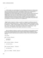
Figure 15-8. Improved error handling for user controls
Static Resource and Designer Fix
Previously, if a static resource was declared in app.xaml, you could not use it in the designer. In VS2010,
you can.
Drag-and-Drop Data Binding
I’m not a big fan of drag-and-drop data binding and I think it’s fair to say that most programmers will
rightly scorn such functionality. However, this type of feature can be very useful for quickly putting
together simple data entry forms and prototyping applications.
VS2010 includes new functionality to easily create data forms and creates some pretty clean XAML.
It seems likely that Microsoft might have brought in this feature to encourage some winforms developers
to move over.
You will now learn about this feature by creating a simple master detail form.
1. Select Data Show Data Sources.
2. Click the Add New Data Source button on the Data Sources window, and the Choose a Data
Source Type window will appear (see Figure 15-9).
CHAPTER 15 WPF 4.0 AND SILVERLIGHT 3.0
373
Figure 15-9. Choose a Data Source Type dialog
3. Select Database and then click Next. The Choose a Database Model screen will appear (see
Figure 15-10).
Figure 15-10. Choose a Database Model dialog
4. Select Dataset (you could also use an entity data model for this feature) and then click Next.
CHAPTER 15 WPF 4.0 AND SILVERLIGHT 3.0
374
5. In the next screen, select the connection to the example database connection (or create it if you
haven’t already) and then click Next.
6. A new screen (similar to Figure 15-11) will now appear, allowing you to select the objects you
want to use.
Figure 15-11. Choose your poison (sorry) database objects
7. Select the Tables node to select all the tables and change the dataset name to Chapter15Dataset
before clicking Finish.
8. You now have the data source set up and if you look over to the Data Sources window (see
Figure 15-12), you will see all the tables and their fields.
Figure 15-12. Data Sources window after configuring the data source
CHAPTER 15 WPF 4.0 AND SILVERLIGHT 3.0
375
9. You will now create a data grid to show all the films. You don’t want the field FilmID to appear,
so click the FilmID beneath the Film table node. A drop-down menu will then appear, allowing
you to select different types of UI to be generated for the field. In this case, you don’t want it to
appear, so select None.
10. Now drag the Film table node onto the designer surface to create a DataGrid of films (see Figure
15-13). If you run your project now, you will find a fully working DataGrid. However, you’re not
done yet; VS2010 also supports the ability to easily create master detail forms.
Figure 15-13. Data grid linked to Data source
11. You will now create a details panel to show more details of the film. Click FilmID (beneath the
Film node) and change the type to Textbox.
12. Now click the Film node itself and on the drop-down menu change it to Details before dragging
it to the right of the data grid (you might want to reposition the grid).
13. You also want to display all the film showings, so click the FilmShowing node and change the
drop-down menu to List, and then drag it to the page beneath the grid.
14. Now press F5 to run your application and you will have a fully functional master details view
similar to Figure 15-14.
CHAPTER 15 WPF 4.0 AND SILVERLIGHT 3.0
376
Figure 15-14. The final product of the drag-and-drop binding
Improved XAML Intellisense
XAML Intellisense has been tweaked. Now when you enter the curly bracket for a binding expression,
Intellisense will add the other curly bracket for you and pop up a dialog with available options (see
Figure 15-15). It seems a shame the team didn’t go further with this feature and show you different
objects you could bind to.
Figure 15-15. Improved XAML intellisense
CHAPTER 15 WPF 4.0 AND SILVERLIGHT 3.0
377
New Controls
WPF 4.0 now contains the DataGrid, Calendar, and DatePicker controls that were previously available as
part of the WPF toolkit. Microsoft says that these controls are nearly 100 percent compatible with their
Silverlight relations. Figure 15-16 shows the new Calendar and DatePicker controls; Figure 15-17 shows
the DataGrid control in action.
Figure 15-16. Calendar and DatePicker controls
Figure 15-17. DataGrid control
The easiest way to create these controls is to drag them from the toolbox or add them manually with
the following XAML:
<Calendar></Calendar>
<DatePicker/>
<DataGrid></DataGrid>
CHAPTER 15 WPF 4.0 AND SILVERLIGHT 3.0
378
Ribbon Control and Bag O’Tricks
Microsoft says that shortly after the release of VS2010 it will introduce a new WPF Ribbon control. The
Ribbon control could work particularly well in conjunction with the new touchscreen APIs. A CTP of the
Ribbon control is available at
Microsoft will also be making an out-of-band release that will contain the following controls under
the collection name “Bag O’Tricks” (sorry, no information is available at time of writing, although
judging by the control names you can have a pretty good guess at what they do):
• AnimatingTilePanel • NumericUpDown
• ColorPicker • Reveal
• InfoTextBox • TransitionsPresenter
• ListPager • TreeMapPanel
Windows 7 Integration
Windows 7 has some great new UI features such as jump lists, taskbar overlays, and progress indicators.
WPF 4.0 allows you to add these features to your applications. It is also worth noting that in this release
WPF dialogs now have the same feel of Vista and Windows 7 (depending what they are running on).
Jump Lists
Jump lists, which allow you to easily perform common tasks, are activated by right-clicking an
application on the task bar. Figure 15-18 shows the jump list for Windows Live Messenger.
Figure 15-18. Jump list in Windows 7
CHAPTER 15 WPF 4.0 AND SILVERLIGHT 3.0
379
Like most things in WPF/Silverlight, jump lists can be created programmatically and declaratively.
The following code shows how to create a jump list to open Internet Explorer and Notepad that you
would define in your MainWindow.xaml:
using System.Windows.Shell;
JumpList appJumpList = new JumpList();
//Configure a JumpTask
JumpTask jumpTask1 = new JumpTask();
jumpTask1.ApplicationPath = @"C:\Program Files (x86)\Internet Explorer\iexplore.exe";
jumpTask1.IconResourcePath = @"C:\Program Files (x86)\Internet Explorer\iexplore.exe";
jumpTask1.Title = "IE";
jumpTask1.Description = "Open IE";
JumpTask jumpTask2 = new JumpTask();
jumpTask2.ApplicationPath = @"C:\Windows\System32\notepad.exe";
jumpTask2.IconResourcePath = @"C:\Windows\System32\notepad.exe";
jumpTask2.Title = "Notepad";
jumpTask2.Description = "Open Notepad";
appJumpList.JumpItems.Add(jumpTask1);
appJumpList.JumpItems.Add(jumpTask2);
JumpList.SetJumpList(App.Current, appJumpList);
Task Bar
Windows 7 applications can communicate progress and application status via the task bar. For example,
Figure 15-19 shows IE indicating download progress.
Figure 15-19. IE indicating download progress
WPF 4.0 Windows 7 task bar APIs give you control over the following:
• Progress bar overlay (refer to Figure 15-19).
• Icon overlay through the Overlay property (e.g., a small picture).
• Thumbnail window (a window that pops up showing a miniview of the
application's window). Note that you can pick which bit of the window is shown
using the ThumbnailClipMargin property.
Let’s take a look at how to work with the progress bar. The progress bar allows you to specify a
double value between 0 and 1 to indicate your application's progress with the ProgressValue property.
You can also indicate different types of status by specifying the ProgressState property. This has five
different settings that change the color of the bar:
CHAPTER 15 WPF 4.0 AND SILVERLIGHT 3.0
380
• Error (red)
• Indeterminate (green)
• None (not shown)
• Normal (green)
• Paused (yellow)
You will now see how to work with this by setting a progress bar at 50% for the application:
1. Create a new WPF application called Chapter15.ProgressBar.
2. Open MainWindow.xaml.cs and add the following using statement:
using System.Windows.Shell;
3. Amend the code to the following:
public MainWindow()
{
InitializeComponent();
this.Loaded += new RoutedEventHandler(MainWindow_Loaded);
}
void MainWindow_Loaded(object sender, RoutedEventArgs e)
{
TaskbarItemInfo taskBarItemInfo = new TaskbarItemInfo();
taskBarItemInfo.ProgressState = TaskbarItemProgressState.Normal;
this.TaskbarItemInfo = taskBarItemInfo;
taskBarItemInfo.ProgressValue = 0.5d;
}
4. If you now run your application, you should find the progress bar at 50%.
Multitouch Functionality
Probably one of the most interesting features in WPF 4.0 is multitouch functionality. Multitouch allows
your application to work with touch input and gestures (e.g., you can spin an image around by rotating
your hand).
Multitouch support is Windows 7 only and is enabled by setting the IsManipulationEnabled
property on an element to true and then handling the various events that the APIs expose. It's worth
noting that multitouch functionality is compatible with Surface SDK 2.0 (the world’s most expensive but
cool table).
ContentElement, UIElement, and UIElement3D elements support the following events:
• PreviewTouchDown
• TouchDown
• PreviewTouchMove
• TouchMove
CHAPTER 15 WPF 4.0 AND SILVERLIGHT 3.0
381
• PreviewTouchUp
• TouchUp
• GotTouchCapture
• LostTouchCapture
• TouchEnter
• TouchLeave
Besides simple touch-related events WPF4.0 also supports various gestures. You can restrict the
manipulations that can be performed in the ManipulationStarted event by specifying the
ManipulationMode.
WPF4.0 supports the following gesture-related events:
• ManipulationStarted
• ManipulationDelta
• ManipulationInertiaStarting
• ManipulationCompleted
• ManipulationBoundaryFeedback
At present, hardware support for multitouch is a bit limited and expensive (and who wants grubby
fingerprints on their monitors?), but expect this to rapidly change in 2010.
Probably the best known multitouch device is the Dell Latitude XT2 and HP touchsmart. If you don’t
want to fork out for one of these devices you could give the clever work around with two mice here:
/>touch-screen/
.
MSDN has a good simple example demonstrating WPF’s touch functionality: http://
msdn.microsoft.com/en-us/library/ee649090(VS.100).aspx.
Binding Changes
Besides the very welcome new Binding window in VS2010, there are a number of other changes in the
exciting world of binding.
Run.text
Run.text is now a dependency property, which means you can now bind to it (one way) unlike previous
releases of WPF.
Dynamic Binding Support
WPF4.0 supports binding to properties implementing the IDynamicMetaObjectProvider interface such as
ExpandoObject and anything inheriting from DynamicObject ( (see Chapter 3).
CHAPTER 15 WPF 4.0 AND SILVERLIGHT 3.0
382
Input Bindings Now Support Bindings
In previous releases of WPF, it was quite tricky to set binding to input keys using the InputBinding class.
This was because the Command property was not a dependency property and also didn’t inherit the
parent's data context. This could make certain scenarios such as implementing the MVVM pattern
difficult.
This is resolved in WPF 4.0. InputBinding, MouseBinding, and KeyBinding now inherit from Freezable
and various related properties are now made dependency properties. This should then allow you to
write input binding XAML such as the following:
<Window.InputBindings>
<KeyBinding
Modifiers="Control" Key="L"
Command="{Binding MyCustomCommand}" />
</Window.InputBindings>
Text-Rendering Improvements
In previous releases of WPF, text could sometimes appear a bit blurry. This is fixed in WPF 4.0 (possibly
driven by the need for clear text in VS2010 IDE) and you now have much finer-grained control over how
text is rendered with the new TextFormattingMode and TextRenderingMode properties.
TextOptions.TextFormattingMode
TextFormatting mode allows you to set the text metrics that WPF will use for formatting text.
TextFormatting mode has two settings:
• Ideal (as per previous versions)
• Display (ensures that every glyph’s position and width is not fractional, which is
very similar to how the GDI renders text)
The following code demonstrates setting text to use the Display setting:
<TextBlock TextOptions.TextFormattingMode="Display">
Hello I am using new Display mode formatting
</TextBlock>
Setting text to Display mode will in many cases make the text look darker and clearer. In Figure 15-
20 the first paragraph uses the old Ideal setting; the second uses the new Display setting (yes, the
difference is subtle, especially in print, but try it for yourself).
CHAPTER 15 WPF 4.0 AND SILVERLIGHT 3.0
383
Figure 15-20. Display mode property
Ideal mode works well for situations when you have large fonts or perform transformations/zoom
into the text but can look a bit blurry at small font sizes. In these cases you would probably be better off
using the Display setting.
TextOptions.TextRenderingMode
The TextRendering setting, which allows you to control how text is anti-aliased, has four settings:
• Auto (uses clear type unless disabled)
• Aliased (disables anti-aliasing)
• Grayscale (uses grayscale anti-aliasing)
• Cleartype (uses clear type anti-aliasing)
The following code shows how to apply the Grayscale rendering mode:
<TextBlock TextOptions.TextRenderingMode="Grayscale">
I am rendered using Grayscale
</TextBlock>
Figure 15-21 shows how these settings effect the output.
Figure 15-21. Demonstration of TextRendering setting
CHAPTER 15 WPF 4.0 AND SILVERLIGHT 3.0
384
Microsoft recommends that for most scenarios Auto is the best setting to use because it takes
advantage of ClearType where available.
RenderOptions.ClearTypeHint
In some rendering situations (such as rendering on transparent areas), ClearType functionality will be
disabled and Grayscale rendering will be used. This can result in text that is not as sharp as it could be.
WPF 4.0 contains a new option called ClearTypeHint to force applications to utilize ClearType. The
following code illustrates how to apply this to a TextBlock:
<TextBlock RenderOptions.ClearTypeHint="Enabled">
I will use cleartype
</TextBlock>
East Asian Bitmap font support
Some non-English alphabet characters can be quite complex (think Chinese glyphs), and when rendered
at smaller sizes can appear very blurry using vector transformations. WPF now uses bitmaps for smaller
text size (if available) which can result in crisper text. Microsoft say this feature is supported for the
following languages and fonts such as:
• Japanese (MS Gothic)
• Korean (Gulium)
• Korean (Batang)
• Traditional Chinese (MingLiu)
• Simplified Chinese (SimSun)
Layout Rounding
When positioning elements in WPF you can sometimes end up with fractional values. For example,
splitting a grid 100 pixels wide into 3 columns of equal size gives each column a nasty width of
33.333333. These fractional properties can result in images and objects with blurry edges and other
horrid rendering artifacts. To see many examples, see this excellent site that visually demonstrates the
affects of subpixel layouts:
Silverlight 2.0 introduced a new property called UseLayoutRounding that offers a solution to this issue
by forcing the layout to use whole pixel values only. UseLayoutRouting is now supported in WPF. Using
this feature can result in crisper images and layouts, but your layout might not be pixel perfect. This
XAML demonstrates how to use this property:
<Grid UseLayoutRounding="True" >
</Grid>
Cached Composition
Arguably one of the best additions to WPF 4.0 is cached composition, that allows you to cache any part
of the visual tree. Complex effects can take time to render, which results in a jerky experience for your
users and uses vast amounts of CPU and memory. WPF 4.0 allows you to cache elements as a bitmap,
CHAPTER 15 WPF 4.0 AND SILVERLIGHT 3.0
385
reducing this rendering time and resource usage with the new BitmapCache and BitmapCacheBrushes
classes. The BitmapCacheBrushes class is used when you will reuse the same content multiple times.
Cached composition supports dirty regions, so it is clever enough to re-render only the parts that
have changed. Re-rendering can occur when WPF detects the visual tree changes or any cache-related
properties are modified. Note that the maximum dimensions the bitmap cache supports are 2048 by
2048 pixels.
There is an excellent demo by Lester Lobo that shows the difference cached composition can make:
new-wpf-features-cached-composition.aspx.
CacheMode can be turned on with the following XAML (applied to a Canvas element in this example):
<Canvas.CacheMode>
<BitmapCache />
</Canvas.CacheMode>
<Canvas x:name="myCanvas" CacheMode="BitmapCache"/>
Or programmatically:
myCanvas.CacheMode = new BitmapCache();
And turned off with the following code:
myCanvas.CacheMode = null;
Animation Easing
WPF contains new effects for creating nonlinear movements using complex mathematical formulas to
produce effects such as bouncy spring animations. You will look at how to utilize these in Silverlight 3.0
later in the chapter, but know that WPF 4.0 provides the following effects:
• BackEase
• BounceEase
• CircleEase
• CubicEase
• Elasticease
• ExponentialEase
• Quadraticease
• QuarticEase
• Quinticease
• PowerEase
• SineEase
CHAPTER 15 WPF 4.0 AND SILVERLIGHT 3.0
386
Pixel Shader 3.0 Support
Previous releases of WPF supported Pixel Shaders version 2.0. WPF 4.0 now supports Pixel Shader
version 3.0. Note that the hardware the application is running on must also support the Pixel Shader
capabilities. To query this, use the static methods on the RenderCapability class such as
RenderCapability.IsPixelShaderVersionSupported.
Visual State Manager Integration
Visual State Manager (VSM)) allows you to define a set of states for your controls (e.g., normal, mouse
over, mouse down) and then define a different look for each of these states. VSM will automatically
animate the transitions between states; for example, if you have a black button with a mouse down state
that highlights it blue, the button can gradually be highlighted blue as the user hovers the mouse. In
WPF 4.0, the VisualStateManager and related classes are added to the main framework.
HTML-XBAP Script Interop
HTML-XBAP applications can use the new BrowserInteropHelper class to interact with the hosting web
page. BrowserInteropHelper provides full DOM access and can handle DOM events.
Full-Trust XBAP Deployment
In previous releases of WPF, it was quite difficult to create a fully trusted XBAP application. That changes
with this release; XBAP applications that require full trust that are run from intranet or trusted site zones
will now give users the ClickOnce elevation prompt. This allows users to easily grant the necessary
privileges for your application.
Client Profile
It is worth mentioning the client profile (a cut-down version of the full .NET Framework) aimed at
reducing application size and installation time is also used for WPF applications. For more information
about the client profile, please refer to Chapter 4.
Miscellaneous Changes
You have barely touched the surface with all the new functionality available in WPF 4 but4.0 before you
leave this area I would like to mention a number of other additions that were made:
• New XAML parser
• Many additions to XAML 2009 language such as support for Generics
• RichTextBox now supports custom dictionaries rather than just using the OS-
provided dictionary ( />dictionaries.aspx)
• Text selection can be customized for TextBox, RichTextBox,
FlowDocumentPageViewer, FlowDocumentScrollViewer, FlowDocumentReader, and
PasswordBox with the new Selection Brush API
CHAPTER 15 WPF 4.0 AND SILVERLIGHT 3.0
387
• Many changes to API and refactoring of XamlSchemaContext for performance
improvements
• System.Xaml.dll no longer has a dependency on WindowsBase.dll
• The same XAML stack is utilized by WCF, WF, and WPF
• Performance optimizations in Baml2006Reader class
• New class XamlXmlReader
• Improved localization support
• Baml2006Writer class might be available with this release, which could potentially
allow the obfuscation of BAML
Silverlight 3.0
Silverlight developers are in for a treat with the latest version of Silverlight which offers the ability to run
your applications offline, deep linking for content and much more.
NOTE
This chapter assumes a basic knowledge of Silverlight and WPF. If you haven’t used Silverlight before
you might want to take a look at Chapter 14 where I introduce Silverlight.
Upgrading from Silverlight 2
Before you look at the new changes in Silverlight 3.0, note that upgrading can potentially break existing
applications. This URL lists breaking changes: />us/library/cc645049(VS.95).aspx.
And this URL provides guidance on how to upgrade your Silverlight 2.0 applications:
Offline Applications
Probably the best feature of Silverlight 3.0 is the ability it offers to run your applications offline. Offline
Silverlight applications run with the same permissions as their web counterparts, so they do not require
additional permissions to install. Offline applications also work on both PC and Mac platforms,
providing a very easy way to create cross-platform .NET applications.
Creating an Offline Application
To enable your Silverlight applications to run offline is very easy and involves making a simple change to
the AppManifest file. Try it now:
1. Create a new Silverlight application called Chapter15.Offline.
2. Add some content (e.g., an image).
CHAPTER 15 WPF 4.0 AND SILVERLIGHT 3.0
388
3. Open the project properties (see Figure 15-22).
Figure 15-22. Enabling offline application in project properties
4. Check the box marked “Enable running application outside of browser”.
5. Click the Out-of-Browser Settings button and note that you can set properties such as images,
window size, and application title.
6. Press F5 to run your Silverlight project and then right-click the Silverlight app. The Silverlight
menu will open up.
7. Select the “Install Chapter15.Offline Application onto this computer” option (see Figure 15-23).
CHAPTER 15 WPF 4.0 AND SILVERLIGHT 3.0
389
Figure 15-23. Installing a Silverlight application onto the computer
8. Silverlight will then ask you to confirm where you want to place shortcuts to your application:
Start menu and/or Desktop (see Figure 15-24).
Figure 15-24. Offline Silverlight application
9. Check both the Start menu and Desktop options.
10. Close the browser.
11. Now click one of the short cuts that has been created, and your application will load up running
offline (see Figure 15-25):
CHAPTER 15 WPF 4.0 AND SILVERLIGHT 3.0
390
Figure 15-25. Running a silverlight app offline
Uninstalling Offline Silverlight Applications
If you want to uninstall an offline Silverlight application, simply right-click the window when it is
running locally and select the “Remove this application” option.
Detaching Manually
You probably don’t want to explain these steps to end users, so the Silverlight API contains an
Application.Current.Install()method that performs the same functionality.
Application.Current.Install() method returns a Boolean value indicating whether the detachment was
possible or not.
Retrieving Attachment State
To query whether your application is running online in a browser or detached, use the
Application.Current.IsRunningOutOfBrowser method.
CHAPTER 15 WPF 4.0 AND SILVERLIGHT 3.0
391
Detecting Connection Status
Now that you have the ability to run applications offline, it is very useful to be able to determine whether
the user is connected to the Internet. This can be accomplished through the GetIsNetworkAvailable
method that returns true if the user is connected:
System.Net.NetworkInformation.NetworkInterface.GetIsNetworkAvailable()
CAUTION
If the user has chosen to work in offline mode, this method will still return true.
You also have the ability to monitor network address changes through the NetworkAddressChanged
event:
System.Net.NetworkInformation.NetworkChange.NetworkAddressChanged()
Autoupdate
When offline applications are run, Silverlight automatically checks to see whether a later version is
available. If it is, it is downloaded.
Deep Linking and Browser History
A major problem with Silverlight applications is that you cannot directly link to content within the
application in the same way you can with web pages. This makes it difficult for users to share or
bookmark content and makes search engine indexing impossible. Silverlight 3.0 attempts to solve this
issue by making use of HTML bookmark syntax in your application's URL.
Navigation Application
Navigation Application is a new type of project in Silverlight 3.0. If you say Navigation Application
quickly it sounds like gangsta rap, argued Silverlight MVP Chris Hay, and he was right. But that doesn’t
have much to do with anything, so let’s take a look at Navigation Application now:
1. Create a new Silverlight Navigation Application project called
Chapter15.NavigationApplication.
2. Press F5 to run the application and you will see the default Navigation Application project (see
Figure 15-26).
3. Click the about button and notice how the URL changes to something similar to this:
http://localhost:51951/Chapter15.NavigationApplicationTestPage.aspx#/About
You can use this URL to refer directly to the about pagetry navigating to a different page and then
pasting the URL into the address bar. This new URL format allows the browser to maintain a history of
pages the user navigated through, which means the back and forward browser buttons can be used to
move around your applications.
CHAPTER 15 WPF 4.0 AND SILVERLIGHT 3.0
392
Figure 15-26. Default Navigation Application
Local Connections
Some page designs utilize two separate Silverlight controls and need a way to pass information between
them. Previously, this could only be accomplished using the HTML DOM methods. Silverlight 3.0 makes
this much easier with the local connection API. Let’s create a simple example and send some text from
one Silverlight control to another:
1. Open Visual Studio and create a new Silverlight application called Chapter15.Sender.
2. Add another Silverlight application to the solution called Chapter15.Receiver (opt not to create
another web hosting project).
3. Open Chapter15.SenderTestPage.aspx.
4. You want to display the Chapter15.Receiver project on the same page, so add another
Silverlight control beneath the existing one by copying the object block and modifying the
source parameter to display the Chapter15.Receiver project.xap file:
<object data="data:application/x-silverlight-2," type="application/x-silverlight-2"
width="100%" height="100%">
<param name="source" value="ClientBin/Chapter15.Receiver.xap"/>
<param name="onError" value="onSilverlightError" />
<param name="background" value="white" />
CHAPTER 15 WPF 4.0 AND SILVERLIGHT 3.0
393
<param name="minRuntimeVersion" value="3.0.40818.0" />
<param name="autoUpgrade" value="true" />
<a href="
style="text-decoration:none">
<img " alt="Get Microsoft
Silverlight"
style="border-style:none"/>
</a>
</object>
5. Open MainPage.xaml in the sender project and add a button with the following XAML:
<Button x:Name="cmdSendMessage" Content="Send Message" Width="200"
Height="200"></Button>
6. Open MainPage.xaml.cs in the sender project and import the following namespace:
using System.Windows.Messaging;
7. Amend the code in MainMenu.xaml.cs to the following:
public partial class MainPage : UserControl
{
LocalMessageSender Channel1 = new LocalMessageSender("Channel1");
public MainPage()
{
this.Loaded += new RoutedEventHandler(MainPage_Loaded);
Channel1.SendCompleted +=
new EventHandler<SendCompletedEventArgs>(Channel1_SendCompleted);
InitializeComponent();
}
void Channel1_SendCompleted(object sender, SendCompletedEventArgs e)
{
//Code to run after message is sent
}
void MainPage_Loaded(object sender, RoutedEventArgs e)
{
this.cmdSendMessage.Click += new RoutedEventHandler(cmdSendMessage_Click);
}
void cmdSendMessage_Click(object sender, RoutedEventArgs e)
{
Channel1.SendAsync("Hello from sender project");
}
}
8. Open the receiver project MainPage.xaml and add a text box to display the received messages:
<TextBlock>Received messages:</TextBlock>
<TextBox x:Name="txtMessage"></TextBox>
CHAPTER 15 WPF 4.0 AND SILVERLIGHT 3.0
394
9. You now need to add code to receive the messages and update the text box with the messages
you have received. To receive messages, handle the MessageReceived event on an instance of
LocalMessageReceiver. Open MainPage.xaml.cs in the receiver project and import the following
namespace:
using System.Windows.Messaging;
10. Amend MainPage.xaml.cs to the following:
public partial class MainPage : UserControl
{
LocalMessageReceiver Channel1Receiver = new LocalMessageReceiver("Channel1");
public MainPage()
{
Channel1Receiver.MessageReceived +=
new
EventHandler<MessageReceivedEventArgs>(Channel1Receiver_MessageReceived);
Channel1Receiver.Listen();
InitializeComponent();
}
void Channel1Receiver_MessageReceived(object sender, MessageReceivedEventArgs e)
{
txtMessage.Text="" + e.Message.ToString();
}
}
NOTE
The LocalMessageReceiver constructor sets the parameter to Channel1 (the same channel that
messages are being sent on).
11. Press F5 to run the project.
12. Click the Send Message button. A message should then be sent using the local connection API
and the results displayed in the text box in the receive project.
Styles
Styles in Silverlight 3.0 can now be modified at runtime and support inheritance.
Applying Styles Dynamically
The following code shows how to apply a style to a button at runtime:
myButton.Style=(Style)Application.Current.Resources["MyHorridFuciaStyle"];
CHAPTER 15 WPF 4.0 AND SILVERLIGHT 3.0
395
Style Inheritance
Silverlight 3.0 allows you to create styles that inherit from another style (sort of like CSS) by specifying a
parent style in the BasedOn property. The following code creates a style inheriting from
MyHorridFuciaStyle:
<Style x:Key="HybridStyle" TargetType="Button"
BasedOn="{StaticResource MyHorridFuciaStyle}"></Style>
Merge Dictionary Support
It is now possible to refer to external resource dictionary files within your application:
<ResourceDictionary>
<ResourceDictionary.MergedDictionaries>
<ResourceDictionary Source="myExternalResources.xaml" />
</ResourceDictionary.MergedDictionaries>
</ResourceDictionary>
Save File Dialog
A major issue in previous versions of Silverlight was that there was no capability of transferring files to a
user. Silverlight 3.0 has a new file save dialog that allows users to save content to their local machine
rather than to isolated storage. This example creates a text file and then gives the user the option to save
it:
void cmdSave_Click(object sender, RoutedEventArgs e)
{
SaveFileDialog SaveDialog = new SaveFileDialog();
if (SaveDialog.ShowDialog() == true)
{
System.IO.Stream fs = null;
try
{
fs = SaveDialog.OpenFile();
byte[] info =
(new System.Text.UTF8Encoding(true)).GetBytes("Test text to write to file");
fs.Write(info, 0, info.Length);
}
finally
{
fs.Close();
}
}
}
CHAPTER 15 WPF 4.0 AND SILVERLIGHT 3.0
396
Filtering Files in SaveDialog
Files shown in the SaveDialog window can be filtered by type using the Filter and FilterIndex
properties. The Filter property allows you to specify a pipe-delimitated list of file types and FilterIndex
(0 based) sets the default filter to use.
This example shows how to show two filter options with the default filter option set to all files:
SaveDialog.Filter = "Text Files (.txt)|*.txt|All Files|*.*";
//Set default filter to All Files
SaveDialog.FilterIndex = 1;
Element to Element Binding
In Silverlight 3.0 and WPF4.0, you can now bind directly to another element. This example binds a
TextBlock’s Text property to the Text property of the text box txtValue:
<TextBox x:Name="txtValue" Width="200" Canvas.Top="50" ></TextBox>
<TextBlock Text="{Binding Text, ElementName=txtValue}"></TextBlock>
Effects and Transformations
WPF 4.0 and Silverlight 3.0 introduce some great new effects functionality. Let’s take a look at these now.
Plane Projection
Plane Projection is a new effect that allows you to rotate XAML elements around a 3D axis. Figure 15-27
shows the results of a Plane Projection transformation:


