Writing task 1 sample answers and exercises
Bạn đang xem bản rút gọn của tài liệu. Xem và tải ngay bản đầy đủ của tài liệu tại đây (1.15 MB, 26 trang )
Task 1 Writing PDF
by Dave Lang
Inside this Book
1
About the Author
2
Question 1 - Line chart
5
Question 2 - Bar chart
7
Question 3 - Bar chart
10
Question 4 - Table
12
Question 5 - Pie chart
15
Question 6 - Map
19
Question 7 - Bar chart (fixed time)
21
Top tips for Overviews
ure
About the Author
Hi, I’m Dave! You can email me at if you have questions!
I want to explain very clearly why there’s no one better to help you learn about IELTS and improve your English
at the same time.
I’ve been working in various countries including Vietnam, Germany, Thailand, Korea, and the United States for
more than a decade - mainly at British Council as a teacher, IELTS examiner and trainer. My qualifications
include a BA in English Literature from Bard in New York, a CELTA, CELTA-YL and DELTA - the highest English
teaching qualification.
The main difference between myself and other websites is that I am both very well versed in IELTS (from
working as an examiner and a trainer for the department) as well as English in general. Combined with all my
years of experience, I know exactly what students need and the best ways to give it to them.
I have hand-made every lesson and material I give you. My lessons are only available here - no other school
has my materials!
Most other websites will delegate their tasks to other employees. I just have a couple of assistants that I have
personally trained to help out - but every video, worksheet, material, etc is made and edited by me first and
foremost.
1
The main problem for all students with IELTS is their language ability. IELTS is a language test.
If your language ability is good and you learn some basic test strategy you will get a good score.
If your ability is not good, then all the test strategy in the world cannot help you. Just like a sport: you can’t just
watch YouTube highlights and expect to be good. You must actively practice and improve.
That’s why my lessons focus on test strategy as well as improving your English - so that you get the balance you
need. It also makes studying IELTS more interesting and fun!
Most lessons include all 4 skills but I focus on speaking (and pronunciation especially) and writing (ideas and
examples, especially) because those are the biggest challenges for students in my experience.
There is a wide range of skills covered. If you have problems with grammar or particular sounds in English or
thinking of main ideas - I cover everything.
I personally guarantee that if you work hard, study the lessons well, and do the workbooks you will improve your
English and your IELTS ability far faster than through any other courses!
Dream big - you can achieve your score!
Regards,
Dave
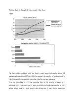
Question 1: US Research Expenditure (changes over time)
1.1 Student model answer
The graph below gives information about U.S. government
spending on research between 1980 and 2008. Summarize the
information by selecting and reporting the main features, and
make comparisons where relevant.
(Introductory sentence) The line graph compares the spending on
five research fields by the US government from 1980 to 2008.
Overall, the spending on all kinds of research increased over the
period.
(Detail paragraph 1) As can be seen from the graph, approximately
8 billion dollars was spent on health studies in 1980 then dipped to
around 6 billion dollars before the peak at about 21 billion dollars in
2004. Followed by a slight drop of 1.5 billion dollars in the following
4 years. By contrast, with only 2.5 million dollars from 1980 to 1994,
General Science was the least spending in the US throughout the
years. Since then, General Science observed a steady growth and
double in 2000 to have one more billion dollars till 2008.
(Detail paragraph 2) Space, Energy and other fields varied
considerably over the given period. Prior to 8 billion dollars in 1997,
the amount of funding allocated for Energy studies hovered around
5 billion dollars from 1980 till 1991, and then plummeted to the
beginning. Thereafter, this figure grew at 2 million dollars which
amounted to 7.5 billion dollars in the 2008. Witness the similar
pattern, Space had 9 billion dollars in the last year, 2 million dollars
higher than other fields.
2
Question 1: US Research Expenditure (changes over time)
1.2 Expert model answer
1 The line graph compares the expenditure, measured in billions of
dollars, spent on different research fields by the US government from
1980 to 2008. 2 Overall, the spending on all kinds of research, except
for other areas, increased marginally over the period, and health
received not only the most funding throughout but also had the largest
increase.
ending up at 7 billion. 8 Space witnessed a similar upward pattern
with fluctuations, finally settling at 9 billion dollars. 9 Other was the
only remaining field and though it was erratic throughout the period
by the end, investment was largely unchanged at around 6 billion
dollars.
1.3 Expert model answer (analysis of structure)
3 For the overall leader health, approximately 8 billion dollars was
disbursed in 1980. 4 This investment dipped to around 6 billion dollars
before rising to a peak of about 21 billion dollars in 2004, followed by a
slight drop in the final four years of the period. 5 In contrast, General
Science was the least prioritized field of research in the US throughout
the recorded period receiving an unchanged amount of only 2.5 million
dollars from 1980 to 1994, followed by a steady growth that doubled
investment to 6 million dollars in 2008.
6 Governmental expenses on Space, Energy and other fields fluctuated
over the given period. 7 The amount allocated for Energy studies
reached a peak at around 8 billion dollars in 1997, before fluctuating and
1 (Introduction) - Paraphrase what the graph shows.
2 (Overview) - Summarize the main trends and compare them to
each other.
3-5 (Detail) – Describe in detail the highest and lowest categories.
6-9 (Detail) – Describe in detail the other groups of data.
3
Question 1: US Research Expenditure (changes over time)
1.4 Expert model answer (focus on verbs)
Complete the model answer with missing verbs, using the correct
form.
1 The line graph __________ the expenditure, __________ in
billions of dollars, __________ on different research fields by the
US government from 1980 to 2008. 2 Overall, the spending on all
kinds of research, except for other areas, __________ marginally
over the period, and health __________ not only the most
funding throughout but also had the largest increase.
3 For the overall leader health, approximately 8 billion dollars
was __________ in 1980. 4 This investment __________ to
around 6 billion dollars before __________ to a peak of about 21
billion dollars in 2004, __________ by a slight drop in the final
four years of the period. 5 In contrast, General Science was the
least prioritized field of research in the US throughout the
recorded period __________ an unchanged amount of only 2.5
million dollars from 1980 to 1994, __________ by a steady
growth that
__________ investment to 6 million dollars in 2008.
6 Governmental expenses on Space, Energy and other fields
__________ over the given period. 7 The amount __________ for
Energy studies __________ a peak at around 8 billion dollars in 1997,
before __________ and __________ up at 7 billion. 8 Space
__________ a similar upward pattern with fluctuations, finally
__________ at 9 billion dollars. 9 Other was the only remaining field and
though it was erratic throughout the period, by the end investment was
largely unchanged at around 6 billion dollars.
4
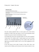
Question 2: Film production in five countries (three time periods)
The chart below shows the number of films produced by five countries
in three years. Summarise the information by selecting and repairing
the main features, and make comparisons where relevant.
2.1 Student model answer
(Introduction) The bar chart compares film in five different countries in
three years 2007, 2008 and 2009. (Overview) It is obvious that whereas
countries A and D observed a slight decline in film production, a
considerable growth in the figure of country C and a marginal rise in B
and E were recorded during the period shown.
(Detail paragraph 1) A created approximately 87 movies and this figure
remained unchanged the next year before decreasing to 80 in 2009. On
the contrary, a reverse trend witnessed in B’s film production. Only
manufacture 50 movies in 2007, B produced 3 more films in the next
year and rose about 17 films in 2009.
(Detail paragraph 2) With substantially lower production, countries C, D,
and E made less than 20 movies. .Specifically, about 8 films
manufactured in C in the first year, then reaching 18 in 2009. Likewise,
an increase of 4 films from 9 to 13 was in country E. By contrast, country
D was with 9 movies 2008 because overall downward trend to 14 movies
in 2009.
5
Question 2: Film production in five countries (three time periods)
2.2 Expert model answer
The bar chart compares film production in five different countries in
three years 2007, 2008 and 2009. Overall, country A produced the
most films during the given three-year period followed by country B,
while the film industry was not as strong in countries C, D, and E.
The largest increase was in country B while country A experienced
a small decrease and there were minimal rises in the other nations.
contrast, country D was the least productive in 2008 with around 9
movies, despite remaining largely steady at around 14 movies in both
2007 and 2009.
2.3 Expert model answer (focus on overview)
1.
Leading the chart, in 2007, country A yielded approximately 87
movies and this figure remained unchanged the next year before
decreasing to 80 in 2009. On the contrary, a reverse trend was
witnessed in B’s film production. Only manufacturing 50 movies in
2007, B produced 3 more films the next year and experienced the
most significant rise to about 17 films in 2009.
With substantially lower production capability, countries C, D, and E
were home to less than 20 movies. Specifically, about 8 films were
manufactured in C in the first year, then this figure increased
twofold prior to reaching 18 in 2009. Likewise, an increase of 4 films
from 9 to 13 was recorded in film industry in country E. By
2.
Complete the notes for your overview
a.
_______ year period
b.
Country ____ made the most films.
c.
Country ____ made the 2nd most films.
d.
Countries ________ didn’t make many films.
e.
Country _____ had the biggest increase.
f.
Country _____ had a small decrease.
g.
Countries ________ had small increases.
Now use your notes to write an overview. Try to combine the
information into a maximum of two or three sentences.
_______________________________________________________
_______________________________________________________
_______________________________________________________
_______________________________________________________
__________________________________________________.
6
Question 3: Marriage age by group (two time periods)
The charts below give information on the ages of people when they got
married in one particular country in 1996 and 2008. Summarise the
information by selecting and repairing the main features, and make
comparisons where relevant.
3.1 Student model answer
The given bar charts compare the percentage of men and women get
married in 1998 and 2008. In general, the proportion of married
individuals of both genders experienced a slight decrease and a
noticeable increase in the given decade. Men got married older than
women.
According to the chart, there was a minor decline in women getting
married under the age of 24, especially the percentage of early
20-year-old females was half in 2008 compared to 1998. Noticeably, no
males got married during 16 to 19 years old. The rate of 25-29-year-old
women married to their husband unchanged at approximately 11.5% over
a 10–year period, while men’s figure observed a slight drop at 8% in
2008.
With regard to older groups, a substantial rise witnessed in 30-37 years
old married people in both genders which accounted for 8% females and
11% males in 2008, in comparison with 7% and 9% respectively in 1998.
For people aged above 35, the proportion of married men surged
substantially to 9% and nearly 7%, resulting in twofold figures of women
over 35 years old.
7
Question 3: Marriage age by group (two time periods)
3.2 Expert model answer
The given bar charts compare the changes in the percentages of men
and women married in 1996 and 2008. Looking from an overall
perspective, it is readily apparent that in both 1996 and 2008 women
tended to get married younger while men got married at an older age,
with the most common marriages being between 25 and 34 years old.
The biggest change that occurred was that in 2008 more members of
both sexes got married later in life.
From 1996 to 2008 there was a decline in the percentage of women
getting married under the age of 24. The percentage of early
20-year-old married females was half in 2008 what it was in 1996. No
males married under age of 20 and the percentage of males aged 20 24 decreased nominally. An unchanged proportion (approximately
11.5%) of young female adults got married when they were 25 – 29
years old, while men’s figures observed a slight drop to 8% in 2008.
In regards to the older age groups, there was a substantial rise in the
proportion of 30-34 year old married people in both genders which
accounted for 8% for females and 11% for males in 2008, compared
with 7% and 9%, respectively in 1996. Men and women in the 35 – 39
and 40 – 44 age group both got married later in life in 2008, with males
especially rising nearly 2 percentage points over the period. The only
exception to this is a slight decline to 2% in the number of females aged
40-44 marrying.
3.3 Expert model answer (analysis of structure)
1 (Introduction) - Paraphrase what the graph shows.
2 (Overview) - Summarize the main trends and compare them to each
other.
3-5 (Detail) – Describe in detail the change in younger age groups.
6-9 (Detail) – Describe in detail the change in older age groups.
8
Question 3: Marriage age by group (two time periods)
3.4 Expert model answer (focus on adjectives)
Complete the model answer with missing adjectives.
The _________ bar charts compare the changes in the percentages
of men and women married in 1996 and 2008. Looking from an
_________ perspective, it is readily _________ that in both 1996 and
2008 women tended to get married _________ while men got married
at an _________ older age, with the most _________ marriages
being between 25 and 34 years old. The _________ change that
occurred was that in 2008 more members of both sexes got married
later in life.
From 1996 to 2008 there was a decline in the percentage of women
getting married under the age of 24. The percentage of early
20-year-old _________ females was half in 2008 what it was in 1996.
No males married under age of 20 and the percentage of males aged
20 - 24 decreased nominally. An _________ proportion
(approximately 11.5%) of _________ female adults got married when
they were 25 – 29 years old, while men’s figures observed a
_________ drop to 8% in 2008.
In regards to the _________ age groups, there was a _________ rise in
the proportion of 30-34 year old _________ people in both genders
which accounted for 8% for females and 11% for males in 2008,
compared with 7% and 9%, respectively in 1996. Men and women in the
35 – 39 and 40 – 44 age group both got married later in life in 2008, with
males especially rising nearly 2 percentage points over the period. The
only exception to this is a _________ decline to 2% in the number of
females aged 40-44 marrying.
9
Question 4: Population of Australia & Malaysia (two time periods)
The table below gives information about populations in Australia and
Malaysia in 1980 and 2002. Summarise the information by selecting
and reporting the main features, and make comparisons where
relevant.
Australia
Malaysia
1980
200
2
1980
2002
Total population (millions)
14.7
19.6
13.7
24.3
Male population (%)
49.9
49.9
50.3
50.6
Female population (%)
50.1
50.1
49.7
49.4
Birth rate (%)
1.5
1.3
3.2
2.2
Average annual population
growth (%)
1.2
1.3
2.4
2.1
Population aged over 65 (%)
9.6
12.4
3.7
4.3
4.1 Student model answer
The table compares six population information of Australia and
Malaysia in the years 1980 and 2002. Overall, the population size in
both countries increased considerably over the period. The two
countries saw differences in the rates of birth, average annual growth
and aging population.
After 22 years, the total population in both countries witnessed a
substantially growth. The figure for Malaysia nearly doubling its
previous data, reaching 24.3 million. While the percentage of men and
women of Australia remained steadily during the period, there was a
slight growth by 0.3% in Malaysian male population.
The two nations experienced a downward trend in birth rates in 2002.
Their older population, by contrast, increased. Between 1980 and
2002, Australia had an extra 2.8% of the elderly while Malaysia rise by
0.6%. Average population growth rate grew by 0.1% in Australia yet fall
by 1% for the other nation.
10
Question 4: Population of Australia & Malaysia (two time periods)
4.2 Expert model answer
higher birthrate and population growth in 1980 (3.2% and 2.4%) and
2002 (2.2% and 2.1%). The senior underwent a different trend. Between
1980 and 2002, Australia was home to an extra 2.8% (12.4% overall) of
the elderly while the figure for Malaysia rose much less substantially by
0.6% (4.3% in total).
The table compares six demographic indicators of Australia and
Malaysia in the years 1980 and 2002. Overall, while the population
size in both countries increased considerably over the period,
Malaysia’s grew at a much higher rate. Despite comparable stable 4.3 Expert model answer (focus on overview)
figures for the male and female population proportions, the population
increase of Malaysia was reflected in an overall higher birthrate,
Complete the notes for your overview
though this rate had a downward trend. Australia had more senior 1.
a.
Population ____________ in both countries
people and saw a larger percentile increase there as well.
b.
__________’s population increased quicker than __________
c.
Male and female proportions were relatively _______.
The total population in both countries witnessed a substantial growth
d.
___________ had a higher birthrate, but with a ____________
with the figure for Malaysia nearly doubling to 24.3 million while
trend.
Australia increased to 19.6 million. While the percentage of men and
e.
___________ had a larger older population.
women of Australia remained steady during the period, there was a
f.
__________’s older population increased quicker.
slight growth of 0.3% in the figure for the Malaysian male population
and reciprocal decline of 0.3% for females.
2.
Now use your notes to write an overview. Try to combine the
information into a maximum of two or three sentences.
Both nations experienced a downward trend in birth rates in 2002, with
_______________________________________________________
a larger difference of 1.0% in Malaysia. Overall, Malaysia had a much
_______________________________________________________
_______________________________________________________
_______________________________________________________
____________
11
Question 5: Transport used for work or study (two time periods)
The charts below show the main methods of transportation for people
travelling to one university for work or study in 2004 and 2009.
Summarize the information by selecting and reporting the main
features and make comparisons where relevant.
5.1 student model answer
The two pie charts compare the percentages of travellers using five traffic
methods to commute to one university for work and study in 2004 and
2009. In general, after ten years’ time, buses overtook cars.
In 1994, over a half of people (51%) travelling to the university used cars,
making automobiles the most preferred one. Followed by bus with 33%.
However, the figure for car users experienced a twice decrease to only
28% in 2004. Witness a reverse trend, after a 10-year period, bus-based
travellers rose by 11%.
An upward pattern was observed in pedestrians, train passengers and
bike riders. More people chose to travel by train or walked to the
university from 2004 to 2009, less than 6% between 1994 and 2004.
However, a substantial rise, from 9% to 16%, was seen in the bicycle.
12
Question 5: Transport used for work or study (two time periods)
5.2 Expert model answer
The two pie charts compare the percentages of travellers using five
traffic methods to commute to one university for work and study in
2004 and 2009. In general, over the five years buses overtook cars to
be commuters’ top preference. Moreover, while the proportion of
people travelling by cars decreased significantly from 2004 to 2009,
the popularity of other methods observed an upward trend, with the
most noticeable growth being in bicycles – the third most used means
in 2009.
In 1994, more than half of people (51%) travelling to the university
used cars as their main method of transport. The second-largest
group was buses with 33%. However, the figure for car users
experienced a nearly twofold decrease to only 28% in 2004.
Witnessing a reverse trend, the percentage of bus-based travellers
rose by 11%. Although a new bus stop was installed at the university
in 2006 and alterations were made to university car parking, the full
effects of these changes is unclear.*
The proportions of pedestrians, train passengers and bike riders all
underwent slight to large increases. Marginally more people chose to
travel by the least preferred routes of trains and walking from 2004 to
2009, each accounting for insignificant percentages of less than 6% in
both years. However, a more substantial rise, from 9% to 16%, can be
seen in bicycle usage.
* Note: Students must include this extra-information, but be careful not to
speculate too strongly, as opinions are not permitted in Task 1 academic
writing.
13
Question 5: Transport used for work or study (two time periods)
5.3 Expert model answer (focus on plurals)
Find and correct mistakes in the following sentences. The number of mistakes are shown in brackets.
1.
The two pie chart compare the percentages of traveller using five traffic method. (3)
2.
In general, over the five years bus overtook car to be commuter’ top preference. (3)
3.
Moreover, while the proportion of person travelling by car decrease significantly. (3)
4.
The popularity of other method observed an upward trend. (1)
5.
In 1994, more than half of people (51%) travelling to the university use car as their main method (3).
6.
The proportion of pedestrian, train passenger and bike rider all underwent slight to large increase (5).
14
Question 6: Changes to Riverdale College (two maps)
The plans below show Riverdale College thirty years ago and now.
Summarize the information by selecting and reporting the main
features, and make comparisons where relevant.
6.1 Student model answer
The two plans illustrate the changes taking place at Riverdale College
after 30 years. Overall, several changes made to both the main
building and the school campus.
It can be clearly seen that the car park has been removed and
replaced by gardens in the eastern. Moreover, the west side of the
school campus has also substantial changed including the removal of
flower beds, space for stairs to be installed.
With regards to the central building on the right side, a new music room
has been constructed underground. The two minor offices on each
floor have been mixed to make a classroom and an art room on the
second and the third floor respectively. The previous office rooms
relocated to the upper floor of the library which has remained its
position inside the left-handed main building after three decades. In
addition, a common room has been erect with an additional floor to the
main building.
15
Question 6: Changes to Riverdale College (two maps)
6.2 Expert model answer
The two plans illustrate the changes that have taken place at
Riverdale College over 30 years. Overall, both the main building and
the school campus have undergone alterations which include
replacing a car park for gardens, flower beds for stairs, as well as
room re-arrangement for more learning and common rooms. One
extra floor has been installed in each building, together with the
addition of a café, music room, and additional stairs connecting the
two main buildings.
In the school campus, it can be clearly seen that the car park has
been removed and replaced by gardens in the eastern part of the
campus. Moreover, the west side of the school campus has also
experienced substantial changes including the removal of flower beds,
leaving space for stairs to be installed. By contrast, the sports halls
and the terrace to the west of the campus have remained unchanged.
With regards to the central building on the right side, a new music room
has been constructed underground across the newly erected Cafe,
which has replaced the classroom and used to serve as the refectory in
the past. The two minor offices on each floor have been
merged to make room for a classroom and an art room on the second
and the third floor respectively. Substituting the refectory, the previous
office rooms have been relocated to the upper floor of the library
whose location has been fixed inside the left-handed main building. In
addition, a common room has been erected with the construction of an
additional floor to the main building. One more set of stairs has been
added to connect the third floors between the two buildings.
16
Question 6: Changes to Riverdale College (two maps)
6.3 Expert model answer (focus on vocab)
Complete the model answer with vocabulary in the box:
connecting
installed
relocated
alterations
substituting
constructed
replacing
merged
erected
addition
removal
re-arrangement
The two plans illustrate the changes that have taken place at
Riverdale College over 30 years. Overall, both the main building and
the school campus have undergone ___________ which include
___________ a car park for gardens, flower beds for stairs, as well
as room ______________for more learning and common rooms.
One extra floor has been ___________ in each building, together
with the __________ of a café, music room, and additional stairs
___________ the two main buildings.
In the school campus, it can be clearly seen that the car park has
been replaced by gardens in the eastern part of the campus.
Moreover, the west side of the school campus has also experienced
substantial changes including the __________ of flower beds,
leaving space for stairs to be installed. By contrast, the sports halls
and the terrace to the west of the campus have remained
unchanged.
With regards to the central building on the right side, a new music room
has been ___________ underground across the newly erected Cafe,
which has replaced the classroom and used to serve as the refectory in
the past. The two minor offices on each floor have been ___________
to make room for a classroom and an art room on the second and the
third floor respectively. ____________ the refectory, the previous office
rooms have been ___________ to the upper floor of the library whose
location has been fixed inside the left-handed main building. In
addition, a common room has been ___________ with the construction
of an additional floor to the main building. One more set of stairs has
been added to connect the third floors between the two buildings.
17
Question 6: Changes to Riverdale College (two maps)
6.4 Expert model answer (focus on complex
sentences)
1.
Study the four different ways of reformulating the example.
(Example 1) The two minor offices on each floor have been merged
to make room for a classroom and an art room on the second and
third floor respectively.
a.
b.
c.
d.
(Relative clause) A classroom and an art room have been
installed on the second and the third floor where the minor
office rooms used to be.
(V-ing participle) The two minor offices on each floor have
been merged, making room for a classroom and an art
room on the second and the third floor respectively.
(with) With the two minor offices being merged, a classroom
and an art room have been added to the second and the
third floor respectively.
(Noun phrase) The merging of the two minor office rooms
on each floor has allowed a classroom and an art room to
be installed on the second and third floor.
1.
Re-write the example in the four different ways.
(Example 2) The kitchen and dining room of the house have been
combined, to create a large open plan kitchen and small dining area
respectively.
a.
b.
c.
d.
(Relative clause)
__________________________________________________
__________________________________________________
________________________________________
V-ing participle)
__________________________________________________
__________________________________________________
________________________________________
(with)
__________________________________________________
__________________________________________________
________________________________________
(Noun phrase)
__________________________________________________
__________________________________________________
________________________________________
18
Question 7: Air pollution in four cities (fixed time)
The chart below shows the average daily minimum and maximum
levels of two air pollutants in four big cities in 2000. Summarise the
information by selecting and reporting the main features, and make
comparisons where relevant.
7.1 Student model answer
The provided chart represents the average minimum and maximum
amount of Sulphur Dioxide and Dinitrous Oxide being disposed daily in
various cities in 2000. Overall, Mexico city was the most polluted city.
As can be seen from the chart, an equal maximum volume of both SO2
and N2O of approximately 200 microgram per m3 was observed in
Mexico City, doubled the minimum amount of around 80 to 100
microgram per m3. Los Angeles was destroyed by N2O, with the
minimum and maximum N2O levels 39 and 104 micrograms per m3
respectively, while the maximum volume of SO2 at only 10 microgram
per m3.
The second most pollute city was Beijing where a minimum of 25
microgram per m3 and a maximum of 130 micrograms per m3 of SO2
on a daily basis, whereas the level of N2O ranged from 14 to 54 units.
Air quality in Calcuta was polluted by approximately 47 to 59
microgram per m3 of SO2 and 30 to 52 micrograms per m3 of SO2.
19
There are many people believe that social networking sites (such as Facebook...) have a huge negative
affect on both individuals and society. From my perspective, I completely agree with this and I will
elaborate on the reasons in following paragraphs.
On the one hand, although social networking sites are developing strongly, they still have big negative
impact on both individuals and society because people will lag behind in developing world. One standout
example of this is using Facebook. The software programmers who like to watch useless things, such as
comedy clips, friends’ photo or advertisement videos on Facebook will lack of their knowledge. If these
programmers do not spend time learning new programming languages or new technical methods, day by
day these programmers can not apply new technical applications, they can not make good products for
their company. These programmers can not improve their career and they also make bad effect on their
company.
On the other hand, social networking sites still have some positive affect on both individuals and society.
This is because those social networking sites are providing huge community of users where companies
can introduce their products to users quickly and spend less money for advertisement than other social
media. It helps them get more profit on business. If companies do good business, they not only help to
improve their company but they also help economic development for countries.
In conclusion, although I concede that there are many advantages of using social networking sites but I
still agree that social networking sites have huge negative impact on individuals and society because by
spending much time for using them, people will lag by their own achievements.
Question 7: Air pollution in four cities (fixed time)
7.2 Expert model answer
The chart provided represents the average minimum and maximum
amount of Sulphur Dioxide and Dinitrous Oxide in the atmosphere in
various cities in 2000. Overall, Mexico city was the most polluted city
with the highest minimum and maximum level of both air pollutants,
Beijing had the second most maximum SO2, Calcutta had moderate
levels across the two pollutants and Los Angeles had a high level of
N20 but comparatively less of the other gas.
A similar maximum volume of both SO2 and N2O (approximately 200
microgram per m3) was present in Mexico City, which was double the
minimum amount of around 80 to 100 microgram per m3. Los
Angeles’s air was primarily contaminated by N2O, with the minimum
and maximum N2O levels being 39 and 104 micrograms per m3
respectively, while the maximum volume of SO2 stood at only 10
microgram per m3.
The city with the second most air pollution overall was Beijing where a
minimum of 25 microgram per m3 and a maximum of 130 micrograms
per m3 of SO2 were recorded on a daily basis, whereas the level of
N2O ranged from 14 to 54 units. Air quality in Calcutta stood at
approximately 47 to 59 microgram per m3 of SO2 and 30 to 52
micrograms per m3 for the other air pollutant.
7.3 Expert model answer (focus on overview)
1. Look at the chart and complete the notes for your overview
a.
Mexico city
__________________________________________________
b.
Beijing
__________________________________________________
c.
Calcutta
__________________________________________________
d.
Los Angeles
__________________________________________________
2. Now use your notes to write an overview. Try to combine the
information into a maximum of two or three sentences.
_____________________________________________________
_____________________________________________________
_____________________________________________________
_____________________________________________________
_____________________________________________________
_____________________________________________________
_________________.
20
Question 7: Air pollution in four cities (fixed time)
7.3 Expert model answer (focus on data)
Complete the model answer with the correct data. Note there are no
figures in the overview.
The chart provided represents the average minimum and maximum
amount of Sulphur Dioxide and Dinitrous Oxide in the atmosphere in
various cities in 2000. Overall, Mexico city was the most polluted city
with the highest minimum and maximum level of both air pollutants,
Beijing had the second most maximum SO2, Calcutta had moderate
levels across the two pollutants and Los Angeles had a high level of
N20 but comparatively less of the other gas.
A similar maximum volume of both SO2 and N2O (approximately
_____ microgram per m3) was present in Mexico City, which was
double the minimum amount of around _____to _____ microgram per
m3. Los Angeles’s air was primarily contaminated by N2O, with the
minimum and maximum N2O levels being _____ and _____
micrograms per m3 respectively, while the maximum volume of SO2
stood at only _____ microgram per m3.
The city with the second most air pollution overall was Beijing where a
minimum of _____ microgram per m3 and a maximum of _____
micrograms per m3 of SO2 were recorded on a daily basis, whereas
the level of N2O ranged from 14 to 54 units. Air quality in Calcutta
stood at approximately _____ to _____ microgram per m3 of SO2 and
_____ to _____ micrograms per m3 for the other air pollutant.
_____________________________
21