Sample writing task 1 ielts collection(pie chart mix) very good
Bạn đang xem bản rút gọn của tài liệu. Xem và tải ngay bản đầy đủ của tài liệu tại đây (737.37 KB, 17 trang )
Tổng hợp: fanpage
Tổng hợp: fanpage
Page 1
IELTS Writing Task 1: my 10 sentences
Last week I explained how to write 10 sentences about the chart below.
Average weekly household expenditure by region, 2007-09
Weekly expenditure (£)
The bar chart illustrates the average weekly spending by household in the different ten
countries from 2007 to 2009.
It is clear that family live in the southern area tend to spend on average more money
than the family in northern area. What is more, the figure is highest in London and
lowest in North East area.
The average weekly family expenditure in London and South East area were the only
two figures over £500, which were around £500 and £520 respectively. Around £480 of
the spending were seen in North East and average England family, while the figure for
East area was a bit higher, with approximately £490.
Similar levels of household spending were seen in South West, West Midlands and
North West, at around £450, £430 and £420 per week respectively. Family in Yorkshire
and The Humber spent £400 per week, while the expenditure in North East area per
week was about just £20 lower than this.
Here are my 10 sentences:
1. The bar chart shows average weekly spending by households in different areas
of England between 2007 and 2009.
Tổng hợp: fanpage
Tổng hợp: fanpage
Page 2
2. Households in the south of the country spent more on average than those in the
north.
3. Average weekly spending by households was highest in London and lowest in
the North East.
4. English households spent on average around £470 per week.
5. The average expenditure for households in London was about £560 per week,
almost £100 more than the overall figure for England.
6. Households in the South East, East and South West also spent more than the
national average.
7. Weekly household spending figures for those three regions were approximately
£520, £490 and £480 respectively.
8. Similar levels of household spending were seen in the West Midlands, the North
West and the East Midlands, at about £430 to £450 per week.
9. In the region of Yorkshire and the Humber, households spent approximately
£400 per week, while expenditure in the North East was around £10 per week
lower than this.
10. It is noticeable that average weekly expenditure by households in the North
East was around £80 less than the national average, and around £170 less
than the London average.
Tổng hợp: fanpage
Tổng hợp: fanpage
Page 3
IELTS Writing Task 1: 'chart without years' essay
The chart below shows numbers of incidents and injuries per 100 million
passenger miles travelled (PMT) by transportation type in 2002.
The bar chart compares the number of incidents and injuries for every 100 million
passenger miles travelled on five different types of public transport in 2002.
It is clear that the most incidents and injuries took place on demand-response vehicles.
By contrast, commuter rail services recorded by far the lowest figures.
A total of 225 incidents and 173 injuries, per 100 million passenger miles travelled, took
place on demand-response transport services. These figures were nearly three times as
high as those for the second highest category, bus services. There were 76 incidents
and 66 people were injured on buses.
Rail services experienced fewer problems. The number of incidents on light rail trains
equalled the figure recorded for buses, but there were significantly fewer injuries, at only
39. Heavy rail services saw lower numbers of such events than light rail services, but
commuter rail passengers were even less likely to experience problems. In fact, only 20
incidents and 17 injuries occurred on commuter trains.
(165 words, band 9)
Tổng hợp: fanpage
Tổng hợp: fanpage
Page 4
IELTS Writing Task 1: 'house prices' chart
The question below comes from Cambridge IELTS book 7. Students tend to find this
question difficult, but last week's lesson about house prices might help.
The chart below shows information about changes in average house prices in five
different cities between 1990 and 2002 compared with the average house prices in
1989.
Some advice:
Introduction: paraphrase the question.
Summary: compare the two periods (prices fell overall from 1990-95, but rose
from 1996-2002), and mention that London prices changed the most.
Details: write one paragraph about each period.
Note: don't write -5%, write "fell by 5%".
I'm afraid I can't give feedback for essays that people share in the "comments" area, but
I'll share my own full essay next week.
Tổng hợp: fanpage
Tổng hợp: fanpage
Page 5
IELTS Writing Task 1: house prices (full essay)
Here's my full essay (band 9) for last week's question:
The bar chart compares the cost of an average house in five major cities over a period
of 13 years from 1989.
We can see that house prices fell overall between 1990 and 1995, but most of the cities
saw rising prices between 1996 and 2002. London experienced by far the greatest
changes in house prices over the 13-year period.
Over the 5 years after 1989, the cost of average homes in Tokyo and London dropped
by around 7%, while New York house prices went down by 5%. By contrast, prices rose
by approximately 2% in both Madrid and Frankfurt.
Between 1996 and 2002, London house prices jumped to around 12% above the 1989
average. Homebuyers in New York also had to pay significantly more, with prices rising
to 5% above the 1989 average, but homes in Tokyo remained cheaper than they were
in 1989. The cost of an average home in Madrid rose by a further 2%, while prices in
Frankfurt remained stable.
(165 words)
Tổng hợp: fanpage
Tổng hợp: fanpage
Page 6
IELTS Writing Task 1: selecting
The following bar chart has a total of 24 bars. It's impossible to describe 24 pieces of
information in only 20 minutes, so you need to select.
A simple rule is to select at least one key thing about each country. Here are some
examples:
Britain: highest spending on all 6 products, give the figure for photographic film.
France: second highest for 3 products, but lowest for the other 3.
Italy: Italians spent more money on toys than on any other product.
Germany: lowest spending overall, similar figures for all 6 products.
I'll write a full essay about this chart for next week.
Tổng hợp: fanpage
Tổng hợp: fanpage
Page 7
IELTS Writing Task 1: bar chart essay
Here's my full band 9 essay for last week's question:
The bar chart compares consumer spending on six different items in Germany, Italy,
France and Britain.
It is clear that British people spent significantly more money than people in the other
three countries on all six goods. Of the six items, consumers spent the most money on
photographic film.
People in Britain spent just over £170,000 on photographic film, which is the highest
figure shown on the chart. By contrast, Germans were the lowest overall spenders, with
roughly the same figures (just under £150,000) for each of the six products.
The figures for spending on toys were the same in both France and Italy, at nearly
£160,000. However, while French people spent more than Italians on photographic film
and CDs, Italians paid out more for personal stereos, tennis racquets and perfumes.
The amount spent by French people on tennis racquets, around £145,000, is the lowest
figure shown on the chart.
Note:
- I tried to keep the essay short (154 words) by selecting carefully.
- It's difficult to change spend, but I used spending, spenders and paid out.
Tổng hợp: fanpage
Tổng hợp: fanpage
Page 8
IELTS Writing Task 1: bar chart
The bar graph shows the global sales (in billions of dollars) of different types of
digital games between 2000 and 2006.
The bar chart compares the turnover in dollars from sales of video games for four
different platforms, namely mobile phones, online, consoles and handheld devices, from
2000 to 2006.
It is clear that sales of games for three out of the four platforms rose each year, leading
to a significant rise in total global turnover over the 7-year period. Sales figures for
handheld games were at least twice as high as those for any other platform in almost
every year.
In 2000, worldwide sales of handheld games stood at around $11 billion, while console
games earned just under $6 billion. No figures are given for mobile or online games in
that year. Over the next 3 years, sales of handheld video games rose by about $4
billion, but the figure for consoles decreased by $2 billion. Mobile phone and online
games started to become popular, with sales reaching around $3 billion in 2003.
In 2006, sales of handheld, online and mobile games reached peaks of 17, 9 and 7
billion dollars respectively. By contrast, turnover from console games dropped to its
lowest point, at around $2.5 billion.
Tổng hợp: fanpage
Tổng hợp: fanpage
Page 9
IELTS Writing Task 1: 'hot dog' bar chart
The bar chart shows the number of hot dogs and buns eaten in 15 minutes by the
winners of ‘Nathan’s Hot Dog Eating Contest’ in Brooklyn, USA between 1980 and
2010.
It is noticeable that the number of hot dogs and buns eaten by winners of the contest
increased dramatically over the period shown. The majority of winners were American
or Japanese, and only one woman had ever won the contest.
Americans dominated the contest from 1980 to 1996, and the winning number of hot
dogs and buns consumed rose from only 8 to around 21 during that time. 1983 and
1984 were notable exceptions to the trend for American winners. In 1983 a Mexican
won the contest after eating 19.5 hot dogs, almost double the amount that any previous
winner had eaten, and 1984 saw the only female winner, Birgit Felden from Germany.
A Japanese contestant, Takeru Kobayashi, reigned as hot dog eating championfor six
years from 2001 to 2006. Kobayashi’s winning totals of around 50 hot dogs were
roughly double the amount that any previous winner had managed. However, the
current champion, American Joey Chestnut, took hot dog eating to new heights in 2009
when he consumed an incredible 68 hot dogs and buns in the allotted 15 minutes.
Tổng hợp: fanpage
Tổng hợp: fanpage
Page 10
IELTS Writing Task 1: more than one chart
Look at the following bar charts, taken from Cambridge IELTS 3, page 73.
The charts below show the levels of participation in education and science in
developing and industrialised countries in 1980 and 1990.
Advice for band 7 or higher:
You must give an overview of the information. This means that you need to find an
overall trend that connects all 3 charts.
Can you find any overall trends? Feel free to discuss your ideas in the "comments"
area. I'll tell you what I think tomorrow.
Tổng hợp: fanpage
Tổng hợp: fanpage
Page 11
IELTS Writing Task 1: bar charts essay
The three bar charts show average years of schooling, numbers of scientists and
technicians, and research and development spending in developing and developed
countries. Figures are given for 1980 and 1990.
It is clear from the charts that the figures for developed countries are much higher than
those for developing nations. Also, the charts show an overall increase in participation
in education and science from 1980 to 1990.
People in developing nations attended school for an average of around 3 years, with
only a slight increase in years of schooling from 1980 to 1990. On the other hand, the
figure for industrialised countries rose from nearly 9 years of schooling in 1980 to nearly
11 years in 1990.
From 1980 to 1990, the number of scientists and technicians in industrialised countries
almost doubled to about 70 per 1000 people. Spending on research and development
also saw rapid growth in these countries, reaching $350 billion in 1990. By contrast, the
number of science workers in developing countries remained below 20 per 1000 people,
and research spending fell from about $50 billion to only $25 billion.
(187 words)
Tổng hợp: fanpage
Tổng hợp: fanpage
Page 12
IELTS Writing Task 1: stacked bar chart essay
The chart below shows the total number of Olympic medals won by twelve
different countries.
The bar chart compares twelve countries in terms of the overall number of medals that
they have won at the Olympic Games.
It is clear that the USA is by far the most successful Olympic medal winning nation. It is
also noticeable that the figures for gold, silver and bronze medals won by any particular
country tend to be fairly similar.
The USA has won a total of around 2,300 Olympic medals, including approximately 900
gold medals, 750 silver and 650 bronze. In second place on the all-time medals chart is
the Soviet Union, with just over 1,000 medals. Again, the number of gold medals won by
this country is slightly higher than the number of silver or bronze medals.
Only four other countries - the UK, France, Germany and Italy - have won more than
500 Olympic medals, all with similar proportions of each medal colour. Apart from the
USA and the Soviet Union, China is the only other country with a noticeably higher
proportion of gold medals (about 200) compared to silver and bronze (about 100 each).
(178 words, band 9)
Tổng hợp: fanpage
Tổng hợp: fanpage
Page 13
Pie chart essays
The pie charts compare the expenditure of a school in the UK in three different years
over a 20-year period.
It is clear that teachers’ salaries made up the largest proportion of the school’s spending
in all three years (1981, 1991 and 2001). By contrast, insurance was the smallest cost
in each year.
In 1981, 40% of the school’s budget went on teachers’ salaries. This figure rose to 50%
in 1991, but fell again by 5% in 2001. The proportion of spending on other workers’
wages fell steadily over the 20-year period, from 28% of the budget in 1981 to only 15%
in 2001.
Expenditure on insurance stood at only 2% of the total in 1981, but reached 8% in 2001.
Finally, the percentages for resources and furniture/equipment fluctuated. The figure for
resources was highest in 1991, at 20%, and the proportion of spending on furniture and
equipment reached its peak in 2001, at 23%.
(158 words, band 9)
Tổng hợp: fanpage
Tổng hợp: fanpage
Page 14
The pie charts compare the proportions of people falling into three distinct age groups in
Yemen and Italy in two different years.
It is clear that Italy had the older population in the year 2000, and that the same is
predicted for the year 2050. The populations of both countries are expected to age over
the fifty-year period.
In the year 2000, just over half of the population of Yemen was aged 14 or under, while
most Italians (61.6%) fell into the 15 to 59 age group, and only 14.3% were children
under 15 years of age. People aged 60 or over accounted for almost a quarter of the
Italian population, but only 3.6% of the inhabitants of Yemen.
Tổng hợp: fanpage
Tổng hợp: fanpage
Page 15
By 2050, the proportion of children under 15 is predicted to drop in both countries, most
noticeably in Yemen where the figure is expected to fall by 13.1%. On the other hand,
the figures for elderly people are expected to rise, by 2.1% in Yemen and a massive
18.2% in Italy. Finally, it is anticipated that the 15 to 59 age group will grow by around
10% in Yemen, but shrink by around 15% in Italy.
Mix chart essays
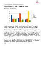
IELTS Writing Task 1: climate essay
The climograph below shows average monthly temperatures and rainfall in the
city of Kolkata.
The chart compares average figures for temperature and precipitation over the course
of a calendar year in Kolkata.
It is noticeable that monthly figures for precipitation in Kolkata vary considerably,
whereas monthly temperatures remain relatively stable. Rainfall is highest from July to
August, while temperatures are highest in April and May.
Between the months of January and May, average temperatures in Kolkata rise from
their lowest point at around 20°C to a peak of just over 30°C. Average rainfall in the city
also rises over the same period, from approximately 20mm of rain in January to 100mm
in May.
Tổng hợp: fanpage
Tổng hợp: fanpage
Page 16
While temperatures stay roughly the same for the next four months, the amount of
rainfall more than doubles between May and June. Figures for precipitation remain
above 250mm from June to September, peaking at around 330mm in July. The final
three months of the year see a dramatic fall in precipitation, to a low of about 10mm in
December, and a steady drop in temperatures back to the January average.
(173 words, band 9)
IELTS Writing Task 1: graph and table essay
The graph and table below give information about water use worldwide and water
consumption in two different countries.
The charts compare the amount of water used for agriculture, industry and homes
around the world, and water use in Brazil and the Democratic Republic of Congo.
It is clear that global water needs rose significantly between 1900 and 2000, and that
agriculture accounted for the largest proportion of water used. We can also see that
water consumption was considerably higher in Brazil than in the Congo.
In 1900, around 500km³ of water was used by the agriculture sector worldwide. The
figures for industrial and domestic water consumption stood at around one fifth of that
amount. By 2000, global water use for agriculture had increased to around 3000km³,
Tổng hợp: fanpage
Tổng hợp: fanpage
Page 17
industrial water use had risen to just under half that amount, and domestic consumption
had reached approximately 500km³.
In the year 2000, the populations of Brazil and the Congo were 176 million and 5.2
million respectively. Water consumption per person in Brazil, at 359m³, was much
higher than that in the Congo, at only 8m³, and this could be explained by the fact that
Brazil had 265 times more irrigated land.
(184 words, band 9)
IELTS Writing Task 1: sample essay (migration)
Full essay (159 words):
The chart gives information about UK immigration, emigration and net migration
between 1999 and 2008.
Both immigration and emigration rates rose over the period shown, but the figures for
immigration were significantly higher. Net migration peaked in 2004 and 2007.
In 1999, over 450,000 people came to live in the UK, while the number of people who
emigrated stood at just under 300,000. The figure for net migration was around
160,000, and it remained at a similar level until 2003. From 1999 to 2004, the
immigration rate rose by nearly 150,000 people, but there was a much smaller rise in
emigration. Net migration peaked at almost 250,000 people in 2004.
After 2004, the rate of immigration remained high, but the number of people emigrating
fluctuated. Emigration fell suddenly in 2007, before peaking at about 420,000 people in
2008. As a result, the net migration figure rose to around 240,000 in 2007, but fell back
to around 160,000 in 2008.