Getting Started in Currency Trading Winning in Today''''s Forex Market_7 pdf
Bạn đang xem bản rút gọn của tài liệu. Xem và tải ngay bản đầy đủ của tài liệu tại đây (856.22 KB, 24 trang )
Technical Analysis
Point and Figure Charts
The modern point and figure (P&F) chart was created in the late nineteenth
century and is roughly 15 years older than the standard OHLC bar chart. This
technique, also called the three-box reversal method, is probably the oldest
Western method of charting prices still around today.
Its roots date back into trading lore, as it has been intimated that this
method was successfully used by the legendary trader James R. Keene during the
merger of U.S. Steel in 1901. Mr. Keene was employed by Andrew Carnegie to
distribute the company shares, as Carnegie refused to take stock as payment for
his equity interest in the company. Keene, using point and figure charting and
tape readings, managed to promote the stock and get rid of Carnegie’s sizeable
stake without causing the price to crash. This simple method of charting has
stood the test of time and requires less time to construct and maintain than the
traditional bar chart. See Figure 11.18.
The point and figure method derives its name from the fact that price is
recorded using figures (Xs and Os) to represent a point, hence the name “Point
and Figure.” Charles Dow, the original founder of the Wall Street Journal and
the inventor of stock indexes, was rumored to be a point and figure user. Indeed,
the practice of point and figure charting is alive and well today on the floor of all
futures exchanges. The method’s simplicity in identifying price trends and sup-
port and resistance levels, as well as its ease of upkeep, has allowed it to endure
the test of time, even in the age of web pages, personal computers, and the infor-
mation explosion.
The elements of the point and figure anatomy are shown later in
Figure 11.19.
125
FIGURE 11.18 Point and Figure Chart
Chapter 11_[115-140].qxd 2/25/10 3:52 PM Page 125
THE TOOLS OF THE TRADE
126
Two user-defined variables are required to plot a point and figure chart,
the first of which is called the box size. This is the minimum grid increment that
the price must move in order to satisfy the plotting of a new X and O. The selec-
tion of the box size variable is usually based upon a multiple of the minimum tick
size determined by the commodity exchange. If the box size is too small, then
the point and figure chart will not filter out white noise, while too large a filter
will not present enough detail in the chart to make it useful. I recommend ini-
tializing the box size for a FOREX P&F chart with the value of one or two pips
in the underlying currency pair.
The second user-defined parameter necessary to plot a point and figure
chart is called the reversal amount. If the price moves in the same direction as
the existing trend, then only one box size is required to plot the continuation of
the trend. However, in order to filter out small fluctuations in price movements
(or lateral congestion), a reversal in trend cannot be plotted until it satisfies the
reversal amount constraint. Typically, this value is set at three box sizes, though
any value between one and seven is a plausible candidate. The daily limit
imposed by most commodity exchanges can also influence the trader’s selection
of the reversal amount variable.
The algorithm to construct a point and figure chart follows:
X
X
X
X
X
X
X
X
X
O
O
O
O
O
O
One Box Size
Downward Trends
Upward Trends
Starting Point
FIGURE 11.19 Anatomy of Point and Figure Columns
Point and Figure Algorithm
• Upward trends are represented as a vertical column of Xs, while down-
ward trends are displayed as an adjacent column of Os.
• New figures (Xs or Os) cannot be added to the current column unless
the increase (or decrease) in price satisfies the minimum box size
requirement.
• A reversal cannot be plotted in the subsequent column until the price
has changed by the reversal amount times the box size.
Chapter 11_[115-140].qxd 2/25/10 3:52 PM Page 126
Technical Analysis
Point and figure charts display the underlying supply and demand of
prices. A column of Xs shows that demand is exceeding supply (a rally); a col-
umn of Os shows that supply is exceeding demand (a decline); and a series of
short columns shows that supply and demand are relatively equal. There are sev-
eral advantages to using P&F charts instead of the more traditional bar or can-
dlestick charts.
127
Advantages of P&F Charts
P&F charts automatically:
• Eliminate the insignificant price movements that often make bar
charts appear “noisy.”
• Remove the often-misleading effects of time from the analysis process
(whipsawing).
• Make trendline recognition a “no-brainer.”
• Make recognizing support/ resistance levels much easier.
Nearly all of the pattern formations discussed earlier have analogous pat-
terns that appear when using a standard OHLC bar chart. Adjusting the
two variables, box size and reversal amount, may cause these patterns to
become more recognizable.
P&F charts also:
• Are a viable online analytical tool in real time. They require only a
sheet of paper and pencil.
• Help you stay focused on the important long-term price developments.
The author uses a point and figure routine in which the reversal is not a
number of boxes but a percentage of the previous column. This accommodates
his Goodman Wave Theory method described in Chapter 12, “A Trader’s
Toolbox.”
For a more detailed examination of this charting technique, we recom-
mend Point & Figure Charting by Thomas J. Dorsey (John Wiley & Sons, 2001).
Charting Caveat—Prediction versus
Description
Chart patterns always look impressive and convincing after the fact. The ques-
tion is: Can they be predicted or are they simply descriptive? One simple
method I learned from my mentor Charles B. Goodman for studying this idea
is to take an old chart with an already well-formed chart pattern. Cover it with
a sheet of blank, opaque paper. Move the paper slowly left-to-right to simulate
Chapter 11_[115-140].qxd 2/25/10 3:52 PM Page 127
THE TOOLS OF THE TRADE
128
real-time trading. Would you be able to predict the chart pattern in advance?
You can easily see the patterns that work—seeing the ones that did not work is
more difficult.
The author has written a program, Charlie’s CAT, to automate this proce-
dure with computer charts.
Indicators and Oscillators
Beyond charting are various market indicators—calculations using the primary
information of open, high, low, or close. Indicators can also be charted or
graphed. Buy and sell signals and complete systems can be generated from a bat-
tery of indicators. The most popular indicators are: relative strength, moving
averages, oscillators or momentum analysis (actually a superset of relative
strength), and Bollinger bands.
TIP: Traders are fascinated by indicators. Numbers bring a sense of cer-
tainty. Be sure you know what an indicator is actually doing, measuring before
using it.
Relative Strength Indicator
The relative strength indicator (RSI) shows whether a currency is overbought or
oversold. Overbought indicates an upward market trend, because the financial
operators are buying a currency in the hope of further rate increases. Sooner or
later saturation will occur because the financial operators have already created a
long position. They show restraint in making additional purchases and try to
make a profit. The profits made can quickly lead to a change in the trend or at
least a consolidation.
Oversold indicates that the market is showing downward trend condi-
tions, because the operators are selling a currency in the hope of further rate
falls. Over time saturation will occur because the financial operators have cre-
ated short positions. They then limit their sales and try to compensate for the
short positions with profits. This can rapidly lead to a change in the trend.
You cannot determine directly whether the market is overbought or over-
sold. This would suppose that you knew all of the foreign exchange positions of
all the financial operators. However, experience shows that only speculative buy-
ing, which leads to an overbought situation, makes rapid rate rallies possible.
The RSI is a numerical indication of price fluctuations over a given
period; it is expressed as a percentage.
RSI ϭ sum of price rises/sum of all price fluctuations
Chapter 11_[115-140].qxd 2/25/10 3:52 PM Page 128
Technical Analysis
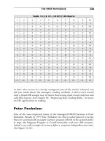
To illustrate this, we have selected the daily closes (multiplied by 10,000)
for the EUR/USD currency pair when it first appeared on the FOREX market
in January 2002. The running time frame in this example is nine days. See
Table 11.1.
An RSI between 30 percent and 70 percent is considered neutral. Below
25 percent indicates an oversold market; over 75 percent indicates an over-
bought market. The RSI should never be considered alone but in conjunction
with other indicators and charts. Moreover, its interpretation depends largely on
the period studied. The example in Table 11.1 is nine days. An RSI over 25 days
would show, given a steady evolution of rates, fewer fluctuations. The advantage
129
TABLE 11.1 Calculating RSI
Date Close Daily Chg Ups Downs Total Percent
1/01/02 8894
1/02/02 9037
ϩ43
1/03/02 8985 Ϫ51
1/04/02 8944 Ϫ41
1/07/02 8935 Ϫ9
1/08/02 8935 0
1/09/02 8914 Ϫ21
1/10/02 8914 0
1/11/02 8925 ϩ11 54 122 176 30.7
1/14/02 8943 ϩ18 72 122 194 37.1
1/15/02 8828 Ϫ15 29 137 166 17.5
1/16/02 8821 Ϫ7 29 93 122 23.8
1/17/02 8814 Ϫ7 29 59 88 33.0
1/18/02 8846
ϩ32 61 50 111 55.0
1/21/02 8836 Ϫ10 61 60 121 50.4
1/22/02 8860 ϩ24 85 39 124 68.5
1/23/02 8783 ϩ23 108 39 147 73.5
1/24/02 8782 Ϫ1 97 40 137 70.8
1/25/02 8650 Ϫ132 79 171 250 31.6
1/28/02 8623 Ϫ27 79 183 262 30.2
1/29/02 8656 ϩ33 112 176 288 39.0
1/30/02 8610 Ϫ46 112 215 327 34.3
1/31/02 8584 Ϫ26 80 232 312 25.6
Chapter 11_[115-140].qxd 2/25/10 3:52 PM Page 129
THE TOOLS OF THE TRADE
130
of obtaining more rapid signals for selling and buying (by using a smaller num-
ber of days) is counterbalanced by a greater risk of receiving the unconfirmed
signals.
Momentum Analysis
Like the RSI, momentum measures the rate of change in trends over a given
period. Unlike the RSI, which measures all the rate changes and fluctuations
within a given period, momentum allows you to analyze only the rate variations
between the start and end of the period studied.
The larger n is, the more the daily fluctuations tend to disappear. When
momentum is above zero or its curve is rising, it indicates an uptrend. A signal
to buy is given as soon as the momentum exceeds zero, and when it drops below
zero, triggers the signal to sell.
Momentum ϭ price on day (X ) Ϫ price on day (X Ϫ n)
where n ϭ number of days in the period studied.
The following example in Table 11.2 of momentum analysis uses the
EUR/USD currency pair as the underlying security.
Examination of the nine-day momentum shows a clear downward trend.
Momentum analysis should not be used as the sole criterion for market entry
and exit timing, but in conjunction with other indicators and chart signals.
Moving Averages
The moving average (MA) is another instrument used to study trends and gen-
erate market entry and exit signals. It is the arithmetic average of closing prices
over a given period. The longer the period studied, the weaker the magnitude of
the moving average curve. The number of closes in the given period is called the
moving average index.
Market signals are generated by calculating the residual value:
Residual ϭ Price(X) Ϫ MA(X)
When the residual crosses into the positive area, a buy signal is generated.
When the residual drops below zero, a sell signal is generated.
A significant refinement to this residual method (also called moving aver-
age convergence divergence, or MACD for short) is the use of two moving aver-
ages. When the MA with the shorter MA index (called the oscillating MA
index) crosses above the MA with the longer MA index (called the basis MA
index), a sell signal is generated.
Chapter 11_[115-140].qxd 2/25/10 3:52 PM Page 130
Technical Analysis
131
TABLE 11.2 Calculating Momentum
9-Day
Date Close Momentum
1/01/02 8894
1/02/02 9037
1/03/02 8985
1/04/02 8944
1/07/02 8935
1/08/02 8935
1/09/02 8914
1/10/02 8914
1/11/02 8925
1/14/02 8943
ϩ49
1/15/02 8828 Ϫ209
1/16/02 8821 Ϫ164
1/17/02 8814 Ϫ130
1/18/02 8846 Ϫ99
1/21/02 8836 Ϫ99
1/22/02 8860
Ϫ54
1/23/02 8783 Ϫ131
1/24/02 8782 Ϫ143
1/25/02 8650 Ϫ293
1/28/02 8623 Ϫ205
1/29/02 8656 Ϫ165
1/30/02 8610 Ϫ204
1/31/02 8584 Ϫ262
Residual ϭ Basis MA(X) Ϫ Oscillating MA(X)
Again we use the EUR/USD currency pair to illustrate the moving average
method (see Table 11.3).
The reliability of the moving average residual method depends heavily on
the MA indices chosen. Depending on market conditions, it is the shorter peri-
ods or longer periods that give the best results. When an ideal combination of
moving averages is used, the results are comparatively good. The disadvantage is
that the signals to buy and sell are indicated relatively late, after the maximum
and minimum rates have been reached.
Chapter 11_[115-140].qxd 2/25/10 3:52 PM Page 131
THE TOOLS OF THE TRADE
132
The residual method can be optimized by simple experimentation or by a
software program. Keep in mind that when a large sample of daily closes is used,
the indices will need to be adjusted as market conditions change.
TIP: For a simple trading method—at least to get started with under-
standing indicators—the new trader could do worse than a moving average and
an oscillator. The moving average works best in trending markets; the oscillator,
in trading or sideways markets. Try to come up with a limited set of rules to
generate buy and sell signals. Use the moving average to identify the trend and
the oscillator to avoid being whipsawed by sideways price movements.
TABLE 11.3 Calculating Moving Average Residuals
Date Close 3-Day MA 5-Day MA Residual
1/01/02 8894
1/02/02 9037
1/03/02 8985 8972
1/04/02 8944 8989
1/07/02 8935 8955 8959 4
1/08/02 8935 8938 8967 29
1/09/02 8914 8928 8943 15
1/10/02 8914 8921 8928 7
1/11/02 8925 8918 8925 7
1/14/02 8943 8927 8926
Ϫ1
1/15/02 8828 8899 8905 6
1/16/02 8821 8864 8886 22
1/17/02 8814 8821 8866 45
1/18/02 8846 8827 8850 23
1/21/02 8836 8832 8829 Ϫ3
1/22/02 8860 8847 8835 Ϫ12
1/23/02 8783 8826 8828 2
1/24/02 8782 8808 8821 13
1/25/02 8650 8738 8782 44
1/28/02 8623 8685 8740 55
1/29/02 8656 8643 8699 56
1/30/02 8610 8630 8664 34
1/31/02 8584 8617 8625 8
Chapter 11_[115-140].qxd 2/25/10 3:52 PM Page 132
Technical Analysis
Bollinger Bands
This indicator was developed by John Bollinger and is explained in detail in his
opus called Bollinger on Bollinger Bands. The technique involves overlaying three
bands (lines) on top of an OHLC bar chart (or a candlestick chart) of the
underlying security.
The central band is a simple arithmetic moving average of the daily closes
using a trader-selected moving average index. The upper and lower bands are the
running standard deviation above and below the central moving average. Since
the standard deviation is a measure of volatility, the bands are self-adjusting,
widening during volatile markets and contracting during calmer periods.
Bollinger recommends 10 days for short-term trading, 20 days for intermediate-
term trading, and 50 days for longer-term trading. These values typically apply
to stocks and bonds, thus shorter time periods will be preferred by commodity
traders. See Figure 11.20.
Bollinger bands require two trader-selected input variables: the number of
days in the moving average index and the number of standard deviations to plot
above and below the moving average. More than 95 percent of all daily closes
fall within three standard deviations from the mean of the time series. Typical
values for the second parameter range from 1.5 to 2.5 standard deviations.
As with moving average envelopes, the basic interpretation of Bollinger
bands is that prices tend to stay within the upper and lower band. The distinctive
characteristic of Bollinger bands is that the spacing between the bands varies
based on the volatility of the prices. During periods of extreme price changes
133
8707.00
8584.50
8462.00
8339.50
8217.00
FIGURE 11.20 Bollinger Bands
Chapter 11_[115-140].qxd 2/25/10 3:52 PM Page 133
THE TOOLS OF THE TRADE
134
(that is, high volatility), the bands widen to become more forgiving. During peri-
ods of stagnant pricing (that is, low volatility), the bands narrow to contain
prices.
Bollinger notes the following characteristics of Bollinger bands:
• Sharp price changes tend to occur after the bands tighten, as volatility
lessens.
• When prices move outside the bands, a continuation of the current
trend is implied.
• Bottoms and tops made outside the bands followed by bottoms and
tops made inside the bands call for reversals in the trend.
• A move that originates at one band tends to go all the way to the other
band. This observation is useful when projecting price targets.
Bollinger bands do not generate buy and sell signals alone. They should be
used with another indicator, usually the relative strength indicator. This is
because when price touches one of the bands, it could indicate one of two
things: a continuation of the trend or a reaction the other way. So Bollinger
bands used by themselves do not provide all of what technicians need to know,
which is when to buy and sell. MACD can be used in conjunction with
Bollinger bands and RSI.
Indicator Caveat—Curve-Fit Data
Most indicators curve-fit data. You must define one or more price or time vari-
ables to calculate the indicator. In a moving average you must select how many
time units to average. The indicator is said to be “curve-fit” to that data. The
pre-Socratic philosopher Heraclitus said it best: “You cannot step twice into the
same river”; and so it is with the FOREX markets. An instance variable that
worked perfectly in one trading session can fail miserably in the next as the mar-
ket environment changes. Opinions vary widely on this caveat. Indicators are
immensely popular in FOREX. Co-author of the first edition Jim Bickford was
a champion of them, whereas I believe they have limited value. At the least an
indicator should be constructed in such a fashion that the instance variables are
adjusted for the changes in market environment. Indicators that work well in
trending markets (high directional movement and low volatility) fail in trading
markets (low directional movement and high volatility) and vice versa. If you
use a battery of indicators, be sure they are evenly divided between trading mar-
kets and trending markets for balance. For an excellent discussion of the classic
trading versus trending concept, see Forex Patterns and Probabilities by Ed Ponsi
(John Wiley & Sons, 2007).
Chapter 11_[115-140].qxd 2/25/10 3:52 PM Page 134
Technical Analysis
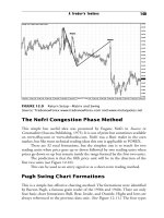
Wave and Swing Analysis
Wave and swing analysis is one of those nebulous terms that means different
things to different people. It is often associated with swing trading, which also
harbors a variety of connotations (the swing trader usually keeps a trade open
longer than the typical session or day trader).
Within the framework of this book, I define wave or swing analysis as
the study of the distance between local peaks and troughs in the closing prices
for the purpose of identifying recurring patterns and correlations. The swing
chart, like its older sibling the point and figure chart, requires the use of a
massaging algorithm that filters out lateral congestion (whipsawing) during
periods of low volatility. For this purpose, a minimum box size must be
selected. Within currency trading, this is almost always a single pip in the
quote (second) currency of the currency pair. Additionally, a minimum rever-
sal quantity must be selected. This is simply the number of pips (box sizes)
required before a retracement can be drawn in the opposite direction (the
continuation of an existing trend requires only one box size to plot the next
point).
Unlike the P&F chart, the swing chart does not necessarily distort the
time element. That is, swing charts are frequently overlaid directly on top of a
vertical bar chart since both use the same numerical scaling for the x- and the y-
axis. (See Figure 11.21.)
In Figure 11.21, it is clear that a swing chart is a sequence of alternating
straight lines, called waves, which connect each peak with its succeeding trough
and vice versa.
135
FIGURE 11.21 Bar Chart with Swing Analysis Overlay
Chapter 11_[115-140].qxd 2/25/10 3:52 PM Page 135
THE TOOLS OF THE TRADE
136
The swing analyst is particularly interested in retracement percentages.
Market behavior is such that when a major trend does break out, there is a
sequence of impulse waves in the direction of the trend with interceding retrace-
ment waves (also called corrective waves). The ratio of the corrective wave
divided by the preceding impulse wave is referred to as the percentage of retrace-
ment. Famous analysts such as William D. Gann and Ralph N. Elliott have ded-
icated their lives to interpreting these ratios and estimating the length of the
next wave in the time series.
Gann believed that market waves moved in patterns based on, among
other things, the Fibonacci number series, which emphasizes the use of so-called
magic numbers such as 38.2 percent, 50 percent, and 61.8 percent. Actually,
there is no magic involved at all; they are simply proportions derived from the
Golden Mean or Divine Ratio. This is a complete study unto itself and has
many fascinating possibilities. Visit www.groups.dcs.st-and.ac.uk/~history/
Mathematicians/Fibonacci.html for more details on Fibonacci and his work.
In his analysis of stocks in the 1920s and 1930s, Elliott was able to iden-
tify and categorize nine levels of cycles (that is, a sequence of successive waves)
over the same time period for a single bar chart. This entailed increasing
the minimum reversal threshold in the filtering algorithm, which creates fewer
but longer waves with each new iteration. He believed each major impulse wave
was composed of five smaller waves while major corrective waves were com-
posed of only three smaller waves. I refer interested readers to the web site
www.elliottwave.com for more details on Elliott and his theories.
Cycle Analysis
Every market is composed of traders at different levels slugging it out. Scalpers,
day traders, and position traders are all attempting to profit from price changes.
Each group has a different time focus or horizon. Cycle theory believes these
groups behave in cyclical fashion and that some composite of their behavior
would parallel the market. If that composite were identified, the cyclical parame-
ters could be run past today’s price into tomorrow’s, resulting in a forecast. I
experimented with a cycle tool, the Expert Cycle System, not to predict the mar-
ket but to examine the ways to find such a composite. (See Figure 11.22.)
Trading Systems
This chapter serves as a road map into the realm of technical analysis. It is a
wondrous realm indeed, but it is easy to get lost there. Time series analysis is a
complex and ever-changing discipline. Advanced studies include deviation
Chapter 11_[115-140].qxd 2/25/10 3:52 PM Page 136
Technical Analysis
analysis, retracement studies, statistical regressions, Fibonacci progressions,
Fourier transforms, and the Box-Jenkins method, to name just a few. A separate
realm is the attempt to transfer methods from other disciplines to market analy-
sis such as data mining.
Many traders have developed more comprehensive systems for trading
using technical analysis. FOREX traders may also wish to consider the technical
analysis of Charles B. Goodman, including the Goodman Swing Count System
(see Chapter 12, “A Trader’s Toolbox”) and the Goodman Cycle Count
System—collectively Goodman Wave Theory. Joe DiNapoli’s DiNapoli Levels
are popular and the basis of the educational course of Derek Ching’s
HawaiiForex (www.HawaiiForex.com). Charles Drummond’s Point & Line
Method has many ardent followers. Elliott Wave Theory is the granddaddy of
them all and remains popular with FOREX traders.
The Technician’s Creed
All market fundamentals are depicted in the actual market data. So the actual
market fundamentals need not be studied in detail.
137
FIGURE 11.22 The Expert Cycle System
Chapter 11_[115-140].qxd 2/25/10 3:52 PM Page 137
THE TOOLS OF THE TRADE
138
The technician believes prices have memory—that past prices do influence
future prices. If you get in a market you have to get out. History repeats itself,
and therefore markets move in fairly predictable, or at least quantifiable, pat-
terns. These patterns, generated by price movement, are the raw buy and sell
signals. The goal in technical analysis is to uncover the signals exhibited in a cur-
rent market by examining past market signals.
Prices move in trends. Technicians typically do not believe that price fluc-
tuations are random and unpredictable. Prices can move in one of three direc-
tions: up, down, or sideways. Once a trend in any of these directions is
established, it usually will continue for some period. Trends occur at all price
levels: tick, 5-minute, 1-hour, 1-day, weekly. What is a trend at the 1-minute
level is obviously just a small blip on the radar on a weekly chart. The various
price levels are interconnected in intricate and fascinating ways.
Never make a trading decision based solely on a single indicator or chart
pattern. The eclectic approach of comparing several indicators and charts at the
same time is the best strategy. Try to move from the most general conditions of
a market to the most specific. Sift your technical tools finer and finer until they
result in a trade.
As in all other aspects of trading, be disciplined when using technical
analysis. Too often, a trader fails to sell or buy into a market even after it has
reached a price that his technical studies have identified as an entry or exit
point. This is money management and psychology, not technical analysis, and
both are very important.
The basic types of technical analysis tools are charts, moving averages,
oscillators, and momentum analysis. Chapter 12, “A Trader’s Toolbox,” puts
forth a suggested program for developing your own technical analysis arsenal.
Your analysis of the markets is only one of three components to successful
trading—money management and psychology are the others.
Summary
The number of technical analysis charts, indicators, methods, and systems can
fill a small library. The subject is fascinating but be objective and remember that
your ultimate goal is to make money. Keep your technical analysis arsenal to a
minimum. Remember that the most popular methods, such as bar chart forma-
tions and support and resistance, are used by many traders. The market gradu-
ally discounts chart patterns and indicator signals when used by many traders
over a long period of time. Also, most traders do not succeed—draw your own
conclusions.
Chapter 11_[115-140].qxd 2/25/10 3:52 PM Page 138
Technical Analysis
Your analysis of the markets is only one component of your trading sys-
tem. In fact, two other components are more important, in the opinion of the
author: money management and psychology (discussed in detail in later chap-
ters). Most traders who fail (and most traders do fail) tend to spend all their
energies on developing a trading system at the expense of money management
and trading psychology. Do not be like them!
139
Chapter 11_[115-140].qxd 2/25/10 3:52 PM Page 139
Chapter 11_[115-140].qxd 2/25/10 3:52 PM Page 140
141
12
A Trader’s Toolbox
Chapter
F
undamentals almost certainly drive the long-term trends of currencies, but
trading is a short-term affair. Most traders do not even hold a position from
one eight-hour session to another. “If U.S. interest rates go up, then the
USD will rise”—this is true in some cases, false in others. There are so many other
factors determining currency prices that an accurate observation one time may
even be incorrect the next. Correlations, between them, almost certainly nonlin-
ear, come and go without notice. But even if one knew a statement to be correct,
how does that help a trader in the short term? Leverage is the name of the game,
and no one wants a $10,000 loss while waiting for a fundamental factor to work.
Ergo, I strongly recommend that the new trader develop a simple technical
analysis toolbox to get started trading currencies. You may add to the toolbox later
or make adjustments. It is important to keep your tools balanced. Do not have four
tools effective in trading markets and only one that works in trending markets. This
implies that you know what an indicator, charting technique, or other technical
tool really does. But begin your FOREX career by keeping it simple.
General Principles
As you select technical analysis tools keep in mind:
• Most tools can be classified as designed for either trading (sideways) or
trending markets. Thus, the majority of traders use similar tools
although they may assemble them in somewhat unique toolboxes. The
majority almost always loses.
Chapter 12_[141-156].qxd 2/24/10 10:12 PM Page 141
THE TOOLS OF THE TRADE
142
• Be certain you know what a technical tool is doing, what it is measur-
ing, before adding it to your toolbox.
• Seek synergy. Does your tool add to and/or complement your other
selections?
• Avoid overkill. Keep it simple!
What does an indicator really measure? Do you really need it in your tool-
box, or can you glean the information from a chart? Consider Figure 12.1. This
shows prices depicted as a bar chart on the top and a relative strength (RS) indi-
cator (see Chapter 11, “Technical Analysis”) on the bottom. Functionally
Relative Strength measures the slope of a line (trend); it is a form of the slop-
intercept formula you learned in Algebra I Ϫ y ϭ mx ϩ b. Does the Relative
Strength indicator below add anything that you cannot see on the bar chart? To
some extent, it depends what you want and need.
TIP: To avoid offending RS aficionados, the author must mention that
this indicator sometimes helps spot tops and bottoms when a new high (or low)
in prices is not matched by a new high (or low) in the RS indicator.
FIGURE 12.1 Charts or Indicators?
Source: TradeviewForex, www.tradeviewforex.com and www.metaquotes.net
Chapter 12_[141-156].qxd 2/24/10 10:12 PM Page 142
A Trader’s Toolbox
It is quite often possible to eliminate indicators because you can more eas-
ily see the same information on a chart. This is the thesis of Charles Goodman’s
Market Environment (ME) charting technique. See Chapter 18, “Improving
Your Trading Skills,” for more on ME. If you get as much bang for your buck as
you can, two or three indicators will be enough to get started.
A KIS Toolbox
This toolbox is only an example of how to select a few basic tools for trading.
Survey the field—it is huge—and pick wisely.
I recommend a toolbox consisting of:
• A chart interpretation technique.
• At the most three indicators.
• A noncomplementary check tool; one that is substantially different
from your primary trading tools. If you use indicators to trade, a simple
bar chart would be a noncomplementary tool. An advisory service may
also be used here.
• An easy-to-use heuristic for analyzing a market with your tools. The
trading heuristic is discussed in more detail in Chapter 15, “The Plan!
The Plan!”
A Chart Interpretation Technique
The Goodman Swing Count System (GSCS) was developed by commodity
trader Charles B. Goodman and used by him until his death in 1984. Michael
D. Archer, whom he mentored, further developed the system. GSCS is a
method for interpreting charts. You may use bar, swing, or point and figure; bar
charts are the easiest and most common. A unique charting technique Mr.
Goodman used, Box Charts, has not yet been programmed into software.
Like all chart interpretation techniques, it is not applicable to all charts all
the time. Not every chart forms a pennant or a head and shoulders, and not
every chart forms a Goodman Wave. But the variety in FOREX is rich enough
that you will find many trading opportunities across all time frames.
The Goodman Swing Count System is one of two components to
Goodman Wave Theory. The other component is the Goodman Cycle Count
System (GCCS). GSCS analysis may become involved, but you can learn
enough quickly to put it into action finding trade candidates. What follows is
143
Chapter 12_[141-156].qxd 2/24/10 10:12 PM Page 143
THE TOOLS OF THE TRADE
144
only a brief introduction to Goodman Wave Theory and GSCS. For a deeper
look see 15 Essential FOREX Trades by John Bland, Jay Meisler, and Michael
Archer (John Wiley & Sons, 2009), or The Goodman Codex by Michael Duane
Archer (B.R. Jostan and Company, 2009). More information is on the author’s
web site, www.goodmanworks.com.
GSCS Rules
There are eight rules to GSCS. The five below are the most basic of them.
The 50 Percent Rule
This rule is almost as old as the market itself. It states simply that at the 50 per-
cent retracement of a trend, prices find at least a temporary equilibrium.
The logic is that in the aggregate all the traders who participated in the
initial trend are at a break-even point. More specifically: Half the buyers have
losses, half have profits; half the sellers have losses, half have profits.
As seen in Figure 12.2, the price value of trend or swing B is 50 percent of A.
Swing A is called a Primary Swing. Swing B is called a Secondary Swing.
The Measure Move Rule
This could be considered a corollary of the 50 Percent Rule. Should prices start
to trend in the direction of the initial trend from the 50 percent price point, the
buyers will hold onto their positions, and the sellers will be forced to liquidate.
The end result is that a second Primary Swing will form of equal value to
the initial swing.
FIGURE 12.2 The 50 Percent Trade Rule
Chapter 12_[141-156].qxd 2/24/10 10:12 PM Page 144
A Trader’s Toolbox
Charles Goodman called this A-B-C formation a “matrix” and considered
it the basic market formation. It is a subset of the Pugh Bull or Bear formations,
discussed below.
As seen in Figure 12.3, the price value of trend or swing C is the same as A
and twice B.
The Wave Propagation Rule
One of Goodman’s most useful discoveries was that prices often form or build as
a series of propagating matrices or measured moves. Each matrix becomes a
swing in the propagation of successively larger matrices.
This is a distinct difference and, in my opinion, improvement over Elliott
Wave Theory.
As seen in Figure 12.4, the price value of D, the return swing, is 50 per-
cent of A-B-C. The matrix A-B-C is now considered itself as a single trend in
GSCS theory.
Trend E is anticipated to be of the net price value of A-B-C. The complete
formation of A-B-C-D-E is a Goodman Wave. Though it may look similar to
an Elliott Wave, the Return Swing and how it is calculated makes an enormous
difference.
145
FIGURE 12.3 Basic Goodman Matrix
FIGURE 12.4 The Goodman Wave
Chapter 12_[141-156].qxd 2/24/10 10:12 PM Page 145
THE TOOLS OF THE TRADE
146
The 3-C Rule
This was the most astonishing discovery Mr. Goodman made about the mar-
kets. It states that if the 50 percent objective is not perfectly met, the over or
under of the measurement will be made on the measured move, the second
Primary Swing.
In Figure 12.5 the 50 percent measurement missed by one chart unit (the
value of B is three instead of four units) and is made up by the full measured
move measurement in the third swing.
FIGURE 12.5 The GSCS 3-C Rule
FIGURE 12.6 3-C Over/Under Measurement
Source: TradeviewForex www.tradeviewforex.com and www.metaquotes.net
Chapter 12_[141-156].qxd 2/24/10 10:12 PM Page 146
A Trader’s Toolbox
TIP: The 3-C Rule states that whatever price value is missed on the 50 per-
cent move will be made up on the measured move. Calculations are done in this
way: (1) Calculate the value missed (either over or under the 50 percent move);
(2) begin counting from the 50 percent price point in the direction of trend A;
(3) calculate the final price point as if the 50 percent move had been in effect;
and (4) add or subtract the value in Step 1 to find the anticipated adjusted price
points for trend C. The two objectives, Over and Under, may be marked with
parentheses. It is not uncommon for prices to first go to the Under measure-
ment, hesitate, then go on to the Over measurement. See Figure 12.6.
The 3-C stands for carryover, compensation, and cancellation.
Curiously, the 3-C Rule is often effective even when the B measurement is
dramatically off the 50 percent point.
There are a number of other GSCS rules and principles but these two trade
setups will suffice for getting started: the Double Intersection and the Return.
The Double Intersection Rule
This is the most useful chart formation I have ever used. It occurs when the
measured move of a swing or matrix intersects at the 50 percent point of the
next larger matrix in a wave propagation. If one 50 percent move represents
equilibrium, two represents even stronger equilibrium. Prices often react sharply
from these double intersections.
TIP: Although this is not functionally accurate, it is useful to think of
traders at different price levels or matrices. Like irrational numbers, they may
not in truth exist, but they are useful for analysis.
In the Double Intersection in Figure 12.7, the traders in swing A have the
same equilibrium point as the traders in matrix 1-2-3. The 50 percent move of
A-B intersects the end point of the 1-2-3 matrix.
At this point a trader would use a timing tool to enter the market in the
direction of the Primary Swing A anticipating a second Primary Swing C to
147
FIGURE 12.7 The Double Intersection Trade Setup
Chapter 12_[141-156].qxd 2/24/10 10:12 PM Page 147
THE TOOLS OF THE TRADE
148
occur. I use the Dagger (See Chapter 18, “Improving Your Trading Skills”) but
moving averages and other indicators will work, also.
There are several Double Intersection templates using the various combi-
nations of the 50 Percent Rule and Measured Move Rule at different points of a
matrix.
Trading the Return
Refer again to the Wave Propagation in Figure 12.4.
When most traders see the D trend or swing on a chart they think in
terms of Elliott Wave Theory where D is simply related to C. In GSCS, D is
in fact the Return or Propagation Wave, representing a 50 percent return of
the entire A-B-C matrix. It almost always has a longer price duration than A,
B, or C, and price reversals may be powerful. Such behavior is tradable. (See
Figure 12.8.)
TIP: Watch for charts where trend D digs into the marked spot intersect-
ing B and C. This spot often offers strong support and resistance, and can be a
good point to watch to enter for a trend E in the direction of A and C.
Here is a return setup where the first component was a matrix and the sec-
ond component was a swing. See Figure 12.9.
Once a Return point is identified, use an entry signal tool to enter with
the major trend or Wave direction.
Goodman Wave Theory is the topic on the author’s web site, www.
goodmanworks.com.
TIP: Always try to enter a market with the major trend and minor trend—
and against the intermediate trend. Buy strength, sell weakness. You want the
long-term trend in your favor (the major trend) and the short-term momentum
(minor trend). But you want to enter after a meaningful correction (the inter-
mediate trend).
I have discovered that GSCS complements two other trading ideas well:
Nofri’s Congestion Phase and Pugh Formations.
FIGURE 12.8 The Return Swing Setup
Chapter 12_[141-156].qxd 2/24/10 10:12 PM Page 148