Great Web Architecture doc
Bạn đang xem bản rút gọn của tài liệu. Xem và tải ngay bản đầy đủ của tài liệu tại đây (10.12 MB, 225 trang )
Release Team[oR] 2001
[x] web development
Simpo PDF Merge and Split Unregistered Version -
- 2 -
Great Web Architecture
by Clay Andres
ISBN: 0764532464
IDG Books © 1999, 217 pages
An enjoyable crash course in the conceptual design of
complex Web sites.
Companion Web Site
Table of Contents Colleague Comments
Back Cover
Synopsis by Michael Nadeau
Creating a static Web page or even a basic, small Web site is one thing, but
producing a large site with many sections and pages is another. Great Web
Architecture will help Web pros making such a leap in scale. It's not a hands-
on guide to building large, professional sites, but an introduction to the
concepts you need to understand before taking on your first big project. The
author covers key issues such as navigation, creating a visual identity, and
keeping track of links. Beautifully illustrated with real-world examples, the
book stands out from other Web guides with clear prose. Interviews with well-
know Web designers adds insight and entertains as well.
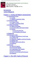
Table of Contents
Great Web Architecture - 3
Foreword - 6
Preface - 6
Part I Secrets of Web Architecture
Chapter 1
- Building Hierarchically Structured Site Plans - 7
Chapter 2
- Navigating Sites—The Flow of Pages - 20
Chapter 3
- Defining Design Elements - 28
Chapter 4
- Envisioning Information - 42
Chapter 5
- Reading Is Believing - 57
Chapter 6
- Integrating Multimedia into the Structure - 80
Part II Web Architecture in Action
Chapter 7
- Informational Sites - 109
Chapter 8
- Marketing Sites—It’s All About Selling - 146
Chapter 9
- Establishing an Identity—Self-Branding - 176
Chapter 10
- Designers Speak - 209
List of Figures - 225
List of Sidebars - 232
Simpo PDF Merge and Split Unregistered Version -
- 3 -
Back Cover
Learn from the Pros! Drawing on interviews with top Web architects, author
Clay Andres shows you how to construct easy-to-navigate, aesthetically
pleasing sites that elegantly project your identity while solving real-world
business challenges. Each chapter explores a different secret, from building a
hierarchy and mapping links to developing vivid themes and planning for
expansion. Illustrated throughout with full-color images of tops sites
including those of Starbucks, Purina, the Getty Center, Salon magazine, and
Carnegie Hall this hands-on guide is your blueprint for successful Web
architecture.
Companion Web site includes:
x All artwork sample pages in the book
x Links to sites described in the book
x Updated information and sample code for Dynamic HTML, JavaScript,
and Cascading Style Sheets
x www.idgbooks.com/extras/webarch.html
About the Author
Clay Andres, a former contributing editor of MacWeek, is the author of seven
books on desktop publishing and design. A graphic designer, typographer,
and Web architect with more than a decade of experience, Andres is the
cofounder of Interactive Arts & Engineering, a Web design and internet
consultancy.
Great Web Architecture
Clay Andres
Published by
IDG Books Worldwide, Inc.
An International Data Group Company
919 E. Hillsdale Blvd., Suite 400
Foster City, CA 94404
www.idgbooks.com (IDG Books Worldwide Web site)
Copyright © 1999 IDG Books Worldwide, Inc. All rights reserved. No part of this book, including interior
design, cover design, and icons, may be reproduced or transmitted in any form, by any means
(electronic, photocopying, recording, or otherwise) without the prior written permission of the publisher.
ISBN: 0-7645-3246-4
Distributed in the United States by IDG Books Worldwide, Inc.
Distributed by CDG Books Canada Inc. for Canada; by Transworld Publishers Limited in the United
Kingdom; by IDG Norge Books for Norway; by IDG Sweden Books for Sweden; by IDG Books Australia
Publishing Corporation Pty. Ltd. for Australia and New Zealand; by TransQuest Publishers Pte Ltd. for
Singapore, Malaysia, Thailand, Indonesia, and Hong Kong; by Gotop Information Inc. for Taiwan; by
ICG Muse, Inc. for Japan; by Norma Comunicaciones S.A. for Colombia; by Intersoft for South Africa;
by Eyrolles for France; by International Thomson Publishing for Germany, Austria and Switzerland; by
Distribuidora Cuspide for Argentina; by LR International for Brazil; by Galileo Libros for Chile; by
Ediciones ZETA S.C.R. Ltda. for Peru; by WS Computer Publishing Corporation, Inc., for the
Philippines; by Contemporanea de Ediciones for Venezuela; by Express Computer Distributors for the
Caribbean and West Indies; by Micronesia Media Distributor, Inc. for Micronesia; by Grupo Editorial
Norma S.A. for Guatemala; by Chips Computadoras S.A. de C.V. for Mexico; by Editorial Norma de
Panama S.A. for Panama; by American Bookshops for Finland.
Simpo PDF Merge and Split Unregistered Version -
- 4 -
For general information on IDG Books Worldwide’s books in the U.S., please call our Consumer
Customer Service department at 800-762-2974. For reseller information, including discounts and
premium sales, please call our Reseller Customer Service department at 800-434-3422.
For information on where to purchase IDG Books Worldwide’s books outside the U.S., please contact
our International Sales department at 317-596-5530 or fax 317-596-5692.
For consumer information on foreign language translations, please contact our Customer Service
department at 800-434-3422, fax 317-596-5692, or e-mail
For information on licensing foreign or domestic rights, please phone +1-650-655-3109.
For sales inquiries and special prices for bulk quantities, please contact our Sales department at 650-
655-3200 or write to the address above.
For information on using IDG Books Worldwide’s books in the classroom or for ordering examination
copies, please contact our Educational Sales department at 800-434-2086 or fax 317-596-5499.
For press review copies, author interviews, or other publicity information, please contact our Public
Relations department at 650-655-3000 or fax 650-655-3299.
For authorization to photocopy items for corporate, personal, or educational use, please contact
Copyright Clearance Center, 222 Rosewood Drive, Danvers, MA 01923, or fax 978-750-4470.
Library of Congress Cataloging-in-Publication Data
LIMIT OF LIABILITY/DISCLAIMER OF WARRANTY: THE PUBLISHER AND AUTHOR HAVE USED
THEIR BEST EFFORTS IN PREPARING THIS BOOK. THE PUBLISHER AND AUTHOR MAKE NO
REPRESENTATIONS OR WARRANTIES WITH RESPECT TO THE ACCURACY OR
COMPLETENESS OF THE CONTENTS OF THIS BOOK AND SPECIFICALLY DISCLAIM ANY
IMPLIED WARRANTIES OF MERCHANTABILITY OR FITNESS FOR A PARTICULAR PURPOSE.
THERE ARE NO WARRANTIES WHICH EXTEND BEYOND THE DESCRIPTIONS CONTAINED IN
THIS PARAGRAPH. NO WARRANTY MAY BE CREATED OR EXTENDED BY SALES
REPRESENTATIVES OR WRITTEN SALES MATERIALS. THE ACCURACY AND COMPLETENESS
OF THE INFORMATION PROVIDED HEREIN AND THE OPINIONS STATED HEREIN ARE NOT
GUARANTEED OR WARRANTED TO PRODUCE ANY PARTICULAR RESULTS, AND THE ADVICE
AND STRATEGIES CONTAINED HEREIN MAY NOT BE SUITABLE FOR EVERY INDIVIDUAL.
NEITHER THE PUBLISHER NOR AUTHOR SHALL BE LIABLE FOR ANY LOSS OF PROFIT OR
ANY OTHER COMMERCIAL DAMAGES, INCLUDING BUT NOT LIMITED TO SPECIAL,
INCIDENTAL, CONSEQUENTIAL, OR OTHER DAMAGES.
Trademarks
All brand names and product names used in this book are trade names, service marks, trademarks, or
registered trademarks of their respective owners. IDG Books Worldwide is not associated with any
product or vendor mentioned in this book.
is a registered trademark or trademark under exclusive license to IDG Books Worldwide, Inc. from
International Data Group, Inc. in the United States and/or other countries.
Simpo PDF Merge and Split Unregistered Version -
- 5 -
To the memory of Garson Kanin: a dear friend, a writer, and a true inspiration. I’m still learning
from you.
About the Author
Clay Andres has been a freelance computer journalist for more than a dozen years, during which time
he has written seven books. He is a former contributing editor to MacWEEK magazine and has written
scores of articles on everything from object technology and ISDN to spreadsheets and graphic design.
At the same time, Andres has written white papers and other technical marketing materials for many
corporate clients, including IBM, Apple, Xerox, and Adobe. Andres is also a cofounder of Interactive Arts
& Engineering, a Web design and Internet consultancy.
In former incarnations, Clay was a programmer and computer center manager. But before that, he was
a student of architecture and still spends a large fraction of his time as a graphic designer, typographer,
and self-proclaimed Web architect. His book design for Illustrator Illuminated was a finalist for the
prestigious Benjamin Franklin Book Design Award.
Clay lives in northwestern Connecticut with a wife, three sons, and a corgi.
Colophon
This book was produced electronically in Foster City, California. Microsoft Word 97 was used for word
processing; design and layout were produced using QuarkXPress 4.04 and Adobe Photoshop 5 on
Power Macintosh computers. The typeface families used are Minion, Myriad Multiple Master, Prestige
Elite, Symbol, Trajan, and Zapf Dingbats.
Acquisitions Editor
Michael Roney
Development Editor
Katharine Dvorak
Technical Editor
Dennis Cohen
Copy Editor
Ami Knox
Permissions Editor
Jesse Simko
Project Coordinator
Tom Debolski
Book Designer
Margery Cantor
Cover Art
Peter Kowaleszyn, Murder by Design/Image Poetry
Production
York Graphic Services
Proofreading and Indexing
York Production Services
Acknowledgments
Simpo PDF Merge and Split Unregistered Version -
- 6 -
I did not write this book by myself, and there are many people whose help was invaluable and untiring.
Without the encouragement and patience of Mike Roney and Katie Dvorak, this book would not exist. I
am grateful to both for going beyond the call of duty (and the fine print of contract) to help turn some
very fallow periods into truly productive ones. I’d also like to thank my friend and intern, Jesse Simko,
who took on the seemingly thankless task of tracking down permissions from all the companies and
design firms discussed in these pages. And, as always, nothing is written without passing the critical,
yet loving, eye of my wife, Katharine, who makes it all worthwhile.
I would be remiss if I didn’t give special thanks to all the people behind the Web sites included in this
book. It was wonderful to be in contact with so many talented, creative people so willing to take time to
discuss the pleasures and travails of Web site design. I have learned much from all of you and am
grateful to have been a part of this active, exciting community.
There are also several companies that supplied me with software and hardware that made the writing of
this book possible. Both Adobe Systems and Macromedia were very generous in supplying me with the
latest editions of their applications. Apple Computer helped me through the loan of Macintosh systems,
as did Sony Electronics with the loan of a Vaio Windows system and Agfa with the loan of one of their
SnapScan scanners. I am deeply grateful for all of this support.
Foreword
As editor in chief of Publish magazine, I’ve seen a lot of Web sites. I can’t begin to count how many of
them opted for flashy graphics instead of understated visual guidance, or chose gimmicky metaphors
over intuitive navigation. All too often Web graphics are confused with Web design—superficial
elements take precedence over structural integrity. In Great Web Architecture, Clay Andres shows us
how it should be done.
Andres pointedly uses the word architecture in this title, because designing a Web site is much like
constructing a building. You need site analysis and structural blueprints. You need skilled masons to lay
the foundation, carpenters to build the framework, and electricians to connect the wiring. You need to
consider whether visitors will enter your building directly through the front door—the home page, if you
will—or if they’ll pause briefly in a vestibule—a splash screen that welcomes people to the site. Is your
site a portal through which visitors access other businesses, much like the lobby of an office building?
Or is it a shopping mall in which people buy a variety of goods? As you can see, there’s a great deal of
planning that must occur before you call in the interior designers who paint the walls and decorate the
rooms.
At Publish magazine, we’ve been pondering these ideas long before the Web entered mainstream
consciousness. Our business is the design and production of communications that are created with
personal computers. Publish began in 1986, along with the then-nascent desktop publishing revolution.
Those early years were a whirlwind of ever-improving software and hardware, released almost as fast
as publishing geeks could think up ways to apply technology to the problems of information design and
production workflows. Today, we’re seeing the same kind of passion, creativity, and excitement around
publishing on the World Wide Web, as individuals and corporations revel in the onslaught of ever-better
technologies and off-the-shelf tools to communicate their messages. But the thread that ties together
these two seemingly diverse disciplines is the flow of information, the architecture of communication.
Like Publish, Clay Andres began with desktop publishing and made the transition to the Web several
years ago. As an author, he’s written books about such mission-critical software as Adobe Photoshop,
an application that lives as much in the Web world as in the print one. In addition to his clear and
engaging writing style, Andres brings to his books his first-hand perspective as a Web site designer for
clients such as International Paper. He uses plenty of real-world case studies to make sense of complex
design principles. You’ll find him a valuable guide to understanding the secrets of successful Web
architecture.
Serena Herr
Editor in chief, Publish
Preface
Available technology both enhances and limits what you can do with architecture.
When you look at a Web site and browse among its pages, you are seeing the solution to a specific set
of business and design problems. But things look very different when you begin to work on a Web site.
In most cases, the problem isn’t well defined, which makes the process of site development one of
mutual discovery for clients and designers. It is this aspect, in addition to rapidly changing technology,
that makes each project different from another, and explains why it is necessary to spend so much time
Simpo PDF Merge and Split Unregistered Version -
- 7 -
gathering information about your clients—their products and services, their customers and employees,
the way they do business, and their goals—before you can start to design or build a site.
In Great Web Architecture, you get a chance to look at Web sites representing many architectural
solutions and explore the different aspects of each. For example, various parts of the book discuss how
problems of navigation, identity, familiarity, and image are solved in each site; and how information is
presented, made accessible, useful, and kept current. In addition to design issues, business issues are
addressed and solved. But the order of exploration does not follow a standard project design workflow.
Instead, the hierarchical plans that support a Web site mark the starting point, and the discussion
continues through the structural elements of sites and pages.
Each chapter provides an opportunity to look at techniques used to solve problems and create strongly
coherent Web sites. You are taken through more familiar HTML constructs, such as those used for
tables and frames, into the various components of Dynamic HTML, including JavaScript and Cascading
Style Sheets. You also learn about opportunities to use Java. (Be sure to check out the Web site that
accompanies this book, www.idgbooks.com/extras/webarch.html, for code samples.)
The approach to Great Web Architecture is architectural, not in the sense of information architecture,
which concerns the classification, ordering, and presentation of data, but in a structural sense. What are
the elements of a site? How are these elements assembled into a coherent, useful, and compelling
whole that can stand up even under the most adverse conditions? It is this post-and-beam approach to
solving the problems of Web site design that proves to be the best metaphor for the design and
construction of really great Web sites.
Part I: Secrets of Web Architecture
Chapter List
Chapter 1: Building Hierarchically Structured Site Plans
Chapter 2:
Navigating Sites—The Flow of Pages
Chapter 3:
Defining Design Elements
Chapter 4:
Envisioning Information
Chapter 5:
Reading Is Believing
Chapter 6:
Integrating Multimedia into the Structure
Chapter 1: Building Hierarchically Structured Site Plans
A site without hierarchy is like a jellyfish—an amorphous mass with a bunch of tentacles leading
nowhere.
Raymond Gargan, Interactive Arts & Engineering
In this chapter, we look at the backbone of Web architecture: the hierarchical site plan. A Web site’s
hierarchy is evident regardless of the language, program, or platform used to build pages and the links
that hold the pages together as a site. Architecturally, this backbone forms the structure upon which we
build our sites and is therefore the logical place to begin a site design. The creation of a strong yet
flexible site plan is as much an exercise in engineering as in design, but remember, the discipline of
architecture is a cross between design and engineering. And even though the look of a building is what
we first admire, it is the combination of form and function in equal measure that enables us to say
whether that building is well designed. In the same way, good Web architecture combines a strong
aesthetic sense with clean, flexible site planning.
Hierarchies provide both form and elasticity, but deciding what makes a good site is very much a matter
of personal taste. For instance, when in search of good design on the Web, I tend to judge sites quickly,
fleeing to other domains before an ugly page has even finished loading. If I’m looking for information,
I’m more likely to tolerate long load times or click through numerous links to get to my destination. But
I’m also quick to look elsewhere if a path seems to be going nowhere. First impressions are important,
but successful Web sites need more than quick, attention-grabbing elements.
The structure that holds up a site is its plan, and even though it’s possible to use links to jump from
page to page almost at random, all site plans are organized hierarchically. The hierarchy needn’t be
rigid, but a clearly delineated structure makes it possible to facilitate stream-of-consciousness browsing.
You Can’t Judge a Web Site by Its Home Page
To begin, take a look at an example home page and the site it covers. TAG Heuer is a well-known
brand with a carefully crafted image as a manufacturer of high-end sports watches. Its home page
(www.tagheuer.com
) reflects this (1.1). Graphically, this page looks like a TAG Heuer ad: sport plus
Simpo PDF Merge and Split Unregistered Version -
- 8 -
watch equal man/woman of action. The addition of a list of links turns this ad into a simple but effective
site entry point. Image and the promise of information—the basic elements of a home page.
Figure 1.1 © Copyright Adjacency, Inc.
But a home page does not constitute a site plan. Instead, it is a portal into the site that reflects the
overall design of the site. TAG Heuer’s site plan, designed by Adjacency, has a straightforward two-
level hierarchy: home page, first-level divisions, and second-level category pages (1.2
). Each entry on
the home page leads to a division page, each of which is subdivided into categories. This basic
structure, reflected in the navigation bars of the site, makes it easy to find information and also know at
all times where you are within the site. Easy navigation combined with a sense of place is the hallmark
of a well-structured Web site.
Figure 1.2 © Copyright Adjacency, Inc.
There is much more to Web architecture than pretty pages and hierarchical links, but these two
elements are the design and engineering basis of good sites—they are our elevations and plans.
Finding Your Footings: Hierarchical Foundations
It is the nature of the human mind to categorize, order, and sort information. Thus, it is no surprise that
given a collection of Web pages, we naturally create hierarchies. Or to put it another way, most subjects
can easily and naturally be broken down into subsets to create a hierarchy of information.
Take a look at any Web site. Some will have relatively broad or flat hierarchies, whereas others may be
quite deep, with many levels of detail. Neither is inherently better, but they serve different purposes.
Most obviously, a site with a lot of information will require greater depth simply to accommodate all of its
pages.
Simpo PDF Merge and Split Unregistered Version -
- 9 -
Smaller sites tend to have flatter hierarchies, which makes it easier to get to details more quickly. As
you can see immediately on his home page, designer Rob Day’s site (www.evansday.com
) is divided
into three functional categories: Our Work, Photoshop, and About Us (1.3
). The site map shows that no
category goes beyond the next level of detail (1.4
). You don’t need much more than this to organize a
couple dozen pages and allow for modest growth.
Figure 1.3
Figure 1.4
This site can grow in two directions: Day can deepen the site by adding more subcategories or detail, or
broaden the site by adding whole new categories. This site will deepen naturally as more examples are
added to the subsections of the Our Work division. If the business were to expand to include a retail
division selling Rob Day’s Iris prints, it could easily be added as a new division to the site. It might well
end up being the largest division, but a simple hierarchical plan can accommodate this kind of change
and growth.
The Web site produced by Impact Design for Absinthe, a restaurant in San Francisco, uses the same
structure as Day’s site: four divisions off a home page, each with a few or no subdivisions and detail
pages (1.5
). A Web site for a belle Époque restaurant in San Francisco might seem to have very little in
common with a designer’s personal showcase, but in plan, they are remarkably similar
(www.absinthe.com
).
Simpo PDF Merge and Split Unregistered Version -
- 10 -
Figure 1.5
Note
The two-level hierarchy is quite flexible and is easily expanded. If you think
about the mathematical possibilities, a site with four categories, each with four
subcategories, has 16 physical divisions for storing detail pages. Any category
can have more than four subcategories, and it’s also easy to create additional
first-level categories. You can see that this simple arrangement of pages can
quickly expand to 25 or 36 categories, each with numerous detail pages.
Digging Deeper—Bigger Basements for Bigger Sites
Crane & Co., Inc., a paper manufacturer in Dalton, Massachusetts, has a moderate-sized site designed
by Interactive Arts and Engineering—over 100 pages (www.crane.com
). It appears to be organized on
the same basic two-level hierarchy with seven primary categories that reflect the business divisions of
this international corporation (1.6
). But there’s a twist here. When you click on any of the divisions, you
are still within the Crane & Co. domain, but the larger divisions have their own two-level hierarchy of
pages.
Figure 1.6
When you enter the Business Papers division, you are one level down in the Crane site hierarchy, but
you are also at the top level of the Business Papers subsite (1.7
). This page acts as another home
page. It conveys a strong image and the promise of information through seven additional links. Frequent
business visitors to Crane’s site would be more likely to bookmark this page than the corporate home
page, because it is the logical entry point for them. Going down this hierarchy another level, you find the
lowest organizing level leading to the detail pages (1.8
).
Simpo PDF Merge and Split Unregistered Version -
- 11 -
Figure 1.7
Figure 1.8
The Crane site can also be seen as a collection of nested sites, with each corporate division as a
closely related but independent site. If Crane acquired a new company with its own Web site, it would
not be difficult to incorporate it as a subsite like any of the existing divisions. When Crane creates a new
product line, the division’s subsite can broaden to include it without affecting any of the other divisions.
It’s as though your filing system not only had document and file drawers, but also rooms of file drawers.
You can see that adding a new room expands the capacity of the system without affecting anything that
came before it. On the other hand, you could spend your life in a single room and never know that other
rooms existed.
Nested sites like Crane’s also allow for a division of Web responsibility. Corporate PR handles the home
page and one category, while product managers within each of Crane’s divisions are responsible for the
content of their own section of the site.
Breaking Hierarchies
Just as we’re beginning to feel comfortable with a purely hierarchical organizing scheme, something
comes along to remind us that ours isn’t a purely hierarchical world. Not all subjects can be neatly
categorized. There are too many extenuating circumstances, interruptions, and leaps of the imagination.
As we strive to achieve a harmonious site plan, something sticks out and upsets the balance. Our goal
is to incorporate these elements without destabilizing the site structure.
Simpo PDF Merge and Split Unregistered Version -
- 12 -
We start with order. We divide and subdivide like Linnaeus with the living world until we get down to the
species level. But what do we do with the platypus? Even worse, what if our system of knowledge is
imperfect? What if we started with only two kingdoms: plants and animals? Where do we put bacteria
and algae?
The Braun site (www.braun.com
), for example, is a model of clean design (as are its appliances). The
home page is devoid of extra decoration; the logo is the image (1.9
). On the left is a column of seven
links that constitute the two-level hierarchy of the site, plus a site map link for quick navigation. On the
right, more links, but outside of the standard order. (Notice also the Braun-designed switch that is used
as a navigational element throughout the site. These elements are discussed in more detail in Chapter
4.)
Figure 1.9
When you look at Braun’s site map, it doesn’t look hierarchical (1.10
) But if we take this graphic and
straighten out the hierarchy, we can see that it’s a classic two-level design (1.11
). Now where do we put
the elements from the right column of the home page?
Figure 1.10
Figure 1.11
Simpo PDF Merge and Split Unregistered Version -
- 13 -
The Contest and Screensaver links can easily be thought of as separate categories that fall under the
home page. We might like all categories at this level of the hierarchy to be of equal importance.
Logically, this would make sense, and by moving them off to the side of the home page, the designers
of this site are making the statement that these links are different. But structurally, they fit right in.
Braun’s World Cup site has special significance. Intended to attract attention to Braun during the world’s
largest sporting event, it is both timely and temporary. The designers have made it of equal importance
to the home page itself by creating a unique domain for it, www.worldcup.braun.com
(1.12).
Hierarchically, this has created two linked and equal sites. It’s as if Linnaeus had discovered a whole
new life form.
Figure 1.12
Hierarchy Tells All
Raymond Gargan, Interactive Arts & Engineering
Q: How does the process of defining a site hierarchy work?
RG: It’s like any research project. What you want to know is: How does this company do what it does?
You start by collecting information. In the case of a Web site, you talk to the client—talk to everyone
you can, executives, managers, sales, and marketing people. Read everything they have available—
annual reports, sales brochures, company news-letters. If you’re lucky, you might even find some
letters from customers. With this mass of information, you get to know the company and can see
beyond the standard corporate organizational charts.
In addition, we always look at what our clients’ competitors are doing both on and off the Internet. It’s
also very important that both the developer and the client agree on the objectives for the site. For
example, does the company want to have e-commerce or online customer service immediately,
sometime in the future, or never?
With all this knowledge, you can begin to categorize and order the information you’ve gathered.
Inevitably, this leads to a hierarchy. Sometimes you have to make compromises. Or there are times
when you might want to put the same thing in two categories, but that’s what the Web is great for. You
can have the same thing in multiple places just by linking across whatever hierarchy you’ve created.
Q: What happens if you need to change the hierarchy?
RG: We originally designed the Crane site with only its two most prominent divisions in mind—Social
Papers and Business Papers. But then Crane decided all seven divisions, including their engraving
and currency papers divisions, should be added. The hierarchical plan easily expanded to
accommodate this. Of course we had to redesign the home page to include all seven links, but that
was easy. The real trick was to keep the look consistent across all of these very disparate entities.
Maintaining a very well-structured hierarchy is what made this possible.
Growing Bigger
You may be thinking that it’s easy for a site like Braun’s to remain clean and uncluttered. It’s relatively
small, it has a well-defined clientele and product line, and it doesn’t try to do too much. Even the
Simpo PDF Merge and Split Unregistered Version -
- 14 -
addition of its World Cup feature doesn’t make the site seem much more complex. After all, Braun is not
an appliance giant. But it is a small part of the consumer giant The Gillette Company, which has its own
Web site that points to Braun’s domain. This is not unlike the situation at Crane & Co., where there are
several divisions. But it’s a matter of scale; The Gillette Company is made up of several companies, and
its Web site (www.gillette.com
) reflects this (1.13).
Figure 1.13
The Gillette Company is so big that Braun, one of its major entities, barely shows up on the home page.
You have to click down a level through the Brands button to get to a Braun link (1.14
). You can see
what the designers of The Gillette Company’s site are up to when you look at the site map (1.15
). This
looks like any other two-level hierarchy, but it only represents the very top of Gillette’s deep domain—
the tip of the iceberg.
Figure 1.14
Figure 1.15
From the Brands page, you can access Braun, Oral-B, or Duracell, each of which had its own site
before The Gillette Company’s corporate domain went online. Actually, there is a detail page for each
Simpo PDF Merge and Split Unregistered Version -
- 15 -
brand with links to the brand’s domain (1.16). It’s a bit hidden, but you can see that the word Braun in
the text is a link that takes you to the Braun site. This isn’t really nested, because you have to leave The
Gillette Company domain to enter the Braun domain, but the effect is similar. And I would guess that, in
the future, there will be links added from Braun’s site back to Gillette’s.
Figure 1.16
One of the most powerful aspects of hierarchical organization is that it allows for the creation of
hierarchies independent of one another. These can be plugged in together without the need to change
either one. You can see how Braun was able to link across at the topmost level to add its World Cup
feature. Crane was able to do this from the top down with its divisions, and Gillette was able to
incorporate entire preexisting sites for its independent brands.
Note
Throughout this chapter, the discussion has moved from smaller to larger sites,
with the focus on how size affects site organization and structure. But we have
not examined the process of gathering information and ordering it by importance,
because this is not within the scope of this book. The Gillette name, for example,
is practically synonymous with shaving, and with one of the bigger advertising
budgets in the world, this is likely to remain so. But a Web site enables The
Gillette Company to promote other important, if less obvious, aspects of the
company. The fact that it is “people-oriented” and a good world citizen rarely
gets mentioned in 30-second spots, but on the Web, the story can be featured
right up front (1.17
).
Figure 1.17
Simpo PDF Merge and Split Unregistered Version -
- 16 -
Balancing Sites
As you explore the structure of the site for The Gillette Company (which was relatively new and still
expanding as of this writing), you find that the depth varies considerably according to category. People,
Company, Investors, and Citizenship are obviously important subjects The Gillette Company wants to
highlight. But even though they represent two-thirds of the first-level hierarchy, they contain less than
one-third of the site’s pages. Yet the site does not appear unbalanced.
If balance were achieved by sheer weight of pages, Gillette could have organized its site differently into
Brands, Products, and Company Information, with People, Investors, and Citizenship moving down a
level under this last category. The site plan would have looked more balanced, but the editorial aspects
of this site would not have been as well served.
This first-level hierarchy presents what The Gillette Company sees as a balanced view of the company.
They’ve essentially tilted a typical product-oriented view (1.18
) up on one side to show a more
corporate-oriented view. By doing this, they rotate the categories that might have been the first-level
hierarchy downward to the second and third levels, and they become the underwater two-thirds of the
iceberg.
Figure 1.18
This points out another aspect of hierarchies. Imagine that your site plan is constructed like an
Alexander Calder mobile with each sculptural element hanging from the top by a wire and balanced
along a rod with other elements of equal prominence (1.19
). It’s possible to pick any element and rotate
the mobile so that it all hangs from this new top element. Gravity may wreak havoc with your wires and
rods, but a site plan on paper can always be rotated this way.
Figure 1.19
Don’t forget that even though a site is designed from a home page downward, sites can be entered at
any page. The home page is the formal entry point, but not the only one. The preponderance of search
engines almost ensures that a large percentage of a site’s visitors will not come in through the front
door. A balanced site is one that can welcome browsers at any point. As detailed later in this book, this
has as much to do with navigational elements as with a site’s structure.
Leaping Over Hierarchies
I have touted hierarchies as the only way to organize Web sites. With a physical collection of printed
pages, there’s no other way. But truly large sites, and sites that change frequently, must present what is
important up front, regardless of where this information lies in the hierarchy. Newspapers have always
used organizing schemes that include rules for laying out the front page, as well as multiple sections
that make it easy to find things like sports and business news. The New York Times adapted this
technique for its Web-based front page, and it almost looks like a “real” newspaper (www.nytimes.com
).
There are no articles on this page, however, only headlines, brief summaries, and links . . . lots of links
(1.20
).
Simpo PDF Merge and Split Unregistered Version -
- 17 -
Figure 1.20 Reprinted by Permission. ©1998 The New York Times Company.
In an electronic newspaper, headlines remain important elements, but the stories themselves are
banished to the inner pages, replaced on the front page by short summaries. Without the physical
sections of paper folded inside each other, section links become more important. The sections remain
the same from day to day, whereas the headlines and summaries change with the news. So there is a
familiar structure that you can use to go straight to the Technology news (1.21
), and there are linked
items of greater importance (in the eyes of The New York Times) that let you skip over the hierarchy
and go right to the lead story (1.22
).
Figure 1.21 Reprinted by Permission. ©1998 The New York Times Company.
Simpo PDF Merge and Split Unregistered Version -
- 18 -
Figure 1.22 Reprinted by Permission. ©1998 The New York Times Company.
The way we read a printed newspaper is very different from browsing through an on-line newspaper, but
in The New York Times’ version some similarities remain. We can browse the front page headlines, but
we can’t read more than the first sentence or two of any article. We’ve got to click to link to the full text
and link back if we want to continue browsing the headlines. Going directly to a story this way is very
different from browsing through one of the sections.
As with the printed paper, sections are organized with a front page and following articles, but in the
electronic version, there is greater emphasis on linking to the articles. To put this another way, there’s a
greater reliance on the structural hierarchies provided by site links. The home page sets up an initial
hierarchy that includes numerous sections or subsites, each with its own hierarchy established on its
own home page.
For example, the Technology sections includes navigation bars that clearly delineate a hierarchy, and
the section is further divided into regular subcategories with the day’s items highlighted for direct linking.
This demonstrates the independence of sections within the paper and the overall site. Once again, we
have a situation where complex relationships are simplified by nesting a subsite within a larger domain.
Although it isn’t immediately obvious on first viewing, The New York Times’ site is a multilevel hierarchy
that is both broad and deep. The full hierarchy is presented as a site map (1.23
). The publication has
taken advantage of the Web to let its readers avoid the multi-level path and go directly to items that
interest them. The hierarchical plan cannot be avoided, but the long path to stories can.
Figure 1.23 Reprinted by Permission. ©1998 The New York Times Company.
Changing links to highlight new features or important items within a strongly delineated structure is a
basic tool for designers of larger sites or sites that change regularly. There are a number of ways to give
the appearance of familiarity so that regular browsers feel comfortable when they return to your site.
Simpo PDF Merge and Split Unregistered Version -
- 19 -
Establishing a recognizable structure is primary. Once this is done, it’s possible to create links that cross
all the boundaries of the hierarchy without losing track of where you are.
In other words, once you have a structure for organizing the pages of your site, you can deal with
content issues. What’s new, different, timely, or of special interest? A hierarchy may not include these
categories, but items like these can exist within your hierarchy. It’s a matter of linking across the
hierarchy to highlight them.
Tip
It’s important to remember that the site hierarchy is a low-level tool used to create
and maintain order among the site’s pages. Once a structure is established, the
site can grow or be reordered along hierarchical lines, but the flow of information
is more like a game of Chutes and Ladders. You want browsers to be able to
climb all over your site in any way they can. In other words, don’t let the structure
restrict the links.
Obscuring Hierarchies for the Greater Good
Look at any online periodical. Current stories are available right from the home page, whereas regular
sections are arranged hierarchically. Salon Magazine’s site (www.salonmagazine.com
) is a good
example of content driving the home page, but existing within a clear structure (1.24
). You can follow a
regular browsing pattern through such sites or pick and choose as the mood suits you. The same is true
for many other sites that serve a community of frequent visitors. Links to what’s new follow the familiar
structural layout of sections or categories.
Figure 1.24
Web indexes and search sites present an opposite picture. Their main purpose is to give the user
search capabilities that ignore all site hierarchy. But all these sites include categorical searches that
provide an orderly means to navigate through a subjective hierarchy and narrow a search. Yahoo! got
its start as the ultimate hierarchical Web index, and although one could argue whether this is still true,
Yahoo! remains the largest single point of entry for people in search of Web content—the ultimate home
page perhaps (1.25
).
Simpo PDF Merge and Split Unregistered Version -
- 20 -
Figure 1.25 Courtesy of Yahoo! Inc.
Search fields are the most obvious tool for finding information buried in the depths of site hierarchies,
but search engines are not really architectural elements. You can’t organize a site around a search
engine, as sites like Yahoo! clearly demonstrate. They are instead a user-directed linking device, which
we’ll examine in Chapter 4
.
I’m often tempted to do away with a hierarchical plan and search for something more free flowing. But
I’ve never succeeded. I’ve come to realize that the ability to browse by following a train of thought is
purely a function of links that have nothing to do with site structure. Links and structure are separate
concerns, but by starting with a sturdy hierarchical base, a stronger system of links can be built on top
of it.
Chapter 2: Navigating Sites—The Flow of Pages
The simpler the navigation, the more people will read and the deeper they will delve into the site.
Karen Templar, Salon Magazine
The collection of pages that make up a Web site does not float randomly in hyperspace. As discussed in
Chapter 1
, the pages are ordered in a hierarchical structure that firmly establishes their relationship to
one another and to the site as a whole. From a site builder’s point of view, it’s crucial to understand the
flow of pages. But such information is superfluous to the browsers who visit a site. These browsers are
mostly concerned with how they get from page A to page B and find their way back again, and so from
their perspective, links are more important. The site solution (the system of links) is navigational and not
necessarily structural.
The definition of a structural hierarchy is an essential part of designing and maintaining a site. But the
elements of site navigation can exist apart from this. In most cases, navigation will proceed along the
hierarchies you’ve defined, but it needn’t. This becomes more important as sites get bigger and the
number of pages increases. You don’t want to force browsers to traverse a long hierarchy to find the
information they’re looking for.
If you think of the page hierarchy as a site’s structure, the navigational system is the floor plan that
leads browsers through the structure from page to page. Our navigational systems can follow a carefully
ordered sequence, or, because we are dealing with hyperstructures, it can transport us to the farthest
edges of the site in a single bound.
Following a Path
Even though we refer to HTML documents as pages, they are not like pages in a book. HTML pages do
not have a clearly defined sequence, as do the pages of a book, magazine, or any other printed
document. The sequence must be defined with links. The individual user decides the viewing order, but
it is the Web architect who defines the choices available.
In the formal study of architecture, there is a phenomenon known as architecturale promenade, which
refers to the sequential flow of spaces or rooms that one walks through to get to a certain point. You
have experienced this kind of planned sequence of spaces when you walk through the galleries of a
museum or even when you ride a roller coaster at an amusement park.
Simpo PDF Merge and Split Unregistered Version -
- 21 -
You can’t ensure that everyone will enter your site at the beginning and proceed through it in orderly
fashion, but this doesn’t mean that you can ignore page sequence altogether. Architecturale promenade
can be a powerful site design tool, especially for process-oriented sites or sections of sites. For
instance, the GetSmart Web site (www.GetSmart.com
) provides information to consumers on borrowing
money. The site is divided into categories by loan type, home loans, debt consolidation, credit cards,
and so forth (2.1). This provides a logical, straightforward hierarchy that is mirrored in the navigational
scheme.
Figure 2.1
The GetSmart home page contains six loan categories, plus a resource link that is clearly differentiated
as less important by its smaller size and placement at the bottom of the list. Clicking one of the major
links leads you down a loan-type-specific path. In fact, each of the loan-type links opens what could be
considered a subsite headed by its own home page. The navigational scheme is similar to the top-level
home page and therefore familiar, but there is no back option or home button (2.2
). If you click the
Home Loans link, you will be sent to the MortgageFinder subsite—the beginning of a goal-centered
journey.
Figure 2.2
Each subsite home page has it own set of loan-type links. You can continue the journey by clicking one
of these, or you can click one of the more general informational buttons—About Us, Privacy/Security,
For Lenders, Why Should I Use GetSmart? These links are shared across the subsites. If you click the
Business Financing button on the GetSmart home page, you’ll see three of these same links at the
BusinessFinanceCenter subsite (2.3
). These buttons represent global links, and if you were to diagram
this site, they would exist under the home page, but outside the second-level hierarchy of subsites.
Simpo PDF Merge and Split Unregistered Version -
- 22 -
Figure 2.3
Just as these tangential links take you away from the information-gathering process, so, too, have I
digressed. Let’s return to our path. As you follow the loan-type links deeper into the site, GetSmart
builds a personal loan profile for you. You are essentially filling out a loan application without realizing it,
and it’s not even painful. The navigational scheme to this point is based on simple sequential links—
virtually a Next button.
Well, it looks simple, but actually each page is being built on the fly by GetSmart’s back-end database
from the answers you supply. Consistent design and clean navigation were the underlying
considerations and all that we, as browsers of this site, are aware of. When you finish the process,
you’re given additional options (links) to choose from. “It was important to keep the pages consistent
throughout the information-gathering process. We had to assure an uninterrupted flow to avoid
programming errors, so that the site takes you through the sequence and then brings you out again
when you’re finished,” said Percy Wang, Senior Art Director/Developer at Elliot|Dickens Advertising,
GetSmart’s designers.
Fancy Tricks, Simple Solutions
When you view the GetSmart home page online, the red arrows pointing to the six subsite buttons
flash in sequence. This draws your attention to the all-important site links. At first glance, this looks as
if it might be a fancy JavaScript trick, but in fact it is a simple animated GIF inserted as a single vertical
image and positioned using a table.
However, the labeled buttons do use the JavaScript event triggers, onmouseover and onmouseout, to
highlight a link when the cursor is over it. (Code segments for the animated GIF and JavaScript
rollovers can be viewed at the Web site that accompanies this book, at
www.idgbooks.com/extras/webarch.html
).
Establishing Routes
It’s easy to stay on a designated path when there’s only one choice. (Your only choice is to continue on
or to leave.) But Web site navigation is all about making choices. If you take a top-down view, you see
the site hierarchy (discussed in Chapter 1
), and each branch taken is a step deeper into the hierarchy.
But we know that people can and will enter a site at any point and that it’s often more useful to jump
around a site than to follow a path. So we must both create the paths of hierarchy and allow navigation
that ignores hierarchy. It’s like a world where gravity and weightlessness coexist.
The GetSmart site is firmly rooted in the gravitational world, where navigational options are closely
bound to the underlying site hierarchy. There is very little opportunity to leap across subject or site
boundaries, but there’s also very little need to do so. At the opposite end of the gravitational spectrum
are search sites, such as Excite, AltaVista, or Lycos, where information is stored in a database and the
Simpo PDF Merge and Split Unregistered Version -
- 23 -
query is the navigational tool. The norm is somewhere between GetSmart’s highly directional paths and
the great leaps of a search site.
For most sites, the ideal navigational scheme is one that matches the hierarchy and provides some
cross-hierarchical linkages. This enables visitors to the site to follow a path from the top, change their
minds and their direction through the site, or enter in the middle of the site and still be able to find their
way around. In the seemingly chaotic environment of the World Wide Web, this last capability is a
crucial part of good navigational design.
A typical site hierarchy might have from three to ten top-level subject headings that appear as links on
the home page. Take a look at Novo Nordisk’s 1997 Environmental Report (2.4
), which is comprised
entirely of links to the chapters of the report. (Novo Nordisk is a large pharmaceutical firm
headquartered in Denmark.) Although the home page (www.novo.dk
) is only the formal entry point for
the site, it is used to establish the site’s hierarchy.
Figure 2.4
Because we are all experienced browsers of the Web (as opposed to being Web browsers), we at once
recognize the six headings on this page as a title and five links. What else could they be? But not
everyone interested in reading this report is likely to realize this immediately. So the designer of this
site, Tim Clements, project manager of the Danish design firm Araneum A/S, has made the navigation
simple by using JavaScript rollovers for each of the links. But unlike the rollovers of the GetSmart site
that highlight the text, these change the single illustration on the page (2.5
).
Figure 2.5
Although the rollover may be one of the more overused Web techniques, in this instance, it does its job:
It adds graphic interest to the page and clearly identifies the links through imagery. But this is just more
Simpo PDF Merge and Split Unregistered Version -
- 24 -
tip-of-the-iceberg stuff. The real navigation of this site doesn’t begin until you click down a layer, at
which point you are presented with a tour de force of navigational elements.
Elemental Navigation
Navigational elements exist throughout all sites, on every page. These elements can be simple text
links, buttons, bars, imagemaps, or any combination of these rolled into a JavaScript. The actual
element is important, because it directs the action of the person browsing your site. But at the same
time, navigational elements are secondary to the course a browser takes through your site. Which is
more important: the road or the journey? We’ll leave this conundrum unanswered and examine some
totems of navigation.
Not long ago, the rollover buttons on Novo Nordisk’s Environmental Report home page would have
been simple buttons arranged in a table or perhaps even a single client-side imagemap with the links
defined as hot spots on the page—merely implementation details for the site’s entry point. But within the
site, navigational elements had to be much more carefully considered. This is a content-driven site, and
it’s important that browsers be able to find pertinent material and read it without sloppy navigational
planning getting in the way.
Each section of the Novo Nordisk Web-based report is divided into subsections—a simple two-level
hierarchy. In fact, this is a collection of four related reports in a single site tied together with an
introductory section. But these are not subsites. This second level of the hierarchy goes straight to the
text of the report. Each report is identified by its title and the familiar graphic from the home page
rollovers. These pages are characterized by clean layout that is matched by clearly delineated
navigational elements (2.6
).
Figure 2.6
Hierarchically, each section of the report is a separate page. In the printed version, each section follows
the one before it sequentially. In the Web version, you can follow this sequence by clicking on the link at
the bottom of each section. It’s a simple link identified by a right-pointing arrow and the name of the next
section (2.7
). This allows the report to be read sequentially, just as you would read it in printed form.
Simpo PDF Merge and Split Unregistered Version -
- 25 -
Figure 2.7
Each report in this site also has a table of contents arranged as a list of links. Putting this list in a frame
makes it a navigational column that is always available, no matter where you are within the report. For
various legitimate reasons, frames have acquired a bad name. From a navigational standpoint, frames
can cause real problems for the person browsing a site. Some Web browsers don’t keep a history of
frame pages, which means that you can’t find your way back to the exact framed page you want to
revisit.
Although this can make it difficult to jump between pages of different sites, the persistent navigational
frame makes it easy to move around the sections of each report in Novo Nordisk’s site. The long textual
frames can be scrolled, or you can move on to further sections without losing this table of contents.
Once again, rollovers are used to highlight the actual links, which simply change from black to red text.
We can isolate the contents of this frame to examine its construction details (2.8
). What appears as text
over a background image actually consists of text images arranged in a table over the background.
Rolling over the area of a table cell reloads the cell with the corresponding red text image. Clicking the
rollover text links to the appropriate section of the report, which is loaded into the text frame of the page
without changing the navigational table.
Figure 2.8
Table of contents–style navigation makes it easy to click back and forth or jump around in what would
otherwise be a sequential report. But this site is comprised of several reports. To avoid getting buried
too deeply in any single report, there is an additional level of navigation that appears as a horizontal
frame across the top of every page. The five links of this frame correspond to the five links of the home
page and the first-level hierarchy of the site (2.9
).
Figure 2.9
This top-level navigation bar indicates the current section (the active link) with a colored underline
swash. The other four swashes are gray. The color used is the same as that on the site’s home page,
but there is no “back to home page” link. None is needed; the navigation provided by the home page is
completely accomplished by this horizontal frame. Essentially, it’s an ever-present home page. Click a
link to change reports.
Simpo PDF Merge and Split Unregistered Version -