Photoshop Lab Color ppt
Bạn đang xem bản rút gọn của tài liệu. Xem và tải ngay bản đầy đủ của tài liệu tại đây (21.67 MB, 350 trang )
A
B
Chapter 1. The Canyon Conundrum Page 1 Return to Table of Contents
Chapter 1. The Canyon Conundrum
Photoshop Lab Color: The Canyon Conundrum: And Other Adventures in The Most
Powerful Colorspace By DAN MARGULIS ISBN: 0321356780 Publisher: Peachpit Press
Prepared for Sudharaka Dhammasena, Safari ID:
Print Publication Date: 2005/08/08 User number: 910766 Copyright 2007, Safari Books Online, LLC.
This PDF is exclusively for your use in accordance with the Safari Terms of Service. No part of it may be reproduced or transmitted in any form by any means without the prior
written permission for reprints and excerpts from the publisher. Redistribution or other use that violates the fair use priviledge under U.S. copyright laws (see 17 USC107) or that
otherwise violates the Safari Terms of Service is strictly prohibited.
eep in Death Valley, land of desolation and summertime heat
in the high 120s, a narrow canyon holds several lessons
about color, photography, human perception, and a power-
ful digital imaging tool.
Parts of the clayish soil contain mineral deposits that
create striking color variations, especially when the light
hits just right in the late afternoon. The effect allegedly reminds some
people of a painter mixing up the tools of his trade.
So, it’s called “Artist’s Palette,” a considerable stretch. These dull tints
have about as much to do with those found on the palettes of Renoir or
Rembrandt as this book does with animal husbandry. But nothing seems
great or small except by comparison. It’s such a shock to encounter green
or magenta dirt that it seems absolutely blazing next to the monotony
of the surroundings. People stand and stare at Artist’s Palette for hours,
seeing subtleties that cameras can’t record and imagining brilliant colors
that cameras don’t think are there.
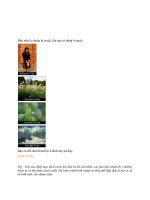
We can leave aside the philosophical question of whether the reality is
these dull colors that the camera saw in Figure 1.1A, or the comparatively
bright ones conjured up by the infinitely creative human visual system.
The fact is, if this picture is a promotional shot or even something for a
nature publication, the original isn’t going to fly. Anybody would prefer
Figure 1.1B, which was created in approximately 30 seconds in
LAB
.
When I first wrote about
LAB
, in a 1996 column, I used a canyon shot
The Canyon Conundrum
LAB
has a reputation for enormous power, yet virtually all reference
materials that advocate its use illustrate its capabilities with a single
class of image. This chapter introduces the basic
LAB
correction method
and explains why it is so extraordinarily effective—if you happen to
have a picture of a canyon.
Figure 1.1 This Death Valley canyon is noted for its strangely colored clay. Green soil like that on
the right side of this photograph is so unusual that people remember it as being greener than what
the camera saw. Canyon images are often used to illustrate the power of
LAB
correction (bottom).
1
Chapter 1. The Canyon Conundrum Page 2 Return to Table of Contents
Chapter 1. The Canyon Conundrum
Photoshop Lab Color: The Canyon Conundrum: And Other Adventures in The Most
Powerful Colorspace By DAN MARGULIS ISBN: 0321356780 Publisher: Peachpit Press
Prepared for Sudharaka Dhammasena, Safari ID:
Print Publication Date: 2005/08/08 User number: 910766 Copyright 2007, Safari Books Online, LLC.
This PDF is exclusively for your use in accordance with the Safari Terms of Service. No part of it may be reproduced or transmitted in any form by any means without the prior
written permission for reprints and excerpts from the publisher. Redistribution or other use that violates the fair use priviledge under U.S. copyright laws (see 17 USC107) or that
otherwise violates the Safari Terms of Service is strictly prohibited.
from Capitol Reef National Park in Utah. My
book Professional Photoshop goes around 100
miles to the south with a shot from Canyon-
lands National Park.
Another Photoshop book illustrates its
LAB
section with a shot from Bryce Canyon Na-
tional Park. A third uses a scene from Grand
Canyon National Park, and a fourth a canyon
from the Canadian Rockies. And author Lee
Varis has a scintillating
LAB
exercise, repro-
duced here in Chapter 16, that brings out the
best in a canyon in North Coyote Buttes, on
the Arizona/Utah border.
Start to detect a pattern?
Yes, ind eed.
LAB
does really, really well
with canyons. And you don’t even need to
know how it works to make the magic hap-
pen; the approach to canyons is simplicity
itself. Figure 1.1B isn’t the best we can do in
LAB
(we’ll be revisiting this image in Chapter
4, treating it in a slightly more complex way)
but it’s much better than any comparable
moves in
RGB
or
CMYK
, and even if you could
match the quality in some other colorspace it
would take far longer.
When I wheeled out that first canyon shot
in 1996, I likened
LAB
to a wild animal: very
powerful, very dangerous. That label has
stuck. Use of
LAB
is now widespread among
top retouchers, but a huge fear factor limits
the techniques they use it for. Most of those
who claim to be
LAB
users are only doing
what’s described in the first five chapters
here, missing out on much magic.
You can’t blame them for being satisfi ed
with what they’ve got, because those limited
LAB
tools can make an extraordinary differ-
ence in image quality. They are also so simple
that beginners can enjoy their benefits.
I hope, and the publisher hopes harder,
that people with limited experience will
learn enough to dramatically improve their
pictures. On the other hand, some of what
follows either is unbearably complicated or
suggests methods that only power users can
fully appreciate. For the best of reasons, it
isn’t customary for Photoshop books to cater
to novices and simultaneously include mate-
rial that leaves experts cursing in frustration
until they re-read it for the eighth time.
Special handling is clearly required.
The Rules of the Game
Each of the first six chapters is divided into
two parts, readily identifiable by a change
in typeface. If you’re just trying to get into
working with
LAB
as quickly as possible, you
can skip the second part of each chapter,
which is more analytical, and can be some-
what difficult to follow.
4 Chapter 1
Figure 1.2 Like Figure 1.1, this image features colors
that are possibly accurate, yet too subdued when taken
in the context of the scene. This canyon is called
“Yellowstone” for a reason. The yellowness of the
canyon walls should be played up.
Chapter 1. The Canyon Conundrum Page 3 Return to Table of Contents
Chapter 1. The Canyon Conundrum
Photoshop Lab Color: The Canyon Conundrum: And Other Adventures in The Most
Powerful Colorspace By DAN MARGULIS ISBN: 0321356780 Publisher: Peachpit Press
Prepared for Sudharaka Dhammasena, Safari ID:
Print Publication Date: 2005/08/08 User number: 910766 Copyright 2007, Safari Books Online, LLC.
This PDF is exclusively for your use in accordance with the Safari Terms of Service. No part of it may be reproduced or transmitted in any form by any means without the prior
written permission for reprints and excerpts from the publisher. Redistribution or other use that violates the fair use priviledge under U.S. copyright laws (see 17 USC107) or that
otherwise violates the Safari Terms of Service is strictly prohibited.
For efficiency’s sake we will bypass two
customary procedures. First, a few para-
graphs ago, I did something that I find
exceedingly irritating when other authors try
it. I asserted that a certain way of doing things
is better than the customary alternative, and
expected you to take it on faith. Yet, if I
had stopped to prove that straight
LAB
correction indeed yields better results than
RGB
in canyon images, there would have
been an eight-page detour.
So, in the interest of speed, the first half of
each chapter concentrates on the how, not
the why. I will say things that might be
labeled matters of opinion without stopping
to prove they are so. Take my word for them if
you like; if you’d rather not, they are backed
up in the “Closer Look” section.
Also, the first halves don’t assume much
Photoshop expertise. I try to give simple
explanations of each command being used.
The second parts play by no such rules, and
often dive right into techniques familiar only
to a sophisticated audience. And they don’t
offer many explanations of Photoshop basics.
LAB
is always an intermediate step. Files
must be converted into it before the fun
begins and out of it afterward. Almost every-
one will be converting into
LAB
from an
RGB
file. When finished, some will convert
back to
RGB
and others, needing a print file,
will go to
CMYK
. For the time being, it doesn’t
matter which; we will assume for conve-
nience that it goes back to
RGB
.Your defini-
tions of
RGB
and
CMYK
in Photoshop’s Color
Settings dialog don’t matter yet, either. We’re
now ready to tackle some canyons.
A 30-Second Definition of
LAB
It would take a wheelbarrow to carry every
way of defining color that’s been propounded
in the last century. Our current
LAB
is one of
the most prominent, an academic construct
designed not just to encompass all conceiv-
able colors (and some that are imaginary, a
fascinating concept that we’ll explore at
length later, notably in Chapter 8), but to sort
them out in a way that relates to how humans
see them.
The version of
LAB
used in Photoshop was
born in 1976, child of a standards-setting
group called the International Commission
on Lighting and known by its French ini-
tials,
CIE
.
There have been several close relatives.
We need know nothing about them, but color
scientists feel that we should use a more
precise name for our version. They call it
CIELAB
or L*a*b*, both of which are a pain to
pronounce and maddening typographically.
Photoshop calls it “Lab color,” but the name
has nothing to do with a laboratory: the
L
stands for luminosity or lightness; the
A
and
The Canyon Conundrum 5
Figure 1.3 A more vivid version of Figure 1.2, prepared
using the
LAB
recipe of this chapter.
Chapter 1. The Canyon Conundrum Page 4 Return to Table of Contents
Chapter 1. The Canyon Conundrum
Photoshop Lab Color: The Canyon Conundrum: And Other Adventures in The Most
Powerful Colorspace By DAN MARGULIS ISBN: 0321356780 Publisher: Peachpit Press
Prepared for Sudharaka Dhammasena, Safari ID:
Print Publication Date: 2005/08/08 User number: 910766 Copyright 2007, Safari Books Online, LLC.
This PDF is exclusively for your use in accordance with the Safari Terms of Service. No part of it may be reproduced or transmitted in any form by any means without the prior
written permission for reprints and excerpts from the publisher. Redistribution or other use that violates the fair use priviledge under U.S. copyright laws (see 17 USC107) or that
otherwise violates the Safari Terms of Service is strictly prohibited.
B
stand for nothing. The name should be
pronounced as three separate letters, as we
do with other colorspaces.
We need not concern ourselves with
LUV
,
LCH
,xy
Y
,
HSB
,
XYZ
, or other color definitions
(at least until Chapter 13), because Photo-
shop fully supports only three:
CMYK
,
LAB
,
and
RGB
. Pretty much everybody has to use
either
CMYK
or
RGB
; increasingly people are
being called upon to use both.
All printing is based on
CMYK
, although
most desktop color printers either encourage
or require
RGB
input. Web, multimedia, and
other display applications require
RGB
files.
Commercial printers want
CMYK
.But
LAB
files are usually unwelcome, except in Photo-
shop, Photo-Paint, and other specialized
applications. A few raster image processors
(
RIP
s) for printing devices also claim to be
able to handle
LAB
, but gambling that they
actually do is a sport for the dedicated player
of Russian Roulette.
Although
LAB
is a distant relative of
HSB
,
which has been used as a retouching and
color correction space on many high-end
systems, such as Quantel’s Paintbox, nobody
thought that people would be perverse
enough to use
LAB
for such purposes in
Photoshop. Instead, it’s there as a means of
expediting color conversions.
The language of color is notoriously im-
precise. If you work in
RGB
, 255
R
0
G
0
B
defines
pure red. Unfortunately, there’s no agreement
as to what pure red means. Anybody needing
to know exactly what kind of red you intend
would have to find out what your Photoshop
Color Settings are, because there are different
definitions of
RGB
, each of which has its
own idea of what constitutes red. There is,
however, only one Photoshop
LAB
.
If you wish to order a car in a different
color than the model you test-drove, it won’t
be sufficient to say you want a red one. Before
accepting your money, the dealer will insist
that you look at a swatch book to make sure
you get the red you expect. You won’t hear
anything about
LAB
, but the supplier of the
vehicle’s paint will, if you complain that
the color doesn’t match and the car manu-
facturer agrees with you. It wouldn’t do for
6 Chapter 1
Figure 1.4 Photoshop defaults (left) look slightly different than the curves in this book (right). In the gradient at
the bottom of the grid, note that the
LAB
default has darkness at the left (in agreement with the Photoshop
RGB
default), but this book uses lightness at the left, which is the default for
CMYK
and grayscale images. To reverse the
orientation, click inside the gradient bar below the grid. Also, the default uses gridlines at 25 percent increments,
whereas the book uses 10 percent intervals. To toggle between the settings, Option– or Alt–click inside the grid.
Chapter 1. The Canyon Conundrum Page 5 Return to Table of Contents
Chapter 1. The Canyon Conundrum
Photoshop Lab Color: The Canyon Conundrum: And Other Adventures in The Most
Powerful Colorspace By DAN MARGULIS ISBN: 0321356780 Publisher: Peachpit Press
Prepared for Sudharaka Dhammasena, Safari ID:
Print Publication Date: 2005/08/08 User number: 910766 Copyright 2007, Safari Books Online, LLC.
This PDF is exclusively for your use in accordance with the Safari Terms of Service. No part of it may be reproduced or transmitted in any form by any means without the prior
written permission for reprints and excerpts from the publisher. Redistribution or other use that violates the fair use priviledge under U.S. copyright laws (see 17 USC107) or that
otherwise violates the Safari Terms of Service is strictly prohibited.
the manufacturer and the paint supplier
to scream and wave swatch books in each
other’s faces. They specify
LAB
values, plus a
tolerance for how far off the paint can be.
In the event of a dispute, they whip out a
spectrophotometer and measure its color.
If the manufacturer
hires you to produce
artwork that represents that
color, you’ll be getting the
LAB
information as well, just as
Photoshop gets
LAB
values from
Pantone, Inc., that enable it to
construct the
PMS
(Pantone
Matching System) colors that
are the de facto standard in the
graphics industry.
Assembling the Ingredients
We will start with, shockingly
enough, a canyon. You can fol-
low along with the image on the
enclosed
CD
, or you may use
one of your own, provided that
you think you understand why
canyons make such great
LAB
fodder. Regrettably, there’s more to life than
canyon shots. And just as
LAB
does extremely
well on certain classes of image, it does
poorly on others. Much of this book is aimed
at showing how to distinguish such images.
If you do choose to use your own image,
The Canyon Conundrum 7
Figure 1.5 Measuring the lightness range of
the interest object. After the file is in
LAB
, call
up the Curves dialog and, with the Lightness
curve open, click and hold the mouse over an
important part of the image. A circle appears
on the curve, indicating the value of the point
underneath the cursor. If you move the cursor
around the interest object with the mouse
button still depressed, the circle will move
with it. The tonal range of the canyon walls
falls between the two diagonal lines.
Figure 1.6 The
LAB
curves
that produced Figure 1.3.
Note how the
L
curve has
been made steep in the area
indicated in Figure 1.5. The
A
and
B
channels have also
been steepened, by rotating
them around the unchanged
midpoint.
Chapter 1. The Canyon Conundrum Page 6 Return to Table of Contents
Chapter 1. The Canyon Conundrum
Photoshop Lab Color: The Canyon Conundrum: And Other Adventures in The Most
Powerful Colorspace By DAN MARGULIS ISBN: 0321356780 Publisher: Peachpit Press
Prepared for Sudharaka Dhammasena, Safari ID:
Print Publication Date: 2005/08/08 User number: 910766 Copyright 2007, Safari Books Online, LLC.
This PDF is exclusively for your use in accordance with the Safari Terms of Service. No part of it may be reproduced or transmitted in any form by any means without the prior
written permission for reprints and excerpts from the publisher. Redistribution or other use that violates the fair use priviledge under U.S. copyright laws (see 17 USC107) or that
otherwise violates the Safari Terms of Service is strictly prohibited.
three types should be avoided. First, the
image should not contain colors that are
already brilliant or highly saturated. Second,
it shouldn’t have an overall color cast. If you
think that the Figure 1.1A is too gray or too
blah or whatever, fine, but if you think it’s
too blue, you won’t be able to fix it without
reading Chapter 4. And third, nobody should
have applied unsharp masking yet.
Figure 1.2 seems to qualify. It hasn’t been
sharpened; there’s nothing even close to a
bright color in the canyon, and the clouds
appear to be white, not some goofy hue that
would indicate a cast.
Also, it appears to be just the
kind of image we’re looking for,
needing a color boost nearly as
badly as the Artist’s Palette of Fig-
ure 1.1 did. The canyon walls here
are slightly off-gray. Not nearly
enough, however, considering that
the most famous national park
in the world bears the name of
that particular color, for this is a
picture of the Grand Canyon of
the Yellowstone.
The following recipe for bring-
ing out the colors that are hidden
in such images will be refined
considerably in coming chapters.
But to get started on making
something more convincingly yel-
low, like Figure 1.3, make yourself
a copy (or a duplicate layer) of the
RGB
original if you think you’d like
to have something to compare
your work to afterwards.
Next, Image: Mode>Lab color.
The picture should look no different, but the
identification bar at its top should now read
Lab rather than
RGB
.
Call up the Curves dialog with Image:
Adjustments>Curves (keyboard shortcut:
Command–M Macintosh; Ctrl–M
PC
). If
you’ve never worked in
LAB
before, the
Photoshop default treatment of lightness-to-
the-right is probably still in effect. Although
there’s no technical advantage either way, this
book uses lightness-to-the-left, so you should
probably change over now by clicking inside
the gradient bar at the bottom of the curve, as
shown in Figure 1.4.
8 Chapter 1
Figure 1.7 In
LAB
, unsharp masking
must be applied to the
L
channel only,
and should be evaluated with the screen
display at 100% view. The numbers shown
here can be used as defaults, but better
results can be had by customizing them
to the specific image.
Chapter 1. The Canyon Conundrum Page 7 Return to Table of Contents
Chapter 1. The Canyon Conundrum
Photoshop Lab Color: The Canyon Conundrum: And Other Adventures in The Most
Powerful Colorspace By DAN MARGULIS ISBN: 0321356780 Publisher: Peachpit Press
Prepared for Sudharaka Dhammasena, Safari ID:
Print Publication Date: 2005/08/08 User number: 910766 Copyright 2007, Safari Books Online, LLC.
This PDF is exclusively for your use in accordance with the Safari Terms of Service. No part of it may be reproduced or transmitted in any form by any means without the prior
written permission for reprints and excerpts from the publisher. Redistribution or other use that violates the fair use priviledge under U.S. copyright laws (see 17 USC107) or that
otherwise violates the Safari Terms of Service is strictly prohibited.
Also, the default curve box has gridlines
at 25 percent increments, a little coarse for
serious work. Option–click (Mac; Alt–click
PC
) inside the box, and the grid changes to
10 percent increments.
Having made these cosmetic changes to
the interface, we proceed to the recipe.
A Canyon Correction, Step by Step
•
Click into the word Lightness above the
curve grid and change it to a. Move the top
right point of the curve one gridline to the
left; that is, a tenth of the way toward the left
axis. Move the bottom left point one gridline
to the right. The two points must be moved
an equal amount, because the resulting curve
needs to pass over the same center point as it
did originally.
•
Without clicking
OK
, switch over to b,
and apply the same changes. In both chan-
nels, we’re making a steeper line by, in effect,
rotating it counterclockwise around the
center point.
These two moves are the ones unique to
LAB
, the ones that drive colors apart from
one another in a way that other colorspaces
can’t equal. What comes next could be done
elsewhere. So, stop now, click
OK
,and return
to
RGB
if you must—but you should really
leave the dialog open, and try to complete
the magic in
LAB
.
The following two steps can be modified to
taste if you’re comfortable with curves and/or
sharpening settings.
If you’ve never worked on the
A
and
B
channels before, then you’ve never worked
on anything like them before. On the other
hand, if you know how to apply curves to a
grayscale document, then you know how to
apply them to the
L
. We’ll discuss the concept
further in Chapter 3, but it boils down to this:
the steeper the curve, the more the contrast.
Your task is to make the part of the
L
curve
that encompasses the canyon steeper than
the rest.
•
Before clicking
OK
, switch to the Light-
ness curve. Move the cursor back into the
picture over part of the canyon, and click and
hold. While the mouse button is depressed, a
circle appears on the curve, indicating where
the point under the cursor is located. Still
holding the mouse button down, move the
cursor to various parts of the canyon, and
note the range where the circle is moving. In
Figure 1.5, I’ve inserted red lines to indicate
where on the curve most of the pixels repre-
senting the canyon are located. That area of
the curve has to be made steeper. Sometimes
we do this by inserting points where my red
lines are and lowering one while raising the
other. Here, I simply raised the center of the
curve, as shown in Figure 1.6.
•
Apply the curves by clicking
OK
in the
dialog. Now, display the
L
channel only, either
by highlighting it in the Channels palette or
by using the keyboard shortcut Command–1
(Mac; Ctrl–1
PC
). Then, Filter: Sharpen>
Unsharp Mask. If you are familiar with
how the dialog in Figure 1.7 works, you’ll have
a good idea of what numbers to enter. If
not, enter Amount 200%, Radius 1.0 pixels,
Threshold 10 levels, understanding that better
results will be possible after you’ve read
Chapter 5. Hit
OK
and compare it to the orig-
inal. If satisfied, return the image to
RGB
if
that’s what your workflow needs, or convert it
to
CMYK
, as I did for this book.
Finding Color Where None Exists
The first two steps established the color vari-
ation that gives
LAB
its reputation for realism.
The third added snap, and the fourth sharp-
ness. If you are considering how this might
have been done in
RGB
or
CMYK
, the bottom
line is that Steps One and Two aren’t easy to
duplicate. Step Three happens to be easier for
LAB
in this particular image, but in other im-
ages there’s no advantage. Step Four is some-
times better done in
LAB
, although this time
it could be done equally well elsewhere.
The Canyon Conundrum 9
Chapter 1. The Canyon Conundrum Page 8 Return to Table of Contents
Chapter 1. The Canyon Conundrum
Photoshop Lab Color: The Canyon Conundrum: And Other Adventures in The Most
Powerful Colorspace By DAN MARGULIS ISBN: 0321356780 Publisher: Peachpit Press
Prepared for Sudharaka Dhammasena, Safari ID:
Print Publication Date: 2005/08/08 User number: 910766 Copyright 2007, Safari Books Online, LLC.
This PDF is exclusively for your use in accordance with the Safari Terms of Service. No part of it may be reproduced or transmitted in any form by any means without the prior
written permission for reprints and excerpts from the publisher. Redistribution or other use that violates the fair use priviledge under U.S. copyright laws (see 17 USC107) or that
otherwise violates the Safari Terms of Service is strictly prohibited.
But working in
LAB
is fast, fast, fast. Once
you get the hang of it, it should take about a
minute to get this kind of result with a canyon
image. Let’s try another.
Figure 1.8 comes from a substantially nas-
tier clime than Yellowstone. It’s Anza-Borrego
Desert State Park, one of the hottest places in
the world. Located in Southern California
just a short way from Mexico, it enjoys sum-
mer temperatures that rival Death Valley’s.
Rainfall is a pitiful inch or
two each year.
Such conditions aren’t
exactly conducive to plant
life. The scraggly ocotillo
in the foreground at right
will wait patiently for five
years or so for enough win-
ter rain to permit it to blos-
som into orange and green
splendor. The rest of the
time, it sits and awaits de-
velopments, clothed in a
brown as drab as the back-
ground. This canyon was
cut not by a river, but by
repeated flash floods, be-
cause when the rain does
fall, the ground is too
parched to absorb it.
When you or I visit such
an area, we don’t find it
particularly colorful but we
certainly see more than the
monochromatic mess that
any camera would. When-
ever we look at a scene of
substantially the same
colors, our mind’s eye
breaks them apart, creat-
ing different levels of
brownness in the rocks
that artificial instruments
10 Chapter 1
Figure 1.8 The desert image at
top shows the lack of brilliant
colors and the shortness of range
that suggest an
LAB
correction.
Bottom, after a literal repetition
of the steps that produced
Figure 1.3.
A
B
Chapter 1. The Canyon Conundrum Page 9 Return to Table of Contents
Chapter 1. The Canyon Conundrum
Photoshop Lab Color: The Canyon Conundrum: And Other Adventures in The Most
Powerful Colorspace By DAN MARGULIS ISBN: 0321356780 Publisher: Peachpit Press
Prepared for Sudharaka Dhammasena, Safari ID:
Print Publication Date: 2005/08/08 User number: 910766 Copyright 2007, Safari Books Online, LLC.
This PDF is exclusively for your use in accordance with the Safari Terms of Service. No part of it may be reproduced or transmitted in any form by any means without the prior
written permission for reprints and excerpts from the publisher. Redistribution or other use that violates the fair use priviledge under U.S. copyright laws (see 17 USC107) or that
otherwise violates the Safari Terms of Service is strictly prohibited.
such as cameras lack the
imagination to envision.
In other colorspaces, it’s
rare to apply exactly the
same move from one image
to the next. But with the
speedy
LAB
recipe, it’s more
thinkable. Figure 1.8B was
produced by a literal repeti-
tion of the steps that pro-
duced Figure 1.3. The result
is the same: dramatically
increased contrast and
color variation, in a way
that as far as I know can’t be
achieved in
RGB
.
Customizing the recipe
to this image yields a mar-
ginally better result, as
shown in Figure 1.9. The
changes are two.
First, the
AB
curves
are twice as steep as
they were in the Yellow-
stone example. That is,
rather than bringing the
bottom and top end-
points in by one grid-
line, the curves shown
in Figure 1.9 are moved
twice as much. There’s no right answer as to
how much to steepen these curves, but it
does make sense that this image should have
steeper
AB
curves. The Yellowstone image
was too flat, but it did have some color varia-
tion. Figure 1.8A is pretty close to a sepiatone.
The function of the
AB
curves is to bring out
the colors. This picture needs such surgery a
lot more than the Yellowstone image did.
Second, a slight improvement is possible
in the
L
curve. The two canyons were just
about the same darkness. The Anza-Borrego
canyon occupies a slightly smaller range, so
the curve could be made a bit steeper. But the
Yel lows ton e
L
curve works acceptably.
A River Runs Through It
Finally, having run out of canyons, we’ll move
a few miles to the south of Figure 1.3, onto
the shores of majestic Yellowstone Lake. Fig-
ure 1.10A was taken in early morning, with
uninspiring lighting and a bit of fog.
In addition to great canyon work,
LAB
melts fog like a blowtorch does butter. Again,
we’ll show a version (Figure 1.10B) made by
exact repetition of the procedure that created
Figure 1.3. For the customized version (Figure
1.10C), instead of doubling how far we took in
the
AB
curves, as in Figure 1.9, it’s tripled—
the top and bottom points have each moved
in three gridlines.
Figure 1.9 A second corrected version uses the curves shown below, increasing the
color variation by bringing the corners of the
A
and
B
curves in by twice as much as
in Figure 1.3.
Chapter 1. The Canyon Conundrum Page 10 Return to Table of Contents
Chapter 1. The Canyon Conundrum
Photoshop Lab Color: The Canyon Conundrum: And Other Adventures in The Most
Powerful Colorspace By DAN MARGULIS ISBN: 0321356780 Publisher: Peachpit Press
Prepared for Sudharaka Dhammasena, Safari ID:
Print Publication Date: 2005/08/08 User number: 910766 Copyright 2007, Safari Books Online, LLC.
This PDF is exclusively for your use in accordance with the Safari Terms of Service. No part of it may be reproduced or transmitted in any form by any means without the prior
written permission for reprints and excerpts from the publisher. Redistribution or other use that violates the fair use priviledge under U.S. copyright laws (see 17 USC107) or that
otherwise violates the Safari Terms of Service is strictly prohibited.
12 Chapter 1
A
B
Chapter 1. The Canyon Conundrum Page 11 Return to Table of Contents
Chapter 1. The Canyon Conundrum
Photoshop Lab Color: The Canyon Conundrum: And Other Adventures in The Most
Powerful Colorspace By DAN MARGULIS ISBN: 0321356780 Publisher: Peachpit Press
Prepared for Sudharaka Dhammasena, Safari ID:
Print Publication Date: 2005/08/08 User number: 910766 Copyright 2007, Safari Books Online, LLC.
This PDF is exclusively for your use in accordance with the Safari Terms of Service. No part of it may be reproduced or transmitted in any form by any means without the prior
written permission for reprints and excerpts from the publisher. Redistribution or other use that violates the fair use priviledge under U.S. copyright laws (see 17 USC107) or that
otherwise violates the Safari Terms of Service is strictly prohibited.
How much to steepen the curves is a
subjective call. The four originals we’ve
looked at exhibit varying degrees of color-
lessness. Personally, I feel that the Yellow-
stone Canyon image starts off better than the
others and needs less of a boost; the Death
Valley picture is second best; the Anza-
Borrego shot is next; and the worst of all is
this Yellowstone Lake image. As the originals
got less colorful, I made the
AB
curves
steeper, always remembering to make them
cross the same center point on the grid.
There is, of course, no reason why you
have to agree with the foregoing assessments.
You can choose steeper ang les for some or
use the same one each time. And please re-
member, this is the first chapter, discussing
the most basic move. This recipe permits an
amazing variety of modifications.
The
L
curve is somewhat different here
than in the other examples we’ve looked at.
The steep area is a bit longer, because the
lake has a fairly long range—parts are light,
and parts get almost to a midtone. All three of
the canyons fell in a very short range, both for
contrast and color.
The Canyon Conundrum 13
Figure 1.10 Top left, this orig-
inal needs an extreme steep-
ening of the
AB
curves to
bring out color. Bottom left, a
version done exactly as in
Figure 1.3. Below, a
customized version using the
curves at right, in which the
AB
endpoints are brought in
three times as much.
C
Chapter 1. The Canyon Conundrum Page 12 Return to Table of Contents
Chapter 1. The Canyon Conundrum
Photoshop Lab Color: The Canyon Conundrum: And Other Adventures in The Most
Powerful Colorspace By DAN MARGULIS ISBN: 0321356780 Publisher: Peachpit Press
Prepared for Sudharaka Dhammasena, Safari ID:
Print Publication Date: 2005/08/08 User number: 910766 Copyright 2007, Safari Books Online, LLC.
This PDF is exclusively for your use in accordance with the Safari Terms of Service. No part of it may be reproduced or transmitted in any form by any means without the prior
written permission for reprints and excerpts from the publisher. Redistribution or other use that violates the fair use priviledge under U.S. copyright laws (see 17 USC107) or that
otherwise violates the Safari Terms of Service is strictly prohibited.
Which brings us back to why authors use
canyon images to illustrate the power of LAB.
The recipe works extremely well—provided
the subject is a canyon, or something with the
same characteristics. By the same token, you
should now be able to imagine the type of
image in which the recipe would probably
not do so well.
These canyon shots have all featured sub-
tle colors. What if they aren’t so subtle? This
recipe makes all colors more intense. If the
original colors were brilliant,
LAB
is highly
effective at rendering them radioactive. And
it is no coincidence that the most important
parts of all four images so far have fallen into
a relatively small range of tonality (darkness).
That isn’t the case with all or even most pic-
tures, and if it isn’t, these
L
curves won’t work.
And that’s the basic
LAB
correction, minus
explanations of why
LAB
works or how it’s
structured. If you want that now, skip ahead
to Chapter 2. If instead you’d like a more tech-
nical explanation of why we like color varia-
tion and why the best way to get it is in
LAB
,
keep going, remembering that the second
halves of chapters assume much more Photo-
shop knowledge than the first halves do.
And a final reminder, once you’re done
with your
LAB
maneuvering: few output
devices accept
LAB
files, and few programs
outside of Photoshop will display them. So,
convert the file back to
RGB
, if you’re going to
post it on the Web or send it to a desktop or
other printer that requires
RGB
; or convert
directly to
CMYK
for commercial printing, as
I had to throughout this book.
14 Chapter 1
Review and Exercises
NOTE: Answers to this section, which appears in every chapter, are found in the “Notes & Credits”
section of this book, commencing on Page 351.
✓Why is it important that the images we’ve worked with so far not start out with any obvious color
cast? What would probably have happened if they had?
✓The images in this chapter are obviously selected to portray
LAB
in its best light. What do they
have in common? What types of images would you suspect might not be appropriate for
LAB
?
✓What is the impact of making the
AB
curves more vertical?
✓What do you think would have happened if, instead of making the
AB
curves more vertical by
rotating them counterclockwise around the center point, we had done the opposite, making
them more horizontal by rotating them clockwise?
✓Do you understand how
LAB
keeps color and contrast as separate items? If in doubt, try redoing
some of these moves, once in the
A
and
B
channels only, and once in the
L
channel only.
✓Have you verified that your curves display darkness to the right as in Figure 1.4? If they don’t,
click into the gradient bar underneath the curves grid to reverse it.
✓Try this method with some of your own images, or redo some of these images. Try the effect of
steepening the
A
and
B
by different amounts, which we’ll be discussing in Chapter 3.
Chapter 1. The Canyon Conundrum Page 13 Return to Table of Contents
Chapter 1. The Canyon Conundrum
Photoshop Lab Color: The Canyon Conundrum: And Other Adventures in The Most
Powerful Colorspace By DAN MARGULIS ISBN: 0321356780 Publisher: Peachpit Press
Prepared for Sudharaka Dhammasena, Safari ID:
Print Publication Date: 2005/08/08 User number: 910766 Copyright 2007, Safari Books Online, LLC.
This PDF is exclusively for your use in accordance with the Safari Terms of Service. No part of it may be reproduced or transmitted in any form by any means without the prior
written permission for reprints and excerpts from the publisher. Redistribution or other use that violates the fair use priviledge under U.S. copyright laws (see 17 USC107) or that
otherwise violates the Safari Terms of Service is strictly prohibited.
Michel Eugène Chevreul, a French
chemist, anticipated
LAB
correction by
a century and a half in his seminal
1839 work, On the Law of Simultaneous
Contrast of Colors. He tried to describe
something that is even today inde-
scribably complex—the propensity of
the human eye to break colors apart
from their surroundings. The effect had
been known to some extent by the an-
cient Egyptians, and in the 15th century
Leonardo da Vinci indicated that he
understood it. Three hundred years
later, the brilliant German poet Johann
Wolfgang von Goethe expounded on
it, and it took less than a century there-
after for Chevreul to fully flesh it out.
Everybody is familiar with examples
like those of Figure 1.11, which are
often described as “optical illusions.”
The term implies that a human ob-
server would have one opinion as to
whether certain colors or even sizes
were the same, and a machine (includ-
ing,
bien entendu, a camera) would
have another.
Simultaneous contrast is an old sur-
vival instinct, dating from the prehis-
toric days when our ancestors were
obliged to forage for food in the forest,
as they could not go to McDonald’s.
Unfortunately, granted that we are
forced to be hunters and gatherers, the
design of our bodies leaves much to
be desired. We don’t run very fast. We
aren’t particularly strong. We don’t fight
well. We can’t climb trees easily. We
don’t have good senses of smell or
hearing. We don’t see well at night.
We have impeccably designed hands,
and what might be described, at least
until recent years, as superior intelli-
gence, but still, we stack up poorly in
comparison to, say, a tiger.
Darwin advises that when a species
has an advantage that enables it to sur-
vive, that advantage gets selected for
and therefore magnified over time.
Start with an animal that can reach
certain edible leaves that others can’t,
because its neck is longer; give it a few
million years and you get a giraffe.
A Closer Look
Figure 1.11 The surroundings influence human perception.
Above, are the two red objects the same color, or is the bottom
set lighter and more orange? Below, are the two magenta circles
the same size? Humans and machines would disagree on the
answers to both questions.
Chapter 1. The Canyon Conundrum Page 14 Return to Table of Contents
Chapter 1. The Canyon Conundrum
Photoshop Lab Color: The Canyon Conundrum: And Other Adventures in The Most
Powerful Colorspace By DAN MARGULIS ISBN: 0321356780 Publisher: Peachpit Press
Prepared for Sudharaka Dhammasena, Safari ID:
Print Publication Date: 2005/08/08 User number: 910766 Copyright 2007, Safari Books Online, LLC.
This PDF is exclusively for your use in accordance with the Safari Terms of Service. No part of it may be reproduced or transmitted in any form by any means without the prior
written permission for reprints and excerpts from the publisher. Redistribution or other use that violates the fair use priviledge under U.S. copyright laws (see 17 USC107) or that
otherwise violates the Safari Terms of Service is strictly prohibited.
With ourselves, the same rule applies. One of the
few physical advantages we enjoy over other
animals is that we see color better. Other ani-
mals, it has been proven, don’t live in a black-
and-white world, but they can’t see nearly the
range of color variation that we do.
Our prehistoric ancestors were therefore able
to peer into a forest and distinguish things that
weren’t exactly green. Such objects might well be
something that would make them a fine break-
fast, whereas a tiger would look at the same
scene, see nothing but green, and leave hungry
and irritable.
This highly useful ability to differentiate a
color from its surroundings became, we pre-
sume, more refined as the millennia went by.
Figure 1.12 Four methods of boosting color. Top left, steepening the
AB
curves only and not touching the
L
. Top right, in
RGB
, boosting saturation with the Hue/Saturation command. Bottom left, the application of a false profile, Wide Gamut
RGB
when the picture is nominally s
RGB
. Bottom right,
RGB
curves applied in Color mode.
AB
CD
Chapter 1. The Canyon Conundrum Page 15 Return to Table of Contents
Chapter 1. The Canyon Conundrum
Photoshop Lab Color: The Canyon Conundrum: And Other Adventures in The Most
Powerful Colorspace By DAN MARGULIS ISBN: 0321356780 Publisher: Peachpit Press
Prepared for Sudharaka Dhammasena, Safari ID:
Print Publication Date: 2005/08/08 User number: 910766 Copyright 2007, Safari Books Online, LLC.
This PDF is exclusively for your use in accordance with the Safari Terms of Service. No part of it may be reproduced or transmitted in any form by any means without the prior
written permission for reprints and excerpts from the publisher. Redistribution or other use that violates the fair use priviledge under U.S. copyright laws (see 17 USC107) or that
otherwise violates the Safari Terms of Service is strictly prohibited.
Scientists don’t yet understand whether it’s a
function of the brain, or the eyes, or a combina-
tion, but they do know what we all do: that col-
ors change depending upon the background.
When the things that we’re looking at are as
gross as the vector objects in Figure 1.11, it
doesn’t matter that they’re being printed on a
page with other irrelevant visual information. But
in every other image in this chapter, the color
changes quite subtly. Under those circumstances,
the rest of the page baffles our visual systems.
If we were actually in Anza-Borrego, we would
be surrounded by brown everywhere we looked,
and evolutionary factors would force us to see
variation. The setting of this book, however,
does not surround Figure 1.8 with brown but
rather with a lot of nasty white space. Conse-
quently, the printed rendition looks tepid.
We have to respond.
LAB
is the best alterna-
tive because it emulates how humans see things
much better than any other colorspace. To un-
derstand why, let’s reconsider the Anza-Borrego
shot. But before doing so, another reminder that
you have entered the for-experts area, and that
you can proceed safely on to the next chapter if
the following discussion doesn’t interest you.
Also, while the following isn’t highly technical,
in later chapters this section can get rather
murky, particularly since in some cases the text
anticipates stuff that hasn’t been introduced or
explained yet.
The beginner’s recipe of this chapter increases
color variation by moves in the
AB
channels; it
hikes contrast by a move in the
L
; and it adds
sharpening. These last two items can be dupli-
cated in other colorspaces, although probably
not as quickly. The color-variation issue, though,
is tougher. Here’s the challenge: leaving aside
sharpening and contrast, how would we achieve
the desired variation in color, if we had never
heard of
LAB
?
I can think of three alternatives, which we will
compare not to Figure 1.8B, which introduces the
irrelevancies of sharpening and detail enhance-
ment, but to Figure 1.12A, which differs from the
original only in that the
AB
curves have been
steepened as they were in Figure 1.8. Its three
opponents are
•
A saturation boost while the file is still in
RGB
, using the Image: Adjustments>Hue/Satura-
tion>Master slider. Hue/Sat is more than ten
years old and not especially precise. In compar-
ison to steepening the
AB
curves, it’s prone to
emphasizing artifacts of such things as
JPEG
ging,
The Canyon Conundrum 17
Figure 1.13 An extreme boost in colors highlights the smoothness of the
AB
-only correction, magnified at left. At right, an
attempt to match the brilliance in
RGB
with Hue/Saturation creates artifacting and a significantly lighter file.
AB
Chapter 1. The Canyon Conundrum Page 16 Return to Table of Contents
Chapter 1. The Canyon Conundrum
Photoshop Lab Color: The Canyon Conundrum: And Other Adventures in The Most
Powerful Colorspace By DAN MARGULIS ISBN: 0321356780 Publisher: Peachpit Press
Prepared for Sudharaka Dhammasena, Safari ID:
Print Publication Date: 2005/08/08 User number: 910766 Copyright 2007, Safari Books Online, LLC.
This PDF is exclusively for your use in accordance with the Safari Terms of Service. No part of it may be reproduced or transmitted in any form by any means without the prior
written permission for reprints and excerpts from the publisher. Redistribution or other use that violates the fair use priviledge under U.S. copyright laws (see 17 USC107) or that
otherwise violates the Safari Terms of Service is strictly prohibited.
and it has problems differentiating colors in
objects that already have a pronounced hue. But
the biggest problem is that the Saturation com-
mand actually affects lightness as well, unlike the
AB
channels.
Magnified sections of exaggerated moves
using both methods illustrate the problem:
Figure 1.13A moves the
AB
curves in by four
gridlines, or twice as much as in the original
correction. Figure 1.13B was done in
RGB
with
a +80 boost in saturation. The two overall color
sensations are about the same, but the
H
ue/Sat
version is far lighter than the
LAB
alternative.
The differentiation between the ocotillo and the
background is wounded. The red rocks are also
too brilliant, and artifacting is beginning to show
up in the background.
These weaknesses are muffled in the less psy-
chedelic Figure 1.12B. Still, the unwanted lighten-
ing hides the ocotillo—and we’re only comparing
Hue/Sat to the very simplest
LAB
move. Let’s
consider two more competitors.
•
A false profile. This involves redefining
RGB
as something more colorful. This book assumes
for convenience that your default
RGB
working
space is s
RGB
. If it isn’t, you can use Edit: Convert
to Profile (Photoshop
CS
2; Image: Mode>Convert
to Profile in Photoshop 6–
CS
) to move the file
into s
RGB
. And once you have an s
RGB
file, you
can Edit: Assign Profile>Adobe
RGB
(Image:
Mode>Assign Profile in Photoshop 6–
CS
) for a
significant boost in color, or (as in Figure 1.12C)
assign Wide Gamut
RGB
for an even bigger one.
The Assign Profile command doesn’t change the
file, but the next time there’s a conversion to
another colorspace, the result will be more vivid.
A false profile avoids the artifacting of the
Hue/Saturation command and seems to me the
best of the three alternatives. Unfortunately, it’s
also the least flexible. The images we’ve seen so
far all took the same basic correction, but the
angles of the
AB
curves were different in all
four. If you’re trying to use false profiles for
more vivid color, you have only two alternatives
without a completely unreasonable effort. If
any of the other three versions aren’t quite right
in your mind, they can be adjusted. With Figure
1.12C you pretty much have to take it or leave it.
18 Chapter 1
Figure 1.14 When the
A
and
B
curves have different angles,
LAB
produces a result that’s not analogous to any tool in
RGB
.
Left, the original. Right, after applying an
A
curve that is three times steeper than the B. The L channel is unchanged.
BA
Chapter 1. The Canyon Conundrum Page 17 Return to Table of Contents
Chapter 1. The Canyon Conundrum
Photoshop Lab Color: The Canyon Conundrum: And Other Adventures in The Most
Powerful Colorspace By DAN MARGULIS ISBN: 0321356780 Publisher: Peachpit Press
Prepared for Sudharaka Dhammasena, Safari ID:
Print Publication Date: 2005/08/08 User number: 910766 Copyright 2007, Safari Books Online, LLC.
This PDF is exclusively for your use in accordance with the Safari Terms of Service. No part of it may be reproduced or transmitted in any form by any means without the prior
written permission for reprints and excerpts from the publisher. Redistribution or other use that violates the fair use priviledge under U.S. copyright laws (see 17 USC107) or that
otherwise violates the Safari Terms of Service is strictly prohibited.
Also, there’s none of the introduction of
subtle hue variation that
LAB
does so well, and
relatively bright colors are intensified more than
duller ones, which is undesirable. So, on to the
third alternative.
•
Curves in Color mode. In
RGB
or
CMYK
, one
could establish a duplicate layer, try to apply
curves that would intensify the color, and then
change the blending mode of the top layer to
Color, thus preserving the detail of the bottom
layer. First of all, it isn’t always possible to do so.
Trying to get the same yellowish soil that the
AB
curves created would be extremely difficult.
More persuasive, it’s an experts-only move. At
least my first two alternatives are accessible to
nonprofessionals. This one can easily introduce
nasty casts, and should be undertaken only by
somebody with a good knowledge of color-by-
the-numbers and of how to structure curves.
Going Too Far, and Then Coming Back
The above discussion demonstrates that the
AB
moves so far, in addition to being faster, have a
slight technical superiority to the logical alterna-
tives. However, those who study
LAB
are looking
for magic, and the puny advantage that these
last trials have shown scarcely qualifies.
But, who cares? So far, we have looked only
at the simplest possible application. Granted,
steepening the
A
and
B
curves is the fundamen-
tal move on which all further progress is based.
But it’s rare that the moves in the
AB
are identi-
cal, as they are in this chapter. And when they’re
not, all these
RGB
alternatives that produced
credible competitors vanish.
For example, the sand in Anza-Borrego has a
distinct yellow tinge. The
AB
curves and the Sat-
uration boost both accentuate it. My personal
opinion is that the yellow isn’t that attractive and
that I would prefer a reddish brown. Therefore, if
I were doing it to please myself, I wouldn’t make
identical moves in the
A
and
B
as previously
shown. I’d move the
A
curve in three gridlines
on both sides (as in the Yellowstone Lake shot)
and the
B
curve by only one gridline, as in the
Yellowstone Canyon image. These two moves
would produce Figure 1.14B.
To steal a little of Chapter 2’s thunder, the
A
channel governs a magenta-green axis and the
B
a yellow-blue one. I am choosing to accentuate
changes in the magenta-green
A
. Almost noth-
ing in the picture is green, but certain things, no-
tably the large rocks, have a strong magenta
component. The soil in the canyon walls is really
neither: some parts are very slightly magenta
and others slightly green. All, however, are de-
cidedly yellow as opposed to blue.
My move therefore enhances all yellows
slightly, not as much as in Figure 1.12A. Some yel-
lows get slightly warmer, more magenta; others
get slightly colder, more green; and still others
are simply more yellow. Things that clearly fa-
vored magenta more than green are affected
strongly, and driven more toward red, as the
magenta component gets pushed three times as
hard as the yellow. So there’s a variety of hue
changes, as well as a general increase in satura-
tion. The rocks are driven sharply away from the
yellowish dirt.
All these shifts and countershifts in hue can’t
be emulated by any
RGB
or
CMYK
procedure
that I’m aware of. No command outside of
LAB
allows certain yellows to move toward green
and certain others to move toward magenta
while some don’t move at all.
Figure 1.14B is therefore deceptively simple.
It looks so natural that one has to assume there
would be some way to emulate it in
RGB
,as
Figures 1.12B, C, and D emulated Figure 1.12A.
But there isn’t.
If you’re still in doubt, the next exercise should
dispel it. The purpose of Figure 1.15B is not to
offer an artistic impression of a man from Mars,
but rather to illustrate how
AB
curving is the only
way to get certain results. The
L
channel wasn’t
touched. The image was created by
AB
curves
that are simply straight lines made as steep as
possible. Both cross the center horizontal line
well to the left of where they originally did. The
left side is the negative side, the cool-color side.
The Canyon Conundrum 19
Chapter 1. The Canyon Conundrum Page 18 Return to Table of Contents
Chapter 1. The Canyon Conundrum
Photoshop Lab Color: The Canyon Conundrum: And Other Adventures in The Most
Powerful Colorspace By DAN MARGULIS ISBN: 0321356780 Publisher: Peachpit Press
Prepared for Sudharaka Dhammasena, Safari ID:
Print Publication Date: 2005/08/08 User number: 910766 Copyright 2007, Safari Books Online, LLC.
This PDF is exclusively for your use in accordance with the Safari Terms of Service. No part of it may be reproduced or transmitted in any form by any means without the prior
written permission for reprints and excerpts from the publisher. Redistribution or other use that violates the fair use priviledge under U.S. copyright laws (see 17 USC107) or that
otherwise violates the Safari Terms of Service is strictly prohibited.
The image is therefore being
forced toward green and blue,
but the curves are so steep that
certain parts of the man’s skin
get redder in spite of it. Thus, the
weird effect of having some skin
turn violently more red while
other parts become phospho-
rescent cyan.
Suppose that you are given
the original file for Figure 1.15A
and a printed copy of this page.
You are told that you have to produce some-
thing that looks like Figure 1.15B, because that
abstract look is exactly what the client wants.
How do you proceed?
If you don’t know your
LAB
, probably you
proceed to punt. The change isn’t possible, be-
cause we are making similar reds go in wildly
different directions. No other colorspace al-
lows us to make some reds blue and nearly
indistinguishable reds orange. Yet if we know
LAB
, the changes take less than a minute.
It would be understandable to protest that
the challenge is ridiculous, because nobody in
their right mind would ever ask for anything
like Figure 1.15B.
If you concede, however, that it can’t be
Figure 1.15 The original, above, looks like
a sepiatone. The man at right appears to
come from another planet. In fact, this
version was created in
LAB
by modifying
only the
A
and
B
channels.
A
B
Chapter 1. The Canyon Conundrum Page 19 Return to Table of Contents
Chapter 1. The Canyon Conundrum
Photoshop Lab Color: The Canyon Conundrum: And Other Adventures in The Most
Powerful Colorspace By DAN MARGULIS ISBN: 0321356780 Publisher: Peachpit Press
Prepared for Sudharaka Dhammasena, Safari ID:
Print Publication Date: 2005/08/08 User number: 910766 Copyright 2007, Safari Books Online, LLC.
This PDF is exclusively for your use in accordance with the Safari Terms of Service. No part of it may be reproduced or transmitted in any form by any means without the prior
written permission for reprints and excerpts from the publisher. Redistribution or other use that violates the fair use priviledge under U.S. copyright laws (see 17 USC107) or that
otherwise violates the Safari Terms of Service is strictly prohibited.
achieved without
LAB
’s ability to drive certain
occurrences of a given color toward red and
others toward green-blue (cyan), there’s a
small problem. If only
LAB
can produce Figure
1.15B, then only
LAB
can produce Figure 1.16B,
which is Figure 1.15B applied to the original
image at 18% opacity. And Figure 1.16B is
something that a client might very well ask for,
because there is very attractive color variation
in the face. The background, which is nearly
the same color as the face in the original,
suddenly becomes more yellow. The lips are
much redder than in the original, which is the
way we want it, because that’s what the
human sense of simultaneous contrast sees.
We break things away from their surrounding
colors, whether gross variations as in the
optical-illusion graphic of Fig-
ure 1.11, or lips against a slightly
duller fleshtone. Studio models
are heavily made up exactly
because the photographer de-
sires to create this type of ap-
parent contrast—redder cheeks,
redder lips.
The Canyon Conundrum 21
Figure 1.16 Assigning a false profile of
Adobe
RGB
, left, increases saturation but
does nothing to
create color varia-
tion. Below,
Figure 1.15B is
applied to the
original at 18%
opacity (inset).
A
B
Chapter 1. The Canyon Conundrum Page 20 Return to Table of Contents
Chapter 1. The Canyon Conundrum
Photoshop Lab Color: The Canyon Conundrum: And Other Adventures in The Most
Powerful Colorspace By DAN MARGULIS ISBN: 0321356780 Publisher: Peachpit Press
Prepared for Sudharaka Dhammasena, Safari ID:
Print Publication Date: 2005/08/08 User number: 910766 Copyright 2007, Safari Books Online, LLC.
This PDF is exclusively for your use in accordance with the Safari Terms of Service. No part of it may be reproduced or transmitted in any form by any means without the prior
written permission for reprints and excerpts from the publisher. Redistribution or other use that violates the fair use priviledge under U.S. copyright laws (see 17 USC107) or that
otherwise violates the Safari Terms of Service is strictly prohibited.
To give us some idea of why alternatives
are unsatisfactory, Figure 1.16A is analogous to
Figure 1.12C. It strives for brighter color through
the assignment of a false profile, in this case
Adobe
RGB
rather than s
RGB
, prior to conversion
to
CMYK
for printing. It’s an improvement, yes,
but the picture is still monochromatic. There’s no
music in it.
The last exercises are not intended to be final
corrections. In real life, I’d do plenty more to
this last image and assume you would as well.
However, those other moves don’t require
LAB
. Therefore, I’ve left them out, so we can see
in pure form the
LAB
move that the other
colorspaces can’t duplicate.
Also, don’t spend too much time trying to
figure out how 18 percent of Figure 1.15B could
possibly produce Figure 1.16B. The drastic
AB
curves have forced certain colors not just wildly
out of the
CMYK
gamut, but beyond the capabil-
ity of a monitor to display them. On the printed
page, we’re trying to approximate colors that are
unimaginably vivid, particularly in the lips and
the forehead. Photoshop has to improvise in
these cases, and beyond knowing that the lips
are some kind of bright red and the forehead
some sort of bright cool color, Figure 1.15B isn’t
particularly informative. It’s only when we start
reducing the opacity that we get an accurate
idea of what’s occurring.
The super-steep curves that did it aren’t
shown, not because we’re short of space, but as
a shot across your bow, a warning that things
may start to get difficult. You should really be
able to visualize what the curves look like at this
point. If not, return to this exercise after getting
to Chapter 4, and it should be a piece of cake.
Finally, the question arises of why we are
deliberately brightening all colors, beyond what
is actually found in nature. Granted that
LAB
is
the way to do it, why do it in the first place?
I could give an answer, but Chevreul beat
me to it:
Correct, but exaggerated coloring is almost
always more attractive than absolute color-
ing; we also cannot hide the fact that many
who experience pleasure in seeing how
colors have been modified and exaggerated
in a picture, would not feel the same pleasure
from the sight of the real thing, because the
actual variations in color that the artist exag-
gerates would not be prominent enough to
make themselves felt.
Anyway, the eye’s apparent desire to be
overwhelmed by exciting colors is basically
analogous to our preference for prominent
flavors in what we eat and drink; which
comports with the comparison I’ve previously
made between the pleasure we derive from
vivid colors (forgetting all other characteristics
of the object presenting them) and the plea-
surable sensation of agreeable flavors.
22 Chapter 1
The Bottom Line
This chapter introduces the simplest
LAB
move:
a recipe for boosting contrast, sharpening, and
enhancing all colors. The recipe is limited, notably
in its inability to deal with originals with obviously
wrong colors.
Nevertheless, the recipe is the foundation for the
more complex moves that make
LAB
magical. It’s
technically a better way to enhance color than trying
to do the same thing in
RGB
, allowing us to create
color variation in a more natural-looking way. And it
offers the possibility of driving apart colors that are
so similar that
RGB
can’t separate them without
making a selection in Photoshop.
Chapter 1. The Canyon Conundrum Page 21 Return to Table of Contents
Chapter 1. The Canyon Conundrum
Photoshop Lab Color: The Canyon Conundrum: And Other Adventures in The Most
Powerful Colorspace By DAN MARGULIS ISBN: 0321356780 Publisher: Peachpit Press
Prepared for Sudharaka Dhammasena, Safari ID:
Print Publication Date: 2005/08/08 User number: 910766 Copyright 2007, Safari Books Online, LLC.
This PDF is exclusively for your use in accordance with the Safari Terms of Service. No part of it may be reproduced or transmitted in any form by any means without the prior
written permission for reprints and excerpts from the publisher. Redistribution or other use that violates the fair use priviledge under U.S. copyright laws (see 17 USC107) or that
otherwise violates the Safari Terms of Service is strictly prohibited.
adical alternatives show up from time to time in politics.
Usually they are harmful, occasionally appealing, but rarely
do they solve all problems at once.
In recent years in the United States, two such radical
alternatives actually became governors of populous states.
One was a professional wrestler, the other a bodybuilder/
actor. Each has much in common with
LAB
: great physical strength, a
certain intuitive simplicity and ability to express things in a way that
human emotions respond to, and a whole lot of baggage that one would
rather not hear about.
LAB
has the advantage that if we don’t like what it has to offer, we can
ignore it and stick with the old reliables. But to understand what it has
to offer, we need to understand the logic under which it works, which is
no mean feat.
***
The biggest problem in attempting to teach almost anything about imag-
ing is that around half the world learns how to work in
RGB
and is deathly
afraid of
CMYK
, thinking that it’s some kind of black art instead of just
RGB
with a black channel attached. The other half learns
CMYK
first, thinks
that
RGB
is for simpletons and that working in it is akin to performing
brain surgery wearing boxing gloves. Both sides thereby miss a host of
opportunities that work better in one space than the other.
Such colorspace chauvinism is particularly galling in that
RGB
and
CMYK
are exceedingly similar. If you know how to work in one, you
already know how to work in the other. The one that’s really different is
LAB
, as Figure 2.1 demonstrates.
LAB
by the Numbers
The structure of
LAB
is frightening: opponent-color channels; a zero in
the middle of a curve; negative numbers for cool colors and positive
numbers for warm ones; colors that are well outside the gamut of any
output device. And outright imaginary colors, ones that don’t and
couldn’t possibly exist anywhere but in the mind. But there’s logic
behind the lunacy, and with practice the system is easy to use.
2
24 Chapter 2
Photoshop LAB Color: The Canyon
Conundrum
Copyright ©2006 Dan Margulis
Figure 2.1 Top right, the
original picture of a pink
rose. Top row, in order: the
RGB
channels, red, green,
and blue. Second row: their
CMYK
counterparts, cyan,
magenta, yellow, and black.
Note the strong similarities
between red and cyan, green
and magenta, and blue and
yellow. The
LAB
channels,
bottom row, are decidedly
different.
Red Green Blue
Cyan Magenta Yellow Black
LAB
Three Pairs of Channels
At top right is the composite color image
of this flower. There are identical-looking
versions in all three of the colorspaces that
Photoshop fully supports. The ten channels
are arranged in three rows. From top to
bottom, they are
RGB
,
CMYK
,and
LAB
.
There’s a striking relationship between
each
RGB
channel and the
CMY
one directly
underneath it.
In the magenta channel of
CMYK
,the
flower is quite dark, because we need a lot
of magenta ink to make it, and in
CMYK
,the
darker a channel is, the more ink we get. The
leaves are much lighter, because magenta ink
kills green.
In
RGB
, the lighter a channel is, the more of
that color of light is supposed to be hitting our
eyes. Little, if any, green light should be doing
so in the middle of a magenta flower. Hence,
the flower in the green of
RGB
is as dark as
it is in the magenta of
CMYK
. For the same
reason, the leaves are about equally light in
both channels. The magenta and green aren’t
identical because of such tiresome factors as
dot gain, ink impurities, and the presence of
a black channel, but still it’s as easy to see
their relation as it is to see the ones between
red and cyan and blue and yellow.
The radical concept of
LAB
is to separate
color and contrast completely, followed by
a most unusual way of defining color. Even
once you get the general idea, there are
complications, exceptions, and nonobvious
ramifications.
All channels in
RGB
and
CMYK
affect both
color and contrast. In
LAB
, all the contrast
goes into the
L
channel, all the color into the
A
and B. Consequently, the
L
is easy to un-
derstand, because, since it’s colorless, we can
think of it as a black and white version of the
color photo, although for technical reasons
the
L
is a bit lighter than a black and white
would be. The
A
and
B
, which are color only,
make zero sense to the casual observer.
If an image has no color at all—that is, if
it’s a black and white—the sensible thing
would be blank
A
and
B
channels, right? Not
in the weird world of
LAB
.If there’s no color,
the
A
and
B
have to be gray —a pure, 50%
gray. The further they get away from gray—
the more they move toward white and/or
black—the more colorful the image gets.
The two are termed opponent-color
channels. When the
A
is a lighter gray, it
contributes magenta, but a darker gray rep-
resents green. And the lighter or darker it is,
the more intense the color.
From that, you might surmise that the
A
channel’s flower would have to be almost a
white, since it would be hard to find an object
more magenta and less green. But again,
LAB
has a trick. It is designed not just to encom-
pass all the colors that we can print, put
on film, or display on a monitor, and not just
colors that are too intense for any of these
media, but colors that are so intense as to be
beyond our conception: imaginary colors,
colors that couldn’t possibly exist.
We’ll get to the official
LAB
numbering
system in a moment, but for now let’s think of
the A channel as though it were a grayscale
image, with possible values from zero to
100%. A 50% value is neither magenta nor
green; anything lighter favors magenta and
darker favors green.
Treating the
A
channel as a grayscale, the
rose’s magenta is only about a 25%—in other
words, about halfway as magenta as
LAB
can
ask for. The dull green of the leaves is 57%,
only slightly higher than the 50% that would
denote something neither magenta nor
green. And the background isn’t gray, either.
It’s biased toward magenta, but it reads only
48% or 49%, just a point or two away from the
neutral 50%.
Although the shapes are blurry, we see the
flower as a light object and the leaves, just
barely, as dark ones in the
A
channel.
In the
B
channel’s opponent-color scheme,
LAB
by the Numbers 25
Photoshop LAB Color: The Canyon
Conundrum
Copyright ©2006 Dan Margulis