Sams Teach Yourself Microsoft Expression Web 3 in 24 Hours- P10 pot
Bạn đang xem bản rút gọn của tài liệu. Xem và tải ngay bản đầy đủ của tài liệu tại đây (1.03 MB, 30 trang )
ptg
252
HOUR 15: Buttons, Buttons, Buttons
FIGURE 15.10
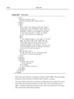
The
.advancedBox
a style is applied
to the new but-
tons, but they
cover each other
because the list
item style has
not been modi-
fied yet.
3. Import the images named blueButtonUp.gif and blueButtonOver.gif from the
lesson files and save them in a new folder called buttonGraphics.
4. Make a new style and give it the selector name .advancedBox a. In the Font
category, set
font-family to Arial, Helvetica, sans-serif, font-size to 0.8em,
font-weight to bold, and text-transform to uppercase, font-color to white
(#FFFFFF). Check the None box under
text-decoration to get rid of the line
under the text.
5. In the Background category, set background-image to the blueButtonUp.gif
image you just imported, and set
background-repeat to no-repeat. Because
the image is larger than the text and you want it to surround the text, go to the
Box category and set
padding to 13px on all sides. Click OK to apply the style.
6. In Design view, you can see that the new button background is applied, but the
buttons are covering each other (see Figure 15.10). This is because the list items
have not yet been styled, and the browser assumes that the list items are the
height of the text without the padding.
To fix this problem create a new style with the selector name
.advancedBox li
and set the padding-top and padding-bottom attributes to 13px to match the
link style you just created. Click OK to apply the new style, and the buttons no
longer overlap.
7. To create a hover-over effect, create a new style with the selector name
.advancedBox a:hover. Because the :hover pseudoclass inherits all the
From the Library of Lee Bogdanoff
ptg
Creating Buttons from Scratch Using CSS
253
styling from the main a class, all you need to do is change background-image
to blueButtonOver.gif. Click OK, and then save and preview in your browser.
Now instead of the background color changing when the mouse hovers over the but-
ton, the background image swaps out. And because the background image is part of
the
a style, the entire image is clickable, not just the text itself.
The problem with this technique is that it requires two images to work. This might
not seem like a big deal, but if the user is on a slow connection, the page is on a slow
server, or if there is something else that slows the system down, the user might experi-
ence noticeable lag between hovering over the button and the new background
image being loaded. One way around this problem is to preload the images using
behaviors, but this requires JavaScript to work properly.
Create Text-Free Buttons with Sliding Doors
The problem of preloading content has become more prevalent with the emergence of
blogs because many blogs have a lot of scripts running at the same time, and it is
important to reduce the load on both the network and the computer as much as pos-
sible to make things work smoothly. A technique often referred to as sliding doors was
developed to enable the designer to use one image file as two different backgrounds.
This is done by creating a file that has two versions of the background, either on top
of or to the side of one another. The name sliding doors refers to the action of literally
sliding the background from one side to the other to display only half of the image at
a time (see Figure 15.11).
You can use a similar technique to hide text content. As you have seen, the regular
method of creating buttons requires there to be text superimposed on the back-
ground. If you don’t want the text to appear, the quick answer is to simply swap out
the text for an image and use it as a button. But if you do this, the link is not visible if
FIGURE 15.11
The name sliding
doors refers to
the action of
sliding the back-
ground image so
that only half of
it is visible
depending on
how the mouse
interacts with
the button.
From the Library of Lee Bogdanoff
ptg
254
HOUR 15: Buttons, Buttons, Buttons
FIGURE 15.12
The new button
text is wrapped
in a <span> tag
and the
.slider class
is applied.
the image doesn’t load or the visitor uses a text-only browser. The way to solve this is
to push the text out of the way so that only the background image appears. Another
reason to use this technique is that designers often want to use custom fonts or font
effects in their buttons. To do this and retain full accessibility, they need to hide the
regular HTML text first. In this example, you create a button that uses the sliding
doors technique and hides the text at the same time.
1. Import the file named slidingButtons.gif into the buttonGraphics folder from the
lesson files. Under the three buttons you just created, add a new subheading and
call it Sliding Doors Button with Hidden Text. Below it, add a paragraph with
the text Button and make it into a hyperlink pointing back to the current page.
2. Make a new class called .slider. Create a span around the new button text
using the Toolbox panel (make sure the
<span> tags go on the outside of the
<a> tags), and apply the .slider class to it using the Quick Tag Selector (see
Figure 15.12).
3. Make a new style and give it the selector name .slider a. Because you are
going to hide the text you don’t need change any of the Font attributes. In the
Background category, set
background-image to slidingButtons.gif and
background-repeat to no-repeat.
From the Library of Lee Bogdanoff
ptg
Creating Buttons from Scratch Using CSS
255
FIGURE 15.13
After styling, the
button appears
as it should, but
the text is still
visible.
4. To create the sliding effect, you need to change the position of the background
image and define the visible area within the page. The image has two buttons
on it: The top one is for the regular state, and the bottom one is for the
:hover
state. Set the (x) background-position to 0px and the (y) background-
position to 0px. This locks the image in place.
5. To define the visible area of the button, you need to first set the display attrib-
ute under the Layout category to Block to create an independent box in which
to display the content and then change the size of the box under the Position
category. The height of the image is 88px and because you will be displaying
half of it at one time, the
height attribute should therefore be 44px. To contain
the active area of the button to the area of the image, set the
width attribute to
92px, which is the width of the image. Click OK to apply the style, and the but-
ton appears in Design view, as shown in Figure 15.13.
6. As you can see, the button looks the way it should, but the text is still visible. To
hide the text, open the Modify Style dialog for the style, go to the Block cate-
gory, and set the
text-indent attribute to -9999px (see Figure 15.14). Click OK
to save the change.
7. Finally create a new style with the selector name .slider a:hover. Because
of the cascade, any pseudoclass inherits all the styling from its parent unless
the style is changed. Therefore you need to make changes to only the
From the Library of Lee Bogdanoff
ptg
256
HOUR 15: Buttons, Buttons, Buttons
FIGURE 15.14
Setting the text-
indent attribute
to -9999px
places the text
of the button
9999 pixels to
the left of the
screen, making it
invisible to the
visitor.
Did you
Know?
background-position attributes, and the rest of the attributes will stay the
same. Set
(x) background-position to 0px and (y) background-position
to -44px. This shifts the background image up 44 pixels, and the bottom half is
shown in place of the top half. Click OK, and then save and preview in your
browser.
Designers frequently use the sliding doors technique to create eye-catching rollovers
without load times getting in the way. In this example, the background image only
had two versions, but you could have an image with more instances. Likewise, you
can place the images next to one another instead of on top of each other and change
the
(x) background-position value instead.
You can find more information and tutorials on how to use the sliding doors tech-
nique at the A List Apart website: www.alistapart.com.
Summary
Buttons are an integral part of a website, both as navigational tools and as design
elements. Knowing how to make and when to use different styles of buttons makes
your life easier as a designer and your sites easier to navigate for the visitors.
Buttons can be anything from simple colored boxes with text inside them to
advanced image-based elements with different graphics for each state. The layout
and design of the page, and what the designer wants out of it, drive the choice of
what kind of button to use.
From the Library of Lee Bogdanoff
ptg
Q&A
257
To simplify the process of creating interactive buttons, Expression Web 3 has a built-
in Interactive Buttons function that lets you choose a design and set properties for a
wide range of prepackaged buttons. In this hour, you learned how to create and cus-
tomize these interactive buttons and insert them into your page. The major benefit of
the interactive buttons is that even after inserting them in your page, you can always
go back to the Interactive Buttons dialog and change the
design and font attributes
of the button without creating a new one. This high level of flexibility is great when
you design pages on-the-fly and you’re not sure what the end product will look like.
The downside of interactive buttons is that they are limited in the button design.
If you want to move beyond the designs of the prepackaged interactive buttons, the
best way to go is to create CSS buttons instead. The advantages of CSS buttons are
that they are text-based and standards-compliant, and a visitor who uses a text-only
browser can still see the hyperlinks within the buttons. In this hour, you learned how
to create simple box-type buttons with interactive features using CSS. You also
learned how to take these buttons to the next level by replacing the solid color back-
grounds with images. Finally, you learned how to use the sliding doors technique to
use one image as the base for multiple different button states by sliding it in the
background to show different versions of the same button image.
Q&A
Q. I inserted an interactive button in my page, but all I see is a small box with a
red X in it. What is wrong?
A. When you make an interactive button, Expression Web 3 creates a series of
images to correspond to the different button states. If you are seeing a red X,
the link to the image or images is broken, probably because you deleted the
images accidentally, didn’t save them when you saved the page before closing
the application, or moved them to a different folder outside of Expression Web
3. To fix the problem, simply right-click the interactive button in Design view
and select Button Properties from the context menu. From here, you can make
changes to the button or, if you just want to reestablish the images, simply
click OK, and the button shows up as it is supposed to.
Q. I created a second copy of the sliding doors button, but it shows up under-
neath the first one no matter what I do. Why can’t I make these buttons
show up next to each other?
A. Although sliding doors buttons can easily be lined up next to one another,
the one you made in this example cannot do so without putting each of the
From the Library of Lee Bogdanoff
ptg
258
HOUR 15: Buttons, Buttons, Buttons
buttons in a separate table cell. The reason for this has to do with the hiding of
the button text, not the sliding doors function.
Workshop
The Workshop has quiz questions and exercises to help you put to use what you just
learned. If you get stuck, the answers to the quiz questions are in the next section.
But try to answer them first. Otherwise you’ll be cheating yourself.
Quiz
1. What is the advantage of using Interactive Buttons generated by Expression
Web 3?
2. When creating the basic and advanced box buttons, do you need to create sep-
arate styles for each of the buttons?
Answers
1. The Interactive Buttons created by Expression Web 3 are accompanied by
macros that help the application remember its settings. That means you can
completely change the look and functionality of the buttons from the Interac-
tive Button Properties dialog even after they have been inserted.
2. No, not unless you want to. The idea of using CSS to create box buttons is that
you can apply the same styling and background (either color or image) to mul-
tiple buttons with one set of styles. That way you can make quick changes to
multiple buttons throughout your site by changing only a few styles rather
than having to change each individual button separately. You can, however,
make individualized buttons with individual backgrounds or styles by wrap-
ping each button instance in a
<span> tag.
Exercise
Using the Interactive Buttons feature, create a series of new buttons with different
designs and layouts. After inserting them, pick one design you like and change all
the buttons to that look by changing their button properties.
To give the visitor a visual cue that the button has been pressed before, make styles
for the
:active and :visited pseudoclasses for all the different CSS buttons you cre-
ated. The
:active style usually has a bold appearance (bright colors and dark font),
whereas the
:visited pseudoclass is usually more muted than the other styles.
From the Library of Lee Bogdanoff
ptg
Introduction
259
HOUR 16
Using Behaviors
What You’ll Learn in This Hour:
.
How to apply behaviors to elements in your site
.
How to edit existing behaviors
.
How to change the events that trigger behaviors
.
What the different behaviors in Expression Web 3 are and how they work
Introduction
Hypertext Markup Language (HTML) and Cascading Style Sheets (CSS) are powerful
tools that can take you a long way to making a great website. But for all the virtues
of those tools, many tasks are impossible or far too cumbersome to do using them
alone. To help simplify some of these tasks, Expression Web 3 comes complete with a
set of behaviors to insert into your pages. Behaviors are small pieces of JavaScript
that, when inserted, perform actions within the page and give the visitor a more
powerful interactive experience.
Behaviors: An Introduction
The behaviors in Expression Web 3 can be accessed from the Behaviors panel, which
when selected from the Panels menu on the toolbar, opens in the lower-right corner
of the workspace next to the Apply and Manage Styles panels (see Figure 16.1).
When you insert a behavior into your page, you are actually adding a block of
JavaScript code to it. JavaScript is a basic script language that enables you to perform
many tasks that are not available or are otherwise hard to achieve using HTML and
CSS alone.
From the Library of Lee Bogdanoff
ptg
260
HOUR 16: Using Behaviors
FIGURE 16.1
The Behaviors
panel docs to
the bottom-right
panel when it is
opened.
Boiled down to its basic components, a behavior consists of two elements: an event
and an action. An event is an interaction, usually performed by the user, which tells
the browser that something happened and asks it to respond by running a script.
Events are standardized code segments that, in most cases, describe themselves pretty
well. Here are some examples:
.
onclick—When the object is clicked
.
ondblclick—When the object is double-clicked
.
onload—When the object is loaded by the browser
.
onmousedown—When the mouse button is pressed
.
onmouseover—When the mouse pointer is over the object
When triggered, an event sends a set of predefined arguments to the browser that it
passes on to the action. In short, the event describes what needs to happen for the
action to trigger.
An action is a JavaScript function (tiny program) that executes when the correspon-
ding event occurs. The action receives the arguments from the event, and the script
performs the programmed task with these arguments.
Creating a Swap-Image Behavior
The easiest way to understand how a behavior works is to see it in action. So, before
you immerse yourself in all the different behaviors available, you apply a simple
behavior to an image:
1. Create and open a new HTML page called behaviors.html in Design view.
From the Library of Lee Bogdanoff
ptg
Creating a Swap-Image Behavior
261
FIGURE 16.2
Clicking the
Insert button in
the Behaviors
panel opens a
menu with all
the available
behaviors.
FIGURE 16.3
The Swap Image
URL is set, and
the Preload
Images and
Restore on
Mouseout Event
options are
checked.
2. From the buttonGraphics folder, drag and drop the blueButtonUp.gif file into
the page. Give it the alternative text Behavior button.
3. Click the image to select it, and click the Insert button in the Behaviors panel
to open the Behaviors menu (see Figure 16.2).
4. Select the Swap Image behavior from the menu. This opens the Swap Images
dialog.
5. In the Swap Images dialog, click the Browse button and select the
blueButtonOver.gif image. Click OK and the image location now appears
in the Swap Image URL column. Leave Preload Images checked and check
Restore on Mouseout Event as well. Click OK to apply the new behavior
(see Figure 16.3).
From the Library of Lee Bogdanoff
ptg
262
HOUR 16: Using Behaviors
FIGURE 16.4
After you add a
behavior to an
object on the
page, it appears
in the Behaviors
panel when you
select the
object.
After clicking OK, you see that there are now two behaviors visible in the Behaviors
panel. The first one has the event
onmouseout and the action Swap Image Restore,
whereas the other has the event
onmouseover and the action Swap Images (see
Figure 16.4).
If you click anywhere else in the page, you see that a different behavior shows up
with the event onload and the action Preload Images. To see what the combination
of these three behaviors does, save and preload the page in your browser. When you
hover your mouse over the image (the
onmouseover event), it is swapped for the
other image you defined (the Swap Images action). When you move your mouse
away from the image (the
onmouseout event), the original image is restored (the
Swap Image Restore action). The third behavior is triggered when the page loads (the
onload event) and preloads the second image into the browser memory so that it is
readily available when it is needed (the Preload Images action).
Modifying Behaviors
Each of the three behaviors you inserted into the page has three components: the
event, the action, and the variable. To change the event, hover over the event name
in the Behaviors panel and click the drop-down arrow. This opens a full menu of all
available events that you can choose from (see Figure 16.5).
To change the variables of a behavior, double-click the behavior in the Behaviors
panel and the dialog for that behavior opens.
The only thing you can’t do to a behavior is change its action. To do that, you have
to add a new behavior to the object and delete the old one, if necessary.
Experienced designers and people familiar with JavaScript can make modifications
of the different behaviors in Code view. Although this book does not cover the
From the Library of Lee Bogdanoff
ptg
Modifying Behaviors
263
FIGURE 16.5
After applying a
behavior, you can
change the
event by opening
the Event sub-
menu from the
drop-down arrow.
modification of JavaScript in Code view, it is worth your time to look under the hood
to understand how exactly behaviors work.
If you click the image you inserted into the page and switch to Split view, you see
that the image code is much longer than what you have seen before:
<img id=”img1” alt=”Behavior button” height=”44”
onmouseout=”FP_swapImgRestore()”
onmouseover=”FP_swapImg(1,1,/*id*/’img1’,/*url*/
‘buttonGraphics/blueButtonOver.gif’)”
src=”buttonGraphics/blueButtonUp.gif” width=”92” /></p>
In addition to familiar components such as id, alt, src, height, and width, the
image now has a series of new code elements attached. Those new code elements are
the behavior events. Let’s take a closer look at the
onmouseover event:
onmouseover=”FP_swapImg(1,1,/*id*/’img1’,/*url*/
‘buttonGraphics/blueButtonOver.gif’)”
The first part of this code is the event itself. The next part, FP_swapImg, is the name
of the action or function the event is triggering. Every JavaScript function has a name
and a set of arguments contained within parentheses and separated by commas. In
this case the variables are
1, 1, ’img1’, ’buttonGraphics/blueButtonOver.gif’,
and they tell the script what image to swap out (img1) and what image to put in its
place (buttonGraphics/blueButtonOver.gif).
The actual action or function is in the head of the page (see Figure 16.6):
function FP_swapImg() {//v1.0
var doc=document,args=arguments,elm,n; doc.$imgSwaps=new Array();
for(n=2; n<args.length; n+=2) { elm=FP_getObjectByID(args[n]); if(elm) {
doc.$imgSwaps[doc.$imgSwaps.length]=elm;
elm.$src=elm.src; elm.src=args[n+1]; } }
}
From the Library of Lee Bogdanoff
ptg
264
HOUR 16: Using Behaviors
FIGURE 16.6
When you attach
behaviors to
objects in the
page, you also
add small pro-
grams called
functions into the
head of the page.
This is highly technical JavaScript code, and you do not need to understand what it
means and how it works. What you can do, however, is examine the sequence of
events: When the page loads in the browser, the image on the page loads as normal,
and the browser loads a second image into memory as per the onload event. When
the visitor moves the mouse over the image, the
onmouseover event triggers the
FP_swapImg action and sends it the arguments img and buttonGraphics/
blueButtonOver.gif. The action runs the tiny program with these arguments and
replaces the image. When the visitor moves the mouse off the image, the
onmouseout event triggers the FP_swapImageRestore action. This action has no
arguments because it just restores the old image.
To put this example into context, the interactive button you created in Hour 15,
“Buttons, Buttons, Buttons,” used the same events and actions along with some addi-
tional ones to achieve its hover and click effects.
The Many Behaviors of Expression Web 3
The preceding example introduced you to the Preload Images, Swap Image, and
Swap Image Restore behaviors. Those are just three of a series of behaviors you can
use to increase interactivity for your visitors. To get the full use out of the program,
you should know each behavior and what it does.
From the Library of Lee Bogdanoff
ptg
The Many Behaviors of Expression Web 3
265
FIGURE 16.7
The Call Script
dialog.
FIGURE 16.8
The Change
Property dialog.
Call Script
The Call Script behavior calls a script that is not featured in the prepackaged behav-
iors in Expression Web 3. To put it simply, Call Script is a behavior where you define
the action. When you apply Call Script to an object, a dialog opens asking you for
the JavaScript/JScript code (see Figure 16.7). This behavior is for advanced users with
previous knowledge of JavaScript.
Change Property
The Change Property behavior lets you change the styling properties of the object to
which it is applied. These properties include
Font, Position, Borders and Shading,
and
Visibility.
1. Below the image you previously inserted, write a couple of lines of text in a
new paragraph. With the cursor inside the text, apply the Change Property
behavior by clicking the Insert button in the Behaviors panel and selecting
Change Property. This opens the Change Property dialog (see Figure 16.8).
From the Library of Lee Bogdanoff
ptg
266
HOUR 16: Using Behaviors
Did you
Know?
FIGURE 16.9
The Borders tab
lets you set the
border style and
color.
2. In the Change Property dialog, you can choose whether you want to change
the properties of the current element or selected element. The Selected Element
option lets you pick any of the defined elements within the page. Leave Cur-
rent Element checked.
3. For this exercise you want to create a box with a gray background around the
paragraph when the visitor hovers over it. Click Borders to open the Borders
and Shading dialog. From here you can pick the border style and shading
(background color). Under the Borders tab, set the Setting to Box and leave
everything else as it is (see Figure 16.9). Under the Shading tab, set the Back-
ground Color to Silver (see Figure 16.10). Click OK.
The Borders and Shading options under the Change Property dialog can be con-
fusing because the names and functionality differ from the Add and Modify Style
dialogs. (In fact they look more like the Borders and Shading dialogs from
Microsoft Word.) Despite this apparent difference, the functions within the two
dialogs are the same as the ones in the Add and Modify Style dialogs, and the
output is the same as if you were to style the element with CSS.
4. The dialog now lists the style changes you made; as you can see from Figure
16.11, they are CSS code. Make further changes if you like using the other func-
tions. When you are done, check the Restore on Onmouseout Event box and
click OK to apply the behavior.
From the Library of Lee Bogdanoff
ptg
The Many Behaviors of Expression Web 3
267
FIGURE 16.10
The Shading tab
lets you set the
background
color or a back-
ground image.
FIGURE 16.11
The Change
Property dialog
lists the styling
changes as CSS
code.
When you save and test the page in your browser, you see that when you hover over
the paragraph, a black border and silver background appear behind it just as if you
created a
:hover pseudostyle in CSS.
Should I Use CSS or Behaviors?
The preceding examples raise this question: If I can apply both CSS and behaviors
to achieve the same result, which one do I use and why? Although CSS and behav-
iors can perform many of the same tasks, there are different reasons to use (or
From the Library of Lee Bogdanoff
ptg
268
HOUR 16: Using Behaviors
Change Property Restore
As its name suggests, the Change Property Restore behavior restores the property
changed by the Change Property behavior to what it was before the behavior was
applied. When you apply the Change Property behavior, you have the option to also
automatically apply the Change Property Restore behavior from within the dialog, as
you saw in the earlier example.
Check Browser
The Check Browser behavior checks what browser the visitor uses and redirects the
visitor to a specific page based on this information. This behavior is useful if you
have certain scripts or styles within your page that you know will not show up cor-
rectly in a particular browser. Applying this behavior, you can redirect users with this
browser to an alternative page that doesn’t contain this script.
The Check Browser behavior can detect multiple versions of the following browsers:
.
Microsoft Internet Explorer
.
Netscape Navigator
.
Opera
.
AOL
.
WebTV
not use) them. For instance, CSS is a great tool for layout, especially if you have a
certain style you are going to use many times throughout your site. But when one
particular element requires a certain style or behavior, using behaviors can be the
better choice because they leave the arguments attached to the element rather
than in the style code. For instance, if you create a series of image-based buttons
that all require different images, creating separate styles for every button is cum-
bersome and create a lot of style code. One way to circumvent this is by creating
an overall style for the buttons and inline styles for each of the backgrounds. But
that still requires a lot of specialized styling. In contrast, applying behaviors to
achieve the same result requires only one function per behavior in the head of the
page and the arguments will be attached to each element.
A caveat: Although JavaScript is prevalent throughout the Web, not everyone sup-
ports it. In particular, some people and companies block JavaScript in their
browsers to prevent malicious scripts from attacking their computers. For those
users, and on computers that do not have Java installed, behaviors will not work.
From the Library of Lee Bogdanoff
ptg
The Many Behaviors of Expression Web 3
269
FIGURE 16.12
The Check
Browser dialog.
FIGURE 16.13
The Check
Browser dialog
lets you specify
a particular
browser and set
a different target
page for that
browser.
In this example, you add the Check Browser behavior to the button you previously
inserted:
1. Select the button you previously inserted, and click Insert in the Behaviors
panel to open the Behaviors menu. Select Check Browser from the menu. This
opens the Check Browser dialog (see Figure 16.12).
2. In the If the Current Browser Type Is drop-down menu, select Microsoft Internet
Explorer. Leave the Version option set to Any. Check the Go to URL box and set
the target page to . Check the box under Otherwise;
for all other browsers, go to and set the target page to http://expression.
microsoft.com (see Figure 16.13).
3. Click OK to apply the new behavior. The Check Browser behavior now shows up
in the list in the Behaviors panel above the two you previously created. Save the
Did you
Know?
Despite the popularity of the Mozilla Firefox browser and the discontinuation of
Netscape Navigator, the browser selection lists the latter. Firefox and Navigator are
always grouped together due to similar signatures, so if you want to target Firefox,
you have to select Netscape Navigator.
.
AOLTV
.
HotJava
From the Library of Lee Bogdanoff
ptg
270
HOUR 16: Using Behaviors
Watch
Out!
page and test it in your browser. If you click the button while in Internet
Explorer, you will be taken to the Mozilla Firefox download page. If you do the
same in any other browser, you will be taken to the Microsoft Expression website.
This behavior is great if you have a web page that you know will not display cor-
rectly in certain browsers and you want to redirect these browsers to a different
page. However, because it is JavaScript based, it loads a bit slower than the rest
of the page. This means that, depending on the visitor’s computer and connection
speed, parts of the page could already be loaded before the behavior redirects
the browser. To avoid this problem, designers often build a separate front page
that contains only this behavior so that the visitor doesn’t get a flash of a broken
page before the browser loads the modified one.
The Check plug-in behavior can check whether your browser has the following plug-
ins installed:
.
Flash
.
QuickTime
.
RealPlayer
.
Shockwave
.
Windows Media Player
Bizarrely, it does not give you the option to check whether the browser has the
Microsoft Silverlight plug-in installed.
As with the Check Browser behavior, you can select to redirect the browser based on
whether it has a particular plug-in installed. In this example, you make a button that
points to the popular video-sharing website YouTube. If a user’s browser does not
have the Flash plug-in installed, she cannot view videos on YouTube, so redirect her
to the Flash plug-in download site instead.
Check Plug-In
The Check Plug-In behavior works in much the same way as the Check Browser
behavior, except that it checks for installed plug-ins instead of browsers. This behav-
ior is extremely useful if your page features content that requires a particular plug-in
to function properly. You have probably encountered this behavior in the past
because designers frequently use it to test whether a browser has either the Flash or
the Shockwave plug-in.
From the Library of Lee Bogdanoff
ptg
The Many Behaviors of Expression Web 3
271
FIGURE 16.14
When you select
a behavior in the
Behaviors panel,
you can delete it
from the ele-
ment by clicking
the Delete but-
ton. Doing so
affects only the
current element.
FIGURE 16.15
The Check Plug-
In dialog lets you
pick a particular
plug-in and set
the target of the
browser to differ-
ent pages
depending on
whether the
user’s browser
has the plug-in
installed.
1. Select the button you previously inserted, and press Ctrl+C on your keyboard to
copy it. Create a new paragraph on the page, and press Ctrl+V to paste the but-
ton in the new location.
2. With the new button selected, click the Check Browser behavior in the Behav-
iors panel to highlight it and delete it by clicking the Delete button in the
panel, as shown in Figure 16.14. (Pressing the Delete button on your keyboard
also deletes the button, not the behavior.) Doing so deletes the behavior from
only the selected element and not the other button.
3. With the new button still selected, click Insert and select Check Plug-In to open
the Check Plug-In dialog.
4. In the If the Current Plug-In Is menu, choose Flash. The wording is somewhat
strange, but it means “if the current plug-in is installed.” Check the box below
and set the target page to . Check the Otherwise, for
All Other Plug-Ins box, and set the target page to />EN_US-H-GET-FLASH (see Figure 16.15).
From the Library of Lee Bogdanoff
ptg
272
HOUR 16: Using Behaviors
FIGURE 16.16
The Go to URL
dialog has only
one field where
you insert the
target address.
Go to URL
The Go to URL behavior does exactly what it says: If the behavior is applied, the
browser goes to the specified URL. In other words, it is a JavaScript method of creating
hyperlinks. You can use this behavior with other behaviors if you want to make but-
tons and so forth. When you apply the Go to URL behavior to an element, the Go to
URL dialog opens, as shown in Figure 16.16, and you insert the target address.
The Go to URL behavior enables you to make hyperlinks that are triggered by events
other than the regular clicking of a button. For instance, you can set the event to
onmouseover so that the browser navigates to the new address when an element is
touched. Or you can set the event to
onload to force the browser to navigate to the
new address when the element or the page loads.
Jump Menu
The Jump Menu behavior adds a drop-down menu with a Jump Menu behavior to
the page wherever you place the cursor. This behavior is actually a “two birds with
one stone” approach to making a drop-down box with some functionality. Techni-
cally, the jump menu part of the behavior is just the
onchange event and Jump Menu
action. Separately, the Jump Menu behavior inserts a drop-down box to which you
attach the behavior. The result is a drop-down box with a set of choices that link to
different pages just like the menu that appears when you hover over the events in the
Behaviors panel.
1. To create a new jump menu, place the cursor where you want the jump menu
to appear, click Insert in the Behaviors panel, and select Jump Menu from the
menu. This opens the Jump Menu dialog.
2. The Jump Menu dialog is where you define the different menu options. To add
a menu option, click the Add button. This opens the Add Choice dialog. The
Choice is the text that appears as an option within the jump menu. The Value
is the target URL navigated to when the user selects the choice. This menu lists
a series of news sources, so start with CNN as the Choice setting and
From the Library of Lee Bogdanoff
ptg
The Many Behaviors of Expression Web 3
273
FIGURE 16.17
The Add Choice
dialog appears
when you click
Add in the Jump
Menu dialog and
lets you insert
new menu items
and their corre-
sponding links.
FIGURE 16.18
The Jump Menu
dialog as it
appears with
multiple menu
items inserted.
as the Value setting. Click OK to add the item to the jump
menu (see Figure 16.17).
3. Add a series of new links to other news sources to create a list. When the list has
several items, you can modify each item, remove them, or move them up and
down in the list with the buttons on the side.
4. When you are satisfied with your list, you can decide whether the new pages
should open in the current window or a new window using the Open URLs In
drop-down menu (see Figure 16.18). Set this option to New Window. You can
also check the Select First Item After URL Change option. Doing so resets the
jump menu to the first item on the list after a URL change. Otherwise, the last
selected item appears in the jump menu. Click OK to insert the jump menu.
If you save and preview the page in your browser, you can test the new jump menu.
Because you set the URL to open in a new window, a new window opens every time
you make a selection from the menu. If you had unchecked the Select First Item After
URL Change box, the last selection you made would appear in the jump menu when
it is not activated.
From the Library of Lee Bogdanoff
ptg
274
HOUR 16: Using Behaviors
FIGURE 16.19
The Jump Menu
Go dialog lists
the available
jump menus you
can control with
the new behavior.
To change the properties of the menu items, double-click the jump menu in Design
view and the Drop-Down Box Properties dialog opens. From here you can add,
remove, modify, and reorganize the different list alternatives and even change
options such as tab order (for visitors using the Tab key on their keyboard) and
whether the visitor can make multiple selections. This is because you are now editing
the menu as a drop-down box, not a jump menu. Note that you don’t have the Open
URLs In and Select First Item After URL Change options in this dialog.
Jump Menu Go
The default setting of the Jump Menu event is onchange. That means whenever the
user selects a menu item, the action triggers. But sometimes you want the user to
make a selection first and then press a separate button to trigger the action. You can
do so with the Jump Menu Go behavior by removing the event and action from the
menu itself and giving it to a separate element.
To make this scenario work properly, you have to create a new button with the Jump
Menu Go event attached and then change the event of the jump menu.
1. You need to attach the Jump Menu Go behavior to a different element than the
jump menu itself. Go to the Toolbox panel and find the Form Control called
Input (button). Drag an instance of the Input (button) and drop it below the
Jump Menu. With the new button selected, click the Insert button in the Behav-
iors panel and select Jump Menu Go from the menu. This opens the Jump
Menu Go dialog (see Figure 16.19).
2. Because there is only one jump menu on the page, you have only one option.
Had there been several jump menus, you could choose which one the Jump
Menu Go behavior would affect. Click OK to apply the new behavior.
3. The jump menu still has the Jump Menu behavior attached. To get the new but-
ton to work properly, you have to remove this behavior. Select the jump menu
From the Library of Lee Bogdanoff
ptg
The Many Behaviors of Expression Web 3
275
and delete the Jump Menu behavior from the Behaviors panel by selecting it
and clicking the Delete button. This might seem counterintuitive but, as you
just learned, the Jump Menu behavior and the drop-down box are two separate
entities. Now the button you created in step 1 controls the menu. Save and pre-
view in your browser to test the new behavior.
Open Browser Window
In Hour 5, “Getting Connected with (Hyper)Links: The Cornerstone of the World Wide
Web,” you learned how to make hyperlinks open in a new window. The Open
Browser Window behavior takes this to a whole new level by letting you create hyper-
links that open in new windows in which you set the parameters for how the window
should look and behave. This gives the designer much more control of the experience
the visitor has after clicking the link. This behavior is especially useful when you
want to open a separate window that displays an image and you want it to be the
same size as the image. Previously, you created a thumbnail of the detail photo of the
damage done to the EOS 1 camera in the page named eos1.html. Now you use the
Open Browser Window behavior to make the thumbnail open a new window that fits
that photo exactly.
1. Open the eos1.html page and find the detail thumbnail in the third paragraph.
2. Right-click the thumbnail, select Hyperlink Properties from the pop-up menu,
and click Remove Link in the Edit Hyperlink dialog to remove the original link.
Click OK.
3. With the thumbnail selected, click the Insert button in the Behaviors panel and
select Open Browser Window from the menu. This opens the Open Browser
Menu dialog.
4. In the Open Browser Window dialog, use the Browse button to navigate to the
eos1Detail.jpg image in the Images folder.
5. In the Window Name box, define a unique name for your window. This name
will not be visible, but the browser uses it to identify the window so that you
can target it with other behaviors or functions. The window name can contain
only numbers and letters, no spaces or symbols. Name the window image.
6. The Window Width and Window Height setting define the physical width and
height of the new window. The default value is 200px by 200px, which is very
small. The eos1Detail.jpg image is 600px wide and 600px high, so match these
values in your window.
From the Library of Lee Bogdanoff
ptg
276
HOUR 16: Using Behaviors
FIGURE 16.20
The Open
Browser Window
dialog with all
the new settings
completed.
FIGURE 16.21
The new win-
dow’s size is
according to
specifications
and stripped of
all the extra fea-
tures a browser
window normally
has.
7. The window’s attributes make up the final set of options in the Open Browser
Window dialog. By checking and unchecking these boxes, you turn various fea-
tures of the window on and off. Leaving all of them unchecked means you get a
stripped window with no navigation or other features (see Figure 16.20). Click
OK to apply the new behavior.
After saving and previewing the page in your browser, click the thumbnail and a new
window opens to the size specified (see Figure 16.21). Note that because you didn’t
check any attributes, the window has no navigation, scrollbars, or any other features.
Furthermore, you can’t resize the window.
From the Library of Lee Bogdanoff


