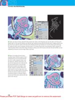
Understanding Adobe Photoshop CS4- P6 pot
Bạn đang xem bản rút gọn của tài liệu. Xem và tải ngay bản đầy đủ của tài liệu tại đây (2.6 MB, 30 trang )
138
Chapter 8 Compositing with Layers
•
If you need a fl attened copy to paste into another document (or
within your current document), use the Copy Merged com-
mand. Select an active, visible layer, and then choose Select >
All. You can copy all visible items to your clipboard as a single
layer by then choosing Edit > Copy Merged or by pressing
Shift+Command/Ctrl+C.
Creating a Panorama
By using layers, you can take several photos from one location and
merge them together to create a large panoramic photo. Many
people take an assortment of photos of a subject while holding the
camera, but it’s best to use a tripod. It’s important to ensure that
you have some overlap between each frame; that is to say, the adja-
cent photos share some common subject matter—about 15 percent
overlap is usually enough.
Let’s try piecing together some photos using the Automation com-
mand called Photomerge:
1. Choose File > Automate > Photomerge. Photomerge is a
specialized “mini- application” within Photoshop that assists in
combining multiple images into a single photo.
2. Click the Browse button and navigate to the Chapter 8 folder
on the book’s CD.
3. Select the folder Ch08_Pano, select all the fi les within the
folder, and then click Open.
TIP
Flattening Images
Remember, fl attening is permanent.
Be 100 percent positive before you
discard your layers permanently.
Saving a fl attened copy is usually
a better idea. You can also group
multiple layers into a Smart Object
by selecting the layers, and then
choosing Layer > Smart Object >
Convert to Smart Object. You can
always edit the Smart Object and
extract the layered fi le.
TIP
Professional Panoramic
Photography
Pros know that it’s best to use a
tripod and slightly move the camera
to create overlap. There are even
specialized tripod heads that you
can purchase from companies like
Kaidan (www.kaidan.com) and
Really Right Stuff (www.reallyright
stuff.com) that make leveling and
rotation much more precise.
Creating a Panorama
139
4. There are several Layout options avail-
able that attempt to fi x problems caused by
panoramic photography (such as distortion).
A good place to start is Auto, which attempts
to align the images but will bend them as
needed.
5. Select the check boxes next to Blend Images
Together and Vignette Removal. These two
options will attempt to blend the edges of the
photos together and can hide subtle differ-
ences in exposure.
6. Click OK to build the panoramic image.
Photoshop attempts to assemble the panora-
ma based on your choices in the dialog box.
Since layers are preserved, however, you can still tweak the
position of individual layers.
7. Nudge any layers with the Move tool if your
alignment is off.
8. The Layer Masks help to blend the photos
together. They can be modifi ed as needed
using the techniques you learned in the
previous chapter.
9. Choose Layer > Flatten Image.
10. Crop the image to a clean rectangular shape
using the Crop tool (C).
Be sure to check out the fi le Ch08_Pano_
Complete.tif to see how the image was further
enhanced with adjustment layers.
140
Chapter 8 Compositing with Layers
Auto-Aligning Layers
The technology that powers the Photomerge
command can also be harnessed to stitch
together nonpanoramic shots. The Auto-Align
Layers command is a useful way to stitch to-
gether multiple shots or scans of a large object or
a group photo. The command is very easy to use
and produces impressive results.
1. Choose File > Scripts > Load Files into
Stack to combine two or more fi les into one
document.
2. In the Load Layers dialog box, click the
Browse button to navigate to the fi les
you need.
3. Open the folder Ch08_Cyborg, select both
images inside, and click Open.
4. In the Load Layers dialog box select the
check box next to Attempt to Automatically
Align Source Images.
5. Click OK. Photoshop opens both images and
aligns them, and does a good job (especially
since the top layer was taken at such an
angle). This alignment can be refi ned even
further.
6. Make sure both layers are selected in the
Layers panel.
7. Choose Edit > Auto Align Layers.
VIDEO
TRAINING
Creating Panoramas
27
Auto-Aligning Layers
141
8. Select the Auto option to enable both
Vignette Removal and Geometric Distortion
options for Lens Correction.
9. Click OK. Photoshop removes some of the
distortion in the glass case, giving it a more
rectangular shape.
The layers can be seamlessly blended togeth-
er using the Auto-Blend Layers command.
This applies Layer Masks as needed to each
layer to mask out exposure issues and create
a seamless composite.
10. Choose Edit > Auto-Blend Layers, specify
the Panorama method, and click OK (be sure
the Seamless Tones and Colors check box is
also selected).
11. Crop the image as needed, adjust Levels,
and Flatten.
142
Chapter 8 Compositing with Layers
Photoshop CS introduced Layer Comps, which allows Photoshop to memo-
rize combinations of layer visibility, opacity, and position. This can be useful
for storing multiple designs inside one document. When experimenting
with layouts, you’ll often use several options in one document. You might
set the headline in three different typefaces and try the main photo in two
different positions. Using Layer Comps allows you to set up different options
within one document (instead of having to save and keep track of several).
1. Open the fi le Ch08_Layer_Comps.psd.
2. Make sure the Layer Comps window is visible. If not, choose
Windows > Layer Comps.
3. Click the forward triangle to Apply Next Selected Layer Comp.
Click through and examine the different layer comps.
4. For Layer Comp 1, move the words around onscreen to a new position.
5. Click the Update layer comp icon at the bottom of the Layer Comps panel (it looks like two arrows in a circle),
6. Switch to Layer Comp 2. On the layer called This is, click the visibility icon next to the Layer Style Outer Glow.
A black glow should be added.
7. Click the Create new layer comp icon (it looks like a pad of paper) on the bottom edge of the Layer Comps
window. Name it Comp 2 Alternate.
8. Save a copy of each layer comp to send to a client. Choose File > Scripts > Layer Comps to PDF. Photoshop
creates a new PDF with all four layer comps in one document. This is a convenient way to email a project to a
client for review.
Layer Comps are a bit confusing at fi rst, but as you master what layers can do, you’ll turn to Layer Comps for fl ex-
ibility. Be sure to check out the Adobe Help Center for more on Layer Comps.
LAYER COMPS
VIDEO
TRAINING
Layer Comps
28
Using Blending
Modes
9
Blending modes are both a mystery and a source
of great design power. Each blending mode
controls how the pixels in one layer are affected
by those in another layer or by a tool from the
Tools panel. Most users give up on them because
the technical defi nitions of blending modes get
very tricky. The secret is to not worry too much
about the technical issues and to learn how to
experiment. While you’ll explore the technology
and the creativity behind blending modes, there
are only a few basics that you must know to make
blending modes part of your design toolbox.
About Blending Modes
There are 25 different blending options avail-
able from the Layers panel and a few additional
blending options that work with specifi c tools.
How do they work? The simple answer is, it de-
pends. Your response is likely, depends on what?
Simply put, the effect achieved by blending two
layers varies with the contents of those two lay-
ers. A blending mode compares the content of
two layers and enacts changes based on the con-
tent of both layers. You’ll fi nd blending modes
in many of the tools, and they can be combined
with every fi lter.
144
Chapter 9 Using Blending Modes
The blending mode specifi ed in the Options bar
controls how pixels are affected by a painting or
editing tool. Additionally, you can set the blend-
ing mode of a layer to control how it interacts
with those below it. A clear understanding of the
following terms will better help you understand
blending modes:
•
Base color: The original color in the image
•
Blend color: The color being applied with
the painting or editing tool (or the color in
the top layer)
•
Result color: The color resulting from
the blend
List of Blending Modes
Here are the different blending modes available
through the Layers panel. I have attempted to
give you a clear and simple defi nition as well as a
sample of how these images blend.
NOTE
Blending Mode Practice
For more practice with blending,
open the fi les Ch09_Blend Modes1.
psd and Ch09_Blend Modes2.psd in
the Chapter 9 folder, and experiment
with different modes and opacity
settings.
Original Blended Image
About Blending Modes
145
Dissolve
Creates a random
replacement of
the pixels with
the base or blend
color.
Color Burn
Evaluates each
channel; darkens
base by increas-
ing contrast.
Lighten
Evaluates each
channel; it then
uses base or blend
color (whichever
is lighter).
Linear Dodge
(Add) Evaluates
color information
and brightens
base by increas-
ing brightness.
Soft Light
Effect is similar to
shining a diffused
spotlight on the
image.
Linear Light
Burns or dodges
by decreasing or
increasing the
brightness.
Difference
Evaluates each
channel and sub-
tracts or inverts
depending on
brightness.
Saturation
Creates color
with luminance
and hue of base
and saturation of
blend.
Darken
Pixels lighter
than blend are
replaced; darker
ones are not.
Linear Burn
Evaluates each
channel; darkens
base by decreas-
ing brightness.
Screen
Results in a
lighter color. It is
useful for “knock-
ing” black out of
a layer.
Lighter Color
Uses highest
value from both
layers to create
resulting color.
Hard Light
Effect is similar to
shining a harsh
spotlight on the
image.
Pin Light
Is useful for add-
ing special effects
to an image.
Exclusion
Is similar to the
Difference mode
but lower in
contrast.
Color
Preserves gray
levels. It’s very
useful for color-
ing and tinting.
Multiply
Is similar to draw-
ing strokes on
the image with
magic markers.
Darker Color
Uses the lowest
value from both
layers to create
resulting color.
Color Dodge
Evaluates color
information and
brightens base
by decreasing
contrast.
Overlay
Overlays existing
pixels while pre-
serving highlights
and shadows of
base.
Vivid Light
Burns or dodges
by increasing or
decreasing the
contrast.
Hard Mix
Enhances the
contrast of the
underlying layers.
Hue
Uses luminance
and saturation of
the base and the
hue of the blend.
Luminosity
Is the inverse
effect from the
Color mode.
Open the fi le Ch09_Blended_Overlay.psd from the Chapter 9 folder on the CD to experiment with blending modes.
146
Chapter 9 Using Blending Modes
Blending Modes in Practice
So far you’ve looked at blending modes in a strictly technical
sense. While it’s useful to have a clear understanding of the tech-
nology, don’t lose sight of the design possibilities. Blending modes
are a great way to mix layers together. For a designer, this can be
a useful way to create backgrounds for speaker support (like Pow-
erPoint presentations) or DVD menus. Let’s dissect one of those
backgrounds:
1. Open the fi le Ch09_Speaker_Support.psd from the Chapter
9 folder on the CD. This eight-layer document uses blending
modes to create a complex background.
2. Turn off the visibility icons for all but the bottommost two layers.
3. Select the Train layer. It is currently set to the
Overlay blending mode. Changing its blend-
ing mode will create a different look.
4. A useful shortcut to cycle blending modes is
Shift++(plus). This will step you forward in
the blending mode list. Pressing Shift+- (mi-
nus) will step backward through the blending
mode list. If you have a tool selected that
has its own mode settings (such as the Brush
or Gradient tool), the shortcut modifi es the
blending mode of just the tool. To quickly
change the mode on a layer, select the Move
tool (V) or Marquee tools (M) fi rst. Ex-
periment with different blending modes and
opacity settings to try out different looks.
5. Repeat your blending mode experimentation
for the Light, Highlights, and Soft Focus layers.
Try out different modes and opacity settings.
6. Select the Blue layer. It is set to the Color
blending mode, which applies its color to all
layers below it. This is a very useful way to
tint multiple layers for a consistent look.
Blending Modes in Action
147
Continue to experiment with different combinations of blending
modes and opacity settings. This sample image provides just a
quick glimpse into the power and fl exibility of blending modes.
Rule #1—Don’t try to memorize how each blending mode works:
The good news is that they are grouped by similar traits. As you make
your way through the list, you will notice a gradual progression
through styles. The fi rst group darkens your underlying image, whereas
the second lightens it. The third set adds contrast, and the last two
generate dramatic results by comparing or mapping values. Depending
on your sources, some blending modes will generate little or no results.
Sound confusing? Keep reading.
Rule #2—Experiment: The best way to use blending modes is to just
try them out. Clicking through a long drop-down menu is boring. A
much better alternative is to select the Move tool and then use the
Shift++ keyboard shortcut.
Rule #3—Exploit them: Do you need a quick visual pop? Try blending
a blurred image on top of itself. Do you need to tint an image? Place a
solid or gradient on top of the image and change to Hue or Color mode.
Blending modes are available for every fi lter (choose Fade Filter from
the Edit menu) and all the Brush tools.
DESIGN “RULES” FOR BLENDING MODES
Blending Modes in Action
Now that you have a little practice with blending modes, it’s time
to explore their creative and production side in greater depth.
Blending modes are part of a professional’s workfl ow. The next
three sections showcase a few different ways to better integrate
blending modes for professional results.
VIDEO
TRAINING
Blending Modes
29
148
Chapter 9 Using Blending Modes
Instant Spice
One way to improve a washed out or fl at image is through blend-
ing modes. By blending a blurred copy of an image on top of itself,
you can quickly create a visual pop. Let’s give it a try:
1. Open the fi le Ch09_Spice.psd from the Chap-
ter 9 folder.
2. Select the Background layer in the Layers
panel.
3. Duplicate the Background layer by pressing
Command/Ctrl+J.
4. Signifi cantly blur the new layer by choosing
Filter > Blur > Gaussian Blur. A value of 25
pixels should do the trick.
5. Select the Move tool by pressing V.
6. Cycle blending modes by pressing Shift++.
Look for modes (such as Overlay or Soft
Light) that increase saturation and add visual
“pop” to the image.
7. If needed, adjust the opacity of the layer as de-
sired. You can quickly change opacity by typ-
ing in the fi rst number of an opacity setting,
such as 4 for 40% opacity. You can type 25 to
quickly switch to 25% opacity, for example, if
a more specifi c adjustment is required.
Here’s a quick look at how different blending modes can be used to
add instant spice to an image.
Blending Modes in Action
149
Dissolve
Color Burn
Lighten
Linear Dodge
Soft Light
Linear Light
Difference
Saturation
Darken
Linear Burn
Screen
Lighter Color
Hard Light
Pin Light
Exclusion
Color
Multiply
Darker Color
Color Dodge
Overlay
Vivid Light
Hard Mix
Hue
Luminosity
150
Chapter 9 Using Blending Modes
Fixing a Shadowed Image
If an image is completely thrown into the shadows, you can turn
to blending modes to shed a little light. In fact, this is a technique
that is often used by law enforcement agencies to enhance security
photos or footage.
1. Open the fi le Ch09_Meter.tif from the Chap-
ter 9 folder.
2. Duplicate the Background layer by pressing
Command/Ctrl+J.
3. Set the top layer to Screen mode. You can
choose it from the pop-up menu in the Lay-
ers panel or press the keyboard shortcut
Shift+Option/Alt+S. The image should ap-
pear signifi cantly lighter.
4. You can further lighten the image by placing
another duplicate copy on top. Press Com-
mand/Ctrl+J as many times as needed. Each
will lighten the image further.
Blending Modes in Action
151
Applying a Rubber Stamp
You can also use blending modes to make one image appear as if it
were applied to another. If you add the Free Transform command,
you can make that stamp match the perspective of the photo. Let’s
give it a try:
1. Open the fi les Ch09_Boxes.tif and Ch09_
Logo.psd from the Chapter 9 folder.
2. Select the Logo.psd fi le so it is active.
3. Choose Select > All and then Edit Copy to
add it to your clipboard.
4. Switch back to the Boxes fi le and choose
Edit > Paste.
5. Press Command/Ctrl+T to invoke the Free
Transform command. To harness addi-
tional transformations, right-click/Ctrl-click.
Choose Distort: This will allow you to corner
pin the logo and match its angle to that of the
box.
6. You now need to scale the logo smaller.
Right-click/Ctrl-click and choose Scale.
Shrink the logo so it fi ts better on the side of
the box.
7. Set the Logo layer to the Multiply blending
mode and lower its opacity to 85%. This will
make the Logo layer appear to be stamped on
the crate.
Table 9.1 provides the keyboard shortcuts to
make it easier for you to use blending modes.
152
Chapter 9 Using Blending Modes
Table 9.1 Blending Shortcuts
Result Windows Windows Mac OS
Normal Shift+Option+N Shift+Alt+N
Dissolve Shift+Option+I Shift+Alt+I
Darken Shift+Option+K Shift+Alt+K
Multiply Shift+Option+M Shift+Alt+M
Color Burn Shift+Option+B Shift+Alt+B
Linear Burn Shift+Option+A Shift+Alt+A
Lighten Shift+Option+G Shift+Alt+G
Screen Shift+Option+S Shift+Alt+S
Color Dodge Shift+Option+D Shift+Alt+D
Linear Dodge Shift+Option+W Shift+Alt+W
Overlay Shift+Option+O Shift+Alt+O
Soft Light Shift+Option+F Shift+Alt+F
Hard Light Shift+Option+H Shift+Alt+H
Vivid Light Shift+Option+V Shift + Alt+V
Linear Light Shift+Option+J Shift + Alt+J
Pin Light Shift+Option+Z Shift + Alt+Z
Hard Mix Shift+Option+L Shift + Alt+L
Difference Shift+Option+E Shift + Alt+E
Exclusion Shift+Option+X Shift + Alt+X
Hue Shift+Option+U Shift+Alt+U
Saturation Shift+Option+T Shift+Alt+T
Color Shift+Option+C Shift+Alt+C
Luminosity Shift+Option+Y Shift+Alt+Y
NOTE
Not All Modes Have Shortcuts
The two newest modes (Darker
Color and Lighter Color) do NOT
have a shortcut key.
VIDEO
TRAINING
Filters & Blending Modes
30
Color Correction
and Enhancement
10
The primary purpose of Photoshop is to act as a
digital darkroom, where images can be correct-
ed, enhanced, and refi ned. How do you know an
image needs touch-up? You can pretty much as-
sume every image can look a little (or even a lot)
better than how the camera captured it. Whether
it’s adjusting the exposure, increasing contrast,
or boosting saturation, Photoshop is the place to
improve an image.
Learning how to spot problems, and then choos-
ing the right correction technique is an essential
part of mastering Photoshop. Several different
tools are available, some more useful than others.
By analyzing the most important tools and deter-
mining in which situations they might help you, a
more thorough understanding of color correction
is possible.
Approach to Color
Correction
New users often have a hard time when color
correcting or enhancing images. They generally
lose sight of the goal: making the image look
better and believable. Many users go “too far”
in their quest to fi x images. If the image starts to look fake or too
altered, it will be distracting. While getting it “right” will require
some practice, here’s some general advice to get you started:
The image on the top is unretouched. The image on the
bottom has been refi ned with three adjustment layers:
one to enhance levels and two to adjust hue and saturation
of the sky and vegetation. You can open the fi le
Ch10_Desert_Enhance.psd to see the changes.
154
Chapter 10 Color Correction and Enhancement
•
Identify what’s wrong: Before you can fi x a picture, be sure
you have decided on what’s wrong. Is it too dark? Is the sky
washed out? Has the picture faded over time? Make a list and
prioritize the issues you fi nd in each image. It’s easiest to fi x
one problem at a time, and if you identify those problems,
you’ll know when to stop twiddling with the image.
•
Work with a copy of the image: Before you start to color
correct an image, you should duplicate it. This way you can re-
turn to an original version if you make a mistake or go too far
in your image touch-up. After opening your fi le, choose File >
Save As and name the duplicate version that will be corrected.
Color correction can be a destructive process, meaning that you
cannot revert to the original state at a later time. By preserving
an original version of the image or employing adjustment lay-
ers, nondestructive editing is possible. Some users also choose to
duplicate the background layer at the bottom of the layer stack.
•
Edit with adjustment layers: Adjustment layers allow you to
apply most of the image correction commands as nondestruc-
tive effects. They are added as a layer above the actual image;
the adjustment layer can be blended, masked, or deleted at any
time. Additionally, if you double-click the adjustment
layer’s thumbnail, you can modify its properties in the
Adjustments panel. The same modifi cations are avail-
able in both the Adjustments menu and Adjustments panel.
You should work with an adjustment layer whenever possible
because its fl exibility will be important for future revisions.
•
Get a fresh opinion: It’s not a bad idea to step back and
examine your work. Open the backup copy of the original im-
age and compare it to the image you’ve been working on. This
before-and-after comparison can be very useful. If you have a
fresh set of eyes nearby, ask that person for his or her opinion.
Primary Image Adjustments
Photoshop offers several image adjustments, but only a few are
used most often. Commands such as Levels and Curves are used
by professionals to achieve outstanding results. These professional
imaging techniques may take a little time to get comfortable with,
but the power they offer is worth your investment.
Primary Image Adjustments
155
Levels
The Levels command corrects tonal ranges and color balance
issues. With this command you can fi x poor exposure. Addition-
ally, you can perform color correction by manually identifying a
white point and black point in the image. Nearly every image can
benefi t from making a Levels adjustment.
To understand Levels, it is essential to be able to read a histogram.
This graph works as a visual guide for adjusting the image. The
Levels adjustment has its own histogram that is visible when work-
ing in the Adjustments panel. You may also want to call up the
Histogram panel (Window > Histogram) and leave it open while
color correcting. You can also choose to expand the Histogram
panel by clicking the submenu and choosing All Channels View.
Let’s give the command a try.
1. Close any open fi les, and then open the fi le Ch10_Levels.tif
from the Chapter 10 folder on the CD.
2. Add a Levels adjustment layer by clicking the
Levels icon in the Adjustments panel. Levels
is also available from the Adjustments menu
(Image > Adjustments), but the adjustment
layer is more fl exible for future modifi cations.
Be sure to select the Preview check box so
changes update onscreen.
3. This photo was shot under
low light, but you can reset
the black and white points
of the image to fi x the ex-
posure. In the Adjustments
panel, move the white Input
Levels slider to the left
(where the histogram starts
to rise). This affects the im-
age’s white point and allows
you to reassign where white
should begin in the image.
NOTE
Levels Beats
Brightness/Contrast
A Brightness/Contrast command
does exist, but the Levels adjust-
ment lets you perform several
improvements with one command.
Using a single image process
cuts down on the loss of quality
introduced from multiple image-
processing steps.
156
Chapter 10 Color Correction and Enhancement
4. Move the black Input Levels
slider to the right where the
fi rst amount of black starts
to rise. The more you move
the black slider to the right,
the more contrast is intro-
duced into the image.
5. The true power lies in the
middle (gray) Input Levels
slider. By moving this slider,
you can modify the gamma
setting. Effectively, you can
use the middle Input Levels
slider to change the inten-
sity of the midtones. This
adjustment can be made
without making dramatic
changes to the highlights
and shadows, and lets you
better expose an image.
Move the slider to the left to
add light; move the slider to
the right to subtract light.
6. In the future if you need to
edit the adjustment, simply
select the adjustment layer
in the Layers panel and
manipulate the controls in
the Adjustments panel.
NOTE
Levels vs Curves
A Levels adjustment does not offer
as many precise adjustment points
as a Curves adjustment. However,
Levels adjustments can be easier to
make and generally produce very
effective results.
VIDEO
TRAINING
Color Correction—Levels
31
Primary Image Adjustments
157
Auto-Levels
When working with the Levels adjustment layer, you may have
noticed the Auto button. This command button triggers an
analysis of the histogram data by Photoshop that is then used to
modify the individual controls of the Levels adjustment. In many
cases this results in an image that is properly adjusted for color
balance and exposure issues. In others it will get you closer to a
corrected image.
1. Close any open fi les, and then Open the fi le Ch10_Auto_Lev-
els.tif from the Chapter 10 folder on the CD.
2. Add a Levels adjustment
layer by clicking the Levels
icon in the Adjustments
panel.
3. Click the Auto button to
perform an automated
adjustment for the image.
The image’s levels and color
are adjusted.
4. To refi ne how the automatic
adjustment works, hold
down the Option/Alt key
and click the Auto button
again. A new dialog box
opens.
5. Choose Find Dark & Light
Colors and Snap Neutral
Midtones to create a very
natural balance of colors for
the image.
6. Click OK to close the dialog
box.
158
Chapter 10 Color Correction and Enhancement
Color cast
In the fi rst Levels example you made a Levels
adjustment to all the channels evenly. In the
Auto-Levels example, you let Photoshop adjust
the levels and remove color cast using an auto-
mated algorithm. The Levels command can be
further isolated to a specifi c channel by clicking
the drop-down list in the center of the Levels
dialog box. This allows you to tackle color cast
issues, such as spill from a background, a bad
white balance, or a photo shot under mixed or
colored lighting.
1. Close any open fi les, and then open the fi le
Ch10_Levels_Color_Balance.tif from the
Chapter 10 folder. Notice how the image has
a greenish tint.
2. Add a Levels adjustment layer using the
Adjustments panel. You will use the Levels
command to fi x color and exposure issues.
3. Select the Set White Point (white eyedropper) in
the Levels dialog box. Click an area that should
be pure white. For this image, click a bright
area in the white pillar. If you click too dark an
area, the whites in the image will overexpose.
(You can click the Reset button—it looks like
a circular arrow—at the bottom of the Adjust-
ments panel if needed to reset the Levels com-
mand, if needed.) After you click, you’ll see that
some of the color spill has been removed.
4. Select the Set Black Point
(black eyedropper) in the
Levels dialog box. Click an
area that should be pure
black. Choose an area such
as a jacket or a dark shadow.
This will adjust the color
balance and the exposure.
Primary Image Adjustments
159
5. The image’s color balance should now be bet-
ter. Adjust the middle Input Levels slider to
brighten the image.
Manual adjustment
You can also use the Levels command to correct skin tones and isolated
areas in an image. The Set White Point and Set Black Point eyedrop-
pers work well, but sometimes it can be diffi cult to fi nd a pure white or
black point in your image. Let’s try fi xing color and exposure manually.
1. Close any open fi les, and then open the fi le Ch10_Levels_Iso-
lated.tif from the Chapter 10 folder.
2. You need to fi x part of the image that has dramatically differ-
ent lighting than the rest of the image. Look at the bottom-left
corner: The indoor lighting is throwing off the rest of the image.
3. Use the Polygonal Lasso tool to select the door region. After
making the selection, choose Select > Feather and enter a val-
ue of 5 pixels to soften the
selection. Making a selec-
tion fi rst causes the adjust-
ment layer to attach a mask
to isolate the color correc-
tion to the selected area.
4. Add a Levels adjustment
layer. You will make a
Levels adjustment on each
channel to fi x color and
exposure issues.
TIP
Rinse and Repeat
If you have several images from the
same camera or shoot, they may
need the same Levels adjustment.
The Save button allows you to save
a Levels adjustment (to the folder
that contains the image is a good
place). You can then click the Load
button to apply that adjustment to
another image.
160
Chapter 10 Color Correction and Enhancement
5. From the Channels drop-down menu in
the Adjustments panel, choose red or press
Option/Alt+3 to select the fi rst channel.
Notice how the histogram is skewed to the
left. Move the white Input Levels slider to the
outside edge of the histogram where it begins
to rise. Move the middle (gray) Input Levels
slider to balance the histogram data evenly
on both sides.
6. Switch to the green channel by pressing Op-
tion/Alt+4. Move the black and white Input
Levels sliders to the outside edges of the his-
togram. Adjust the middle (gray) Input Levels
slider to balance the histogram.
7. Make the same adjustment to the blue chan-
nel by pressing Option/Alt+5. The image
should now appear color balanced. If needed,
you can return to the individual channels to
tweak color balance.
8. Switch back to the composite view by press-
ing Option/Alt+2. You can now make a
standard Levels adjustment to tweak contrast
and exposure until you are satisfi ed.
VIDEO
TRAINING
Correcting Color Cast
with Levels
32
Primary Image Adjustments
161
Curves
Most users will either use Curves a lot or they won’t use it at all. The
Curves interface is more complex than Levels, which scares away
many users. While Levels gives you three control points (highlights,
midtones, and shadows), the Curves adjustment allows for up to 16
control points. This can signifi cantly open up more options when
adjusting color and exposure.
Let’s try the Curves command
on a practice image.
1. Close any open fi les, and
then open the fi le Ch10_
Curves_Practice.tif from
the Chapter 10 folder.
2. Add a Curves adjustment
layer by clicking the Curves
button in the Adjustments
panel. When you fi rst open
the Curves interface, there
are two points (one for white and one for black).
3. Add a single control point in the middle of the line (click at an
Input Value of 50%).
4. Pull this new control point
down to lighten the image
(toward the lighter area on
the Y axis). You can pull
the point up to darken the
image. Notice that the Input
and Output values update
as you drag.
5. The adjustment is applied
gradually throughout the
entire image. Multiple
points can be employed for
contrast adjustments based
on tonal range.
The primary advantage of Curves is that you have precise control
over which points get mapped (whereas in Levels you do not).
Another benefi t is that Curves adjustments use a curved line (as
opposed to Levels, which uses only three control points) to make
162
Chapter 10 Color Correction and Enhancement
adjustments. In this way, color
correction can be applied in a
more gradual manner (without
the hard clipping that can be
associated with Levels).
1. Close any open fi les, and
then open the image Ch10_
Curves.tif from the Chapter
10 folder.
2. Add a Curves adjustment
layer by clicking the Curves
icon in the Adjustments
panel. The curve has only
two points on it—one repre-
senting the black point; the
other, the white point.
3. It’s now time to add more control points to refi ne the curve. To do
this, you’ll use a Curves preset. Click the drop-down menu to se-
lect a Curves preset in the Adjustments panel. Choose the Strong
Contrast (RGB) preset. Notice that the image now has more
contrast in the shadows and highlights, and more visual “pop.”
4. Experiment by adjusting the fi ve control points. Try to further
emphasize the shadows in the image. Continue to experiment
by moving the control points (you can use the up and down
arrow keys for precise control).
NOTE
Pay Attention to Your Axes
When working with a grayscale or
CMYK fi le, the axes go from light
to dark. When working with RGB
images, the scales are reversed.
This means that pulling a control
point up or down may have a dif-
ferent effect depending on your
image mode.
TIP
Easy Curves
When the Curves Editor is open, you
can easily add control points. Click
the icon that looks like a pointing
fi nger, and then just click and drag
in the image to modify the curve.
The control points will appear in
the editor. These can be moved to
lighten or darken the image.