Creative Photoshop: Digital Illustration and Art Techniques Photoshop Cs4- P6
Bạn đang xem bản rút gọn của tài liệu. Xem và tải ngay bản đầy đủ của tài liệu tại đây (8.65 MB, 50 trang )
238
Part Three: Real World Photoshop
13
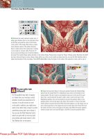
28 Create a new layer and drag it beneath the blue outlines layer. Select a pink foreground color from the picker and fill the active
selection with it on the new layer. Deselect, and offset the layer contents by moving them with the Move tool or nudging with the arrow
keys. Feel free to rotate the contents of this layer while offsetting with the Free-Transform tool if you like. Open up the small1b.jpg
file. Lighten the black, convert to grayscale, and then convert it to a bitmap. Perform what is now becoming a familiar operation to
create the bitmap halftone screen effect. Angle and frequency settings can be left the same as they were the last time. When you have
completed the conversion, invert the image. Select all and copy.
29 Return to the working file and create a
new alpha channel. Paste the copied art into it
and position the art o
ver the small squid with
the aid of a visible composite channel. Load
the channel as a selection and create a new
layer. Set the foreground color to white and fill
the active selection with it on the new layer.
Deactivate the selection and nudge or move
the layer contents if necessary. Open up the
small1c.jpg file. Invert the image, copy it, and
paste it into a new alpha channel in the working
file. Move the channel contents into position
and load the channel as a selection. Create a
new layer and fill the active selection with light
green on the new layer.
Please purchase PDF Split-Merge on www.verypdf.com to remove this watermark.
239
Chapter 13: Simulated Screen-Printing
13
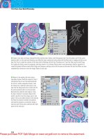
30 Select all of the layers that make up this smaller squid
creature and group them. Open up the small2a.jpg file. Invert
the image and copy it. Paste it into a new alpha channel in the
image. Position the art so that the
creature’s tail extends beyond the
right side of the channel and then
load the channel as a selection.
Create a new layer and fill the
active selection with the same
light green foreground color you
just used. Now use the Magic
Wand to select the inner area
of the creature on this layer; a
single click should do it. Create
a new layer. Drag it beneath the
green outlines layer, fill the active
selection with pink, and then
deselect. Use the Move tool to
Shift-drag the layer down slightly
to offset it.
31 Target the layer that
contains the green outlines
and use the Magic Wand to
select the iris area of the
creature. Create a new layer
and fill this selection with
cyan-blue. Deselect and
move the contents upward
a little. Then drag the layer
beneath the outlines layer in
the Layers palette. Target the
three layers that make up this
creature and group them.
Please purchase PDF Split-Merge on www.verypdf.com to remove this watermark.
240
Part Three: Real World Photoshop
13
32 Open up the small3a.jpg file and invert it. Copy
the artwork and paste it into a new alpha channel in
your working file. Position the art over the big squid’s
tentacles, a little to the left of the center of the canvas.
Load the channel as a selection and create a new layer.
Fill the active selection on the new layer with a dark blue
foreground color. Deactivate
the selection and use
Free-Transform to rotate
the layer contents a little.
Select the Magic Wand, but
don’t select anything with it
yet, I’m going to show you a
shortcut.
Quickly selecting interior regions
Previously, we selected all regions within a creature manually. However, this alternative method is just as effective and perhaps
a little quicker.
1 First, load a selection from the
contents of the entire layer. In
the Layers palette, Control(PC)/
Command(Mac)-click on the layer
thumbnail that contains the squid’s
blue outlines in the Layers palette.
2 Now that the areas of the layer
content are selected, invert the
selection. Type Control(PC)/
Command(Mac)-Shift-I on the
keyboard to invert the selection, so
that all of the transparent areas of the
layer are selected.
3 Now, select the Magic Wand tool
and ensure that the Contiguous option
is enabled and the Sample All Layers
option is disabled. Hold down the
Alt(PC)/Option(Mac) key and then
click in the selected transparent area
that surrounds the creature. This will
effectively remove this region from
the selection, leaving only the areas
inside the creature selected.
Please purchase PDF Split-Merge on www.verypdf.com to remove this watermark.
241
Chapter 13: Simulated Screen-Printing
13
33 Create a new layer and
fill the active selection with
a cyan-blue foreground color.
Deactivate the selection and
drag the layer beneath the
dark blue outlines layer in the
Layers palette. Use the Move
tool or arrow keys to offset the
cyan-blue fill slightly. Reduce
the opacity of the layer to 95%
so that a little of the underlying
layers show through. Target the
dark blue outlines layer in the
Layers palette. Select the sclera
of the eye and the inside of the
tooth. Create a new layer and
fill these selected regions with
white. Drag the layer beneath the
blue outlines layer in the Layers palette and offset it slightly
with the arrow keys or the Move tool.
34 Open up
the small3b.jpg
file. Lighten the
black. Convert to
grayscale and then
to bitmap mode. Use
the halftone effect
to create a line
pattern and then
invert the results.
Select the inverted
halftone art and
copy it. Return to
the working file and
paste the copied art
into a new channel.
Move that art in
the channel into
position and then
load a selection
from the channel. Create a new layer and fill the
active selection with a very light green foreground
color on the new layer. Deselect and alter the
position and/or angle of the contents of this layer
if necessary.
Please purchase PDF Split-Merge on www.verypdf.com to remove this watermark.
242
Part Three: Real World Photoshop
13
The finishing touch
Use the Gradient tool and everything you’ve learned thus far to add shading into the background, completing the illustration.
1 Create a new image file in grayscale
mode, which has the identical size
and resolution as the working file. Set
the gradient opacity to 50%. Use the
Gradient tool to click and drag from
the upper right corner to the center of
the canvas, creating a diagonal, linear
gradient in the corner.
2 Convert the image to a bitmap. This
time set the line frequency to around
15 and the angle to 135 ° . Invert
the image, copy it, and return to the
working file. In the working file, create
another alpha channel and paste the
copied art into it.
3 Load the channel as a selection
and create a new layer. Drag the layer
down in the Layers palette so that it
resides beneath all layers except for
the background layer. Fill the selection
with a blue foreground color and then
deselect. Offset the layer content with
the Move tool or the arrow keys.
35 Open the small3c.jpg file
now
. Inver
t the image and copy
it. In the working file, paste the
copied art into a new channel.
Align the art with the current
squid and then load the channel
as a selection. Create a new
layer and fill the active selection
with a pink foreground color.
Deactivate the selection and use
Free-Transform to rotate and
resize the contents of the layer
as necessary. Target all of the
layers that make up this squid in the Layers palette and group
them. Select the Gradient tool. Enable the linear method and
the Foreground to Background Color Gradient preset in the Tool
Options bar. Press the “ D ” key to set the foreground color to
black and the background color to white.
Please purchase PDF Split-Merge on www.verypdf.com to remove this watermark.
243
Chapter 13: Simulated Screen-Printing
13
Practical uses of this technique
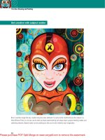
This technique lends itself nicely to works that are meant to convey an organic, nostalgic, or friendly feeling, like the
coffee cup illustration shown here. Also, the compositions can be less complicated than the featured image, yet still
convey the desired feeling. Sometimes a real-world element, like a desktop scan or a photograph in the background, can
also help to convey the feeling. Generally, the success lies in the style of the illustration itself, which is a direct result of
the halftone effect, not the intricacy of the design.
Please purchase PDF Split-Merge on www.verypdf.com to remove this watermark.
Please purchase PDF Split-Merge on www.verypdf.com to remove this watermark.
245
Real World Collage
F
lexibility and functionality make Photoshop the ultimate digital collage tool.
If you’re holding this book in your hands, it’s likely that you’re more than
familiar with this concept. The downside to all of these is that we, digital
artists, are only human and unfortunately, more often that not, we’ll tend to
follow the path of least resistance. We get locked in front of our computers and through
con
venience, whether
conscious of it or not, we tend to get into the habit of creating
only on the screen. The unfortunate byproduct of this is a vast array of uninspired digital
collages everywhere you look. You’ll notice a lot of softly blended imagery, sleek stock
photos and royalty-free textures, and in the case of something really inno
vative,
you might
just see a desktop scan used.
M y goal in this chapter is to offer you an alternative to uninspired collage conformity.
Hopefully, getting a bit of paint on your hands will help you snap out of the convenient and
predictable. Let’s make a bit of a mess and combine some real-world materials to give your
collage a distinctly non-digital look. I want to encourage you to bridge the gap between
the tactile and the digital, allo
wing you
to create strange hybrid works of art that look like
something new altogether.
Chapter 14
Although you’ll be expected to have a basic understanding of selection
tools, layers, paths, and fi le creation, the actual Photoshop methods for
compositing this piece are rather rudimentary. Anyone who has a basic
understanding of Photoshop should be able to pull this off.
Please purchase PDF Split-Merge on www.verypdf.com to remove this watermark.
246
Part Three: Real World Photoshop
14
What you’ll learn in this chapter
Creative Techniques and Working Methods
Prior planning and observation
Planning and forethought is an integral part of the creative process. Unfortunately, the habits
of digital artists tend to gravitate away from this preliminary and crucial phase. It seems to be
common practice to open a new file and jump right to the stage of creating finished art digitally.
The early portions of this chapter discuss the planning stage, and that is what I want to draw your
attention to. Take a look at what is around you. Find interesting items that lend themselves to a
composition and will work together. Devise a plan and work to that plan. The results of your efforts
will certainly benefit from this.
Imperfection
Looking at the opening image of this chapter, it is hard to ignore the fact that a large part of
the appeal is the imperfect, distressed, and choppy execution. In this chapter, quick and dirty
compositing methods will prevail. You won’t be asked to produce precise selections or masks. You’ll
focus more on what goes where and intentionally leave things a little rough. Roughness is a key
component in this image’s unique quality.
Photoshop Tools, Features, and Functions
Inverted Wand selections
The Magic Wand isolates solid areas of color easily. But you can use it to quickly select complicated
surrounding areas just as easily. Simply generate a selection of the solid areas, in this case black, and
then invert the selection to capture the multicolored area that surrounds them.
Layer blending modes
Planning your project with blending modes in mind will save you time in the long run. By
photographing certain elements against black, they can be easily placed over the
top of dark regions, and the lighten blending mode will make them appear to be
close-cut, saving you the trouble.
Color range to isolate texture
A lot of people think of this tool as a photography retouching device, allowing you to
generate complex selections like the perimeter of a person’s hair. However, a simple
approach proves that this is part of an efficient method for capturing ranges of
color and using them to create surface textures.
Please purchase PDF Split-Merge on www.verypdf.com to remove this watermark.
247
14
Chapter 14: Real World Collage
PART ONE: Planning and gathering
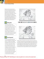
2 The next step is to source props and gather up all of the items you’ll need. The
finished image in this chapter contains a mixture of real-world paintings as well
as photographed items. To create the painted components, I needed to set up a
paint station. I also needed to set up a camera, lights, and backgrounds to capture
elements photographically. Again, if you’re following along using the supplied
files then you needn’t worry about this part. This is only a consideration if you’re
creating and using your own resources.
1 When creating a collage like this, the first step is to get
your idea down on paper
. It doesn’t hav
e to be exact in terms
of proportion, just something to use as reference. Adding brief
notes will assist you in planning as well as aid you in gathering
up the different props and materials that you’ll need. You don’t
have to be an accomplished illustrator by any means. The goal
of sketching is to get you to devise a plan that consists of a
basic image composition while considering the resources at
your disposal. If you are going to follow this chapter exactly,
using the supplied images, there is no need for a sketch as the
concept is already provided for you.
Project files
All of the files needed to follow
along with this chapter and create
the featured image are available for
download on the accompanying Web
site in the project files section. Visit
www.creativephotoshopthebook.com .
Skipping ahead
The first two parts of this chapter
describe the process of preparing and
creating art before entering Photoshop.
If you aren’t interested in this aspect
and just want to get busy creating the
featured image, go ahead and skip
forward to Part Three of this chapter.
However, those of you interested in
using these methods to generate
original works of your own will likely
find the entire chapter of interest.
Please purchase PDF Split-Merge on www.verypdf.com to remove this watermark.
248
Part Three: Real World Photoshop
14
PART TWO: Prepare and create the traditional components
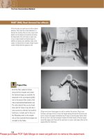
3 On an illustration board, I carefully drew the
image border in pencil so that the painting
would be proportionately accurate later, when
it comes back into Photoshop. Flat black paint
was used to paint the dark areas indicated by
the original sketch. The paint was then allowed
to dry thoroughly. Flat black was used because
solid black is easy to work with. If a gloss or
semigloss paint was used, the lights could
cause irritating specular highlights on raised
areas of the paint, regardless of the angle of
the lights, when photographing the result.
4 After creating the black areas I mixed up a variety of colors. Then a second
illustr
ation board was used to paint bold, paint laden brush str
okes upon. The paint
was kept thick, so there would be noticeable raised and recessed areas within each
stroke. I am yet to see a digital tool that replicates this raised paint effect randomly
and convincingly enough for it to look as realistic as possible.
Photographing paintings
When you’re ready to shoot a finished
painting, proper lighting is something
you need to bear in mind. Position two
identical light sources in front of the
painting on either side of the camera.
Position the light sources apart evenly
and try to aim them so that the light hits
the painting at a 45° angle. Move the
light sources back far enough so that
there are no sharp specular highlights
appearing on the paint.
Please purchase PDF Split-Merge on www.verypdf.com to remove this watermark.
249
14
Chapter 14: Real World Collage
5 After the finished painting was photographed, I peeled the top layer of the
illustration board off the backing. T
his effectively removes the painting from the
board as a thin layer. The next step is to tear up and cut the painting into smaller
pieces. Then the little pieces are glued onto the unpainted areas of the first
painting.
6 After gluing down enough pieces to cover the white areas and create an overlap
effect, I went back to my paint station and mixed up some more colors. Using colors
that were similar to those used in the existing pieces, I painted over the glued on
pieces in certain areas. This is a good way to sort of tie things together. Think of it
as a blending technique, much like you would blend layers together in Photoshop
with masking techniques. When the paint dried, I photographed the results.
Board versus canvas
You’ll notice that the actual paintings
created for this tutorial were done on
illustration board instead of canvas.
This is because one of the paintings
needed to be torn and cut apart.
Illustration board allows you to peel
off the surface as a thin layer, whereas
canvas does not. However, canvas is
a fine material for surfaces that are
destined to remain intact.
Please purchase PDF Split-Merge on www.verypdf.com to remove this watermark.
250
Part Three: Real World Photoshop
14
7 Bear in mind that painting doesn’t have to
be restricted to flat surfaces. As you can see
here, the masks were painted so that they’ll
blend into the composition better. Once the
paint dried, the lower mask was photographed
on a white background and the other mask was
photographed on a black background.
Photography preparation
Combining things in the tactile realm can add a unique look as well as improve efficiency.
1 Here, a face photo was printed out
twice, the first printout had holes
poked in the eyes and was torn,
revealing another printout below. Both
the printouts were slightly crumpled to
emphasize the tactile feel.
3 Combining items can also save you
time. Since both of these elements
were to be photographed against
black, there was no reason why they
couldn’t be ganged up in the same
shot, then quickly isolated later.
2 Here, an empty frame was placed
on a printout, then a torn printout was
added on top of the frame, and finally
the composition was photographed as
is, shadows and all. Combining items
before you enter Photoshop provides a
natural feel.
Please purchase PDF Split-Merge on www.verypdf.com to remove this watermark.
251
14
Chapter 14: Real World Collage
PART THREE: Building the background
8 Start by opening up the background.jpg
file. In the adjustments panel, click on the
Hue/Saturation button to create a new hue/
saturation adjustment layer. Adjust the hue
to 1 30 and then increase the saturation by
16. When you’re finished, click on the Return
to Adjustment List arrow in the bottom left
corner of the adjustments panel. When the
adjustment list reappears, create a new
levels adjustment layer by clicking on the
Levels button in the adjustments panel. Drag
the left and right input levels sliders toward
the center of the histogram to increase the
contrast.
9 Select the Magic Wand tool. Ensure that
the Contiguous option is disabled and that
the Select All Layers option is enabled
in the Tool Options bar. You can leave the
tolerance set at the default value of 32.
Click within the black area to select all
of the black areas. Then type Control(PC)/
Command(Mac)-Shift-I to invert the
selection. The selection doesn’t have to be
precise or anywhere near perfect; we want
this image to have a rough and rugged feel.
Open up the sky.jpg file.
Adjustment layers
in CS3
The adjustments panel is new to
CS4. Those of you who are still
using CS3 will notice its absence
very quickly when you begin to work
through the steps on this page. So,
if you are still using CS3, you’ll
need to create your adjustments
layers via the Layer menu or the
pop-up menu at the bottom of the
Layers palette. You’ll need to edit
your adjustments in the pop-up
dialog boxes that appear, and you’ll
need to press OK to apply your edits.
To perform further edits to your
adjustment layers after the fact,
you’ll need to double-click their
thumbnails in the Layers palette.
Please purchase PDF Split-Merge on www.verypdf.com to remove this watermark.
252
Part Three: Real World Photoshop
14
10 Select the contents of the sky file by typing Control(PC)/Command(Mac)-A and
copy by typing Control(PC)/Command(Mac)-C. Return to your working file and, with
the selection still active, paste into the active selection by typing Control(PC)/
Command(Mac)-Shift-V. This pastes your copied art into the working file as a
masked layer. Use the Move tool to move the layer contents to the upper right within
the mask. Ensure that the layer is targeted in the Layers palette and not the mask or
you will accidentally move the mask instead.
11 Change the blending mode of the layer to luminosity and reduce the opacity to
71% in the Layers palette. Duplicate the layer by dragging it onto the Create a New
Layer button at the bottom of the Layers palette. Return the opacity of the duplicate
layer to 100% and then change its blending mode to hard light. Now hold down the
Shift key and click on the original layer in the Layers palette. This will select both
layers. Add both of these layers to a group by typing Control(PC)/Command(Mac)-G.
Click the Add Layer Mask button at the bottom of the Layers palette to add a mask
to the group. Select the Gradient tool.
Please purchase PDF Split-Merge on www.verypdf.com to remove this watermark.
253
14
Chapter 14: Real World Collage
12 In the Tool Options bar, select the radial gradient method and the Foreground to
Transparent preset. Set the foreground color to black. A quick way to do this when
a mask is targeted is to first hit the “ d ” key to set the foreground and background
colors to white and black, respectively. Then, press the “ x ” key to invert them,
setting the foreground color to black. Now, with the group’s mask targeted, create
a series of small, black to transparent gradients with the mask to reveal subtle
blends of imagery on the underlying layers.
13 Open up the tree.jpg file. Select the entire image and copy it. Then return to
your working file. As you’ve done previously, use the Magic Wand to select the black
areas of the image and then invert the selection. Paste the copied tree image into
the selection as a new layer and move it to the left within the mask. This is exactly
the same procedure, using the same keyboard shortcuts, that you used to paste the
sky into a masked layer moments ago. Duplicate the layer and change the blending
mode to overlay.
Foreground to transparent
You’ll notice throughout this tutorial
that in every instance where a gradient
is used to edit a layer mask, the same
Gradient preset is used. Foreground to
transparent is the Gradient preset of
choice because it doesn’t fill the entire
area surrounding your gradient with
color, allowing you to create multiple
gradients within your mask. Be very
careful to ensure that you are not
using the Foreground to Background
preset. Many people make this mistake
because it is the default preset. Using
Foreground to Background will always
fill the entire area; so if there is an
existing gradient within a mask, it will
be replaced each time you create a
new gradient.
Please purchase PDF Split-Merge on www.verypdf.com to remove this watermark.
254
Part Three: Real World Photoshop
14
14 Shift-click on the original tree layer, below the currently targeted duplicate layer in the Layers palette, so that both the tree layers
are selected and then group them. Add a mask to the new group. Target the mask and again use the same radial gradient methods that
you used previously with the sky group to mask areas of the tree group, blending it into the background. Ensure that you are using the
Foreground to Transparent preset and a black foreground color as you create gradients within the mask.
PART FOUR: Create the body of the figure
15 Open up the suit.psd file. Select the contents of the image layer in that file by typing Control(PC)/Command(Mac)-A. Then paste it
into your working file as a new layer by typing Control(PC)/Command(Mac)-V. Use the Move tool to position it over the black area that
defines the figure’s body at the left. Reduce the opacity of the layer to 33%. Duplicate the layer and change the layer blending of the
new duplicate layer mode to overlay.
Please purchase PDF Split-Merge on www.verypdf.com to remove this watermark.
255
14
Chapter 14: Real World Collage
16 Open up the arm1.jpg file. Use the Polygonal Lasso tool to draw a rough
selection border that contains the arm and a bit of the shoulder of the wooden
figure; it is f
ine to have some black within the rough selection. Copy the selected
contents. Paste the copied arm into the working file as a new layer. Use Edit Ͼ Free-
Transform to resize it. Simply drag a corner handle of the bounding box while
holding down the Shift key to scale it proportionately. Then press Enter to apply the
transformation. Change the blending mode to lighten, then place it over the black
area where it belongs. Add a mask to the layer and create black to transparent,
radial gradients within the mask to blend it into the background.
17 Duplicate the arm layer and change the blending mode to overlay. Then
duplicate the newly duplicated layer as well. The result of building up layers like
this is a colorful and intense image component. Now open up the arm2.jpg file.
Again, use the Polygonal Lasso tool to draw a very rough, polygonal selection
around the arm and copy it. Again, black within the selection area is fine.
Please purchase PDF Split-Merge on www.verypdf.com to remove this watermark.
256
Part Three: Real World Photoshop
14
18 Paste the copied arm into your working file as a new layer. Resize with Free-
Transform and reposition the arm to the other side of the suit. Add a mask to the
layer and then, while the layer mask is targeted, draw a rough polygonal selection
around the forearm and hand. Fill the current selection within the layer mask with
black to hide it. Deactivate the selection by typing Control(PC)/Command(Mac)-D.
Create radial, black to transparent gradients within the mask to gently mask the
shoulder. Duplicate the layer and change the blending mode to overlay.
Adding hands
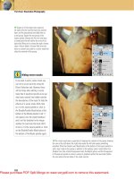
Use what are now becoming familiar methods to add some disproportionate hands to the ends of your mannequin arms.
1 Open up the hand1.jpg file. Select
all and copy. Then paste the copied
image into your working file as a new
layer. Use Free-Transform to rotate,
size, and position it. Change the layer
blending mode to lighten and add a
layer mask.
2 Create gradients within the mask
to hide the v
isible sharp edges that
remain. Duplicate the layer and
change the blending mode of the
duplicate layer to soft light. Now open
up the hand2.jpg file. Again, copy the
image and paste it into the working
file as a new layer.
3 Use the Move tool to position it at
the end of his other arm.
Change the
blending mode to lighten. Duplicate
the layer and change the blending
mode to overlay. There is no need to
mask these layers, the subtle hard
edges add to the choppy feel of the
composition.
Please purchase PDF Split-Merge on www.verypdf.com to remove this watermark.
257
14
Chapter 14: Real World Collage
PART FIVE: Create the main facial components
19 Open up the mask1.jpg file. Select all and then copy. Return to your working file
and paste the copied mask into it as a new layer. Use the Move tool to position it
over the black area that defines the region for the figure’s head. Change the layer
blending mode to lighten so that any dark areas that overlap the painted sky will
disappear. Use the Pen tool to carefully draw a closed path around the mask.
20 When you have finished drawing the path, load the path as a selection by Control(PC)/Command(Mac)-clicking on the path thumbnail
in the Paths palette. With the new selection active, choose Layer Ͼ New Ͼ Layer Via Copy from the menu to create a new layer containing
only the selection contents. Add a mask to the layer and create gradients within the mask to softly mask areas, like the bridge of the
nose. While editing the mask, remember to use the radial gradient method, a black foreground color, and the Foreground to Transparent
Gradient preset. Basically, you’re just repeating the methods you used previously to edit other masks. Reduce the layer opacity to 41% and
then duplicate it. Change the blending mode of the duplicate layer to soft light and increase this layer’s opacity to 100%.
Please purchase PDF Split-Merge on www.verypdf.com to remove this watermark.
