Photoshop cs5 by steve Johnson part 28 doc
Bạn đang xem bản rút gọn của tài liệu. Xem và tải ngay bản đầy đủ của tài liệu tại đây (352.18 KB, 6 trang )
ptg
Understanding Colors and
Channels
Introduction
In the world of design, color is one of the most important ele-
ments. When you're creating a brochure, advertisement, or
banner using Adobe Photoshop, good use of color attracts
the attention of the viewer. It also helps draw the elements of
your design into one cohesive unit. Color is a strong motiva-
tor and is used in all aspects of our daily life.
Since color is so important to design, Photoshop lets you
use industry-standard color sets, or you can create and save
your own customized color panels. You can also color-correct
a photograph by removing the color entirely or selectively
remove colors from portions of the image. In addition,
Photoshop gives you ways to select areas based on color,
and then fill those areas with any color you choose.
Not only is it important to understand how color is used,
it's also important to understand how Photoshop manages
color information and that's where the Channels panel comes
into the picture.
Channels
are where color information is
stored. The number of channels in an image is based on its
color mode
, or color model, such as RGB (Red, Green, and
Blue) or CMYK (Cyan, Magenta, Yellow, and Black). A firm
understanding of channels and color modes, and their func-
tion in Photoshop, will go a long way in helping you control
and manage color.
When adjusting your image, you can use various com-
mands—Auto Contrast and Color, Curves, Color Balance,
Brightness/Contrast, and Desaturate, just to name a few. You
can also use the Match Color and Selective Color adjust-
ments to further fine-tune your image. Photoshop also pro-
vides a Photo Filter adjustment, as well as a Shadows and
Highlights adjustment to correct those overexposed or under-
exposed images. With all of the commands and adjustments
available, the real dilemma will be, where do you begin?
8
8
What You’ll Do
Work with 8-, 16-, and 32-Bit Images
Work with the Channels Panel
Work with Color Modes
Understand the Various Color Modes
Use the Replace Color Adjustment
Work with the Color Panel
Work with the Swatches Panel
Use the Stroke and Fill Commands
Create Spot Color Channels
Use Auto Contrast and Auto Color
Use Levels Adjustment Commands
Use the Exposure Adjustment
Use Curves and Color Adjustments
Use Hue and Saturation
Use Match and Selective Color
Use Channel Mixer and Gradient Map
Use Photo Filter and Shadows/Highlights
Use the Invert and Equalize Commands
Use the Threshold and Posterize
Adjustments
Use the HDR Toning Adjustment
Use the Black & White Adjustment
175
From the Library of Wow! eBook
From the Library of Michele Renth
ptg
176 Chapter 8
It's all about the numbers, and that's a fact.
The number of colors available for displaying
or printing each pixel in an image is called
bit
depth
—also known as pixel depth or color
depth. A higher bit depth means more avail-
able colors and more accurate color represen-
tation in an image. A bit depth setting of 2
bits displays 4 colors, 4 bits displays 16 col-
ors, 8 bits displays 256 colors, 16 bits displays
32,768 colors, and 24 bits and 32 bits both
display 16.7 million colors. Most digital
images currently use 8 bits of data per chan-
nel. For example, an RGB image with 8 bits
per channel is capable of producing 16.7 mil-
lion (a 24-bit RGB image: 8 bits x 3 channels)
possible colors per pixel. While that may
seem like a lot of color information, when it
comes to color correction and adjustment, it
isn't.
In response to Photoshop users needing
more control, Photoshop supports 16-bit and
now 32-bit—known as
High Dynamic Range
(HDR)
—images. High Dynamic Range images
with 32 bits per channel have a more
extended dynamic range than lower bit depth
images.
Dynamic Range
describes the ability
of a channel to capture maximum information
from the black to white and dark and bright
areas of an image. An 8-bit channel image has
a dynamic range of 250:1 (per channel), simi-
lar to the dynamic range of printed paper or a
computer display. A 16-bit channel image has
a dynamic range of 65,000:1, and a 32-bit
channel image has a dynamic range of over
200,000:1. The greater dynamic range trans-
lates into better control over an image when
making fine color and contrast adjustments
using Levels and Curves (shown below).
Working with HDR images is very similar to
using raw files and applying exposure
changes after the fact. Photographers can
capture the full dynamic range of a scene
with multiple exposures and merge the files
into a single image.
Working with 8-, 16-, and 32-Bit Images
When you correct a 8-bit image, it can lose tonal values.
16- and 32-bit images hold more image data and therefore
provide more to work with during correction operations.
From the Library of Wow! eBook
ptg
Chapter 8 Understanding Colors and Channels 177
Changing Bits Per Channel
The ability to work with 32-bit images is rela-
tively new in Photoshop, and initially you had
a limited use of adjustments and filters.
However, in Photoshop many more adjust-
ments and filters have become available for
32-bit images, such as Hue/Saturation, Levels,
Gaussian Blur, Add Noise, Smart Sharpen,
Vibrance, and more.
When adjusting the color or contrast of an
image, first convert a standard 8-bit image to
16 bits, and then make your corrections. This
helps prevent loss of color information, and
banding between light and dark shades. Once
all the color/contrast adjustments have been
made, you can (if necessary) convert the
image back to 8 bits. It's that simple. You can
change an image's bit depth by displaying the
image, clicking the Image menu, pointing to
Mode, and then clicking 8 Bits/Channel, 16
Bits/Channel, or 32 Bits/Channel.
When you convert a 32-bit image to 8 or
16 bits per channel, if you choose to merge
your layers before changing the bit depth,
Photoshop opens the HDR Conversion dialog
box to let you make exposure and contrast
corrections so the image retains the dynamic
range you want. The Exposure and Gamma
option lets you manually adjust brightness
and contrast. Drag the Exposure slider to
adjust the gain and drag the Gamma slider to
adjust the contrast. The Highlight
Compression option automatically adjusts
highlight values to fit within the range for
8- or 16-bit images. The Equalize Histogram
option automatically preserves image con-
trast. The Local Adaptation option adjusts the
tonality (local brightness regions) in the
image. Drag the Radius slider to specify the
size of the local brightness regions and then
drag the Threshold slider to specify the dis-
tance between tonal values before they are
included in the brightness region. If you want
to reuse these settings in the future, you can
save them, and then load them again as
needed.
Viewing 32-Bit Images
The dynamic range of HDR images exceeds
the display capabilities of standard monitors.
When you view a 32-bit HDR image, the high-
lights and shadows may look dark or washed
out. To correct the problem, Photoshop allows
you to adjust 32-bit preview options so 32-bit
images display properly on your monitor. The
preview options are stored in the image file,
so each file retains its own settings. To set pre-
view options, open a 32-bit HDR image, click
the View menu, and then click 32-Bit Preview
Options. In the 32-bit Preview Options dialog
box, select the preview settings you want
(described earlier in this topic), and then click
OK.
From the Library of Wow! eBook
ptg
178 Chapter 8
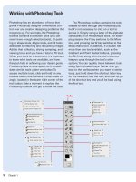
The Channels panel is Photoshop's storage locker for color and selec-
tion information. For example, when you open an RGB image, the
Channels panel displays color channels of red, green, and blue. When
you open a CMYK image, the color channels are cyan, magenta, yellow,
and black. These primary color channels are defined as the native
color channels of the image. The Channels panel can also contain spot
color channels and selection masks. In addition to color information
and selection masks, the Channels panel contains a composite chan-
nel. The composite, when selected, lets you view the full-color image in
the document window. Selecting any of the individual native color
channels changes the active view of the image to display the selected
color channel. The Channels panel stores color information using
shades of gray, and each color channel is capable of displaying 256
gradations from black to white. A zero-value pixel displays as black,
and a 255-value pixel displays as white. The darker the shade of gray,
the less of the selected ink color is used to create the visible colors
within the image.
Working with the
Channels Panel
Work with the Channels Panel
Open a color document.
Select the Channels panel.
Click on the individual channels to
view the native color channels of
the active document.
Click the composite channel to
view the full-color image.
4
3
2
1
3
4
2
See Also
See “Creating Spot Color Channels” on
page 196 for more information on using
the Channels panel.
See “Using Channels to Create and
Store Selections” on page 92 for more
information on using channels.
From the Library of Wow! eBook
ptg
Chapter 8 Understanding Colors and Channels 179
Color modes define the colors represented in
the active document. Although you can
change the color mode of a document, it is
best to select the correct color mode at the
start of the project. Photoshop's color modes
are Bitmap, Grayscale, Duotone, Indexed
Color, RGB (Red, Green, and Blue), CMYK
(Cyan, Magenta, Yellow, and Black), Lab, and
Multichannel. See "Selecting Color Modes and
Resolution" on page 13 for information on the
best use for each color mode. The number of
channels in an image depends on its color
mode. For example, a CMYK image contains
at least four channels, one for each color.
Color modes determine the number of col-
ors, the number of channels, and the file size
of an image. For example, an RGB image has
at least three channels (like a printing plate),
one for red, green, and blue color information.
Color modes not only define the working
color space of the active document, they also
represent the color space of the output docu-
ment. It's the document output (print, press,
or monitor) that ultimately determines the
document color mode. Color modes do not
just determine what colors the eye sees; they
represent how the colors are mixed, and
that's very important because different output
devices use different color mixes.
Therefore, when selecting a color mode,
know the file format of the document and
where it will be used. An image taken with a
digital camera and then opened in Photoshop
would most likely be in the RGB color mode.
An image displayed on a monitor would be
RGB, or possibly Indexed Color. A photograph
scanned on a high-end drum scanner would
most likely be in the CMYK color mode. An
image being sent to a 4-color press would be
CMYK, too. If you were creating a Photoshop
document from scratch, the color mode
you choose should represent the eventual
output destination of the document, such
as on a web page, to an inkjet printer, or a
4-color press.
Switching Between Color Modes
Unfortunately, images do not always arrive
in the correct format. For example, you
take several photographs with your digital
(RGB) camera, but the images are being
printed on a 4-color (CMYK) press, or you
want to colorize a grayscale image.
Changing color modes is a snap, but
changing the color mode of an image isn't
the problem. The problem is what happens
to the digital color information when you
change color modes. For example, if you
open an RGB image with the intent of
sending it out to a 4-color press (CMYK),
the smartest course of action is to remain
in the RGB color mode through the pro-
cessing of the image, and then convert the
image into the CMYK mode at the end. The
reason has to do with how Photoshop
moves between those two color spaces.
For example, if you move a color-corrected
CMYK image into the RGB color mode,
and then back to CMYK, the colors shift
because Photoshop rounds color values
during the change process. On top of that,
a CMYK image is 25% larger than an RGB
image, and the RGB color mode repre-
sents the color space of your monitor, not
a printing press. It is impossible to view
subtractive CMYK color on an RGB device.
If, however, the image originally came to
you as a color-corrected CMYK image,
then stay in and work inside that color
mode.
Working with Color Modes
From the Library of Wow! eBook
ptg
180 Chapter 8
The RGB color mode is probably the most widely used of all the color
modes. RGB generates color using three 8-bit channels: 1 red, 1 green,
and 1 blue. Since each channel is capable of generating 256 steps of
color, mathematically, that translates into 16,777,216 possible colors per
image pixel. The RGB color mode (sometimes referred to as Additive
RGB) is the color space of computer monitors, televisions, and any
electronic display. This also includes PDAs (Personal Digital
Assistants), and cellular phones. RGB is considered a device-
dependent color mode. Device-dependent means that the colors in
images created in the RGB color mode will appear differently on vari-
ous devices. In the world of computer monitors and the Web, what you
see is very seldom what someone else sees; however, understanding
how Photoshop manages color information goes a long way to gaining
consistency over color.
Understanding the
RGB Color Mode
Convert an Image to RGB Color
Open an image.
Click the Image menu, point to
Mode, and then click RGB Color.
Photoshop converts the image
into the RGB color mode.
2
1
1
RGB color
mode
From the Library of Wow! eBook