Professional ASP.NET 1.0 Special Edition- P9 ppsx
Bạn đang xem bản rút gọn của tài liệu. Xem và tải ngay bản đầy đủ của tài liệu tại đây (1.39 MB, 40 trang )
HorizontalAlign, Rows
TableRow
Cells, HorizontalAlign, VerticalAlign - none -
TableCell
ColumnSpan, HorizontalAlign, RowSpan, Text, VerticalAlign, Wrap - none -
Literal Text
- none -
PlaceHolder
- none - - none -
It should be obvious from the names what most of the properties are for, however, we will examine each control in the
following sections, and indicate some of the things to look out for when we use them. The sample application, which we
have already seen in Chapter 5, contains pages for most of the ASP.NET Web Form controls, and we will be using these
pages to demonstrate the properties of each control:
You can get the sample files for this chapter, which contain this application, from
The application is in the folder named
server-controls. You can also run many of the examples online at http:/www.daveandal.com/profaspnet/.
Using the Web Form Controls
When we want to add an ASP.NET Web Form server control to our page, we define it just like an ordinary HTML element,
by adding the appropriate 'attributes' for the properties we want to set. For example, we can add an
ASP:TextBox
control to the page to output an HTML textbox element using:
<ASP:TextBox id="MyTextBox" BackColor="Red" Text="Enter a value "
runat="server" />
Notice that the Web Form controls all have the ASP namespace prefix (uppercase or lowercase, it doesn't matter which)
to denote that they are from the
System.Web.UI.WebControls namespace.
One thing that makes working with the HTML server controls we used in the previous chapter easy is that all the properties
are simple
String values. For example, we specify the string value right for the Align property of an HtmlImage
control to align the image to the right of any following page content. As you will see in this section, however, it is not
always as straightforward with the ASP.NET Web Form controls. Many of the properties for the ASP Web Form controls use
values from an enumeration, or a reference to an object.
Setting Property Values from Enumerations
For example, to align an image to the right of any following content when using an ASP.NET
Image server control, we set
the ImageAlign property to the integer value that is defined for the enumeration member ImageAlign.Right. In this
example the enumeration is named
ImageAlign, and the member is named Right.
Of course, this isn't a problem when we explicitly define the properties declaratively (in other words by setting the
'attributes' of a server control in the source of the page). The control knows from the property name which enumeration
to use:
<ASP:Image Src="mypic.gif" ImageAlign="Right" runat="server" />
This produces the following HTML output (notice that, in the Image control, border="0" is the default if not specified
otherwise):
<img src="mypic.gif" align="Right" border="0" />
However, if we need to assign a value to the property within the executable code of the page we have to use the following:
objMyImage.ImageAlign = ImageAlign.Right
Creating Enumeration Values Dynamically
Even this is no good if we want to assign property values dynamically at run-time, such as when they are selected from
a list (as in our demonstration pages). We have to use the numeric value of the appropriate enumeration member. In the
case of
ImageAlign.Right this value is 2.
If we use a
<select> list control for the values, we can set the Text of each <option> to the name in the enumeration,
and set the
Value to the integer that this equates to. The following code shows a <select> list containing the complete
ImageAlign enumeration:
<select id="selAlign" runat="server">
<option value="0">ImageAlign.NotSet</option>
<option value="1">ImageAlign.Left</option>
<option value="2">ImageAlign.Right</option>
<option value="3">ImageAlign.Baseline</option>
<option value="4">ImageAlign.Top</option>
<option value="5">ImageAlign.Middle</option>
<option value="6">ImageAlign.Bottom</option>
<option value="7">ImageAlign.AbsBottom</option>
<option value="8">ImageAlign.AbsMiddle</option>
<option value="9">ImageAlign.TextTop</option>
</select>
Then, to set the ImageAlign property, we can just assign the value from the list directly to it:
objMyImage.ImageAlign = selAlign.Value
Or we can be more specific and use the SelectedIndex property of the list:
objMyImage.ImageAlign = selAlign.Items(selAlign.SelectedIndex).Value
Finding Enumeration Values
Of course, the next obvious question is how do we go about finding out the values to use for an enumeration? In fact there
are a few options here. Most enumerations provide a type converter that we can use to get the value given the
enumeration member as a string. In Visual Basic, we can use:
TypeDescriptor.GetConverter(GetType(enumeration)).ConvertFromString("member")
To be able to create a TypeDescriptor object and use its methods in our code, we must import the
System.ComponentModel namespace that contains the definition of the TypeDescriptor class:
<%@Import Namespace="System.ComponentModel" %>
For example, to get the value of HorizontalAlign.Left we can use:
TypeDescriptor.GetConverter(GetType(HorizontalAlign)).ConvertFromString("Left")
Alternatively, for enumerations that don't provide a type converter, we can usually cast the enumeration member directly
to an
Integer variable:
Dim intValue = CType(HorizontalAlign.Left, Integer)
Another technique is to use the excellent WinCV utility that is included with the frameworks. Simply type in all or part of
the name of the enumeration, select it in the left-hand pane, and then the values are displayed in the right-hand pane.
You can even click the
Option button in the top right of the window to copy them to the clipboard ready to paste into your
code (but note that the values are hexadecimal).
WinCV is installed in the Program Files\Microsoft Visual Studio.NET\FrameworkSDK\Bin folder if you have Visual
Studio .NET, or the
ProgramFiles\Microsoft.NET\[version]\FrameworkSDK\Bin folder if you just installed the .NET
Framework.
Setting Properties that are Objects
The second area where working with the ASP Web Form controls can be a little tricky is when we want to set (or retrieve)
property values that are actually references to other objects. A typical example of something that should be simple, but
actually isn't when you first try it, is setting the value of a 'color' property. It's not that Microsoft's developers were trying
to make life awkward - it's done on purpose to provide extra features within the controls and the framework as a whole.
It also allows strong type checking to be achieved by the compiler and better support in a designer tool such as Visual
Studio, which would not be possible if they were string values.
As an example, the ASP Web Form controls have several properties (
BackColor, ForeColor, BorderColor) that
reference a
Color object rather than a simple string value. When we explicitly define the colors for the controls in our
sourcecode, we can use the color names directly:
<asp:textbox id="MyText" Text="This is a textbox" runat="server"
BackColor="Red" ForeColor="White" />
However, if we want to assign colors at run-time, we have to create a Color object first and then assign this object to the
appropriate property. For this, we use the shared properties and methods that the
Color class exposes.
The System.Drawing.Color Class
The
Color class defines shared properties for all of the standard HTML color names, such as AliceBlue,
AntiqueWhite, and so on. It also exposes three shared methods that create a Color object:
Method Description
FromArgb
Creates a
Color object from its 32-bit component values that define the alpha, red, green, and
blue elements.
FromKnownColor
Creates a
Color object from a specified HTML standard 'known color' name, for example AliceBlue
or
Gainsboro.
FromName
Creates a
Color object using the specified name, which can be a 'known color' name, a 32-bit value
or a hexadecimal HTML-style color value such as
#ff0000 (red).
Each Color object also has properties that return the individual components of the current color. For example, the
properties
A, B, G, and R return the alpha, blue, green, and red components respectively. To get the name of the color if
it is one of the 'known colors', we can query the
Name property of the Color object.
To be able to create a
Color object and use its shared properties and methods in our code, we must import the
System.Drawing namespace that contains the definition of the Color class:
<%@Import Namespace="System.Drawing" %>
In our demonstration pages, we include textboxes where you can enter the colors you want for various properties of the
control. For example, to set the
BackColor property of a control, we call the FromName method (passing it the value that
was entered), and then assign the object that this method creates to the
BackColor property of the control:
MyControl.BackColor = Color.FromName(txtBackColor.Value)
To retrieve the color from the BackColor property, we just have to extract the Name of the Color object that the
property references:
txtForeColor.Value = MyControl.ForeColor.Name
The System.Web.UI.WebControls.Unit Class
Several properties of the ASP Web Form controls are references to a
Unit object, for example the Width and Height of
an
Image control and the BorderWidth of a Table control. As with the Color properties, we don't have to concern
ourselves with this when we explicitly define the values in our sourcecode:
<asp:image id="MyImage" Src="mypic.gif" runat="server"
Height="100px" Width="50%" />
However, to assign values at run-time, we have to use the properties and methods exposed by the Unit object. The class
that defines the
Unit object is part of the same namespace as the ASP.NET Web Form controls, and so it is imported by
default into our ASP pages. It exposes two properties:
Property Description
Type
The type of unit that the value is measured in. One of the members of the
UnitType enumeration (Cm, Mm, Em,
Ex, Inch, Percentage, Pica, Pixel, or Point).
Value
The actual number of the units (as defined in the
Type property) that make up the value.
The Unit class also provides three shared methods that we can use to create a Unit object with a specific Type property
value:
Method Description
Percentage
Creates a
Unit object of type Percentage using the specified 32-bit signed integer.
Pixel
Creates a
Unit object of type Pixel using the specified 32-bit signed integer.
Point
Creates a
Unit object of type Point using the specified 32-bit signed integer.
So, if we have an Integer variable named intTheHeight that contains the value in pixels we want to set for the
Height property of a control named MyControl, we can use:
MyControl.Height = Unit.Pixel(intTheHeight)
If the value comes from a textbox with the id of txtHeight, we can use:
MyControl.Height = Unit.Pixel(txtHeight.Value)
If we want the value to be set as a percentage (say we wanted the control to be 50 percent of the width of the page or its
container), we would use:
MyControl.Height = Unit.Percentage(50)
To retrieve the value of the Height property from the control, we query the Unit object's Value property. The following
code returns
100 for the Image control we used earlier in this section:
txtHeight.Value = MyControl.Height.Value
If we want to know the type of unit, we can query the Type property of the Unit object, but this returns the integer
equivalent of the
UnitType enumeration. For a unit in pixels, for example, this property returns 1. However (in a similar
way to the example with the
HorizontalAlign enumeration), we can use a type converter to get the text name. This
time we use the ConvertToString method rather than the ConvertFromString method:
TypeDescriptor.GetConverter(GetType(UnitType)).ConvertToString _
(MyControl.Height.Type)
Finally, the easiest way to get the complete value in human-readable form (including the unit type) is to use the
ToString method. For the same control, the following code returns 100px:
txtHeight.Value = MyControl.Height.Value.ToString()
Using the AutoPostBack Feature
When we build an interactive form using previous versions of ASP, a common technique is to use some client-side script
with certain controls (such as a list box or checkbox) to automatically submit the
<form> they reside on to the server for
processing when the user selects a value. This allows the server to update the page in response to changes the user
makes in the form.
In ASP.NET, this is now part of the feature set you get for free with the framework. Certain Web Form server controls (the
TextBox, CheckBox, RadioButton), and all the list controls we will look at later in the chapter, provide a property
named
AutoPostBack. By default this property is False. If we set it to True for a control, that control will automatically
post its val ue, and the values of the rest of the contro ls on the same form, back to the server when the user selects a value.
This also raises an event on the server that we can handle and use to update the contents of the page. You can experiment
with
AutoPostBack in the samples we provide, and we will look at how we can handle the events on the server later in
this section of the chapter.
How Does AutoPostBack Work?
The mechanism to implement automatic postback is simple. It uses exactly the same techniques as we would use if we
were programming it ourselves in a
<form> page. When the AutoPostBack property is True, the server control adds
a client-side event to the control - for a buttontype control it is the
onclick event, and for textboxes and list controls it
is the
onchange event:
<input id="MyControl" type="checkbox" name="MyControl"
onclick="javascript:__doPostBack('MyControl','')" />
This causes a client-side function named __doPostBack to run when the control is clicked, when the selection is changed
in a list, or when the user edits the content of a textbox and moves to another control. The
ID of the control is passed to
this function as well.
At the same time, the
<form> on which the control resides has two extra hidden-type <input> controls added to it.
These are used to pass back to the server the
ID of the control that was clicked or changed, and any value for the second
parameter that the
__doPostBack function receives:
<input type="hidden" name="__EVENTTARGET" value="" />
<input type="hidden" name="__EVENTARGUMENT" value="" />
And, of course, the client-side __doPostBack function is added to the page as well. It just collects the control name and
any arguments, puts them into the hidden controls, and submits the form to the server:
<script language="javascript">
<!
function __doPostBack(eventTarget, eventArgument) {
var theform = document.ctrl0;
theform.__EVENTTARGET.value = eventTarget;
theform.__EVENTARGUMENT.value = eventArgument;
theform.submit();
}
// >
</script>
Examples of the ASP Web Form Controls
In this section, we will briefly look at each of the basic ASP.NET Web Form controls to give you a flavor for what they do
and how they can be used. We will bring out any particularly important points about each control as we go.
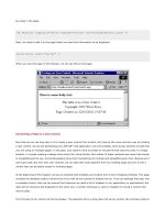
The ASP:CheckBox and ASP:RadioButton Controls
We start with the controls that create individual checkboxes and radio buttons (later we'll see two controls that can create
lists of checkboxes or radio buttons automatically). One extremely useful feature of the
CheckBox and RadioButton
controls is that they automatically create a label for the control using the value of the
Text property, and you can place
this label to the left or right of the control using the
TextAlign property:
The sourcecode we used to create the server control in this page is:
<ASP:CheckBox id="MyControl" Text="My CheckBox" runat="server" />
You can also use this page to experiment with the effects of the AutoPostBack property we discussed earlier. Also notice
the
AccessKey and ToolTip that make it seem like a real Visual Basic style control. These are, of course, client-side
features (
ToolTip sets the title attribute of the element), but they are part of the HTML 4.0 standards.
Adding Styles to Web Form Controls
The formatting features that apply to all the ASP Web Form controls are demonstrated in the next screenshot of the
CheckBox control. You can see how they add a set of CSS-style properties (or selectors) to the element:
Setting the Group Name for a RadioButton Control
The
RadioButton control is almost identical to the CheckBox control, except (of course) that it creates an <input
type="radio">; element instead of an <inputtype="checkbox">; element. However, there is one more
fundamental difference. The
RadioButton control exposes an extra property called GroupName, which sets the name
attribute of the control. You can see this in the next screenshot:
The sourcecode we used to create the server control in this page is:
<ASP:RadioButton id="MyControl" Text="My RadioButton" runat="server" />
This feature is required for two reasons. One is the obvious reason that you must use the same name attribute for all radio
but tons tha t you want to be par t of the same mutu a lly exclu s ive grou p . The seco nd reaso n i s that a l l the con trols on a p ag e
must have a unique
ID property, and this is automatically used as the name attribute as well (as you can see if you refer
back to the screenshot of the
CheckBox control). Unlike the HTML radio button control, there is no Name property for the
ASP.NET Web Form RadioButton control, so the GroupName is the only way to set the name attribute.
The ASP:HyperLink Control
This control provides an easy way to create hyperlink
<a>; elements. As well as the usual formatting, AccessKey, and
ToolTip properties, it provides specific properties for the NavigateUrl (which sets the href attribute) and the
Target property (which sets the target attribute). One other great feature is that we can set the text that appears as
the hyperlink (the content of the resulting
<a>; element) using the Text property:
The sourcecode we used to create the server control in this page is:
<ASP:Hyperlink id="MyControl" Text="My Hyperlink"
NavigateUrl="asp_hyperlink.aspx" runat="server" />
Notice that there is again, no Name property. This seems to indicate that we can't use the control to create an anchor in
a page that another hyperlink can target. An HTML anchor element requires the
name attribute to be set:
<a name="para1">Paragraph One</a>
Then, we target this location in the page using an HTML element such as:
<a href="thepage.aspx#para1">Go To Paragraph One</a>
However, we can add a name attribute to a Hyperlink control either declaratively or programmatically. We do it
declaratively by specifying it within the element in the source of the page:
<ASP:Hyperlink Name="para1" id="MyAnchor" Text="text-for-link"
NavigateUrl="url-to-go-to" runat="server" />
Using the Attributes Property with Server Controls
One other solution at run-time is to use the
Attributes property to add the attribute programmatically. This property
gives us access to a collection of all the HTML attributes on a server control. So, we can access the
name attribute using:
strNameAttr = MyAnchor.Attributes("name")
And we can set or change the name attribute using:
MyAnchor.Attributes("name") = strNewName
So, we can still achieve what we want without a Name property. This useful technique can be applied to any of the server
controls, including the HTML server controls we looked at in the previous chapter. It may be useful in other cases where
you want to add non-standard attributes to an element for your own purposes.
Using an Image as a Hyperlink
We often use images as hyperlinks in our pages, and the
Hyperlink control makes this much easier than coding by hand.
If we specify the path to an image file as the
ImageUrl property, that image is used in place of the Text property as the
content of the
<a>; element. We have provided a few images for you to try out:
The ASP:LinkButton Control
The
LinkButton control demonstrates an interesting extension to the use of an HTML <a>; element. By default it uses
the
AutoPostBack feature we described earlier, specifying the client-side JavaScript function named __doPostBack as
the
href attribute of an <a>; element. This means that whenever the link is clicked, the form will be posted back to the
server where a
Click event will be raised:
The sourcecode we used to create the server control in this page is:
<ASP:LinkButton id="MyControl" Text="My LinkButton" runat="server" />
We specify the clickable text using the Text property in the same way as with a Hyperlink control, but in this control
there is no option to use an image instead of text. For that, we have to use an
ImageButton control (described shortly)
instead.
The ASP:Image Control
When we want to display an image in our page, and be able to access the control in our serverside code, we can use the
ASP.NET
Image server control. There are properties available that specify all the usual attributes for an <img>; element,
including the size, an
AccessKey, the ToolTip, the alignment in relation to surrounding content, the border style, and
the border and background colors:
The sourcecode we used to create the server control in this page is:
<ASP:Image id="MyControl" ImageUrl="BookmarkButton.gif" runat="server" />
Again, we have provided a few images for you to experiment with. Notice also how we can specify the values for the
Color properties (BorderColor in the screenshot above) using a standard HTML-style hexadecimal color value.
The ASP:Panel Control
While it might sound like an exotic new feature to use in your pages, the
Panel control is actually just a way of creating
a formatted HTML
<div>; element. We can specify the size and style of the element, and add a background image
(though you should realize that, as with all the server controls, some browsers may not support all the style properties we
apply):
The sourcecode we used to create the server control in this page is:
<ASP:Panel id="MyControl" Text="My Panel" runat="server">
Some text inside the Panel control</ASP:Panel>
A useful feature is the ability to set the width of the control, and then turn text wrapping on and off using the Wrap
property. Remember that we can also add our own extra style properties to any server control using the
Style collection:
MyControl.Style("selector-name") = "value"
So we could specify that the <div> should be absolutely positioned on the page, add scroll bars to it, change the font, and
so on, just by adding the appropriate CSS selector values.
The ASP:Label Control
The
Panel control we have just seen creates an HTML <div> element, and this is not always ideal. For example, it
automatically wraps to the next line and causes other content to be wrapped below it. To place content inline with other
elements and text, we need an HTML
<span> element instead. This is just what the ASP.NET Label control provides.
This control has the usual set of properties that define the appearance:
ToolTip, AccessKey, and so on. It also has the
Text property that we use to specify the content of the <span>; element:
The sourcecode we used to create the server control in this page is:
<ASP:Label id="MyControl" Text="My Label" runat="server" />
The ASP:Button Control
The ASP.NET
Button control is used to create a standard HTML button that we can access in our server-side code. Again,
the properties are the usual set we have seen in all the other controls. Notice that the type of
<input>; element it creates
is a
submit button. Clicking the button will automatically submit the form on which it resides to our server, where we can
handle the
Click event it raises in our server-side code:
The sourcecode we used to create the server control in this page is:
<ASP:Button id="MyControl" Text="My Button" runat="server" />
The ASP:ImageButton Control
Instead of using a normal textcaptioned button to raise a
Click event on the server, we can use a clickable image instead.
The ImageButton control creates an <input type="image">; element that submits the form it resides on to the
server when clicked. Also, as you can see from the following screenshot, we can control the size and appearance of the
image to get the effect we want:
The sourcecode we used to create the server control in this page is:
<ASP:ImageButton id="MyControl" ImageUrl="BookmarkButton.gif"
runat="server" />
The ASP:TextBox Control
One of the most complex of the basic Web Form input controls is the
TextBox control. We can use this to create several
different types of HTML element, including a normal single-line textbox, a multi-line textbox (where it actually creates an
HTML
<textarea> element), and a password input box that displays asterisks instead of text.
In its simplest form, to create a normal
<input type="text">; element, we don't have to change any of the default
property values. However, in the following screenshot you can see that we have set the
MaxLength, ReadOnly, and
ToolTip properties. We also set the Columns property, which equates to the size attribute for an <input
type="text">; element:
The sourcecode we used to create the server control in this page is:
<ASP:TextBox id="MyControl" Text="My TextBox" runat="server" />
We've turned on AutoPostBack as well, and if you do the same and experiment, you will find that you can type in the
textbox as usual, but when you move the input focus to another control (by pressing the Tab key or by clicking on another
control with the mouse), the page is automatically submitted to the server where it will raise a
Change event that we
could create an event handler for. We'll see more about this later in this chapter.
Creating a Multi-line Textbox
The next screenshot shows how we can create an HTML
<textarea>; element that acts as a multi-line textbox using the
ASP.NET
TextBox control. We just have to change the value of the TextMode property to TextBoxMode.MultiLine
and specify the appropriate number of
Rows and Columns:
Creating a Password Input Element
The third option for the
TextMode property is TextBoxMode.Password. When this is selected, as you can see in the
next screenshot, the control creates an HTML
<input type="password">; element instead:
Note that textboxes always persist their state (text) when placed on an HTML form, even if you turn off viewstate by
setting
EnableViewState=False. This is because they always post their value back to the server from a form and
cause an update event.
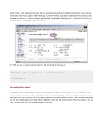
The ASP:Table Control
A useful ASP.NET Web Form control is the
Table control. This is, in fact, very similar to the HtmlTable server control we
experimented with in the previous chapter. However, it also provides the standard Web Form range of control properties
for the appearance of the table. The next screenshot shows a formatted table and the output that the control creates to
implement the table in the browser. At the bottom of the page, you can see the values we set for the properties. The
drop-down lists for the number of rows and columns are there so that we can specify what size the table we generate
should be:
Creating the Table
The way that we dynamically create the table is very similar to the way we did it with the
HtmlTable server control in the
previous chapter. Of course, the object class names are different (
TableRow and TableCell instead of HtmlTableRow
and
HtmlTableCell). We have highlighted the differences between the example in the previous chapter and this one:
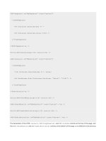
Dim intRows As Integer = selRows.Value
Dim intCols As Integer = selCols.Value
Dim intRowCount, intColCount As Integer
Dim objRow As TableRow
Dim objCell As TableCell
For intRowCount = 0 To intRows - 1
objRow = New TableRow()
For intColCount = 0 To intCols - 1
objCell = New TableCell()
objCell.Controls.Add(New LiteralControl ("R" & intRowCount _
& "C" & intColCount))
objRow.Cells.Add(objCell)
Next
MyControl.Rows.Add(objRow)
Next
We also have to use a different technique to insert the values into the cells of the table. In our HtmlTable example, we
simply set the
InnerHtml property of the cells, but we can't do that here because the TableCell object doesn't have
an
InnerHtml property. Instead, we use LiteralControl objects to generate the cell content.
Using a LiteralControl Object to Generate Content
The
LiteralControl object provides no inherent formatting or content of its own - in other words, it doesn't create any
HTML elements. It simply inserts an instruction into the code when the page is compiled (actually a
Write statement)
that outputs the value of the control.
So, to output the content for each cell, we just instantiate a new
LiteralControl object and pass as the single
String-type parameter the text, HTML or other content that we want to be generated. We can, of course, use a
LiteralControl anywhere where we want to generate some content without placing it inside another HTML element.
The ASP:Literal and ASP:PlaceHolder Controls
Two controls that we do not include in the demonstration application, but which you may find uses for in your own pages,
are the
ASP:Literal and the ASP:PlaceHolder controls. We will describe these two controls here for completeness.


