Professional ASP.NET 1.0 Special Edition- P11 pdf
Bạn đang xem bản rút gọn của tài liệu. Xem và tải ngay bản đầy đủ của tài liệu tại đây (853.26 KB, 40 trang )
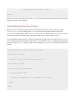
<ASP:Repeater id="MyRepeater" runat="server">
<ItemTemplate>
<%# Container.DataItem.Key %> =
<%# Container.DataItem.Value %>
</ItemTemplate>
</ASP:Repeater>
<b><ASP:DataList></b> control:
<ASP:DataList id="MyDataList" runat="server">
<ItemTemplate>
'<%# Container.DataItem.Key %>'- value:
<%# DataBinder.Eval(Container.DataItem, "Value", "{0:E}") %>
</ItemTemplate>
</ASP:DataList>
<b><ASP:CheckBoxList></b> control:
<ASP:CheckBoxList id="MyCheckList" runat="server" />
<b><ASP:RadioButtonList></b> control:
<ASP:RadioButtonList id="MyRadioList" runat="server" />
The declaration of the HTML <select>, ASP:DropDownList, and ASP:ListBox controls at the top of the page, and
the ASP:CheckBoxList and ASP:RadioButtonList controls at the bottom of the page, is no different to the previous
example - we just define the control itself. However, the definition of the other three list controls has to take into account
the new structure of the data source.
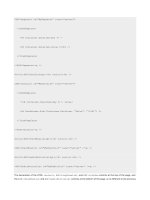
Binding a DataGrid Control To a HashTable
The DataGrid control cannot figure out by itself how to handle a HashTable, and needs us to provide some help. As
you'll see in more detail later in this chapter, we do this by setting the AutoGenerateColumns property of the control
to False, and then using a <Columns> element and ASP:BoundColumn controls to specify where the values should
come from.
The two columns are bound to the Key and Value fields in each item using the following syntax. We also specify a
DataFormatString for the Value column so that it is displayed in currency format:
<ASP:DataGrid id="MyDataGrid" runat="server" AutoGenerateColumns="false">
<Columns>
<ASP:BoundColumn HeaderText="Key" DataField="Key" />
DataFormatString="{0:C}" />
</Columns>
</ASP:DataGrid>
Binding a Repeater and a DataList Control To a HashTable
The Repeater and the DataList controls contain an <ItemTemplate> entry as in the previous example where we
used an ArrayList. However, now we can include two values in each template - the Key property and the Value
property. We refer to these as properties of the DataItem object.
We're adding some extra layout information in these two controls. In the Repeater control we're adding the equals sign
between the Key and the Value, and a line break after each Key/Value pair. In the DataList control, we wrap the
output for each Key in single quotes, adding the word "value:" and formatting the Value property in scientific notation
using the format string "{0:E}":
<b><ASP:Repeater></b> control:
<ASP:Repeater id="MyRepeater" runat="server">
<ItemTemplate>
<%# Container.DataItem.Key %> =
<%# Container.DataItem.Value %>
</ItemTemplate>
</ASP:Repeater>
<b><ASP:DataList></b> control:
<ASP:DataList id="MyDataList" runat="server">
<ItemTemplate>
'<%# Container.DataItem.Key %>'- value:
<%# DataBinder.Eval(Container.DataItem, "Value", "{0:E}") %>
</ItemTemplate>
</ASP:DataList>
The Page_Load Event Handler
When the page loads, we first create the HashTable and fill in some values:
Sub Page_Load()
'create a HashTable of values to bind to
Dim tabValues As New HashTable(5)
tabValues.Add("Microsoft", 49.56)
tabValues.Add("Sun", 28.33)
tabValues.Add("IBM", 55)
tabValues.Add("Compaq", 20.74)
tabValues.Add("Oracle", 41.1)
Then we can set the DataSource property of each of the controls on the page. In this case, we have to set at least the
DataSource and DataTextField properties of the HTML <select>, ASP:DropDownList, and ASP:ListBox
controls so that they know which field in the data source contains the values to display. In fact we've exploited this by
having the first control in each pair display the Key values from the HashTable, and the second display the actual values
of each item in the HashTable. We can also provide different values for the value attribute of the control if requiredwe've done this for the second one of each control listed next:
'first <select> displays the Keys in the HashTable
MySelectList1.DataSource = tabValues
MySelectList1.DataTextField = "Key"
'second one displays the Values in the HashTable
'and uses the Keys as the <option> values
MySelectList2.DataSource = tabValues
MySelectList2.DataValueField = "Key"
MySelectList2.DataTextField = "Value"
'same applies to ASP: controls, except here
'we can also specify the format of the Key
MyDropDown1.DataSource = tabValues
MyDropDown1.DataTextField = "Key"
MyDropDown2.DataSource = tabValues
MyDropDown2.DataValueField = "Key"
MyDropDown2.DataTextField = "Value"
MyDropDown2.DataTextFormatString = "{0:F}"
MyASPList1.DataSource = tabValues
MyASPList1.DataTextField = "Key"
MyASPList2.DataSource = tabValues
MyASPList2.DataValueField = "Key"
MyASPList2.DataTextField = "Value"
MyASPList2.DataTextFormatString = "{0:C}"
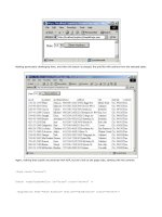
If you look back at the earlier screenshot, you can also see the results of setting the DataTextFormatString property
of the ASP:DropDownList and ASP:ListBox controls. For example, in the last four lines of the preceding code we
bound the second ASP:ListBox control to the HashTable so that the text of each <option> element is automatically
formatted as a currency value.
Binding the DataGrid, Repeater, and DataList controls is easy because we specified how the columns should be
mapped to the data source in the control definitions. We just need to set the DataSource property of each one:
MyDataGrid.DataSource = tabValues
MyRepeater.DataSource = tabValues
MyDataList.DataSource = tabValues
For the final two list controls, the CheckBoxList and RadioButtonList, we can specify both the DataValueField
and the DataTextField properties. This is like the simple list controls such as the <select> list, and allows us to use
different fields from the HashTable for the value attribute and the text for the control's caption:
'in the CheckboxList we'll display the Title and
'use the Value as the control value
MyCheckList.DataSource = tabValues
MyCheckList.DataValueField = "Value"
MyCheckList.DataTextField = "Key"
'in the RadioList we'll display and format the
'Value and use the Key as the control value
MyRadioList.DataSource = tabValues
MyRadioList.DataValueField = "Key"
MyRadioList.DataTextField = "Value"
MyRadioList.DataTextFormatString = "Percentage rate {0:F}%"
The final part of the code in the Page_Load event simply calls the DataBind method of the page to perform the data
binding:
Page.DataBind() 'bind all the controls on the page
End Sub
How the Controls Are Bound
If you view the output that this page creates in the browser, you'll see that (unlike in the previous ArrayList example
where the value and text were the same) the second of the two lists in each group has the Key from each item in the
HashTable as the value attribute of the <option> elements, and the Value from each item in the HashTable as the
text of each <option> element:
<select name="MySelectList2" id="MySelectList2">
<option value="Sun">28.33</option>
<option value="IBM">55</option>
<option value="Oracle">41.1</option>
<option value="Microsoft">49.56</option>
<option value="Compaq">20.74</option>
</select>
In the RadioButtonList, this technique also gives an output that specifies the Key from each item in the HashTable
as the value attribute. The Value of each item in the HashTable is formatted and used as the text caption of the
checkbox or radio button:
<span value="Microsoft">
<input id="MyRadioList_3" type="radio" name="MyRadioList" value="Microsoft" />
<label for="MyRadioList_3">Percentage rate 49.56%</label>
</span>
Repeated-Value Binding to a DataView Object
Our third example of data binding is to a DataView object. For this example we're using a custom user control that
returns a DataView object from a database. We've provided the scripts and instructions for creating this database with
the sample files, as well as a Microsoft Access database that you can use instead.
We're putting off discussion of data access techniques until later in the book- it's not a vital topic here as long as you
appreciate that basically each of the objects provides us with a set of data rows (a rowset) to which we can bind our
controls. In the next chapter we'll discuss in detail how we can use these objects to extract data from a relational database.
The example page, Repeated-Value Data Binding to a DataView Object (dataview-binding.aspx) contains the same
eight list controls as we've used in the previous two examples. However, now we are displaying information drawn from
our database of Wrox books:
How It Works
The HTML section of this page is basically the same as the first ArrayList example. The difference is the definition of the
Repeater and the DataList controls. In each case, we need to specify the way we want to generate the content of the
control from the values that are available in each "list item" (that is, each data row) within our source DataView.
The Repeater control generates no layout information by default, so we have to create a template using an
<ItemTemplate> element. We specify a <div> element to get each item on a separate line, because the Repeater
does not provide any intrinsic formatting. Inside the <div> element we place the text, HTML, and definitions of the fields
in the data source that we want to display. We're displaying the contents of three columns from the DataView - the
Title, ISBN, and PublicationDate. We also format the PublicationDate column using the DataBinder.Eval
method:
<ASP:Repeater id="MyRepeater" runat="server">
<ItemTemplate>
<div>
<b><%# Container.DataItem("Title") %></b>
ISBN: <%# Container.DataItem("ISBN") %>
Published: <%# DataBinder.Eval(Container.DataItem, _
"PublicationDate", "{0:D}") %>
</div>
</ItemTemplate>
</ASP:Repeater>
The DataList control creates an HTML table by default, so in this case we just need to specify the column and formatting
information, along with any text and HTML we want to include in the table cells in each row:
<ASP:DataList id="MyDataList" runat="server">
<ItemTemplate>
<b><%# Container.DataItem("Title") %></b>
ISBN: <%# Container.DataItem("ISBN") %>
Published: <%# DataBinder.Eval(Container.DataItem, _
"PublicationDate", "{0:D}") %>
</ItemTemplate>
</ASP:DataList>
As we saw earlier, the DataGrid control is primarily designed to work with objects that are returned as the result of a
database query, such as a DataView object- and so it will figure out what the column names and content are from the
data source object automatically. Therefore, we don't need to provide column information, we only need to place the
DataGrid control in the page:
<ASP:DataGrid id="MyDataGrid" runat="server" />
The Page_Load Event Handler
In this example, we're using two separate custom user controls that return a database connection string and a DataView
object populated with details about some Wrox books. All the code in this page has to do is call functions in the user
controls to get back the DataView object:
'get connection string from ..\global\connect-strings.ascx user control
Dim strConnect As String = ctlConnectStrings.OLEDBConnectionString
'create a SQL statement to select some rows from the database
Dim strSelect As String
strSelect = "SELECT * FROM BookList WHERE ISBN LIKE '18610053%'"
'create a variable to hold an instance of a DataView object
Dim objDataView As DataView
'get dataset from get-dataset-control.ascx user control
objDataView = ctlDataView.GetDataView(strConnect, strSelect)
If IsNothing(objDataView) Then Exit Sub
The details of how the control is inserted into the page, and how it gets the data from the database and creates the
DataView object are covered in Chapter 8.
The next step is to set the DataSource and other properties of the controls in the page. The HTML <select> list,
ASP:DropDownList and ASP:ListBox controls are mapped to the ISBN and Title columns in the DataView using
the DataValueField and DataTextField properties of the controls:
'<select> list displays values from the Title column
'and uses the ISBN as the <option> values
MySelectList.DataSource = objDataView
MySelectList.DataValueField = "ISBN"
MySelectList.DataTextField = "Title"
'do same with ASP: list controls
MyDropDown.DataSource = objDataView
MyDropDown.DataValueField = "ISBN"
MyDropDown.DataTextField = "Title"
MyASPList.DataSource = objDataView
MyASPList.DataValueField = "ISBN"
MyASPList.DataTextField = "Title"
As we mentioned earlier, the DataGrid control can figure out what the DataView contains, so we just set the
DataSource property:
MyDataGrid.DataSource = objDataView
Because we specified the column information in the definition of the Repeater and DataList controls, we just set their
DataSource properties:
MyRepeater.DataSource = objDataView
MyDataList.DataSource = objDataView
For the CheckBoxList control, we're using the ISBN as the value attribute, and the Title as the text to be displayed
for each checkbox caption:
MyCheckList.DataSource = objDataView
MyCheckList.DataValueField = "ISBN"
MyCheckList.DataTextField = "Title"
We specify that the value property of each radio button in the RadioButtonList control should be the ISBN, but this
time we're displaying the content of the PublicationDate as the caption. We also format it using a custom format
string to display a "long" date:
MyRadioList.DataSource = objDataView
MyRadioList.DataValueField = "ISBN"
MyRadioList.DataTextField = "PublicationDate"
MyRadioList.DataTextFormatString = "Published on {0:dddd, MMMM dd, yyyy}"
All that's left is to activate the binding for all the controls on the page by calling the DataBind method of the Page object:
Page.DataBind()
Repeated-Value Binding to a DataSet Object
Our next example of data sources is the DataSet, and this is used in the page Repeated-Value Data Binding to a DataSet
Object (dataset-binding.aspx). This page creates exactly the same result as the previous example. The only
difference is the creation of the data source, and how we actually perform the binding. The page includes some code that
creates a DataSet object, and we're leaving discussion of how this works until the next chapter. What we want to focus
on here is the use of an object that has (or can have) multiple members as a data source.
As we'll see in the next chapter, a DataSet object can contain several tables of data (in DataTable objects). When we
bind to a DataSet, therefore, we have to specify which table we want the values for the control to come from. This is done
with the DataMember property of each control. For example, to set the binding for the <select> list with the id of
MySelectList we use:
MySelectList.DataSource = objDataSet 'specify the DataSet as the source
MySelectList.DataMember = "Books" 'use values from the table named "Books"
MySelectList.DataValueField = "ISBN" 'specify column to use for control values
MySelectList.DataTextField = "Title" 'specify column containing text to display
And, of course, the same technique is used for the rest of the controls on the page.
Repeated-Value Binding to a DataReader Object
The example page Repeated-Value Data Binding to a DataReader Object (datareader-binding.aspx) uses a
DataReader as the data source for the bound controls. In general, using a DataReader is the preferred source of data
for server-side data binding. However, there is one important difference between this and the other data sources we've
used. A DataReader is really just a "pipe" to the result of executing a query in a database. Once the database has
processed the query and built up the result set, the DataReader gives us a forward-only connection to that result set. We
can only read the rows once.
This means that we can't create a DataReader and bind it to multiple controls as we've done in the previous examples.
They worked because all of the other data sources (an ArrayList, HashTable, DataView, and DataSet) are
"disconnected" from the database. Unlike the DataReader, they are objects that actually hold the data, which allows us
to read the contents as many times as we like.
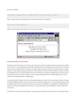
So, the DataReader example page only contains one data-bound control- a DataGrid. This is what the page looks like:
All we do is create our DataReader object in a variable named objDataReader, and bind it to the DataGrid control.
The control can figure out what columns are in the rowset, and it displays the column names and the data automatically
when we call the DataBind method:
'create a DataReader object
Dim objDataReader As OleDbDataReader
...
'code here to connect to the database and build the rowset
...
'set the DataSource property of the control
MyDataGrid.DataSource = objDataReader
MyDataGrid.DataBind() 'and bind the control
We are calling the DataBind method of the control, rather than the DataBind method of the Page object as we did in
previous examples (as we've only got this one control).
Adding Styles and Templates
We've seen how easy data binding is to use, and how much code and effort it saves. Next, we'll look at how we can change
the appearance of the data-bound controls. This can be done in three ways:
Add CSS styles to the control - either directly using a <style> element in the page, or by setting the specific
style properties of the controls
Create templates that specify the appearance of individual sections of the control's output
Use a combination of the two techniques
All of our example pages include a standard HTML <style> element in the <head> section, which specifies the font name
and font size for the page. The controls are generating ordinary HTML, so their output is automatically formatted in line
with these styles by the browser:
<style type="text/css">
body, td {font-family:Tahoma,Arial,sans-serif; font-size:10pt}
input {font-family:Tahoma,Arial,sans-serif; font-size:9pt}
</style>
So, all of our <input> elements (including those that are created by the ASP:ListBox control, ASP:DropDownList
control, and so on) are formatted with the style specified within our <style> element. We also include specific CSS style
definitions for the <td> elements in the <style> section, so that the HTML tables that some of the list controls create will
be formatted as well.
Using the Style Properties
The list controls designed for use with data binding have a set of style properties that override the CSS styles defined in
the page. These can be used to change the appearance of the control. The one exception is the Repeater control, which
provides no visible interface elements (it simply repeats the content of the templates we define within it). Some of the
properties that can be set are shown in the table below (a full list for each control is included in the .NET SDK
Documentation):
Properties
Description
BackColor, BackImageUrl
Sets the appearance of the control's background
BorderStyle, BorderColor, BorderWidth
Sets the appearance of the control's border
GridLines, CellPadding, CellSpacing
Specifies the appearance of each cell
Font-Name, Font-Size, Font-Bold
Specifies the text style within the control
HeaderStyle, ItemStyle, FooterStyle
Specifies the style for various parts of the control's output, such
AlternatingItemStyle
as the header or the content items
Adding Style to a DataGrid Control
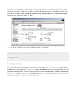
If you run the example page Using CSS to Add Style to a DataGrid (css-style-datagrid.aspx), you will see how
these style properties can be used, and what effect they have on the appearance of a DataGrid control. You can edit the
code to experiment with the different styles:
How It Works
All of the work of formatting the output of this (rather garish) example is done using the style properties of the DataGrid
object. This is the definition of the DataGrid within the HTML section of the page:
ShowHeader="True"
ShowFooter="False"
BackColor="darkgray"
BackImageUrl="background.gif"
ToolTip="A List of Wrox Books"
GridLines="None"
BorderStyle="Solid"
BorderColor="black"
BorderWidth="3"
CellPadding="2"
CellSpacing="2"
Font-Name="Comic Sans MS"
Font-Size="10pt"
Font-Bold="True" >
<HeaderStyle ForeColor="blue" />
<ItemStyle ForeColor="red" />
<AlternatingItemStyle ForeColor="green" />
</ASP:DataGrid>
We're specifying that the grid should display a header but not a footer row (although, in fact, these are the defaults).
We're also specifying the background color and an image to be used to fill the grid, a tool-tip that is displayed when the
mouse hovers over the grid, as well as turning off display of the grid lines.
Next come the properties that define a 3-pixel wide black border for the control, and the padding within and spacing
between the cells. We also specify the font name and size, and make it bold. Then, finally, come the style definitions for
the header, each item (row) in the grid, and each alternating item. All we're doing here is specifying a color for the
ForeColor property (via the ForeColor attribute), though in fact we can include values for the other properties such
as BackColor, BorderWidth, Font, and so on.
In the Page_Load event, all we have to do now is create a DataReader object, set it as the DataSource property of the
grid, and then call the DataBind method. In this case, as we only have the one control to deal with, we've called the
DataBind method for our DataGrid control rather than calling it at Page level:
...
'create a suitable DataReader object here
...
'set the DataSource property of the DataGrid
MyDataGrid.DataSource = objDataReader
'and bind the control to the data
MyDataGrid.DataBind()
Using Templates with Data-bound Controls
The second way to manage the appearance of the ASP list controls designed for use with data binding is through the
addition of templates to the control definition. In fact (as we've seen in earlier examples), templates can do a lot more
than just change the appearance of a control - we can use them to specify which columns are displayed in a control, and
how the values appear.
Three of the ASP list controls, the Repeater, DataList, and DataGrid, accept a series of templates that define the
appearance and content of specific parts of the output. All the templates are optional (depending on the control and the
data source, as we'll see shortly), but the full list is demonstrated in the following diagram:
The names of each template are self-explanatory: we can optionally specify a different appearance for the header row
(usually where the names of each field or column appear), the item rows, the alternating item rows, the separator used
between each item row, and the footer row (often used to display navigation controls if there is more than one 'page' of
rows available).
The other two templates require a little more explanation:
The DataList and DataGrid controls allow us to specify one item or row that is "selected" (by setting the
SelectedIndex property). The SelectedItemTemplate is then used to specify the appearance of this item
or row.
The DataList and DataGrid controls also allow us to switch them into "edit mode" (by setting the
EditItemIndex property). The EditItemTemplate is used to specify the appearance of this item or row (for
example, by changing the controls used to display the values in the row from labels to input controls).
Specifying Style and Content in a Repeater Control
You'll recall that a Repeater control is the simplest of all list controls, and is designed to repeat the content of the item
or row without adding any formatting or layout information. To specify the content of each item when using a Repeater
control (as we saw in earlier examples), we have to add at least an <ItemTemplate> element to the control declaration.
For example, to bind to an ArrayList we used the following code:
<ASP:Repeater id="MyRepeater" runat="server">
<ItemTemplate>
<%# Container.DataItem %>
</ItemTemplate>
</ASP:Repeater>
This specifies that the value in each row of the one-dimensional ArrayList should be displayed within the control. The
<ItemTemplate> is used to define the content of the output.
The example page Using a Simple Template with a Repeater Control (simple-repeater-template.aspx)
demonstrates how we can use templates to specify both the content and the appearance of a Repeater control. In this
case we're displaying an image, a subheading, and some text for each item. We're also displaying a header (Some of the
Latest Wrox Press Books), a footer (that contains a hyperlink to the Wrox web site), and separating each row with a dark
red "horizontal rule" image:
How It Works
This example applies style to a Repeater control through the use of four templates - one each for the header, item,
separator, and footer of the control - and through a set of CSS styles defined within a <style> element in the <head>
section of the page. Each template specifies the formatting, layout, and content of that section of the control's output - it
has to do so as the Repeater control produces no layout information of its own.
The control definition starts with the opening <ASP:Repeater> tag, and then contains the first template definition. This
is the <HeaderTemplate> (although template definitions don't have to be placed in any particular order within the
control definition). It uses a <div> element to place the heading text and a ruler-style image on the page. This <div>
element uses the CSS style class named rHead to format the appearance of the text in the header:
<ASP:Repeater id="MyRepeater" runat="server">
<HeaderTemplate>
<div class="rHead">
Some of the Latest Wrox Press Books
<img src="images/redrule.gif">
</div>
</HeaderTemplate>
This is followed by the <ItemTemplate> definition, which again is a <div> element. However, this time it takes its style
from the CSS style class named rItem. Inside the <div> element is an <img> element that contains the cover image it uses the value of the column ImageURL as the src attribute of the image. This is followed by definitions of the text and
bound values - similar to those we've used in earlier examples - that display the book title, the ISBN, the publication date,
and a short description obtained from a column named Precis. After all this comes a
element that prevents the
next item from wrapping to the cover image in this row:
<ItemTemplate>
<div class="rItem">
align="left" hspace="10" />
<b><%# Container.DataItem("Title") %></b>
ISBN: <%# Container.DataItem("ISBN") %>
Published: <%# DataBinder.Eval(Container.DataItem, _
"PublicationDate", "{0:d}") %>
<%# Container.DataItem("Precis") %>
</div>
</ItemTemplate>
Note that we've included a line-continuation character in the Eval statement for the "Published" value. As this is code
that is executed within the control at run-time to obtain the values, you can't have line breaks within it when using Visual
Basic unless you include the line-continuation character.
Next comes the <SeparatorTemplate> definition. This is simply the red "horizontal rule" image:
<SeparatorTemplate>
<img src="images/redrule.gif">
</SeparatorTemplate>
Finally, we have the <FooterTemplate> definition. This also contains the red "horizontal rule" image (the
SeparatorItem template is only rendered between items in the control and not before the first one or after the last one).
After the image comes the "more information" link, and then the closing </ASP:Repeater> tag:
<FooterTemplate>
<img src="images/redrule.gif">
<div class="rFoot">
For more information visit
<a href=""></a>
</div>
</FooterTemplate>
</ASP:Repeater>
The Page_Load Event Handler
In this example, we provide our Repeater control with a DataView object that we create in code within the Page_Load
event handler, rather than using a separate user control as we have in some of the earlier examples. The first part of the
Page_Load event handler is responsible for creating a DataTable object from which we can obtain a DataView. The
code follows in abridged form - we'll discuss the concepts of relational data access in depth in the following chapters:
Sub Page_Load()
'create a new empty DataTable object
Dim objTable As New DataTable("NewTable")
'define four columns (fields) within the table
objTable.Columns.Add("ISBN", System.Type.GetType("System.String"))
objTable.Columns.Add("Title", System.Type.GetType("System.String"))
objTable.Columns.Add("PublicationDate", System.Type.GetType("System.DateTime"))
objTable.Columns.Add("ImageURL", System.Type.GetType("System.String"))
objTable.Columns.Add("Precis", System.Type.GetType("System.String"))
'declare a variable to hold a DataRow object
Dim objDataRow As DataRow


