Taking Your Talent to the Web- P3 doc
Bạn đang xem bản rút gọn của tài liệu. Xem và tải ngay bản đầy đủ của tài liệu tại đây (276.16 KB, 15 trang )
the project life cycle and a detailed definition of the web designer’s role. If
you’d like to hear more about how smart you are for deciding to learn about
web design, phone your Mom—that is, if she’s forgiven you for that cheap
floral bouquet you got her.
On the other hand, if you’re ready to plunge into the most interesting
aspects of web design, Chapter 2, “Designing for the Medium,” has your
name on it, baby. But before you dive into it, we need to make one more
prefatory point.
SMASH YOUR ALTARS
With the exception of a few facts, everything in this book is subject to
debate. Web design, like the medium, is too new to be bound by fusty rules.
When we explain general principles and accepted practices, our goals are
to clarify how the medium functions and to ground you in the thinking and
methods of most working web practitioners. You will need to know this in
order to do your job. But it is only the beginning, and you are encouraged
to constantly think beyond everything we tell you here.
For every ten sites that fail because they’ve ignored a certain web verity
(for instance, that navigation should be clear and streamlined), there is at
least one site that succeeds precisely because it violates this “rule” in a
unique and brilliant way. For every hundred sites that fundamentally mis-
understand the medium by behaving like static Illustrator layouts, there is
one that achieves greatness by doing so.
Most web designers begin each project by considering the end-user. But
we know of at least one certifiable web design genius who starts every job
by inventing dynamic behaviors he has never seen on anyone else’s sites
and then following those behaviors wherever they lead. Remarkably
enough, they lead to professional and usable sites whose uniqueness
delights precisely the users they were intended to serve. This should not
work at all, but it not only does work, it enlarges what the Web can be.
There is stupidity (and there is a lot of it). And then there is innovation and
creative rule-breaking that sometimes leads to greatness.
11
Taking Your Talent to the Web
03 0732 CH01 4/24/01 11:14 AM Page 11
If your boss or client dictates or forbids a certain web design practice
because of some rule in an old web book (or, sadly, in a new book full of
bad ideas), we won’t mind you citing this book to counter the argument.
But please don’t invoke this book as an authoritative set of web design
commandments. This is not a book of rules, and any web book that pre-
tends to be is full of it. Take what we say seriously but stay flexible. Musi-
cians learn scales before writing melodies. These are the scales; you’ll write
the tunes.
12
WHY: Splash Screen: Smash Your Altars
03 0732 CH01 4/24/01 11:14 AM Page 12
chapter 2
Designing for the
Medium
THE WEB IS LIKE EVERY OTHER MEDIUM to which you’ve applied your talents and
like no other medium you’ve ever grappled with. Everything you know as a
designer will help you tremendously, yet nearly everything you know must
be rethought. Sounds like a sales pitch—until you’ve actually tried your
hand at web design.
The Web is different because websites must function as both documents
and databases. It’s different again because the medium is somewhat
ephemeral in nature, never looking or functioning exactly the same way for
each person who encounters it. Prove this to yourself by visiting any
sophisticated site using IE5 on an iMac, Netscape 6 in Linux, and IE4 on a
Windows PC. If it looks and works exactly the same in all three settings,
we’ll eat our Aunt Miriam’s crepe de chine hat. And these are just three of
thousands of possible combinations.
The Web is both more and less capable than print. On the one hand, it pro-
vides near-instant access to information, offers rich multimedia experi-
ences, and responds dynamically to the visitor’s actions. On the other, it
defeats the designer’s desire to completely control the visual experience.
The Web is different because anybody can make a website, but not every-
body can do it well.
04 0732 CH02 4/24/01 11:14 AM Page 13
Finally, the Web is different because it works best when it’s lean and mean.
Looking at a full-bleed, two-page spread places no strain on magazine
readers, but viewing sites that make extensive use of images, sounds, and
other “heavy” media can put a serious crimp in the web user’s experience—
particularly if the designer has not taken pains to optimize the site. File
sizes must be kept small if web pages are to download quickly and effi-
ciently over slow, dialup modem connections (or even fast connections).
Include too many images or other files per page, and the fastest connec-
tion will slow to a crawl due to limitations in the number of files that can
be served simultaneously.
This conflict between size and speed is known as bandwidth, and we will
have much to say about it later in this chapter. For now, the following dis-
turbingly technical definition will either give you your bearings or send you
screaming back to the safety of print design.
A Definition of Bandwidth
According to Whatis.com (www.whatis.com):
"Bandwidth (the width of a band of electromagnetic frequencies) is used
to mean… how fast data flows on a given transmission path…. It takes more
bandwidth to download a photograph in one second than it takes to down-
load a page of text in one second. Large sound files, computer programs,
and animated videos require still more bandwidth for acceptable system
performance."
Designing for the medium is a joy—once you understand the Web’s limita-
tions and opportunities.
BREATH MINT? OR CANDY MINT?
If you know your web history (or if you’ve skipped ahead to Chapter 5, “The
Obligatory Glossary”), you’ll recall that the Web was conceived as an open
platform for distributing structured text documents. When physicists Tim
Berners-Lee and Robert Caillou created Hypertext Markup Language
(HTML) as a limited subset of a much more complex open standard for doc-
ument publishing, graphic design was the last thing on their minds.
14
WHY: Designing for the Medium: Breath Mint? Or Candy Mint?
04 0732 CH02 4/24/01 11:14 AM Page 14
HTML was as simple as rain. It was built in that way so scientists could learn
it quickly and use it to publish their physics papers online. Documents pub-
lished in HTML were “styled” by the default settings of early Web browsers
(the familiar Times New Roman on a gray background). Early web pages
looked exactly like physics papers, which was pretty darned great if you
were a physicist.
But clients don’t buy physics papers. After designers and their clients
grasped the Web’s commercial potential, they began seeking ways to make
web pages look as good as other professional publications. Today, web
standards such as Cascading Style Sheets (CSS) allow us to do just that.
But in 1994 and 1995, these standards did not exist, so web designers and
browser makers such as Netscape began “extending” the behavior of HTML
in nonstandard ways.
What happened to HTML was not unlike what happens to legislation intro-
duced in the U.S. Congress. A legislator wants to change the speed limit in
his home state. By the time it gets out of committee, the bill includes taxes
on liquor and tobacco, gun licensing restrictions, subsidies for farmers,
mandatory parental warnings on CDs and cassettes, and an impassioned
plea for school prayer. Over the years, HTML was similarly amended,
extended, and tacked onto by a thousand hands. Many of those amend-
ments were intended to facilitate the needs of designers. A few were just
plain wacky. We’ve been coping with the damage ever since. Take the fol-
lowing example:
HTML in the “Good Old Days”:
<a href=”index.html”><IMG SRC=”image.gif” alt=”Return to the home page.”></a>
HTML Today:
<tr><td valign=”top”><a HREF=”index.html” target=”elchico” onMouseOver=”
window.status=’Home again, home again, jiggity jig.’; changeImages(‘toc’, ‘omen2/
coreover.gif’); return true;” onMouseOut=”window.status=’’; changeImages(‘toc’,
‘omen2/core.gif’); return true;”><img name=”toc” src=”omen2/core.gif” width=”49”
height=”25” border=”0” alt=”Return to the core page.” Title=”Home again, home again,
jiggity jig.”></a></td></tr>
15
Taking Your Talent to the Web
04 0732 CH02 4/24/01 11:14 AM Page 15
Later in this chapter, we’ll talk about HTML and web standards in more
detail. For now, it’s important to realize that the impulse behind the Web’s
creation was logical, structured, and intended to address a basic need: the
simple sharing of data. It was never about marketing or design.
Despite all that has befallen since those early days, many people continue
to view the Web as an archive or database of searchable information. And
some of these folks have espoused a set of “rules” to ensure that web pages
yield their information with a minimum of fuss and confusion. Let’s call this
group the Usability People. Jakob Nielsen is one of their foremost expo-
nents, and you can read what he has to say at www.useit.com. To Usabil-
ity fans, anything that impedes access to the data is bad; anything that
momentarily confuses even a single user is bad; and thus, pretty much any-
thing out of the ordinary is viewed with suspicion or banned outright. This
view of the Web is straightforward and can serve as a touchstone for web
designers, though the guidelines espoused by Usability gurus should not be
confused with Commandments. (Last time we checked, the Command-
ments were written by Someone else.)
Usability basically reminds designers to think about the needs of their
audience. On many commercial and informational sites, web users simply
hope to find things or do things as quickly as possible. When checking
sports scores or seeking low airfares, they do not wish to be creatively chal-
lenged by a complex multimedia experience. They merely want to find what
they seek and get on with their lives.
This does not mean that web design is a cold, calculating science. Far from
it: Like all good design, web design is aesthetic, emotional, and largely
unquantifiable. The value in the Usability perspective is that it reminds web
designers to create sites that people can actually use.
This ought to go without saying, but you’ll find that in web design almost
nothing goes without saying. Perhaps in print you’ve known designers who
become so carried away with graphic design for its own sake that they for-
get to communicate. The synergy between headline and visual gets lost in
a haze of technique; typography advances toward illegibility; subtleties of
lighting completely obscure the subject, and so on. When web designers
make the same mistake, potential readers and customers are thwarted in
16
WHY: Designing for the Medium: Breath Mint? Or Candy Mint?
04 0732 CH02 4/24/01 11:14 AM Page 16
their desire to use the site. The folks in suits start beating the designers
over the head with Jakob Nielsen’s latest book, and a good time is had by
no one. Don’t let this happen to you. It’s easy to avoid if you keep the
intended user and usages in mind.
Magazine and ad layouts may be wild or restrained as long as they are leg-
ible. Web design must be much more than legible, though many sites fail
to achieve even basic readability, and few indeed are a pleasure to read. (To
say nothing of the fact that most ad layouts are intended to convey sim-
ple messages, while websites often perform numerous, complex functions.)
In his widely read 1996 treatise, Creating Killer Websites, David Siegel
listed three cardinal virtues of web design: “Clarity, Brevity, Bandwidth.”
Though Siegel was a graphic designer and not a Usability Person (and
though he did not always achieve these goals in his own work), there’s
likely not a Usability Person on the planet who would disapprove of that
trinity.
But many designers and artists saw something quite different in the Web:
the chance to create and publish creative works that plunge the viewer into
a unique world of imagery, exploration, and cinematic or personal narra-
tive. This view, implicit in sites such as Photomontage (www.photomon-
tage.com) and Presstube (www.presstube.com), is as vital to the health of
the medium as the contrasting Usability perspective. We’ll call its expo-
nents the web artists, though this label is somewhat misleading. For while
it’s true that many web artists are motivated by the urge toward pure cre-
ative expression, the trails they blaze are invariably followed by marketers
in search of deep online branding opportunities. The innovations delivered
by pioneering multimedia artists quickly become the basis for sites touting
Motown, Madonna, or Barney’s New York.
Web artists do not believe in holding the visitor’s hand. They judge that
websites can be as challenging as paintings, music, literature, or Swedish
movies. They further hold that there is an audience for sites that raise bars
and test boundaries. They are, of course, correct. Challenging sites can
reward patient viewers. They don’t please everyone but neither does mod-
ern painting. Writer Curt Cloninger summed up the conflict between those
who view the Web as an informational database and those who see it as
a wide-open aesthetic frontier when he shrugged, “Usability Experts are
from Mars, Graphic Designers are from Venus” (www.alistapart.com/
stories/marsvenus/).
17
Taking Your Talent to the Web
04 0732 CH02 4/24/01 11:14 AM Page 17
18
WHY: Designing for the Medium: Breath Mint? Or Candy Mint?
Figure 2.1
Supermodified looks like
(and is) a work of multi-
media art. Yet it serves a
commercial purpose.
Visitors can trigger loops
of music by typing on the
keyboard. A strictly infor-
mational approach to site
design, such as the Google
Search Engine (Figure 2.2),
would be far less effective
at creating excitement
about the composer’s work
(www.amontobin.com).
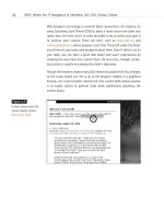
Figure 2.2
The Google Search Engine.
A classic example of func-
tion driving form (with the
possible exception of the
logo). Google’s search
engine delivers solid
results, and hardcore geeks
love it because it strips
away the clots that clog
the arteries of most com-
mercial search engines.
Both Google and amonto-
bin.com are successful at
doing what they set out to
do, yet they are clearly
different in their approach
to the user experience
(www.google.com).
04 0732 CH02 4/24/01 11:15 AM Page 18
Mars and Venus, left and right brain, utility and artistry. On one side stands
a set of Usability Commandments based on roughly a decade of trial
and error and a heaping teaspoon of pseudo-science. On the other lies the
indefinable essence of art and a horde of marketers who stand ready to
exploit it.
Somewhere between these two extremes you will find the appropriate bal-
ance for each site. The ideal balance for most sites will not be found in the
stone tablets of Mars or the sensual abandon of Venus. Rather, it will come
from each project’s intended audience. Your visitors’ needs set the param-
eters; your taste, inspiration, and expertise do the rest.
That tension between structure and style, function and aesthetics, is key to
understanding web design and web technology. Users have needs; tech-
nology sets limitations. The conflict will resurface throughout this book and
your career—and it is only the beginning. Web design is different in fasci-
nating ways. Following are a few key points of difference.
Where’s the Map?
Books, magazines, CDs, and videocassettes do not need to explain them-
selves. Most of us read from left to right and top to bottom; we turn the
page. We insert the disc or tape and press Play. Websites are not so self-
explanatory. Consequently, web designers spend a great deal of effort cre-
ating contextual and navigational cues to guide readers, viewers, and
“users” through the site.
Visitors take their cues from non-web experiences. From a lifetime of
newspaper reading, they know that headlines carry more weight than sub-
heads and body copy. They intuitively grasp that right-pointing arrows
mean “more” or “continue.” (This intuitive grasp is, of course, the result of
previously absorbed social conventions. Red, green, and yellow buttons
suggest traffic lights to an American web user; they may mean something
different or nothing at all in Papua, New Guinea.) Web users also take their
cues from other sites they’ve seen. Soon after figuring out how the modem
works, users learn that underlined text is almost always a link, and they
know that when the cursor changes shape they are hovering over an
“active” link or image.
19
Taking Your Talent to the Web
04 0732 CH02 4/24/01 11:15 AM Page 19
Mars and Venus
Adept web designers take care to follow some familiar contextual conven-
tions while breaking or reinventing others. On one site you might use CSS
to turn off link underlining; on another, you preserve link underlining
because the site is intended for neophyte users who need to be led by the
hand. One site requires idiot-proof icons with text labels; another cries out
for subtle, dynamic navigational menus. Usability People lecture sternly
about the “sins” of web design, but designers don’t sin—they make deci-
sions. A good web designer may break as many rules as she follows. Visi-
tors determine whether the site succeeds as a piece of communication or
is merely a failed, cryptic experiment. This book explores issues of naviga-
tion and interface in Chapter 3, “Where Am I? Navigation & Interface.”
You’ll be exploring them for the rest of your career.
That we devote an entire chapter to navigation and interface should be
indication enough that graphic design alone does not equal web design—
a point we’ll restate several times in case some of you haven’t had your
coffee yet. Choosing and setting type, crafting pretty buttons, and devel-
oping a grid are all well and good but not good enough. Above all, web
designers are the architects of user experience.
You might feel that your training and experience have not prepared you to
build such architecture, but you’ll soon see that it’s the web equivalent of
what a designer always does: guide viewers toward an understanding.
WEB PHYSICS: ACTION AND INTERACTION
Design for the Web is different. It’s different because web pages don’t just
sit there; they do things. More importantly, they allow visitors to do things.
Magazine pages may be beautiful (or not) but the reader’s interactivity
consists of reading the page (or not), dog-earing it (or not), and rereading
it (or not). At most, the reader might cut it out and mail it to a friend.
Strictly speaking, none of this can truly be called interactivity. Beautiful
magazine layouts do not change in response to the viewer’s actions. News-
paper ads do not sprout additional body copy if the reader shows genuine
interest. The Web invites depth of exploration in ways traditional media
cannot. For a designer, the creative possibilities are tantalizing and practi-
cally limitless.
20
WHY: Designing for the Medium: Web Physics
04 0732 CH02 4/24/01 11:15 AM Page 20
On the Web, linear motion gives way to user emotion. Site visitors link ran-
domly as they choose. Set up as many careful hierarchies and navigational
cues as you want; visitors will still do what they like on most sites. Not only
may visitors move up, down, and sideways, they also can bookmark any
page they fancy; download it to their hard drives; save the images from it;
and even study the HTML markup with which it was produced.
Readers can order books on the Web by typing in HTML form fields sup-
ported by scripts written in Perl, Java, or other programming languages
(www.amazon.com). They can post their opinions to message boards
(www.metafilter.com). If the designer has given them the option, they may
change the background colors to suit their mood (www.camworld.com). On
fancy Dynamic HTML (DHTML) sites, they can drag images from place to
place (www.dhtml-guis.com/game/). On fancier ones, they can do much
more (www.assembler.org). On a corporate intranet site, employees may
spend hours updating a group calendar or adding phone numbers to a con-
tact database. (Anything to avoid working.)
21
Taking Your Talent to the Web
Figure 2.3
Non-commercial interac-
tivity: Assembler.org was
created with DHTML (here
it is done well). As of this
writing, the site was opti-
mized for Netscape and
Microsoft’s 4.0 browsers,
which rely on proprietary
coding techniques. Thus
the site’s marvels would
be invisible to users of
recent browsers that avoid
proprietary, old-school
DHTML. By the time you
buy this book, the site
should function well in
standards-compliant
browsers such as Netscape
6 (www.assembler.org).
04 0732 CH02 4/24/01 11:15 AM Page 21
22
WHY: Designing for the Medium: Web Physics
Figure 2.4
Commercial interactivity:
Barnes & Noble, a func-
tional and attractive
shopping site. Successful
e-commerce sites work in
as many browsers as pos-
sible and add value to the
commercial transaction by
providing content and
artificially intelligent
“shopping tips.” Though
Barnes & Noble has a
real-world heritage,
Amazon.com dominates
the online market because
Amazon came first. When
web brands are effective,
users can be incredibly
loyal (www.bn.com).
There is obvious commercial value to commercial interactivity; novelty or
“proof of concept” value to dynamic artwork and games; branding value to
interactive multimedia (www.barneys.com); and hidden value to still other
types of interactivity. (Changing the background color may seem trivial to
you or me, but it could be vitally important for a color-blind web user.)
Overall, interactivity is a defining characteristic of the Web and thus of web
design. Lesbian poetry and physics papers did not drive the rapid expansion
of the medium. Commerce did that, and commerce depends on interactiv-
ity: the visitor clicks, the sale is made.
No offense to the lesbian poetry sites. In fact, no offense to the hundreds
of thousands of noncommercial sites that bring richness, depth, and mean-
ing to the Web. Without these noncommercial sites, the medium would be
nothing more than a dialup variation on the infomercial. But without all
the commercial sites, the Web’s infrastructure, services, and rate of adop-
tion might never have grown so quickly.
At least, that’s what the marketers tell us. Consider this another
Mars/Venus variation for your pleasure. The Internet grew in popularity for
at least two years before any commercial sites were allowed on the Net,
04 0732 CH02 4/24/01 11:15 AM Page 22
much less the Web. And many defining characteristics of the modern Web
($20 unlimited access dialups, 56K modems, free browsers) were estab-
lished by 1995-96, a time when most web users were also web designers,
and the word “commerce” did not begin with the letter “e.” Still, the Web
has expanded like nobody’s business since business came online. And if you
ask most normal humans who’ve gone online in the past few years why
they bought a computer and signed up for an Internet account, “shopping”
seems to top the list.
Different Purposes, Different Methodologies
It is still possible for a lone web designer or small team to create personal,
artistic, and corporate sites using an image editor, HTML, style sheets, and
JavaScript. But the “lone rider” approach is increasingly rare in the corpo-
rate web development space. Today, teams of specialists with odd-
sounding job titles develop most sites collaboratively. (See Chapter 5, "The
Obligatory Glossary” and Chapter 7, “Riding the Project Life Cycle,” for the
funky titles and the typical web project life cycle.) It is not your job to pro-
gram a shopping cart or develop a database. It is your job to understand
where your work fits into the bigger picture.
As a professional web designer, you will work closely with programmers to
implement the appropriate interactivity in every site. You also might be
called upon to execute rudimentary interactivity yourself—for instance,
writing JavaScript to swap images on navigational menus.
WEB AGNOSTICISM
Design for the Web is also different because the Web is not a fixed medium.
It has no size, no inks, no paper stock. Even your typographic choices may
end up as mere suggestions. That’s because the Web is platform-agnostic
and device-independent. Good web design adapts to different browsers,
monitors, and computing systems. What’s sauce for the goose may not be
sauce for the gander. More literally, what’s Geneva for the Mac may be Arial
for Windows; what’s VBScript for Windows may be error messages for Mac
and Linux users. (So don’t use VBScript to build websites.)
23
Taking Your Talent to the Web
04 0732 CH02 4/24/01 11:15 AM Page 23
Looking at poorly implemented sites, you could come away with the
impression that the Web is a Windows application or even an extension of
the Windows desktop. And there are certainly marketers who’d like you to
believe that. But it just ain’t so.
Berners-Lee and Caillou invented the Web on a NeXT computer. The first
browser ever released was for UNIX, the second for Mac OS. Berners-Lee
envisioned the Web as a completely portable medium—one that could be
accessed not only by every computer operating system (including dumb
terminals), but also by all kinds of devices from hand-held Personal Digital
Assistants (PDAs) to telephones and other common appliances. Slowly and
sometimes painfully, everything Berners-Lee envisioned in 1990 has been
coming true.
To help the Web evolve in an orderly fashion, Berners-Lee founded the
World Wide Web Consortium, or W3C (www.w3.org). It’s a place where uni-
versity professors join engineers from companies such as Sun, Microsoft,
AOL/Netscape, IBM, Compaq, and Apple to hammer out common techno-
logical standards, such as HTML and CSS…and more recently, Extensible
Markup Language (XML) and the Document Object Model (DOM). For a
complete listing of W3C member organizations, see the following web
page: www.w3.org/Consortium/Member/List.
Don’t worry about what the acronyms stand for at the moment. Just dig
the concept: If everyone supports the same standards (or “Recommenda-
tions,” in W3C parlance), then designers and programmers will have the
tools they need to deliver a dynamic and attractive Web that works for any
human being, on any platform or device. Sweet, smart, simple.
Sadly, due to competitive pressures, the desire to innovate, and sheer
cussedness, the companies that make web browsers have not always done
a superb job of implementing commonly shared standards. In fact, until
quite recently, you could argue that their support for these standards was
sometimes downright shoddy. You might even be forgiven for suspecting
that browser makers deliberately avoided fully implementing any standard
for fear that supporting common standards would hurt business.
24
WHY: Designing for the Medium: Web Agnosticism
04 0732 CH02 4/24/01 11:15 AM Page 24
In the beginning of this chapter, we mentioned that the Web was spawned
as a beautiful medium for the delivery of physics papers. And that to deliver
commercially viable sites—sites with some semblance of visual appeal—
web designers felt they had no choice but to “hack” HTML, forcing the
deliberately primitive markup language to serve their aesthetic needs.
Netscape (now AOL) joined web designers in extending HTML beyond its
creators’ intentions.
Initially, the Web was a one-horse town. If you wanted to design a com-
mercial site, you wrote nonstandard HTML that was “optimized” for
Netscape’s browser. Once Microsoft’s browser entered the picture, all hell
broke loose, as two powerful software companies began deforming HTML
in mutually exclusive ways.
Browser development was originally viewed as just another genre of soft-
ware development. Adobe Illustrator competes with Macromedia Freehand
by offering features Freehand lacks. Freehand does the same to Illustrator.
God Bless America.
Similarly, Netscape competed with Microsoft (and vice versa) by offering
functionality not supported by the competitor’s product. Each company
hoped these unique features would seduce web developers into creating
sites optimized for its browser alone.
Eventually, the market split in two. Though a tiny percentage of web users
sported alternative browsers including Lynx, Mosaic, Opera, and Amaya,
basically 50% of the market was using Netscape’s browser; the other 50%
was using Microsoft’s. To create “technologically advanced” sites for their
clients without alienating half the potential visitors, designers and devel-
opers felt obliged to create Netscape-specific and Microsoft-specific ver-
sions of their sites. Clients then paid more than they should have to support
the development of these incompatible site versions. Thanks in part to
protests from groups such as The Web Standards Project (www.webstan-
dards.org) and mainly to the hard work of browser company engineers, sup-
port for common standards is constantly improving—though not without
occasional backsliding.
25
Taking Your Talent to the Web
04 0732 CH02 4/24/01 11:15 AM Page 25