Taking Your Talent to the Web- P6 pptx
Bạn đang xem bản rút gọn của tài liệu. Xem và tải ngay bản đầy đủ của tài liệu tại đây (207.62 KB, 15 trang )
Monitors that are limited to 256 colors face an additional problem in that
up to 40 of these colors are “used up” in advance by the operating system
itself. For instance, Windows reserves 40 Windows system colors for its
own display purposes in lower-end color environments. That leaves exactly
216 colors at your disposal.
In 1994, the makers of Netscape Navigator mathematically subdivided the
color spectrum into 216 web-safe colors, which are equidistant from each
other along the color wheel. You will hear this mathematical arrangement
of web-safe colors variously referred to as the Netscape Color Cube, the
web-safe palette, and variations thereof, many of them unprintable in a
family publication.
The Color Cube is the bane of many web designers’ existence, but it need
not be. Paper stocks have limitations; so do type families, and so does the
Web. This is one of those limitations you can master upon accepting it as
part of the discipline the medium imposes.
Know the Code
Photoshop 5 (and higher) includes a web-safe color palette, and the included
VisiBone color palette is even more useful because it arranges the colors in
ways with which designers can understand and work. But how can you tell in
code alone if your colors are web-safe? Easy. Know the code. In HTML, all col-
ors are indicated in three pairs (six digits) of hexadecimal code.
This, for instance, is red: #ff0000.
And this is a darker red: #cc0000.
What are these little characters? They are hexadecimal code for the Red,
Green, and Blue channels of an RGB monitor. The first two digits indicate the
amount of light pouring from the monitor’s Red channel; the second pair tells
how much Green appears; and the third tells how much Blue.
With #ff0000, the Red channel is going full blast (#ff is the highest possible
two-digit value in hexadecimal), and the other two channels are “turned off”
(#00). (Most of the time, you will be working with subtler color values.)
Web-safe colors are composed only of the following hexadecimal pairs:
00 33 66
99 cc ff
Thus, #3399ff is a web-safe color, while #07ba42 is not.
56
WHY: Designing for the Medium: Color My Web
04 0732 CH02 4/24/01 11:15 AM Page 56
Only the 216 web-safe colors (colors that can be described with the hexa-
decimal pairs indicated in the previous sidebar) are guaranteed to display
correctly in both Windows and Mac OS in the 8-bit environment. Any other
color will dither (be broken into dots) on a 256-color monitor and will shift
(change to an unintended and subtly mismatched color) on a system with
thousands of colors.
Thousands Weep
As of this writing, 56% of computer owners now have 16-bit color (thou-
sands of colors), and this probably makes them happy because it makes the
daily bikini models’ flesh tones look more realistic. But for web designers,
16-bit color is a nightmare.
Sure, the dithering in 8-bit (256-color) systems is downright ugly and can
make a web page unreadable, but you can avoid it by sticking to the web-
safe Color Cube, which thus ends the problem. By contrast, the unavoid-
able color shifting that occurs on 16-bit systems springs from the dripping
maws of Hell.
57
Taking Your Talent to the Web
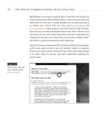
Figure 2.11
For reasons only a soft-
ware company could
explain, browsers and
image editors round off
16-bit color calculations
differently. As a result,
for users of 16-bit color,
image backgrounds and
HTML (or CSS), back-
grounds will never match
(www.alistapart.com/
stories/beyond/).
Say your web page has a web-safe, light brown background color. Say your
client’s product shot is supposed to sit on the page. Say the background
color in that product shot is subtly “off” from the background of your web
page. Say you’re in big trouble, cowboy.
04 0732 CH02 4/24/01 11:15 AM Page 57
Due to differences between the way browsers calculate 16-bit color and
the way image editors like Adobe Photoshop do it, in the 16-bit color space,
browsers are off differently from the way GIF images are off. In other
words, the background color of the image absolutely, mathematically can-
not match the background color of the web page. All the web designer’s
careful illusions are revealed. There is nothing you can do about this except
wait for 24-bit color to become cheaper so that more consumers will
adopt it.
Some web designers work around this problem by using transparent back-
grounds. This is fine as long as the image does not serve also as a link. (Most
images these days do.) Why are links problematic? Today most web pages
use the CSS hover property to make links light up (meaning change colors)
when the visitor drags her mouse over them. As you’ll see in Chapter 3, this
kind of visual interactivity is helpful because it lets the user know that this
particular set of words can take her somewhere else with a click of her
mouse. When images serve as links and when links use the CSS hover prop-
erty, the background color of a transparent image will change in response
to the actions of the visitor’s mouse. Freddie Kreuger has nothing on this
unintentional visual effect. Web designers who wish to avoid this horror
will either create incredibly complex style sheets or simply use solid, web-
safe background colors in their images. And of course, these solid colors
will be subtly mismatched on the screens of all 16-bit users. Welcome to
the Web. Meantime, at least you can protect your 8-bit, 24-bit, and 32-bit
using friends by sticking to the web-safe color palette as often as possible,
particularly for large color fields, typography, and background colors.
At this point many designers scream: “These colors are ugly! This is not
what I want.” You will find, after you work with these colors, that it is pos-
sible to create pleasing combinations with them, and you will develop your
own techniques for doing so. We promise.
When saving images, you do not need to worry about intermediate colors.
If your type is web-safe orange, and your background is web-safe blue, the
edges of the type will be filled in with intermediately shaded pixels that are
probably not web-safe. They do not have to be. As long as the large areas
of color are web-safe, a little dithering around the edges of type and
images goes unnoticed by most users.
58
WHY: Designing for the Medium: Color My Web
04 0732 CH02 4/24/01 11:15 AM Page 58
While GIFs are an appropriate format for logos, typography, and illustra-
tions, the JPEG format is usually preferred for photography. It is impossi-
ble to shift colors to the web-safe palette in a JPEG. Again, this limitation
of the medium is accepted or ignored by most users. But GIF images should
generally be shifted as closely as possible toward the Color Cube. In the
next sections, we will talk about ways of doing that.
Gamma Gamma Hey!
Gamma is a measurement of light, and different platforms come with dif-
ferent standard gamma settings. The Macintosh has a System Gamma set-
ting of 1.8. Put simply, it looks bright and has a wide range of light-to-dark
variance unless Mac users adjust their display to some other setting. Sili-
con Graphics Machines (SGI) have a System Gamma setting of 2.4. Their
default output is darker than that of Mac OS.
The Windows, Linux, and Sun operating systems run on PCs. PCs and their
components are built by a wide variety of manufacturers. While this keeps
end-user costs down, it also means that PCs have no standard hardware
gamma correction. Typically, their System Gamma is estimated at 2.4—
darker than Macintosh. In practice, PC gamma can be all over the place,
but it is always darker than that of Mac OS.
What does this mean to web designers? It means that if you do not com-
pensate for this cross-platform gamma variance, the subtle “study in earth
tones” that looks so moody and mysterious on your Mac will probably look
like a “study in mud” on most PCs. Because PCs are used by at least 90%
of your audience, a study in mud is not what you want.
In the late 1990s, Microsoft and Hewlett-Packard (www.w3.org/
Graphics/Color/sRGB.html) came up with a gamma standard called
standard RGB (sRGB) that gives Windows machines a common gamma set-
ting of around 2.2—at least in theory. Of course, it doesn’t work if users
don’t select it. And if they haven’t calibrated their monitors, it still won’t
really work. But at least it gives us something to aim for. Windows-based
web designers should calibrate their monitors, set their machines to sRGB,
and find something else to worry about.
59
Taking Your Talent to the Web
04 0732 CH02 4/24/01 11:15 AM Page 59
There are three ways for Mac-based web designers to compensate for
gamma issues.
The simplest is to download and install GammaToggle FKEY (www.acts.org/
roland/thanks/), a $5.00 shareware control panel created by Roland
Gustafsson in the mid-1990s. After it's downloaded and installed in the
System folder, this simple control panel allows you to toggle between your
Mac gamma setting and a representative PC gamma setting at the touch
of a command key. The software works flawlessly, the $5.00 shareware fee
is optional (but how could you not pay the man?), and this tool has proved
sufficient for hundreds of thousands of web designers since the earliest
days of professional design on the Web. Another advantage to Gamma-
Toggle FKEY is that it is software-independent. In other words, you can tog-
gle from Mac to PC gamma whether you’re working in Photoshop, using a
browser, or simply have the kooky urge to push a Command key in the mid-
dle of a slow day.
The second solution is to download the Furbo Filters Webmaster pack
(www.furbo-filters.com), created by Iconfactory’s brilliant Craig Hocken-
berry with kibitzing from your humble author. Unveiled in 1997, the Furbo
Webmaster pack is a constellation of Photoshop plug-ins that (among
other things) allows web designers to switch between Mac gamma and
three kinds of PC gamma. The software also lets you preview the effects of
various types of GIF and JPEG compression, and an included Web Scrubber
(based on the pioneering efforts of user interface guru Todd Fahrner) lets
you selectively shift your images toward the Color Cube. The shareware
costs $40, and may be downloaded and used indefinitely for free. A nag
screen helps your conscience decide when it’s time to pay for the software.
In 1998, Adobe got wise to this whole cross-platform gamma issue (and
related web design issues) and came out with ImageReady, a Photoshop-
like application for creating and exporting web graphics. Like Furbo Filters,
ImageReady lets you preview the effects of gamma differences and com-
pression settings on your images, and it also lets you shift your colors closer
to or further from the Color Cube.
60
WHY: Designing for the Medium: Color My Web
04 0732 CH02 4/24/01 11:15 AM Page 60
In late 1998, with the release of Photoshop 5, Adobe made it possible to
compensate for gamma differences between platforms using Photoshop
alone. This is largely because Adobe supports the sRGB standard in Photo-
shop (even on Macs), and Apple supports it through the system’s included
ColorSync control panel.
Mac users, here’s how to put sRGB to work:
1. Open the RGB Settings preference in Photoshop 5 or higher and
select sRGB as your working environment.
2. Photoshop will prompt you to set up your System Gamma if you have
not done so already. In Mac OS 8 and higher, you can set your Mac’s
System Gamma to sRGB using either the Mac’s built-in ColorSync
control panel or the Adobe Gamma control panel that comes with
Photoshop.
3. Set your Mac to sRGB, and you will always be inside the Windows
gamma space. If you prefer, leave it at typical Mac gamma (or some
custom setting), and Photoshop will magically shift your images
from the Mac to the Windows color space.
Choose Your Gamma
If you continue to design for print as well as the Web, stick with Apple’s default
settings and let Photoshop toggle you back and forth between Mac and sRGB
gamma settings. If you’re biting the bullet and plunging into full-time web
design, by all means set your Mac to sRGB and be done with it. After you get
used to working inside a slightly darker color space, it will look just fine to you,
and you’ll never have to worry about gamma compatibility again.
ImageReady 2.0 is included in Photoshop 5 and higher. Photoshop 5.5 is
much more web-savvy than its predecessor, and Photoshop 6 is even more
so. We heartily recommend these later versions of Photoshop. If you use an
older version, by all means try GammaToggle FKEY or Furbo Filters.
61
Taking Your Talent to the Web
04 0732 CH02 4/24/01 11:15 AM Page 61
TYPOGRAPHY
Given what we’ve already discussed in terms of screen, color, and gamma
differences, it should come as no surprise that there are vast differences in
the way different platforms handle typography on the Web.
For one thing, different platforms offer different fonts. Two sans serif fonts,
Geneva and Helvetica, come standard with Mac OS. Geneva is not found
on any other platform, and while Helvetica is available in Linux, it may or
may not be present on Windows systems. (Arial is the standard sans serif
font that comes with Windows. There is also a version of Geneva that
PC users can download, and we believe that three or four of them have
done so.)
Confused, yet?
The 97% Solution
In 1997, Microsoft decided to do something about these typographic dif-
ferences and commissioned a set of cross-platform web fonts for both Mac
and Windows. These include Verdana, a lovely sans serif font designed by
Matthew Carter; Georgia, also by Carter, a broad-in-the-beam serif font
that can claim a distant kinship with Palatino; and Mac versions of the
Windows fonts Arial, Impact, Times New Roman, Courier New, and so on.
The notion of cross-platform web fonts was a great idea. Unfortunately,
not everyone bothered to download and install these fonts, so Microsoft
included them in its Internet Explorer browser. (That took care of all the
Windows users.) Microsoft then persuaded Apple to make IE the default
browser that comes with the Macintosh Operating System. (That took care
of the new Mac users and nearly took care of Netscape.)
This did nothing for Linux or UNIX users, but it did go a long way toward
solving cross-platform font problems because Windows and Mac OS
together make up about 97% of the market. (Depending on how you define
the market, anyway.)
That still left a huge problem unsolved: the difference in typographic res-
olution between Mac OS and Windows.
62
WHY: Designing for the Medium: Typography
04 0732 CH02 4/24/01 11:15 AM Page 62
Points of Distinction
By default in Mac OS, there are 72ppi, and a pixel is the same as a point.
Thus 12pt. type is 12 pixels tall, 72pt. type is 72 pixels (or one inch) tall,
and so on. Of course, most Mac users set their screens to higher resolu-
tions, so this one-to-one equivalency between points and pixels soon
becomes meaningless. But 72ppi is the starting point for Macs.
Windows users start off with 96ppi resolution; thus, 12pt. type in Windows
is 16 pixels tall. Again, this varies according to the user’s choice of screen
resolutions, but 96ppi is the starting point.
In 4.0 (and older) browsers, what looks readable on a Mac looks big and
horsey on a Windows PC. Conversely, what looks tasteful and discrete on a
Windows box is often illegibly small on a Mac.
63
Taking Your Talent to the Web
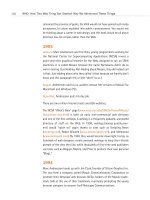
Figure 2.12
Font Wars: In 1997, CSS
expert Todd Fahrner stuck
this image in an obscure
corner of the Web. It
proved why using
points was a brain-dead
approach to CSS (too bad
so few people listened). He
sarcastically observed that
if things got much worse,
Macs would have to use
Windows-size typographic
defaults. Three and a half
years later, Fahrner’s sar-
donic prediction came true
( />font_size/points/
font_wars.GIF).
04 0732 CH02 4/24/01 11:15 AM Page 63
Particularly since web designers began overcoming their fear of style
sheets, Windows-based designers who do not check their work cross-plat-
form have been giving Mac users type they could neither read nor enlarge
in the browser. On a PC, 8pt. type looks swell. On a Mac, it looks like 8 pix-
els, which is at least 1 pixel shy of legibility.
Year 2000—Browsers to the Rescue
In 2000, browser makers figured out how to compensate for this long-
standing problem. The first to do so was IE5 Macintosh Edition, released in
March 2000. IE5/Mac’s default setting is 16px type at 96ppi (Windows res-
olution). The Mac version of Netscape 6, released in November, followed
suit.
In IE5/Mac and Netscape 6, users can change their preferences and restore
the traditional “Mac” setting for text. By doing so, they risk continuing to
be frustrated by the typographic resolution differences between their plat-
form and the dominant Windows OS. But if they’re smart enough to change
their settings once, they’re smart enough to change them back again when
needed.
IE5/Mac also introduced text zooming, which enables users to enlarge (or
shrink) HTML and CSS text on the page, no matter how the designer has
formatted that text. This liberates web users from web designers’ mistakes
and makes the medium more accessible to the visually impaired. Netscape
6 offers similar functionality, though for some reason it was left out of the
Macintosh version (at least in the initial Netscape 6 release).
Of course, 4.0 browsers are still very much among us, and the 18-Month
Pregnancy period has only just begun. Consequently, cross-platform font
size issues will continue to plague the Web for some time to come. In Chap-
ter 10, “Style Sheets for Designers,” we’ll explain how to use style sheets
to compensate for all these incompatibilities.
64
WHY: Designing for the Medium: Typography
04 0732 CH02 4/24/01 11:15 AM Page 64
TOUCH FACTOR
When designing a book, your choice of materials and textures is limited
only by the client’s budget. When designing a website, you have no tex-
tures whatsoever. There is no “touch factor” in work designed for the dig-
ital screen. But this lack of sensory input does not mean that the site must
be a cold, detached, clinical object. There are many tools to help you bring
humanity and warmth to the Web.
Appropriate Graphic Design
Interactivity can go a long way toward simulating the effect of the “touch.”
For instance, when you move your mouse over or press the buttons at
www.k10k.net, they seem to respond to your touch—like buttons in the real
world. Intuitive, user-centered navigation helps as well. If the architecture
is designed the way users think, navigating the site will be simple pleasure.
There will be more on all that in Chapter 3. Smart, appropriate copywrit-
ing, which reads the way people talk, also can go a long way toward bring-
ing warmth and humanity to the onscreen experience.
These approaches enable anyone to create a site that feels like a living
entity. Failure to use these tools results in a site that feels cold and dead—
high tech, but not high touch.
ACCESSIBILITY, THE HIDDEN SHAME
OF THE
WEB
The framers of the Web intended it to be a medium of universal access—a
medium whose wealth of information would be accessible to anyone,
regardless of physical, mental, or technological disability. Anything that
stands in the way of that accessibility is contrary to the purpose of the Web.
It is also inhumane, and, as we alluded to earlier, it is now against the law:
65
Taking Your Talent to the Web
04 0732 CH02 4/24/01 11:15 AM Page 65
Section 508 of the Workforce Investment Act (www.usdoj.gov/crt/
508/508law.html) requires all United States Federal Agencies with web-
sites to make them accessible to individuals with disabilities. Inaccessible
sites can be shut down by the government. In the private sector, inacces-
sible sites face lawsuits. In 1999, a group of blind citizens successfully sued
America Online because its service was not accessible to them.
How do you design for the blind? It sounds like a paradox, but on the Web
it is actually fairly easy.
The Web Content Accessibility Guidelines of the W3C (www.w3.org/TR/
WAI-WEBCONTENT/) spell out everything designers must do to make their
sites accessible to all.
Here are some of the things you can do to make your site accessible:
■ Your <IMAGE> tags should include <ALT> text for the benefit of the
visually impaired; adding <TITLE> attributes is a good idea as well.
<ALT> and <TITLE> attributes can be spoken by audio browsers used
by the blind, so they don’t have to miss out on any content. For
example, your web page on the wreck of the Titanic includes a pho-
tograph of that ill-fated ship. A bad <ALT> attribute reads “Image,
24K.” Well, what good is that to the disabled user? So your site has
an image, so what? A good <ALT> tag will read “S.S. Titanic.” The
<TITLE> attribute can provide additional description: “Photograph of
the Titanic on her maiden voyage.”
■ If you use frames, include <NOFRAMES> content in the frameset
document. <NOFRAMES> text shows up in browsers that cannot
view frames. Old browsers fall into this category, but so do text
browsers such as Lynx and special browsers for the blind. By copy-
ing your text and pasting it into the <NOFRAMES> area, you guar-
antee that anyone can access the information on your site, even if
he or she cannot view your spectacular visual design efforts.
■ Even if most users will be navigating via snazzy visual menu bars at
the top of your site, be sure to include simple HTML links somewhere
on the page so that the disabled—or folks with older, non-JavaScript-
capable browsers—can still find their way around the site.
66
WHY: Designing for the Medium: Accessibility, the Hidden Shame of the Web
04 0732 CH02 4/24/01 11:15 AM Page 66
For more on accessibility and the law, see Alan Herrell’s article in A List
Apart, “Accessibility: The Clock is Ticking” (www.alistapart.com/stories/
access/).
USER KNOWLEDGE
A website must be designed so novice users can find their way through
it without trouble. At the same time, a good site offers shortcuts and power
tools for more experienced users. How do you serve these two very differ-
ent audiences at the same time? We’ll discuss that in the very next
chapter.
67
Taking Your Talent to the Web
04 0732 CH02 4/24/01 11:15 AM Page 67
04 0732 CH02 4/24/01 11:15 AM Page 68
chapter 3
Where Am I? Navigation
& Interface
“I LEFT MY BABY DAUGHTER in the car while I went to buy dope. Then I drove
away. I’d gone about five blocks when I realized my daughter wasn’t in the
car any more.”
So begins a brief personal narrative that fills most of the screen of a web
page. At the conclusion of this woeful tale, we see a link or button labeled
More Stories. We are likely to click it.
Before doing so, we notice that a small Narcotics Anonymous logo appears
in the upper left area of the screen and that four menu items appear in a
column on the right. The Face of Addiction, reads one. There Is a Solution,
reads another. Meetings, says a third, and Membership, reads the fourth.
Meetings takes us to a map of the United States. Clicking any city takes us
to a schedule of Narcotics Anonymous meetings in that city. The Narcotics
Anonymous logo, consistently placed at the upper left of every screen on
the site, takes us back to the first page, with its riveting personal narrative
and easily understood menu structure. Perhaps when we return to the
home page we are served a different personal story. This story may be a bit
longer than the first we encountered. After all, our attention is now
engaged because we have committed at least a few minutes of our time to
the site. At this point we are ready to involve ourselves with a slightly more
elaborate narrative.
05 0732 CH03 4/24/01 11:16 AM Page 69
This is one possible interface for the home page of Narcotics Anonymous,
a 12-Step program that helps addicts recover, one day at a time. Recovery
begins by facing the problem and telling the truth about one’s life—how-
ever painful that truth may be. The honesty of these stories enables the sto-
ryteller to get well and his listeners to identify with the problem his story
demonstrates. The prototype web interface parallels this process because
the designers have done their homework and found out how the “product”
(Narcotics Anonymous) actually works.
WHAT COLOR IS YOUR CONCEPT?
Notice that we have not said a word about graphic design, typography, or
technology. We are simply examining a prototype whose purpose is to
immediately engage readers in the site’s drama and promise. The site
achieves this by plunging the reader into content (but not too much con-
tent) and by supporting that content with a quickly comprehensible menu
structure, as well as a linear method of reading on (More Stories).
This simple site architecture, with its emphasis on human interest, provides
an immediate way for addicts to identify with an anonymous speaker and
thus begin to admit that they suffer from the same problem. It helps the
loved ones of addicts to recognize their husbands and wives as addicts and
start to understand why Harry or Sally is “that way.” The site does not
preach, nor does it overwhelm visitors with too much initial detail. Its care-
ful structure engages the minds of a specific audience and allows them to
get whatever level of support they need.
Every site should be this effective, whether it offers help for personal prob-
lems or half-price airfare. Every site should immediately engage its
intended audience with compelling content that invites exploration. A web
designer’s first job is to find the heart of the matter: the concept. The sec-
ond job is to ensure that readers understand it too. That is the purpose of
architecture and navigation.
70
WHY: Where Am I? Navigation & Interface: What Color Is Your Concept?
05 0732 CH03 4/24/01 11:16 AM Page 70


