Taking Your Talent to the Web- P8 potx
Bạn đang xem bản rút gọn của tài liệu. Xem và tải ngay bản đầy đủ của tài liệu tại đây (557.83 KB, 15 trang )
Web designers can change or override these conventions—for instance, by
using Cascading Style Sheets (CSS) to place a hand cursor over plain text
rather than live links—but it is rarely desirable to do so unless your goal is
to confuse your visitors. There are sites, such as www.jodi.org and
www.superbad.com, whose purpose is just that. These fall under the head-
ing of fine art, and many web designers adore them. Even if they’re not to
your taste, you can learn a great deal about web users’ expectations by
studying the way these sites subvert them. On most sites, though, confus-
ing visitors is usually not among the client’s objectives.
Though the browser creates many GUI elements (underlined links, changes
to the cursor state), the rest is up to the designer. Indeed, in a graphical
browser, one could consider commercial sites custom GUIs whose purpose
is to enable visitors to perform tasks while subliminally absorbing the
client’s brand.
86
WHY: Where Am I? Navigation & Interface: GUI, GUI, Chewy, Chewy
Figure 3.9
Visitors know what this
cursor change means
(www.glish.com).
05 0732 CH03 4/24/01 11:16 AM Page 86
CLARITY BEGINS AT HOME (PAGE)
In developing GUI elements, web designers will frequently begin with the
brand: funky elements for an entertainment site pitched at 20-somethings;
somber, restrained elements for a news or medical site; and so on (more
about branding in a moment). As each site presents a visitor with new GUI
elements, those elements have the potential to brand the site while offer-
ing visitors a sense of identity and place. These elements also have the
potential to confuse the heck out of people. As with the operating systems
they mimic, GUI elements should be as clear and easy to use as possible.
Clarity and ease of use are especially crucial factors in the development of
iconic interface elements and site structure labels.
87
Taking Your Talent to the Web
Figure 3.10
So why confuse them
with this one? Changing
familiar GUI elements
“because you can” is a
dog’s rationale for licking
himself. In this case, it’s
a Glassdog’s rationale
(www.glassdog.com).
05 0732 CH03 4/24/01 11:16 AM Page 87
I Think Icon, I Think Icon
Graphical devices (icons) guide viewers through the site experience. For-
ward and reverse arrows are common ways of navigating from page to
page. Graphical buttons are often used to trigger certain actions. For
instance, a Play button may be used to trigger a recorded sound or an
embedded, streaming QuickTime movie. A pen or pencil icon may link to a
message board, or a book or newspaper icon can guide the visitor to a
downloadable, printer-friendly version of the page’s content.
Printing in the Browser Wars
Why aren’t web pages themselves printer-friendly? It is because too often
browsers are rushed into production as the latest assault in the “Browser
Wars,” instead of offering carefully considered and usable features. By the
time this book is released, the worst of the Browser Wars will be behind us.
Icons, with or without text labels, frequently serve as quick, visual cues to
the site’s offerings. They also support international visitors for whom Eng-
lish is not a first language. Sites with massive amounts of content on their
home pages, such as portals and magazine sites, can use icons to better
organize and clarify sections (see Figures 3.11 and 3.12).
88
WHY: Where Am I? Navigation & Interface: Clarity Begins at Home (Page)
Figure 3.11
The icons seen here help
draw the eye to the sec-
ondary menu, and some of
them even communicate
in ways a non-English
speaking visitor might
understand. Designing
icons that communicate is
difficult. Competing ele-
ments must fit within the
narrow width of a lowest-
common-denominator
monitor, leaving little
room in which to develop
legible imagery
(www.eloquent.com).
05 0732 CH03 4/24/01 11:16 AM Page 88
On the Web, as in talking to a policeman, clarity is a virtue. While it is
tempting to get really creative with such elements, the most creative solu-
tions are often the clearest.
Say you are designing a site for a chain of Wild West theme hotels. In vis-
iting the hotels and studying the chain’s promotional brochures and adver-
tising, you can’t miss the fact that Western paraphernalia is used to brand
the franchise—from the bronze horse-head coat hooks in guest closets to
the cowhide couches in the lobby. Thinking like a brand steward, you decide
it might be fun to use lassos rather than arrows to indicate “previous page”
and “next page” on the site. To you, as a visual person, it is readily appar-
ent that the rope at the edge of the lasso “points” forward or backward.
Well, cowboy, test that design on some users before you fight for it. If users
are confused by your branded iconic elements—if the lassos strike users as
meaningless ornamentation rather than functional GUI elements—be pre-
pared to rustle up some traditional left and right arrows, even if it chaps
your spurs.
89
Taking Your Talent to the Web
Figure 3.12
We are clearly in the land
of the recreational web-
site, as denoted by the
tagline “professional
martini consumer.” Few
sites would devote all
that screen space to a
menu structure. Indeed,
this site recently went
offline for a redesign
(www.drymartini.com).
05 0732 CH03 4/24/01 11:16 AM Page 89
Adding “invisible” text labels to an icon via the <ALT> attribute of the
HTML image tag or the <TITLE> attribute of a linked image can help explain
the icon’s purpose to inexperienced users. In modern graphical browsers,
these <ALT> and <TITLE> attributes generate popup “tool tips” or help-bal-
loon-style blurbs, enhancing the page’s interactivity in a meaningful and
user-friendly way.
Such tags also make the content more accessible to the visually disabled,
to those using non-graphical browsers or Personal Digital Assistants (PDAs)
such as the Palm Pilot, and to folks using conventional browsers who surf
with images turned off. (As mentioned in Chapter 2, accessibility makes
good business and moral sense. Besides, it’s U.S. law.)
When invisible text labels are not enough, consider adding visible text.
Structural Labels: Folding the Director’s Chair
In the early days of the Web, designers and copywriters frequently had fun
coming up with creative labels for menu bar sections and other naviga-
tional items. For instance, the home page of a video editing company’s site
might be labeled “The Director’s Chair,” while downloadable video clips
would be found in “The Screening Room.”
Today, most web agencies find it better to err on the side of clear copy than
cute copy. After all, if the visitor does not immediately grasp what “The
Screening Room” means, she could leave the site without having discov-
ered one of its most important content areas. While alternatives to tradi-
tional labeling may be appropriate for some types of sites (gaming sites,
fun sites for kids), many corporate sites depend on such traditional labels
as Home, About, and Clients to facilitate easy user navigation. Dull as dish-
water, we know. Be creative clearly, and it need not be dull at all.
The Soul of Brevity
Back in Chapter 2 we recalled David Siegel’s three hallmarks of good web-
site design:
■ Clarity
■ Brevity
■ Bandwidth
90
WHY: Where Am I? Navigation & Interface: Clarity Begins at Home (Page)
05 0732 CH03 4/24/01 11:16 AM Page 90
Because most web users have little time and less bandwidth to waste, good
interfaces are rarely overwrought. Given the choice between a simple,
functional design and one that is ornate, most folks prefer the simple web
layout that loads quickly and is easy to understand. Web users don’t tell
you this by peering over your shoulder; they tell you this by visiting the site
or neglecting it.
Even when bandwidth is not an issue, quick, clear communication always
will be. Users lucky enough to have T3, cable modem, or DSL access may
not be slowed down by a cluttered interface, but they will be just as baf-
fled by it as dialup modem users are. Regardless of the user’s access speed,
your communication must be fast and clear, or users will retreat faster than
you can say “failed dot com.” It’s a peanut butter and jelly scenario: By
focusing on functionality, you will develop low bandwidth interfaces; by
focusing on bandwidth, you will develop interfaces that speak quickly and
clearly.
Many web designers initially feel constrained by this. Some feel they can-
not truly express their vision unless every page sports a 128K background
JPEG, an animated menu bar, and a series of spinning logos and pulsing
photographs. We’ve all had that feeling. It passes as you discover the joy
of communicating richly while using a few elements well, or it never
passes, and you locate clients with tastes as baroque as yours. When citi-
zens avoid visiting the resulting sites, your client and you can toast your
superiority to the rest of humanity and then hurry on to the next failure.
When bad web designers die and go to Hell, they will spend eternity search-
ing for the Heaven option on an endless menu bar of purgatories. (That is,
if they’re not simply stuck waiting for an infernal intro to finish down-
loading.)
Hypertext or Hapless Text
Brevity is just as important when putting text content on the Web. A book
is easy to read. Hundreds of years of book design make it so. But on a glar-
ing computer screen, at 72ppi (pixels per inch) or 96ppi, reading long pas-
sages is a chore. A reader will simply skip lengthy texts, whether they’re
providing valuable product information or explaining how to use some
advanced feature of the site.
91
Taking Your Talent to the Web
05 0732 CH03 4/24/01 11:16 AM Page 91
By breaking text down into usable sub-units of information, a web designer
can help readers find critical information and more easily absorb content.
White space, while useful in print, becomes even more crucial on a web
page. The logical separation of chunks of information helps engage read-
ers and maintain their interest. Designers can use paragraphs, section
breaks, and links to new pages to chunk information.
The more white space, the greater the chance that readers will remain
engaged. Use CSS by itself or in combination with table-based layouts to
create pages that demand to be read.
92
WHY: Where Am I? Navigation & Interface: Clarity Begins at Home (Page)
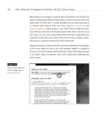
Figure 3.13
Readable typography, an
elegantly spare layout, and
plenty of white space add
up to a site that welcomes
readers—a quality that is
depressingly rare on the
Web (www.harrumph.com).
Contrast this with
Figure 3.15.
In print, a designer might include ten sentences in a paragraph. On the
Web, with its scrolling interface, ten sentences can feel like a life sentence.
To enhance readability, web designers (or web designers in combination
with web-savvy copywriters and editors) will separate one long paragraph
into several shorter ones.
Learn when to stop one page and start another. Despite what some pun-
dits tell you, readers will scroll to read an engaging story, but they will not
scroll forever. After two or three screens, it may be time to present the
05 0732 CH03 4/24/01 11:16 AM Page 92
reader with an arrow (or other page indicator) allowing them to move on
to the next page of text. Doing so can relieve eye fatigue, enhance the
drama of the presentation (www.fray.com), or simply give your client
another page on which to sell ad banners.
Remember in Chapter 2 when we talked about the tradeoff between one
large image that takes a long time to download and many small images
that take a long time to display? (If this were a web page, we’d provide a
link here.) Well, the same kind of tradeoff goes on with text. Jam too much
of it on a single web page, and readers may be frightened away. Provide
too little, forcing the reader to click to a new screen after every paragraph
or two, and you practically guarantee that no one will read to the end of
the article or story.
Working with client-supplied text is particularly tricky. If average citizens
are bad writers, clients are bad writers with egos. Upper Middle Managers
would rather add value to cross-brand synergies while enhancing the func-
tionality of strategically targeted product from the dairy side than put milk
in their coffee. Rare is the client who writes the way people talk; rarer still
is the client who uses few words when many will suffice.
In brochures and catalogs, such copy is ineffective. On a web page, it’s
destructive on a nuclear scale. Consumers may ignore bad catalog copy if
the layout and photography are compelling enough. But a site laden with
vast blocks of ham-handed text is doomed. No visitor will stay long enough
or scroll far enough to discover the million dollar photographs or com-
pelling brand proposition buried on page three.
Laid out well (via text chunking and CSS), bad text can squeak by. Laid out
badly, it kills websites dead. We cannot overemphasize the impact (and
tragic rarity) of good writing on the Web nor the harm done by verbose and
inexpressive texts, drizzled into layouts like so much phlegm. Learn web
typography, practice text chunking, and work with good writers and edi-
tors. Do not let your clients or your project managers skimp on the writing
budget unless you find failure exciting.
93
Taking Your Talent to the Web
05 0732 CH03 4/24/01 11:16 AM Page 93
94
WHY: Where Am I? Navigation & Interface: Clarity Begins at Home (Page)
Figure 3.14
The front page
of Sapient.com
(www.sapient.com),
a leading web agency,
shows mastery and promise.
Clean typography and high-
quality photography, bal-
anced as skillfully as in a
classic Ogilvie print ad,
direct the visitor’s attention
to the most important con-
tent. The carefully balanced
page also makes use of
Liquid Design (see Chapter
2) to accommodate
variously sized monitors.
So far, so good.…
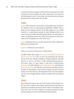
Figure 3.15
…Alas, once past the front
page, visitors encounter too
many pages like this one,
where blocks of undifferenti-
ated text, laid out with little
care and no love, beg to be
ignored rather than read.
Since 99% of the Web con-
sists of text that is intended
to be read, the lack of atten-
tion to good textual presen-
tation is tragic—hurting not
only the site owner, but the
would-be reader. Contrast
this with Figure 3.13.
(www.sapient.com).
05 0732 CH03 4/24/01 11:16 AM Page 94
Scrolling and Clicking Along
Some “experts” will inform you that users don’t click. They also will inform
you that users don’t scroll. If users never clicked or scrolled, nobody would
actually be using the Web. Of course users click. (How else would they link
from page to page?) Of course users scroll. (How else would they, uh,
scroll?)
Nobody clicks more than they have to—hence the so-called “Three-Click
Rule,” described later. And nobody scrolls for fun and profit. Visit an ama-
teur home page and see how excessive scrolling drags its nails across the
blackboard of the user’s experience.
The previous section, “Hypertext or Hapless Text,” discussed text chunking
and offered methods to keep scrolling to a minimum, but this does not
mean that every web page should be limited to one or two paragraphs of
text. Particularly when presenting in-depth articles online, text chunking
has its limits. Users would probably rather scroll through five longish pages
of text than click through 25 short screens that present the same infor-
mation. Develop a case-by-case, site-by-site sense for these nuances, and
you will find your skills in demand.
Every newspaper is designed so that the most important headlines, photo-
graphs, and stories appear “above the fold” (where the paper naturally folds
in half). As shown in Chapter 2, vital information is best served in this
small space above the fold. When links to the site’s most important con-
tent appear within the first 380 pixels of vertical space, even visitors sad-
dled with small monitors can find what they seek without scrolling. Once
enmeshed in a story that engages their interest, visitors will scroll down a
few screens to continue reading.
How many screens of text will readers scroll before wearying of scrolling
and seeking the blessed release of clicking to the next page? Three. Just
kidding. Only a pseudo-scientist would pretend to know. As web designers,
we use our best judgment on each site. That, after all, is what we’re
getting paid for.
95
Taking Your Talent to the Web
05 0732 CH03 4/24/01 11:16 AM Page 95
One reason frames are popular is that they allow web designers to keep the
interface onscreen in a consistent location, even when the user is scrolling
up or down like a madman. For instance, a horizontal menu bar at the top
(www.microsoft.com) or bottom (www.the-adstore.com) of the screen will
stay in place no matter how long the page may run and no matter how
much scrolling the user performs. Frames are on their way out (in W3C
parlance, they have been “deprecated”), but you can achieve the same
effects with CSS, a web standard.
Inexperienced designers sometimes create pages that require the user to
scroll horizontally. This is almost always unwise. Except at certain “art
gallery” sites, users will almost never scroll horizontally. Such interfaces are
inconvenient and often appear to be mistakes rather than deliberate design
decisions.
To understand why horizontal scrolling is an evil spawned from the fester-
ing loins of the incubus, imagine that you have to … turn the page to fin-
ish reading this … sentence and then fold the page back … to read the next
line of … text, which bleeds … backwards across the gatefold again, forc-
ing you to … turn the page, and then turn … it back again in order to begin
reading the next line.
No print designer would lay out book pages that way, but inexperienced
web designers do so frequently, whether from misguided creative impulses
or because they’ve made assumptions about their visitors’ monitor sizes.
This is another reason that Liquid Design (detailed in Chapter 2) comes
highly recommended; it always fits neatly into any user’s monitor.
It’s also the reason that clients, designers, and IT departments that set
“monitor baselines” of 800 x 600 are blockheads. If even 5% of the audi-
ence is expected to scroll horizontally simply to read marketing copy, the
client or web agency is effectively sending millions of potential customers
to a competitor’s site.
96
WHY: Where Am I? Navigation & Interface: Clarity Begins at Home (Page)
05 0732 CH03 4/24/01 11:16 AM Page 96
STOCK OPTIONS (PROVIDING ALTERNATIVES)
Users employ a variety of means to access the Web, including modern
browsers, older browsers, non-graphical browsers, audio browsers, and
non-traditional devices such as cell phones and PDAs. If the goal of a
site is to accommodate as many visitors as possible, then it is critical to
provide alternative forms of navigation.
Imagine that you have designed a lovely, frames-based site and that your
navigational menu exists in its own frame. A visitor using a text browser
enters the site. He cannot see frames because his browser does not sup-
port them. You, however, have thoughtfully included a <NOFRAMES> tag
in your HTML frameset. Inside the <NOFRAMES> tag you cut and paste the
main content from the home page, along with an HTML-based text menu.
The visitor can now use your content, even though he cannot see your
frames-based layout. (Again, we remind you that frames are on their way
out anyway.)
Options and alternatives increase the odds that someone will actually use
what you’ve designed. Larger web agencies employ quality assurance (QA)
staffs who spend all day hunting for online porn. Better QA staffers search
for flaws in your design by testing it in a wide variety of old and new
browsers on various platforms. Do not hate these site testers—they are your
friends. Build alternatives into your navigational scheme, and you will win
their admiration and more, importantly, that of your site’s audience.
The mechanics of including alternate forms of navigation will be covered
in Chapter 9, “Visual Tools.”
HIERARCHY AND THE SO-CALLED THREE
CLICK RULE
To accommodate the need for rapid access to information, a web designer
creates layouts that immediately reassure the visitor that she has “come
to the right place.” Brand-appropriate design accomplishes some of this
purpose. A clear hierarchical structure does the rest.
97
Taking Your Talent to the Web
05 0732 CH03 4/24/01 11:16 AM Page 97
It’s widely agreed, even by people who are not idiots, that web users are
driven by a desire for fast gratification. If they can’t find what they’re look-
ing for within three clicks, they might move on to somebody else’s site.
Hence the so-called “Three-Click Rule,” which, as you might expect, states
that users should ideally be able to reach their intended destination within
three mouse clicks.
With the average site offering hundreds if not thousands of items and
options, the Three-Click Rule sounds preposterous. But it is actually fairly
easy to achieve if you start by constructing user scenarios before you begin
to design the site.
What will people who use this site want to do? Where will they want to
go? Based on those scenarios, the site is structured into main areas of con-
tent. These are then organized into no more than five main areas. (See the
next section, “The So-Called Rule of Five.”) Submenus in each of the five
main areas get the user close enough that he or she is at least reassured
by the third click, even if it takes a fourth click to get to the final, desired
page.
Let’s play it out. You are designing a site for people who live with house-
cats. In the scenario portion of development, the team agrees that cat own-
ers might want to read about Mister Tibbles’ genetic heritage. In the
top-level hierarchy, you create an item called Breeds. When Aunt Martha
clicks Breeds, the site offers Long-Hair, Short-Hair, Tabby, and Exotic
options. A second click takes her to Short-Hair, a third to Mister Tibbles’
particular breed.
Like all so-called “laws” of web design, the Three-Click Rule is a sugges-
tion, not an ironclad rule. It is, though, a suggestion based on the way peo-
ple use the Web, and, particularly for informational and product sites, you
will find that it works more often than not. If nothing else, the rule can help
you create sites with intuitive, logical hierarchical structures—and that
ain’t bad.
98
WHY: Where Am I? Navigation & Interface: Hierarchy and the So-Called Three Click Rule
05 0732 CH03 4/24/01 11:16 AM Page 98
THE SO-CALLED RULE OF FIVE
The so-called “Rule of Five” sounds like a period out of Chinese history, but
it’s actually just another guideline most working web designers keep in
mind—especially if they want to keep working.
The Rule of Five postulates that complex, multi-layered menus offering
more than five main choices tend to confuse web users. A glance back at
Figure 3.5 should confirm the common sense behind this “rule.” The main
menu at Overstock.com offers not five, not six, not seven, but a whopping
twelve main categories to choose from. (And that’s not even counting the
strange tagline area that is inexplicably designed to resemble a clickable
menu button.) Overstock.com is so busy offering everything that many
users will be hard pressed to find anything.
By contrast, Sapient’s main menu (back in Figure 3.14) offers four choices:
Clients, Expertise, Company Info, and Careers. Giving users three, four, or
five main choices makes it easier for them to decide where they want to
go. Hitting them with ten or more choices makes their next move harder
to predict—for them and for you. Confuse them enough, and it becomes
easier to predict where they will go, namely: anywhere else.
As with the Three-Click Rule, evolving a site whose architecture can be
navigated in five main areas or less is easier if you engage in scenario play-
ing before you begin to design. Chapter 7, “Riding the Project Life Cycle,”
provides a detailed analysis of how you, your team, and your client can col-
laborate to develop logical site structures that facilitate the Three-Click
Rule and the Rule of Five.
On multi-purpose sites (and there are many of those), several layers of nav-
igation may peacefully coexist. Looking yet again at Sapient (Figure 3.14),
four choices are enough to guide visitors to main areas of the site but not
enough to help those seeking one-click access to various client/vendor suc-
cess stories. The icon-driven menu on the right ignores the Rule of Five
without incident.
99
Taking Your Talent to the Web
05 0732 CH03 4/24/01 11:16 AM Page 99
On a shopping site, the main menu may offer three choices: Women’s,
Men’s, and Kids’. But submenus can be far more extensive: the Women’s
section might offer Outerwear, Sportswear, Business Attire, Casual Wear,
Accessories, Cosmetics, Health Aids, and sundry other stuff without con-
fusing any shopper. As the shopper burrows deeper into the hierarchy, these
submenus can sprout submenus of their own, for example Cosmetics could
include Hair Products, Makeup, Toners, Cleansers, and beyond. Such sub-
menus may run deep, as long as they appear when users expect them to
appear and behave consistently from section to section.
Some site designers and architects distinguish between goal- and task-ori-
ented navigation. With goal-oriented navigation, the user wants to go
somewhere (Clients, Expertise, or Company Info, for example). With task-
oriented navigation, the user wants to do something (apply for a job, log
in, or read case studies). Combining the two types of user needs in the same
navigational context can be more confusing than helpful. In such cases,
task and goal-oriented navigation coexist separately (see Figure 3.16), and
the Rule of Five pertains to each navigational stream rather than to the
page as a whole.
100
WHY: Where Am I? Navigation & Interface: The So-Called Rule of Five
Figure 3.16
Goal-oriented navigation
(Expertise, Process, Proof)
and task-oriented naviga-
tion (Hire Us, Work Here,
Login) carefully separated
and balanced. The user
can quickly follow a
desired activity path
without becoming con-
fused or overwhelmed.
Such complex structures
are hard to pull off
(www.hesketh.com).
05 0732 CH03 4/24/01 11:16 AM Page 100


