Taking Your Talent to the Web- P18 pptx
Bạn đang xem bản rút gọn của tài liệu. Xem và tải ngay bản đầy đủ của tài liệu tại đây (340.52 KB, 15 trang )
You will run into the same difficulty with lines at almost every angle. The
45-degree angle is the exception: It works perfectly with LZW, like a diag-
onal in a game of tic-tac-toe. As you might expect, 45-degree angles came
into vogue around 1999 because they reproduce well on the Web, and
within six months they were popping up in print and TV as a meaningless
design fetish after everyone had tired of the striped effect. And as you
might also expect, many web designers employed 45-degree angles in
JPEGs, then saved the JPEGs at the highest possible quality settings to pre-
serve the crispness of their lines. The result: wasted bandwidth.
PNG
The PNG format was developed in hopes of establishing it as an open
standard for graphics on the Web—which it now is (see www.w3.org/
Graphics/PNG/). But while PNG was slowly being developed, working web
designers had to create websites, and all browsers supported GIFs. In effect,
then, GIF is a long-standing, unofficial defacto standard based on a pro-
prietary compression algorithm, while PNG is a nonproprietary, officially
sanctioned standard that is not as well supported as it ought to be.
There are two forms of PNG. PNG-8 is an 8-bit format (like GIF). PNG-24
offers 24-bit color (like JPEG), yet its sharpness and quality put JPEG to
shame. To create PNG images for the Web, simply choose PNG-24 or PNG-
8, 128 Dithered in Photoshop’s Save For Web dialog box or in ImageReady.
PNG is still not natively supported in enough web browsers, and though
support is growing, PNG is unlikely to supplant GIF or JPEG any time soon.
For one thing, PNG, while high in quality, is often high in bandwidth as well.
For another, while PNG stays crisp in milk (like GIFs do), the PNG format
does not support animation. GIFs are therefore seen as more versatile by
those who even bother to lift their heads out of their cubicles and think
about these issues.
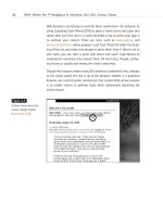
To see why PNG can be cool indeed, if your browser can handle it, visit the
Audio site at www.panic.com/audion/faces.php, click any thumbnail, and a
PNG image will pop up on the screen. Drag the image from place to place
on the page at your pleasure. You can even drag it off screen (as shown in
Figure 9.12).
236
HOW: Visual Tools: Compression Breeds Style
13 0732 CH09 4/24/01 11:22 AM Page 236
Notice that the PNG format offers true alpha channel transparency—it
matches any background you drag it over. No more halo effects caused by
mismatched anti-aliasing, no more ring around the collar. Notice too that
PNG offers crisp imagery as well as rich color.
Notice that the page only works in IE5 for the Macintosh. Bummer. Even-
tually all browsers will support PNG natively.
ANIMATED GIFS
Animated GIFs are nothing more than a series of frames (or individual GIFs)
that have been joined together to create the illusion of motion. They can
loop endlessly or play once and then stop. We could include a screenshot
here, but what’s the point? If you haven’t seen animated GIFs, you’ve never
used the Web. (Hint: look at the ad banners that clutter most commercial
content sites—web animation in a nutshell.)
Although the GIF format supported the embedding of multiple images in
the late 1980s, it was not until 1995 or so that Netscape figured out how
to hack the format’s multi-image capability to create flip-book-style ani-
mation. (Basically, Netscape did this by appropriating a Comments field and
some unused but reserved bits in the GIF89A file format.)
237
Taking Your Talent to the Web
Figure 9.12
PNG a ding-ding. On the
Audion site, you can bask
in the glories of the PNG
format—glories that
include true alpha channel
transparency, rich color,
and crisp detail. (But only
if you’re packing the right
browser.)
13 0732 CH09 4/24/01 11:22 AM Page 237
Back in the day, web designers used free shareware tools to create ani-
mated GIFs, after first preparing each individual image, saving it as a GIF,
and then running all resulting GIFs through DeBabelizer, a cumbersome
color management tool that ensured that the colors would match between
frames. (Nothing ruins the illusion of motion faster than an unexplained
color shift between one frame and the next.)
Today all that work is merely a memory because Photoshop comes with
ImageReady, and ImageReady makes it easy to create, optimize, and save
GIF animations.
Animation for its own sake is charmless, abrasive, and amateurish. Good
web designers use animation as they use everything else: with taste and
skill in support of a concept and brand image. The creators of www.k10k.net
employ animated GIFs well. The animations are revealed when rolling over
the miniature content header graphics.
Care should be taken to avoid wasting bandwidth when creating animated
GIFs. If one image uses x bytes, then ten images theoretically use 10x bytes,
and your web page might bloat as a result. Fortunately, web designers can
trim excess fat from their animations by telling the software to animate
only the parts that change, rather than redrawing each frame in its entirety.
This process is explained in the next sections. Web designers also can opti-
mize their animations by leaving out inessential in-between frames, by
keeping their images small (50 x 50 is better than 100 x 100), and by cre-
ating graphics that can be rendered in as few colors as possible.
CREATING ANIMATIONS IN IMAGEREADY
Adobe ImageReady simplifies the process of creating animated GIFs by
allowing web designers to use Photoshop’s layers as a series of frames and
enabling them to manually change the location of elements from one
frame to the next.
For instance, if you wish to animate an arrow, you can draw the arrow on
one layer in Photoshop then jump to ImageReady and open the animation
palette. Create a new frame and drag the arrow manually to the left or
238
HOW: Visual Tools: Creating Animations in ImageReady
13 0732 CH09 4/24/01 11:22 AM Page 238
right. Create a third frame and drag the arrow again. ImageReady “remem-
bers” the location of each arrow and will render an animation as a result
of these manual movements.
ImageReady can also generate tweens automatically. Start with an arrow
on the left. Create a new frame. Drag the arrow to the right. Choose the
Tween command and instruct ImageReady to tween between the first and
second frames. ImageReady generates a smooth flow of images. You can
then use the Optimize palette to ensure color consistency from the first
frame to the last. Keep in mind that the more you tween, the smoother the
motion but the larger the overall file size.
We could blab on about this, but the Photoshop owner’s manual does a
great job of explaining everything. The way we see it, if you own Photo-
shop, read the manual. If you don’t own it, there’s no sense in reading about
it here and probably not much sense in planning a web design career. (Gosh,
that sounds like a product endorsement.)
TYPOGRAPHY
A designer’s interest in typography usually borders on obsession. On the
Web, you’ll get plenty of opportunities to indulge your fetish. As part of
establishing the look and feel of a site, the web designer is responsible for
all of its typographic choices, including
■ Body text typography (CSS)
■ Logo (if not preexisting)
■ “Type GIF” headlines, subheads, and so on
■ Navigational typography (menu bar)
Body text typography is controlled with Cascading Style Sheets (CSS), a
subject so important we devote an entire chapter to it (Chapter 10, “Style
Sheets for Designers”) and still scarcely do it justice. All we’ll do here is
remind you that 99% of the Web is text, most of it intended to be read,
and that there is neither a reason nor an excuse to create hard-to-read text
on your web pages.
239
Taking Your Talent to the Web
13 0732 CH09 4/24/01 11:22 AM Page 239
The logo, if not preexisting, will be designed in Adobe Illustrator or Macro-
media Freehand, just as it would be in print projects. All we need to say
about that is to remember to start with web-safe colors, keep your design
simple so it can reproduce at small sizes (32 x 32 web buttons, for
instance), and pay attention to the following discussion about serif versus
sans serif faces in the limited 72ppi screen environment.
Remember the VisiBone color palette we mentioned earlier in this chapter?
Download the Illustrator version and use it to develop logos and other
graphics intended for the Web.
Before copying Illustrator artwork to Photoshop, convert to RGB via Illus-
trator’s Filter, Colors menu. The process is not perfect; web-safe colors may
shift, and you might need to select large areas in Photoshop and refill them
with web-safe colors.
The main thrust of our look at typography will not be body text (covered in
Chapter 10) or logo design (covered previously in this chapter). Instead, we
will discuss the basics of using Adobe Photoshop and ImageReady to cre-
ate typographic GIFs for the Web. We’ll also further examine how anti-
aliasing can work for or against your web designs.
THE ABCSOFWEB TYPE
As you know, Photoshop and ImageReady let you add horizontal and ver-
tical type to any image. As of Photoshop 5.5, you can specify the typeface,
leading, kerning, tracking, baseline style, size, and alignment of the type
and edit its characters. Photoshop 6 improves on its predecessor’s already
remarkable power.
Previously, such details as leading, kerning, and tracking were the exclu-
sive province of Illustrator, and most serious web designers would create
their typography in Illustrator and then cut and paste it into Photoshop.
Some still do that, and you might prefer to as well. Illustrator offers useful
keyboard shortcuts for kerning and other typographic functions. Many of
those keyboard shortcuts are missing from Photoshop, making the process
a bit less streamlined.
240
HOW: Visual Tools: The ABCs of Web Type
13 0732 CH09 4/24/01 11:22 AM Page 240
But keyboard shortcuts aside, Photoshop has advanced tremendously in its
handling of type and now offers essentially the same typographic func-
tionality that Illustrator does. As a result, many designers use Photoshop
for everything.
Photoshop 5.5 and higher also allows you to select an anti-aliasing option
for type, apply simulated styles to type, and turn off fractional character
widths to improve the appearance of small, bitmapped type displayed at
low resolution.
Anti-Aliasing
As all designers know, anti-aliasing enables you create the appearance of
smooth-edged type by partially filling in the edge pixels with intermediary
colors. For those who don’t know, we provide the following handy exercise.
Exercise 4: The Great Intermediary
Launch Photoshop and create a new blank document with a white back-
ground. Work at 72ppi. (We always work at 72ppi on the Web.)
Select the type tool. Click in the image to set an insertion point.
Enter some text in the Type Tool dialog box (Photoshop 5.5) or directly on the
image (Photoshop 6). Format the text however you like. For the sake of argu-
ment, we’ll type our names in black, 24pt. Helvetica. “Crisp” anti-aliasing is
chosen by default. (If it is not, choose it now.)
Close the Type dialog.
Go to Photoshop’s Navigator menu and blow up the image by 400%. Look at
the edges of any letter. Those soft gray pixels are anti-aliasing. Now you know.
The purpose of anti-aliasing is to fool the eye into seeing type as smoothly
rounded in spite of the low resolution of computer monitors.
Anti-aliasing is also used for images unless you’re deliberately going for a
bitmapped, pixellated look. And you’re usually not. Whether for type or
images, it can cause problems when working with GIF transparency.
241
Taking Your Talent to the Web
13 0732 CH09 4/24/01 11:22 AM Page 241
Exercise 5: Match 'Em Up
Open Photoshop and create a new blank document with a white background.
Choose any two web-safe colors from the Photoshop Color Picker or the Vis-
iBone web palette. For the sake of argument, we’ll choose a dark purple and
a light green.
Select a circular area and fill it with the foreground color (dark purple).
Save the image as circle.psd.
Hide the Background layer so that it becomes transparent.
Save for Web.
Choose GIF (choosy mothers choose GIF) and click the Transparency checkbox.
Select the background (light green) color as your transparency color.
Optimize at 16 colors with dithering on and the web-safe slider dragged to
about 40% web-safe.
Save the image as circle.gif.
Open BBEdit or your HTML editor of choice.
Create a new basic HTML document with a background color to match the
light green (transparent) background of your GIF image.
Save the file as circle.html.
Open it in any web browser.
The circle should look good and should have a soft edge thanks to anti-
aliasing.
Return to the HTML document and change the <BODY> background color to
a new, contrasting color. Say, black (#000000).
Save the file and reopen it in the web browser.
The circle should be surrounded by an ugly light green halo.
That is improper anti-aliasing. What have we learned? Always anti-alias
against the color you expect to use in the finished web page.
How do you anti-alias a transparent type (or image) GIF when the site uses
a gradient background image or a random texture?
You can’t. So avoid using those types of backgrounds unless you never need
to set transparent GIFs in the foreground.
242
HOW: Visual Tools: The ABCs of Web Type
13 0732 CH09 4/24/01 11:22 AM Page 242
You should avoid gradient background images anyway because they will
dither horribly on 256-color monitors, don’t render properly in the GIF for-
mat, and if exported as JPEGs cannot be web-safe.
And you should avoid busy random textured backgrounds as well because
they are generally hideous, and they make text harder to read. Even beau-
tiful pages developed with subtle background tiles are not much use if no
one can read the text they contain.
The PNG format mentioned earlier offers real transparency, which means a
PNG image could be used against any type of web background without ill
effect. But the trouble with PNG is…well, we’ve covered that to death
already.
Specifying Anti-Aliasing for Type
Anti-aliasing options in Photoshop and ImageReady allow you to choose
from three levels of anti-aliasing to modify the appearance of type online.
You can choose to make type appear crisper, smoother, or heavier.
Exercise 6: Shape Up—Sizes and Faces
Create a new type layer by typing in a new, blank Photoshop document.
In the Type Tool dialog box, select an anti-aliasing option from the pop-up
menu. Choose:
■ None to apply no anti-aliasing. Useful for bitmapped fonts such as Joe
Gillespie’s Mini 7 (www.wpdfd.com/mini7.htm), Jason Kottke’s Silkscreen
(www.kottke.org/plus/type/silkscreen/), or the Fountain Type Foundry’s
Sevenet (www.fountain.nu).
■ Crisp to make type appear sharp. This is the default setting. It renders
well and uses less bandwidth than Strong or Smooth.
■ Strong to make type appear heavier. This is an impressive setting, but
because it requires additional anti-aliasing to create its effect, it fights
the LZW compression algorithm and results in larger file sizes. We are
talking about very small differences here, but these differences do
add up.
■ Smooth to make type appear, well, smoother.
243
Taking Your Talent to the Web
13 0732 CH09 4/24/01 11:22 AM Page 243
Experiment with different sizes and faces to get a feeling for which type of
anti-aliasing is appropriate for each face, size, and weight. This also varies
depending on the background being used, the visual interaction of other ele-
ments on the page, and so on. Most web designers choose Crisp most of the
time.
General Tips
As just mentioned, the smoother or heavier the anti-aliasing, the greater
the number of edge pixels in various shades, and the more bytes the result-
ing GIF image will require. When bandwidth is at a premium—and it is
always at a premium—err in the direction of Crisp.
Not all type needs to be anti-aliased. Smaller type might be easier to read
with no anti-aliasing at all. For instance, 10px Helvetica will be easier to
read (and will use up less bandwidth) if you choose “None” in the Anti-
Aliasing dialog box. But rather than create GIF type of that nature, a more
responsible course would be to use HTML and CSS to create small bits of
web type because such text may be easily copied, pasted, and indexed by
search engines—whereas type GIFs are simply images.
GENERAL HINTS ON TYPE
Pardon the pun. (Get it? Type? Hints? Never mind.) Every aspect of web
design involves trade-offs and potential problems for some web users.
When setting typography for the Web, here are some points to keep in
mind.
The Sans of Time
Let’s just get it over with: Sans serif fonts are far easier to read onscreen
than serif fonts. This is the exact opposite of what is true for books. But
printing is high-resolution; the computer screen is low-resolution. There
are simply not enough pixels to correctly render the tiny details required
by serif typefaces. This is especially true with smaller type, such as body
text and subheads. (It is also true for CSS text.)
244
HOW: Visual Tools: General Hints on Type
13 0732 CH09 4/24/01 11:22 AM Page 244
It helps to think of your type GIFs as icons, which must be rendered pixel
by pixel in a 72ppi environment—because that is essentially what they are.
Anti-aliased fringe colors must use up an entire pixel (there are no half-
pixels). Now add subtle ascenders and descenders to this mix, attempt to
wedge such nuances into discreet pixels, and you can see why serifs work
poorly onscreen.
You also can see why typographic colors should be web-safe. Add dither-
ing to the unholy mix of anti-aliasing and serifs, and you have an illegible
mess.
This inherent preference for sans serifs on the Web might be behind the
present resurgence in Helvetica. We could be talking through our hats, but
we haven’t heard a better theory, and as we’ve shown earlier, web styles
have been entering mainstream media as fast as designers could rip each
other off.
From this discussion, it might seem that the Web is no place for fine typog-
raphy. But that is not the case. Juxt Interactive is one agency that creates
superb type treatments online, and their work repays careful study
(www.juxtinteractive.com).
Space Patrol
In most cases, web type is more readable when it is widely spaced because
such spacing makes allowances for the imprecise spreading of unruly edge
pixels. So when setting type, try loosening your tracking in the Type dialog
box. If you’ve done any TV design, it’s pretty much the same thing. If you
haven’t, just trust us.
Lest We Fail to Repeat Ourselves
Always start with web-safe colors for your type and your background to
avoid ugly dithering in low-end monitors.
245
Taking Your Talent to the Web
13 0732 CH09 4/24/01 11:22 AM Page 245
Accessibility, Thy Name Is Text
The more text you create graphically, the less a search engine will under-
stand about your client’s web page and the more problems you create for
readers with disabilities or those using alternative web browsers.
As mentioned elsewhere in this book, use <ALT> and <TITLE> attributes in
your HTML <IMG> tags to explain what the search engine and the disabled
visitor cannot see. If HTML and a text GIF look equally good, choose HTML
because it increases the accessibility and usability of your page, makes it
easier for search engines to locate the relevant information, and almost
invariably uses less bandwidth than graphics.
In most cases, HTML text can be resized by the user. Type GIFs cannot. Keep
in mind that small type that looks great to you might be difficult or impos-
sible for folks with impaired vision to read.
If you were wondering why you see so much large bold sans serif typogra-
phy on the web, now you know. It’s not that web designers are copycats.
Well, we are, but it’s not just that. It’s that we’ve learned by experience that
small fonts, sans serif fonts, and tightly kerned text can all be problematic
for the people who use our sites.
As support for CSS improves, it becomes a little easier to sell clients on
CSS-style text instead of type GIFs. But resistance to this notion is wide-
spread because clients seek branding, and designers like creating it. And,
most of the time, type GIFs just work better for that purpose, regardless of
their accessibility issues.
NAVIGATION: CHARTING THE VISITOR’S
COURSE
We covered the guiding principles of navigation in Chapter 3, “Where Am
I? Navigation & Interface.” And in Chapter 7, “Riding the Project Life Cycle,”
we learned that developing a branded, intuitive navigational menu—or a
series of hierarchical navigation menus—is only the beginning and that
most web firms perform interface testing, asking volunteers to work with
the developing site. And as problems are identified, the designer is asked
to rethink and redesign.
246
HOW: Visual Tools: Navigation
13 0732 CH09 4/24/01 11:22 AM Page 246
Focus group testing in advertising often results in mediocre campaigns, but
focus group testing of a web interface can result in a better site—if those
who run the tests know what they are doing.
What this means in the context of Photoshop is that you will be creating
a lot of comps until you truly crack the interface problem, and then you
will be refining your comps based on feedback from user tests.
When the perfect interface has been designed in Photoshop, there is still
more to do. Often, the design team will implement a menu bar that changes
state via JavaScript as the visitor navigates the site. On the simplest level,
changing state means that the menu bar subtly indicates where the user
is within the site structure. For instance, when the visitor reaches the About
section of PlanetRX ( />the About portion of the menu bar is highlighted to remind the visitor “you
are here.” Refer back to Chapter 3’s Figures 3.2 and 3.3 to see how this “you
are here” state change is handled on the Gap site.
Changing state to reinforce the visitor’s position within the site can be
accomplished by simple HTML, via JavaScript, or with the help of publish-
ing systems that swap visual elements on-the-fly. The choice of imple-
mentation varies by the scope of the site and the size of the budget. On a
small site, the menu bar can be changed via HTML or JavaScript. On a very
large site that is constantly updated, a publishing system will probably be
used.
No matter how the technique is implemented, it is up to the designer to
create the alternate state graphics on separate layers in the Photoshop
document. (These will come in handy later in the process when the work is
sliced and produced in ImageReady.)
Typical navigation menus also “light up” or otherwise change state when
the user drags the mouse cursor over a given menu item selection. Again,
this is accomplished via JavaScript, and again, though there is no substi-
tute for home-cooked code (or working with good developers), ImageReady
can help out, as we are about to see.
247
Taking Your Talent to the Web
13 0732 CH09 4/24/01 11:22 AM Page 247
SLICING AND DICING
Photoshop is the primary tool used to design navigational menus and their
associated text (unless these menus are created in CSS, per the preceding
discussion). Photoshop and Illustrator are also used to create assorted nav-
igational elements such as arrows and buttons. The larger and more com-
mercial the site, the greater the pressure to create uniquely branded
elements.
These elements can be created in separate image documents. For instance,
you might create hundreds of arrows in Illustrator before choosing one for
your design. Similarly, you might (and probably will) go through several
rounds of logo development.
But after they are created and chosen, all of these elements are generally
layered into a single Photoshop comp, which is used to sell the work to the
client (see Figure 9.13). Of course, as we’ve just said (and as Chapter 7
explained), this “selling” is a multistage process, with continual refinement
occurring based on research, user testing, and the client’s strange whims.
248
HOW: Visual Tools: Slicing and Dicing
Figure 9.13
Here is a Photoshop web
layout that combines
photography, logos, and
interface elements. We
used this layout to sell
a final web design to
JazzRadio.Net
(www.jazzradio.net).
13 0732 CH09 4/24/01 11:22 AM Page 248
After it’s sold, production begins, and at this point Photoshop’s ImageReady
module comes into its own. Knives were made to slice cake, and
ImageReady was made to slice web comps. The process begins by dragging
Photoshop guidelines across any area that will have to be sliced—for
instance, dragging guidelines to separate one menu bar item from the next
(see Figure 9.14).
249
Taking Your Talent to the Web
Figure 9.14
The next phase is dragg-
ing Photoshop’s guides
to mark areas to be con-
verted to slices in the
ImageReady module.
(Photoshop 6 can create
the slices itself.) Though
slicing such comps is the
normal next step, for this
project we opened a text
editor and re-created the
layout in HTML and CSS to
minimize bandwidth and
enable the layout to
squash or stretch in true
“liquid” fashion.
With Photoshop 6, you can create and name slices right in the Photoshop
program itself. With Photoshop 5.5, having dragged guides, you “Jump to
ImageReady” via the File menu and automatically convert your guides to
slices at the touch of a button. ImageReady generates the relevant HTML,
animations (if any), and JavaScript rollover functions (if any). We don’t
mean to imply that this happens instantly, of course. There is a great deal
of typing, dragging, and layer selection involved.
Rollovers are created by selecting new layers for each rollover state and
typing the relevant URL and text (if any) in the Slices dialog box. Now you
can see why rollover states are visually designed during the comping phase.
Not only does this satisfy the client, it also enables you to focus on pro-
duction tasks without worrying about previously unconsidered design
issues.
13 0732 CH09 4/24/01 11:22 AM Page 249
Performing all these production tasks is a fairly straightforward process,
and the Photoshop manual spells it out so completely that we won’t bother
doing so here. One thing Photoshop’s manual does not emphasize (but we
will) is that you can often replace selected slices with bandwidth-friendly
HTML and CSS equivalents. For example, instead of generating a large
brown GIF image, you can generate an empty table cell filled with the
appropriate background color, merely by choosing No Image from the Type
drop-down menu.
This by no means converts a browser-centric, brand-heavy site into a light,
accessible one. It does, however, help reduce overall file size, and it does
make life a bit easier for those using nontraditional browsers, given that
this will be one less pointless image to trouble them with its incompre-
hensibility.
After the process is completed, sophisticated web designers take the HTML
and JavaScript generated by ImageReady, open it in an HTML text editor
such as BBEdit, PageSpinner, or HomeSite, and edit as needed. For exam-
ple, you might substitute a simpler JavaScript function for one generated
by ImageReady.
ImageReady’s JavaScript is verily a two-edged sword. Novices and experi-
enced web designers in a hurry can rightly consider ImageReady’s auto-
mated scripting a godsend. But it is equally easy to generate massively
confusing or even completely dysfunctional scripts until you familiarize
yourself with the process. The first time we used ImageReady to automat-
ically generate image rollovers, we ended up with a folder full of bizarrely
named duplicate slices and a script that changed every image on the page
at the slightest movement of the mouse.
Then we read the manual.
Most professionals will use ImageReady to generate slices and raw HTML,
then tighten up its markup for better standards compliance and lower
bandwidth, and replace its often complex scripts with simpler ones. In large
web agencies, web technicians will perform these tasks.
250
HOW: Visual Tools: Slicing and Dicing
13 0732 CH09 4/24/01 11:22 AM Page 250