Taking Your Talent to the Web: A Guide for the Transitioning Designer- P5 pptx
Bạn đang xem bản rút gọn của tài liệu. Xem và tải ngay bản đầy đủ của tài liệu tại đây (501.96 KB, 20 trang )
In late 1998, with the release of Photoshop 5, Adobe made it possible to
compensate for gamma differences between platforms using Photoshop
alone. This is largely because Adobe supports the sRGB standard in Photo-
shop (even on Macs), and Apple supports it through the system’s included
ColorSync control panel.
Mac users, here’s how to put sRGB to work:
1. Open the RGB Settings preference in Photoshop 5 or higher and
select sRGB as your working environment.
2. Photoshop will prompt you to set up your System Gamma if you have
not done so already. In Mac OS 8 and higher, you can set your Mac’s
System Gamma to sRGB using either the Mac’s built-in ColorSync
control panel or the Adobe Gamma control panel that comes with
Photoshop.
3. Set your Mac to sRGB, and you will always be inside the Windows
gamma space. If you prefer, leave it at typical Mac gamma (or some
custom setting), and Photoshop will magically shift your images
from the Mac to the Windows color space.
Choose Your Gamma
If you continue to design for print as well as the Web, stick with Apple’s default
settings and let Photoshop toggle you back and forth between Mac and sRGB
gamma settings. If you’re biting the bullet and plunging into full-time web
design, by all means set your Mac to sRGB and be done with it. After you get
used to working inside a slightly darker color space, it will look just fine to you,
and you’ll never have to worry about gamma compatibility again.
ImageReady 2.0 is included in Photoshop 5 and higher. Photoshop 5.5 is
much more web-savvy than its predecessor, and Photoshop 6 is even more
so. We heartily recommend these later versions of Photoshop. If you use an
older version, by all means try GammaToggle FKEY or Furbo Filters.
61
Taking Your Talent to the Web
04 0732 CH02 4/24/01 11:15 AM Page 61
TYPOGRAPHY
Given what we’ve already discussed in terms of screen, color, and gamma
differences, it should come as no surprise that there are vast differences in
the way different platforms handle typography on the Web.
For one thing, different platforms offer different fonts. Two sans serif fonts,
Geneva and Helvetica, come standard with Mac OS. Geneva is not found
on any other platform, and while Helvetica is available in Linux, it may or
may not be present on Windows systems. (Arial is the standard sans serif
font that comes with Windows. There is also a version of Geneva that
PC users can download, and we believe that three or four of them have
done so.)
Confused, yet?
The 97% Solution
In 1997, Microsoft decided to do something about these typographic dif-
ferences and commissioned a set of cross-platform web fonts for both Mac
and Windows. These include Verdana, a lovely sans serif font designed by
Matthew Carter; Georgia, also by Carter, a broad-in-the-beam serif font
that can claim a distant kinship with Palatino; and Mac versions of the
Windows fonts Arial, Impact, Times New Roman, Courier New, and so on.
The notion of cross-platform web fonts was a great idea. Unfortunately,
not everyone bothered to download and install these fonts, so Microsoft
included them in its Internet Explorer browser. (That took care of all the
Windows users.) Microsoft then persuaded Apple to make IE the default
browser that comes with the Macintosh Operating System. (That took care
of the new Mac users and nearly took care of Netscape.)
This did nothing for Linux or UNIX users, but it did go a long way toward
solving cross-platform font problems because Windows and Mac OS
together make up about 97% of the market. (Depending on how you define
the market, anyway.)
That still left a huge problem unsolved: the difference in typographic res-
olution between Mac OS and Windows.
62
WHY: Designing for the Medium: Typography
04 0732 CH02 4/24/01 11:15 AM Page 62
Points of Distinction
By default in Mac OS, there are 72ppi, and a pixel is the same as a point.
Thus 12pt. type is 12 pixels tall, 72pt. type is 72 pixels (or one inch) tall,
and so on. Of course, most Mac users set their screens to higher resolu-
tions, so this one-to-one equivalency between points and pixels soon
becomes meaningless. But 72ppi is the starting point for Macs.
Windows users start off with 96ppi resolution; thus, 12pt. type in Windows
is 16 pixels tall. Again, this varies according to the user’s choice of screen
resolutions, but 96ppi is the starting point.
In 4.0 (and older) browsers, what looks readable on a Mac looks big and
horsey on a Windows PC. Conversely, what looks tasteful and discrete on a
Windows box is often illegibly small on a Mac.
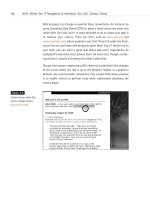
63
Taking Your Talent to the Web
Figure 2.12
Font Wars: In 1997, CSS
expert Todd Fahrner stuck
this image in an obscure
corner of the Web. It
proved why using
points was a brain-dead
approach to CSS (too bad
so few people listened). He
sarcastically observed that
if things got much worse,
Macs would have to use
Windows-size typographic
defaults. Three and a half
years later, Fahrner’s sar-
donic prediction came true
( />font_size/points/
font_wars.GIF).
04 0732 CH02 4/24/01 11:15 AM Page 63
Particularly since web designers began overcoming their fear of style
sheets, Windows-based designers who do not check their work cross-plat-
form have been giving Mac users type they could neither read nor enlarge
in the browser. On a PC, 8pt. type looks swell. On a Mac, it looks like 8 pix-
els, which is at least 1 pixel shy of legibility.
Year 2000—Browsers to the Rescue
In 2000, browser makers figured out how to compensate for this long-
standing problem. The first to do so was IE5 Macintosh Edition, released in
March 2000. IE5/Mac’s default setting is 16px type at 96ppi (Windows res-
olution). The Mac version of Netscape 6, released in November, followed
suit.
In IE5/Mac and Netscape 6, users can change their preferences and restore
the traditional “Mac” setting for text. By doing so, they risk continuing to
be frustrated by the typographic resolution differences between their plat-
form and the dominant Windows OS. But if they’re smart enough to change
their settings once, they’re smart enough to change them back again when
needed.
IE5/Mac also introduced text zooming, which enables users to enlarge (or
shrink) HTML and CSS text on the page, no matter how the designer has
formatted that text. This liberates web users from web designers’ mistakes
and makes the medium more accessible to the visually impaired. Netscape
6 offers similar functionality, though for some reason it was left out of the
Macintosh version (at least in the initial Netscape 6 release).
Of course, 4.0 browsers are still very much among us, and the 18-Month
Pregnancy period has only just begun. Consequently, cross-platform font
size issues will continue to plague the Web for some time to come. In Chap-
ter 10, “Style Sheets for Designers,” we’ll explain how to use style sheets
to compensate for all these incompatibilities.
64
WHY: Designing for the Medium: Typography
04 0732 CH02 4/24/01 11:15 AM Page 64
TOUCH FACTOR
When designing a book, your choice of materials and textures is limited
only by the client’s budget. When designing a website, you have no tex-
tures whatsoever. There is no “touch factor” in work designed for the dig-
ital screen. But this lack of sensory input does not mean that the site must
be a cold, detached, clinical object. There are many tools to help you bring
humanity and warmth to the Web.
Appropriate Graphic Design
Interactivity can go a long way toward simulating the effect of the “touch.”
For instance, when you move your mouse over or press the buttons at
www.k10k.net, they seem to respond to your touch—like buttons in the real
world. Intuitive, user-centered navigation helps as well. If the architecture
is designed the way users think, navigating the site will be simple pleasure.
There will be more on all that in Chapter 3. Smart, appropriate copywrit-
ing, which reads the way people talk, also can go a long way toward bring-
ing warmth and humanity to the onscreen experience.
These approaches enable anyone to create a site that feels like a living
entity. Failure to use these tools results in a site that feels cold and dead—
high tech, but not high touch.
ACCESSIBILITY, THE HIDDEN SHAME
OF THE
WEB
The framers of the Web intended it to be a medium of universal access—a
medium whose wealth of information would be accessible to anyone,
regardless of physical, mental, or technological disability. Anything that
stands in the way of that accessibility is contrary to the purpose of the Web.
It is also inhumane, and, as we alluded to earlier, it is now against the law:
65
Taking Your Talent to the Web
04 0732 CH02 4/24/01 11:15 AM Page 65
Section 508 of the Workforce Investment Act (www.usdoj.gov/crt/
508/508law.html) requires all United States Federal Agencies with web-
sites to make them accessible to individuals with disabilities. Inaccessible
sites can be shut down by the government. In the private sector, inacces-
sible sites face lawsuits. In 1999, a group of blind citizens successfully sued
America Online because its service was not accessible to them.
How do you design for the blind? It sounds like a paradox, but on the Web
it is actually fairly easy.
The Web Content Accessibility Guidelines of the W3C (www.w3.org/TR/
WAI-WEBCONTENT/) spell out everything designers must do to make their
sites accessible to all.
Here are some of the things you can do to make your site accessible:
■ Your <IMAGE> tags should include <ALT> text for the benefit of the
visually impaired; adding <TITLE> attributes is a good idea as well.
<ALT> and <TITLE> attributes can be spoken by audio browsers used
by the blind, so they don’t have to miss out on any content. For
example, your web page on the wreck of the Titanic includes a pho-
tograph of that ill-fated ship. A bad <ALT> attribute reads “Image,
24K.” Well, what good is that to the disabled user? So your site has
an image, so what? A good <ALT> tag will read “S.S. Titanic.” The
<TITLE> attribute can provide additional description: “Photograph of
the Titanic on her maiden voyage.”
■ If you use frames, include <NOFRAMES> content in the frameset
document. <NOFRAMES> text shows up in browsers that cannot
view frames. Old browsers fall into this category, but so do text
browsers such as Lynx and special browsers for the blind. By copy-
ing your text and pasting it into the <NOFRAMES> area, you guar-
antee that anyone can access the information on your site, even if
he or she cannot view your spectacular visual design efforts.
■ Even if most users will be navigating via snazzy visual menu bars at
the top of your site, be sure to include simple HTML links somewhere
on the page so that the disabled—or folks with older, non-JavaScript-
capable browsers—can still find their way around the site.
66
WHY: Designing for the Medium: Accessibility, the Hidden Shame of the Web
04 0732 CH02 4/24/01 11:15 AM Page 66
For more on accessibility and the law, see Alan Herrell’s article in A List
Apart, “Accessibility: The Clock is Ticking” (www.alistapart.com/stories/
access/).
USER KNOWLEDGE
A website must be designed so novice users can find their way through
it without trouble. At the same time, a good site offers shortcuts and power
tools for more experienced users. How do you serve these two very differ-
ent audiences at the same time? We’ll discuss that in the very next
chapter.
67
Taking Your Talent to the Web
04 0732 CH02 4/24/01 11:15 AM Page 67
04 0732 CH02 4/24/01 11:15 AM Page 68
chapter 3
Where Am I? Navigation
& Interface
“I LEFT MY BABY DAUGHTER in the car while I went to buy dope. Then I drove
away. I’d gone about five blocks when I realized my daughter wasn’t in the
car any more.”
So begins a brief personal narrative that fills most of the screen of a web
page. At the conclusion of this woeful tale, we see a link or button labeled
More Stories. We are likely to click it.
Before doing so, we notice that a small Narcotics Anonymous logo appears
in the upper left area of the screen and that four menu items appear in a
column on the right. The Face of Addiction, reads one. There Is a Solution,
reads another. Meetings, says a third, and Membership, reads the fourth.
Meetings takes us to a map of the United States. Clicking any city takes us
to a schedule of Narcotics Anonymous meetings in that city. The Narcotics
Anonymous logo, consistently placed at the upper left of every screen on
the site, takes us back to the first page, with its riveting personal narrative
and easily understood menu structure. Perhaps when we return to the
home page we are served a different personal story. This story may be a bit
longer than the first we encountered. After all, our attention is now
engaged because we have committed at least a few minutes of our time to
the site. At this point we are ready to involve ourselves with a slightly more
elaborate narrative.
05 0732 CH03 4/24/01 11:16 AM Page 69
This is one possible interface for the home page of Narcotics Anonymous,
a 12-Step program that helps addicts recover, one day at a time. Recovery
begins by facing the problem and telling the truth about one’s life—how-
ever painful that truth may be. The honesty of these stories enables the sto-
ryteller to get well and his listeners to identify with the problem his story
demonstrates. The prototype web interface parallels this process because
the designers have done their homework and found out how the “product”
(Narcotics Anonymous) actually works.
WHAT COLOR IS YOUR CONCEPT?
Notice that we have not said a word about graphic design, typography, or
technology. We are simply examining a prototype whose purpose is to
immediately engage readers in the site’s drama and promise. The site
achieves this by plunging the reader into content (but not too much con-
tent) and by supporting that content with a quickly comprehensible menu
structure, as well as a linear method of reading on (More Stories).
This simple site architecture, with its emphasis on human interest, provides
an immediate way for addicts to identify with an anonymous speaker and
thus begin to admit that they suffer from the same problem. It helps the
loved ones of addicts to recognize their husbands and wives as addicts and
start to understand why Harry or Sally is “that way.” The site does not
preach, nor does it overwhelm visitors with too much initial detail. Its care-
ful structure engages the minds of a specific audience and allows them to
get whatever level of support they need.
Every site should be this effective, whether it offers help for personal prob-
lems or half-price airfare. Every site should immediately engage its
intended audience with compelling content that invites exploration. A web
designer’s first job is to find the heart of the matter: the concept. The sec-
ond job is to ensure that readers understand it too. That is the purpose of
architecture and navigation.
70
WHY: Where Am I? Navigation & Interface: What Color Is Your Concept?
05 0732 CH03 4/24/01 11:16 AM Page 70
BUSINESS AS (CRUEL AND) USUAL
How would ineffective web designers and clients approach the Narcotics
Anonymous project? It wouldn’t be by providing immediately engaging
content, nor by offering a streamlined menu with both global and linear
functionality. They would likely present a standard menu bar with five to
ten choices, a tedious welcome message, stock photos of smiling families
implicitly representing addicts in recovery (at least, in the designer’s mind),
and overtly commercial tie-ins to an online retailer selling self-help books.
The interior of the site might offer similar content to that contained in our
imaginary prototype, but the content would be buried several layers down
in the site’s hierarchy, where only the most dedicated would stand a chance
of finding it. Instead of capturing and presenting the essence of the client’s
message, the site would merely mimic the boring “professional” surface
appearance of thousands of other sites. Instead of potentially saving lives,
the site would merely be one more roadblock in an addict’s troubled life.
How would cutting-edge web shops approach the project? Possibly by cre-
ating a 250K introductory Flash movie featuring a spinning hypodermic
needle. The needle might morph into a rotating navigational device. Or it
might fill with blood that drips to form letters spelling out some horrific
statistic on the mortality rate of drug addicts. Such a site might win awards
in a graphic design showcase, but it would not help a soul.
In all probability, the Narcotics Anonymous organization would never com-
mission a site like any of these, nor would we expect many drug addicts to
go online in search of help. We’ve chosen this example because it quickly
dramatizes the difference between effective and ineffective web design. In
the case of Narcotics Anonymous, it could mean the difference between
life and death. But this is equally true for any business or organization that
requires an online identity—except that what’s at stake is not the reader’s
life, but the survival of the business itself. Sites with strong concepts and
solid, intuitive architecture will live. Sites lacking those things will die.
Web design is communication. It says specific things to specific people. It
does this by offering meaningful content in the context of focused digital
architecture. Navigation and interface are the doors to that architecture.
71
Taking Your Talent to the Web
05 0732 CH03 4/24/01 11:16 AM Page 71
In a consumer society, communication is a function of time. Traditional
designers and art directors are trained in the art of instant communication.
They understand that consumers make split-second decisions based on
emotional responses to visual information. Which toothpaste gets tossed
into the shopping cart? A stripe of color may make one dentifrice appear
more clinically effective than its competitor. Which paperback is bought in
the airport bookstore? Color and typography make one book leap off the
shelves while another is ignored. Which of a thousand billboard messages
is remembered? The one with the smart line of copy and complementary
image lingers in the mind.
When traditional designers and art directors take their talent to the Web,
their consummate understanding of the power of the image would seem
to position them as the ideal architects of the sites they design. After all,
who knows better how to focus and deliver the appropriate message before
the consumer has time to click the browser’s Back button? In good shops,
skilled web designers are empowered to do what they do best, but this is
not the case in every web agency. Some shops constrict the designer’s abil-
ities by forcing her into a more limited role.
THE RISE OF THE INTERFACE DEPARTMENT
Traditional designers and art directors work in Design Departments and
Creative Departments. The existence of these departments indicates the
importance traditional media businesses place upon design—and rightly so.
In such businesses, designers play an essential role in the formation of con-
cepts and images that convey brand attributes and communicate mean-
ingful intellectual and emotional propositions.
Sadly, many otherwise savvy web agencies do not have Creative or Design
Departments at all. Nor do creative directors or lead designers show up
often enough on some of these companies’ organizational charts. What
they frequently have instead are Interface Departments, implicitly or
explicitly staffed by “interface designers.” This departmental label trivial-
izes and may even constrict the web designer’s potential usefulness as
brand steward, conceptualist, structural architect, and user advocate.
72
WHY: Where Am I? Navigation & Interface: The Rise of the Interface Department
05 0732 CH03 4/24/01 11:16 AM Page 72
When a web designer is reduced to the handwork of graphic design, some-
body else determines the overall focus and architecture of the site. Never-
theless, the rise of the Interface Department is telling because it underlines
the supreme importance of interface design to web development.
Designing interfaces is only part of a web designer’s job in the same way
that working with actors is only part of a movie director’s job. A director
who can’t work with actors will make a lousy movie, and a web designer
who can’t devise the most communicative interface for each particular site
will serve up mediocrity. Websites provide content; interfaces provide con-
text. Good interfaces support the visitor’s (and client’s) goals by visually
and structurally answering two urgent questions:
1. What is this? What kind of site is this? What is its purpose? What
messages are being conveyed or services offered? For whom is this
site intended? If it’s intended for me, does it offer the product or
information I’ve been seeking, or is it all show and no substance?
2. Where am I? What kind of space is this? How does it work? Can I
find what I need? If so, can I find it quickly? If I take a wrong turn,
can I find my way back?
When a web designer fully understands the nature of the product or serv-
ice, as in the example of the Narcotics Anonymous prototype above, then
content and context, meaning and architecture, are one. Not only does the
Narcotics Anonymous prototype quickly reveal the site’s purpose by
emphasizing appropriate text, it also understands and fulfills its potential
viewer’s gut-level needs by functioning simply and transparently. A wife
who fears her husband is becoming an addict does not have time to waste.
If the site confuses her, she’s gone.
When a web designer does not fully understand the nature of the product
or service—or understands but is not empowered to act upon that under-
standing—we get sites that excite and engage no one. Or we get poten-
tially engaging sites that confuse and estrange the very people they worked
so hard to attract.
73
Taking Your Talent to the Web
05 0732 CH03 4/24/01 11:16 AM Page 73
There are too many such sites on the Web. What businesses must under-
stand is that vague, non-engaging interfaces are a death sentence because
they alienate potential readers, members, or customers rather than reas-
suring them that they’ve come to the right place. Good web design plunges
the visitor into the exact content appropriate for the most efficient (and
personal) use of the site and continues to guide him or her through each
new interaction.
Movies immediately plunge a protagonist (and the audience) into conflict
and action. Entertainment sites can work the same way.
Newspapers carry many stories but call the reader’s attention to the most
important ones. Content sites can work the same way.
Stores sell many products, but special displays on featured products arrest
shoppers’ attention as they enter. Commercial sites can work the same way.
FORM AND FUNCTION
Effective interfaces not only lead visitors to the content but also under-
score its meaning, just as chapter divisions underscore the meaning of a
book’s content. Without usable, intuitive interfaces, websites might as well
offer no content at all—because no visitor will be able to find it.
At their most basic level, web interfaces include navigational elements
such as menu bars, feedback mechanisms such as interactive forms and
buttons, and components that guide the visitor’s interaction with the site
such as magnifying glass icons and left or right arrows. Tired interfaces
offer exhausted metaphors such as the ubiquitous folder tab and the
heinous beveled push-button. Better interfaces are uniquely branded and
help reinforce the site’s thematic concerns (see Figure 3.1).
The Mary Quant site is a study in quick visitor orientation and structurally
grounded design. the dominant but fast-loading photograph telegraphs
“1960s” and “mini-skirt,” which are the essence of fashion designer Mary
Quant’s legacy. The flower motif reinforces the 1960s theme as well as
Quant’s identity. A large flower fills in the space behind appropriately min-
imal text content; this is a fashion site, not a Ph.D. dissertation. Smaller
flowers brand the five simple structural divisions: History, Makeup, Press
Office, Shops, and Homepage.
74
WHY: Where Am I? Navigation & Interface: Form and Function
05 0732 CH03 4/24/01 11:16 AM Page 74
Figure 3.1
The Mary Quant site—the
perfect combination of
solid design and ease of
use (www.maryquant.co.uk).
The History label is faded to reinforce the visitor’s position within the site’s
hierarchy. The Previous and Next buttons are placed left and right where a
western audience would expect them and where even non-English speak-
ers (at least those who read from left to right) will likely understand what
these buttons do.
Although this is a fashion site, its structure is nearly identical to that
sketched out in our imaginary Narcotics Anonymous prototype. The Previ-
ous and Next buttons provide linear navigation. Menu icons let the visitor
jump from section to section. Engaging visual and text content match the
desires of the intended audience.
Sophisticated interfaces work on multiple levels. On a well-made catalog
site, not only will visitors find a main navigation bar, they also will be
guided by contextual, user-driven navigational elements throughout the
page. Both the photograph and the text description of a blue parka can
serve as links to more detailed photographs and information or to an order
form. The product photo caption may include a link to More Items Like This
One, initiating a new and more focused search. Navigation does not live by
menu bars alone.
75
Taking Your Talent to the Web
05 0732 CH03 4/24/01 11:16 AM Page 75
Figure 3.2
Multi-level navigation in
action: the Gap site pres-
ents visitors with an over-
all menu bar but does not
limit them to it. Clicking
the model’s photograph…
76
WHY: Where Am I? Navigation & Interface: Form and Function
Figure 3.3
…links the visitor to a
page displaying the jacket
the model is wearing,
along with relevant text
information and the
opportunity to buy the
item (www.gap.com).
05 0732 CH03 4/24/01 11:16 AM Page 76
COPYCATS AND PSEUDO-SCIENTISTS
A site’s navigational interface is the leading edge of the visitor’s experi-
ence. It facilitates human needs or thwarts them. If it is not intuitive, it is
useless. One reason we have so many unimaginative interfaces (visual
Muzak) is because their familiarity makes them appear intuitive, and they
therefore survive the pre-launch “user testing” phase.
For several years, nearly all sites offered left-hand navigation (menu items
on the left side of the web page, content on the right). Was left-hand nav-
igation easier to use or understand than any other configuration? No. In
fact, some studies suggested that navigation worked better on the right.
Navigation cropped up on the left because it was easier for web designers
and developers to create HTML that way—and later, it was easier to con-
trol <FRAMES> that way.
Because it was easier to program, a few large sites such as CNET.com
began offering left-hand navigation. Since CNET.com was a successful site,
unimaginative web agencies copied its interface in hopes that CNET’s suc-
cess would somehow rub off on them. With so many sites engaging in this
practice, consumers got used to it. Thus, in unsophisticated user
acceptance testing, left-hand navigation was considered “intuitive”
because consumers were accustomed to seeing it—not because it had any
intuitive advantages on its own. The “folder tabs” metaphor used at Ama-
zon.com has been copied for the same reasons. Every Nike spawns a thou-
sand swooshes; every successful site with a particular stylistic flourish
leaves a hundred thousand imitators in its wake. Bad processes encourage
bad design.
There are good marketers and there are dolts in suits. Similarly, there is
good user acceptance testing and there is worthless pseudo-science that
promotes banality. Unfortunately, worthless pseudo-science is as easy to
sell to web agency CEOs as it is to clients. It’s hard to tell until you’re actu-
ally working at a web agency whether its testing practices are informative
or a shortcut to Hell. An engaged and thoughtful web designer will develop
and fight for the best navigational structure for each site, knowing that
each site is unique because its content and audience are unique.
77
Taking Your Talent to the Web
05 0732 CH03 4/24/01 11:16 AM Page 77
CHAOS AND CLARITY
Beyond providing access to and subtly reinforcing a site’s content, the
interface also enables people to engage in interactive behaviors, such as
shopping and searching. Or it frustrates them and sends them scurrying to
a competitor’s site, as in Figure 3.5, where clutter and lack of differentia-
tion create chaos rather than a satisfying user experience. Sites of this
nature, if they do not die immediately, persist in spite and not because of
their architecture. They survive by offering something of value to those
who are willing to overlook the experience’s deficiencies. With better
architecture they would attract more customers.
78
WHY: Where Am I? Navigation & Interface: Chaos and Clarity
Figure 3.4
Ye Olde Left-Hand Nav Bar
in action, seen here on the
Winter 2000 edition of
Icon Factory, creators of
free, funky Mac desktop
icons since 1995
(www.iconfactory.com).
The left side is no better or
worse than any other
menu placement. But for
several years, nearly all
sites stuck their menus on
the left because, well,
nearly all sites stuck their
menus on the left. Most
left-hand navigation bars
are nowhere near as cute
‘n cuddly as Icon Factory’s.
05 0732 CH03 4/24/01 11:16 AM Page 78
We once inherited an entertainment site that worked only on one platform
and one browser (no names, please). Our client pointed out that he was
getting four million visits a month. We replied that he was cheating him-
self out of an additional million visitors. Similarly, the owners of cluttered
and confusing sites frequently mistake a profit margin for success. Better
user experiences mean bigger profits, which is the best way to sell them to
clients whose sole concern is money.
Clients are not alone in sometimes forgetting that sites are created to serve
human needs. Web designers also can lose sight of their work’s primary
objective.
79
Taking Your Talent to the Web
Figure 3.5
Where do I go from here?
Most likely, my browser’s
Back button. Busy inter-
faces bore or confuse
all but the most die-
hard bargain seeker
(www.overstock.com).
05 0732 CH03 4/24/01 11:16 AM Page 79
A Design Koan: Interfaces Are a Means too
Often Mistaken for an End
As web designers become expert at crafting more and more sophisticated
navigational structures, we sometimes forget that our interfaces do not
come into being for their own sake. Interfaces are built to serve the user,
not to demonstrate our cleverness and technical mastery (unless cleverness
and technical mastery are an essential part of the brand). The best design
may go unnoticed by users, but Heaven is watching and you will get your
reward.
Universal Body Copy and Other Fictions
Good copy comes from the product; good interfaces come from consider-
ing the particular audience, content, and brand attributes of each site.
When navigation anticipates the visitor’s needs and guides her through the
site, it succeeds at the baseline level. When it does this in a fresh and
brand-appropriate manner, it succeeds as effective web design.
In this sense, web design is no different from advertising, print, or product
design. At the lowest level, an advertisement’s text must be grammatical,
and its presentation must be legible. At the highest levels, design and con-
cept are indistinguishable from the product experience. (Many would say
they are the product experience.)
Impeccable graphic design does not necessarily equate to good interface
design. As suggested by the design koan above, a site that looks drop-dead
gorgeous but confuses visitors is a site that fails.
At the turn of the Millennium, several high-stakes web businesses went
under because they forgot that their interfaces were supposed to be used
by human beings. Looking at comps and demos, the board members said,
“Oooo-Ahhh!” But when attempting to navigate the completed sites, the
public went, “Huh?” The public is the final court of appeals.
80
WHY: Where Am I? Navigation & Interface: Chaos and Clarity
05 0732 CH03 4/24/01 11:16 AM Page 80


