Taking Your Talent to the Web: A Guide for the Transitioning Designer- P7 pot
Bạn đang xem bản rút gọn của tài liệu. Xem và tải ngay bản đầy đủ của tài liệu tại đây (454.25 KB, 20 trang )
HIGHLIGHTS AND BREADCRUMBS
Drivers use road signs to track their location in space. Web users rely on
navigation. Well-designed sites cue the visitor to her location within the
site’s hierarchy. For instance, if the visitor is within the Breeds section of
the cat site, the Breeds item in the menu bar may be highlighted by a sub-
tle change of color. This “you are here” indicator helps keep the visitor
grounded, thus promoting lengthier visits (see Figure 3.17).
101
Taking Your Talent to the Web
It’s all about comfort. Better hotels offer fluffier pillows; better sites pro-
vide constant spatial and hierarchical reassurance. Breadcrumbs, called
this because they resemble the trails left by Hansel and Gretel, not only
serve as hierarchical location finders, but they also allow visitors to jump
to any section further up in the hierarchy (see Figure 3.18).
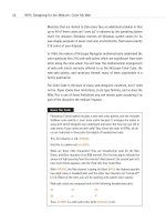
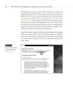
Figure 3.17
Subtle highlighting on the
menu bar reminds you that
you’re on the Home Store
page. Click to a different
page, and a different menu
item will be highlighted.
Note, too, how much air
the design team has
managed to work into the
page, in spite of the vast
number of links and menu
items the page must carry
(www.bloomingdales.com).
Compare with Figure 3.16
and contrast with Figure 3.5.
05 0732 CH03 4/24/01 11:16 AM Page 101
CONSISTENT PLACEMENT
The location of the navigation in the digital nation permits much permu-
tation without causing perturbation. Navigation can exist in a horizontal
strip at the top or bottom of the site. It can live in a navigation bar on the
left or right side of the page. It also can float in a JavaScript remote popup
window (as long as alternatives are provided).
What matters most, aside from technological and user appropriateness
(remote popup window navigation is probably not the best choice for the
Happy Valley Retirement Home), is that the navigation stay in one place so
the user knows where to find it when he or she is ready to move on. A
handrail guides someone down a flight of stairs, and the guidance works
because the handrail remains in the location where the user expects to find
it. Good site navigation works the same way. With few exceptions, it does-
n’t really matter where you stick your navigation as long as you keep stick-
ing it there throughout the site.
102
WHY: Where Am I? Navigation & Interface: Consistent Placement
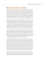
Figure 3.18
Breadcrumbs remind you
that you’re on the Miles
Davis page of the Artists
section. Essential to
complex directories,
breadcrumbs can enhance
branding, entertainment,
and content sites by pro-
viding alternative naviga-
tion for those using
less-capable browsers.
They reassure beginners
while enabling sophisti-
cated users to skip tedious
hierarchical layers and
move quickly to the exact
content they seek
(www.jazzradio.net).
05 0732 CH03 4/24/01 11:16 AM Page 102
BRAND THAT SUCKER!
We’ve discussed navigation and interface in terms of the user’s needs, and
they of course come first. But what of the client’s needs? Meeting them is
the role of branding.
A corporate website is the online expression of that company’s brand iden-
tity. Making sure that the navigation fully supports the company’s brand
identity is crucial to the success of the site (and sometimes to the success
of that company). Build the most navigable, information-filled site in the
world, and if it lacks a coherent brand identity, nobody will remember it,
nobody will tell their friends about it, and nobody will bother to bookmark
it and return.
For over 100 years, advertisers have been working to build our joyful world
of branding. When your stomach hurts, you reach for Alka-Seltzer (not an
antacid). Sneeze, and you reach for Kleenex (not a disposable paper tissue).
103
Taking Your Talent to the Web
Figure 3.19
What’s the “best” place
for navigational menus?
That’s up to the web
designer. Caffe Mocha
runs its menu bar
horizontally across the
middle of the page
(www.caffemocha.com).
05 0732 CH03 4/24/01 11:16 AM Page 103
Like millions, we may express our individuality through Levi’s. You may
choose Gap to show the world how different you are. Neither of us, as we
don our separate uniforms, is likely thinking about the folks who picked the
cotton, or groomed the silkworms, or trimmed the fleece from the sheep.
Consciously or unconsciously, we’re identifying ourselves with images cre-
ated in small offices, thousands of miles from where the cotton grows and
the silkworm arches toward the sun—images created by brand advertising.
Branding, branding, branding. McDonald’s does not sell cereal mixed with
the flesh of cows; it sells food, folks, and fun. Marlboro sells the myth of
the freedom of the Wild West. Camels are not for everybody, but then, they
don’t try to be.
Branding is not limited to products. Although his verbal gymnastics, half-
spoken vocal delivery, and angry social consciousness predate Rap, Bob
Dylan can’t perform Hip Hop; it would conflict with his brand image as the
spokesman of the 1960s generation. But David Bowie can do hip-hop or
drums-and-bass because his brand identity is that of an ever-changing,
ever-current chameleon.
And how come Seinfeld can quip wisecracks about supermarket checkout
lines but will never mine his personal sexual experiences for comic mate-
rial? Hey, it’s not part of the brand.
How does this relate to the task of web design? As a designer, you know
the answer to this one already. Whether you’re building a corporate site or
a multimedia online funhouse, your first task is to understand and trans-
late the existing brand to the web medium or to create a new brand from
scratch.
Good interfaces reflect the brand. Sleek, high-tech graphics complement a
sleek, high-tech company—or one that wants to be perceived that way. A
“friendly” GUI is necessary for a “friendly” company such as AOL. (You in
the back, keep your sarcastic observations to yourself.) It goes without say-
ing that the company’s color scheme, logo, and typographic style must be
reflected in your web graphics and that existing print and other materials
are often a guideline to what is appropriate for the site.
104
WHY: Where Am I? Navigation & Interface: Brand That Sucker!
05 0732 CH03 4/24/01 11:16 AM Page 104
105
Taking Your Talent to the Web
Smart web designers go far beyond the obvious. In addition to graphic
design elements, savvy web folk craft interfaces whose very functioning
reflects and extends the brand. A “fun” brand needs more than cute graph-
ics. Its sectional titles should be fun to read and its menu fun to interact
with. This may mean taking a cue from the world of gaming. It may mean
building the interface in Macromedia Flash.
A movie studio’s interface should not resemble that of a bank. A company
that sells active wear should encourage active participation, through
games, message boards, or contests. A literary site’s interface should qui-
etly promote reading, instead of busily distracting from it with funky danc-
ing icons. (A literary site that avoids long copy belies its own brand
identity.) The interface of a religious organization’s site dare not resemble
that of an e-commerce site, lest visitors along with moneylenders be driven
from the temple.
IBM’s brand image is that of a big-time solutions provider (www.ibm.com).
If you’re asked to design their site, it had better be technologically solid,
visually impeccable, and easy to use. Anything less will send the wrong
brand message.
■ Technologically solid, in this brand context, doesn’t mean a deluge
of plug-ins or a reliance on safe, old 1990s web technologies; it
means online forms that work, search functions that deliver usable
results, and enhancements that shine in new browsers while degrad-
ing well in old ones.
■ Visually impeccable means that imagery and typographic choices
must play in the key of the brand. Type should be clean and read-
able—not fussy, not grungy, not softly feminine or boyishly abrasive.
Photographic images need not be disgustingly corporate (two suits
at a monitor will take you only so far), but images of crime, drugs, or
bongo jams will obviously be inappropriate.
■ Easy to use means easy to use. Why even mention it? Because if vis-
itors find their way to content they seek on the IBM site, it reinforces
the overriding brand idea that IBM provides solutions. If users get lost
or don’t know which button to push, it will send the opposite mes-
sage. Sending the wrong brand message could harm a brand identity
the company has carefully built up over generations.
05 0732 CH03 4/24/01 11:16 AM Page 105
Branding the WaSP
The Web Standards Project (WaSP), mentioned in Chapter 2, evolved from con-
versations between a number of frustrated web designers and developers.
While some members brought high-level technological knowledge to the proj-
ect and others brought “marquee value” (their names alone adding instant
credibility to anything the WaSP might say or do), your humble author focused
on creating a brand identity that would be both memorable and consistent
with the task at hand.
Many names were bandied about; we pushed “The Web Standards Project” for
a variety of reasons, not least of which was its ability to be referred to in short-
hand by the acronym WaSP. Call us shallow, but we believed that this aggres-
sive little insect was the perfect metaphor for our group. We also knew that
a memorable identity was needed to keep the effort from becoming so tech-
nologically-focused as to confuse potential members.
After all, by agitating for compliance with web standards, we were taking on
giant companies such as Netscape and Microsoft in spite of being a small
grassroots effort. Which tiny creature has the power to disturb a giant? The
wasp. It’s a purposeful, productive beast with a powerful stinger, and while
you may be able to swat away one wasp, you don’t want to mess with an angry
nest. The site’s verbal tone and visual approach came straight out of this sim-
ple little brand image—from the color palette (wasp-yellow, gold, and black)
to the tone of voice (www.webstandards.org).
When Kioken Inc. (www.kioken.com), a leading New York web shop, was
charged with designing a site for the high-end retailer, Barney’s, they
carefully considered the client’s brand identity as a provider of well-made,
tasteful, and luxurious clothing. To put it bluntly, Barney’s goods are well
above the means of most of us working stiffs, and Barney’s customers like
it that way.
Kioken crafted a sophisticated, Flash-based interface like nothing else on
the Web (www.barneys.com). If you were a savvy web user, owned a fairly
powerful PC, had a fast connection, and were equipped with the latest
Flash plug-in, you were treated to a unique showcase of Barney’s clothing.
Just navigating it made you feel smarter than the average web user.
If you were not an experienced web user, owned an old PC, had not down-
loaded the latest Flash plug-in, and were stuck with a slow dialup modem
connection, Kioken (and their client) figured that you were not really a Bar-
106
WHY: Where Am I? Navigation & Interface: Brand That Sucker!
05 0732 CH03 4/24/01 11:16 AM Page 106
107
Taking Your Talent to the Web
ney’s customer anyway. A certain elitism was as much as part of the inter-
face as it is of the store. The Barney’s site may not exemplify democratic
humanism, but it is a perfect web translation of the client’s brand.
Some critics faulted Barneys.com for failing to provide an e-commerce
solution. You could look at Barney’s clothing, but you could not buy it
online. The criticism betrays a misunderstanding of the client’s brand iden-
tity. You expect to be able to buy jeans from Sears’ website, but to buy Bar-
ney’s clothing online would be wrong for such a highfalutin’ brand.
Interfaces that deeply and meaningfully reflect the brand will encourage
repeat user visits and repeat assignments from your clients. As a web
designer grounded in traditional art direction and design, you are better
equipped than many working professionals to create brand-appropriate
web interfaces: interfaces that don’t just look like the brand, they behave
like it.
Interfaces that look and act like the brand and that guide the right audi-
ence to the most important content or transactions form the foundation
for the best sites on the Web—the ones you are about to design.
05 0732 CH03 4/24/01 11:16 AM Page 107
05 0732 CH03 4/24/01 11:16 AM Page 108
Part II
WHO: People, Parts,
and Processes
4 How This Web Thing Got Started 111
5 The Obligatory Glossary 123
6 What Is a Web Designer, Anyway? 135
7 Riding the Project Life Cycle 147
06 0732 Part II 4/24/01 11:17 AM Page 109
06 0732 Part II 4/24/01 11:17 AM Page 110
chapter 4
How This Web Thing Got
Started
1452
GUTENBERG CONCEIVES OF MOVEABLE TYPE based on a punch-and-mould
system. Working with paper (brought to Europe from China in the twelfth
century), oil-based ink, block print (brought to Europe by Marco Polo in the
thirteenth century) and a wine press, he sets the stage for the mass pro-
duction of books and the wide dissemination of learning.
1836
Cooke and Wheatstone patent the telegraph, thus bringing telecommuni-
cations to the world. For the first time in history, two people can carry on
an argument even when they are miles apart.
1858
The first Atlantic cable is laid across the ocean floor, facilitating telecom-
munications between Europe and the United States. Unfortunately, the
cable goes on the fritz after just a few days. (And you thought your cable
service was bad.) A second attempt in 1866 succeeds. That cable will
remain in service for close to a century.
07 0732 CH04 4/24/01 1:02 PM Page 111
1876
Alexander Graham Bell demonstrates the telephone. The first busy signal
follows soon after.
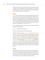
WHY WE MENTIONED THESE THINGS
The events we just mentioned set the stage for the Internet and thus even-
tually for the Web. Gutenberg’s invention sets in motion the concept that
information belongs to the people (at least, to those people with a few
coins in the pockets of their funny fifteenth-century pants). The subse-
quent technological breakthroughs make possible the eventual sharing of
data via telephone lines.
1945
Vannevar Bush, Science Advisor to U.S. President Roosevelt, proposes
a “conceptual machine” that can store vast amounts of information
linked by user-created associations. He calls these user-generated con-
nections “trails and associations.” Eventually they’ll be called “hyper-
links.” (As We May Think, www.theatlantic.com/unbound/flashbks/
computer/bushf.htm).
1962
The Advanced Research Projects Agency Network (ARPANET) is established,
which will eventually be known as the Internet. Dr. J.C.R. Licklider is
assigned to lead ARPA’s research into the military application of computer
technology.
1965
Scientist Ted Nelson coins the word hypertext to describe
“nonsequential writing—text that branches and allows choice
to the reader, best read at an interactive screen.” (See http://
www.acclarke.co.uk/1960-1969.html and />~wwwbtb/book/chap1/htx_hist.html for more information.)
112
WHO: How This Web Thing Got Started: Why We Mentioned These Things
07 0732 CH04 4/24/01 1:02 PM Page 112
Nelson dreams of a worldwide library of all human knowledge that can be
read on a screen and based on links. Sound familiar? Nelson also dreams
of micropayment-based royalty schemes, two-way links, and other fea-
tures not found in the Web as we know it.
1966
ARPA scientist Robert Taylor, no doubt depressed when women find out he
is not the movie star Robert Taylor, figures out a way for researchers at var-
ious locations to collaborate by means of electronic computer networks.
Inexpensive terminals are linked to a few pricey mainframe computers. Sci-
entists begin exchanging documents and email messages. The first public
demonstration of what is now being called ARPANET will take place in
1972. The Internet is born.
1978
On January 3, Steve Jobs and friend, Woz, take Apple Computer public, thus
launching the personal computer “revolution.” As Gutenberg’s invention
brought human knowledge out of the monastery and into the hands of
ordinary citizens, Jobs and Woz’s invention takes the arcane business of
data crunching out of the realm of Big Science and makes it available to
folks like us. The subsequent Macintosh computer (1984) offers a Graphi-
cal User Interface (GUI), making it easier still for ordinary people to use a
computer. The Graphical User Interface, based on work done in Xerox Parc
in the 1970s, enables people to perform tasks by clicking onscreen icons
and buttons. Most civilians find this easier than memorizing and typing
cryptic commands. A Windows GUI follows in the PC realm. The point-and-
click interface will be key to the eventual acceptance of the Web.
1981
The domain name server (DNS) is developed, thus making the future
safe for web addresses (www.ietf.org/rfc/rfc0799.txt). At first these will
have cryptic numerical “names” such as 191.37.4211, but eventually
consumer-friendly domain names such as brandname.com will take their
place. This is key because advertisers would see little value in adding
“Visit us at 191.37.4211” to the end of their radio commercials but are
113
Taking Your Talent to the Web
07 0732 CH04 4/24/01 1:02 PM Page 113
perfectly happy asking us to visit brandname.com. When advertisers are
happy, they spend money. When money is available, professionals
arise to claim it. The rise of web design and development is thus
partially made possible by the invention of consumer-friendly domain
names.
1984
The Apple Macintosh ushers in an era of “desktop publishing,” empowering
designers to set their own type and place and color-correct their own
images, rather than relying on the skills of third-party service profession-
als. Desktop publishing also empowers ordinary citizens to express them-
selves creatively, sometimes (though not always) with wonderful results.
This too will be mirrored a decade later, when the Web empowers anyone
with a computer and the willingness to learn HTML to become a “web
designer.”
As if all that was not enough, Apple makes use of Ted Nelson’s hypertex
concept in its HyperCard product, which enables creative folks to create
link-based presentations.
1986
There are now 5,000 Internet hosts (computers connected to the Internet
“backbone”) and 241 newsgroups.
On the campaign trail, Al Gore makes frequent reference to the developing
“Information Superhighway.” The phrase actually refers to high-speed
coaxial networks, but it is popularly understood to mean ARPANET or the
Internet. Press confusion on the subject will later haunt Gore’s 2000 bid for
the U.S. presidency.
1988
The NSFNET backbone is upgraded to T1 (1.544 Mbps). We’re not sure what
this means either, except that stuff gets a lot faster.
Internet Relay Chat (IRC) is developed in Israel, thus paving the way for
a future where office workers can complain about their jobs to friends
in foreign lands, instead of simply boring their spouses with these petty
grievances.
114
WHO: How This Web Thing Got Started: Why We Mentioned These Things
07 0732 CH04 4/24/01 1:02 PM Page 114
1989
Tim Bray and others cofound Open Text, an Internet search engine. Search
engines cut through the chaos of the burgeoning Internet by enabling cit-
izens to actually find things. This ability to find things brings value to the
Net and will be an invaluable aspect of the coming Web. Search engines
will eventually enable citizens to find half-price airline tickets or seek out
information to help their children write school reports. The human and
commercial potential built into that premise will empower the coming
“revolution” of faster and faster networks, and larger and larger web agen-
cies such as Scient, iXL, and Razorfish.
CERN is the biggest Internet site (location) in Europe. Working there is a
young scientist, Tim Berners-Lee.
1990
On the twelfth of November at CERN, Tim Berners-Lee (with R.
Cailliau) invents the World Wide Web, rooting the idea in hypertext:
“HyperText is a way to link and access information of various kinds as a
web of nodes in which the user can browse at will… A program which pro-
vides access to the hypertext world we call a browser… World Wide Web
(or W3) intends to cater for these services across the HEP [High Energy
Physics] community.” (See />Not content with the profundity of this invention, Berners-Lee also devel-
ops a “web browser” on his NeXT machine. With Berners-Lee’s browser, not
only can you view web pages, you can also edit and design them. Fortu-
nately, the “designing” part of the browser does not make it far out of
Berners-Lee’s lab, and thus the way is paved for professional designers and
art directors, rather than scientists, to create the visual language of the
Web. (The original CERN W3 package included a server, a browser, and a
true WYSIWYG editor.)
1991
America Online (AOL) begins offering Internet access in addition to its pro-
prietary content and newsgroup features. Millions of people begin “going
online” thanks to AOL’s easy-to-use point-and-click functionality and con-
sumer-friendly brand imagery. This is important because if the Internet had
115
Taking Your Talent to the Web
07 0732 CH04 4/24/01 1:02 PM Page 115
remained the province of geeks, the Web would not have gained such ready
acceptance, let alone exploded into public consciousness. You would not
be thinking about a career in web design, and this book would be all about
delicious low-fat recipes rather than the Web.
1993
January: Marc Andreessen and Eric Bina, young programmers working for
the National Center for Supercomputing Applications (NCSA) invent a
point-and-click graphical browser for the Web, designed to run on UNIX
machines. It is called Mosaic because the name Pantaloons didn’t do as
well in testing. (Just kidding. Not kidding about Mosaic, they did indeed call
it that. Just kidding about why they called it that because we frankly don’t
know and this paragraph felt a little “short” to us.)
August: Andreessen and his co-workers release free versions of Mosaic for
Macintosh and Windows PCs.
December: Andreessen quits his day job.
There are two million Internet hosts and 600 websites.
The NCSA “What’s New” page (www.ncsa.uiuc.edu/SDG/Software/Mosaic/
Docs/whats-new.html) is both an early non-commercial web directory
and one of the first weblogs. A weblog is a frequently updated, annotated
directory of stuff on the Web. In 1998, weblogs (always quietly pres-
ent) would “catch on” again thanks to sites such as Scripting News
(scripting.com), Robot Wisdom (www.robotwisdom.com), and Memepool
(www.memepool.com). By 1999 they would become downright trendy, as
hundreds of web designers create personal weblogs to keep their friends
abreast of the sites they like, while thousands of first-time web publishers
use tools such as Blogger, Manila, and Pitas to produce their own personal
“Blogs.”
1994
Marc Andreessen hooks up with Jim Clark, founder of Silicon Graphics Inc.
The two form a company called Mosaic Communications Corporation to
promote their Netscape web browser. NCSA, holders of the Mosaic trade-
mark, balk at this use of their trademark, eventually prompting the young
browser company to rename itself Netscape Communications.
116
WHO: How This Web Thing Got Started: Why We Mentioned These Things
07 0732 CH04 4/24/01 1:02 PM Page 116
Two graduate students, Jerry Yang and David Filo, form Yahoo! (Yet Another
Hierarchical Officious Oracle), a directory whose purpose is to keep track
of the websites springing up everywhere (www.yahoo.com). The site is
organized somewhat like a library’s card catalog system. Other directories
of lesser quality quickly spring up in imitation.
Wired Magazine’s Hotwired site evangelizes the new medium and pioneers
techniques of web design and web architecture.
Tim Berners-Lee founds the World Wide Web Consortium (W3C), an inter-
national non-profit think tank dedicated to providing a rational roadmap
for the technological advancement of the Web.
People begin designing and producing personal sites because they can.
“Justin’s Links from the Underground” (www.links.com) is one of the fir-
st and most famous personal sites. Glenn Davis launches Cool Site of
the Day (www.coolsiteoftheday.com) to keep track of interesting or funky
content on the rapidly growing Web.
1995
Pushed into public consciousness and acceptance by the coolness of
Netscape’s Navigator graphical browser and by sites such as Cool Site of
the Day, the Web mushrooms. There are now 6.5 million hosts and 100,000
websites.
The Web functions well, but its design potential is sadly underdeveloped.
David Siegel, a typographer and early web designer, publishes “Web Wonk”
(www.dsiegel.com/tips/), an online tutorial offering techniques with which
designers can create pleasing, magazine-like page layouts on the Web by
working around (hacking) the limitations of HTML—the language with
which web pages are created. These techniques seriously conflict with the
purpose of HTML as a simple, structured language for sharing documents.
But they are all designers have to work with at this time. The rift between
the W3C and graphic designers has begun. (In 1996, Siegel publishes the
book, Creating Killer Websites. Though far from the first how-to guide, it
will be one of the first books to treat web design as a serious issue.)
Netscape introduces the tiled background image in Navigator 1.1. Warner
Brothers’ “Batman Forever” site is among the first to make intelligent use
of the feature, hacking it to create the illusion of full-screen images.
117
Taking Your Talent to the Web
07 0732 CH04 4/24/01 1:02 PM Page 117
Batmanforever.com helps prove that the Web has tremendous potential for
anyone wishing to promote an idea, event, or product. There are three mil-
lion web users, and half of them—1.5 million people—view this one site
every week.
Jakob Nielsen, a Ph.D. from Sun Microsystems, begins publishing articles
(www.useit.com) calling for a rational approach to the development of the
Web. Nielsen calls his approach “usability” and claims that it is based on
scientific studies. The rift between designers and usability experts has
begun.
Personal home pages are proliferating.
Yahoo! and other large sites begin running ad banners.
Netscape goes public.
1996
David Siegel creates “High Five” to honor and showcase the
best-designed sites on the Web. (High Five is no longer active, but
archives are available at highfivearchive.com/core/index.html.) He bestows
the first High Five award on his own site. Some consider the gesture arro-
gant, but Siegel doesn’t care; his book is selling like crack. And, to some
extent because of his evangelism, the Web begins attracting greater num-
bers of design professionals and becoming better and better designed as a
result. But this aesthetic boon comes at a cost. Because most of us are
using hacks and workarounds to make our sites more attractive and read-
able, few of us are demanding the creation of robust standards that would
provide better presentational capabilities without breaking the Web’s
structural underpinnings. And since we’re not hollering for better stan-
dards, the W3C isn’t rushing them out the door, and browser makers aren’t
hastening to support them. We will all pay for this later.
“Suck” (suck.com), a brilliantly written daily site created by Joey Anuff and
Carl Steadman, offers sardonic commentary along with a radically flat-
tened hierarchy. Instead of offering a splash page, followed by a contents
page, followed by sectional header pages, and so on (the tedious architec-
ture found in most early sites), Suck slaps its content on the front page
118
WHO: How This Web Thing Got Started: Why We Mentioned These Things
07 0732 CH04 4/24/01 1:02 PM Page 118
where you can’t miss it. Minds reel. The rift between web architects and
graphic designers begins. (Architects think about streamlining and con-
trolling the flow of the user’s experience. Graphic designers think about
reinventing the interface and blowing the user away on every page. Good
web designers struggle to find a balance between these two approaches on
a site-by-site basis.)
Anuff and Steadman will later sell their creation to their employers for
more than lunch money, thus ushering in a period where “content is king,”
whether it’s actually valuable or even read, and where everybody and her
sister wants to be a millionaire. This is not Anuff or Steadman’s fault.
Word.com begins offering intricately designed, well-written content. Like
Suck, Word.com will be purchased later, with mixed results. One mass delu-
sion (“content is dead”) will briefly replace another (“we all get to be mil-
lionaires”).
Netscape introduces JavaScript, a “simple” programming language that
enables web pages to become far more interactive. Web designers begin
stealing JavaScript from each other.
Netscape and Sun announce that Sun’s new object-oriented Java language
will “free” everyone from the “tyranny” of Microsoft’s Windows operating
system. Bill Gates smells the coffee. Microsoft creates Internet Explorer.
The browser wars begin. Over the next four years, Netscape will invent one
way of doing things while Microsoft invents another. Web designers will be
forced to choose which technologies to support—or will support multiple
technologies at considerable cost to their clients. Eventually, most every-
one will realize that the medium can only advance with full support for
common standards.
There are 12.8 million hosts and half a million websites.
1997
Amazon.com begins selling books over the Web. Marketers everywhere
wake up to the promise of e-commerce and begin scrambling to launch e-
commerce companies, add e-commerce capabilities to the offerings of
their existing companies, or just put the letter “e” in front of whatever it is
that they do. There are e-books, e-investments, e-architects, and e-com-
munities. E-nough, already. A brief i-period will follow the e-period.
119
Taking Your Talent to the Web
07 0732 CH04 4/24/01 1:02 PM Page 119
Internet Explorer 3.0 begins to support Cascading Style Sheets (CSS), an
advanced yet simple-to-use design technology created by the W3C.
Netscape Navigator 3.0 does not support CSS but does offer JavaScript
(and JavaScript Style Sheets—a competing technology that nobody ever
adopts). IE3 does not fully support JavaScript. The browser wars escalate,
and the Web becomes still more fragmented.
There are now 19.5 million hosts, one million websites, and 71,618 news-
groups.
1998
There are over 300 million pages on the Web—and 1.5 million new ones
appear online daily.
Internet traffic doubles every 100 days.
Investors become frenzied. Venture capitalists become stupidly wealthy.
Anyone in a suit can raise $5 million by promising to sell anything to any-
body. If we exaggerate, it’s because this is a period of deep delusional
dementia fueled by 80s style greed and 90s style buzzwords. Baby Jesus
weeps.
The growth of e-commerce exceeds its one-year expectation by more than
10,000 percent. The projected growth of business-to-business services on
the Web dwarfs even the growth of e-commerce.
With much money at stake, the browser war’s fragmentation of the Web
becomes intolerable. Developers spend at least 25 percent of their time
working around incompatibilities between Netscape and Microsoft
browsers.
A group of designers, developers, and writers, lead by Glenn Davis
and George Olsen, forms The Web Standards Project (WaSP) at
www.webstandards.org. The group hopes to persuade browser makers to
support common standards so the Web can evolve rationally.
The W3C, which creates most of the standards, lacks police power
to enforce them; in W3C parlance, things such as CSS and HTML 4
are “recommendations.” The WaSP sees these recommendations as an
absolute necessity and will spend the next three years spreading that
gospel by any means necessary.
120
WHO: How This Web Thing Got Started: Why We Mentioned These Things
07 0732 CH04 4/24/01 1:02 PM Page 120