Taking Your Talent to the Web: A Guide for the Transitioning Designer- P12a docx
Bạn đang xem bản rút gọn của tài liệu. Xem và tải ngay bản đầy đủ của tài liệu tại đây (233.81 KB, 20 trang )
redesigned or updated. At other times, you will be creating a site for some-
one else to update. All these situations are best served if you comment the
code as you write it. Referring once again to the code used earlier in this
chapter:
<! Begin menu bar. >
<table border=”0” cellpadding=”0” cellspacing=”0” align=”center”>
<tr>
<td>
<a href=”reading.html”><img src=”reading.gif” width=”20” height=”20” border=”0”
alt=”Reading”></a>
</td>
<td>
<a href=”writing.html”><img src=”writing.gif” width=”20” height=”20” border=”0”
alt=”Writing”></a>
</td>
<td>
<a href=”arithmetic.html”><img src=”arithmetic.gif” width=”20” height=”20” border=”0”
alt=”Arithmetic”></a>
</td>
</tr>
</table>
<! End menu bar. >
<Begin menu bar> and <End menu bar> are the comments that help you
(or a teammate or successor) figure out what was intended by all that
wacky HTML. They are always enclosed within <! special brackets > so
that they will not be displayed on the web page. Even if you routinely work
alone (say, as a freelancer), comments will help you find your way when
you return to an HTML document you haven’t looked at for six months. Pro-
fessional web designers always comment their markup.
In Chapter 2 we mentioned that designers could save bandwidth by remov-
ing white space from their HTML documents. We also mentioned that most
of us refrain from this practice because it interferes with the need to con-
tinually update existing web documents. Comments exist to facilitate that
need. No further comment.
201
Taking Your Talent to the Web
12 0732 CH08 4/24/01 1:22 PM Page 201
WYSIWYG, MY AUNT MOIRA’S LEFT FOOT
We’ve all seen the ads: “Create web pages without learning a single HTML
tag!” We’ve also seen ads that tell us how to lose weight while eating candy
bars all day long. Strangely enough, we know no one who’s lost weight that
way.
Today’s “What You See Is What You Get”( WYSIWYG) programs are far more
powerful than the early, lame-o programs that gave WYSIWYG a bad name.
But most professional web designers continue to use text-based web edi-
tors. Why? In a word, control. In four words, to avoid bad markup.
Code of Dishonor
Though we hope to see this change soon, nearly all WYSIWYG editors tend
to write bloated (and often invalid) HTML markup. To make sure that every
browser—even one that’s five years old—will be able to display your page
as the program thinks you want it to be seen, these programs will grind out
all kinds of unnecessary workaround markup, adding unsightly flab to every
web page.
Other programs, notably one famous one we won’t mention for fear of law-
suits, tend to generate markup that works only in one browser. Coinciden-
tally, this browser is made by the company that also makes the WYSIWYG
program. Is this just bad design or an insidious marketing ploy? Ask their
attorneys.
Beyond the twin plagues of page-swelling bloat and browser-specific
“HTML,” there is the problem of artificial limitations imposed upon you by
the designers of any WYSIWYG program you may use. Unless you work the
code yourself, you cannot expand its capabilities or explore new creative
terrain.
Citizen Kane was not shot with an autofocus lens. Great web pages are not
built by using defaults. Use the markup, or you’ll be forced to depend on
the kindness of strangers (otherwise known as software companies), to
determine what you can and cannot do with your site.
202
HOW: HTML, the Building Blocks of Life Itself: WYSIWYG, My Aunt Moira’s Left Foot
12 0732 CH08 4/24/01 1:22 PM Page 202
With an autofocus camera, the man in the striped hat will be in perfect
focus; too bad if you wanted to focus on the bird in the bush. Likewise, even
with an advanced WYSIWYG editor, your options as a designer will always
be limited. Comparing WYSIWYG editors to autofocus cameras is probably
unfair—to the cameras.
Yes, these WYSIWYG programs are getting much better. Yes, a substantial
number of pros do use them, particularly to rough out web pages quickly.
But these pros always end up revising the end product by hand.
WYS Is Not Necessarily WYG
With a WYSIWYG tool, if you slap an image down 30 pixels to the right of
another image, it stays 30 pixels away, even if you want it to move as the
user’s window widens. If you drop an image onto the exact center of the
WYSIWYG editor page, you might think the image is “centered,” but it’s
not—it is stuck in an exact location, which may bear no relation whatso-
ever to the relative center of your users’ respective browser windows. (This
is also the problem with using more advanced WYSIWYG editors to gener-
ate DHTML pages or CSS-based layouts. But we’ll get to those issues in
time.)
WYSIWYG editors give you a false sense of control and a false sense of the
Web. As explained in Chapter 2, the Web is not fixed like a printed page. It
is fluid and variable and should be designed for accordingly. The tightly-
rendered page that looks great in your WYSIWYG editor may look terrible
on Aunt Moira’s monitor because your default fonts are larger than hers,
or she doesn’t have the same fonts installed that you do, or just because
she’s a silly thing who is going to leave her money to her cats, not you.
Suppose we intend to create a three-column layout with an image in the
center column. Using HTML, this is no problem—we write a three-column
table, set its borders to 0, and in a few moments, we are done. If we’ve used
relative widths when constructing our table (<width=”33%”> for example,
instead of <width=”200”>) the design will reflow to accommodate any
user’s monitor, as discussed back in Chapter 2.
We can do the same thing with CSS, and before this book reaches its sec-
ond edition, that’s what we’ll all be doing. With CSS such layouts are faster
and easier to achieve, and the resulting web pages render more quickly.
203
Taking Your Talent to the Web
12 0732 CH08 4/24/01 1:22 PM Page 203
Now let’s build the same layout in a WYSIWYG editor. We drag three
columns over a grid and place our image in the middle column. Unfortu-
nately, we were two pixels off when we dropped our image, because the
program lacks a “snap-to-grid” feature (or we forgot to turn the feature
on). What does the program do? It calculates an 18-column cubist mess of
code, using <ROWSPANS> and <COLSPANS> to make sure that our mis-
take gets perfectly rendered.
The program doesn’t know that our inexact placement of the image was an
accident. The program cannot think; it can only execute, using tortured
workarounds to honor our errors as hidden intentions. The result is a slow-
to-download, tortuously coded fiasco—one which, after all that absurd
markup and lengthy downloading, looks like garbage because the layout is
subtly “off.”
And of course, it will never reflow to fit each user’s monitor just so.
Knowing HTML doesn’t make you a web designer any more than knowing
your native language makes you a writer. But choosing not to know is
senseless. Don’t trust the ads. Learn the markup. If you wish to use the bet-
ter WYSIWYG programs to rough out your layouts, go ahead, but be ready
to get in there later and refine your code.
BROWSER INCOMPATIBILITIES: CAN’T WE
ALL JUST GET ALONG?
Not only is there no WSY in WYSIWYG web editors, there’s no guarantee
that any two browsers will display your page the same way or even that
your page will work in every browser. Even if you write perfectly valid and
standards-compliant code, old browsers are not standards-compliant, and
the dream of “write once, publish everywhere” has not yet been attained.
Moreover, even on that great day when all browsers fully support W3C
standards, extensive platform and hardware differences (as described
extensively in Chapter 2) mean that the Web will remain evanescent and
unfixed: a little different with each browser, in each monitor, and on each
operating system. That kind of incompatibility is perfectly okay—there’s
nothing we can do about it anyway. Incompatibilities that result in page
failures are not okay.
204
HOW: HTML, the Building Blocks of Life Itself: Browser Incompatibilities
12 0732 CH08 4/24/01 1:22 PM Page 204
One thing you can do is author in accordance with commonly supported
web standards instead of to “nifty new features” that work only in one
browser. By definition, you will be including more people if you avoid pro-
prietary, browser-specific markup. Given that support for these standards
varies widely and browsers may legitimately differ in the way they inter-
pret some standards, you and your company’s Quality Assurance (QA) team
will spend much time testing designs on a variety of browsers and
platforms. (See Chapter 7, “Riding the Project Life Cycle,” if you skipped it
earlier.)
Another thing you can do is visit The Web Standards Project (www.
webstandards.org), read our Mission Statement (www.webstandards.org/
mission.html), and use the Project’s Resources section to learn more about
standards (as well as incompatibilities). (In Chapter 10 we’ll talk about CSS
incompatibilities and how to work around them.)
PUBLISH THAT SUCKER!
After you have created a website, how do you publish it? You publish it by
sending your files and directories to the web server. This is done by means
of an FTP program, so called because it uses the File Transfer Protocol (FTP)
to do its work. Fetch is one common FTP program for the Mac; Interarchy
(the FTP program formerly known as Anarchie) is another; and Panic Soft-
ware’s Transmit (www.panic.com/transmit/) is a third—and the most Mac-
like. We still use Fetch, which has not been updated since the Pleistocene
era, because the crusty old tool makes us feel that we are in UNIX, and that
makes us feel all hardcore and stuff. WinFTP and CuteFTP are common
Windows FTP programs.
To use an FTP program, you open it, type in the FTP address, user name, and
password, and upload your files by dragging them from the open window
on your desktop to the open FTP window. You can drag and drop hundreds
or even thousands of files at once.
Note that unlike the Mac OS, an FTP server will not warn you if you are
about to overwrite your files. Nor is there a comforting “Are you sure?” dia-
log box, such as in Windows. (Well, maybe the “Are you sure?” box is not
205
Taking Your Talent to the Web
12 0732 CH08 4/24/01 1:22 PM Page 205
comforting, exactly, but it does help prevent mistakes. FTP does not.) Exist-
ing files, if present, will simply be deleted and replaced by the new file.
Many a life, or at least, a weekend, has been ruined when a web designer
dragged one file on top of another. So use care when naming
your files. Many web designers rename old files before they update
them (personnel.html becomes, for instance, personnelbak.html,or
~personnel.html).
Equally important is that depending on the rules of the FTP server, text files
might have to be uploaded as text, or they will not work. Image files, along
with Flash movies, sound files, and so on, might have to be uploaded as
binaries, or they will not work. Doddering old Fetch has a checkbox for
“automatic” detection of text or binary. That checkbox is your friend. Check
it and you will not be faced with the mysteries of the nonworking site.
Finally, as we’ve emphasized all along, it’s important to make sure that your
files end in appropriate extensions (.jpg for JPEG images, .html for HTML
documents, and so on) and that you have paid attention to their capital-
ization—or lack thereof.
Offline, you can get away with mismatched cases. For example, <IMG
SRC=”mydog.gif”> might work just as well as <IMG SRC=”MYDOG.GIF”>
or <IMG SRC=”mYdOg.gIf”> when you’re testing the web page offline on
your hard drive. But almost all web servers are case-sensitive. (Windows IIS
does not seem to care one way or the other.) On most servers, if the file is
named mydog.gif and your HTML refers to <MyDog.gif>, the image will not
show up on the Web.
Many web designers avoid this problem by using only lowercase for their
filenames: mydog.gif—never MyDog.gif or MYDOG.GIF.
Sticking to lowercase and coding all references in lowercase may save
hours of tedious labor. You’ll also protect your clients and your site’s poten-
tial visitors. Because most folks who’ve spent time on the Web have noticed
(consciously or unconsciously) that nearly all URLs are lowercase, when
they hear your client’s ad they’ll type . They will
not type HTTP://WWW.WIDGETS.COM. Stick to lowercase so your client’s
visitors can actually view the site.
206
HOW: HTML, the Building Blocks of Life Itself: Publish That Sucker!
12 0732 CH08 4/24/01 1:22 PM Page 206
Besides, all-caps filenames are annoying. Who wants to view MYDOG.GIF
on MYHOMEPAGE.HTML? Come to think of it, who wants to view mydog.gif
on myhomepage.html? Never mind.
One of our clients performs his own site maintenance and updating. Well,
actually, many of our clients do this, but we’re not talking about those
clients. We’re talking about a particular client who wreaked havoc by
renaming a certain directory <PRODUCTS> after linking to it throughout
the site from its original name, <products>. One little word, eight little let-
ters that simply meant he got fired.
HTMHELL
This chapter and the resources to which it points are not sexy because
HTML is not sexy. It is a dull, baseline standard that behaves in predictable
ways (give or take a few browser compatibility problems). As a web
designer, you’ll be hired because of your visual skills and your thinking, not
because you can upload files correctly, write good <META> tags, or have
committed the various <DOCTYPES> to memory. Nevertheless, without a
thorough understanding of HTML and the ability to write it, detect and fix
errors in it, and use it creatively as a design tool, you cannot be an effec-
tive web designer. So take the time to learn this simple, logical markup lan-
guage before moving on to the more exciting stuff. (The exciting stuff
begins in the very next chapter.)
207
Taking Your Talent to the Web
12 0732 CH08 4/24/01 1:22 PM Page 207
12 0732 CH08 4/24/01 1:22 PM Page 208
chapter 9
Visual Tools
IN THIS CHAPTER, you’ll learn how web designers use Adobe Photoshop and
related software to design comps, prepare typography and images, and
convert the whole shebang into working web pages. Along the way, you’ll
get the lowdown on image file types, learn design techniques that make a
virtue of web images’ limitations, and see how the issues of color, band-
width, and navigation discussed earlier in this book apply to the creation
of web layouts in image editors. We’ll also chat about alternative web
design methods that produce lighter, more accessible sites.
If you’ve read other web design books, some of the initial material in this
chapter will be familiar to you, though we might take it places other books
haven’t.
In short—pour yourself a tall one, fluff up your seat cushions, and get ready
to burrow in.
PHOTOSHOP BASICS: AN OVERVIEW
Coming from the world of print, most art directors and designers are famil-
iar with Adobe Photoshop as an image editing tool. In web design, Photo-
shop is that and more. In fact, Photoshop, along with its included
ImageReady module, is most web designers’ primary imaging, layout, and
production tool.
13 0732 CH09 4/24/01 11:21 AM Page 209
Some web designers use Macromedia Fireworks (www.macromedia.com/
software/fireworks/) to supplement or even replace Photoshop. Fireworks
is a fine tool created specifically to serve the needs of web design. But as
a transitioning designer or as one adding web work to an existing reper-
toire of design services, you will want to use the tools you know. And that
means Photoshop/ImageReady and Illustrator. You will encounter Fire-
works in some web agencies—Photoshop and Illustrator in all of them.
We’re assuming that you already know how to open an image in Photo-
shop, resize it as necessary, apply color correction, make selections, run fil-
ters, save the image in a particular format, and scream when the client tells
you your multilayered masterpiece is “too busy.” If not, now might be a
good time to brush up on your basic Photoshop skills (www.adobe.com/
products/tips/photoshop.html).
Following is an overview of key Photoshop functions in addition to the
familiar tasks of resizing, color correction, blurring, and sharpening. Mate-
rial that might be new to you will be covered in detail following the
overview.
Comp Preparation
Unlike in the print world, where Quark XPress, Illustrator, and InDesign hold
sway, most web designers create their page layouts entirely in Photoshop.
You’ll use it to conceive designs and show them to clients.
Dealing with Color Palettes
In print, color is practically unlimited. Not so on the Web. Photoshop 5.5
(or higher) and its bundled sister product, ImageReady, handle this issue
with ease and grace.
Exporting to Web-Friendly Formats
Each computing platform sports a native, bitmapped image format—PICT
for Mac users and BMP for Windows. But web browsers are configured to
display special, cross-platform image formats that trade quality for band-
width. In designing web pages, you’ll use the compressed GIF and JPEG for-
mats almost exclusively. The PNG format, an open standard with
210
HOW: Visual Tools: Photoshop Basics
13 0732 CH09 4/24/01 11:21 AM Page 210
advantages including alpha channel transparency, is also beginning to
enjoy support in newer browsers. Photoshop exports to all these formats,
with advanced functions that make your job easier. It is also a fine tool for
applying image compression during the exporting process.
Gamma Compensation
Photoshop easily handles the cross-platform gamma dilemma we dis-
cussed earlier in this book. (See “Gamma, Gamma, Hey!” in Chapter 2,
“Designing for the Medium.”)
Preparing Typography
Photoshop, together with Illustrator, enables you to prepare typographic
images for the Web. Photoshop has become so adept at this task that many
web designers now use it exclusively.
Slicing and Dicing
To turn a comp into a web page, most professionals find themselves slic-
ing the comp into smaller component images and using HTML markup to
put the pieces back together. Photoshop and ImageReady make this easy
and painless, relieving you of the burden of hand-coding complexly nested
HTML table cells and their associated image files.
Rollovers (Image Swapping)
The ever-popular rollover effect, in which one image is replaced by another
when the visitor’s cursor “rolls” over it, is not just a meaningless gimmick.
By emulating familiar Graphical User Interface (GUI) behavior, in which
user actions trigger software reactions, rollovers can provide important
cues to the way the site functions. Or they can just be meaningless gim-
micks. Rollover effects are powered by JavaScript (or ECMAScript, as it now
prefers to be called).
We’ll explore JavaScript in Chapter 11, “The Joy of JavaScript.” While there
is no substitute for learning JavaScript and employing it creatively, in this
chapter you’ll learn how ImageReady can automatically generate appro-
priate rollover scripts for you. These rollovers can be extremely sophisti-
cated and might exceed many web designers’ hand-programming abilities.
211
Taking Your Talent to the Web
13 0732 CH09 4/24/01 11:21 AM Page 211
GIF Animation
On the Web, images need not be static. Animated GIFs create the illusion
of motion without requiring visitors to download and install third-party
add-ons such as Flash, Shockwave, or the Adobe SVG plug-in (not that
there’s anything wrong with Flash, Shockwave, or SVG, all of which are dis-
cussed in Chapter 12, “Beyond Text/Pictures”).
GIFs can contain more than one image, and the format was originally
prized for its utility as a kind of multiple image storehouse. In the mid-
1990s, some smart soul figured out that these multiple images could be
“played” in sequence, creating the illusion of motion. The animated GIF was
born, and the Web has never fully recovered. Photoshop’s ImageReady
module enables you to easily create GIF animations. These can be free-
standing, but might just as easily be incorporated into rollovers.
Create Seamless Background Patterns (Tiles)
These patterns or tiles formed a staple of web design in its early years.
Many were downright ugly, and few appear in today’s sophisticated sites,
but the technique can still prove useful when creatively reimagined by web
designers with taste.
From this brief overview, it should be clear that the Photoshop/ImageReady
combo is a powerful tool for web designers. Basically, with Photoshop and
your HTML editor of choice, you can perform almost any web task.
Now let’s look at some problems peculiar to web design and see how you
can solve them with Photoshop and ImageReady.
COLOR MY WEB: ROMANCING THE CUBE
Glance back at Chapter 2 for a refresher on the 216 color palette—or the
Netscape Color Cube.
Designers work with computers that support millions of colors. But most
web users are limited to thousands (or hundreds) of colors, and your design
must work well in these environments.
212
HOW: Visual Tools: Color My Web
13 0732 CH09 4/24/01 11:21 AM Page 212
Monitors limited to thousands of colors (16 bits) might seem to display
realistic color, but it is never the actual color specified by the web designer.
For mathematical reasons, colors shift slightly “off” in the 16-bit color
space. This problem is insoluble and will haunt you like Jacob Marley’s
ghost until cheap 24-bit graphics cards find their way into most PCs and
vendors ship them configured to use the higher resolution and bit depth.
(One of the tragic stupidities of the computer industry is that computers
that can display millions of colors come configured to show thousands;
those that can show thousands come configured to show hundreds, and so
on. It’s tragic because ordinary citizens rarely realize that they can increase
their PC’s graphic power with a quick trip to the appropriate control panel.)
Eight-bit (256 color) systems face an additional problem in that up to 40
of these 256 colors are “used up” in advance by the operating system itself.
For instance, Windows reserves 40 (count ‘em) Windows system colors for
its own display purposes. Knowing Windows, we should be glad it’s only 40.
Nevertheless, that leaves exactly 216 colors at your disposal. (And GIF, as
an “indexed” file format, only supports 255 colors anyway, two of which—
black and white—are always present.)
What happens to viewers with lower-end graphics capabilities when you
design with millions of colors they can’t see? The browser tries to simulate
your color choices by combining adjacent pixels of color the visitor can see.
This visual side effect is known as dithering, a verb that also means “bab-
bling inconsequentially,” which is kind of what we’re doing here.
Dither Me This
You’ve chosen a subtle shade of off-white for your typography. The viewer’s
graphics processor cannot reproduce that exact color, so the web browser
breaks up your type into a series of adjoining pink and white pixels. If the
viewer squints, she will get an approximation of the color you intended to
use (see Figure 9.1).
213
Taking Your Talent to the Web
13 0732 CH09 4/24/01 11:21 AM Page 213
In small, transitional areas, dithering is okay. But when it occurs across
large areas of solid color—or when it is visible in the primary letterforms of
typography—the result will be visually hideous, and legibility can be seri-
ously impaired. (Usability experts and web artists alike can agree that
hideous, illegible type is not a good thing.)
Because the discrepancy between computers’ graphic capabilities is so
enormous, it initially seems as though it would be impossible for a designer
to create web pages that do not dither and degrade on most viewers’ mon-
itors. The Color Cube saves the day (see Figure 9.2).
214
HOW: Visual Tools: Color My Web
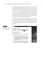
Figure 9.1
The toothpaste may get
teeth their whitest, but
it doesn’t do much for
this off-white typographic
headline. On 8-bit
systems, the type gets
pixellated, and we suspect
the web designer will, too.
(Image enlarged 200%.)
Figure 9.2
With the typography
recast in web-safe white
(#ffffff), the headline is
no longer pixellated,
increasing the chances
that it will actually be
read. The background
image is still dithered, but
users of 8-bit systems will
accept that. (Image
enlarged 200%.)
For typography, CSS or HTML background colors, or any other area of large,
flat color, if you stick to the web-safe color palette, you will avoid causing
dithering and its resulting illegibility and aesthetic problems on 8-bit sys-
tems. As explained in Chapter 2, the practice will not help those with 16-
bit systems, but nothing can save those folks except a graphics card
upgrade in their future.
13 0732 CH09 4/24/01 11:22 AM Page 214
Death of the Web-Safe Color Palette?
Creative people complain about everything. Web designers certainly com-
plain about being limited to 216 web-safe colors, but to us this is like grip-
ing about the nip in the air while enjoying the scenic beauty of rustic New
England. You want fall foliage, so put on an extra sweater.
Lulled by the music of these constant complaints, pundits perennially pro-
claim the death of the web-safe color palette, usually on the grounds that
16-bit systems enjoy a major market share. That 16-bit systems are widely
used is undeniable: They are installed in 46% of PCs as of this writing. That
the web-safe color palette is therefore dead is wishful thinking.
The web-safe color palette cannot die as long as it continues to solve prob-
lems for millions of web users. It does not solve every problem, but neither
does penicillin, and nobody talks about the death of penicillin. We bring
this up now because you will hear about it at the office and read about it
in web design newsletters, mailing lists, and bulletin boards.
Who spreads these obituaries? Sometimes it’s information architects and
interface developers who conduct meaningful research but draw debatable
conclusions from their data. The Webmonkey article, “Death of the Web
Safe Color Palette?" ( />index2a.html), proves beyond all doubt that 16-bit systems are hopelessly
inadequate and invariably reveal the rabbits hiding in a web magician’s hat.
But the article nihilistically concludes that all color palettes and traditional
methods are meaningless in the chaos of the Web; whereas we judge sim-
ply that 16-bit users are hosed until they upgrade. Not long ago, 16-bit
color was considered luxurious; cheap graphics cards changed the market,
and the next generation of cheap 24-bit cards will change it again.
Few discussions of the topic have been as carefully researched as Web-
monkey’s. The death of the web-safe color palette is generally announced
by the same people who tell us that bandwidth no longer matters because
“everybody” will “soon” enjoy high-speed access. These folks often go on to
proclaim that presently every site will be pumping out full-screen video
productions to rival Hollywood blockbusters.
215
Taking Your Talent to the Web
13 0732 CH09 4/24/01 11:22 AM Page 215
A moment’s analysis will tell you that many people around the world are
not online yet. That those who are online are mainly limited to slow con-
nections over untrustworthy phone lines. That even in the major urban
areas of industrialized nations, high-speed access is often hard to come by
and frequently comes at a premium many cannot afford—or are not will-
ing—to pay. That major Hollywood productions cost millions and can make
a profit (when they do make a profit) only by charging admission. That web-
sites generally do not charge admission, and web clients generally do not
have millions of production dollars at their disposal. And finally, that most
people do not seek big-budget entertainment from the Web. They seek
information, services, and communities—all of which the Web can deliver
with a minimum expenditure of bandwidth.
In other words, much of what you hear about how the Web works and
where it is going is bunk—including, we think, the death of the web-safe
color palette. Ask us again in a year or two when (hopefully) most PCs come
standard with 24-bit color or higher.
A Hex on Both Your Houses
Reared on RGB and CMYK, many designers find the Web’s hexadecimal
color nomenclature strange, at first. But the predictability of recurring
hexadecimal pairs (00, 33, 66, 99, cc, ff) makes it easy to tell if you are
using web-safe colors or not. It also makes it easy to specify web-safe
background colors and text colors in HTML and CSS.
You will find, after you work with these colors, that it is possible to create
pleasing combinations with them, and you will develop your own tech-
niques for doing so.
In this quest, you will be greatly aided by Photoshop’s own tool set and by
the VisiBone color palette included in Photoshop 5.5 and higher and avail-
able free online. The VisiBone palette is a superb tool for establishing visual
relationships between web-safe colors. And, as you already know, visual
relationships are the key to creating pleasing and effective color schemes.
216
HOW: Visual Tools: Color My Web
13 0732 CH09 4/24/01 11:22 AM Page 216
Color relationships are essential to branding, can support navigational
structures, and may greatly enhance a site’s aesthetic appeal at a minimum
expenditure of bandwidth. Fill an entire page with a CSS background color,
devise complementary link and text colors, and you begin to have the rudi-
ments of an attractive design using just a few kilobytes of bandwidth.
Was Blind, but Now I See
It should be noted that a small percentage of women and a larger per-
centage of men suffer from various forms of color blindness. Designs that
rely exclusively on color to convey essential information and relationships
could therefore be inaccessible to some viewers. So, while taking color
extremely seriously, you must also test your designs for accessibility—
ideally by running them past test subjects who manifest different forms of
color blindness. If you can’t do it that way, use the Color Blindness Simu-
lator at www.vischeck.com. Viewing your web layouts in grayscale mode is
a nice gesture but not a truly accurate means of testing how they will
appear to, say, a person with red/green color deficit (deuteranopia).
From Theory to Practice
The following three exercises introduce you to the effects of dithering,
describe how to set up the Photoshop Color Picker so that your color
choices are always web-safe, and explain how to locate and install the Vis-
iBone color palette. You will notice that we begin each exercise by cau-
tioning you to set your monitor to 24- or 32-bit mode before launching
Photoshop. If you accidentally launch Photoshop while in 16-bit mode, all
your colors will shift, and the images you design for the Web will always
be mismatched from their backgrounds.
217
Taking Your Talent to the Web
13 0732 CH09 4/24/01 11:22 AM Page 217
Exercise 1: In a Dither
Be certain your monitor is set to 24- or 32-bit mode. Launch Photoshop 5.5
or higher.
Open a new, blank document (600 x 400 pixels) and paint in it randomly, using
the Paintbrush and Airbrush tools.
Also be sure to use the Type tool to set some large type in a variety of colors.
Stop when you are satisfied.
In the Mac Finder or Windows desktop, switch your monitor to 256 colors.
Look at the image you’ve created. Those ugly dots are dithering, and that’s
what millions of viewers will see if you do not learn to incorporate the web-
safe color palette into your work.
Close the image without saving it, quit Photoshop, and restore your monitor
to its normal color settings (millions of colors).
Exercise 2: You Sure Can Pick 'em
Be certain your monitor is set to 24- or 32-bit mode. Launch Photoshop 5.5
or higher.
Open a new, blank document (600 x 400 pixels).
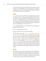
Open Photoshop’s Color Picker (see Figure 9.3). Note the Only Web Colors
checkbox and check it.
218
HOW: Visual Tools: Color My Web
Figure 9.3
The Photoshop Color
Picker provides RGB, HSB,
Lab, CMYK, and hexadeci-
mal readouts for any color
you choose. The familiarity
of RGB and CMYK will
help acclimate you to
hexadecimal nomencla-
ture. Click the checkbox
that reads Only Web
Colors, and your choices
will always be web-safe.
13 0732 CH09 4/24/01 11:22 AM Page 218
Watch your universe of color options shrink down to 216 choices. On the plus
side, the various graphic dialogs help you see the relationships between web-
safe colors.
Close the Color Picker dialog.
From now on, Photoshop’s Color Picker will always be web-safe. You can also
use Photoshop’s Color Picker to shift a near-web-safe color so that it is fully
web-safe.
Photoshop’s web-safe Color Picker is a vast improvement over what the pro-
gram used to offer in the way of support (namely, nothing).
Now that our Color Picker is web-safe, let’s do the same for our color palette
dialog. Jeepers, but we are moving along quickly here.
Exercise 3: Rolling the ‘Bones
Be certain your monitor is set to 24- or 32-bit mode. Launch Photoshop 5.5
or higher.
Open a new, blank document (600 x 400 pixels).
Refer to the Colors dialog. Note that there is a web-safe palette included in
Photoshop. Note that the color combinations are not especially intuitive and
have no meaningful relationship with the color wheel or other color theory
models.
Let’s fix that.
In the Swatches dialog box, choose Replace Swatches. A dialog box opens,
allowing you to navigate to a new palette located on your hard drive. Steer
your way to the VisiBone color palette (VisiBone1.aco), which is most likely
located in Adobe Photoshop 5.5, Goodies, Color Swatches.
Handsome, isn’t it? (See Figure 9.4.)
219
Taking Your Talent to the Web
13 0732 CH09 4/24/01 11:22 AM Page 219
This is still the web-safe color palette. But unlike Photoshop’s built-in, default
version, the VisiBone palette offers a meaningful arrangement built around
the color wheel model we all learned about in school (unless we spent our time
in school doodling and learned almost nothing except how to draw guitars in
the margins of our textbooks). Colors move in a circle across the spectrum,
and related colors are geometrically aligned with respect to one another.
The VisiBone color palette not only helps you choose web-safe colors, it helps
you choose web-safe colors that relate to one another in a meaningful way,
man. Harmonious and contrasting color relationships are easy to see and thus
easier to create.
In other words, the VisiBone palette helps you start doing beautiful work
within the limitations of the Color Cube. For instance, it helps you quickly find
a web-safe approximation of a client’s logo color and begin experimenting
with complementary and contrasting web-safe colors for your layouts. (It goes
without saying that if original logo development is part of the project, you will
design the logo using web-safe colors. It also goes without saying that your
client might want you to design a logo that matches the color of their
new Beetle or their favorite coffee mug, but that is where tact and client
education come in.)
220
HOW: Visual Tools: Color My Web
Figure 9.4
The VisiBone color palette,
located in the Color
Swatches folder within
the Goodies folder in
Photoshop 5.5 and higher,
makes it easy to choose
harmonious or contrasting
colors from within the
web-safe palette. Don’t
leave home without it.
13 0732 CH09 4/24/01 11:22 AM Page 220


