Taking Your Talent to the Web: A Guide for the Transitioning Designer- P12b docx
Bạn đang xem bản rút gọn của tài liệu. Xem và tải ngay bản đầy đủ của tài liệu tại đây (645.98 KB, 20 trang )
Save the VisiBone swatch so it is always available when you work in
Photoshop.
Now pat yourself on the back. Many of your peers have no idea that this spe-
cial swatch exists, that it comes bundled with Photoshop, and that it can
greatly ease the creation of meaningful and attractive color schemes for the
Web. You are ahead of the game.
If you’re stuck using an older version of Photoshop or an alternative image
editor, you can download the VisiBone palette free of charge at
www.visibone.com. While there, help yourself to additional VisiBone
palettes for other software programs you or your teammates use, includ-
ing Adobe Illustrator and ImageReady, Macromedia Fireworks, Bare Bones
BBEdit, Jasc Paint Shop Pro, Allaire HomeSite, MetaCreations Painter, or the
GIMP (an image editor for Linux). You need it; they’ve got it.
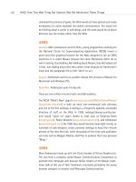
For additional wisdom on the Color Cube, see Lynda Weinman’s site at
www.lynda.com and David Siegel’s at www.killersites.com. You also might
want to buy Weinman’s Designing Web Graphics and Coloring Web Graph-
ics, both of which are available from New Riders Press, and are pretty much
the standard industry texts. They are full of practical examples and offer
stimulating and innovative ideas from the earliest days of web design.
Another standard industry text, David Siegel’s Creating Killer Websites, is
also available from New Riders and also provides extensive information on
the subjects we cover in this chapter. It’s a beautifully written book full of
great ideas, but it is also a book of its time (1996), and many of the prac-
tices it preaches would now be considered harmful to the development of
a semantic Web based on W3C Recommendations. We own and cherish this
book, which was greatly influential in our development, and we recom-
mend it as long as you know which of its visual techniques to shun. (If
you’re unsure, wait for the book’s third Edition…we hear it’s coming soon.)
FORMAT THIS: GIFS, JPEGS, AND SUCH
Raster images come in at least as many formats as there are software pro-
grams and operating systems. On the Web, however, we tend to use two
formats almost exclusively: GIF and JPEG. (As explained previously, ani-
mated GIFs are a special instance of the GIF format.)
221
Taking Your Talent to the Web
13 0732 CH09 4/24/01 11:22 AM Page 221
PNG is yet another web format, one that has been little supported in the
past. Some newer browsers have begun to support PNG, though it is still
far from ubiquitous. We will discuss it after thoroughly examining the GIF
and JPEG formats—how they work, which types of images they deliver best,
and how you can evolve strong stylistic concepts by understanding their
limitations.
GIF
The Graphics Interchange Format (GIF) is older than the Web. In fact it is
older than some web designers. GIF was developed in the 1980s by Com-
puServe, and you’ll often hear old-timers speak of “CompuServe GIFs.”
You’ll also hear them talk about walking 12 miles to a one-room school-
house.
The Compuserve folks pronounced the word as if it were the name of the
peanut butter (“Jiff”) and because they were the inventors, that is the cor-
rect pronunciation. Millions of people pronounce GIF with a hard “G,” how-
ever, so you might as well be a sniveling conformist and spend the rest of
your career mispronouncing GIF while secretly suffering great guilt over it.
GIFs are usually seen with a .GIF file extension, as in payme.GIF or
payme.gif.
The GIF format renders in 8-bit color or lower, at your discretion. Two-color
GIFs are not uncommon. GIF permits you to achieve crude transparency
effects by marking one of your 216 (or fewer) colors as “transparent.” How-
ever, you must take care to anti-alias the foreground image against the
transparent color, lest mismatched halos surround your graphics. Fortu-
nately, GIF renders specific colors exactly, so it is an easy matter to match
web page backgrounds to image backgrounds. The only caveat there is the
previously mentioned heartbreak of 16-bit systems.
Above all, GIF enables you to save bandwidth without sacrificing quality. It
employs the Unisys-patented Lempel Ziv Welch (LZW) algorithm
(www.dogma.net/markn/articles/lzw/lzw.htm) to efficiently compress solid
color areas while preserving crisp detail. Though the format necessarily dis-
cards colors—for instance, when rendering a 24-bit image as a 16-color
GIF—it does not blur or eliminate significant image details. For this reason,
the GIF algorithm produces what is known as lossless compression.
222
HOW: Visual Tools: Format This
13 0732 CH09 4/24/01 11:22 AM Page 222
Loves logos, typography, and long walks in the woods
This combination of crisp detail and efficient compression makes GIF the
format of choice for line art including typography, logos, and illustrations.
As mentioned earlier, the GIF format can also be used to create animated
images. When combined with JavaScript rollovers, animated GIFs can lend
life and dynamism to a website. They can also create nausea and ennui.
With animation and rollovers, as with Tabasco, a little goes a long way.
Animated GIFs have been supported in all graphical web browsers since
Netscape 2.0 (1995), and nonanimated GIFs have been supported in graph-
ical web browsers since before time began. For now we will continue to
discuss the merits and uses of static (nonanimated) GIFs.
In spite of the fact that GIFs are found on millions of sites, the GIF format
is not a W3C-recommended web standard. That’s because GIF gets its
power from a patented algorithm. Unisys, the patent holder, is entitled to
charge royalties on any software that employs the LZW algorithm—in other
words, any software that can read or write GIFs. The revelation of Unisys’
right to charge a “GIF tax” spread panic among early web designers when
it became widely known only after the entire Web seemed to be built with
GIF images. It also led to the development of PNG, a GIF-like format with
more advanced features and a nonproprietary compression algorithm.
GIF “royalties” do not work in the way that, say, photo rights work. You do
not pay a fee each time you create a GIF image. Instead, software compa-
nies such as Adobe, Macromedia, and Corel render these tributes to Cae-
sar. You pay your share one time only, and it is hidden in the purchase price
of Photoshop, Fireworks, or any other software program that exports to the
GIF format.
GIFs are not the format of choice for photography, paintings, and other
subtly modulated images because they lack sufficient colors to reproduce
these types of images and because the nuances in those images do not lend
themselves to LZW compression. Photographic images tend to render bet-
ter in the JPEG format (or PNG), and we’ll get to those formats soon
enough.
223
Taking Your Talent to the Web
13 0732 CH09 4/24/01 11:22 AM Page 223
GIFs in Photoshop
In Photoshop, you can choose whether to save your image as a standard or
interlaced GIF. The standard format is like a reader, taking in one letter after
another, one word after another, one sentence after another. Standard GIFs
store and display the bytes comprising an image’s pixels in their order of
appearance: The first pixel in is the first pixel out. Thus, standard GIFs scroll
onto the viewer’s screen pixel by pixel and line by line.
The interlaced format is like a nervous reader who keeps skipping ahead—
from paragraph one to paragraph five, then back to paragraph one. Inter-
laced GIFs load in a parallel rather than linear sequence, allowing the total
image to be rendered more quickly and then with greater detail as addi-
tional pixels are downloaded. This allows viewers to get a sense of the
image before it has finished downloading.
Under the right conditions, interlaced GIFs might thus appear to load
faster—and so may your site. The appearance is deceptive given that inter-
laced GIFs are often a few bytes larger than standard GIFs and therefore
take a fractionally longer time to fully download. Moreover, the slight
benefits of interlaced GIFs often evaporate when other conditions are
factored in.
For one thing, the effectiveness of progressive GIFs depends on the viewer’s
access speed. With a super-fast connection, images load so quickly that
any progressive rendering benefits are lost. The format was something of a
godsend not so long ago, when most web users were limited to 14.4
modems. Today, few are stuck with such abysmal speeds.
The effectiveness of progressive GIFs also depends on the browser. Some
browsers do not show anything at all until all images are fully loaded; in
those browsers, the progressive aspects of the image are entirely wasted.
If anything, in such browsers, progressive GIFs delay the page by adding a
few bytes to the overall download time.
Some browsers, such as Internet Explorer, give users a choice. Users may
view each image as it downloads (best with slow connections), or they may
choose to wait for the entire page to download and assemble itself in mem-
ory before appearing full-blown on the screen (best with fast connections).
Users choose a viewing method in the Explorer Preferences dialog box. You
have no way of knowing or controlling these user preferences.
224
HOW: Visual Tools: Format This
13 0732 CH09 4/24/01 11:22 AM Page 224
Beginning web designers often ask if they can control the loading order of
images on a web page. Given what has just been explained, the answer is
obviously “no,” because web users can choose (or their browsers may force
them) to wait for the entire page to load. Beyond that, HTML has no means
of controlling the loading order of images. And even if it did support such
nuances, the unpredictability of HTTP calls (explained in Chapter 2) means
that one image might halt in mid-download, not even appearing until
another, called much later, has already popped into place. The more images
per page, the greater the randomness of load order. View a busy thumbnail
image gallery sometime to see this in action, assuming your browser allows
you to watch images download one by one.
Avoid progressive GIFs when creating an image to be used as a background.
Backgrounds do not appear until they have fully downloaded, so any “pro-
gressive” effects will be lost. Moreover, progressive GIF backgrounds can
crash some older browsers.
Progressive GIFs also can be hazardous to animations because each suc-
ceeding frame of a progressive animated GIF will appear blurry, thus
defeating the effort to create smooth motion effects.
They’re not great for JavaScript rollovers, either. You can offset the harm-
ful, blurred quality of progressive GIFs in rollovers by preloading the
images, a technique explained in the Chapter 11, “The Joy of JavaScript.”
When preloaded via JavaScript, images download and are stored in the
viewer’s cache even though they do not appear on the web page until trig-
gered by some action on the viewer’s part (typically, moving the mouse over
an image to which rollover effects have been applied). Any sane web
designer who creates rollovers starts by preloading the alternate (replace-
ment) images. But if the images are going to be preloaded anyway, there’s
no sense in having them render progressively because the user will never
see them until they have fully downloaded and cached.
One last tip while we’re in this area. Given that text loads instantly and
images take time (see Chapter 2), designs that use HTML text above the
fold will appear to load more quickly than those that bury their text fur-
ther down on the screen. A web user waiting for images is a web user with
nothing to do (except, perhaps, hit the Back button). A web user reading
225
Taking Your Talent to the Web
13 0732 CH09 4/24/01 11:22 AM Page 225
text has less anxiety about the fact that some images may not have fin-
ished downloading. With sufficiently engaging text, the user will feel that
the site is responsive. Keep this in mind when designing sites that require
a great many images.
JPEG, the Other White Meat
The Joint Photographic Experts Group (JPEG) format should be familiar to
you from stock photo houses, digital cameras, and the Photoshop tutorial
itself. Usually seen with a .jpg file extension (as in landscape.jpg), JPEG sup-
ports 24-bit color and preserves the subtle hue and brightness variations
found in photographs and other continuous-tone images. JPEG is therefore
usually the format of choice when creating photographic images for the
Web. Like GIF, JPEG is widely supported in visual web browsers.
Just as MP3 music files toss away audio harmonics to achieve compact file
sizes, JPEG’s compression works by selectively discarding bits of image
data. Because a loss of quality is involved, JPEG compression is referred to
as lossy compression. “Lossy” is an annoying word that looks wrong, but we
appear to be stuck with it. In theory, the material discarded by the JPEG
optimization process is data that is nearly invisible to the human eye (just
as audio data discarded by the MP3 format is supposed to go practically
undetected by your ears, though we’ve never met a music fan who could
not hear the difference). The greater the JPEG compression, however, the
more visible the “missing data” becomes. At extremely high compression
ratios, JPEG images can display funky artifacts (see Figures 9.5 and 9.6).
Although JPEG is generally preferred for photographic images, when sharp
detail is important, GIF is the better choice. JPEG tends to soften images as
it compresses them. Particularly when you are working with typography,
the softness of JPEG images can ruin the effect of a web graphic. Naturally,
there is a workaround, as explained in the “Combining Sharp and Blurry”
section later in this chapter.
Unlike GIF, the JPEG format does not retain specific web-safe (or other) col-
ors. It promises you a rose garden, but the rose might be umber. In a sil-
houetted portrait where the edges of the image must match the
background of the web page, you would therefore use GIF, not JPEG.
226
HOW: Visual Tools: Format This
13 0732 CH09 4/24/01 11:22 AM Page 226
227
Taking Your Talent to the Web
Figure 9.5
At moderate JPEG
compression levels,
image details are clear,
but file size is high.
Figure 9.6
At high JPEG compression
levels, file size is low
(minimizing bandwidth)
but so is the quality. Each
JPEG optimization is an
exercise in balancing file
size versus quality of
detail.
13 0732 CH09 4/24/01 11:22 AM Page 227
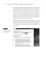
Photoshop’s Save For Web function provides a small, Matte Color dialog
box that purports to save an exact background color of your choice, even
in the JPEG format. (Skip ahead to Figure 9.7, if you must. The Matte Color
dialog appears at mid-right.)
Photoshop does all it can to fulfill this promise, but the JPEG format really
is not built to handle specific colors like this. To viewers with 24-bit and
higher systems, the background color will appear to match. For 16-bit and
lower users, the mismatch may be clearly visible. So stick with GIF when
you absolutely, positively, have to deliver a specific web-safe (or other)
color.
In Photoshop, you can choose whether to save your JPEG as a baseline
(standard) JPEG or as a progressive JPEG. Progressive JPEGs display a low-
resolution version of the image almost immediately and then gradually
come into crisper focus.
As with progressive GIFs, under the right circumstances, progressive JPEGs
can create the illusion that the site is loading faster. As previously dis-
cussed, this varies depending on the viewer’s access speed, browser func-
tionality, browser preferences, and the caprices of HTTP. And as in the
discussion of GIFs above, when intended as background images, progres-
sive JPEGs are a no-no unless you want some of your visitors to crash-
crash.
Optimizing GIFs and JPEGs
When we export images such as GIFs and JPEGs, we choose the format
most appropriate to the type of image we’re dealing with and then opti-
mize it to create the best appearance possible, while using the least
amount of bandwidth and computing resources.
In addition to optimizing (reducing file sizes), the exporting process allows
us to further exert control over the color of our GIF images.
Photoshop 3, 4, and 5 offered early web designers very little in the way
of optimization and color controls. As a result, a number of inexpensive,
third-party, shareware plug-in products specifically tailored to the needs
of web designers sprang up in the mid-1990s, most notably Boxtop
228
HOW: Visual Tools: Format This
13 0732 CH09 4/24/01 11:22 AM Page 228
Software’s PhotoGIF, ImageVice, and ProJPEG (all are available at
www.boxtop-software.com). These products were dandy (still are), but they
did not come as standard equipment (still don’t). Arguably, they do a bet-
ter job than Photoshop at handling some tasks.
Fortunately, Photoshop 5.5 and higher, together with ImageReady, offers a
number of tools to help web designers create the best-looking image while
using the least amount of bandwidth. Photoshop’s Save For Web command
(found in File, Save For Web) enables web designers to preview the effects
of various compression settings on their images and then execute those
settings and save the resulting web-ready images (see Figure 9.7).
The Save For Web dialog is powerfully compelling in the breadth and sub-
tlety of its tools. You can preview GIF versions using as few as two colors,
as many as 256, or anything in between. You can use Adaptive, Selective,
Perceptual, or web-safe color, with or without dithering, transparency, or
interlacing (the “progressive” setting). You can skew images closer to or
further from the web-safe palette as you desire. You also can name and
save custom settings for later application to similar images.
229
Taking Your Talent to the Web
Figure 9.7
Photoshop’s Save For
Web dialog in action. In
this “four-up” view, the
original image appears at
the upper left for easy
comparison with various
optimization schemes of
your choosing.
13 0732 CH09 4/24/01 11:22 AM Page 229
Work on one optimization setting at a time or view three at once—and
compare them with the original to check for image degradation and color
shifting. Get an instant readout of the effect your decisions will have on
file size and downloading speed. Enlarge images to check fine details. Lock
selected colors before trying a new set. Shift one color at a time to its clos-
est web-safe equivalent. We feel like press agents. We feel giddy. We love
this dialog box. You will too.
Images in Save For Web mode also may be previewed at various JPEG set-
tings, both baseline and progressive, and again the tools are remarkably
powerful.
In general, the fewer the colors used in a GIF, the better it compresses. This
is not because the color palettes themselves eat bandwidth; rather it is
because of the way LZW compression works. More on that in a moment in
the “Expanding on Compression” section that is coming up next.
Dithering images produces more photographic-like effects at the cost of
slightly higher file sizes; images without dithering are smaller. We find that
typographic GIFs are often cleaner and more legible when saved without
dithering. Your mileage may vary. You can create either type of image (and
preview the results) in Photoshop’s Save For Web dialog box.
After you decide which optimization scheme works best for a given image,
the image can be saved in that format. Your chosen settings may be
retained indefinitely, and can even be applied (as a droplet) to an entire
folder of images.
Photoshop lets you name and store as many of these settings as you like.
If a series of images you’ve created for Acme Widgets happens to work well
in 12 colors with no dithering at 60% web-safe, you can name that set-
ting 12color_nodither (or acme_widgets or 60websafe or donaldduck if
you prefer). You can then save it forever—or at least until your backup
media deteriorates and what’s left of your hair is white and listless. By then
we’ll all be living on Mars while our clones do the work, anyway.
Alternately, you can use the ImageReady module to satisfy your wanton
image compression and formatting needs. But Photoshop’s Save For Web
is just as effective, and the true power of ImageReady comes later in the
process (and this chapter).
230
HOW: Visual Tools: Format This
13 0732 CH09 4/24/01 11:22 AM Page 230
Expanding on Compression
As explained previously, we compress images to minimize wasted band-
width and speed the arrival of the web page. We’ve shown you how Pho-
toshop optimizes images when preparing them for the Web, so you know
all you need to know to handle the basics. The following are some extra
tips.
Make your JPEGS smaller
You can make your JPEGs even smaller in file size (and reduce the appear-
ance of JPEG artifacts) by blurring them slightly before compressing them.
Not all areas of all images react well to blurring, but it’s surprising what
you can achieve by blurring, say, a distant sky and sunset while preserving
the sharpness of a human subject in the foreground.
This kind of work requires selecting the parts of the image you want to blur,
feathering the edge of the selection slightly, and masking out the parts of
the image where sharper focus is important. As we said in the beginning,
we assume you already know how to do these things in Photoshop.
If you prefer, you can apply subtle (or not-so-subtle) blurring effects to
your entire image in the Save For Web dialog box, but we generally find
this method too coarse. Blurring, say, an entire portrait makes the subject
look drunk—or the viewer feel that way. Selectively and subtly blurring
large areas of undifferentiated skin tones, while preserving the sharpness
of eyes, brows, hair, and lips, will usually be much more effective. And that
kind of work you do in the main Photoshop window before entering the
Save For Web dialog.
Combining sharp and blurry
Subtle problems can arise when choosing the appropriate image format.
Say you’ve designed a header graphic that includes both photography (a
shot of the corporate board of directors) and typography (a superimposed
headline in Meta or Helvetica Neu Condensed Black). The headline requires
sharp focus and crisp handling—thus it begs to be a GIF. The photograph
wants to be a JPEG. What’s a mother to do?
231
Taking Your Talent to the Web
13 0732 CH09 4/24/01 11:22 AM Page 231
232
HOW: Visual Tools: Format This
Figure 9.8
The background image,
a layered photomontage,
wants to be saved as a
JPEG because JPEG would
best reproduce its subtly
modulating hue and
brightness variations.
But…
Figure 9.9
…the typography insists
on being saved as a GIF
because only the GIF for-
mat will reproduce the
crisp, clear lines of type.
A JPEG would soften the
headline and render the
small type as an illegible
blur. So…
Figure 9.10
…the image is saved as a
GIF because type takes
precedence over photo-
graphic nuances. The
image could also have
been saved as a PNG. But
the PNG would have been
far larger and not enough
browsers fully support the
PNG format yet.
Usually, what you do is give greater weight to the need for crisp typogra-
phy and export the entire image as a GIF, accepting that the photographic
imagery will not render as well as it would have in a JPEG (see Figures 9.8,
9.9, and 9.10).
13 0732 CH09 4/24/01 11:22 AM Page 232
233
Taking Your Talent to the Web
Alternately, you could export the human subjects as a JPEG, export the
typography as a transparent GIF, and superimpose the GIF over the JPEG
using any number of web sleights of hand. For instance, you could employ
CSS absolute positioning to layer a crisp, transparent typographic GIF on
top of a soft photographic JPEG. (This would not work in Netscape 3 or IE3
and might destabilize Netscape 4. Thankfully, these browsers are finally
limping away from the playing field, although not as fast as we’d like.)
Depending on the layout, you alternatively could use the old, nonstandard
<bgimage> attribute of the HTML table cell <td> tag to position a photo-
graphic image in the background of a table cell and then place a type GIF
in the foreground. The type GIF would have to be the same size as the back-
ground image and would require GIF transparency to allow the background
to peek through. The size of the GIF would be marked up in the table cell
attributes to ensure that the cell was the correct size. Though this tech-
nique works well in almost every graphic browser since the svelte boyhood
of Fred Flintstone, it is a lot of silly (and nonstandard) markup—and it’s
probably not worth the bandwidth.
Or you could do what Magdalena Donnea did on the front page of her
award-winning personal site, “Water,” at www.kia.net/water/. (Use View
Source to see exactly what Magdalena did.)
As we said, most of the time, you’ll use the GIF format to ensure that your
text is legible. You also might consider rethinking the entire design idea in
favor of one that is more in keeping with the limitations of the Web (see
Figure 9.11).
Figure 9.11
The ever-popular “striped”
effect that dominated the
web in the late 1990s had
its roots in a technique to
minimize bandwidth by
making the most of the
GIF compression algo-
rithm’s preference for
straight horizontal lines.
13 0732 CH09 4/24/01 11:22 AM Page 233
COMPRESSION BREEDS STYLE: THINKING
ABOUT THE MEDIUM
The GIF format not only compresses by removing millions of colors, it also
employs the LZW algorithm to keep track of those colors and further reduce
file sizes. A clever web designer can create large images that use little
bandwidth by designing with LZW compression in mind. To understand how
that is possible, we must take a closer look at how LZW compression actu-
ally works.
Onscreen images are like diners inside a burger joint. A mentally challenged
waiter says, “The first gentleman at Table One would like a cheeseburger.
The second gentleman at Table One would like a cheeseburger. The third
gentleman at Table One would like a cheeseburger. The fourth gentleman
at Table One would like a cheeseburger.”
This is how a noncompressed image works. The computer looks up the color
of a pixel and then displays it. It looks up the color of the adjoining pixel
and displays that—and so on and so on for every pixel on the screen.
A smart waiter says, “Four cheeseburgers,” which is how LZW compression
works.
LZW compression looks at an image line by line and says, “Row #1 is all red
pixels” (assuming that Row #1 actually is all red pixels). Obviously, the
greater the number of pixel rows that are identical to each other, the bet-
ter the compression engine works (for example, four tables of four cheese-
burgers). Thus, horizontal and vertical elements compress better than
diagonal elements because with horizontal or vertical elements, more rows
of pixels can be exactly the same as each other.
Without getting too technical, horizontal lines tend to compress even bet-
ter than vertical ones because LZW compression “reads” images left to right
and line by line, the same way you’re reading this book. If every pixel in a
given line is the same color, that line compresses better, and therefore so
does the GIF (there’s more to it than that, of course). Ten lines containing
234
HOW: Visual Tools: Compression Breeds Style
13 0732 CH09 4/24/01 11:22 AM Page 234
all the same color compress better still. Basically, GIF compression likes
large areas of flat color, whether they are confined to a single line or bleed
down across several. The main point is that an image containing one or
more lines of identically colored pixels will compress much better than the
average image whose colors are arrayed at random.
In 1995, when 14.4 modems prevailed, some clever web designers began
masking every other horizontal line in an image to maximize LZW com-
pression and minimize bandwidth. This technique of masking images
with evenly spaced horizontal lines is known as CRLI compression
(www.infohiway.com/faster/crli.html).
What started out as a bandwidth-oriented tool had become a stylistic
design fetish by the late 1990s, as newcomers to the field fell in love with
the CRLI “look” without understanding its utilitarian purpose as a tool of
bandwidth compression. To these designers, stripes were “webby,” and
“webby” was cool. As the Web exploded into public consciousness, con-
sumers and ad agencies seemed to agree with this link between “Web” and
“cool.” The ever-popular striped effect was soon seen not only all over the
Web, but also in print and television.
Among many ironies, some web designers exported these striped images in
the JPEG format, where, far from saving bandwidth, the technique actually
wasted it. They knew not what they were doing. CRLI compression is a GIF
thing, baby.
The strengths and limitations of LZW compression are equally profound. For
instance, because LZW prefers straight horizontal and vertical lines to all
others, Roman type tends to reproduce better than oblique. Roman type is
also better at hiding its anti-aliasing artifacts at screen resolutions—
another reason it works better onscreen than oblique does.
Considering these limitations of the medium may lead you to set your
headlines in Roman type more often than oblique. Of course, Roman type
is far more frequently used than oblique to begin with, so this situation is
hardly tragic. But you should be aware of it. Oblique type can certainly be
used for headlines—we do it all the time—but it never reproduces as well
as upright type.
235
Taking Your Talent to the Web
13 0732 CH09 4/24/01 11:22 AM Page 235
You will run into the same difficulty with lines at almost every angle. The
45-degree angle is the exception: It works perfectly with LZW, like a diag-
onal in a game of tic-tac-toe. As you might expect, 45-degree angles came
into vogue around 1999 because they reproduce well on the Web, and
within six months they were popping up in print and TV as a meaningless
design fetish after everyone had tired of the striped effect. And as you
might also expect, many web designers employed 45-degree angles in
JPEGs, then saved the JPEGs at the highest possible quality settings to pre-
serve the crispness of their lines. The result: wasted bandwidth.
PNG
The PNG format was developed in hopes of establishing it as an open
standard for graphics on the Web—which it now is (see www.w3.org/
Graphics/PNG/). But while PNG was slowly being developed, working web
designers had to create websites, and all browsers supported GIFs. In effect,
then, GIF is a long-standing, unofficial defacto standard based on a pro-
prietary compression algorithm, while PNG is a nonproprietary, officially
sanctioned standard that is not as well supported as it ought to be.
There are two forms of PNG. PNG-8 is an 8-bit format (like GIF). PNG-24
offers 24-bit color (like JPEG), yet its sharpness and quality put JPEG to
shame. To create PNG images for the Web, simply choose PNG-24 or PNG-
8, 128 Dithered in Photoshop’s Save For Web dialog box or in ImageReady.
PNG is still not natively supported in enough web browsers, and though
support is growing, PNG is unlikely to supplant GIF or JPEG any time soon.
For one thing, PNG, while high in quality, is often high in bandwidth as well.
For another, while PNG stays crisp in milk (like GIFs do), the PNG format
does not support animation. GIFs are therefore seen as more versatile by
those who even bother to lift their heads out of their cubicles and think
about these issues.
To see why PNG can be cool indeed, if your browser can handle it, visit the
Audio site at www.panic.com/audion/faces.php, click any thumbnail, and a
PNG image will pop up on the screen. Drag the image from place to place
on the page at your pleasure. You can even drag it off screen (as shown in
Figure 9.12).
236
HOW: Visual Tools: Compression Breeds Style
13 0732 CH09 4/24/01 11:22 AM Page 236
Notice that the PNG format offers true alpha channel transparency—it
matches any background you drag it over. No more halo effects caused by
mismatched anti-aliasing, no more ring around the collar. Notice too that
PNG offers crisp imagery as well as rich color.
Notice that the page only works in IE5 for the Macintosh. Bummer. Even-
tually all browsers will support PNG natively.
ANIMATED GIFS
Animated GIFs are nothing more than a series of frames (or individual GIFs)
that have been joined together to create the illusion of motion. They can
loop endlessly or play once and then stop. We could include a screenshot
here, but what’s the point? If you haven’t seen animated GIFs, you’ve never
used the Web. (Hint: look at the ad banners that clutter most commercial
content sites—web animation in a nutshell.)
Although the GIF format supported the embedding of multiple images in
the late 1980s, it was not until 1995 or so that Netscape figured out how
to hack the format’s multi-image capability to create flip-book-style ani-
mation. (Basically, Netscape did this by appropriating a Comments field and
some unused but reserved bits in the GIF89A file format.)
237
Taking Your Talent to the Web
Figure 9.12
PNG a ding-ding. On the
Audion site, you can bask
in the glories of the PNG
format—glories that
include true alpha channel
transparency, rich color,
and crisp detail. (But only
if you’re packing the right
browser.)
13 0732 CH09 4/24/01 11:22 AM Page 237
Back in the day, web designers used free shareware tools to create ani-
mated GIFs, after first preparing each individual image, saving it as a GIF,
and then running all resulting GIFs through DeBabelizer, a cumbersome
color management tool that ensured that the colors would match between
frames. (Nothing ruins the illusion of motion faster than an unexplained
color shift between one frame and the next.)
Today all that work is merely a memory because Photoshop comes with
ImageReady, and ImageReady makes it easy to create, optimize, and save
GIF animations.
Animation for its own sake is charmless, abrasive, and amateurish. Good
web designers use animation as they use everything else: with taste and
skill in support of a concept and brand image. The creators of www.k10k.net
employ animated GIFs well. The animations are revealed when rolling over
the miniature content header graphics.
Care should be taken to avoid wasting bandwidth when creating animated
GIFs. If one image uses x bytes, then ten images theoretically use 10x bytes,
and your web page might bloat as a result. Fortunately, web designers can
trim excess fat from their animations by telling the software to animate
only the parts that change, rather than redrawing each frame in its entirety.
This process is explained in the next sections. Web designers also can opti-
mize their animations by leaving out inessential in-between frames, by
keeping their images small (50 x 50 is better than 100 x 100), and by cre-
ating graphics that can be rendered in as few colors as possible.
CREATING ANIMATIONS IN IMAGEREADY
Adobe ImageReady simplifies the process of creating animated GIFs by
allowing web designers to use Photoshop’s layers as a series of frames and
enabling them to manually change the location of elements from one
frame to the next.
For instance, if you wish to animate an arrow, you can draw the arrow on
one layer in Photoshop then jump to ImageReady and open the animation
palette. Create a new frame and drag the arrow manually to the left or
238
HOW: Visual Tools: Creating Animations in ImageReady
13 0732 CH09 4/24/01 11:22 AM Page 238
right. Create a third frame and drag the arrow again. ImageReady “remem-
bers” the location of each arrow and will render an animation as a result
of these manual movements.
ImageReady can also generate tweens automatically. Start with an arrow
on the left. Create a new frame. Drag the arrow to the right. Choose the
Tween command and instruct ImageReady to tween between the first and
second frames. ImageReady generates a smooth flow of images. You can
then use the Optimize palette to ensure color consistency from the first
frame to the last. Keep in mind that the more you tween, the smoother the
motion but the larger the overall file size.
We could blab on about this, but the Photoshop owner’s manual does a
great job of explaining everything. The way we see it, if you own Photo-
shop, read the manual. If you don’t own it, there’s no sense in reading about
it here and probably not much sense in planning a web design career. (Gosh,
that sounds like a product endorsement.)
TYPOGRAPHY
A designer’s interest in typography usually borders on obsession. On the
Web, you’ll get plenty of opportunities to indulge your fetish. As part of
establishing the look and feel of a site, the web designer is responsible for
all of its typographic choices, including
■ Body text typography (CSS)
■ Logo (if not preexisting)
■ “Type GIF” headlines, subheads, and so on
■ Navigational typography (menu bar)
Body text typography is controlled with Cascading Style Sheets (CSS), a
subject so important we devote an entire chapter to it (Chapter 10, “Style
Sheets for Designers”) and still scarcely do it justice. All we’ll do here is
remind you that 99% of the Web is text, most of it intended to be read,
and that there is neither a reason nor an excuse to create hard-to-read text
on your web pages.
239
Taking Your Talent to the Web
13 0732 CH09 4/24/01 11:22 AM Page 239
The logo, if not preexisting, will be designed in Adobe Illustrator or Macro-
media Freehand, just as it would be in print projects. All we need to say
about that is to remember to start with web-safe colors, keep your design
simple so it can reproduce at small sizes (32 x 32 web buttons, for
instance), and pay attention to the following discussion about serif versus
sans serif faces in the limited 72ppi screen environment.
Remember the VisiBone color palette we mentioned earlier in this chapter?
Download the Illustrator version and use it to develop logos and other
graphics intended for the Web.
Before copying Illustrator artwork to Photoshop, convert to RGB via Illus-
trator’s Filter, Colors menu. The process is not perfect; web-safe colors may
shift, and you might need to select large areas in Photoshop and refill them
with web-safe colors.
The main thrust of our look at typography will not be body text (covered in
Chapter 10) or logo design (covered previously in this chapter). Instead, we
will discuss the basics of using Adobe Photoshop and ImageReady to cre-
ate typographic GIFs for the Web. We’ll also further examine how anti-
aliasing can work for or against your web designs.
THE ABCSOFWEB TYPE
As you know, Photoshop and ImageReady let you add horizontal and ver-
tical type to any image. As of Photoshop 5.5, you can specify the typeface,
leading, kerning, tracking, baseline style, size, and alignment of the type
and edit its characters. Photoshop 6 improves on its predecessor’s already
remarkable power.
Previously, such details as leading, kerning, and tracking were the exclu-
sive province of Illustrator, and most serious web designers would create
their typography in Illustrator and then cut and paste it into Photoshop.
Some still do that, and you might prefer to as well. Illustrator offers useful
keyboard shortcuts for kerning and other typographic functions. Many of
those keyboard shortcuts are missing from Photoshop, making the process
a bit less streamlined.
240
HOW: Visual Tools: The ABCs of Web Type
13 0732 CH09 4/24/01 11:22 AM Page 240